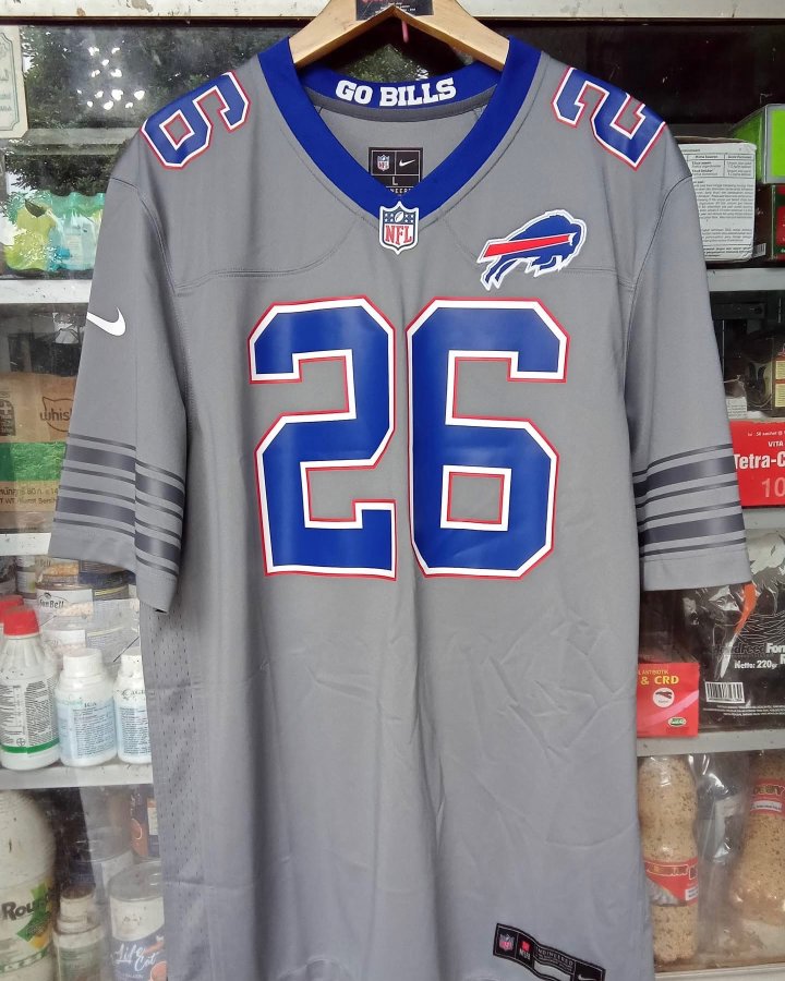
via @FlyingZebra30 on X
A gray Buffalo Bills alternate jersey showed up on social media this week, and we have some thoughts. Posted by @FlyingZebra30 on X, the jersey features a full gray base with blue numbers, red trim, and the classic Bills charging buffalo logo on the chest. There's no official confirmation from the Bills or Nike on whether this is a real 2026 alternate or not, and honestly, we hope it isn't.
The Blue Collar
The blue V-neck collar is probably the only part of this jersey that actually works. It gives the gray base a little bit of contrast and ties back to the Bills' primary blue. The "GO BILLS" jock tag inside the collar is a nice touch that most fans won't ever see but adds some personality. That's about where the positives end.
The Gray-on-Gray Problem
The sleeve stripes are gray on gray. Tonal striping can work when it's subtle and deliberate, like the way some NBA City Edition jerseys handle it. Here, it just looks like the design ran out of ideas. The stripes blend into the jersey so much that from a distance, the sleeves look completely blank. If you're going to do stripes, commit to them. Make them blue or red. Don't just ghost them into the background.
The Logo Placement
The charging buffalo logo sits on the left chest, which is standard for NFL jerseys. But on a gray base, the blue and red logo doesn't pop the way it does on a white or royal blue jersey. It just kind of sits there. The whole point of the Bills' visual identity is that contrast between the deep royal blue and the bright red. A gray jersey washes all of that out.
The Back
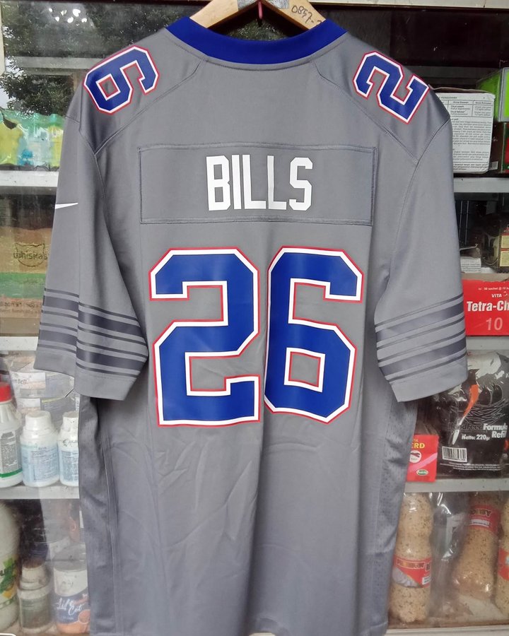
via @FlyingZebra30 on X
The Numbers
Blue numbers with white and red outlines on a gray base. The font is the standard Bills block numbering, which is fine. But the blue-on-gray combination doesn't have enough contrast to be readable from the upper deck or on TV. Compare this to how sharp blue numbers look on a white Bills jersey. Night and day.
Is This Even Real?
There's a real chance this is a knockoff or a fan mockup that got passed around as a leak. The stitching, the tag placement, and the overall construction look like they could be from an unofficial source. We've seen plenty of fake leaks before that turned out to be nothing. There are rumors swirling around that this is not real, and we genuinely hope those rumors are right. If the Bills actually go ahead with a gray alternate, we'd expect a much more polished execution than what we're seeing here.
Overall Grade
We're grading what's in front of us, and what's in front of us is a jersey that strips away everything that makes the Bills' visual identity work. The blue collar is fine. Everything else misses. Gray jerseys can work in the NFL when they're done right. This isn't done right.