The 2026 FIFA World Cup home kits are here from all three major brands. Adidas has 23 home jerseys, Nike has 16, and Puma has 12. That gives us 51 home kits to rank from worst to best.
We already ranked every 2026 World Cup jersey overall and each brand individually. This ranking focuses only on home kits, the jerseys each team will wear most often on the World Cup stage this summer. All images are courtesy of Nike, Adidas, and Puma.
51. Qatar (Adidas): D+
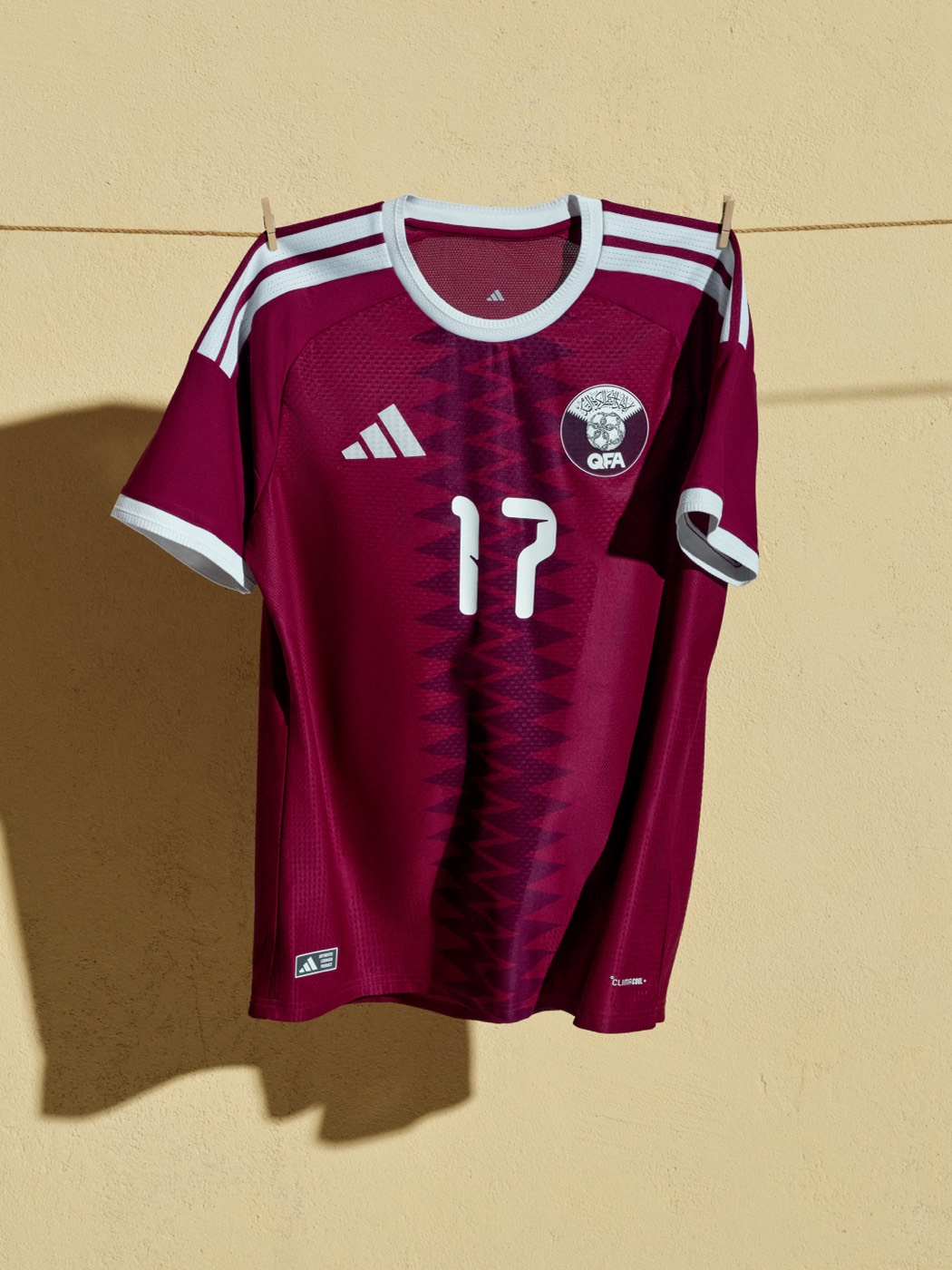
The maroon base with a subtle pattern down the center looks more like a training top than a World Cup kit. Qatar hosted the last World Cup and this is the best they could come up with. Easily the weakest home kit in the 2026 batch.
50. Egypt (Puma): D
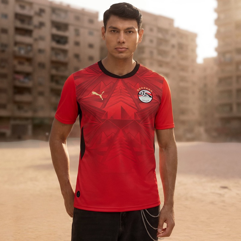
The pyramid-inspired graphic on red just doesn't come together. Egypt has so much visual history to pull from and neither the concept nor the execution takes advantage of it.
49. China (Nike): D+
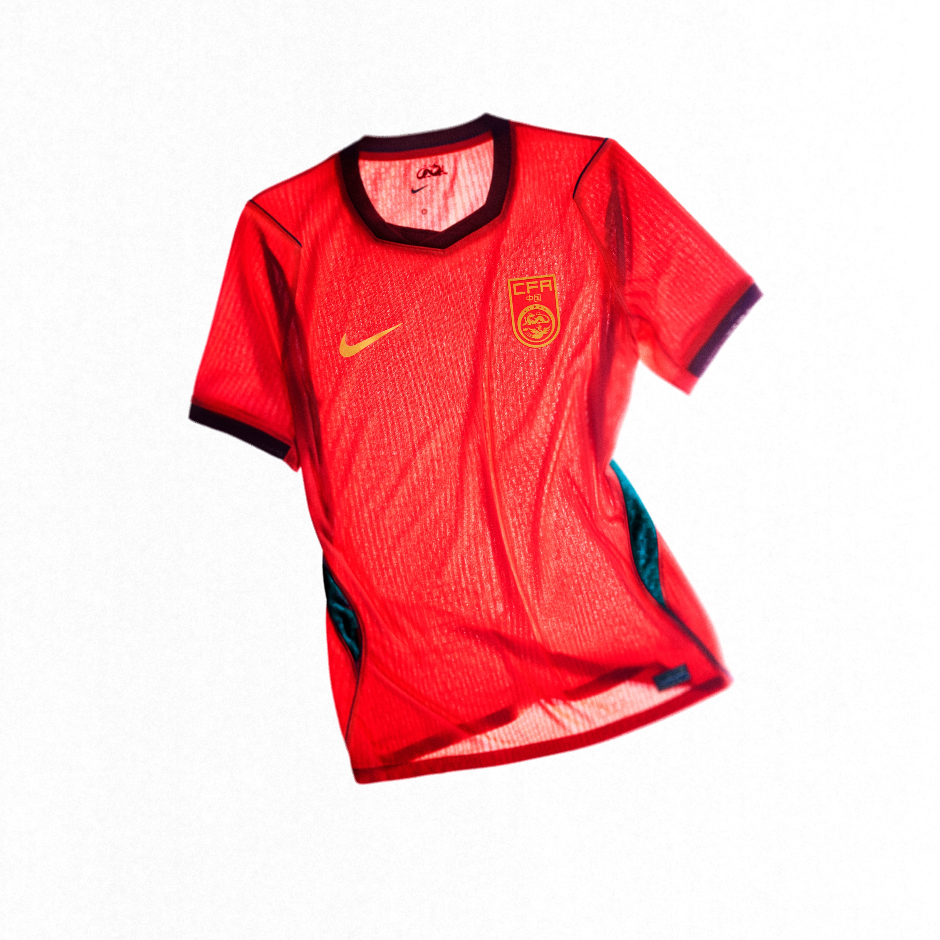
Red and gold should be an easy win. Somehow this kit makes it boring. There is nothing here that grabs your attention, and for a country with that much visual culture, this feels like a missed opportunity.
48. Poland (Nike): C-
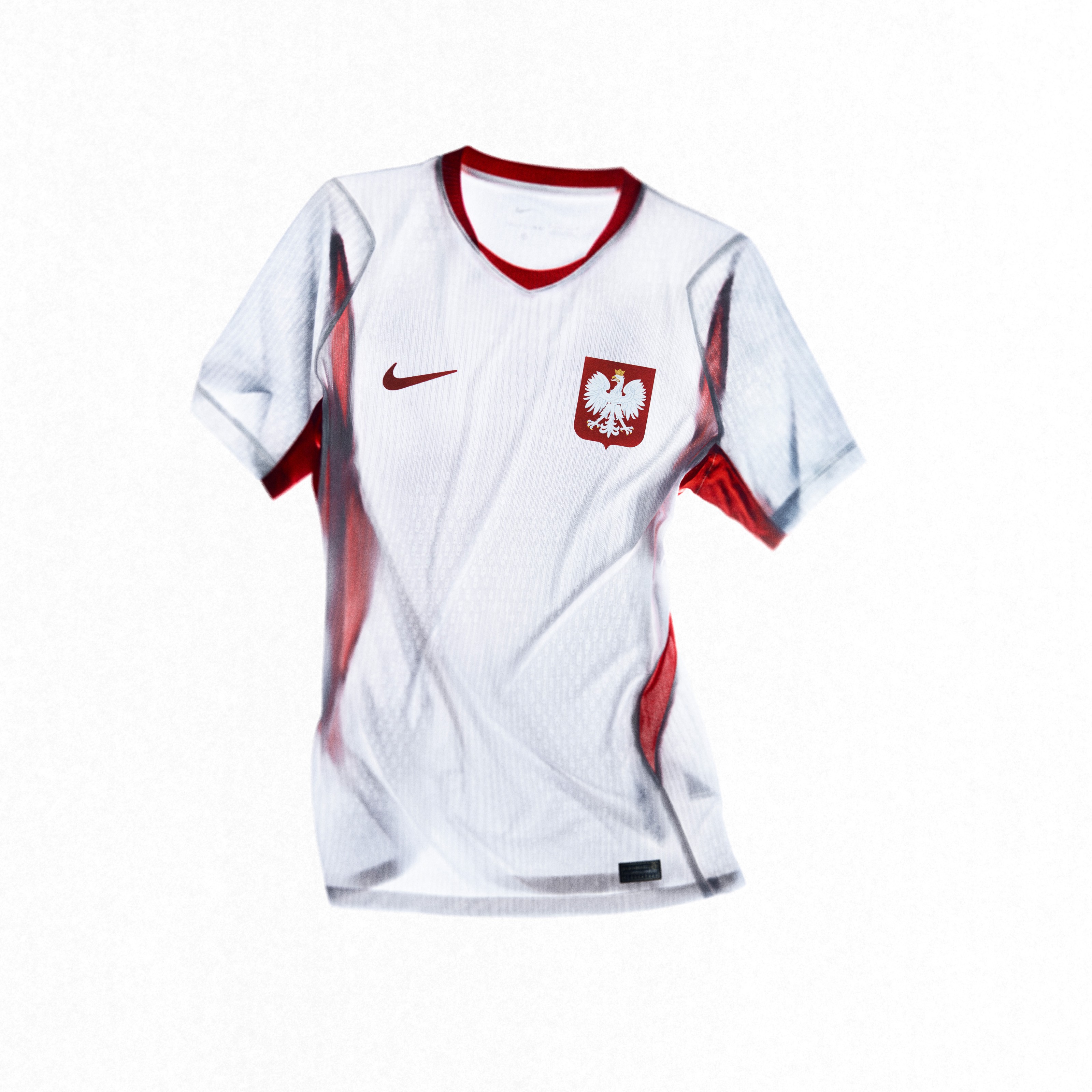
The white home with the eagle feather graphic is subtle to the point of being invisible. Poland needs more personality in their home kits.
47. Czech Republic (Puma): C
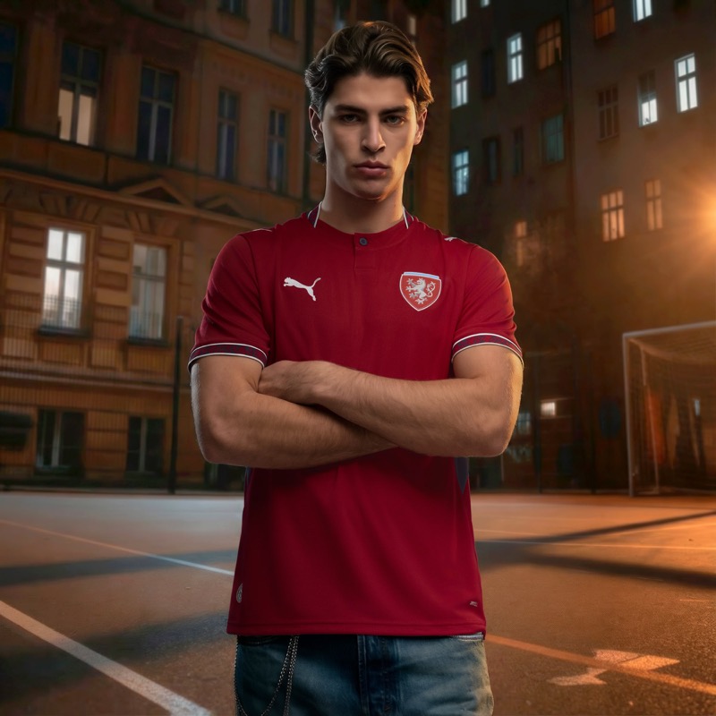
The dark cherry red is a nice base color, but the button collar feels out of place on a soccer jersey. Not enough going on here.
46. Turkey (Nike): C
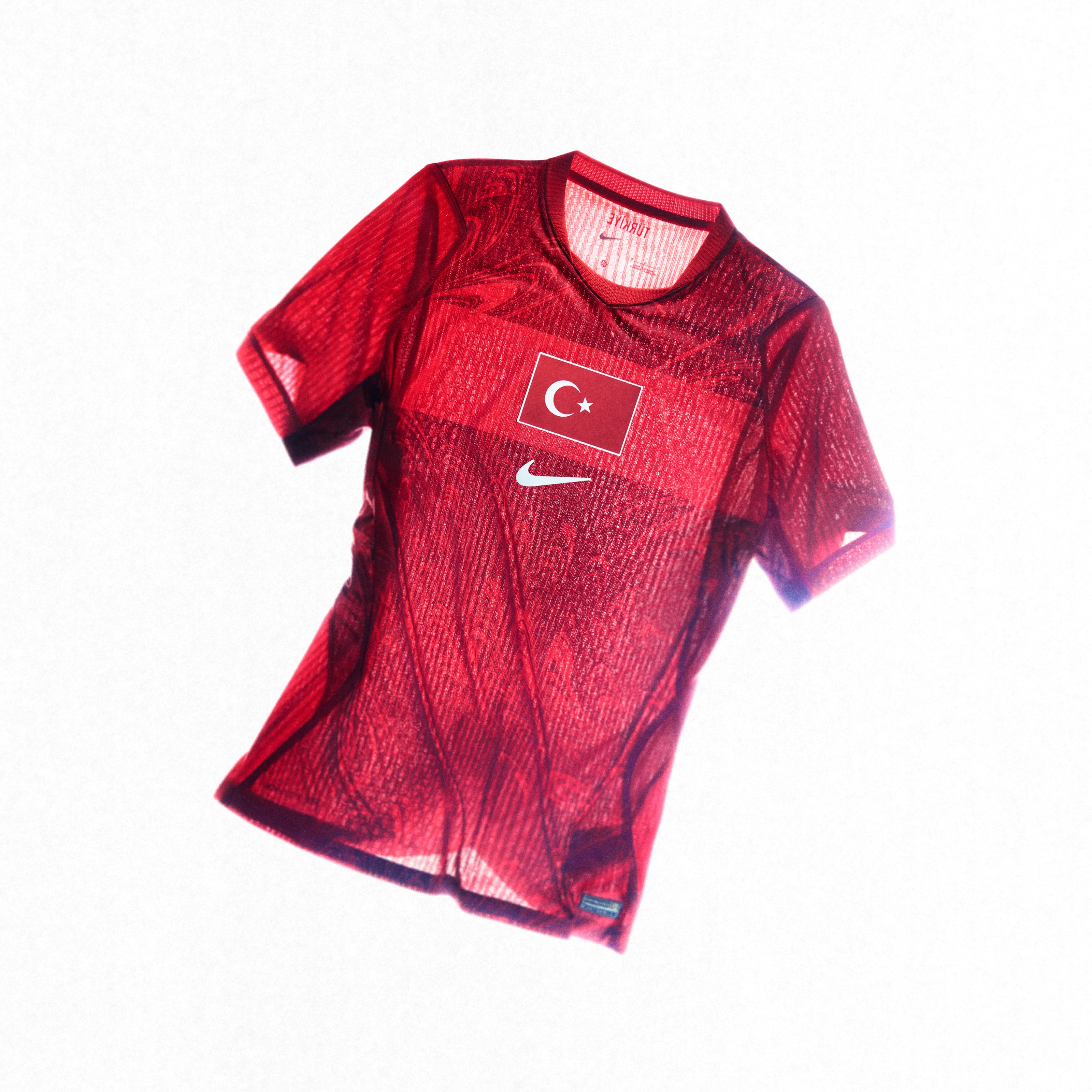
The red home with the chest band is a standard Nike template. Turkey's colors should pop more than this.
45. UAE (Adidas): C
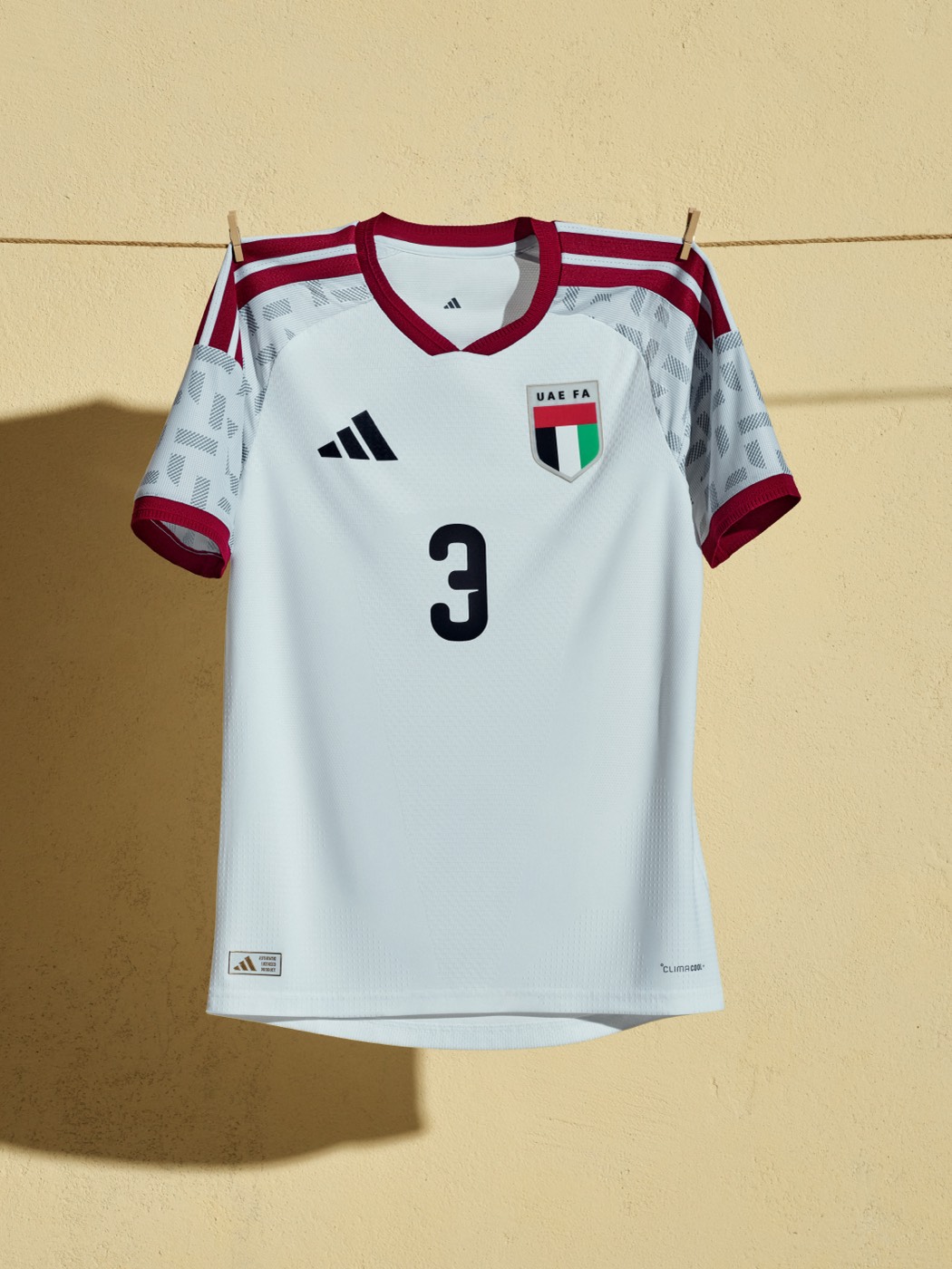
The white base with maroon accents is clean, but it doesn't really look like a soccer jersey. More like a cricket kit or a polo shirt.
44. Northern Ireland (Adidas): C
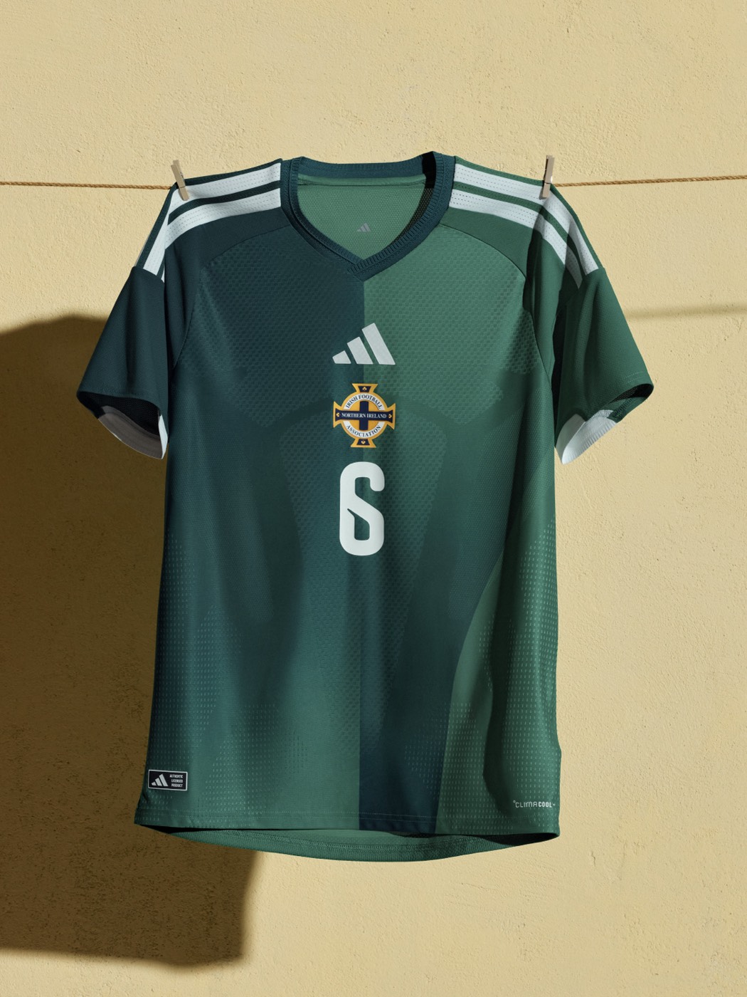
The two-tone green gradient doesn't work. Northern Ireland has worn green forever, and there are plenty of ways to make a green kit interesting. This isn't one of them.
43. Iceland (Puma): C+

A solid blue with the snowflake crest. Puma says it's inspired by volcanic landscapes and glaciers, but that doesn't translate to the actual jersey.
42. Switzerland (Puma): C+
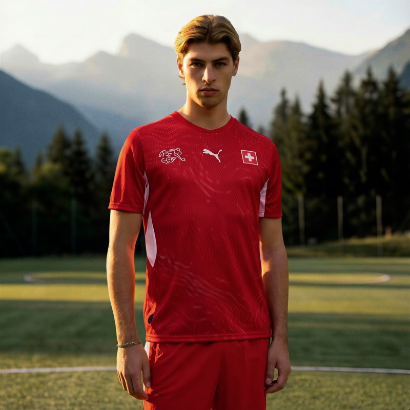
A standard red kit with a subtle wave pattern. It's clean, but it's boring. Switzerland as a country deserves better.
41. Scotland (Adidas): C+
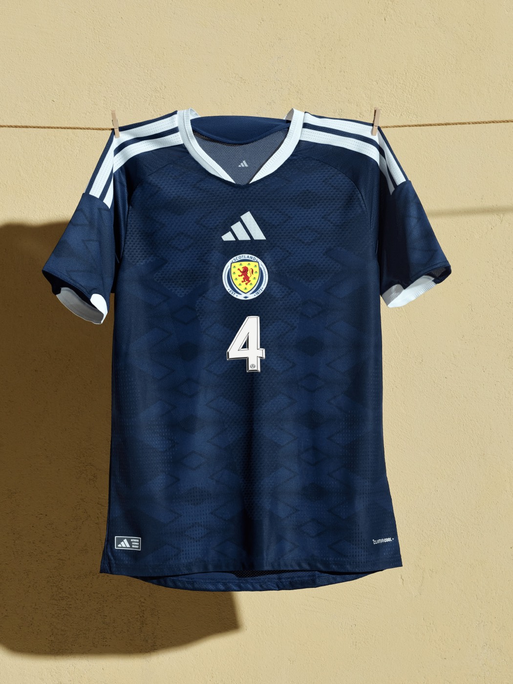
The navy blue with the subtle tartan-style pattern is fine. It looks like a Scotland kit. But that's about it. Nothing here makes you look twice.
40. Chile (Adidas): C+
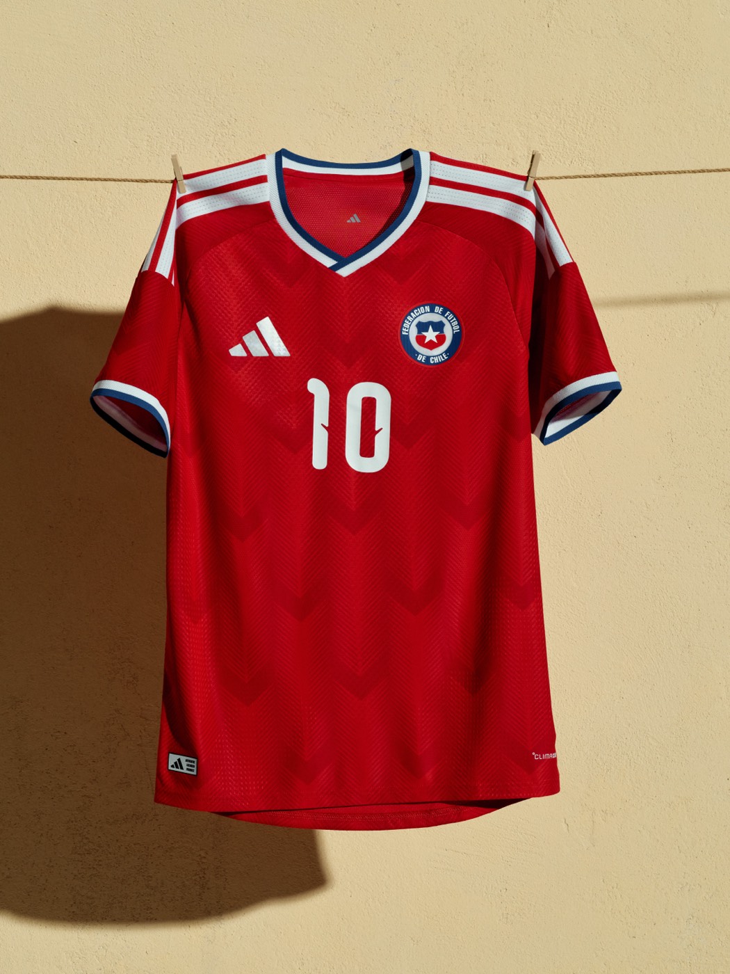
The subtle chevron pattern is hard to see unless you're up close. We expected more from one of the most recognizable colors in international soccer.
39. Peru (Adidas): C+
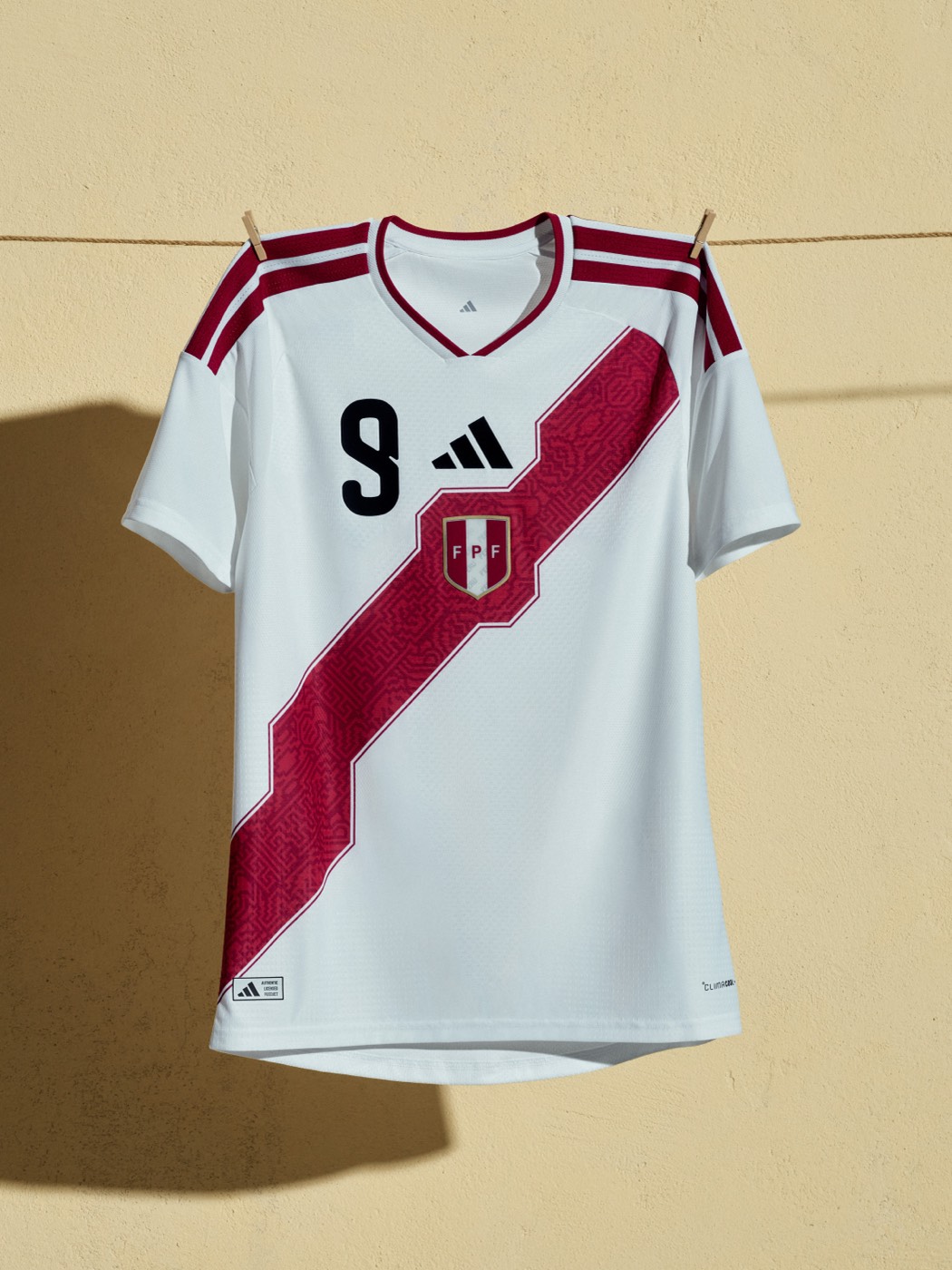
The iconic diagonal sash is there and it always looks good on Peru. But this version doesn't hit the same way as some of their older kits.
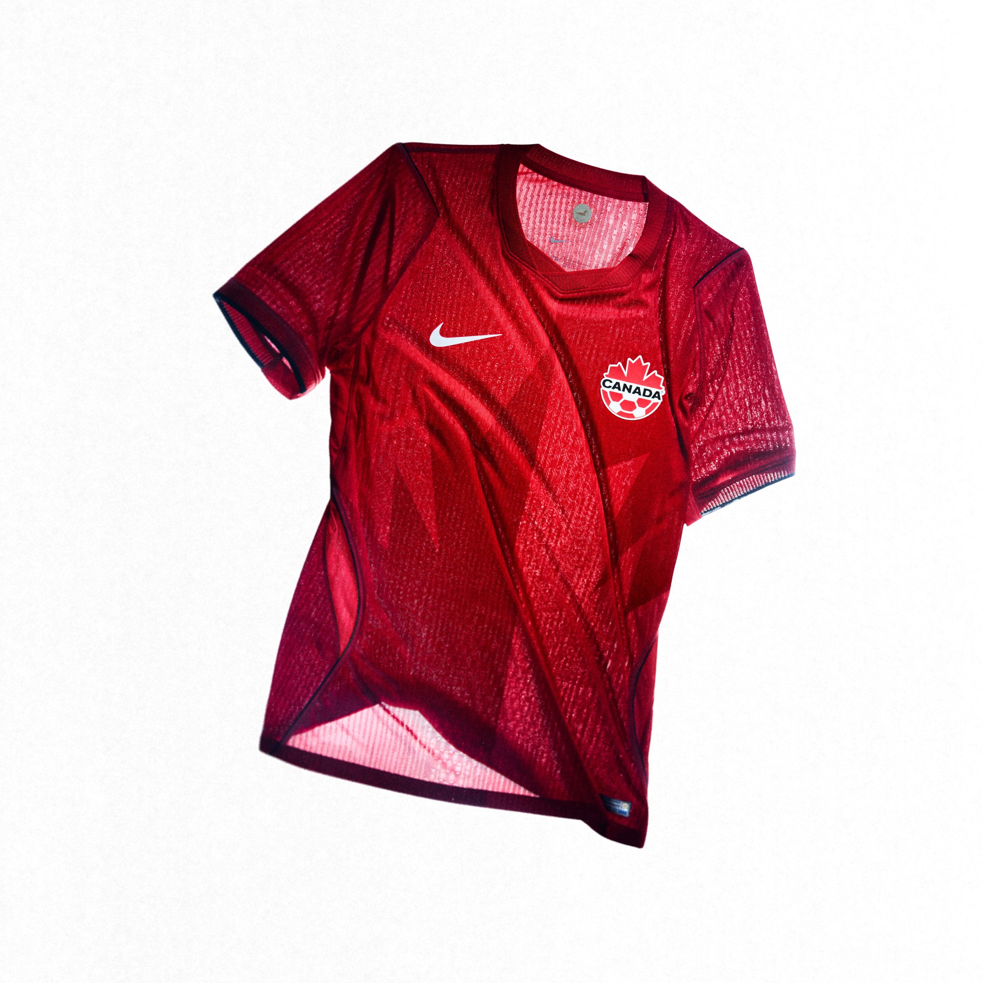
38. Canada (Nike): C+
The home kit in red does what it needs to do, but for a country hosting the World Cup, we expected something more memorable.
37. South Korea (Nike): C+
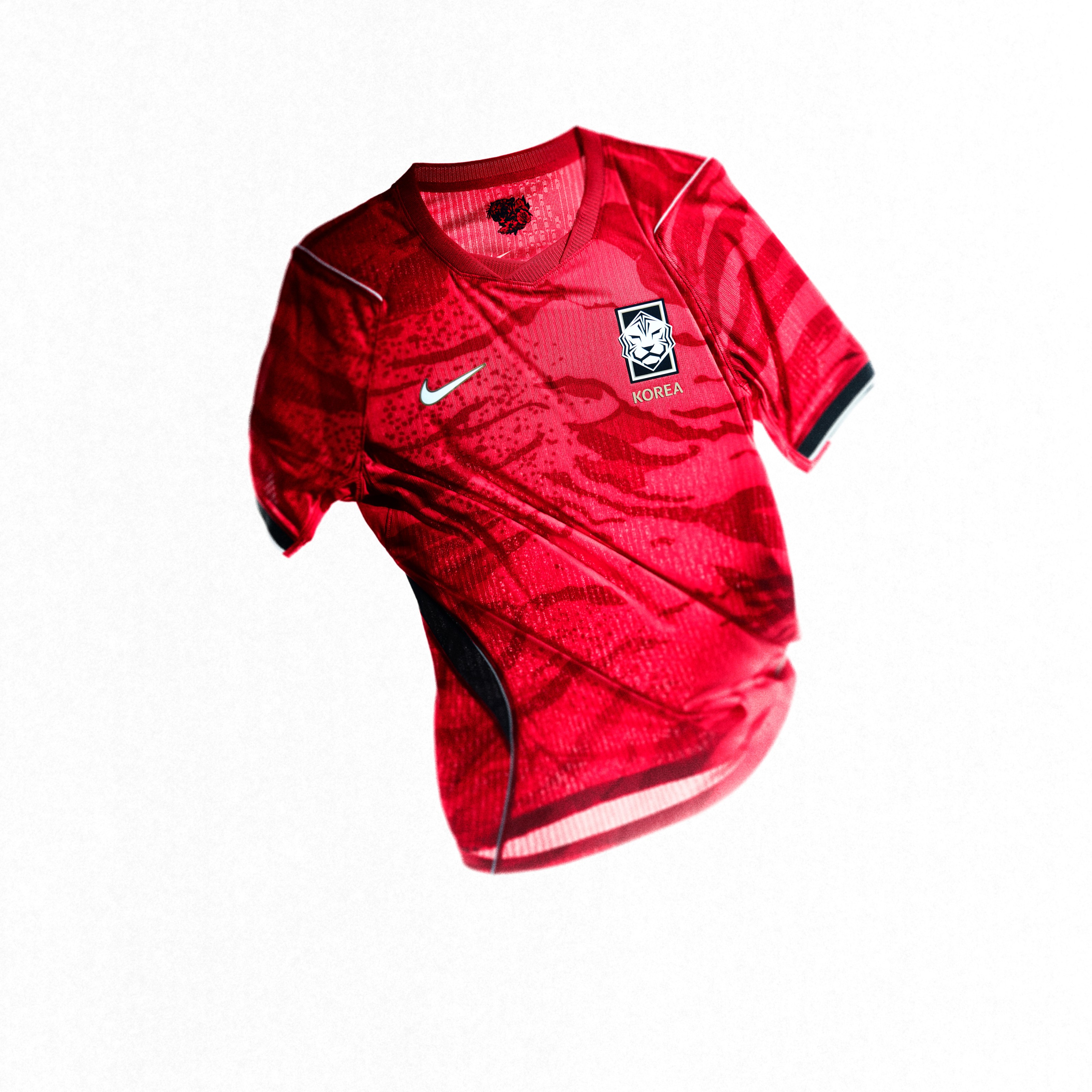
The white tiger print is fine. Everything about this kit is just fine. Nothing wrong, nothing exciting. South Korea has had better.
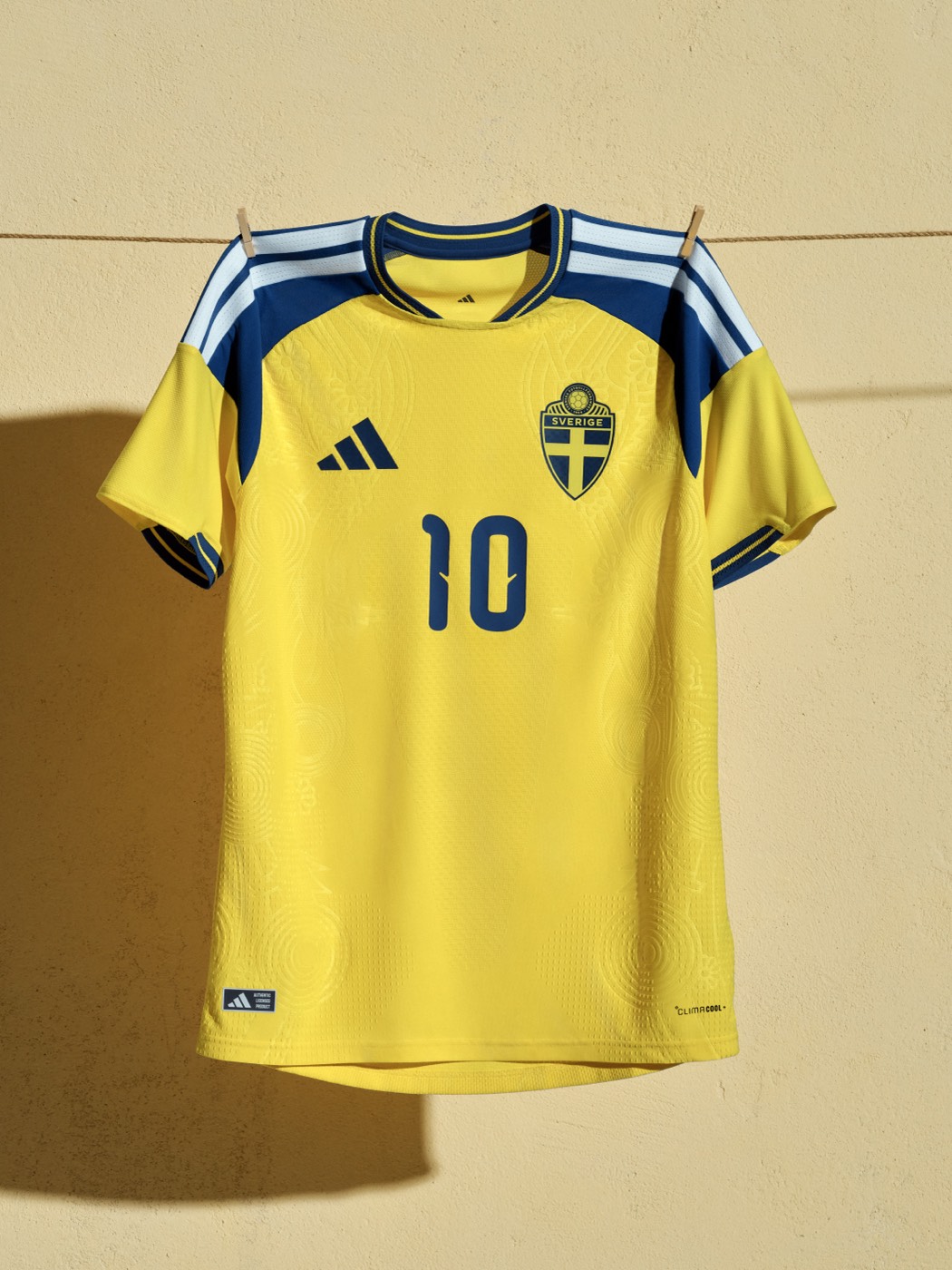
36. Sweden (Adidas): B-
Yellow and blue, same as always. The subtle pattern gives it texture, but it looks too similar to Ukraine's kit. Solid but not exciting.
35. Spain (Adidas): B-
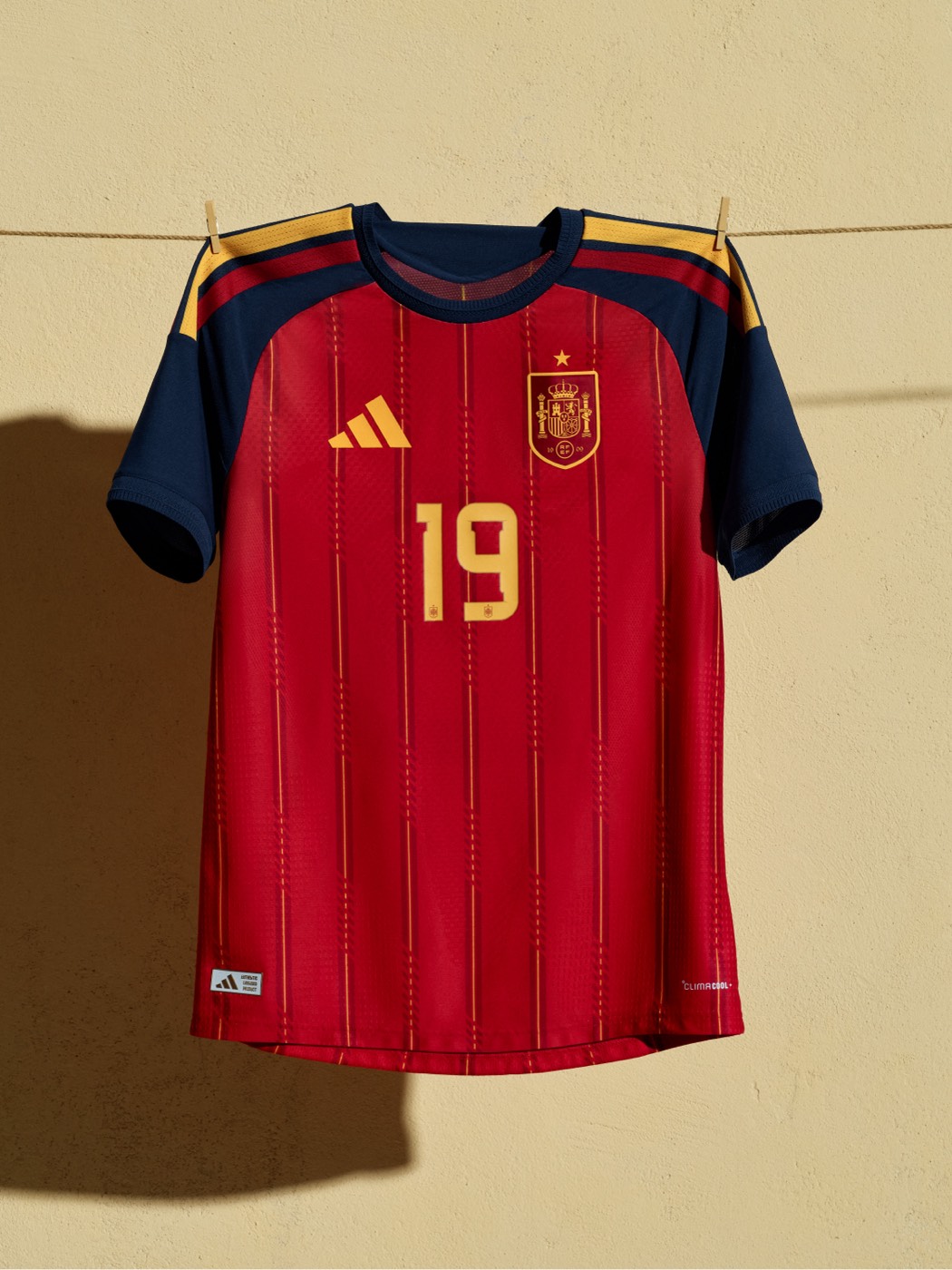
The red base with gold pinstripes and navy shoulders is clean. But Spain has had legendary home kits over the years, and this one doesn't quite reach that level.
34. South Africa (Adidas): B-
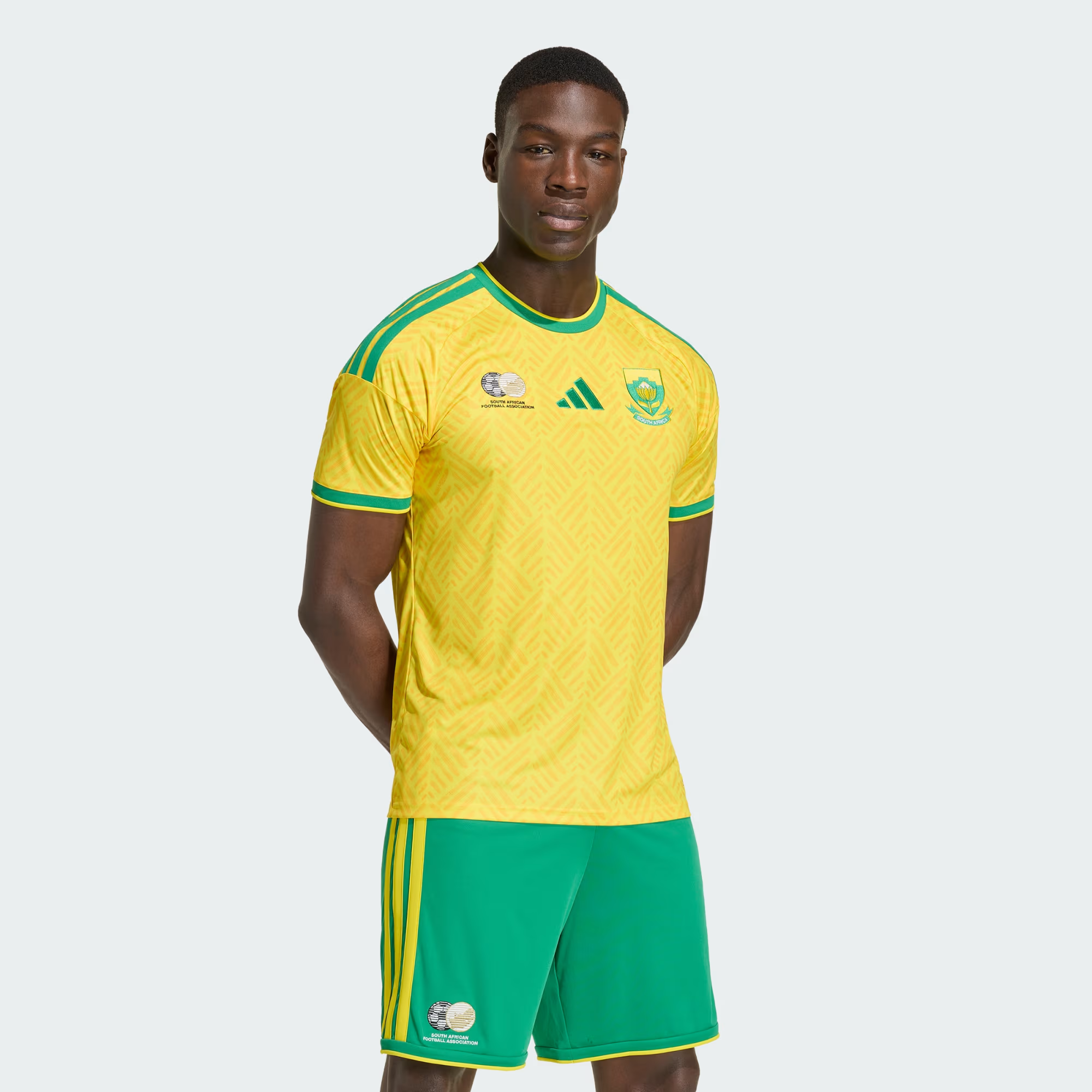
The yellow base with green accents is a classic Bafana Bafana look, but the execution is a little plain compared to what the away kit delivers.
33. Saudi Arabia (Adidas): B-
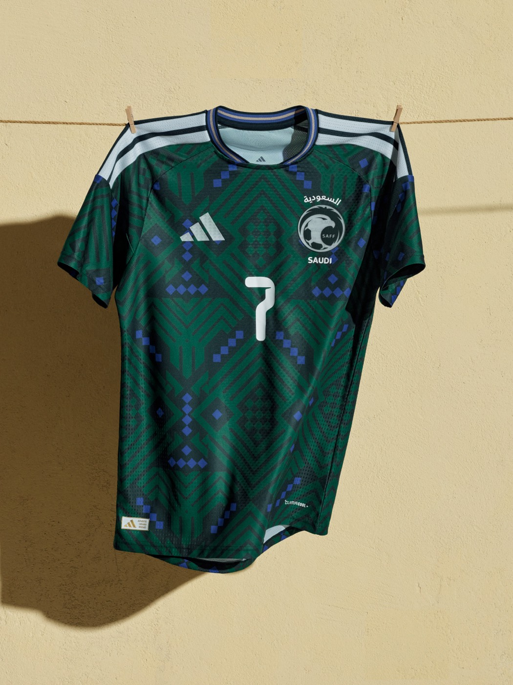
The green geometric pattern with blue diamond accents is more interesting than expected. The color scheme is unusual for a home kit, but it has some depth to it.
32. Mexico (Adidas): B-
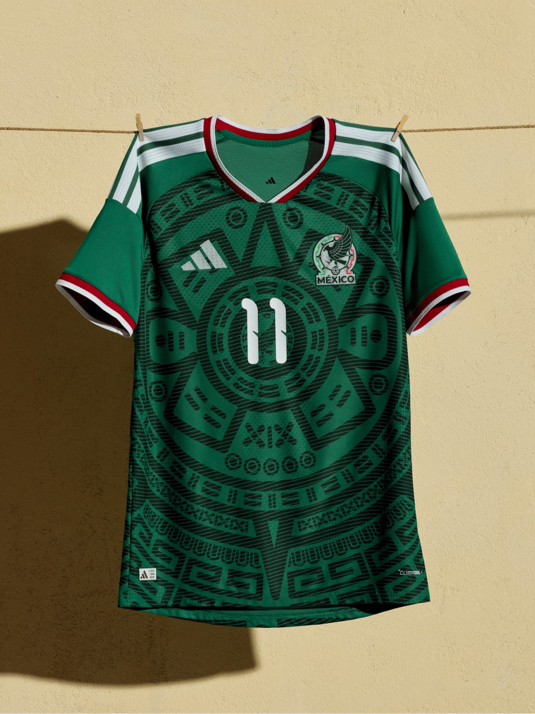
The Aztec calendar design covering the entire front is bold. We like the concept. But the green-on-green pattern is hard to see from a distance, and Mexico has had better home kits in World Cup history.
31. Japan (Adidas): B-
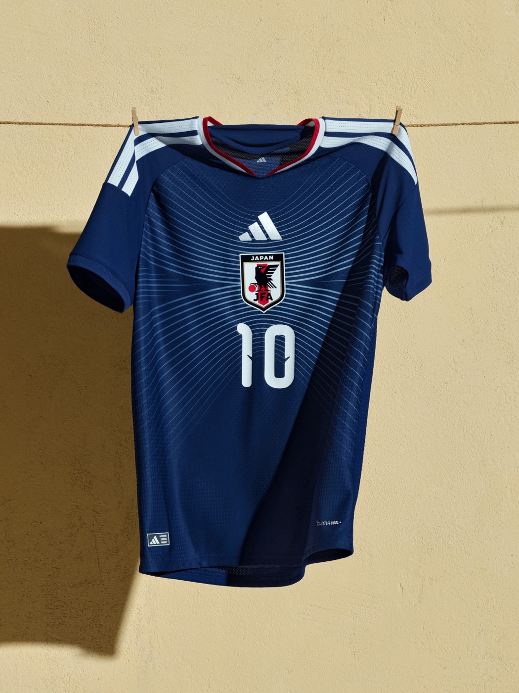
The radiating lines from the crest are a cool concept and the dark navy is a strong base. But we like brighter colors on soccer kits, and this one is just too dark and subdued for our taste.
30. Slovenia (Nike): B-
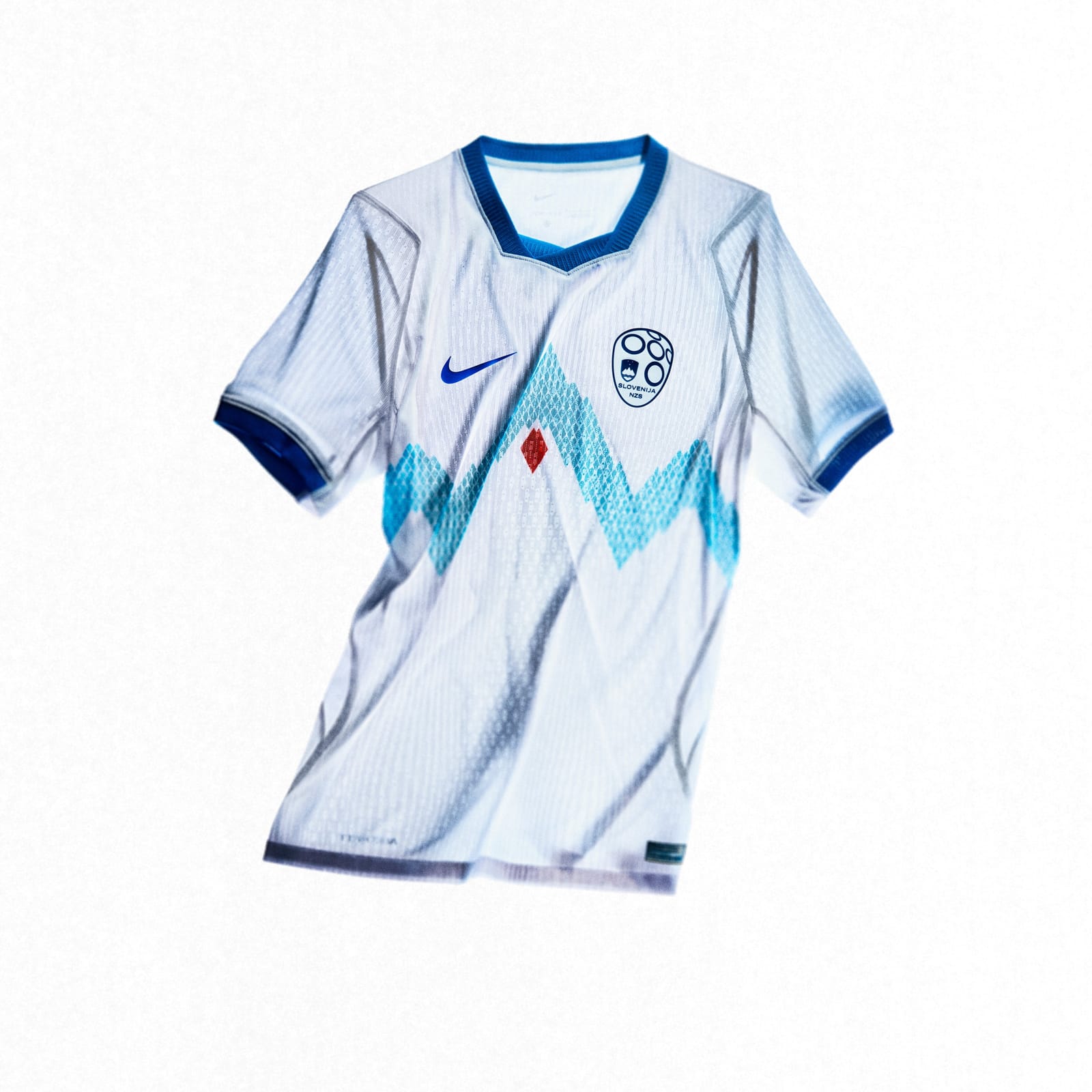
The mountain silhouettes in the grid pattern are a nice touch. Slovenia clearly put thought into this one. It just isn't flashy enough to crack the top half.
29. Australia (Nike): B-
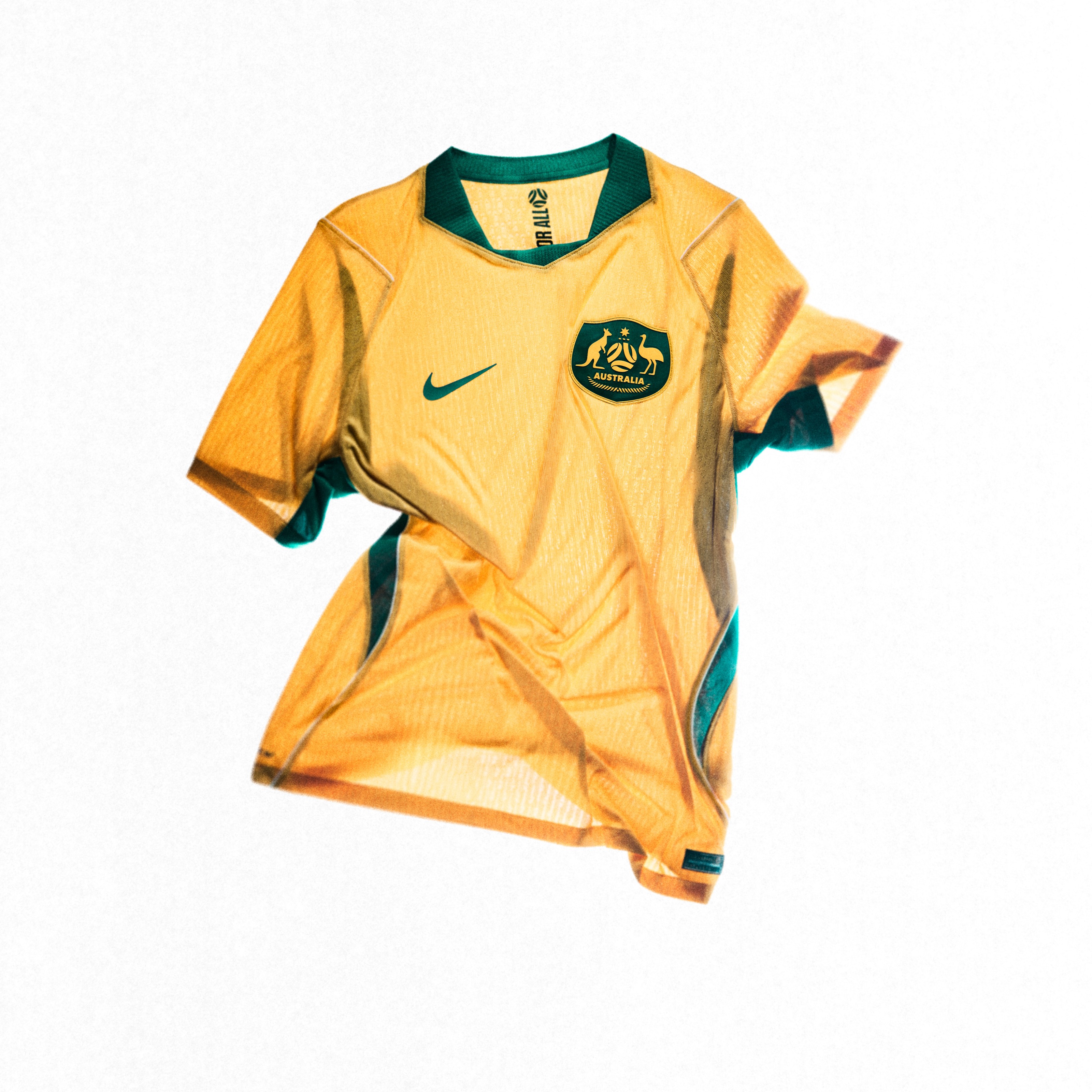
The yellow-green is a callback to their 2006 kit, which is a nice touch. Decent, but not going to turn heads.
28. Nigeria (Nike): B
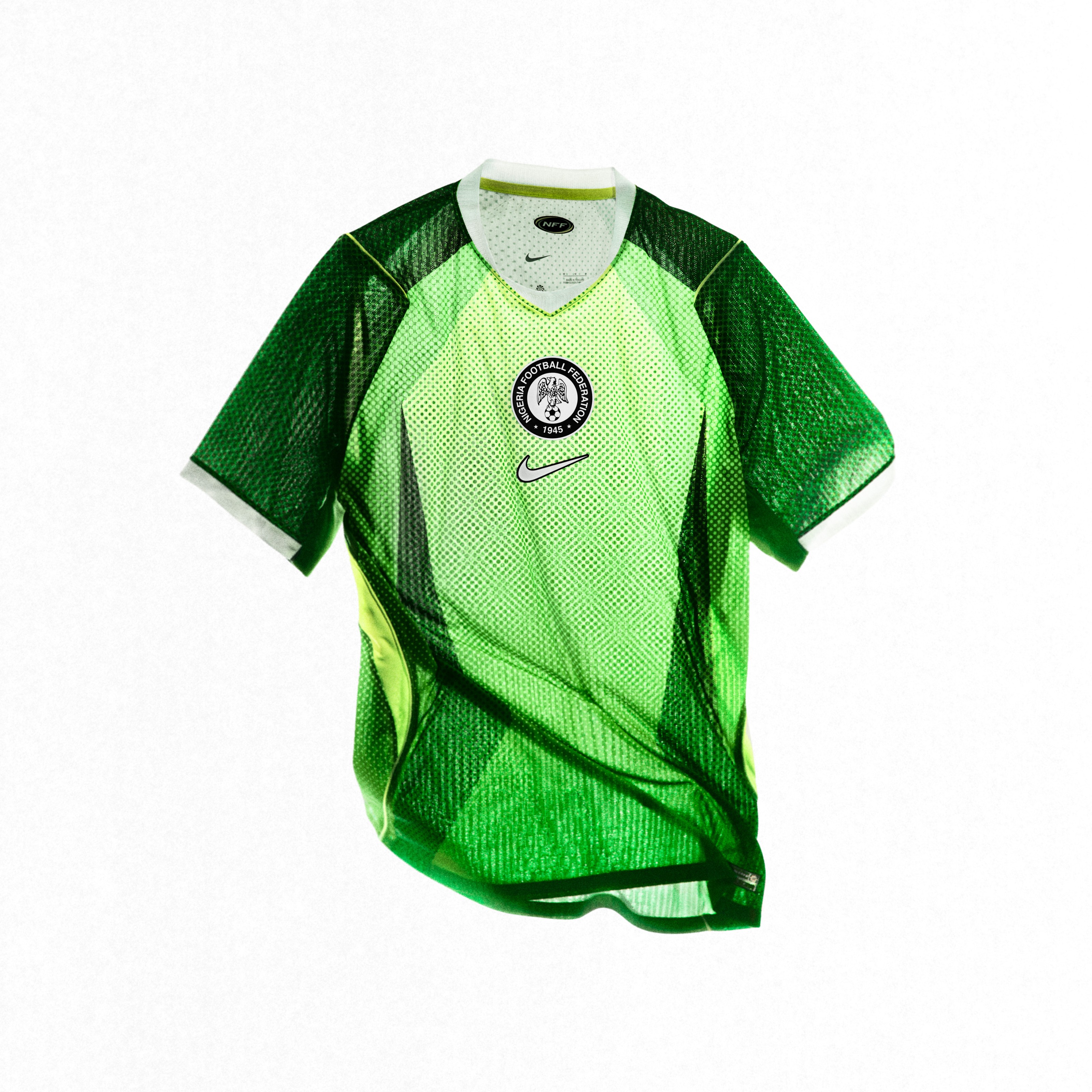
The green is vibrant and the design is a bit busy, but when the colors are this good, you can get away with it. Nigeria always brings energy to their kits.
27. Austria (Puma): B
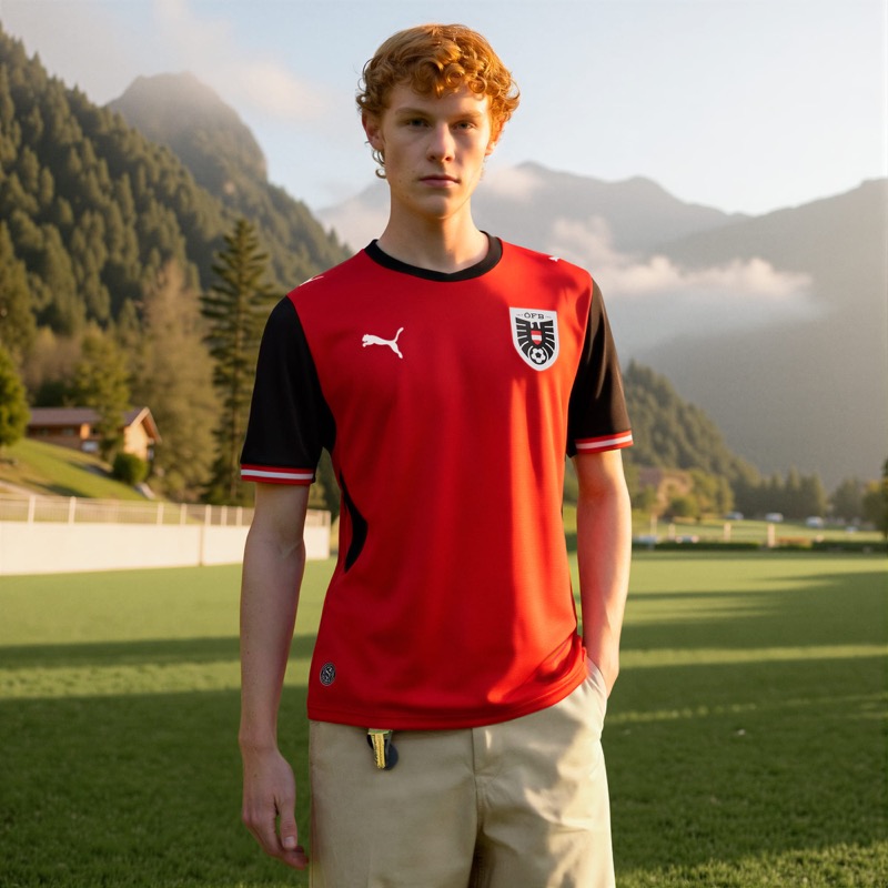
Red body, black sleeves and shoulders. It's clean but doesn't take any risks. Gets the job done without being memorable.
26. New Zealand (Puma): B

The black home with a tonal fern pattern is a nod to New Zealand's rugby identity. Simple and clean for a country making just their second World Cup appearance.
25. Paraguay (Puma): B
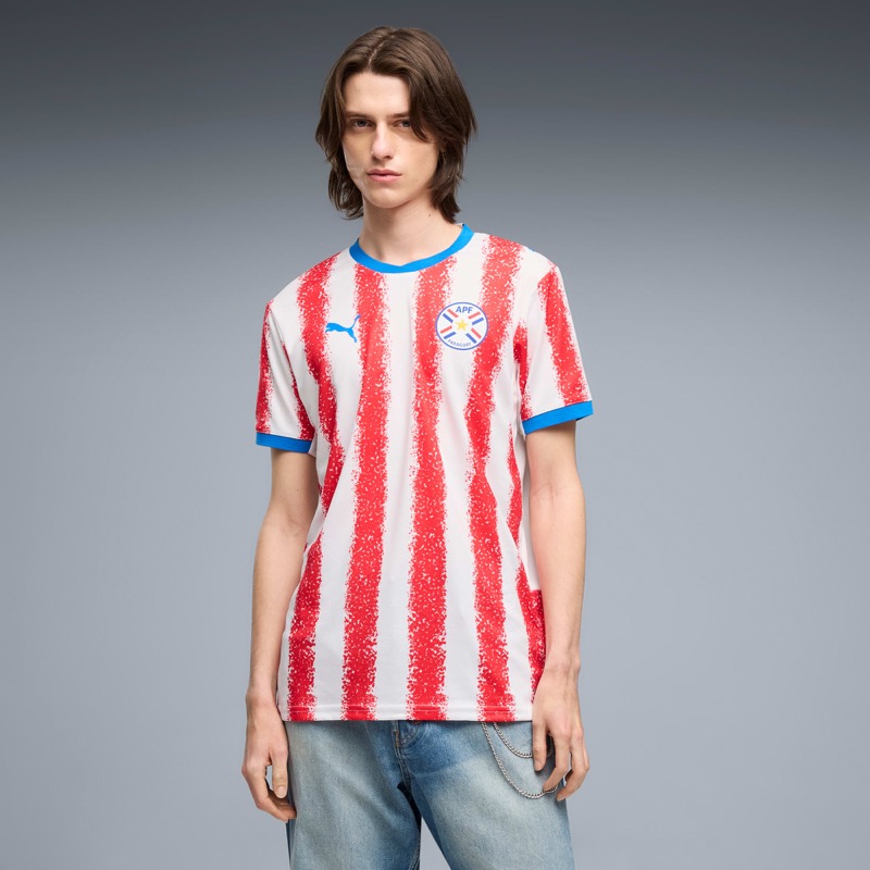
The red and white stripes have a hand-painted, chalk-like texture that gives the classic look a fresh twist. It reminds us of Atletico Madrid, and that's a good thing.
24. Greece (Adidas): B
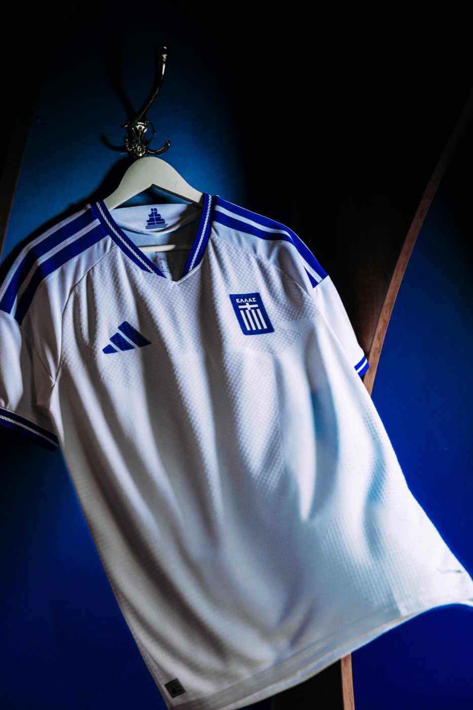
White base with blue collar and shoulder stripes. Classic and clean. Greece doesn't push the envelope but the colors work.
23. Hungary (Adidas): B
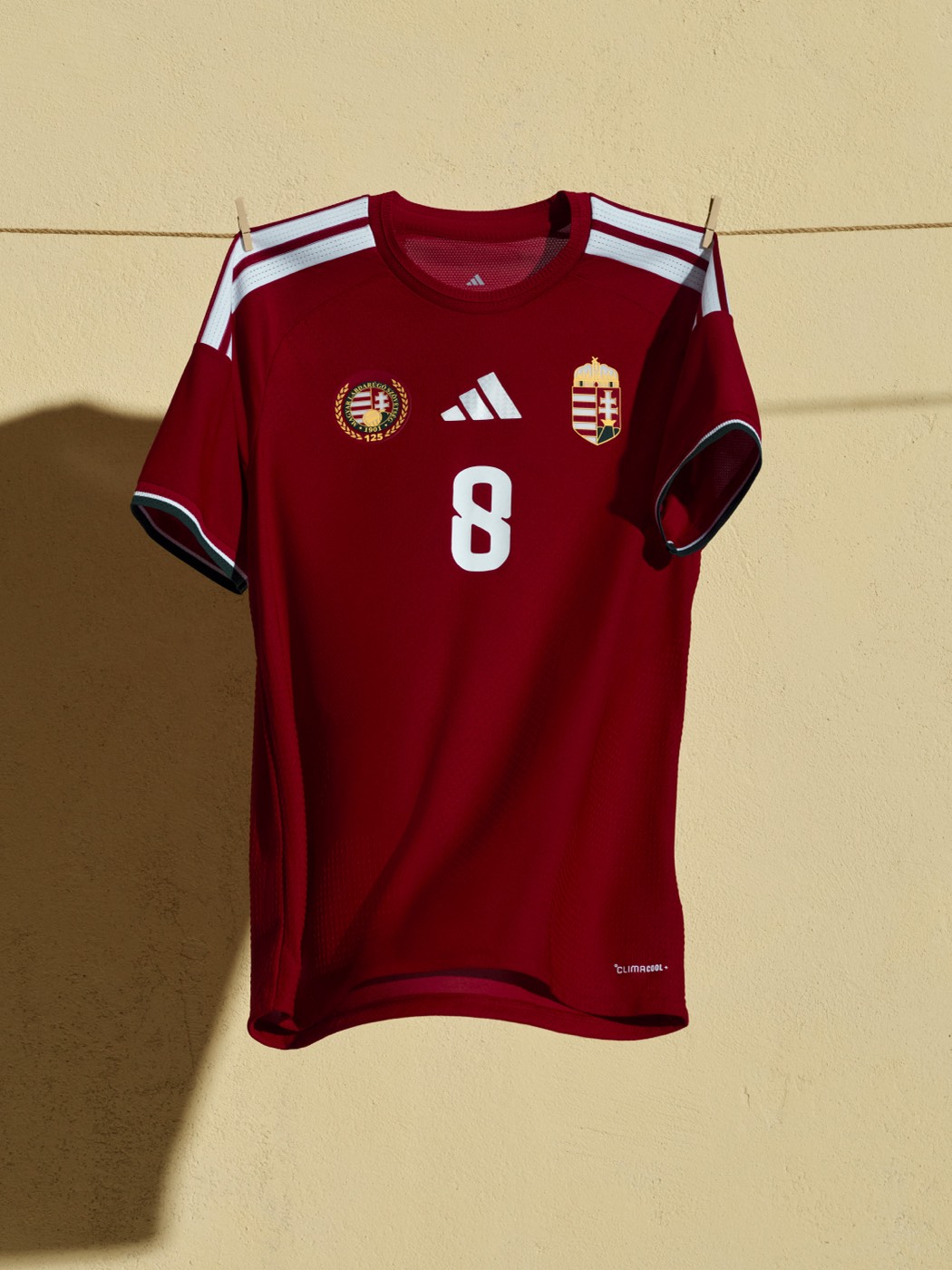
The dark maroon is a strong color, and the dual crests are a nice detail. Sometimes less is more, and Hungary pulls that off.
22. Algeria (Adidas): B
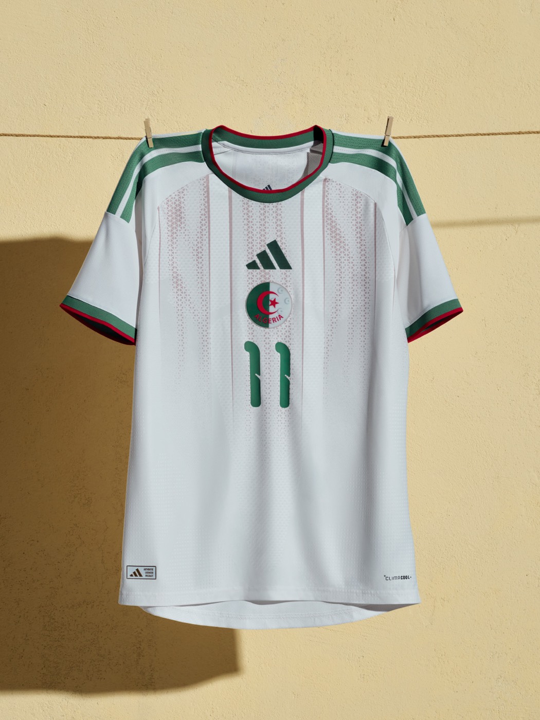
The white home with green and red trim is actually pretty nice. The subtle vertical panel design adds texture, and the crescent and star crest looks great against the white base. The home kit is way better than Algeria's terrible away kit.
21. Ukraine (Adidas): B
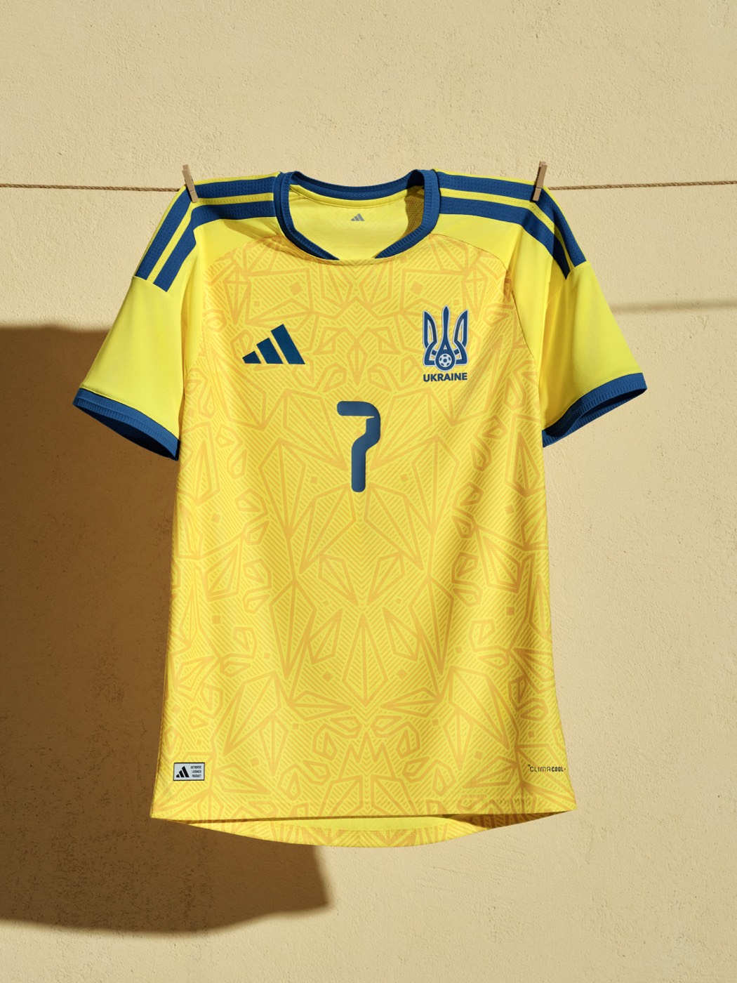
The intricate floral pattern on the yellow base has real character up close. Ukraine gets the edge over Sweden because the pattern has more personality.
20. Venezuela (Adidas): B
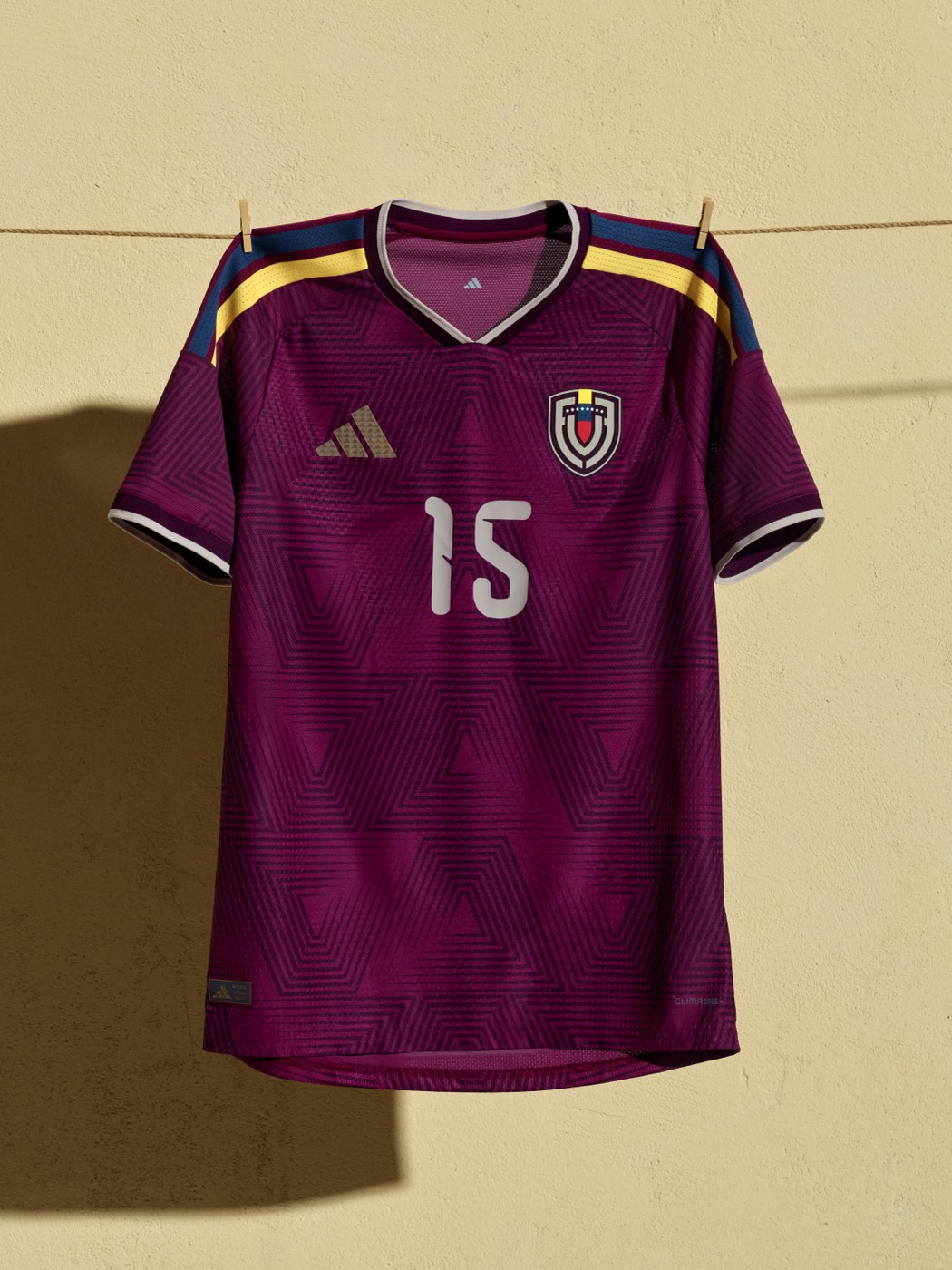
The deep burgundy with the geometric triangle pattern is different from anything else in the Adidas batch. The gold and blue shoulder stripes add just enough contrast.
19. Croatia (Nike): B+
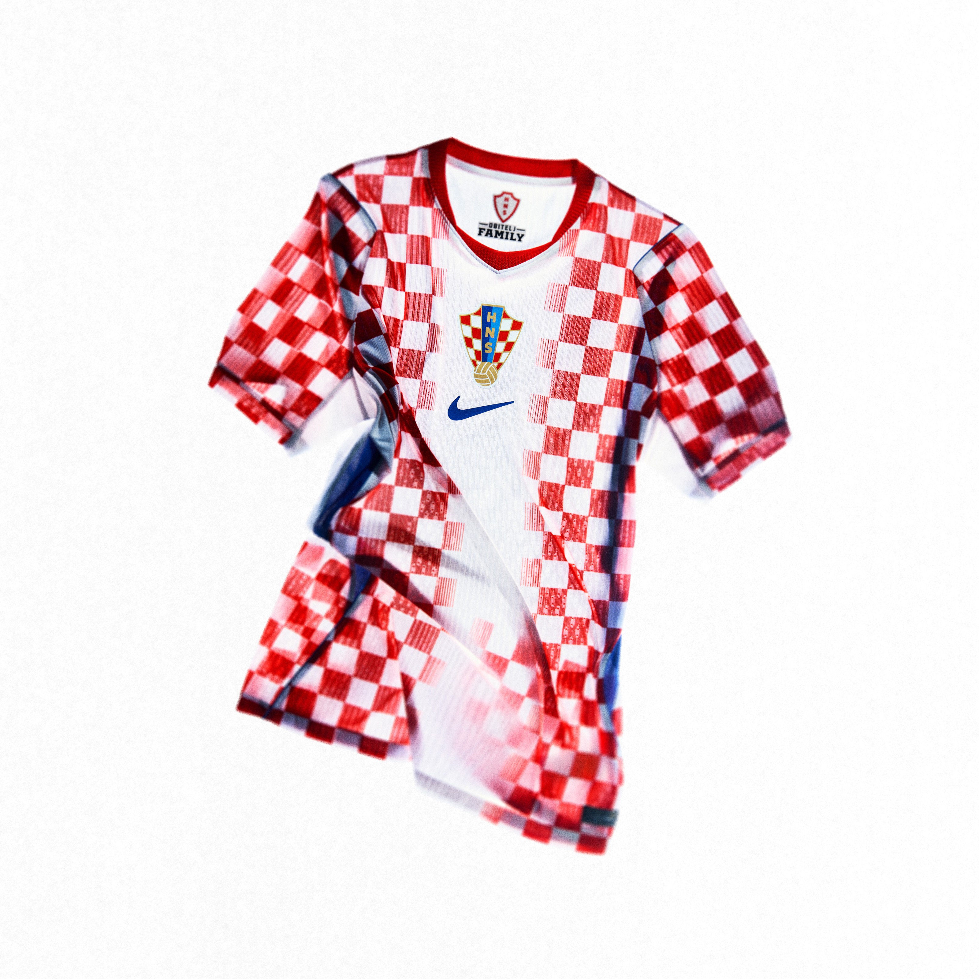
The checkered pattern is Croatia's identity, and this version scales down the checkers from the 1990 original for a more modern feel. Refined without losing what makes it special.
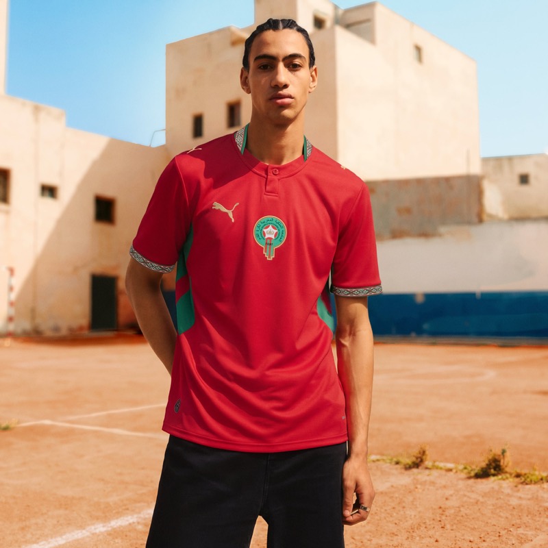
18. Morocco (Puma): B+
Red with green accents and geometric tilework-inspired details on the collar and sleeves. The combination of red, green, white, and gold just works for Morocco's identity.
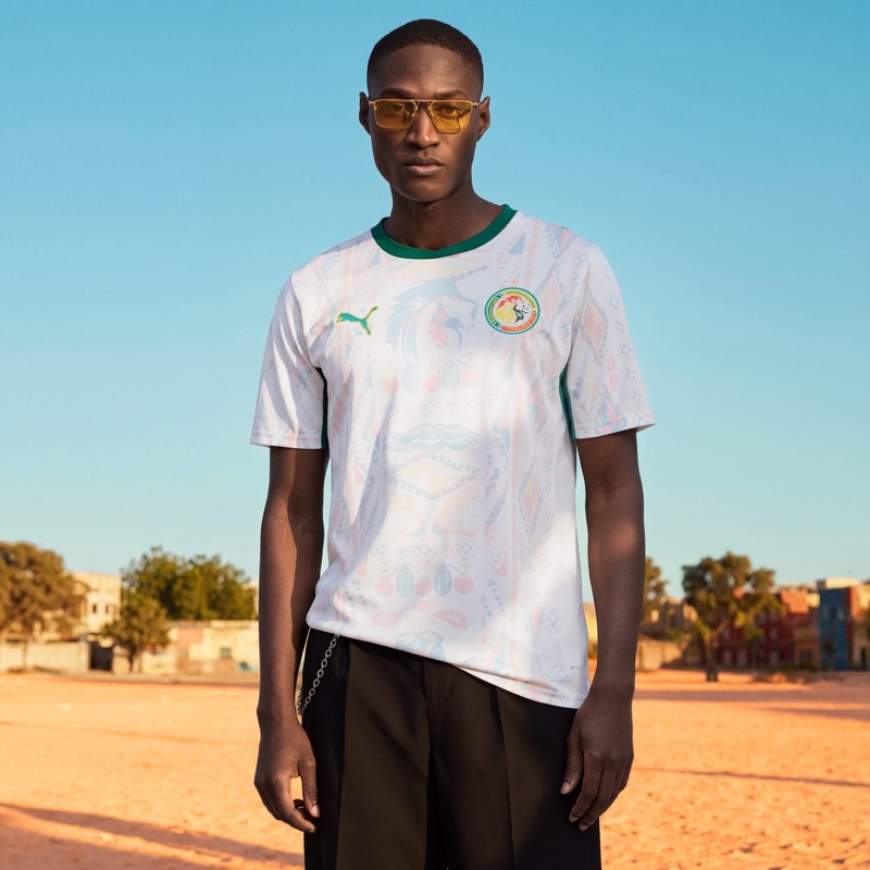
17. Senegal (Puma): B+
The pastel patterns inspired by Dakar's hand-painted Car Rapide minibuses give this home kit a strong cultural connection. One of the more unique designs in the entire Puma collection.
16. Uruguay (Nike): B+
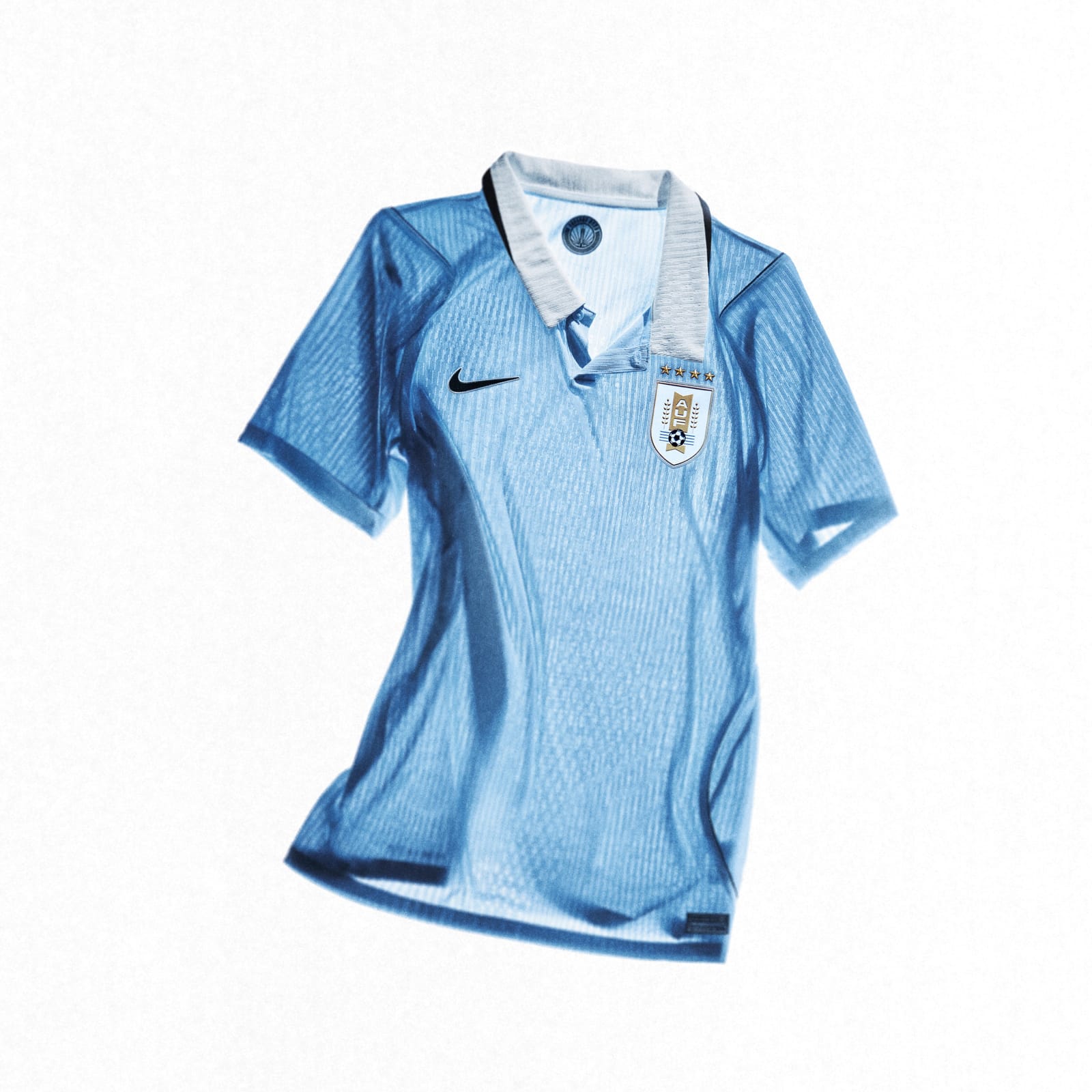
The powder blue is beautiful. Uruguay's color is one of those shades that just feels right on a soccer kit. The navy accents keep it clean.
15. Wales (Adidas): B+
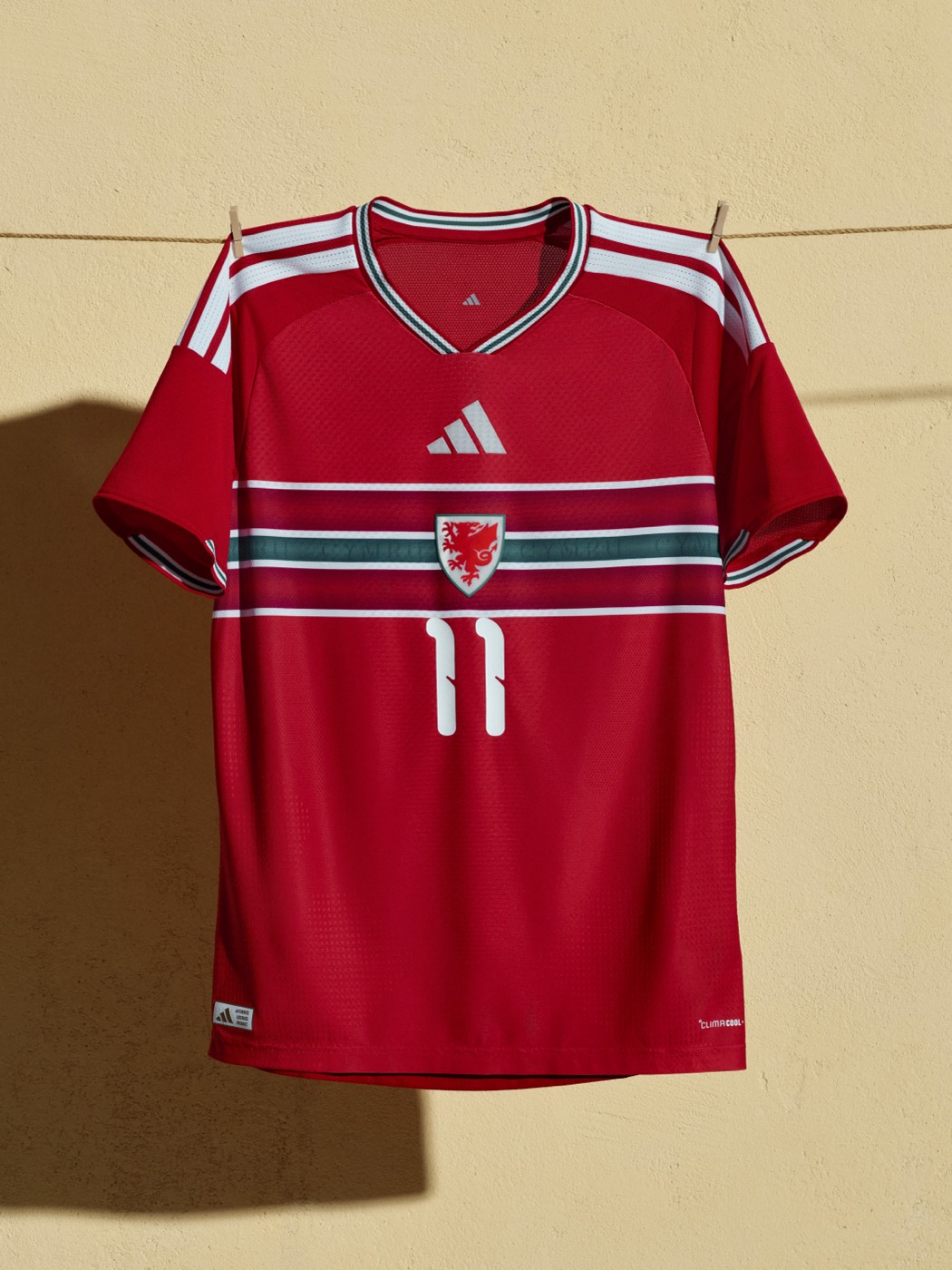
The red base with horizontal stripes across the chest is a look you don't see on many international soccer kits. The dragon crest pops in the center. Wales took a chance and it paid off.
14. Germany (Adidas): B+
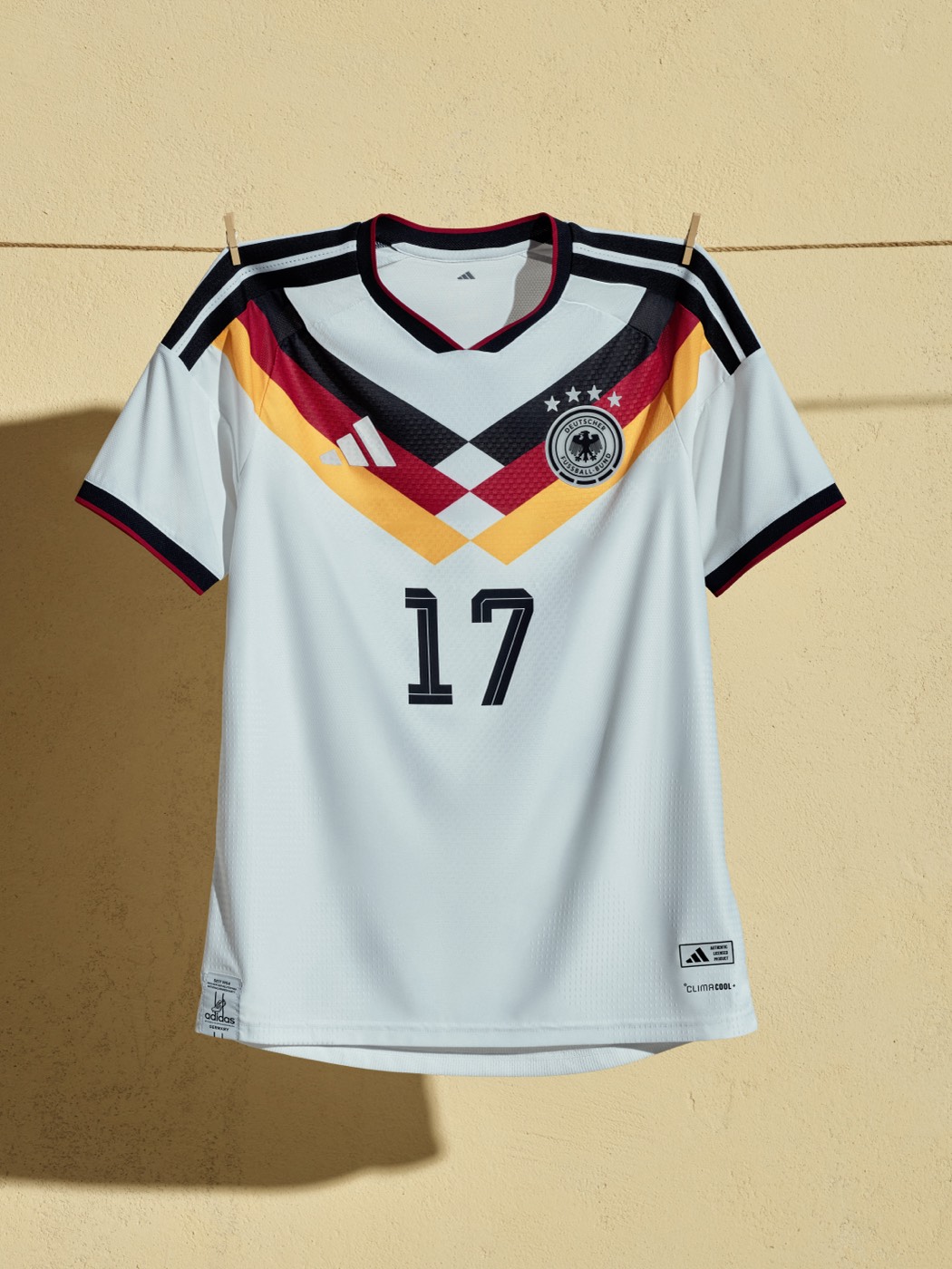
The retro chevron pattern with black, red, and gold is a callback to some of Germany's most iconic World Cup kits from the late 80s and early 90s. One of the best design concepts in the entire Adidas batch.
13. Costa Rica (Adidas): B+
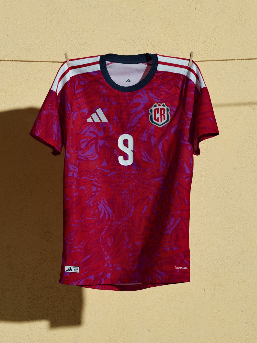
That red and purple swirl pattern is wild. Costa Rica came to play. The design is loud, bold, and completely different from anything else in the Adidas 2026 batch.
12. England (Nike): B+
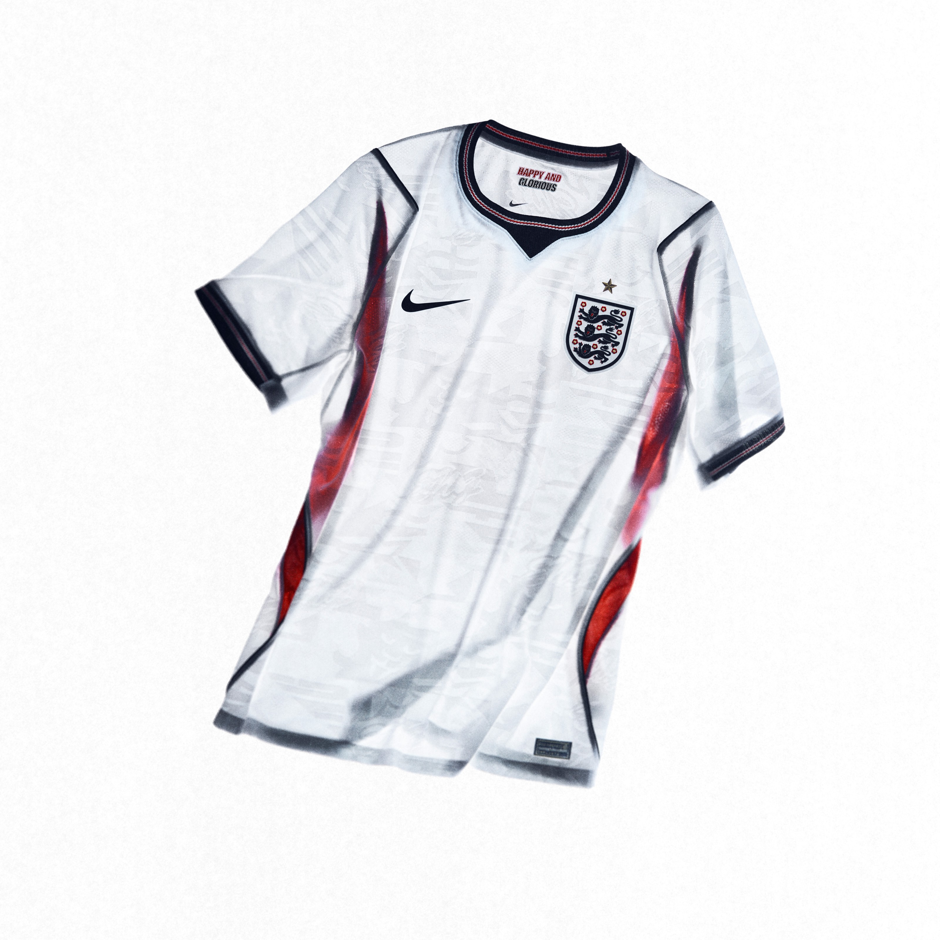
England has a way of keeping things classic without being boring. There's a reason the Three Lions kits always sell well. They just look right.
11. Netherlands (Nike): A-
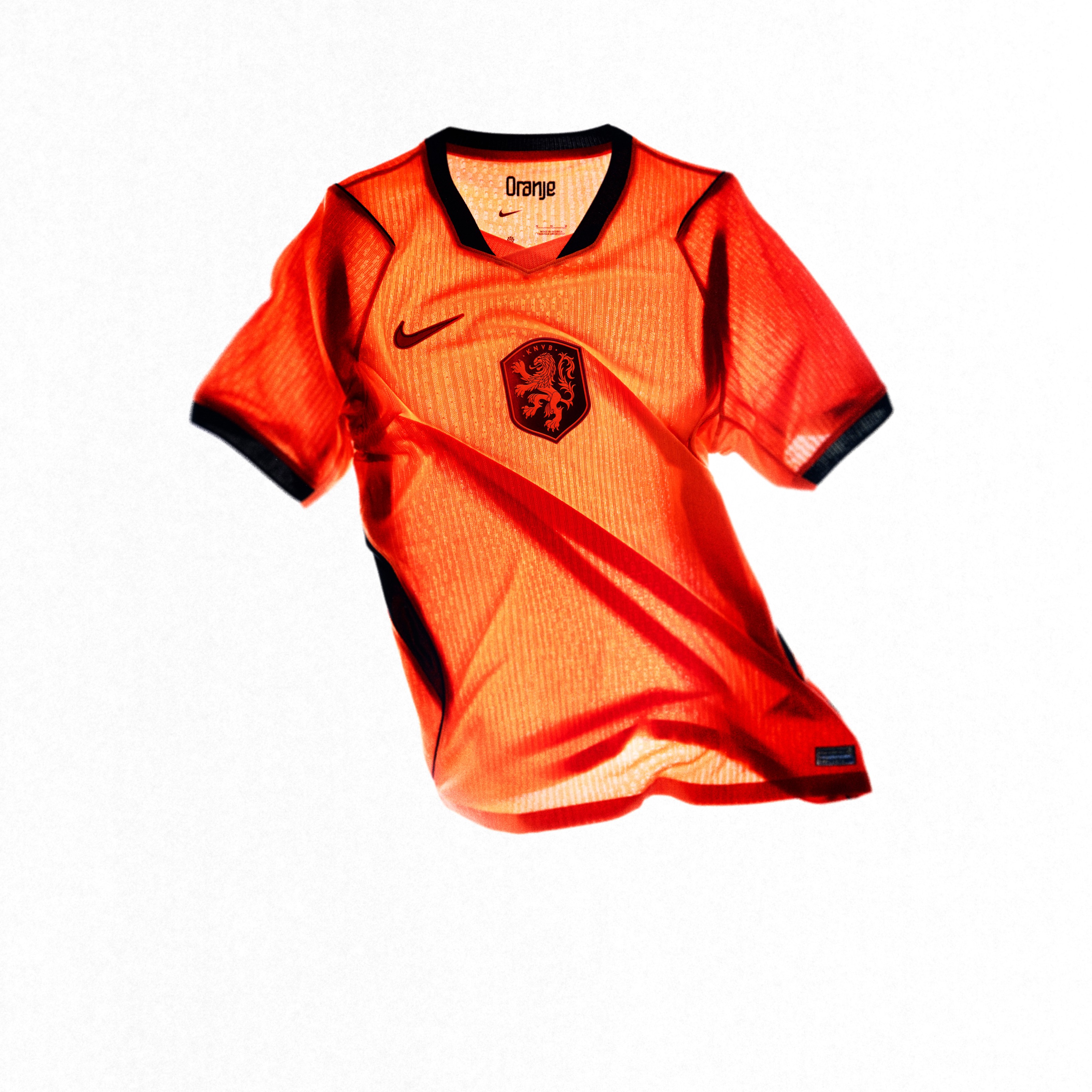
You can't go wrong with Dutch orange. It's one of the most recognizable colors in international soccer, and this home kit does it justice. The colors just pop in that way that Nike does best.
10. USA (Nike): A-
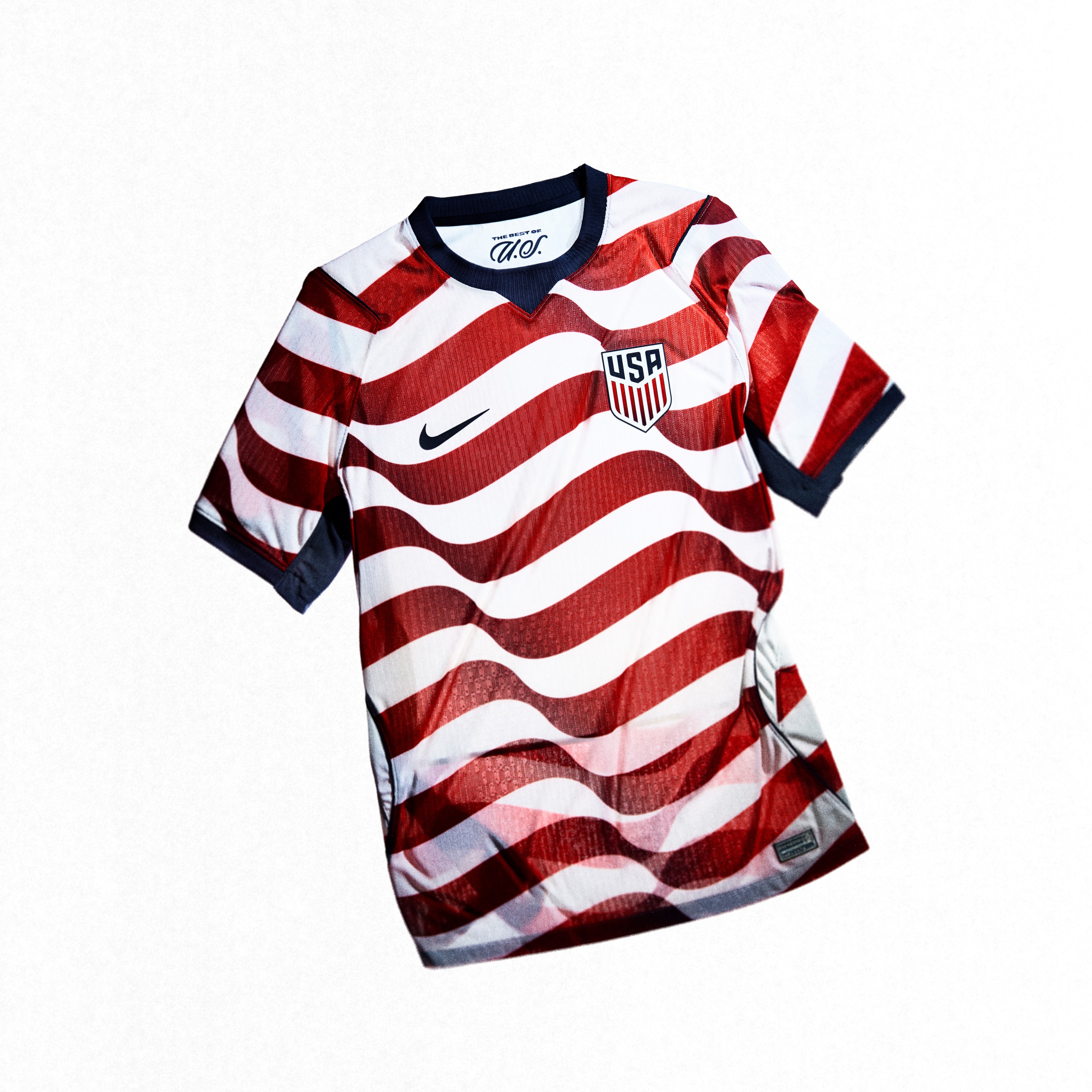
Nike got it right. The stars and stripes feel is there without making it look like a costume. It's patriotic and clean at the same time. For a World Cup on home soil, the home jersey delivers.
9. Ghana (Puma): A-
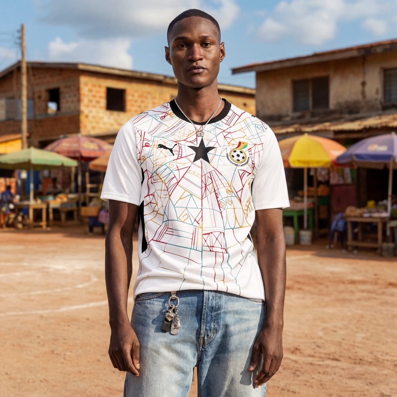
The colorful abstract line drawing with red, yellow, green, and teal lines weaving around the black star looks like street art. One of the most creative home kits in the entire 2026 collection from any brand.
8. Portugal (Puma): A-
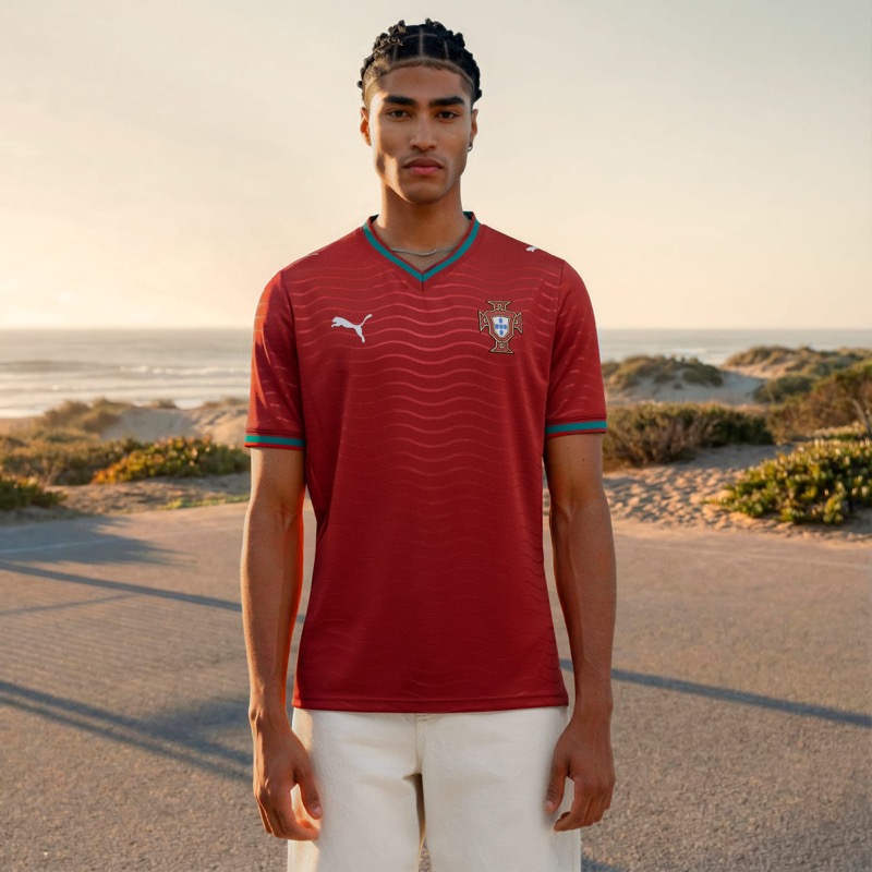
Puma's first World Cup with Portugal and they delivered on the home kit. The deep red with the wave pattern and teal accents on the collar and cuffs is simple, but the color pops and it looks great.
7. Colombia (Adidas): A
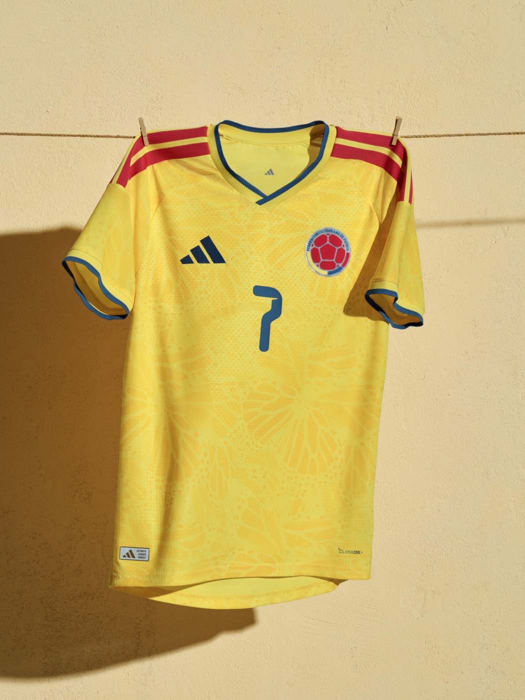
The yellow with the subtle floral pattern is one of the best home kits in the entire Adidas batch. The red shoulder stripes with blue collar and cuffs tie together all three colors of the Colombian flag. This kit just looks right.
6. Belgium (Adidas): A
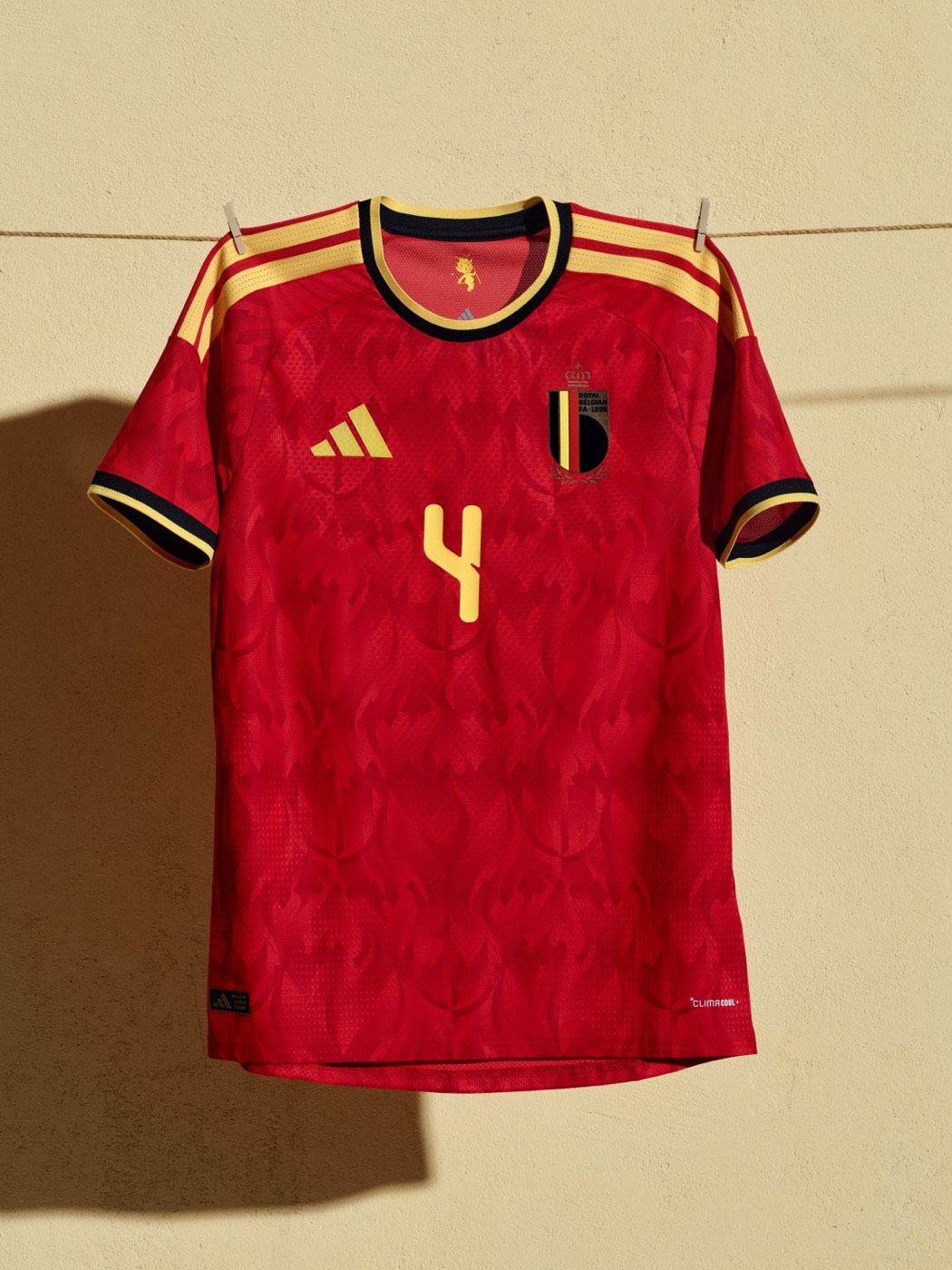
The deep red base with gold accents and black collar is premium. The subtle pattern across the front gives it texture without being too busy. Everything about this one just works.
5. Ivory Coast (Puma): A
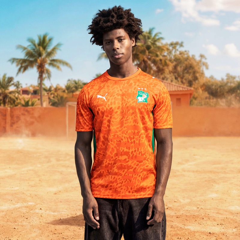
The iconic Elephants orange with that leopard-print texture gives this kit real energy. The green accents on the sides are the perfect complement. Puma's best home kit in the entire 2026 collection.
4. Argentina (Adidas): A
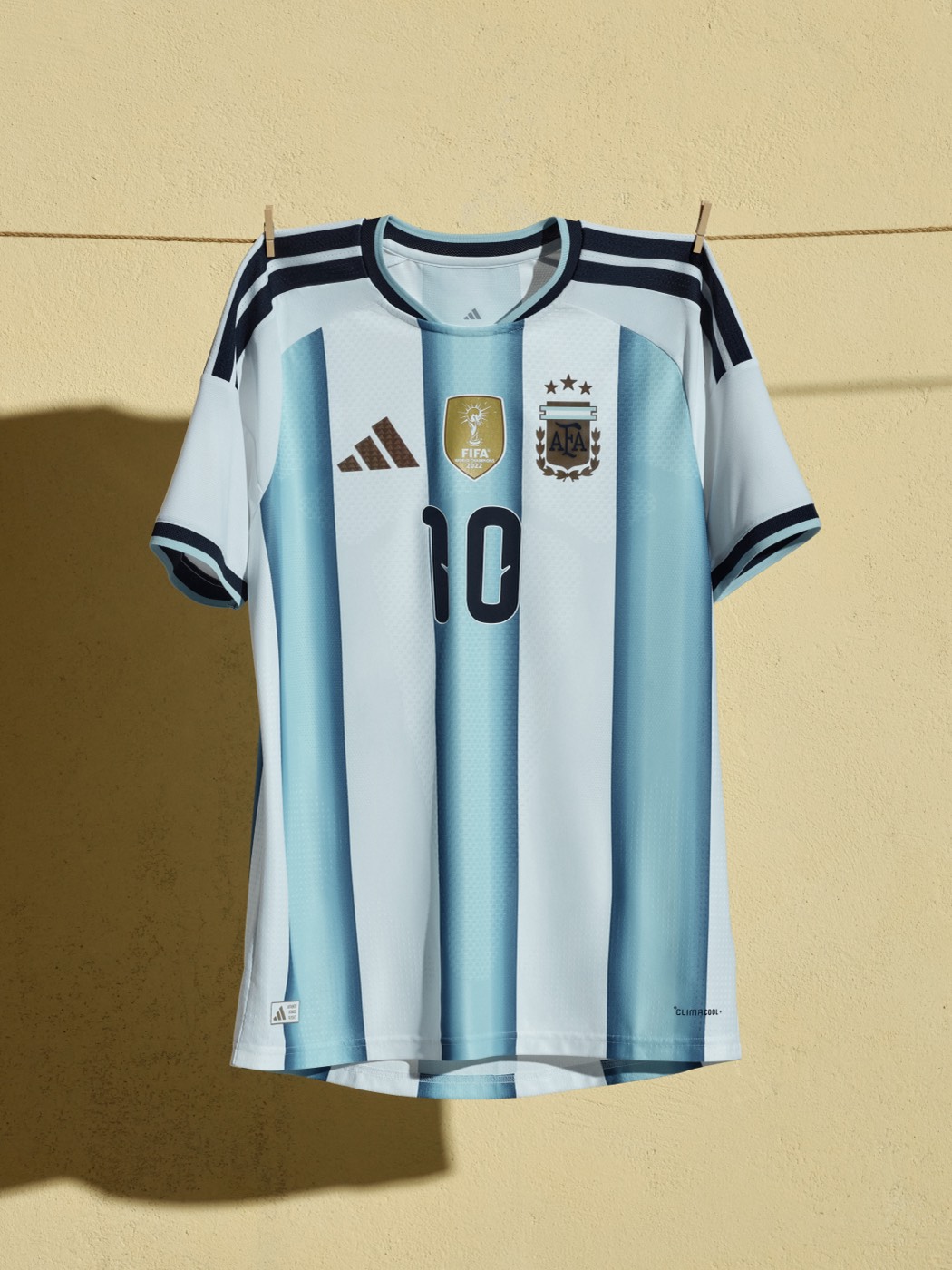
Classic Argentina. The light blue and white vertical stripes are one of the most iconic looks in all of soccer. This 2026 version nails it. Argentina doesn't need to reinvent the wheel, and they didn't. Timeless.
3. Norway (Nike): A
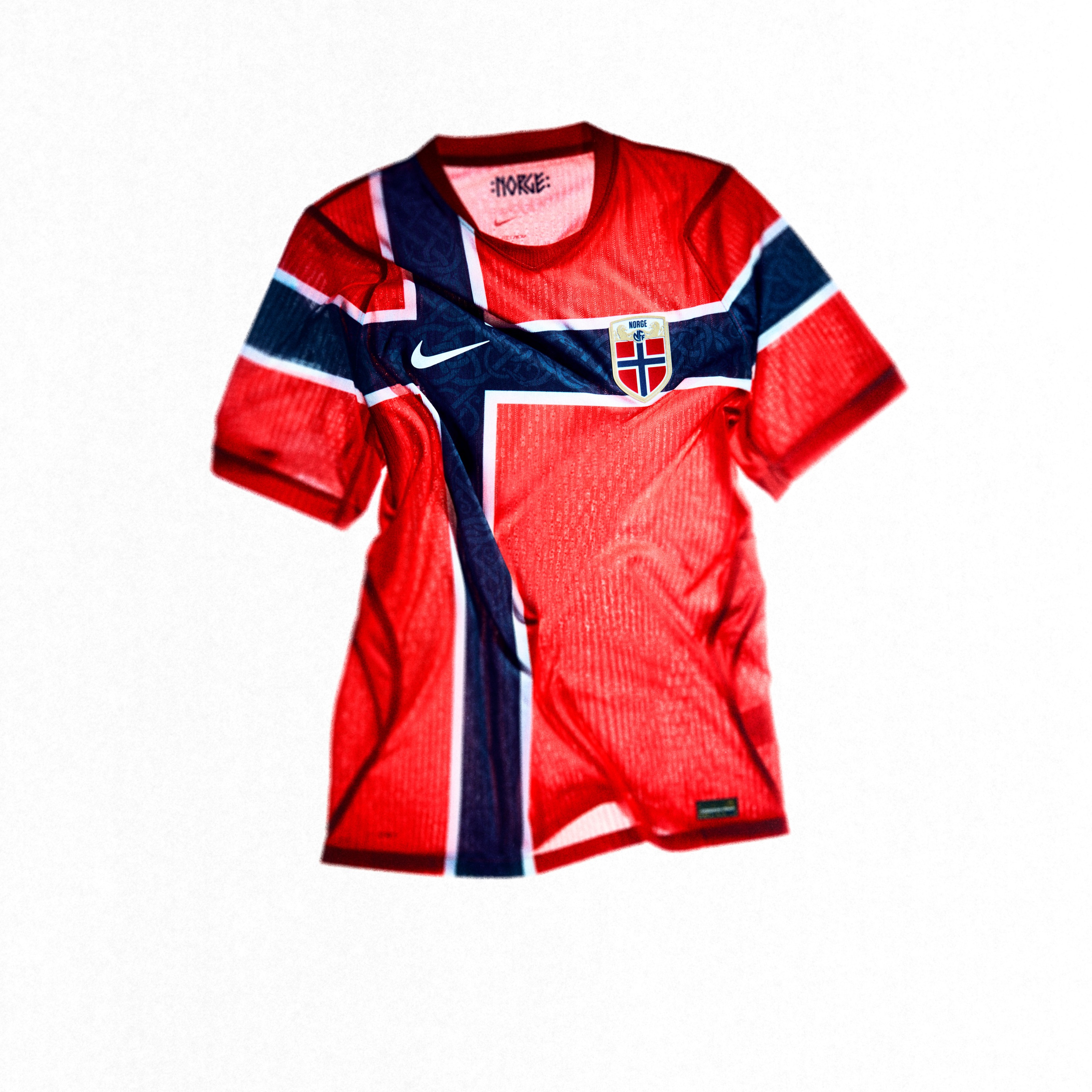
That tonal Viking cross is absolutely incredible. It's one of those kits where you have to look closely to see the detail, and when you do, it hits different. Norway doesn't get enough credit for consistently putting out great home kits.
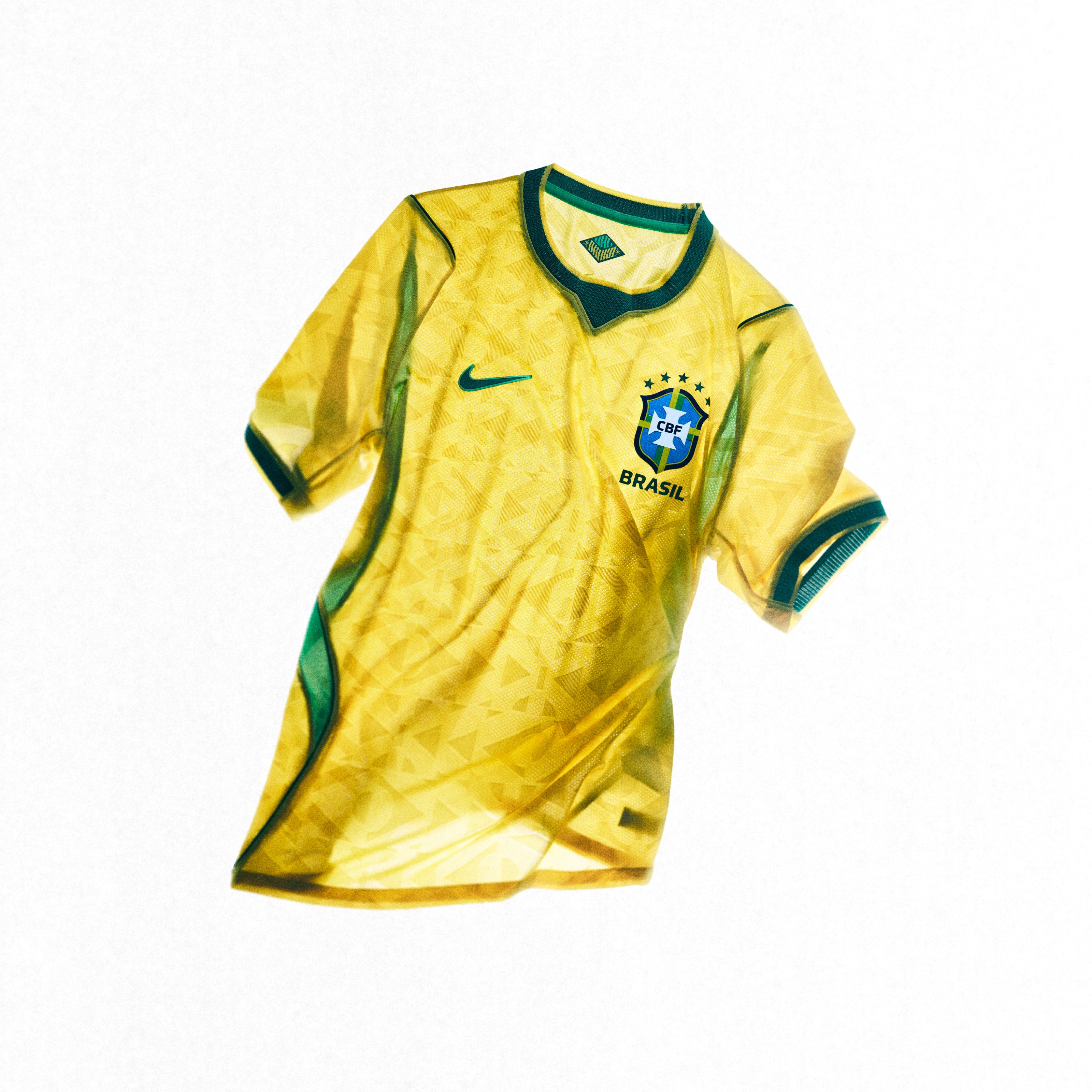
2. Brazil (Nike): A
It's Brazil. The yellow, green, and blue is one of the most iconic color combinations in all of sports, and Nike nailed it. The colors pop off the screen in a way that only Nike pulls off. This is exactly what you want from a Brazil home kit.
1. France (Nike): A+
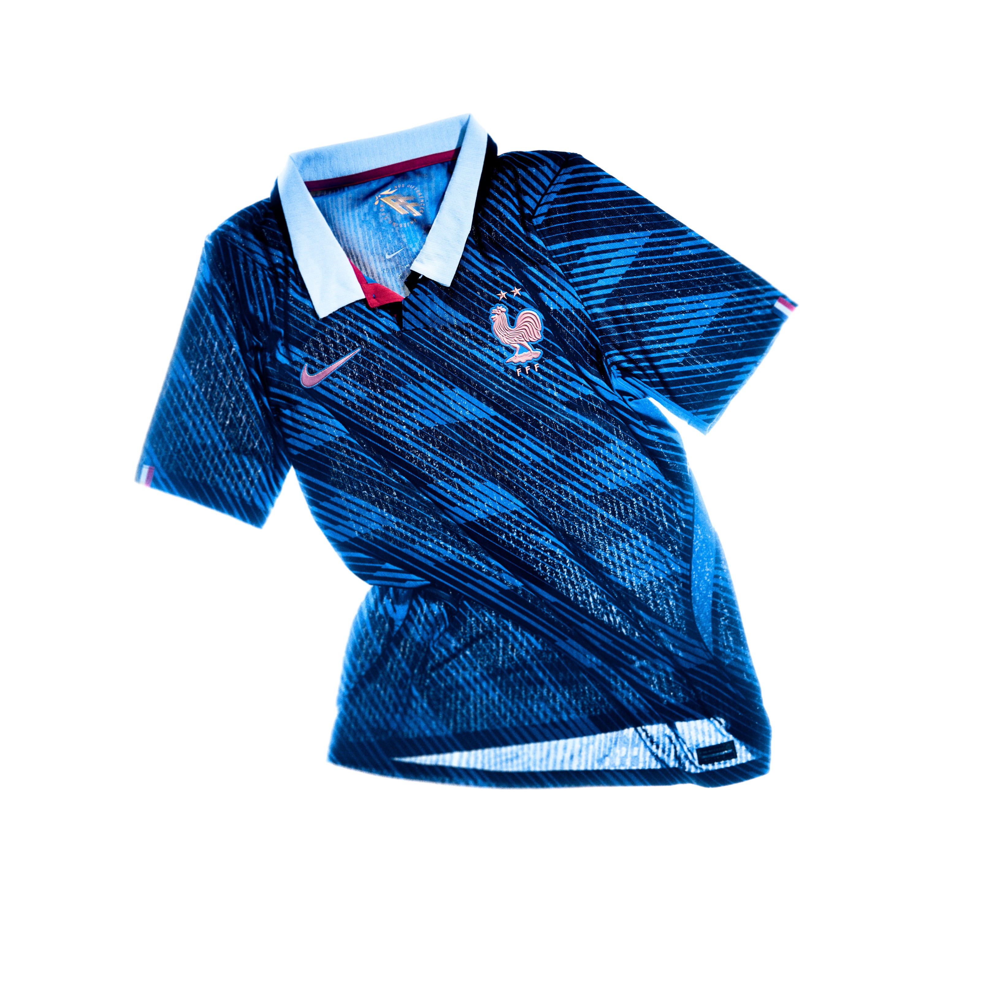
Our number one home kit for the 2026 World Cup. The white base with the metallic copper crest is clean, elegant, and modern all at once. Nike gave France something that looks as good hanging in your closet as it does on the pitch. When you pair this with the Statue of Liberty away kit that we ranked as the best jersey overall, France owns the 2026 kit cycle.