The Houston Rockets dropped the full 2026-27 rebrand today, June 4, 2026, after teasing the "ketchup and mustard are back on the menu" reveal last week. The full identity package is here. New global badge logo, updated primary R icon, the Dunkstronaut secondary mark now permanent, refreshed wordmarks, a four-color palette led by Rockets Red and Championship Yellow, and three brand new jerseys in Association white, Icon red, and Statement black. The whole rebrand hangs on a space mission narrative tying the franchise back to Houston's NASA Space City identity, and the ketchup-and-mustard color story from the 1994 and 1995 championship runs is officially back on the Rockets uniform set for the first time in 30 years. We graded every piece below.
The New Logos: Global Badge, Primary R Icon, Dunkstronaut, Wordmarks, and the Championship Yellow Palette
The new Houston Rockets global logo is an inverted-triangle space mission patch lock-up the team is calling the Nose Cone treatment. The badge packages the new HOUSTON ROCKETS wordmark at the top and the primary R icon below inside a yellow-and-black bordered triangle. The two stars flanking the wordmark are quasars and the team's design notes say they symbolize the franchise's journey from San Diego to Houston, connecting the Rockets' past and future. The whole identity is built on a space mission narrative that ties the rebrand back to Houston's NASA Space City story, and the global badge is the lock-up that carries the most of that narrative.
We are not big fans of badge-style logos in general. The cleanest brand identities tend to keep the primary mark standalone and let it run on its own without a crest or shape locking the whole identity into a single frame. The new Rockets badge sits the wordmark and the icon inside the inverted triangle and gives the brand less flexibility than the standalone primary R icon already has on its own, and the downward-facing orientation of the triangle reads as a heavier visual call than the franchise needed. The space mission patch reference is the strongest possible case for the badge, and Houston is the right NBA franchise to lean into the space mission story, but the badge as a primary lock-up is the design call we like the least about the otherwise strong rebrand.
The primary R icon, the iconic Houston Rockets mark since 2003, is updated for 2026-27 with Championship Yellow drop trim layered into the existing silhouette. The team's design notes call out that the R symbolizes two rockets launching through a Saturn-inspired basketball hoop, with the glowing yellow treatment representing energy, motion, and the spirit of innovation. The R stays at the core of the franchise identity and the yellow hints are the cleanest single update in the whole rebrand. The primary icon was already the strongest piece of the Rockets brand and adding the Championship Yellow without changing the silhouette is exactly the kind of restrained refresh fans wanted.
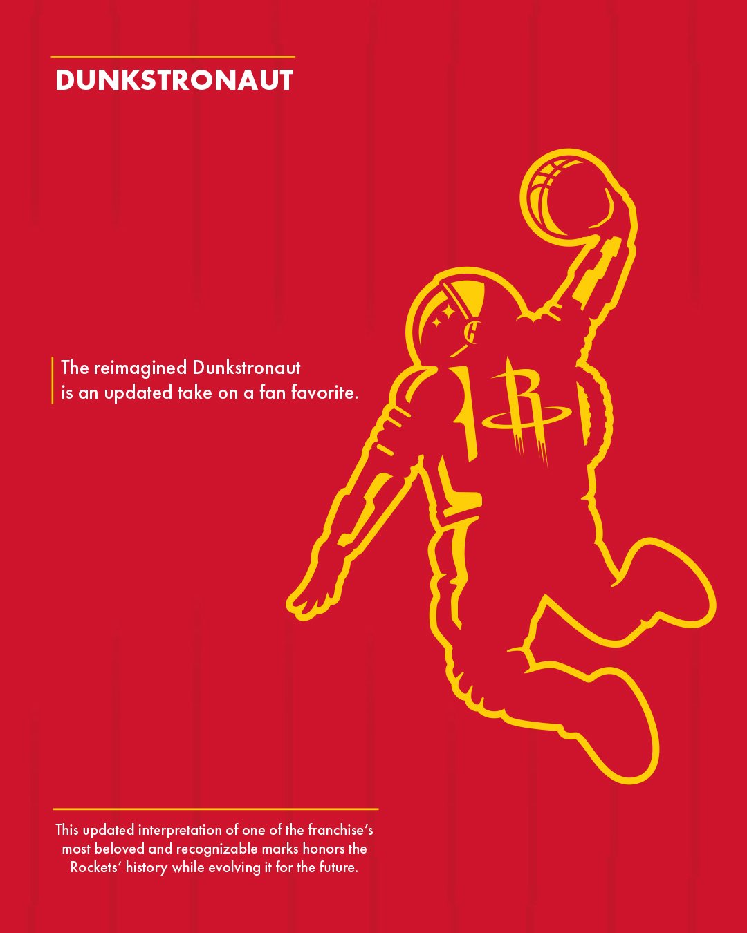
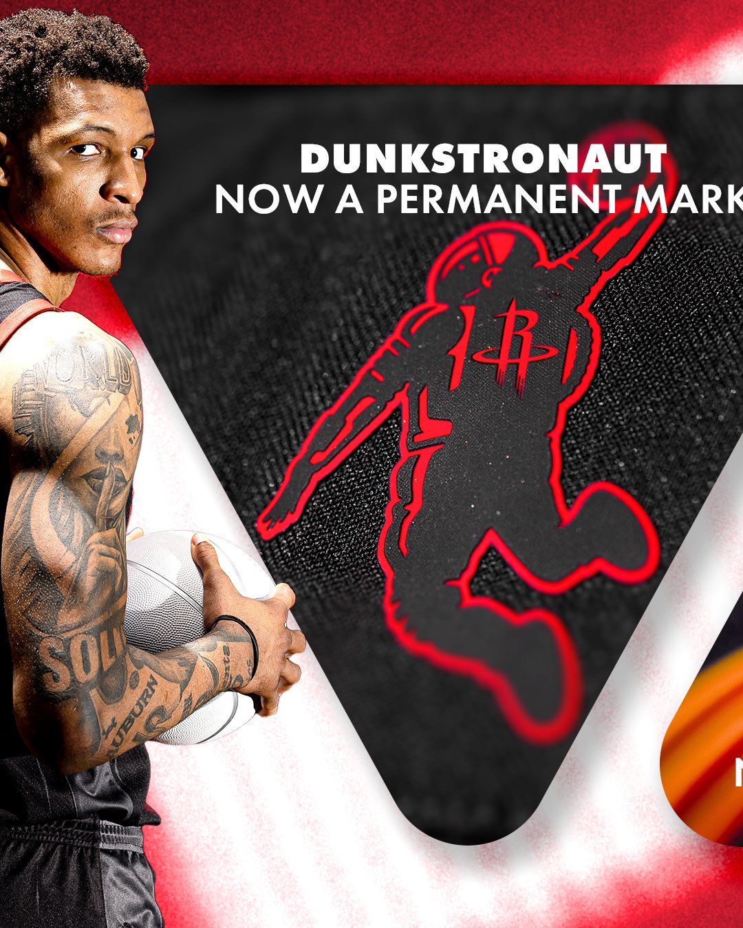
The Dunkstronaut, the dunking astronaut secondary mark Houston has used as a playful supplemental logo for years, is reimagined for 2026-27 with Championship Yellow line work and is now officially a permanent part of the franchise identity. The team's design notes call it "an updated take on a fan favorite" honoring the Rockets history while evolving it for the future. The Dunkstronaut is the playful counterpoint to the more disciplined space mission tone of the global badge and the primary icon. We are not crazy about the Dunkstronaut as a secondary mark, but it works, fans love it, and folding the Championship Yellow into the silhouette ties it back to the rest of the updated identity. Locking it in as a permanent mark instead of leaving it as an occasional alternate is the right call.
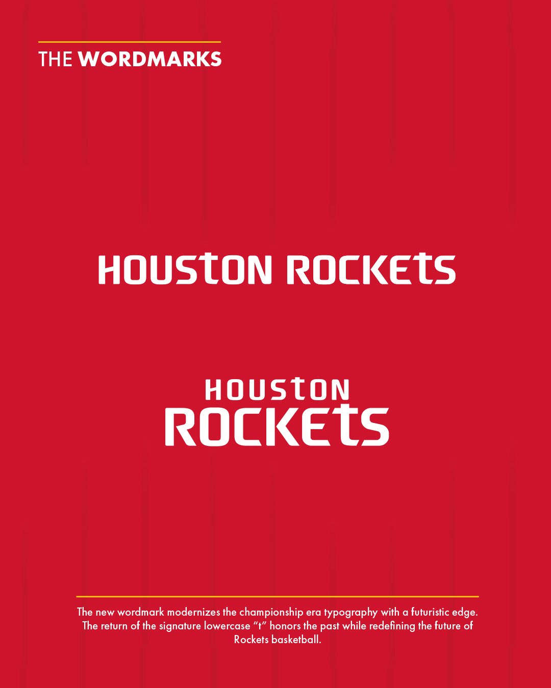
The new HOUSTON ROCKETS wordmark modernizes the championship-era typography with a futuristic edge per the team's design notes. The most important typographic detail is the return of the signature lowercase t, the same letterform that anchored the original 1972-95 wordmark during the ketchup-and-mustard championship run. The wordmark drops in both a horizontal lock-up and a stacked lock-up with the smaller Houston above the larger ROCKETS, and the letterforms read as a quiet refinement of the existing identity rather than a wholesale rewrite. The wordmark updates land as restrained, considered, and historically grounded. Easily the second-cleanest piece of the new identity package after the primary R icon refresh.
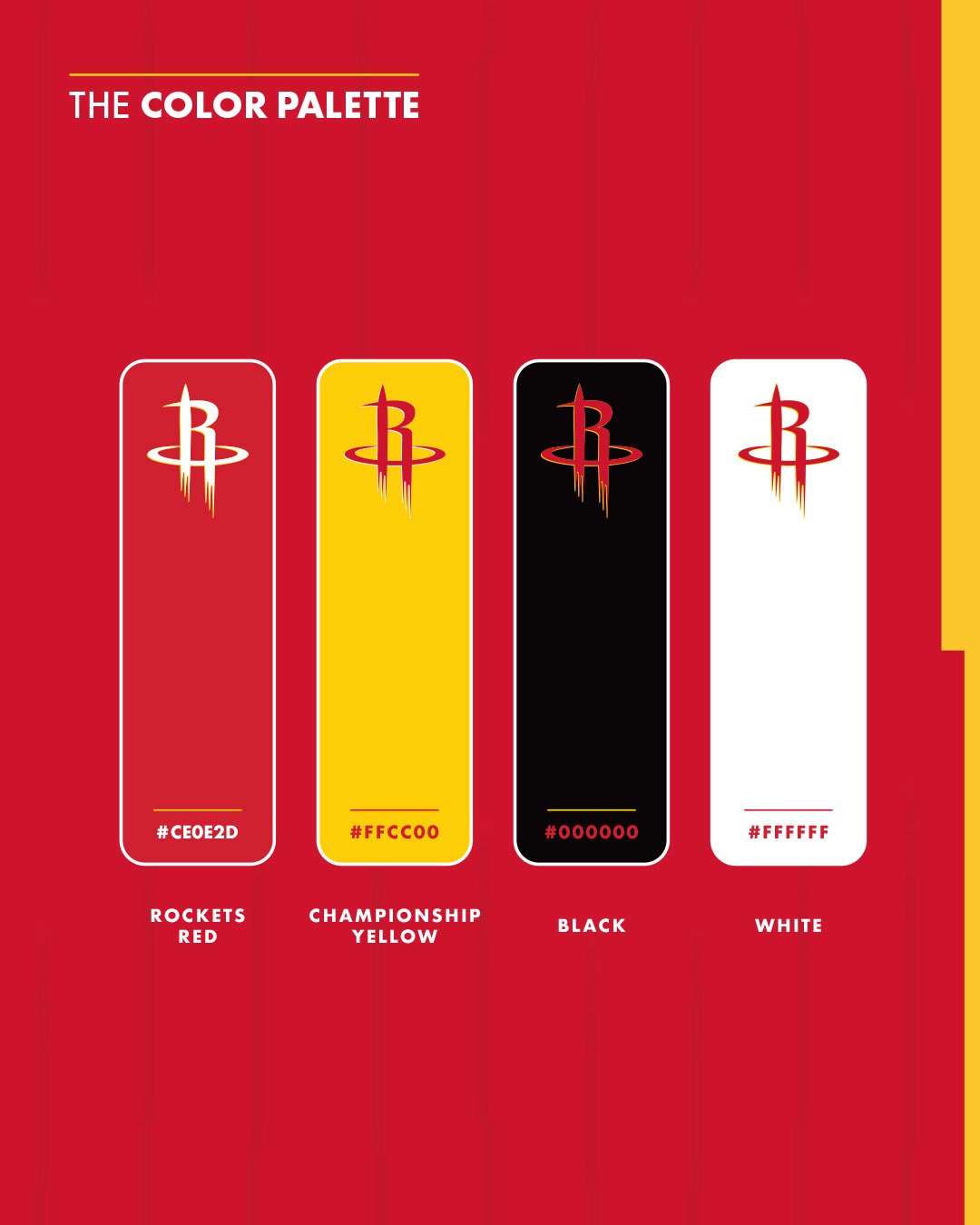
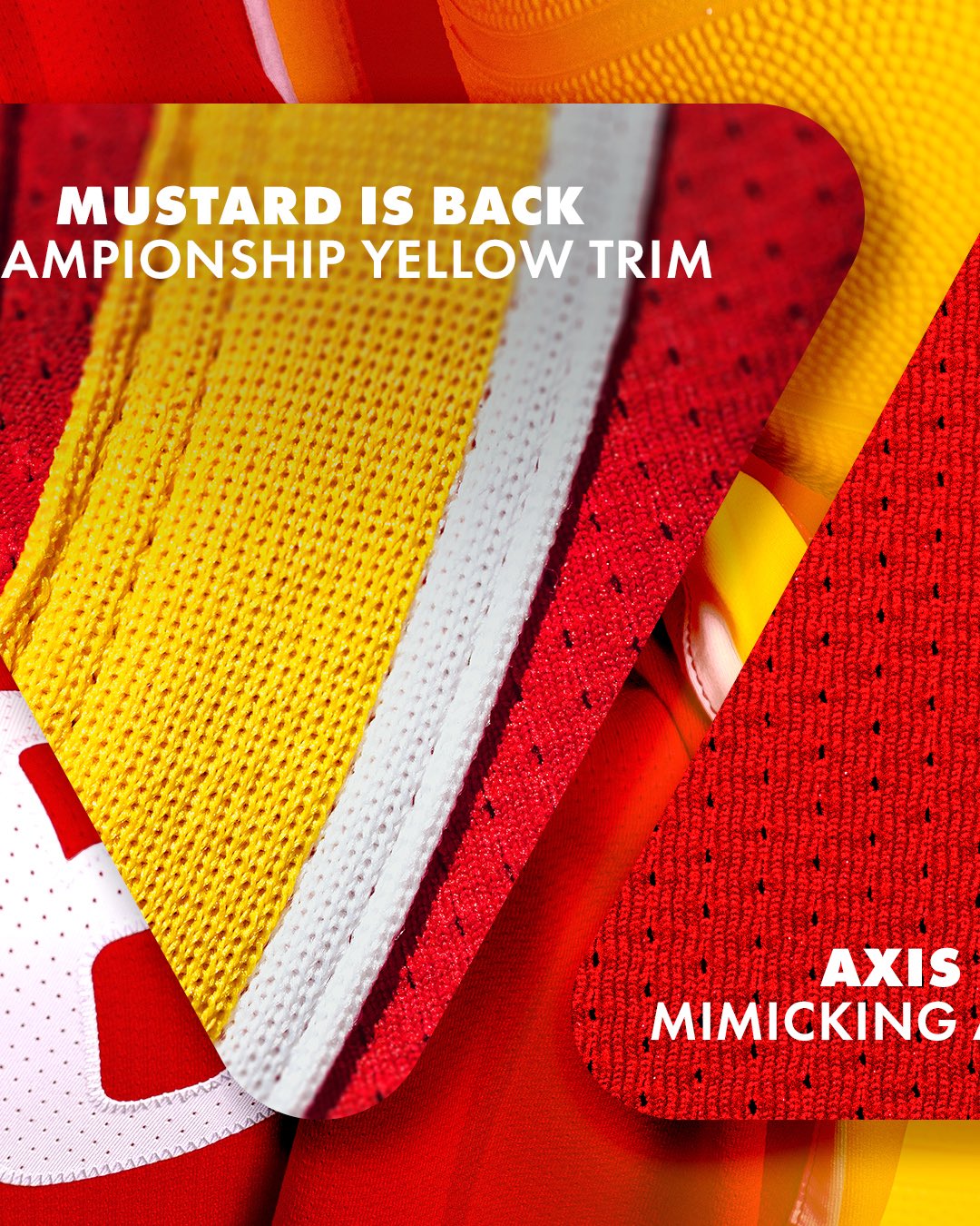
The four-color palette officially locks in Rockets Red (#CE0E2D), Championship Yellow (#FFCC00), Black (#000000), and White (#FFFFFF). The team's marketing language for the rebrand is "ketchup and mustard are back on the menu," and the Championship Yellow is the named color carrying the throwback story back into the modern identity. The official color name plus the marketing language make clear that the Rockets are anchoring this whole rebrand to the back-to-back championship era under Hakeem Olajuwon. Mustard yellow is back.
The Association Edition White Jersey: B+
Grade: B+
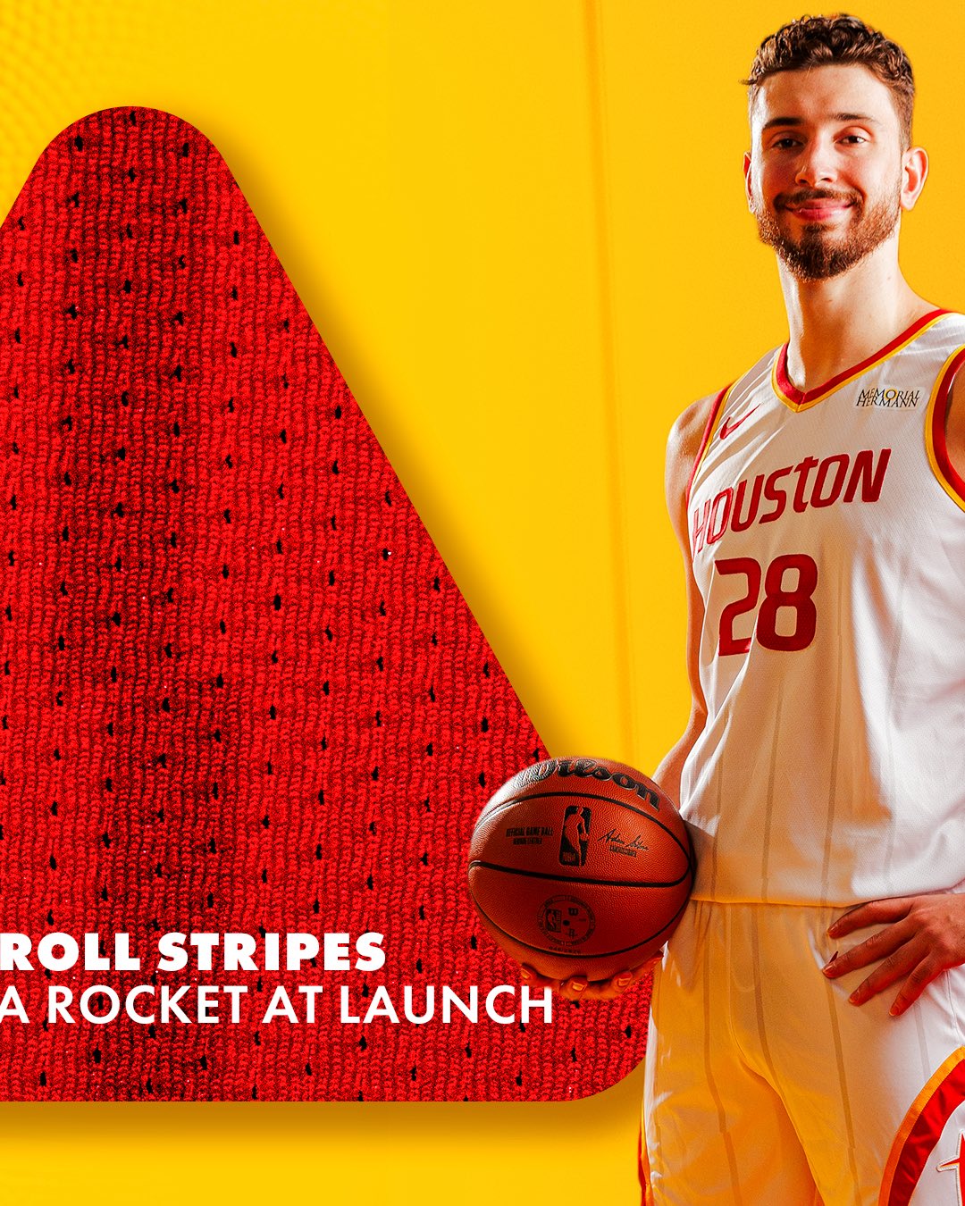
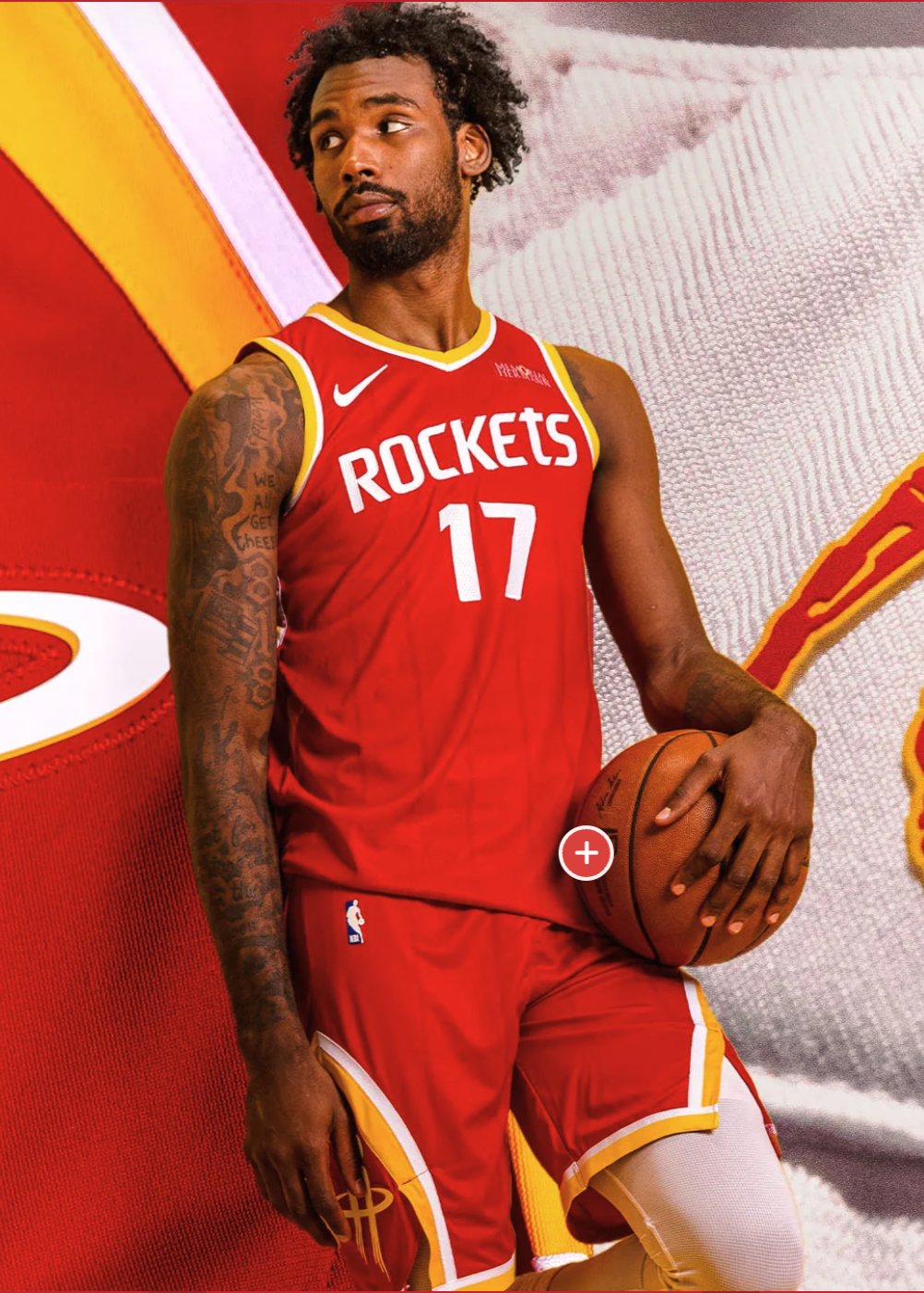
The new Houston Rockets Association Edition white home jersey is a clear improvement on the white jersey it replaces. The red HOUSTON wordmark across the chest with Championship Yellow drop trim is the sharpest piece of the white jersey, and the yellow trim runs through the collar, the arm holes, and the side stripes to thread the throwback color story through the whole uniform. The team is calling the side stripes the Roll Stripes, a yellow-and-red layered stripe meant to evoke a rocket at launch and reference the original 1972-95 stripe treatment. On the white jersey, the Roll Stripes are the design detail that does the most for our eye, layering yellow over red in the same way the championship-era uniforms did.
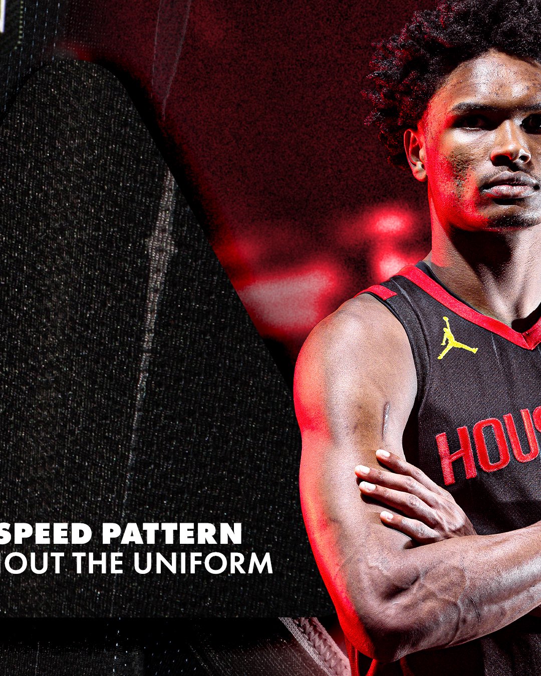
Our one issue with the new white jersey is the pinstripes the team is calling the Speed Pattern, a subtle vertical stripe treatment running throughout the body of the uniform meant to evoke motion and speed. On the white base, the Speed Pattern reads heavier than we would have called for and the vertical lines clutter the field around the wordmark instead of reinforcing it. Pinstripes are a 1990s and 2000s NBA design call that has worked on some franchises and dragged on others, and the new Houston Speed Pattern reads more cluttered than crisp, especially against the bolder Championship Yellow trim that is already doing the work of carrying the colorway. Stripped of the Speed Pattern lines, the white jersey would be one of the strongest white home jerseys in the Western Conference.
The Memorial Hermann sponsor patch sits on the upper-right chest of the white jersey in a clean way that does not fight the red HOUSTON wordmark across the chest. Sponsor patches are the single detail most likely to drag a jersey grade down across the league and the Memorial Hermann placement on the new Rockets white is one of the better placements in the new identity package.
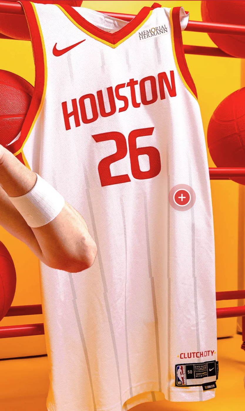
B+. A real upgrade on the previous white jersey, with the Championship Yellow trim and the Roll Stripes doing the heavy lifting and the Memorial Hermann patch finding a clean home on the upper chest, but the Speed Pattern pinstripes are the one detail that drags the grade down from the A range.
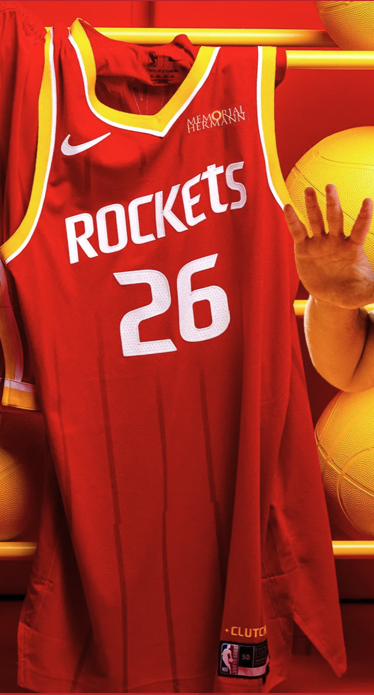
The Icon Edition Red Jersey: B+
Grade: B+
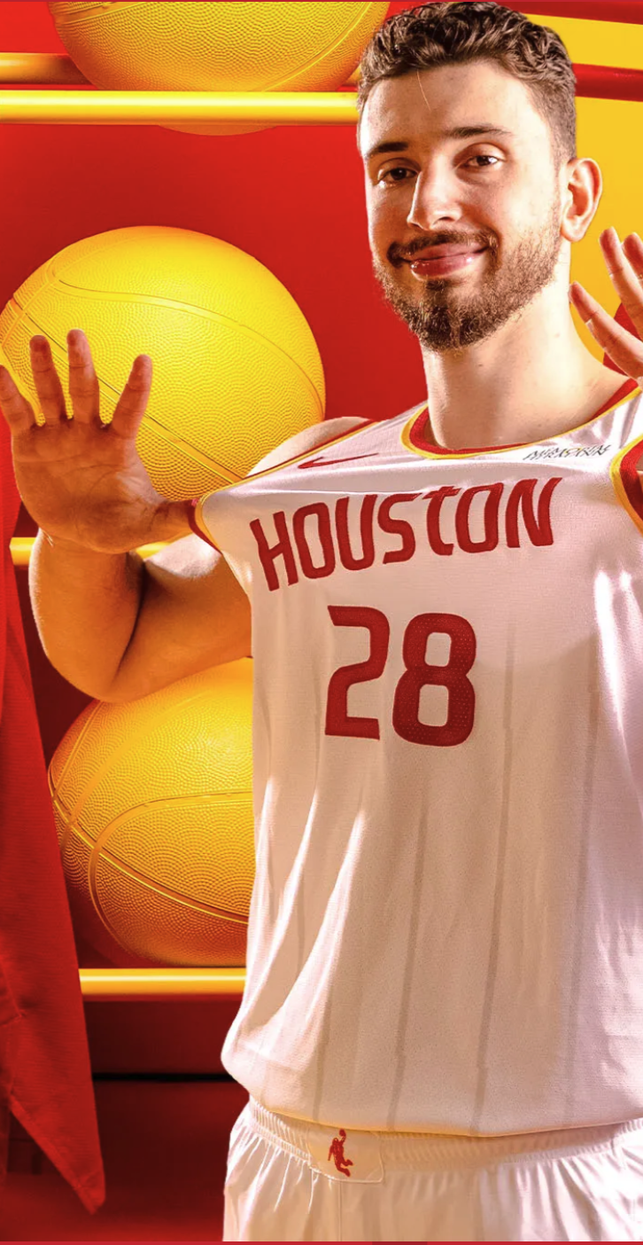
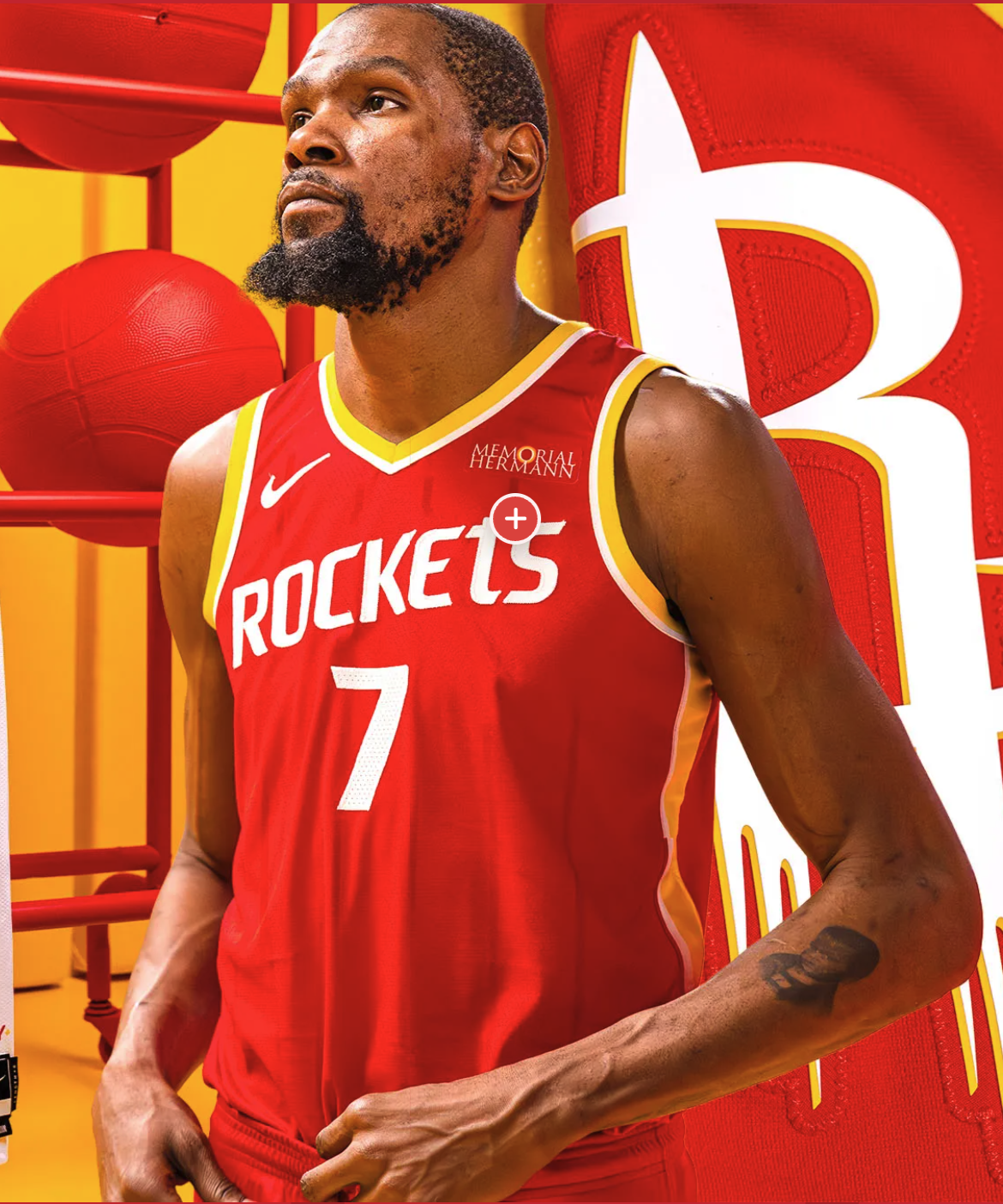
Kevin Durant in the new Houston Rockets Icon Edition red number 7 is the marquee shot of the whole rebrand. KD's first official photo in the new red uniform locks the rebrand to a future-Hall-of-Famer marketing center and gives the Rockets one of the strongest brand-launch shots in the league this offseason. The Icon Edition red is our favorite of the three new jerseys before we even get to the design. The red base color, the white ROCKETS wordmark across the chest, and the Championship Yellow drop trim on the wordmark land the original ketchup-and-mustard color story the franchise ran during the 1994 and 1995 championship runs in the modern Rockets silhouette.
The Speed Pattern pinstripes are present on the red jersey the way they are on the white, but on the red base they read faded and recede into the colorway instead of fighting the wordmark. This is why the red jersey lands cleaner to our eye than the white even though both jerseys carry the same pinstripe call. On red, the Speed Pattern lines read like subtle texture. On white, they read like clutter.
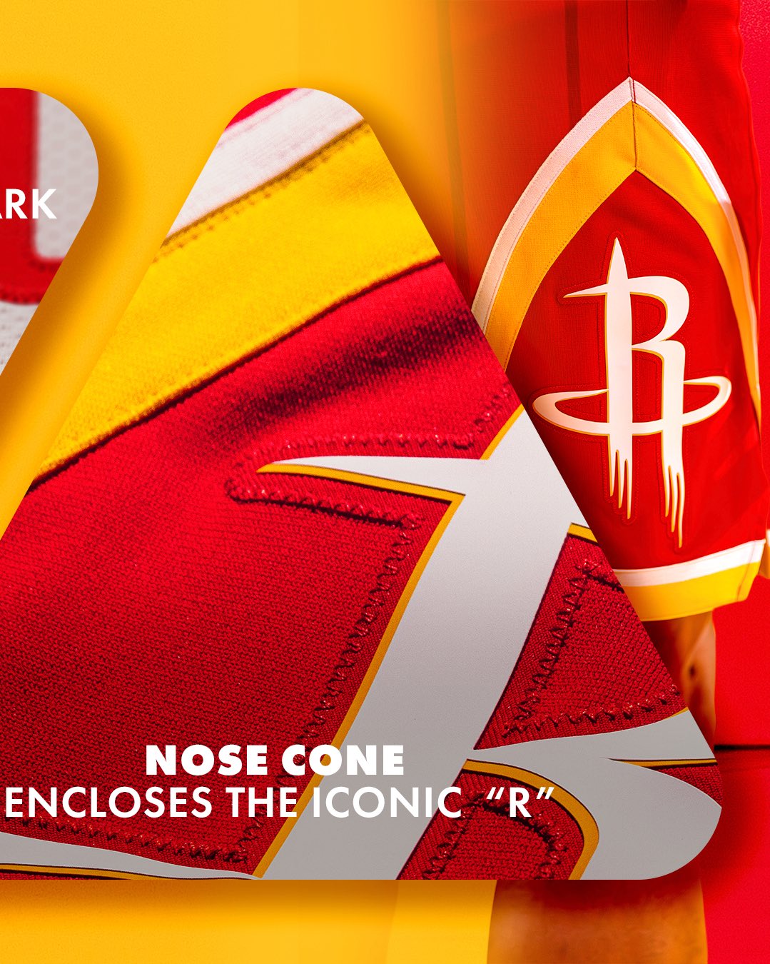
The Memorial Hermann sponsor patch sits better on the red Icon jersey than on the white or the black. The red base gives the patch a stronger color background and the patch reads as part of the colorway rather than a separate floating mark. The Nose Cone treatment of the global logo on the back of the jersey is the only place the inverted-triangle badge actually feels like the right shape for the surface it lives on, with the global badge sitting on the upper back as a literal mission patch the way the team's space narrative wants it to read.
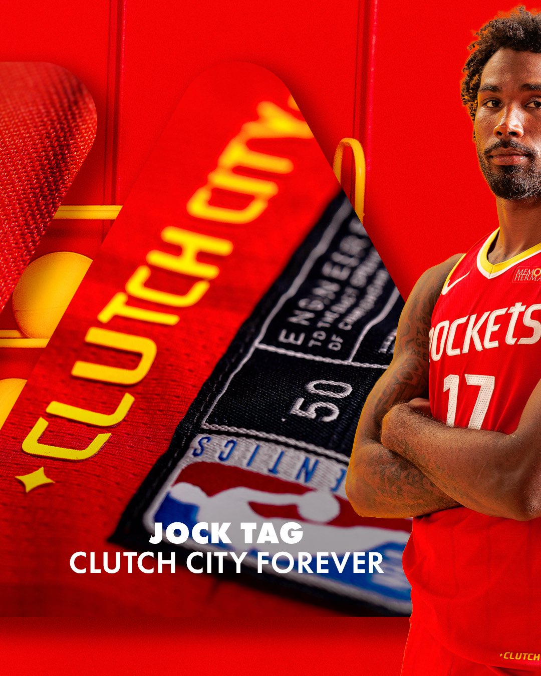
The jock tag reads Clutch City Forever in Championship Yellow text on the inside hem, a permanent tribute to the back-to-back championship Rockets teams of 1994 and 1995. The jock tag is the kind of internal detail most fans never see live on the floor, but the team baking the Clutch City era into the inside of every Icon jersey is exactly the kind of identity-anchoring move the rebrand needed to land.

B+. The strongest of the three new jerseys for our taste, with the Speed Pattern pinstripes faded enough to recede into the red base, the Memorial Hermann patch sitting cleanly on the red, and the Nose Cone global badge finding the right home on the upper back. The original ketchup-and-mustard color story reads here the way it has not on a primary Rockets jersey in 30 years, and KD in the red 7 will be the photo that anchors the Rockets brand in every preseason editorial graphic this fall.
The Statement Edition Black Jersey: B+
Grade: B+
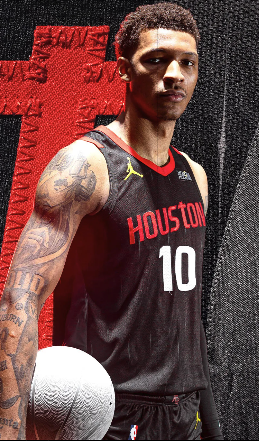
We do not usually grade black NBA jerseys this high. Most black alternates across the league lean on the same dark-base-with-team-color-trim formula and the look has been done out across the league for years. The new Houston Rockets Statement Edition black is the exception. The whole jersey leans into the spacesuit narrative the broader rebrand is built on, and the result is one of the most considered black alternates in the modern NBA.
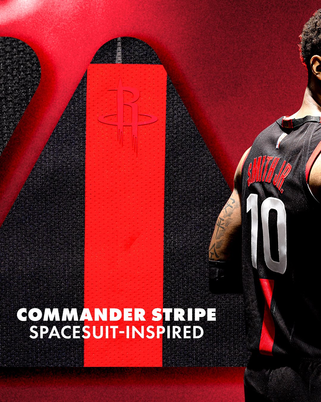
The single biggest design swing on the black jersey is what the team is calling the Commander Stripe, a spacesuit-inspired red stripe that runs from the collar down the spine of the jersey with the primary R icon sitting at the top of the stripe. Early fan reactions to the leak photos last week pushed back hard on the Commander Stripe but it is the design detail we like the most about the whole jersey. The Commander Stripe gives the black alternate a unique architectural feel that no other black jersey in the league is running, and the spacesuit-inspired narrative ties the design call back to the same NASA Space City story the global badge and the Nose Cone treatment are built on. The whole rebrand earns the right to make the Commander Stripe swing because the spacesuit reference is sitting at the center of the identity package, not just decorating the back of one alternate.
The Championship Yellow Jumpman logo on the upper-left chest is the design detail that earns the grade. Houston is one of the Jordan Brand Statement Edition teams in the NBA, and the Jumpman in Championship Yellow instead of the standard white, red, or black Jumpman colorway ties the Jordan Brand mark back to the throwback color story without forcing the yellow into the wordmark or the trim. A yellow Jumpman against the black base pulls the jersey out of the standard boring-black-alternate category and into the design swing territory the Statement Edition is actually meant to live in.
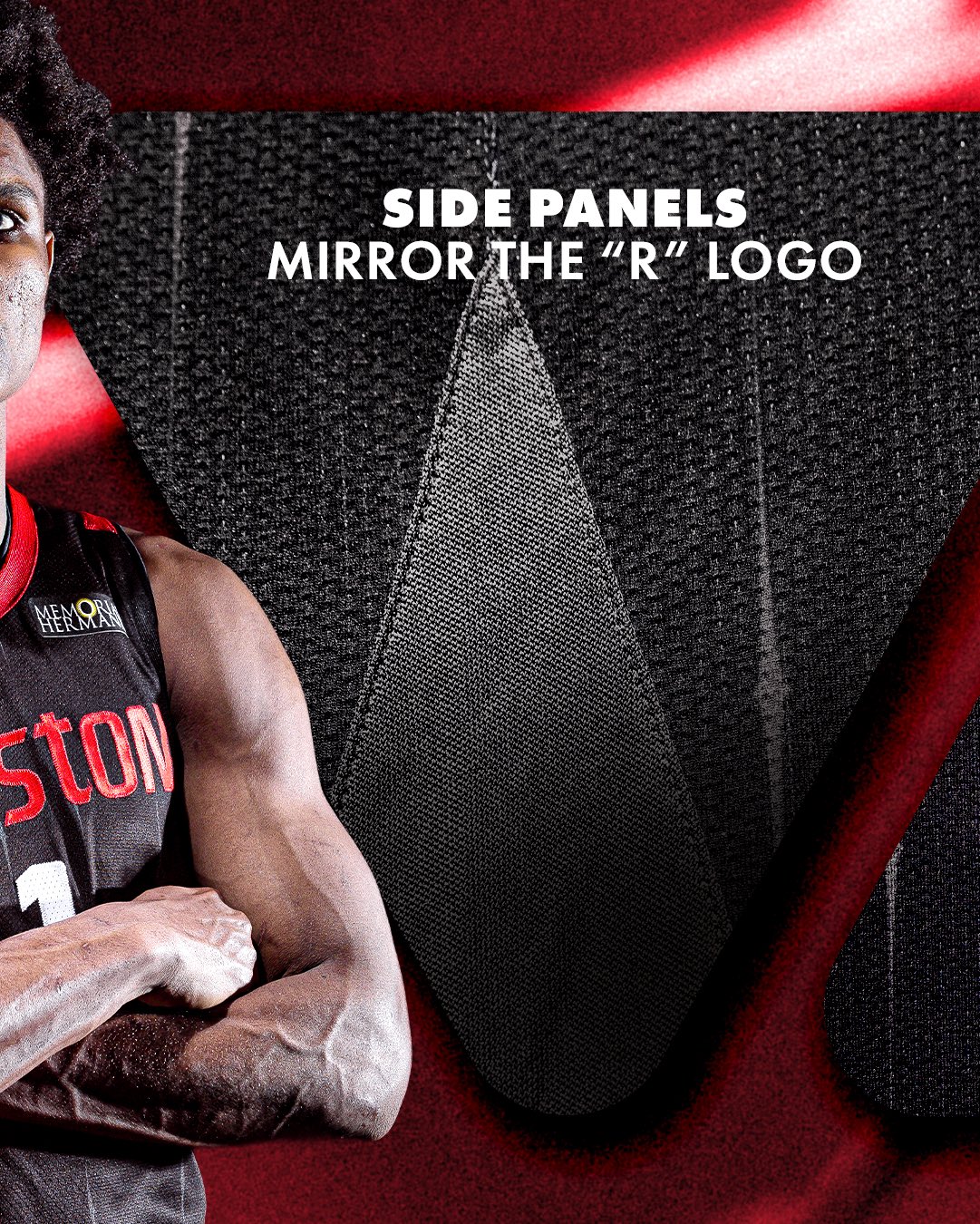
The diamond-shaped side panels are designed to mirror the silhouette of the primary R icon. The team's design notes explicitly call out that the side panel shape is built from the R logo silhouette, which means the architecture of the jersey itself is carrying the primary mark even when the front and back of the uniform are not showing it.
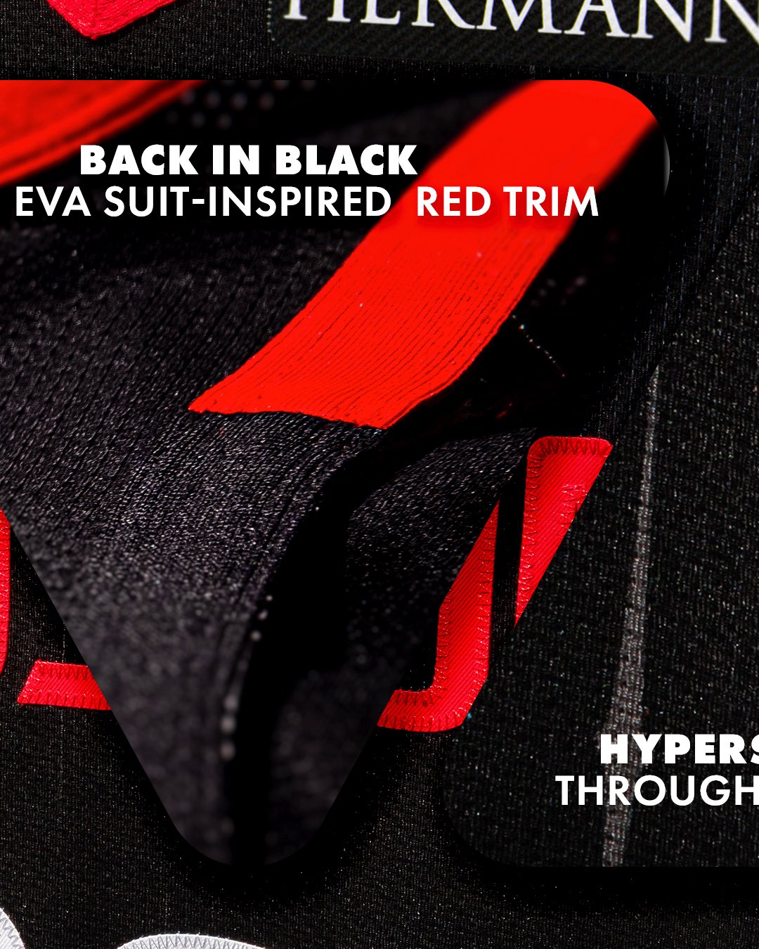
The red trim across the black jersey is EVA suit-inspired, the team's reference to the extravehicular activity spacewalk suit. Every piece of design language on the Statement black is built around the same spacesuit story. The trim, the Commander Stripe, the side panels, and even the Speed Pattern lines all hang on the same astronaut narrative the global badge anchors. The Speed Pattern reads least intrusively on the black base of the three new jerseys, which is part of the reason the black jersey lands cleaner than the white even though both jerseys carry the same pinstripe call.
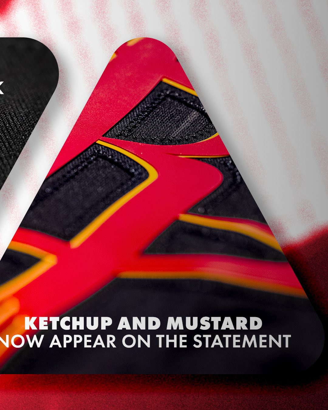
The team's own promo language for the macro shot of the black jersey numbers is "Ketchup and Mustard Now Appear on the Statement," which makes clear that bringing the championship-era color story onto the black alternate was a specific brand call rather than an accident. The red numbers with Championship Yellow drop trim on the black mesh are the most direct visual carry of the original 1972-95 color story onto a modern black silhouette.
B+. Black alternates rarely earn the B+ range from us and this one does because the Commander Stripe, the EVA suit-inspired red trim, the diamond side panels mirroring the R icon, the Championship Yellow Jumpman at the hem, and the ketchup-and-mustard color story on the numbers all hang together on the same spacesuit narrative. Most black alternates are designed to look generically tough. The new Rockets Statement Edition is designed to tell a story, and it earns the grade for committing to it.
The Verdict on the Houston Rockets 2026-27 Rebrand: B
The Houston Rockets 2026-27 rebrand earns a B overall on our scale. The three new jerseys all grade B+, the primary R icon update with the Championship Yellow drop trim lands as the cleanest single refresh in the package, the Dunkstronaut becoming a permanent secondary mark is the right move, the wordmark return to the signature lowercase t honors the championship-era typography, and Championship Yellow returning to the primary Rockets palette is the single strongest call the team made. The original ketchup-and-mustard color story is back on the Rockets uniform set for the first time in 30 years and Houston was right to put the yellow at the center of the rebrand.
What pulls the grade down to a B rather than a B+ is the global badge logo and the Speed Pattern pinstripes. The global badge packages the whole identity inside a single inverted-triangle Nose Cone lock-up and the downward-facing orientation reads as the design call we like the least about the rebrand. The space mission patch reference is the strongest possible defense of the badge, but we would have preferred Houston keep the primary R icon and the wordmark as the standalone primary marks the way the franchise has run them since 2003, with the Championship Yellow accent updates as the only real visual change. The Speed Pattern pinstripes are the same 1990s and 2000s NBA throwback call that does not need to live in the modern Rockets identity package, especially on the white jersey where the lines clutter the field around the wordmark. Both calls are fixable design decisions sitting inside an otherwise strong rebrand.
The rebrand brings the actual Houston Rockets color story back to the franchise and that is the single most important thing it does. Kevin Durant in the red 7 is the marquee photo of the whole package and locks the new identity to a future-Hall-of-Famer launch center. The three jerseys all earn B+ grades, the spacesuit narrative carries the Statement black further than any black alternate in the league this year, and the Clutch City Forever jock tag locks the championship era into the inside of every Icon jersey. The global badge and the Speed Pattern are the only reason the rebrand lands at B rather than higher.
Frequently Asked Questions
What grade do the new Houston Rockets 2026-27 jerseys get?
The three new Houston Rockets 2026-27 jerseys all grade at B+ on our 10-point scale. The Association Edition white home jersey is a clear upgrade with Championship Yellow trim and clean Memorial Hermann patch placement, the Icon Edition red is the strongest of the three with faded Speed Pattern pinstripes that recede into the red base and the cleanest sponsor patch placement of the set, and the Statement Edition black is the exception to our usual rule on black alternates because of the spacesuit-inspired Commander Stripe, the EVA suit-inspired red trim, the diamond side panels mirroring the R logo, and the Championship Yellow Jumpman on the hem.
What grade does the Houston Rockets 2026-27 rebrand get overall?
The Houston Rockets 2026-27 full rebrand earns a B grade on our scale. The return of Championship Yellow to the primary identity, the three new B+ jerseys, the Kevin Durant marketing center, and the deeply considered space mission narrative all carry the rebrand, but the new Nose Cone global badge logo with the downward-facing orientation and the Speed Pattern pinstripes that run across all three new jerseys are the design calls that drag the grade down from the B+ range we would have given the rebrand without them.
What is the Houston Rockets new global logo for 2026-27?
The new Houston Rockets 2026-27 global logo is an inverted-triangle space mission patch lock-up the team is calling the Nose Cone treatment. The badge packages the HOUSTON ROCKETS wordmark at the top and the primary R icon below inside a yellow-and-black bordered triangle. The two stars flanking the wordmark are quasars, the team's reference to the franchise's journey from San Diego to Houston, connecting the Rockets' past and future inside a single mission patch lock-up. The whole identity is built on a space mission narrative that ties the rebrand back to Houston's NASA Space City story.
Did the Houston Rockets keep the iconic R logo for 2026-27?
Yes. The Houston Rockets kept the iconic R primary icon that has anchored the franchise identity since 2003. The R is built from two rockets launching through a Saturn-inspired basketball hoop per the team's design notes. The 2026-27 update adds Championship Yellow drop trim into the existing silhouette without changing the shape, and the yellow hints are the cleanest single refresh in the whole rebrand. The glowing yellow treatment represents energy, motion, and the spirit of innovation per the team's own language.
What is the Dunkstronaut Houston Rockets logo?
The Dunkstronaut is the Houston Rockets secondary mark, a dunking astronaut figure tying the franchise to Houston's NASA Space City identity. The 2026-27 update reimagines the Dunkstronaut with Championship Yellow line work and locks the mark in as a permanent part of the Rockets identity for the first time. The team's design notes call the Dunkstronaut "an updated take on a fan favorite" honoring the franchise history while evolving it for the future.
Why are the Houston Rockets bringing back Championship Yellow and mustard?
The Houston Rockets are bringing Championship Yellow back to the primary identity for 2026-27 because mustard yellow was the layering color that defined the original Houston Rockets ketchup-and-mustard era from 1972 through 1995, including the back-to-back NBA championship runs in 1994 and 1995 under Hakeem Olajuwon. The official 2026-27 color is named Championship Yellow with the hex code #FFCC00, and the team's marketing language for the rebrand reveal is "ketchup and mustard are back on the menu." The yellow ties the current identity back to the most successful era in franchise history.
Do the new Houston Rockets jerseys have pinstripes?
Yes. All three new Houston Rockets 2026-27 jerseys carry a vertical stripe pattern the team is calling the Speed Pattern, a subtle pinstripe treatment running throughout the body of every uniform meant to evoke motion and speed. The Speed Pattern is heaviest on the white Association Edition where it clutters the field around the red HOUSTON wordmark, faded on the red Icon Edition where it recedes into the base color, and least intrusive on the black Statement Edition. The pinstripes are the design call we like the least about the new uniforms.
What are the Roll Stripes on the new Houston Rockets jerseys?
The Roll Stripes are the yellow-and-red layered side stripes running down the sides of every new Houston Rockets 2026-27 uniform. The team's design notes say the Roll Stripes are meant to mimic a rocket at launch and the layered stripe treatment references the original 1972-95 championship-era stripe call. The Roll Stripes are the side panel detail that does the most for the Championship Yellow throwback color story.
What is the Commander Stripe on the Houston Rockets black jersey?
The Commander Stripe is the spacesuit-inspired red stripe that runs from the collar down the spine of the new Houston Rockets Statement Edition black jersey, with the primary R icon sitting at the top of the stripe. The team's design notes say the Commander Stripe is inspired by astronaut spacesuit design, tying the back of the black jersey to the same NASA Space City story the global Nose Cone badge is built on. Early fan reactions pushed back on the Commander Stripe but it is the design detail we like the most about the black jersey.
What is the Memorial Hermann patch on the Houston Rockets jerseys?
Memorial Hermann is the Houston Rockets jersey patch sponsor and the Memorial Hermann logo sits on the upper-right chest of every new Houston Rockets 2026-27 jersey. The Memorial Hermann patch sits cleanest on the red Icon Edition jersey where the red base gives the patch a strong color background, and it works on the white Association Edition without fighting the red HOUSTON wordmark. On the black Statement Edition the patch sits cleanly inside the EVA suit-inspired red trim around the upper chest.
Why is the Jumpman logo yellow on the Houston Rockets black jersey?
The Houston Rockets Statement Edition black jersey carries the Jordan Brand Jumpman logo on the upper-left chest in Championship Yellow rather than the standard white, red, or black colorway. Houston is one of the Jordan Brand Statement Edition teams in the NBA, and the Jumpman in Championship Yellow ties the Jordan Brand mark back to the throwback ketchup-and-mustard color story without forcing the yellow into the wordmark or the trim. It is the design detail we like most about the black jersey.
What does the jock tag say on the new Houston Rockets jerseys?
The jock tag on the new Houston Rockets 2026-27 Icon Edition red jersey reads Clutch City Forever in Championship Yellow text, a permanent tribute to the back-to-back championship Rockets teams of 1994 and 1995. Baking the Clutch City era into the inside of every Icon jersey is the kind of identity-anchoring detail the rebrand needed to land the championship-era throwback story.
Is Kevin Durant on the new Houston Rockets jersey reveal photos?
Yes. Kevin Durant in the new Houston Rockets Icon Edition red number 7 is the marquee shot of the entire 2026-27 rebrand reveal. KD wearing the new red uniform locks the rebrand to a future-Hall-of-Famer marketing center and gives the Rockets one of the strongest brand-launch shots in the league this offseason.
When can I buy the new Houston Rockets jerseys?
The new Houston Rockets 2026-27 jerseys officially dropped on June 4, 2026 with reservations open the same day per the official @HoustonRockets reveal. The new Houston Rockets jerseys are available through Fanatics, the official Rockets team store, and the NBA Store.
When did the Houston Rockets last use mustard yellow on a uniform?
The Houston Rockets last used mustard yellow as part of their primary uniform set in the 1994-95 NBA season, the second of their back-to-back NBA championship runs under Hakeem Olajuwon. The Rockets rebranded to a navy blue and red color scheme starting in the 1995-96 season and have not used mustard yellow on a primary Rockets jersey since. The 2026-27 rebrand brings Championship Yellow back to the primary Houston Rockets identity for the first time in 30 years.
For the original Houston Rockets mustard yellow tease post and the build-up to the June 4 rebrand reveal, read our Houston Rockets new jerseys drop June 4 ketchup and mustard post.