 Image courtesy of the Houston Texans website
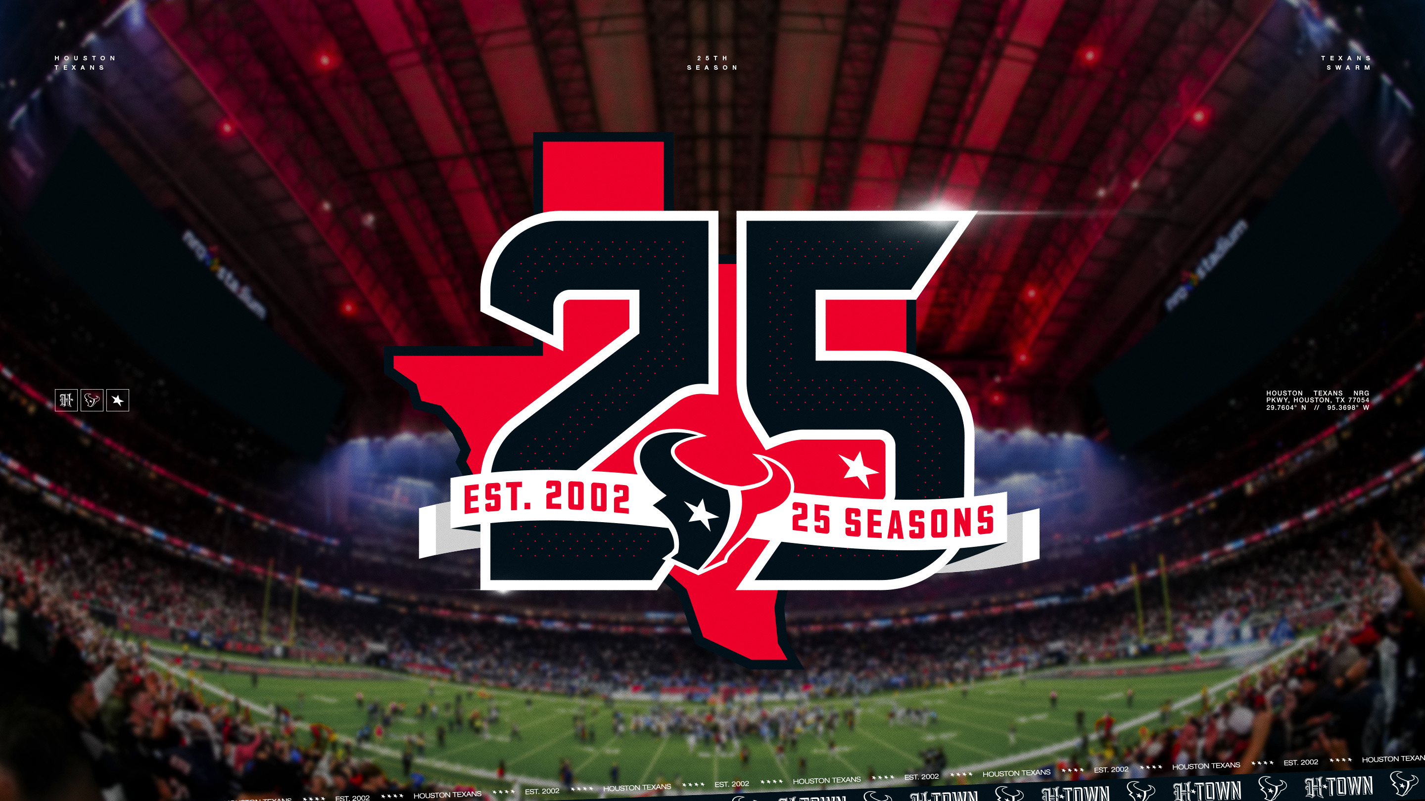
The Houston Texans just dropped their 25th anniversary logo, and it looks good.
The patch features a bold "25" front and center with the outline of the state of Texas behind it. The Texans bull logo sits in the middle with a banner that reads "Est. 2002" on the left and "25 Seasons" on the right. The whole thing uses the team's navy, red, and white color scheme.
It works. The state of Texas silhouette ties the number to the geography, and the team logo in the center keeps it grounded. It's not trying to do too much. A lot of anniversary patches get overdesigned with too many elements, but this one keeps it simple and lets the "25" do the talking. The dot pattern inside the numbers adds a subtle texture that gives it some depth without making it feel busy.
The Texans have come a long way since their first game in 2002. They entered the league as the 32nd franchise after Houston lost the Oilers to Tennessee in 1997. Twenty-five seasons later, they're coming off back-to-back playoff appearances with one of the youngest and most exciting rosters in the NFL.
This patch will appear on all Texans jerseys during the 2026 season.
Check out the full reveal from the Texans:
Our grade: B+
Simple, clean, and effective. The state outline is the right call, and the color palette stays on brand. It does the job very well without overcomplicating things. Not the most creative anniversary logo we've ever seen, but it's solid and it'll look good on the jersey.
Image courtesy of the Houston Texans.