NFL Stories
 Arizona Cardinals
 Atlanta Falcons
 Baltimore Ravens
 Buffalo Bills
 Carolina Panthers
 Chicago Bears
 Cincinnati Bengals
 Cleveland Browns
 Dallas Cowboys
 Denver Broncos
 Detroit Lions
 Green Bay Packers
 Houston Texans
 Indianapolis Colts
 Jacksonville Jaguars
 Kansas City Chiefs
 Las Vegas Raiders
 Los Angeles Chargers
 Los Angeles Rams
 Miami Dolphins
 Minnesota Vikings
 New England Patriots
 New Orleans Saints
 New York Giants
 New York Jets
 Philadelphia Eagles
 Pittsburgh Steelers
 San Francisco 49ers
 Seattle Seahawks
 Tampa Bay Buccaneers
 Tennessee Titans
 Washington Commanders
 College Football Stories
 SEC
SEC Big Ten
 ACC
ACC Big 12
 Pac-12
 American Conference
 Mountain West
 Sun Belt
 MAC
MAC Conference USA
 FBS Independents
 NBA Stories
 Atlanta Hawks
 Boston Celtics
 Brooklyn Nets
 Charlotte Hornets
 Chicago Bulls
 Cleveland Cavaliers
 Dallas Mavericks
 Denver Nuggets
 Detroit Pistons
 Golden State Warriors
 Houston Rockets
 Indiana Pacers
 LA Clippers
 Los Angeles Lakers
 Memphis Grizzlies
 Miami Heat
 Milwaukee Bucks
 Minnesota Timberwolves
 New Orleans Pelicans
 New York Knicks
 Oklahoma City Thunder
 Orlando Magic
 Philadelphia 76ers
 Phoenix Suns
 Portland Trail Blazers
 Sacramento Kings
 San Antonio Spurs
 Toronto Raptors
 Utah Jazz
 Washington Wizards
 MLB Stories
 Arizona Diamondbacks
 Atlanta Braves
 Baltimore Orioles
 Boston Red Sox
 Chicago Cubs
 Chicago White Sox
 Cincinnati Reds
 Cleveland Guardians
 Colorado Rockies
 Detroit Tigers
 Houston Astros
 Kansas City Royals
 Los Angeles Angels
 Los Angeles Dodgers
 Miami Marlins
 Milwaukee Brewers
 Minnesota Twins
 New York Mets
 New York Yankees
 Philadelphia Phillies
 Pittsburgh Pirates
 San Diego Padres
 San Francisco Giants
 Seattle Mariners
 St. Louis Cardinals
 Tampa Bay Rays
 Texas Rangers
 Toronto Blue Jays
 Washington Nationals
 NHL Stories
 Anaheim Ducks
 Boston Bruins
 Buffalo Sabres
 Calgary Flames
 Carolina Hurricanes
 Chicago Blackhawks
 Colorado Avalanche
 Columbus Blue Jackets
 Dallas Stars
 Detroit Red Wings
 Edmonton Oilers
 Florida Panthers
 Los Angeles Kings
 Minnesota Wild
 Montreal Canadiens
 Nashville Predators
 New Jersey Devils
 New York Islanders
 New York Rangers
 Ottawa Senators
 Philadelphia Flyers
 Pittsburgh Penguins
 San Jose Sharks
 Seattle Kraken
 St. Louis Blues
 Tampa Bay Lightning
 Toronto Maple Leafs
 Utah Mammoth
 Vancouver Canucks
 Vegas Golden Knights
 Washington Capitals
 Winnipeg Jets
 All Soccer Stories
 International Competitions
 UEFA Champions League
 Premier League
 La Liga
 Serie A
 Bundesliga
 Ligue 1
 MLS
MLS College Basketball Stories
 All F1 Stories
 Alpine
 Aston Martin
 Audi
Audi Cadillac
 Ferrari
 Haas
Haas McLaren
 Mercedes
 Racing Bulls
 Red Bull Racing
 Williams
 NASCAR
The New York Islanders just did something no NHL team has ever done: they handed the direction of a uniform to their fans and let a vote decide it. The winner is the Navy Lighthouse, a navy sweater with a lighthouse crest and orange, sky blue and white striping, and it beat out the rest of the field in a bracket that started from 80,490 fan submissions.
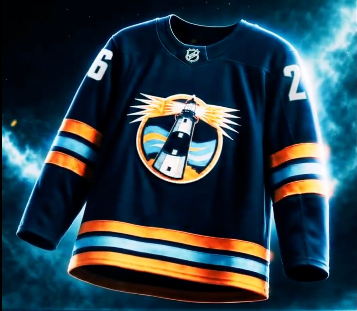
via the New York Islanders
The Catch: This Is a Concept, Not a Jersey Yet
Before anyone starts checking sizes, read the fine print on the announcement. What the Islanders unveiled is a design concept, not a finished sweater, and it is targeted for the 2027-28 season, not this one. The team said plainly that it will now work with Fanatics to develop the final jersey and that it is still reading fan suggestions submitted during the voting to "refine and enhance" the design before it goes to production.
So the crest, the colors and the striping logic are locked in as a direction. The exact shade of navy, the collar treatment, the shoulder patches and the number font are all still moving. Expect the version that hits the ice at UBS Arena to look like this jersey's better-dressed cousin rather than a pixel-for-pixel match.
What the Navy Lighthouse Actually Looks Like
The design is built around one idea, and it commits to it completely.
- The crest. A circular medallion with the Fire Island Light standing dead center, beams firing out both sides in orange and white, and stylized waves running behind it in two blues. It reads as a badge rather than a wordmark, which is exactly what a third jersey crest should do.
- The body. Navy, deeper than the Islanders' usual royal, which is what separates this from just being the home sweater with a new logo on it.
- The striping. Orange, sky blue and white bands on both sleeves and a wider stacked set across the hem. Sky blue is the piece that matters most here. It is the color the Islanders have flirted with for years and never fully committed to.
- The numbers. White on the shoulders, no outline, which is the right restraint on a jersey already carrying a busy crest.
Our Grade: A-
This was the one we wanted, and the fans got it right.
The lighthouse is the single best piece of iconography the Islanders have that is not the map-and-stick primary, and it is the rare alternate crest that is genuinely about the place the team plays rather than a font exercise. Long Island is defined by its coastline. A lighthouse throwing light across water is not a gimmick, it is the most honest logo the franchise could put on a chest.
The navy is the smart call too. A royal blue version of this would have been a slightly different home sweater. Going darker gives the orange somewhere to live and makes the sky blue read as a real accent instead of a smudge.
What keeps it off an A: the crest is doing a lot of work in a small circle. Beams, waves, a two-tone tower, an outer ring and a horizon line is five ideas stacked inside one badge, and at ice level from the 300 level it is going to compress into an orange blob with something dark in the middle. This is the exact thing the Fanatics refinement pass should fix. Thicker line weight, fewer beams, and let the tower breathe.
The other half-step down is the striping density. Two bands on each sleeve plus a three-color stack on the hem is a lot of horizontal information on a jersey that already has a busy crest. Pick one place to be loud.
Fix the crest legibility and this is an A. As it stands, it is the best fan-voted uniform decision any league has run, mostly because the Islanders gave fans a genuinely good set of options to choose between.
Why This Vote Matters Beyond Long Island
Teams have asked fans to name jerseys before. Teams have run polls on which throwback to bring back. No NHL team had handed over the actual design direction until now.
Islanders president of business operations Kelly Cheeseman framed it as breaking down a barrier, giving fans a direct voice in shaping the look. The winning designer gets a signed jersey and tickets to the first game the uniform is worn in.
The number worth remembering is 80,490. That is how many submissions came in. For a franchise that has spent a decade arguing with itself about fisherman logos and wordmark sweaters, getting eighty thousand people to actively design for you is a bigger win than any single jersey.
Every other team's marketing department watched this. Expect at least three more of these next summer.
Frequently Asked Questions
What is the Islanders' new third jersey?
It is called the Navy Lighthouse: a navy sweater with a circular lighthouse crest and orange, sky blue and white striping on the sleeves and hem. Fans voted it in from a field that started with 80,490 submissions.
When will the Islanders wear the Navy Lighthouse jersey?
The Islanders are targeting the 2027-28 season for its on-ice debut at UBS Arena. It will not be worn in 2026-27.
Is the Navy Lighthouse the final Islanders jersey design?
No. The Islanders unveiled it as a design concept. The team will work with Fanatics on the production version and has said it is still incorporating fan feedback, so expect refinements to the crest and trim before it is finalized.
Has an NHL team ever let fans vote on a uniform before?
Not like this. Fan polls on throwbacks and jersey names have happened, but the Islanders are the first NHL franchise to let a fan vote determine the design direction of a new uniform.
Can you buy the Islanders Navy Lighthouse jersey?
Not yet. Because the design is still being finalized with Fanatics for a 2027-28 debut, there is no retail version on sale.
The Bottom Line
The Islanders ran the boldest uniform experiment in the league and it worked. The Navy Lighthouse is the right crest, on the right base color, with the right accents, and it beat a real field rather than winning by default. We grade it an A-, with the only real work left being crest legibility at distance, which is exactly what the Fanatics refinement pass is for. Just be clear on the timeline: this is a 2027-28 jersey, and what you are looking at today is the concept, not the sweater.