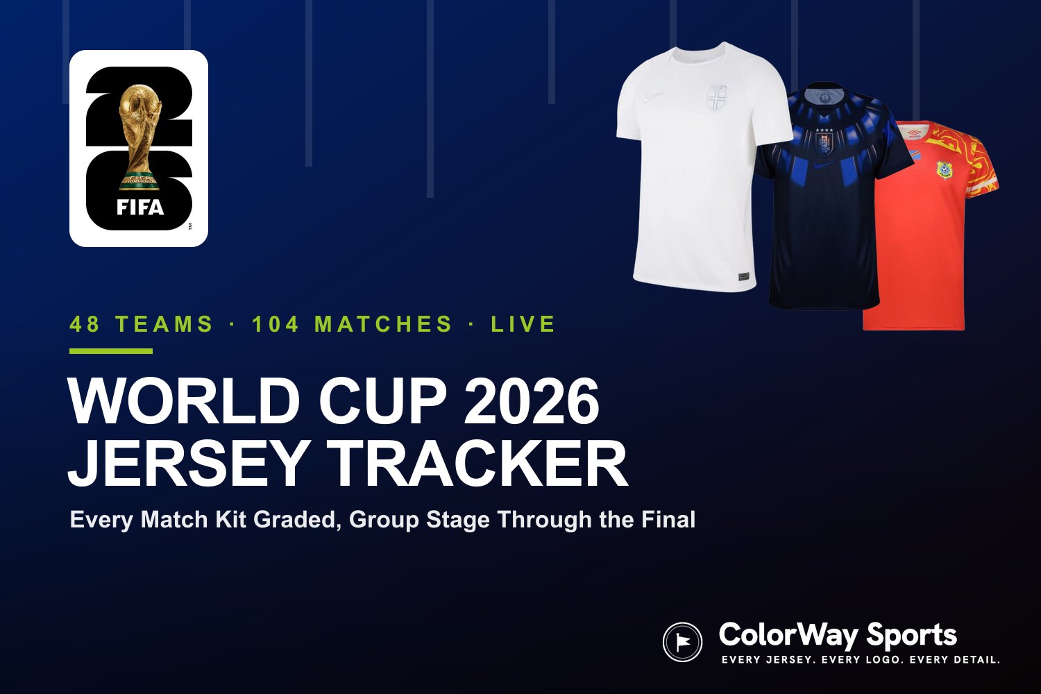
ColorWay Sports
Olympique de Marseille just changed their logo for the first time in over two decades, and the result is about as minimal as it gets. The new crest was unveiled on April 8, 2026, at a gala dinner in Marseille, ending the 22-year run of one of the most recognizable badges in European football.
The New Design
via Olympique de Marseille
The new logo takes the classic "O" and "M" monogram and strips it down to its most basic form. The M is now fully enclosed inside a circle with a thin double border, and the sharp overlapping edges from the old crest have been replaced by soft, rounded, almost bubble-like contours. The entire thing is rendered in a single shade of blue that the club is calling "Marseille Blue."
According to the club, the design pulls from several eras of their visual history. The white border references the 1973 logo. The structure of the M comes from the original 1899 mark. The curves are inspired by the 1986 logo. And the double border is a nod to the 1993 version. On paper, that sounds like a thoughtful evolution. In practice, it looks like a logo that could be on the hood of a European sedan.
Old Logo vs. New Logo
Former Olympique de Marseille crest
The old logo had character. The M had sharp, angular points that jutted out beyond the circle. It had a gold star above it representing their 1993 Champions League title. It had "DROIT AU BUT" written below it. It felt like a football club crest. It had texture, history, and personality.
The new logo has none of that. The gold is completely gone. The motto is gone. The star is gone. The sharp edges that gave the old M its aggressive, athletic feel have been smoothed out into something that looks more like a lifestyle brand than a sports club. We get the move toward simplicity, but there is a line between clean and empty, and this one feels like it crossed it.
The Volkswagen Problem
Marseille's new logo (left) vs. Volkswagen's current logo (right)
We have to talk about the elephant in the room. The new Marseille logo looks a lot like a car brand. Put it next to the current Volkswagen logo and the similarities are hard to ignore. Both are monogram letters inside a circle with a thin border. Both use a flat, single-color design with no gradients or depth. Both prioritize clean geometry over personality. If you saw the new OM logo on a car grill, you would not question it for a second.
It also shares DNA with the Moncler logo. That same minimal, fashion-forward approach where the mark is meant to feel premium and versatile across merchandise, social media, and partnerships. That is clearly what Marseille is going for here, and we understand the business logic behind it. But a football club crest is not a luxury fashion house. Fans do not want their badge to look like it belongs on a puffer jacket.
The Moncler logo shares a similar minimal philosophy
Part of a Bigger Trend
Marseille is not the first club to go this route, and they will not be the last. We have seen this across European football over the past few years. Juventus went minimal with their "J" logo back in 2017. Inter Milan simplified their crest in 2021. Even outside of football, teams and brands everywhere are flattening their logos, dropping details, and chasing that clean, scalable look that works on an app icon as well as it does on a stadium facade.
The logic makes sense from a branding perspective. Simpler logos are easier to reproduce across digital platforms, merchandise, and partnerships. But the trade-off is that you lose the things that made the crest feel like it belonged to a specific club with a specific history. When every logo starts looking like a tech startup, they all start blending together.
The 3D Treatment
via Olympique de Marseille
We will say this: the 3D chrome renderings the club released look really good. The logo takes on a glass-like, almost liquid quality that gives it far more depth and presence than the flat 2D version. If the club leans into these kinds of treatments for merchandise and stadium branding, the logo could end up looking much better in real-world applications than it does as a flat graphic on a screen. That is where the design might win people over.
Our Grade
We like this logo. We do not love it. The simplicity is well-executed and the "Marseille Blue" color is strong. The construction is clean and it will look good on kits, social media, and everything else the club needs it for. But the loss of the gold star, the motto, and the sharp edges of the old M takes away too much of what made the Marseille crest feel like a football badge. It leans too far into corporate minimalism and not far enough into the history and identity of one of France's biggest clubs. We will see how it grows on people over time, but right now it feels like OM traded personality for versatility.
Overall Grade
B-
via Olympique de Marseille