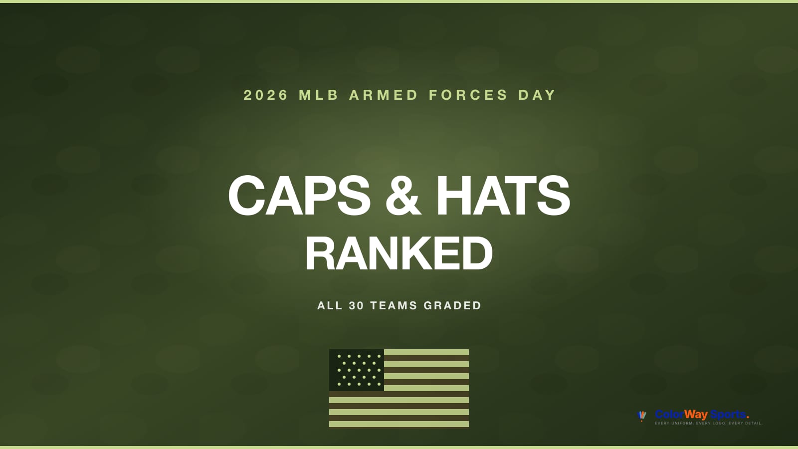
All 30 MLB teams wore service-inspired caps and hats by New Era over Armed Forces Day weekend, Friday May 15 through Sunday May 17. Every cap shares the same template: olive green crown, visor, and button with each team's primary cap logo recolored in lighter green, darker green, and white. The right side carries the American flag patch positioned with the stars up front to read like the flag is flying forward, and the under-visor is black with six stars for the six branches of the U.S. military. The inner crown is a military camouflage pattern. Toronto's cap swaps the flag patch and six stars for three maple leaves to match the Canadian context. We ranked all 30 by how cleanly the team's primary cap logo translates to the monochromatic olive-green palette.
Shop the Collection
Memorial Day Weekend sale at Fanatics: 30% off regular price plus markdowns through Monday, May 25. Code MEMORIAL.
Shop Armed Forces Day Caps on FanaticsThe Grading Framework
Every cap runs the same olive-green-on-olive-green template. The variable is how the team's primary cap logo holds up when its color identity is stripped out and rebuilt in three shades of green and white. Simple monograms with clean silhouettes get rewarded. Complex multi-element logos that lean on team-specific colors take the biggest hit when those colors are removed. Letter grades, not numbers. We pair "cap" and "hat" throughout for the way fans search.
S Tier (A+ to A): Logos Built for Monochrome
These caps and hats lead the league because the primary logo is a clean, iconic silhouette that the olive-green palette frames perfectly.
1. New York Yankees (A+) — The interlocking NY is the most recognizable cap logo in sports and white-on-olive is one of the cleanest looks the Yankees have ever had on a non-navy crown. A first-ballot Armed Forces Day cap.
2. Detroit Tigers (A+) — The Old English D is a typography masterclass and the monochrome green treatment lets the serifs and counters carry the cap on their own. Stronger than most of Detroit's alternate caps for the rest of the season.
3. Los Angeles Dodgers (A) — The interlocking LA is the cleanest two-letter monogram in baseball and the olive green palette reads sharp on the Dodger Stadium broadcast. Memorial Day weekend sells these caps and hats by the trailer load.
4. Boston Red Sox (A) — The Boston B is built to translate. The simple block letter holds its silhouette in any color treatment and the olive green plus flag patch combination is the Fenway Park Memorial Day weekend uniform many fans expected MLB to keep before the league switched to poppy patches on the jerseys in 2019.
5. Chicago Cubs (A) — The wishbone C is one of the oldest cap logos in the league and the olive-and-white treatment showcases the negative space inside the C cleanly. Wrigleyville cap.
A Tier (A- to B+): Strong Silhouettes, Slight Trade-Offs
These cap and hat designs translate well but the team identity gives up a little of its primary color punch in the green-only treatment.
6. Chicago White Sox (A-) — The clean Sox wordmark is a beautiful monochrome cap on any palette and olive green plays nice with the black-and-white South Side identity.
7. San Francisco Giants (A-) — The interlocking SF carries cleanly and the orange-trim-not-needed reading actually works because Giants fans already buy alternate-color caps regularly.
8. Houston Astros (A-) — The star H sits well on any background. Olive green removes the navy-and-orange Astros palette but the star shape is the hook.
9. Seattle Mariners (B+) — The compass-S is one of the prettier multi-element cap logos in the league. The trident plus compass needle plus S translates better than most multi-element logos because every piece is line-based instead of fill-based.
10. Philadelphia Phillies (B+) — The script P stands on its own as a typography piece. The Phillies lose their famous red but the silhouette of the P carries the cap.
11. Kansas City Royals (B+) — The KC monogram is one of the most underrated cap logos in baseball and the white-on-olive treatment is going to make a lot of casual fans want this one.
12. St. Louis Cardinals (B) — Cardinals' birds-on-bat alternate would be a disaster in monochrome, but if New Era used the StL interlock the cap reads strong. The StL is a clean typography move that the olive palette frames cleanly.
13. Oakland / Sacramento Athletics (B) — The simple A holds together and the green-on-green is actually a nod to the A's traditional kelly-green identity even when the green tones have been shifted to olive.
B Tier (B- to C+): Functional, Identity-Neutral
These cap designs translate to monochrome cleanly enough but the team identity goes generic when the primary palette is replaced with olive green.
14. Cleveland Guardians (B) — The block C is a clean monogram. Cleveland's overall identity is still settling post-rebrand but the C alone holds the cap.
15. Texas Rangers (B-) — The interlock T is a fine letter mark, the loss of the Texas red-white-blue is the cost. Memorial Day weekend home games in Arlington still move this cap.
16. Atlanta Braves (B-) — The A with the tomahawk is a clean silhouette. The navy-and-red Atlanta identity goes generic in monochrome but the typography carries.
17. Pittsburgh Pirates (B-) — The P is one of the most beautiful single-letter cap logos in the league but black-and-gold Pittsburgh loses a lot in green-and-white. Cap reads fine, identity not so much.
18. Minnesota Twins (C+) — The TC monogram works at any size but red-and-navy Minnesota gives up a lot of its visual identity when the colors get stripped.
19. Washington Nationals (C+) — The curly W is the Nationals' best asset. Stripped of the red-and-navy palette the curly W still reads but the cap feels Generic Olive instead of Nats Olive.
20. New York Mets (C+) — Mets fans will buy this regardless of how it grades. The NY interlock isn't as universally readable in monochrome as the Yankees version, but the cap fan base shows up every weekend.
21. San Diego Padres (C+) — The SD interlock is one of the cleaner two-letter monograms in baseball but Padres brown-and-gold is the identity. Stripped to olive, the cap goes generic.
22. Cincinnati Reds (C+) — The wishbone C is similar to the Cubs version with the Cincinnati twist. Without the red identity the cap loses the entire reason Reds fans love the brand. Cleanest typography in the group, biggest color sacrifice.
C Tier (C to D+): Complex Logos That Don't Translate
These caps and hats fight the green-only template because the team's primary cap logo leans on color-specific identity or multi-element compositions.
23. Toronto Blue Jays (C) — The Blue Jays bird is a multi-color asset and the olive green strip-out flattens the personality. Toronto does get the unique three-maple-leaves treatment under the visor instead of the six-stars treatment U.S. team caps carry, which is the best detail on any cap in the collection.
24. Colorado Rockies (C) — The interlock CR is functional in any color but Rockies purple is half the brand. Without it, the cap is a generic monogram on olive green.
25. Miami Marlins (C-) — Miami's M is built around teal-and-orange Miami Vice energy. Olive green is the opposite of the Miami identity. Cap reads clean but it's a different team.
26. Los Angeles Angels (C-) — The A with the halo on top is a great cap logo. Stripped to olive green and white, the halo loses its silver shimmer and the cap feels generic.
27. Tampa Bay Rays (C-) — The TB sunburst depends on the yellow-and-blue radial pattern. Olive green removes the warmth and the cap goes Confederate-gray-flat. Lowest-grade Florida cap in the collection.
28. Milwaukee Brewers (D+) — Brewers wear the M ball-in-glove style as their primary cap logo, one of the most clever cap logos in sports because the M is also a baseball glove. The yellow-and-blue color treatment is the punch line. Olive green removes the punch line and the cap reads like a generic M.
29. Baltimore Orioles (D+) — The cartoon ornithologically-correct Oriole is a multi-element, multi-color logo. Olive green flattens every layer and the cap reads like a vague bird shape. Worst translation in the collection.
30. Arizona Diamondbacks (D+) — The D-snake is one of the cleverest cap logos in the modern game but it depends on the sedona red and contrast for legibility. Olive green removes the contrast and the snake fades into the D.
Special Detail: Toronto's Maple Leaves Under-Visor
Toronto's cap is the only one in the 30-team collection that breaks from the U.S. flag-on-the-side, six-stars-under-the-visor template. The Blue Jays carry three maple leaves under the visor instead of the six branch stars and skip the American flag patch on the side. This is the most thoughtful Canadian-context tribute detail in any MLB cross-league cap collection we've graded this year. The maple leaves choice is a B+ design move even though the front-of-cap logo grades a C.
The Bottom Line on the 2026 MLB Armed Forces Day Caps
The 2026 collection is one of the cleanest MLB tribute cap drops in years because the olive-on-olive template gives the strong typography teams a real showcase and exposes the multi-color identity teams as needing their primary palette. Yankees, Tigers, Dodgers, Red Sox, and Cubs lead the league because the simple silhouettes carry the monochrome treatment effortlessly. The Orioles, Diamondbacks, and Brewers fall to the bottom because their primary cap logos depend on color-specific identity that the olive-green strip-out flattens. The American flag patch on the side and the six branch stars under the visor are the best collection-wide design details MLB has shipped on a tribute cap in years. Toronto's three-maple-leaves Canadian-context treatment is the single best individual design choice in the entire 30-cap collection. Caps and hats are on sale at Fanatics through Memorial Day weekend with the MEMORIAL discount code.
FAQ: 2026 MLB Armed Forces Day Caps
When did MLB players wear the 2026 Armed Forces Day caps? All 30 MLB teams wore the special olive green Armed Forces Day caps and hats on Friday, May 15, Saturday, May 16 (Armed Forces Day), and Sunday, May 17, 2026. The caps are now available for fans through Fanatics, Lids, MLB Shop, and New Era directly.
What do the 2026 MLB Armed Forces Day caps look like? Every cap shares the same template: olive green crown, visor, and button with each team's primary cap logo recolored in lighter green, darker green, and white. The right side carries an American flag patch and the under-visor is black with six stars representing the six branches of the U.S. military (Army, Navy, Air Force, Marines, Coast Guard, Space Force). The inner crown has a military camouflage pattern. The Toronto Blue Jays cap swaps the flag and six stars for three maple leaves to honor the Canadian context.
Do MLB players still wear special caps on Memorial Day? No. MLB shifted the on-field service cap to Armed Forces Day weekend in 2019. On Memorial Day, all 30 teams wear a red poppy patch with "Lest We Forget" on the primary jersey instead of a special cap. The Stars and Stripes cap drop now lands on July 4th instead of Memorial Day.
Where can I buy the 2026 MLB Armed Forces Day caps? Caps are available at Fanatics, Lids, MLB Shop, Dick's Sporting Goods, and New Era Cap directly. Fanatics is running a Memorial Day Weekend sale at 30% off with the code MEMORIAL through Monday, May 25, 2026, which is the deepest discount we have seen on this collection so far.
Does MLB donate the proceeds from Armed Forces Day caps to veterans? Yes. 100% of the licensed royalties from the sale of Armed Forces Day On-Field Authentic Collection apparel is donated to MLB Charities to support military programs. 2026 donations benefit Blue Star Families, SkyHope, Tragedy Assistance Program for Survivors (TAPS), Travis Manion Foundation, United Service Organizations (USO), and Wounded Warrior Project.
Where can I find your other 2026 cap and uniform rankings? Our other recent MLB cap and uniform breakdowns are linked across the site. For NHL and NBA playoff jersey grades, see the 2026 NHL Conference Finals Jersey Tracker and the 2026 NBA Conference Finals Jersey Tracker.