📸 via @ZachCohenFB on X
We wanted to love these. We really did. After nearly a decade of Nike refusing to make NBA Christmas Day jerseys, the news that they were finally bringing them back was one of the best uniform stories of the year. The Adidas Christmas jerseys from 2012 to 2016 were some of the most iconic alternate uniforms in NBA history. Christmas Day felt like an event, and the jerseys were a huge part of that.
Now eight Nike designs have leaked, and we do not like them at all.
The Problem
Every leaked jersey has a black base with some kind of neon, aurora-style graphic baked into the fabric. The logos and wordmarks are minimized and centered. The graphics are supposed to be unique to each city, but the overall effect is the same across all eight teams: dark, busy, and hard to read. They look like concept art for a video game, not basketball jerseys that will be worn on the most-watched regular season day of the year.
There are no snowflakes. No sweater patterns. No holiday typography. Nothing that says Christmas. The only thing connecting these to the holiday is the patch on the back of the jersey, which we do appreciate. At least that signifies it is an important game. But the actual design? It does not feel like Christmas at all.
What We See in the Leaks
All eight teams share the same template: black base, team-colored graphics woven into the jersey, minimized branding. Here is the full list:
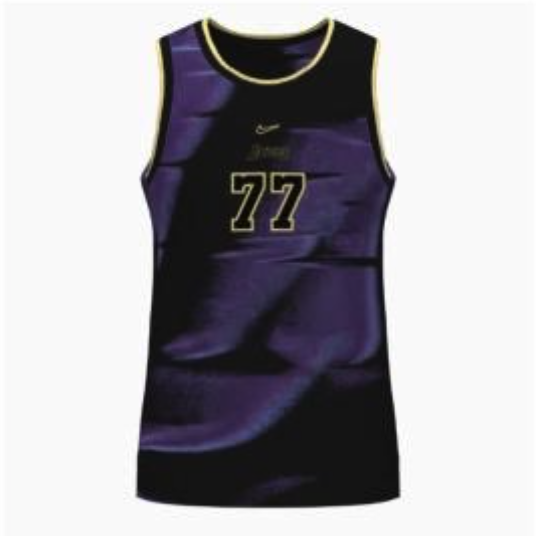
- Los Angeles Lakers -- Black and deep purple with a satin or liquid metal texture. Gold trim on the collar and numbers. Of the eight, this is probably the least bad because the purple texture actually looks premium. But it still does not look like a Christmas jersey.
- Boston Celtics -- Black with glowing neon green aurora shapes. Feels like a thermal heatmap, not a basketball jersey.
- New York Knicks -- Black with blue and orange accents. The Knicks colors pop on black, but that is true of any black jersey. Nothing special here.
- Golden State Warriors -- Black with an asymmetrical Bay Bridge-inspired pattern. The concept is interesting, but the execution just looks busy.
- Philadelphia 76ers -- Black with glowing neon-red stars wrapping around the sides. Could look like a costume on the court.
- Sacramento Kings -- Black with purple neon gradient rising from the hem, inspired by the Light the Beam tradition. The concept is clever, but the jersey itself still just looks dark and hard to read.
- Atlanta Hawks -- Black with hawk feather brushstrokes in blue and neon green. Those are not even the Hawks' colors.
- Detroit Pistons -- Black with teal accents and hot rod flames from the waist. Motor City concept, but flames on a basketball jersey is a choice.
Where Nike Went Wrong
The Adidas Christmas jerseys worked because they were simple and they felt like an event. The 2012-13 monochromatic designs were the best of the bunch. Every team got a single bold color with a clean wordmark. They were immediately recognizable, they looked incredible on TV, and they actually felt like Christmas.
That is what a Christmas jersey should look like. Clean, simple, special. You knew instantly that you were watching a Christmas Day game. These new Nike designs? You would have no idea. They look like any other City Edition or Statement jersey that gets worn on a random Tuesday in January.
Nike had nine years to study what worked and come back with something better. Instead, they went in the complete opposite direction. Where Adidas went clean, Nike went busy. Where Adidas used holiday themes, Nike used generic city branding. Where Adidas made jerseys you wanted to buy, Nike made jerseys that look like tech demos.
The One Thing They Got Right
The Christmas Day patch on the back of the jersey is a good touch. It is a small detail, but it matters. When you are watching a game on Christmas and you see that patch, you know it is a big deal. That tradition should have never gone away, and we are glad it is back regardless of what the rest of the jersey looks like.
Also, credit to Nike for at least trying. They could have kept ignoring the tradition. They chose to bring it back, and even though we think the execution missed badly, we respect the effort. But effort alone does not earn a good grade.
The Lakers on Christmas
The Lakers always wear white at home for Christmas, and we have always loved that. The white jersey under the Staples Center lights on Christmas Day is one of the cleanest looks in the NBA. With these new dark jerseys, that tradition is going to look completely different.
The white Lakers Christmas jersey has always had a subtle snowflake or holiday detail that you can barely see unless you are looking for it. That is how you do a Christmas jersey. Subtle, classy, understated. These new leaked designs are the exact opposite of that.
The Grade
We are giving the 2026 Nike NBA Christmas jersey collection a D+. We appreciate that Christmas jerseys are back. We appreciate the patch. We appreciate that Nike tried something different. But these designs are not good. They are busy, they are dark, they do not feel like Christmas, and they do not feel like an upgrade over the Adidas era in any way. Nike had a layup and they missed it.
The Adidas era is still the gold standard for NBA Christmas Day uniforms, and it is not even close. But since these are happening whether we like it or not, we ranked all eight individually below.
Individual Rankings
- Detroit Pistons: A -- The flames and turquoise piping make this the clear winner. Full Review
- Atlanta Hawks: A- -- The most colorful of the bunch, and it works. Full Review
- Boston Celtics: B+ -- Neon green on black is actually pretty good for this concept. Full Review
- New York Knicks: B+ -- The lightest design of the collection, which helps it stand out. Full Review
- Philadelphia 76ers: B -- The glowing stars are nice but we want more color. Full Review
- Golden State Warriors: B -- Gold and black looks fine but the design is boring. Full Review
- Sacramento Kings: B- -- Simple and not bad, but nothing special. Full Review
- Los Angeles Lakers: C -- Way too dark for the purple and gold. Needs more color. Full Review