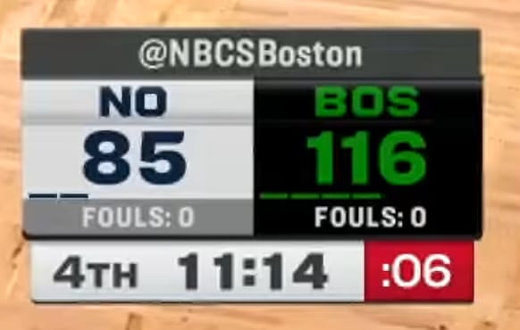
The NBC Sports Boston scorebug during a 2026 Celtics broadcast. Screenshot via YouTube.
NBC Sports runs four regional NBA broadcasts across the country, covering the Boston Celtics, Golden State Warriors, Philadelphia 76ers, and Sacramento Kings. All four channels use the same scorebug template for the 2026 season, just swapping in team colors and logos for each market. It is one of those designs that is easy to overlook because it does not try to do anything flashy. It just works.
The template itself is compact and well-organized. Team logos sit on the left side of each row with the team abbreviation and score next to them. The quarter and game clock are displayed cleanly on the right side. The color blocking for each team row gives it enough visual identity without getting too busy. Compared to something like the FanDuel Sports Network template that a bunch of other NBA teams use, the NBC Sports version is noticeably cleaner. The FanDuel bug tends to feel a bit more cramped and generic, while this one gives each element room to breathe.
What we like most about this design is the consistency. Whether you are watching a Celtics game on NBC Sports Boston or a Kings game on NBC Sports California, the experience feels the same. That kind of unified branding across regional networks is something a lot of other broadcast groups struggle with. It also helps that the template is simple enough to let each team's colors do the talking without any unnecessary gradients or effects getting in the way.
Boston Celtics (NBC Sports Boston)
Screenshot via YouTube.
The Celtics version uses the classic green-and-white color scheme, and it might be the best-looking version of the four. The green pops nicely against the darker elements of the bug, and the shamrock logo is instantly recognizable even at a small size.
Golden State Warriors (NBC Sports Bay Area)
Screenshot via YouTube.
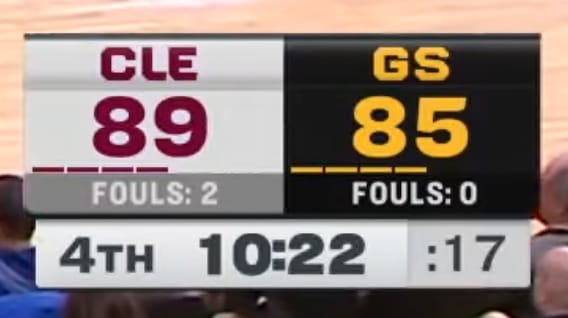
The Warriors version brings in that royal blue and gold combination. The blue row reads well on screen and the gold accents give it just enough contrast to feel distinct from the other NBC Sports markets.
Philadelphia 76ers (NBC Sports Philadelphia)
Screenshot via YouTube.
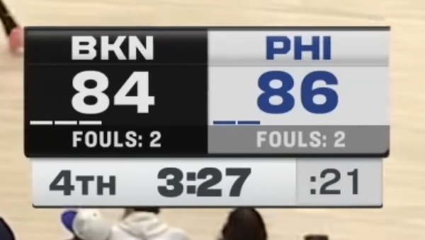
The 76ers version goes with the blue and red treatment. Philadelphia's color palette is one of the more patriotic in the league, and it translates well into this template without looking too busy. The bell logo is clean at the scorebug scale.
Sacramento Kings (NBC Sports California)
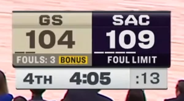
Screenshot via YouTube.
The Kings version uses that purple and gray combination that Sacramento has been rocking for the past few seasons. The purple reads a bit darker on screen than the other team colors in this template, but it still holds up well and keeps the scorebug feeling cohesive.
The Grade
The NBC Sports NBA scorebug template gets a B+ from us. It is clean, consistent, and does exactly what a local broadcast scorebug should do. The unified template across four different markets is a smart approach, and the design gives each team's branding enough room to shine. It does not break any new ground, and we would not call it one of the best scorebugs in the league, but it is a solid, well-executed design that does not get in the way of the game. Compared to the FanDuel Sports Network template, this one wins easily.
Screenshots via YouTube