Netflix aired its first MLB game and brought a new scorebug with it. For a streaming platform stepping into live baseball for the first time, they handled it well.
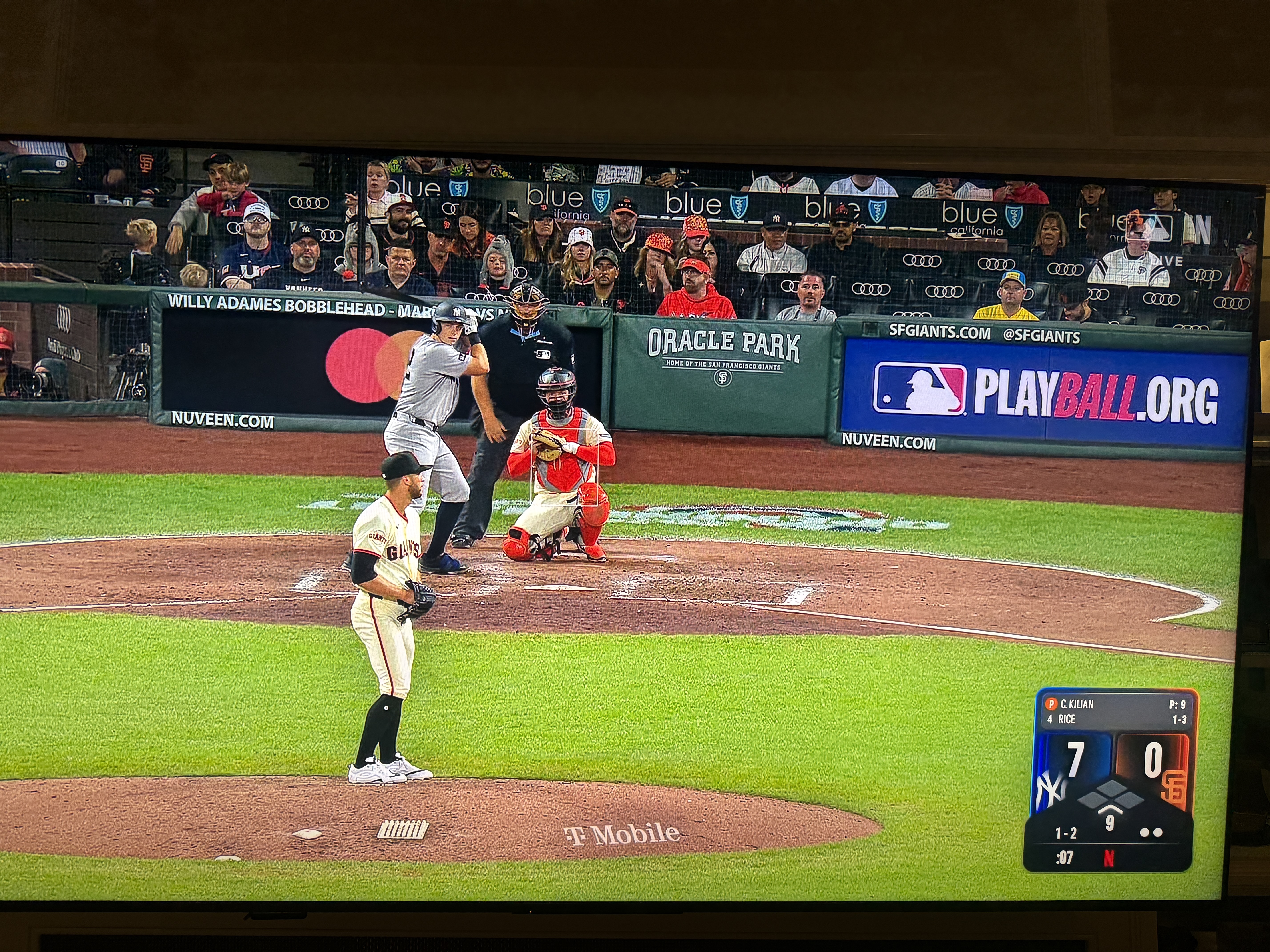
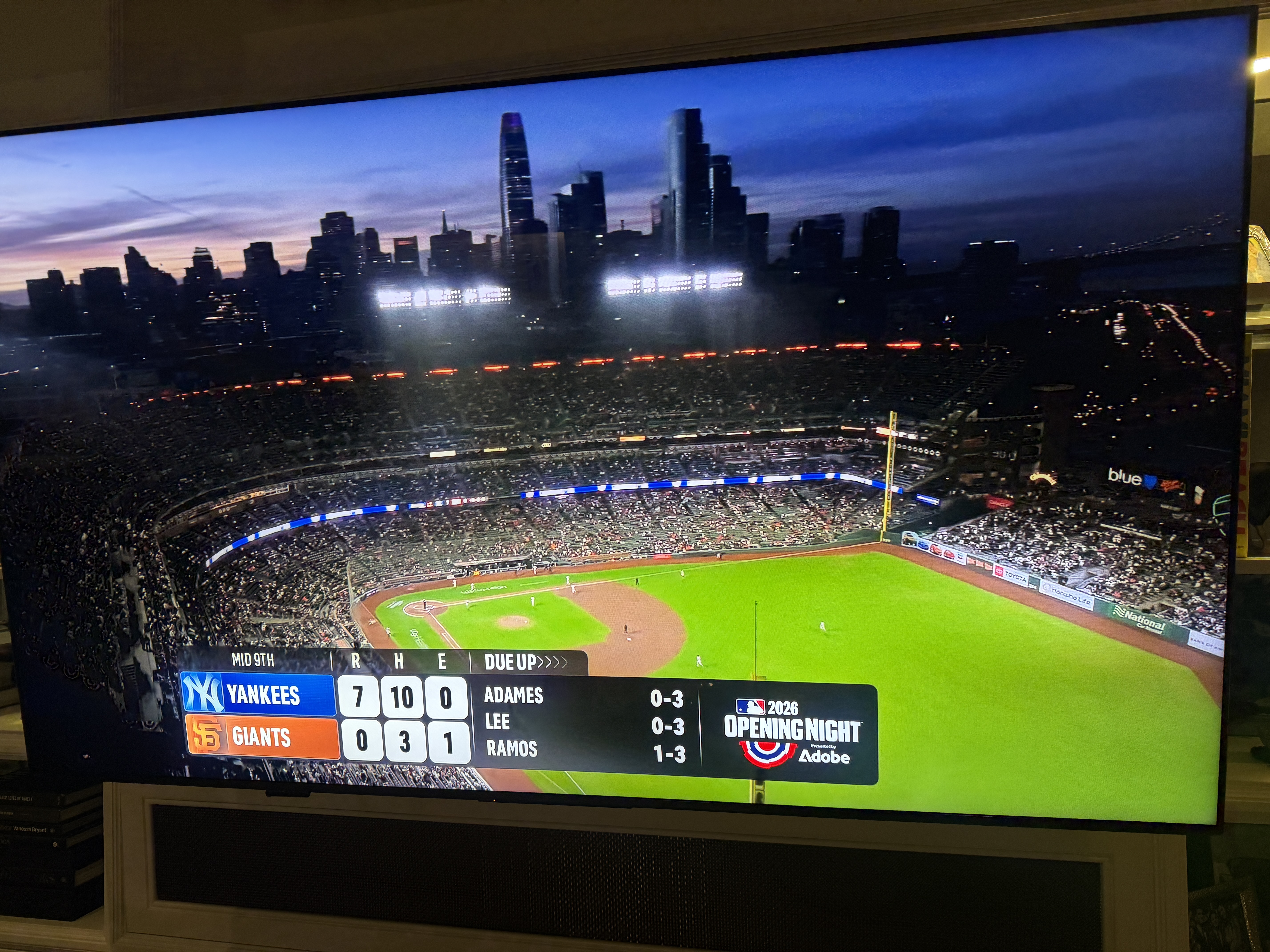
Netflix MLB scorebug
The shape is the first thing you notice. It's more rounded, more app-like, which makes sense for a platform that lives on your phone and TV. It doesn't look like a traditional broadcast scorebug, and that's kind of the point. It feels current without overdoing it.
The diamond graphic on the bottom keeps the base-runner info integrated without cluttering the layout. The Netflix logo sits in the top right with a "Live" tag next to it. You know what you're watching and who's broadcasting it. No confusion.
The Transition Graphic
Netflix transition graphic heading into commercial break
The commercial break transition carries the same design language. Minimal Netflix branding on the bottom, consistent with the in-game look. Nothing over the top. Just cohesive. You can tell someone actually thought about making the whole broadcast package feel like one thing, not a bunch of separate graphics thrown together.
The Verdict
It's not going to change anyone's life, but for a first attempt at live baseball, Netflix kept it simple and got it right. The scorebug looks like it belongs on a modern streaming platform. It's easy to read, it stays out of the way, and it doesn't try to reinvent baseball broadcasting. Sometimes that's all you need.
Grade: B+