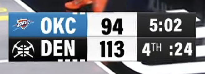
Screenshot via YouTube
The Denver Nuggets local broadcast scorebug on Altitude TV for the 2026 NBA season is about as straightforward as it gets. It delivers the information you need during a game without any design flair or visual identity to make it stand out. For a team with a color palette as strong as navy, gold, and light blue, there is a lot of untapped potential here.
The layout is functional. Logos, team abbreviations, scores, and the game clock are all positioned where you expect them. Nothing is hard to find, and readability is solid even on smaller screens. The Nuggets' navy and gold colors are present but they do not do much to elevate the design beyond the basics. It looks like a template that could belong to any team with a simple color adjustment.
The biggest issue with this scorebug is that it is boring. Denver has one of the more distinctive color schemes in the NBA, and the broadcast graphics do almost nothing with it. There are no subtle design touches, no creative typography choices, and no use of the Nuggets' skyline or mountain motifs that could tie the scorebug to the city. It is purely utilitarian, and while that is not the worst thing in the world, it is a missed opportunity when other teams around the league are putting real effort into their broadcast presentation.
The Altitude branding is present but does not add visual clutter, which is a positive. The overall proportions of the scorebug are fine and it stays out of the way of the game action.
Grade: B-
Boring and straightforward with no real flair. It works, but the Nuggets' brand has way more to offer than what this scorebug delivers. A redesign with some personality would go a long way.