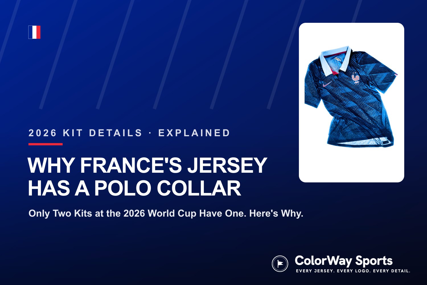
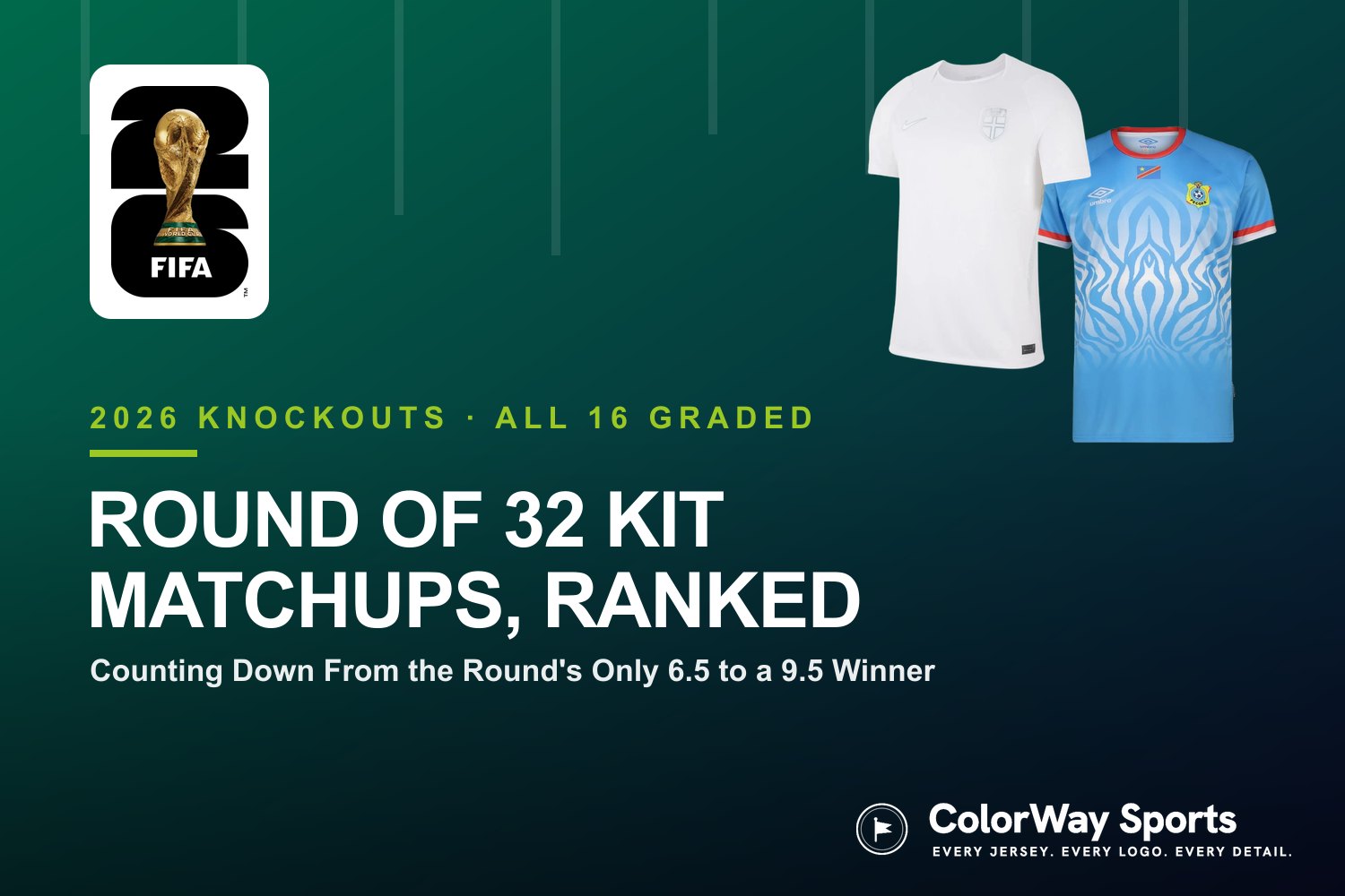
 Image courtesy of Adidas
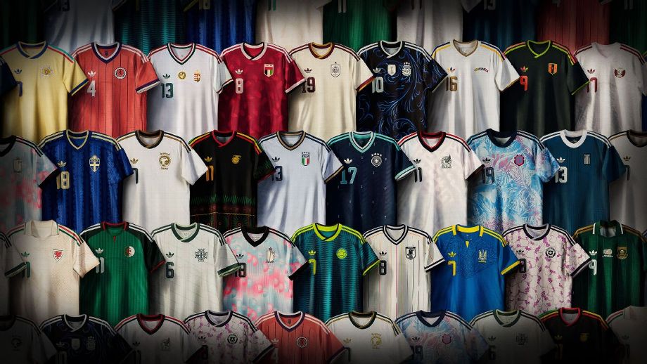
Adidas just dropped 25 new national team away kits ahead of the 2026 FIFA World Cup, and the retro trefoil logo is back on a World Cup pitch for the first time since the 1990s. Some of these kits are incredible. Others are forgettable. A couple are genuinely bad.
We ranked all 25 of them. That includes the 13 teams already qualified for the World Cup, 5 teams still fighting for a spot through European playoffs, and 7 teams that won't be in the tournament at all.
Here's our ranking from worst to best.
Want to grab one? Shop the full Adidas 2026 World Cup collection on Amazon or at adidas.com.
25. Qatar: F
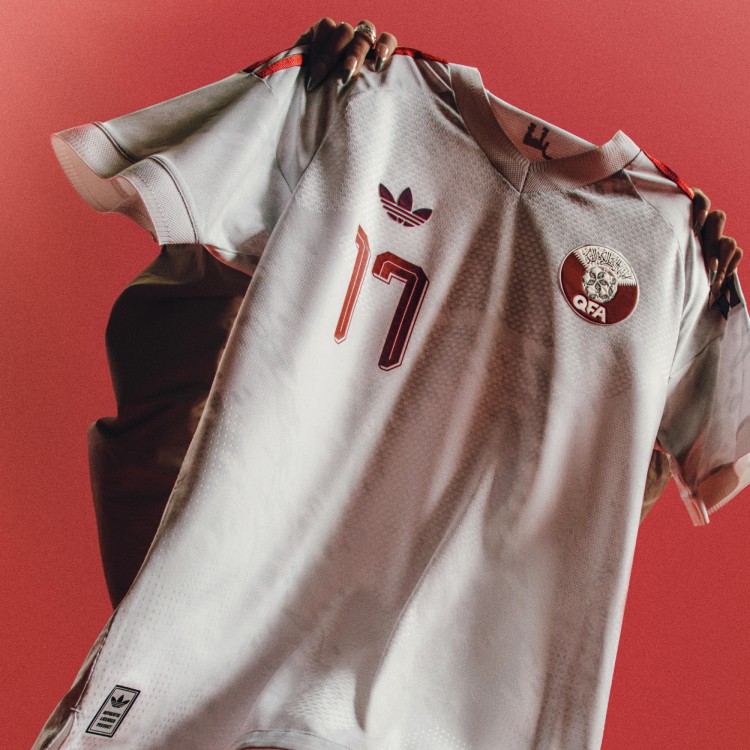 Image courtesy of Adidas
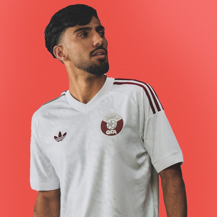 Image courtesy of Adidas
There's just nothing here. White kit, maroon accents, no pattern, no personality. This is the most boring away kit in the entire batch. It looks like a plain training top you'd grab off a clearance rack. For a country that just hosted the last World Cup, you'd expect more effort than this. Easily our least favorite.
24. Algeria: D-
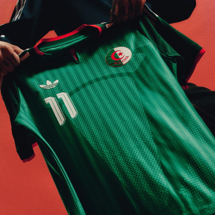 Image courtesy of Adidas
 Image courtesy of Adidas
The two-tone green is not it. The collar is strange, and the overall look just feels off. Algeria has had some solid kits in the past, but this one misses the mark. The red accents try to add some flair, but the whole thing feels like two different jerseys stitched together. Don't love it at all.
23. Saudi Arabia: C+
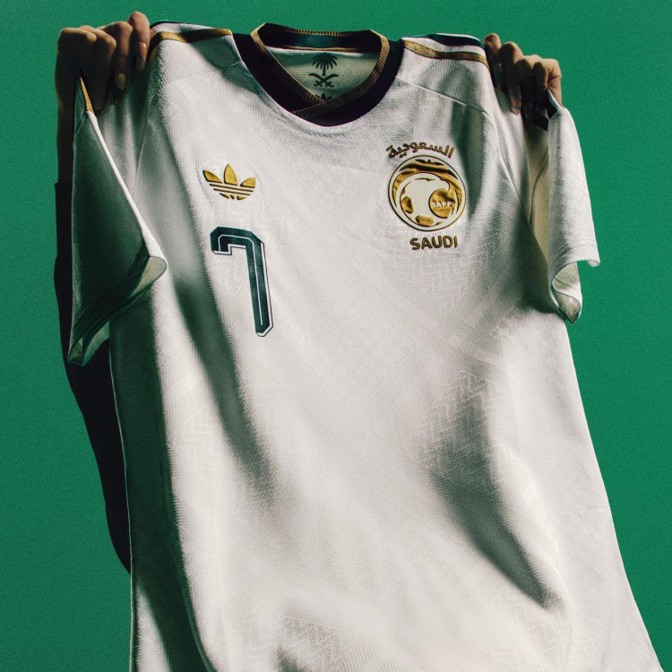 Image courtesy of Adidas
 Image courtesy of Adidas
This one's not bad, but it's not good either. The white base with gold and green detailing is clean, and the Arabic script on the crest is a nice touch. But there's just not enough color going on. It needs more personality. It's the definition of playing it safe.
22. Peru: B-
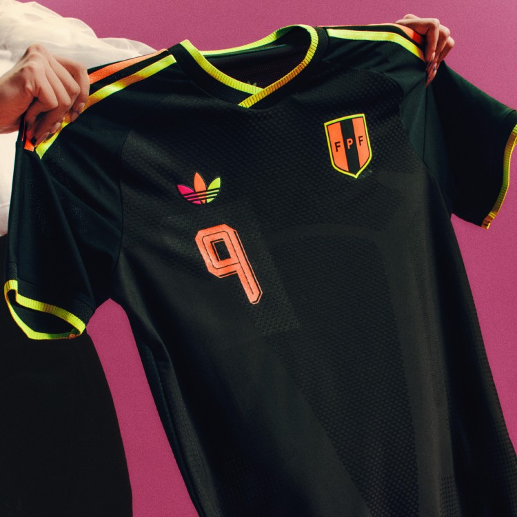 Image courtesy of Adidas
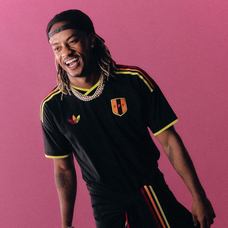 Image courtesy of Adidas
The colorful logo is the best part of this kit. The neon magenta, yellow, and orange on the trefoil and crest pop against the black base. But outside of those accent colors, the jersey itself is pretty plain. The details carry it, but the overall design doesn't do enough.
21. Greece: B-
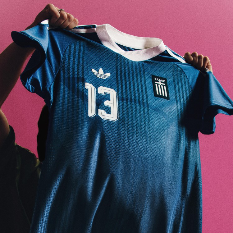 Image courtesy of Adidas
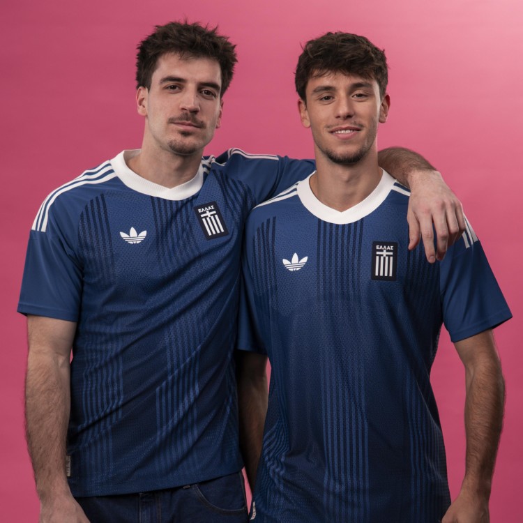 Image courtesy of Adidas
Very boring. The deep blue is a nice color and it pops, but the design just doesn't do enough. The subtle vertical stripes give it a little something, but it looks more like a good t-shirt than an actual World Cup kit. Not enough there.
20. Chile: B-
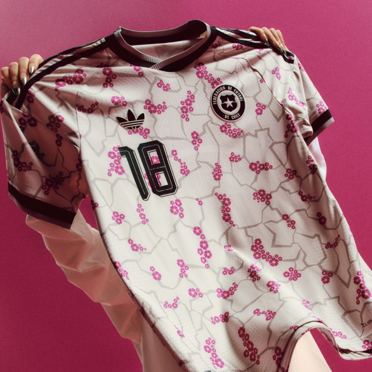 Image courtesy of Adidas
The flowering desert concept is cool on paper, but the pink floral pattern on a white base doesn't really translate to a soccer kit. It's unique, we'll give it that. But we're not in love with how it turned out.
19. Ukraine: B-
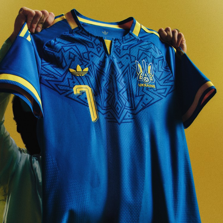 Image courtesy of Adidas
 Image courtesy of Adidas
Blue and yellow is always a strong color combo, and the geometric pattern on the chest has some nice detail. But we don't really like the specific shade of blue they went with here. It's not bad, just not great.
18. Italy: B-
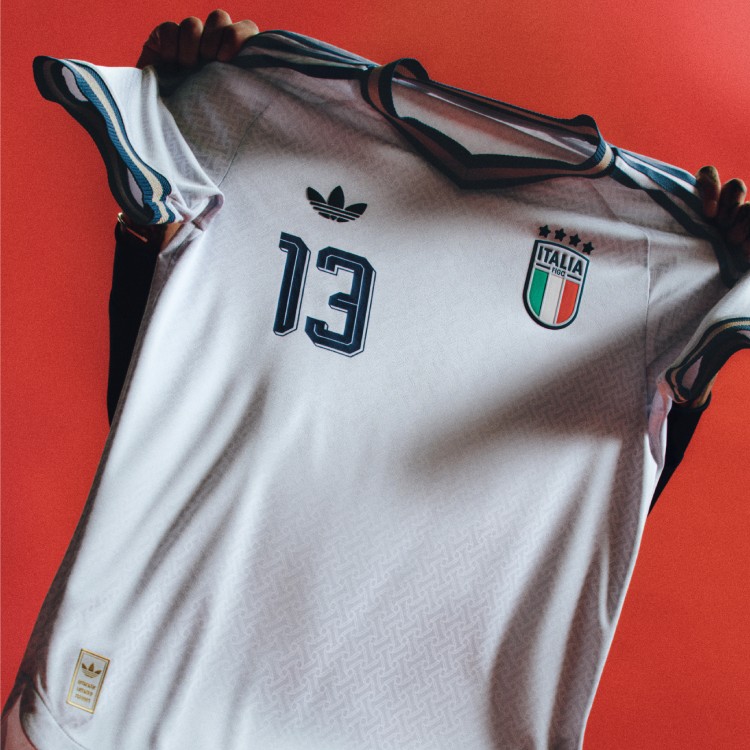 Image courtesy of Adidas
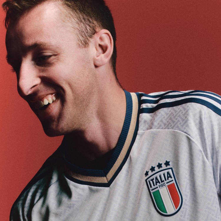 Image courtesy of Adidas
We like Italy's kit, we just don't love it. The subtle weave pattern on white is clean, and the blue and gold collar is a nice touch that nods to Italian tailoring. But for a team with Italy's design history, this feels like it could have been more. Still in the European playoffs, so they might not even get to wear it at the World Cup.
17. Colombia: B-
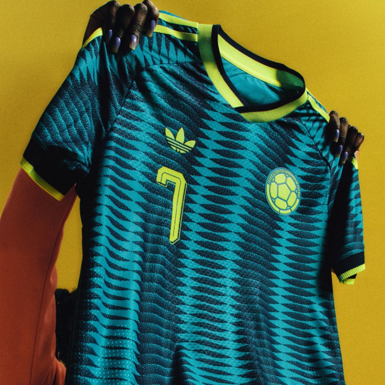 Image courtesy of Adidas
 Image courtesy of Adidas
They're okay. The teal wave pattern with the yellow trim has a cool vibe to it, but nothing about this kit really grabs you. Colombia has done better in the past, and this one just doesn't stand out enough in a batch of 25 kits.
16. Germany: B-
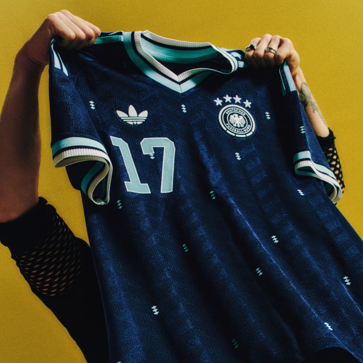 Image courtesy of Adidas
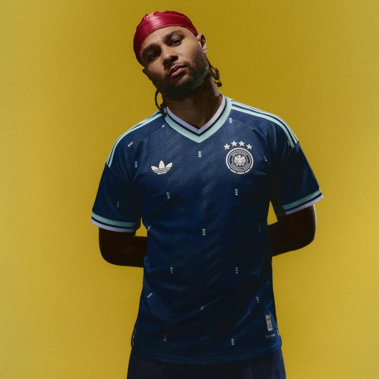 Image courtesy of Adidas
Germany's older away jerseys were better. The navy blue with aqua accents is fine, and the chevron pattern is subtle, but we've seen this team do more interesting things with their away kits over the years. The retro trefoil looks good on it, though. That's about the best thing we can say.
15. Sweden: B
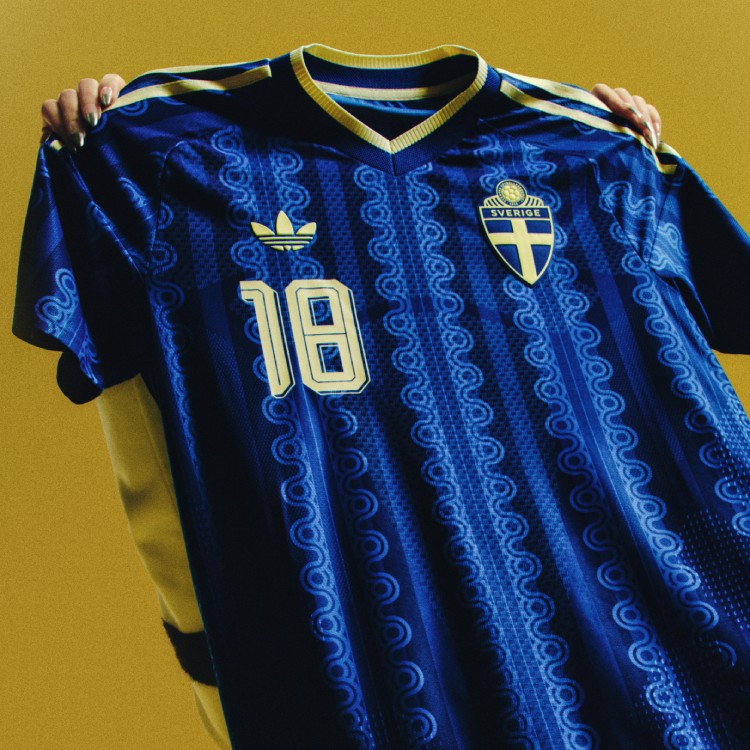 Image courtesy of Adidas
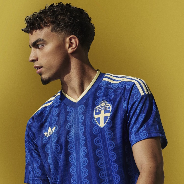 Image courtesy of Adidas
The royal blue with the wavy pattern and gold trim is solid. The 70s-inspired design gives it a retro feel, but the pattern itself is a little weird up close. It works from a distance better than it does in your hands. Still in the European playoffs, so this one could end up at the World Cup.
14. UAE: B
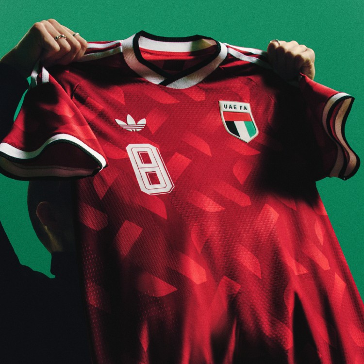 Image courtesy of Adidas
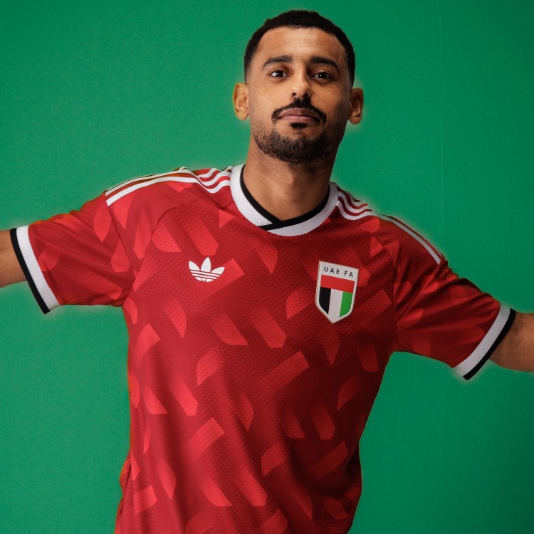 Image courtesy of Adidas
We actually kind of like this one. The red geometric pattern is bold, and the white trim keeps it clean. For a team that didn't qualify for the World Cup, this is one of the better-looking kits in the whole batch.
13. Hungary: B
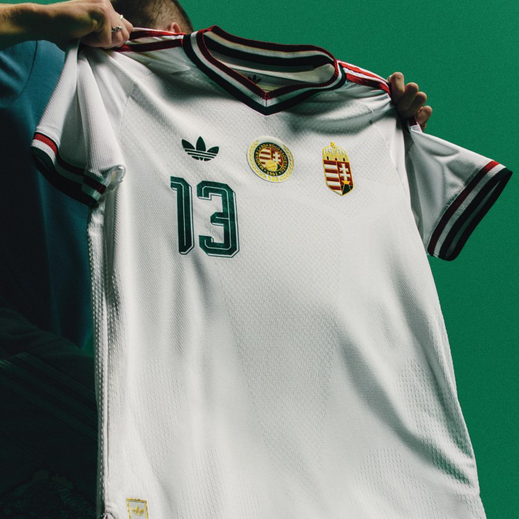 Image courtesy of Adidas
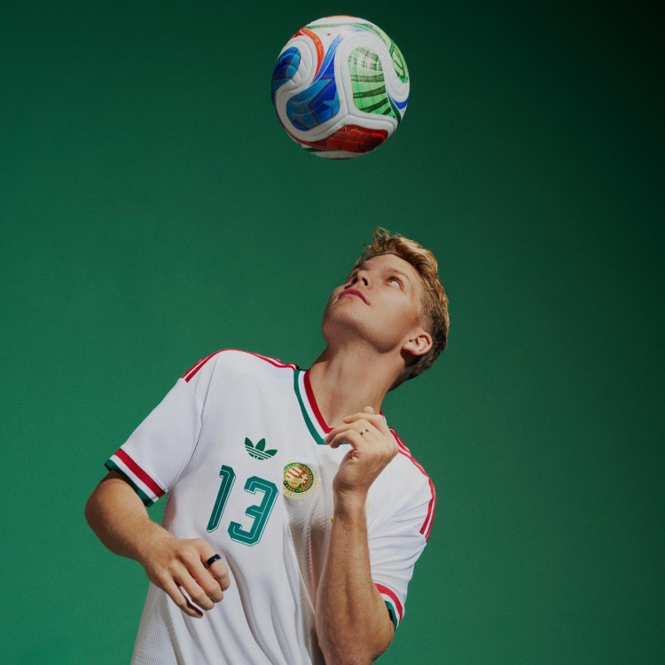 Image courtesy of Adidas
Clean and classic. The white base with the red collar and sleeve detailing is simple but effective. The double crest with the 125th anniversary badge is a nice detail. Nothing flashy, just a well-put-together kit. We like the collar and the stripes.
12. Wales: B
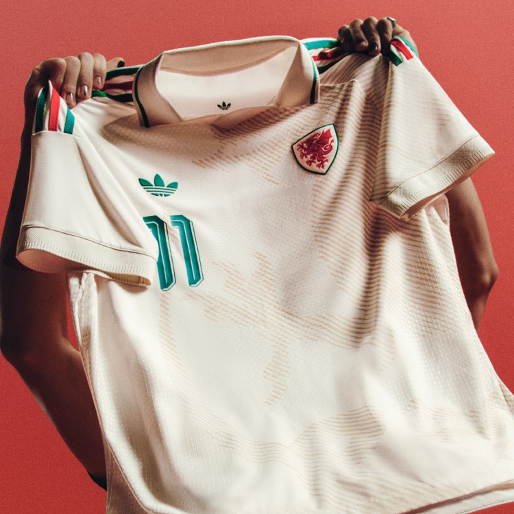 Image courtesy of Adidas
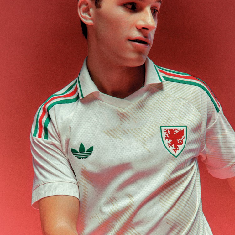 Image courtesy of Adidas
We've been liking the lighter colors Adidas has been doing with this whole batch, and Wales fits right in. The cream base with the abstract dragon pattern and green/red shoulder stripes is solid. Nothing special, but it looks good. Still fighting for a World Cup spot in the European playoffs.
11. Northern Ireland: B
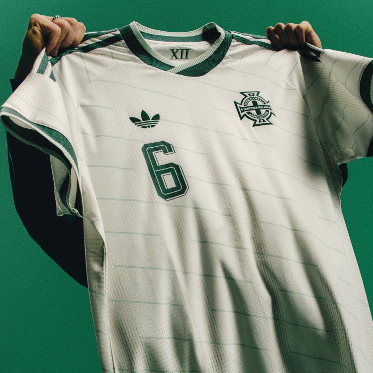 Image courtesy of Adidas
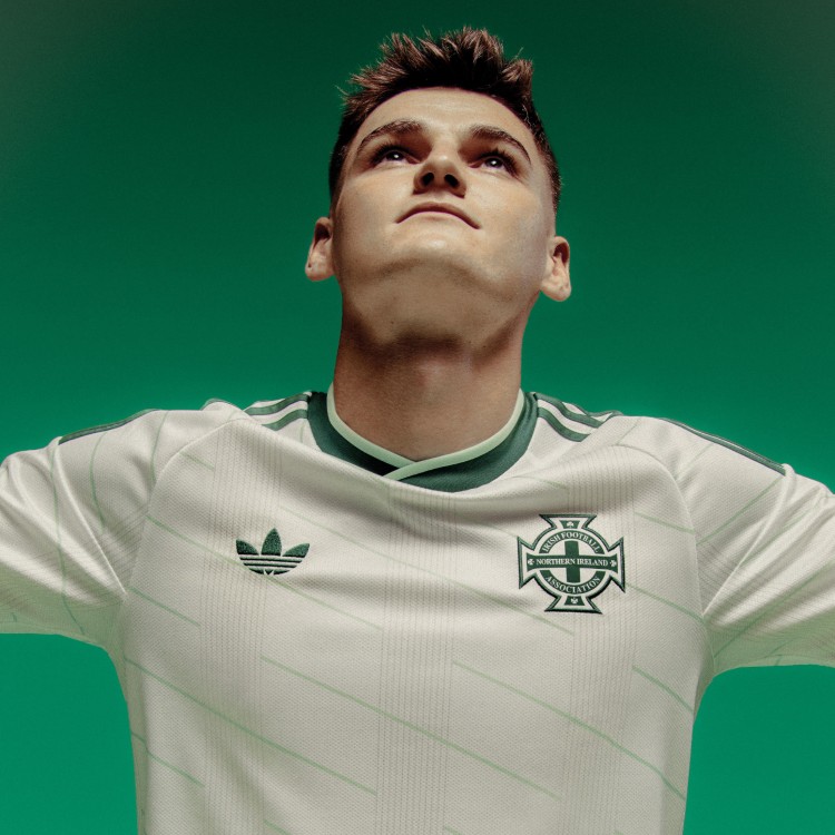 Image courtesy of Adidas
The use of mint green on the white base is sharp. The diagonal lines add some texture without being too busy. Simple but clean. We like the use of green on this one.
10. South Africa: B
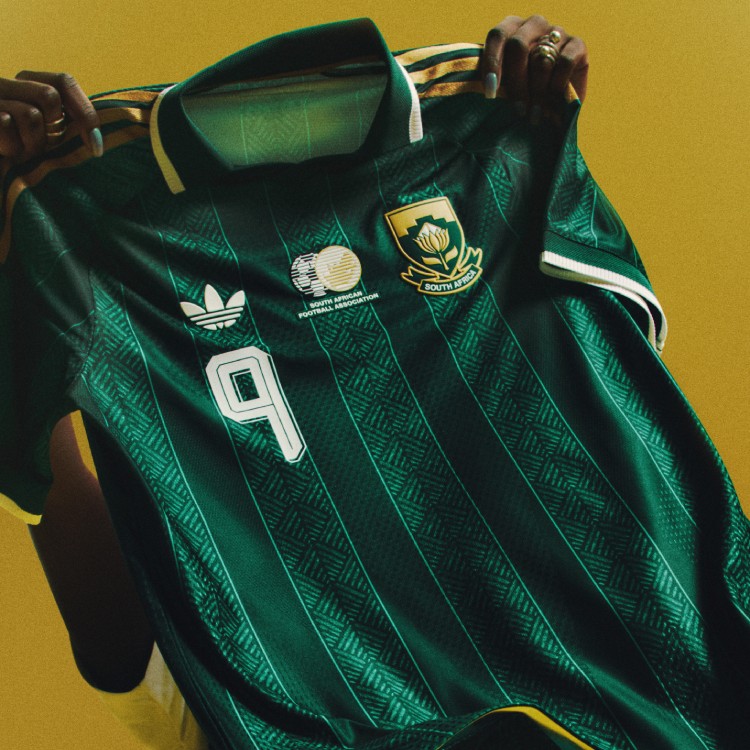 Image courtesy of Adidas
 Image courtesy of Adidas
South Africa's green and gold is iconic, and this kit delivers. The woven pattern in the green, the gold shoulder stripes, and the polo collar give it a sophisticated look. The Protea crest in gold is beautiful. This is a kit that looks even better in person.
9. Scotland: B
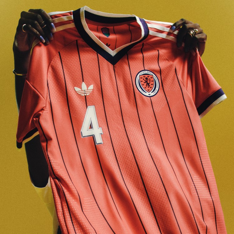 Image courtesy of Adidas
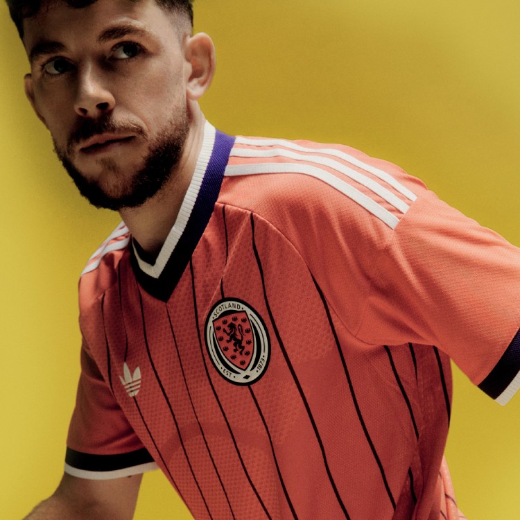 Image courtesy of Adidas
That salmon red with the purple pinstripes is a great color combo. It's different from anything else in this batch and it stands out. The retro v-neck collar ties it all together. We like that color a lot.
8. Mexico: B
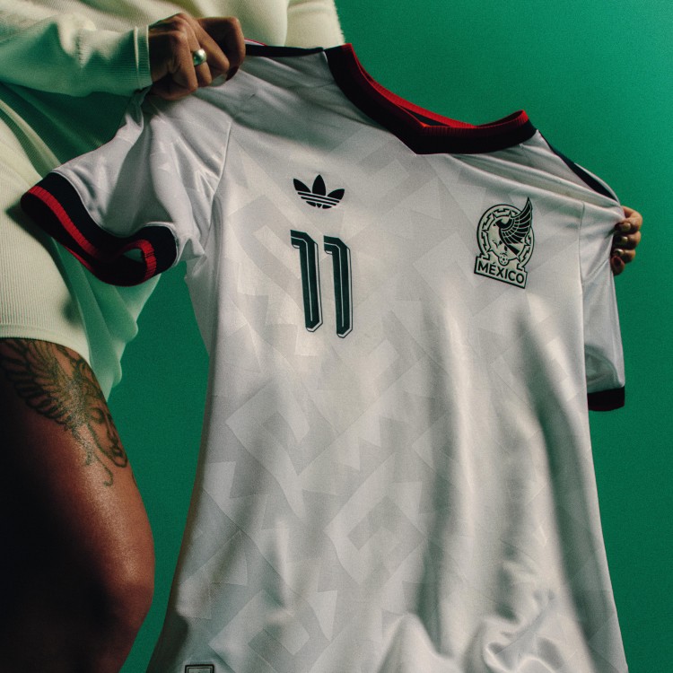 Image courtesy of Adidas
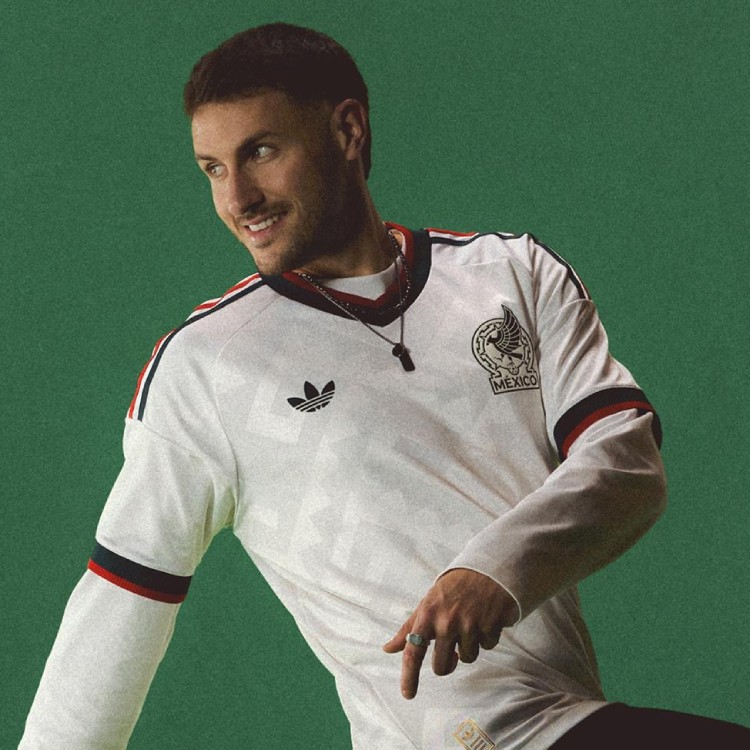 Image courtesy of Adidas
The white away with the green and red trim on the collar and sleeves is clean. We like the green and red on the sleeves. The subtle Grecas pattern is a nice nod to Mexican architecture without being over the top. As a host nation, Mexico's away kit does the job well.
7. Argentina: B
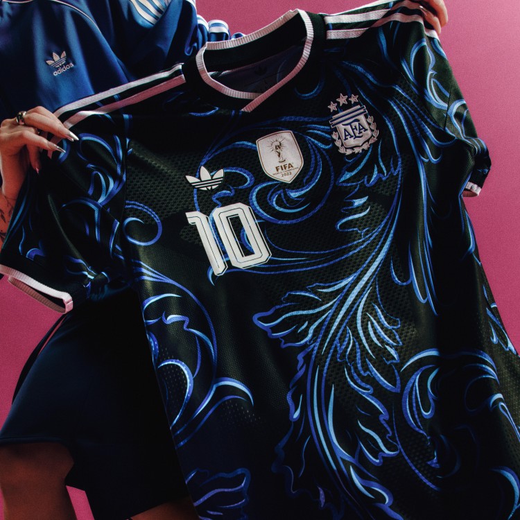 Image courtesy of Adidas
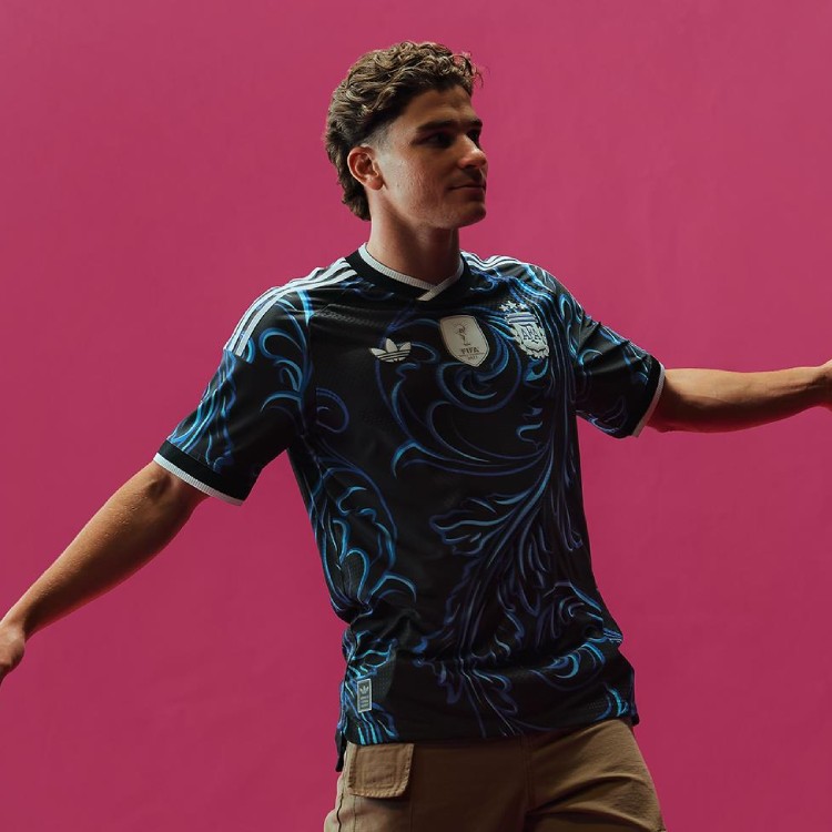 Image courtesy of Adidas
We like Argentina's kit. The black base with the blue swirling floral pattern is eye-catching. But with Argentina's history of iconic away kits, this one doesn't quite reach that level. It's good, not legendary. We like it, we just don't love it.
6. Curacao: B+
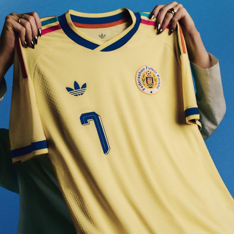 Image courtesy of Adidas
 Image courtesy of Adidas
This is Curacao's first ever World Cup, and they showed up with a kit that matches the energy. The pastel yellow base with the pink, turquoise, and orange stripes on the shoulders is fun and different. We love the colors on the top. The retro trefoil looks perfect on this one.
5. Japan: B+
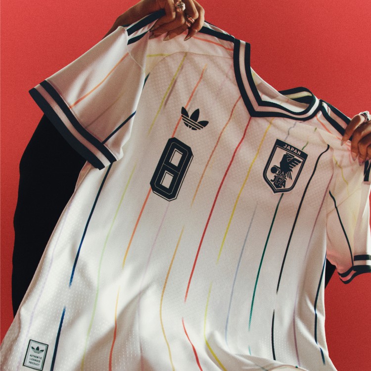 Image courtesy of Adidas
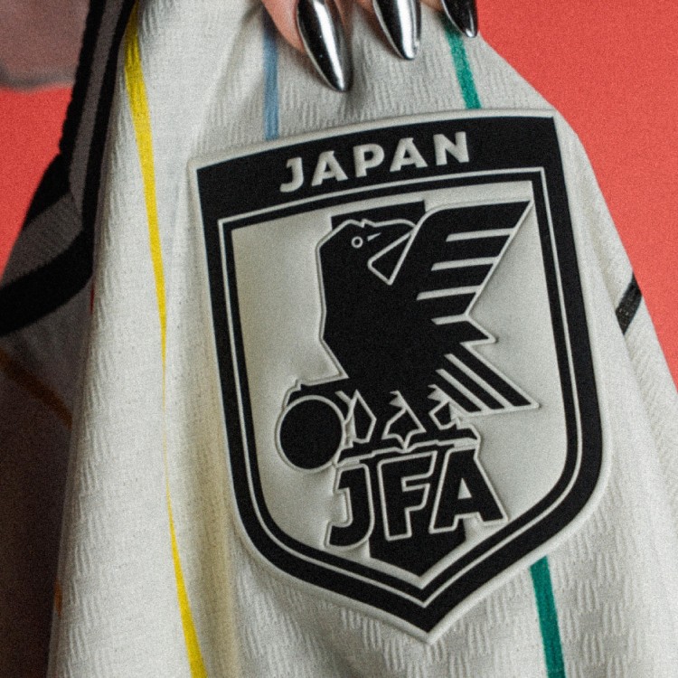 Image courtesy of Adidas
The rainbow vertical stripes on the off-white base are clean. Each of the 12 colored lines represents the unity of the team, with the bold red stripe in the middle representing the fans and the rising sun. It's subtle, creative, and one of the more thoughtful designs in the entire batch. Nice cool touch.
4. Costa Rica: A-
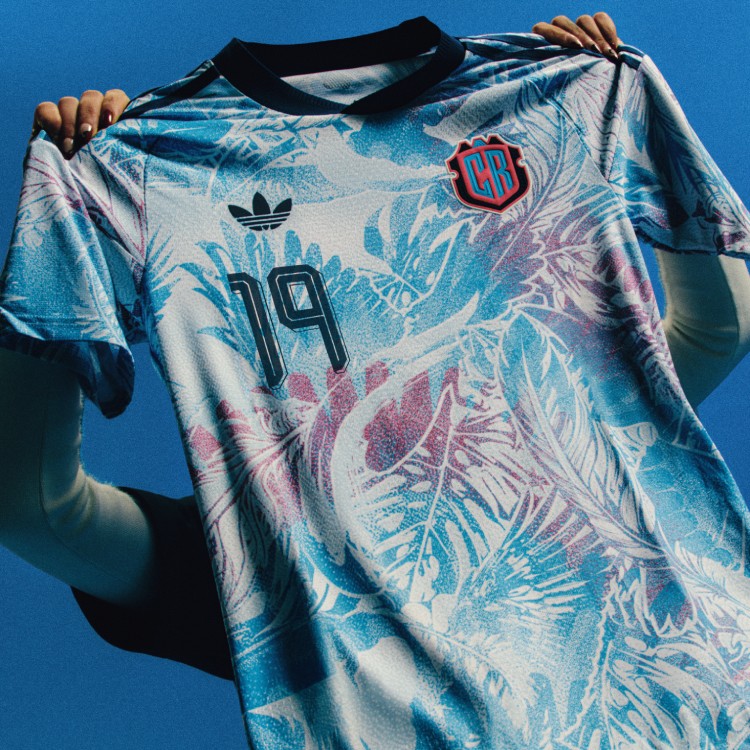 Image courtesy of Adidas
 Image courtesy of Adidas
This is how you make a kit. The tropical blue and pink pattern inspired by the Toucan and Costa Rican rainforests is bold, colorful, and completely unique. Costa Rica didn't qualify for the World Cup, but they won the kit game. Come out with a bang, make it fun. That's exactly what they did. We love it.
3. Belgium: A-
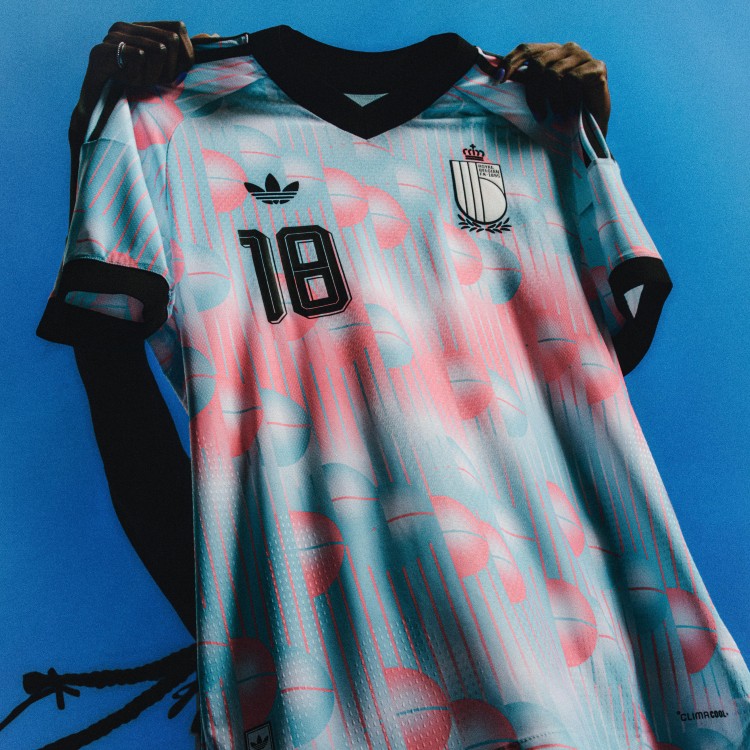 Image courtesy of Adidas
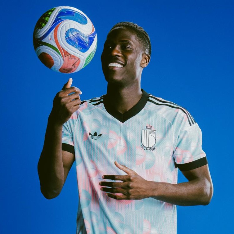 Image courtesy of Adidas
The pink and blue surrealist art pattern is a tribute to legendary Belgian artist Rene Magritte, and it works. That hint of pink is what makes it. This kit takes a risk and it pays off. It's wearable as a fashion piece, not just a soccer jersey. One of our favorites in the whole batch.
2. Spain: A-
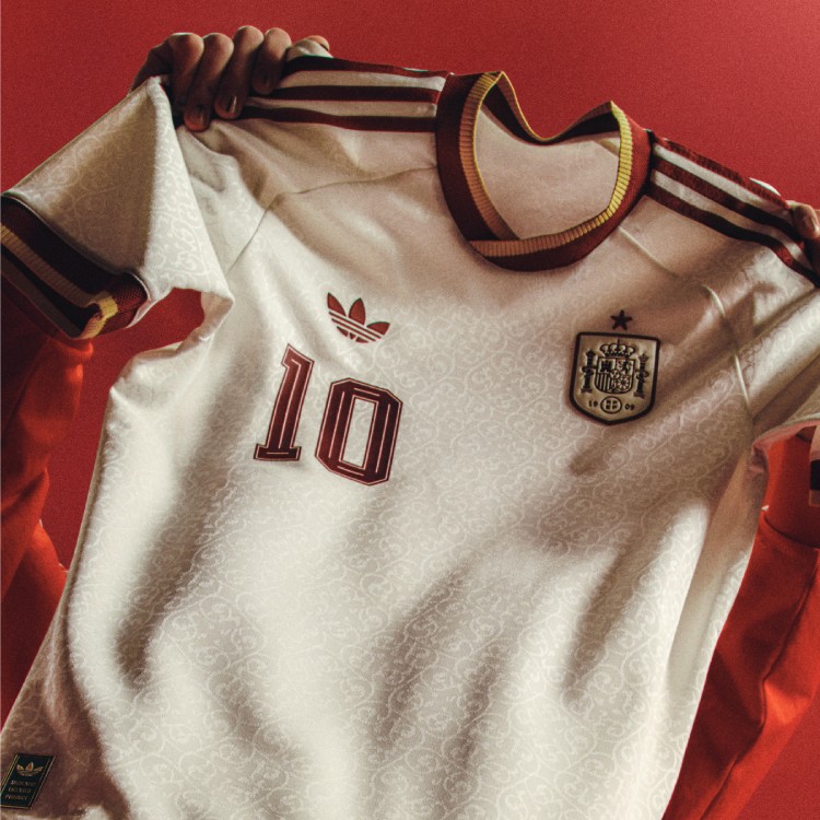 Image courtesy of Adidas
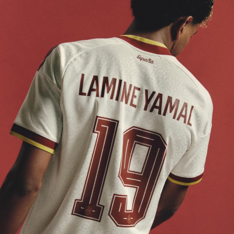 Image courtesy of Adidas
These are so clean. The off-white base with the burgundy and gold trim looks premium. The subtle pattern across the front adds just enough texture without being busy. And Lamine Yamal's name and number on the back is going to be everywhere this summer. That burgundy and gold combo just looks right on Spain. One of the best away kits Adidas has ever made for La Roja.
1. Venezuela: A
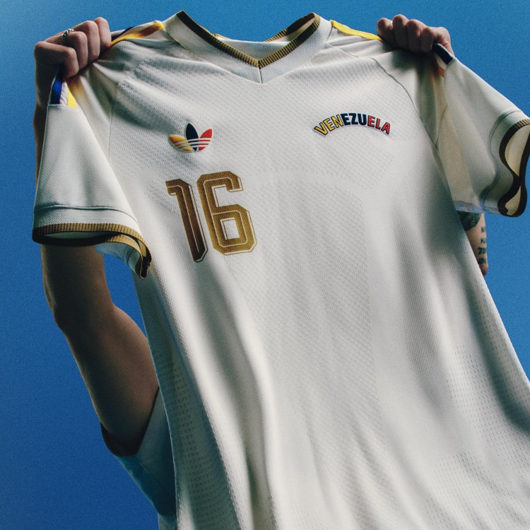 Image courtesy of Adidas
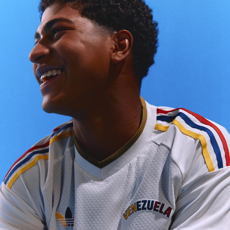 Image courtesy of Adidas
Venezuela takes the top spot. The white base is minimal, but the pops of yellow, red, and blue in the three stripes and gold detailing on the collar and cuffs are perfect. It's understated, sophisticated, and the retro block lettering on the crest ties the whole thing together. They did an incredible job with this one. It's minimal but very nice, and the pops of color make it. Our number one.
Shop all Adidas 2026 World Cup kits: Amazon | Adidas.com
We may earn a small commission from links on this page. It doesn't cost you anything extra.