 Image courtesy of Puma
Puma dropped kits for all 12 of their national teams ahead of the 2026 FIFA World Cup. Of those 12 teams, 11 made the tournament in the United States, Canada, and Mexico, with Czechia punching the final ticket through the UEFA play-offs in March. Iceland is the only Puma nation watching from home.
The collection as a whole leans heavily into cultural storytelling. Puma gave each team its own identity, pulling from things like Moroccan tilework, Senegal's hand-painted minibuses, and New Zealand's Maori heritage. Some of them are fantastic. Some of them missed.
We ranked all 12 kits (home and away combined) from worst to best.
Want to grab one of these kits? You can shop the full Puma 2026 World Cup collection on Amazon or directly at puma.com.
12. Egypt: D
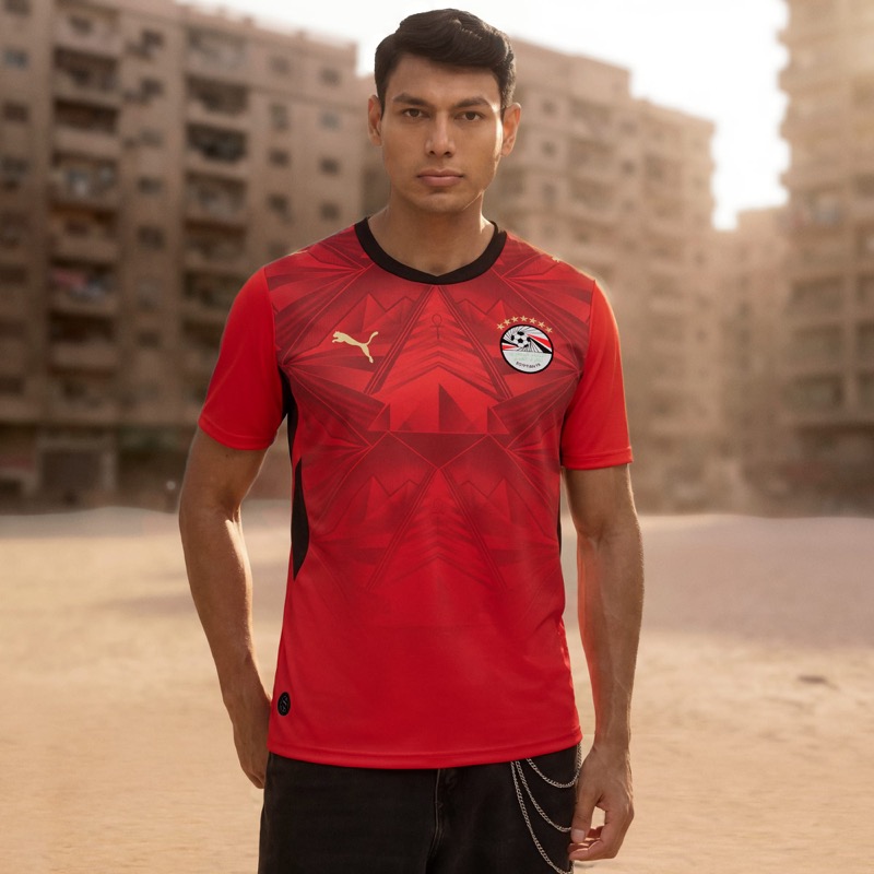 Image courtesy of Puma
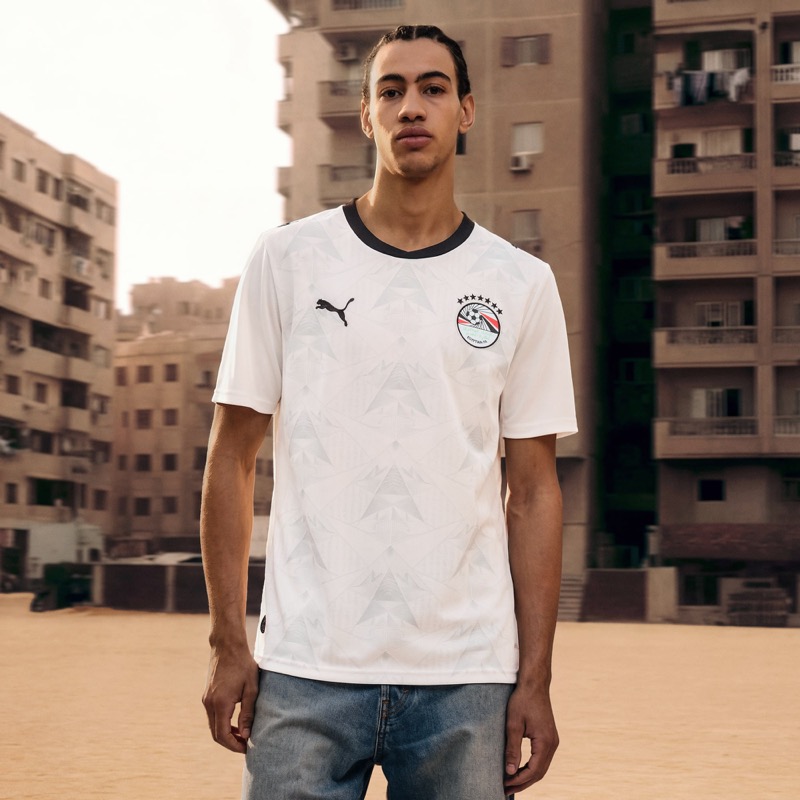 Image courtesy of Puma
We don't love either of these. The home kit has a pyramid-inspired graphic on red, but it just doesn't come together. The away is white with a subtle version of the same pattern, and it's even more forgettable. Egypt has such a rich visual history to pull from, and neither kit takes advantage of it. These are pretty boring across the board.
11. Czech Republic: C
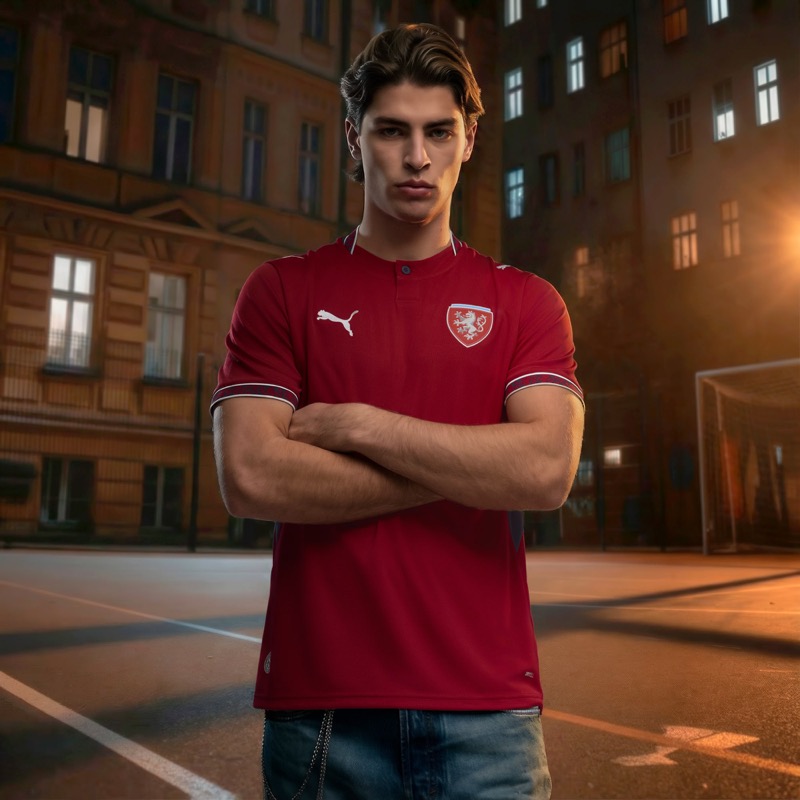 Image courtesy of Puma
Czech Republic only has a home kit available so far. The dark cherry red is a nice base color, but the button collar feels out of place on a soccer jersey. The sleeve trim is fine. There's just not enough going on here to make it memorable, especially when you see what Puma did for some of the other teams in this collection. It's okay. Nothing more.
10. Switzerland: C+
 Image courtesy of Puma
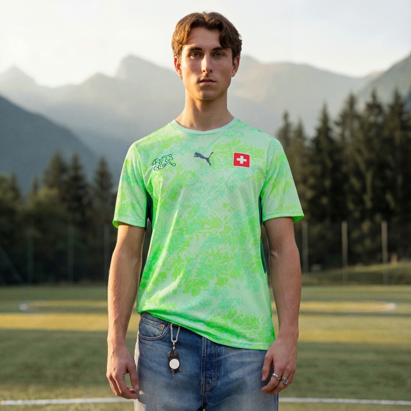 Image courtesy of Puma
Switzerland's home is a standard red kit with a subtle wave pattern. It's clean, but it's boring. The away is where things get interesting, with a green topographic map design inspired by Swiss passports. Sounds cool on paper, but it ends up looking more like a goalkeeper jersey than a proper away kit. We love Switzerland as a country, but this set doesn't do it justice.
9. Iceland: C+
 Image courtesy of Puma
Iceland only has a home kit so far, and it's a solid blue with the snowflake crest. That's about it. Puma says it's inspired by volcanic landscapes and glaciers, but we don't really see that translating to the actual jersey. The blue is a nice shade, and the kit is clean, but for a country with that much natural drama in its landscape, they could have done more with the design.
8. Paraguay: B
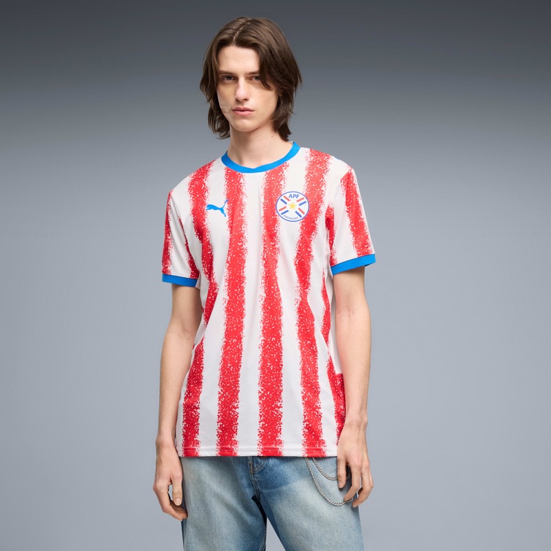 Image courtesy of Puma
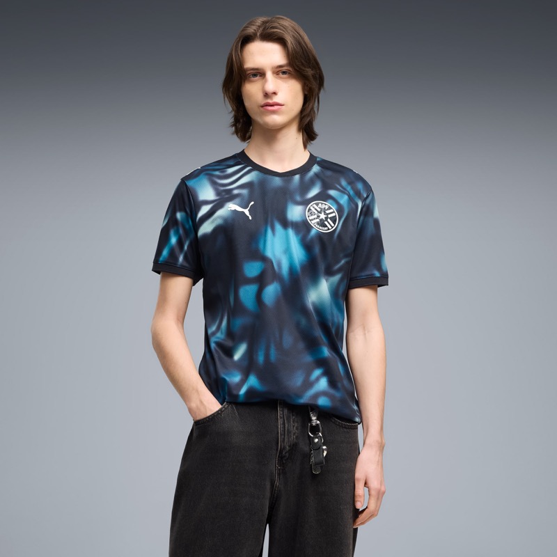 Image courtesy of Puma
Paraguay's home kit stands out immediately. The red and white stripes have a hand-painted, almost chalk-like texture that gives the classic look a fresh twist. It reminds us a lot of Atletico Madrid, and that's a good thing. The away kit goes a completely different direction with a dark blue tie-dye pattern. It's bold, but we don't love it as much. The home carries this set.
7. New Zealand: B
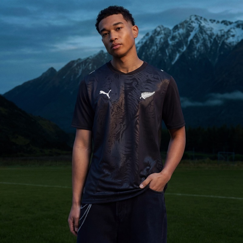 Image courtesy of Puma
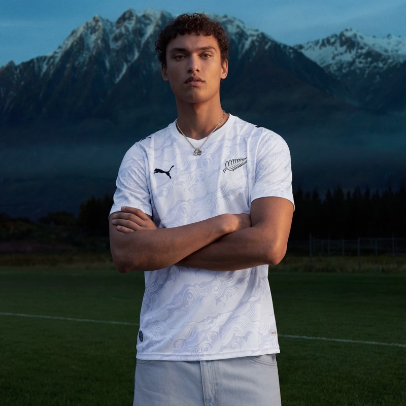 Image courtesy of Puma
The All Whites went with a black home and white away, which is a nod to New Zealand's rugby identity. The black home has a tonal fern pattern that only shows up in certain light, and we actually kind of dig it. The away is similar but flipped to white with a swirl pattern. Both are simple, both are clean. Not flashy, but respectable for a country making just their second World Cup appearance.
6. Austria: B
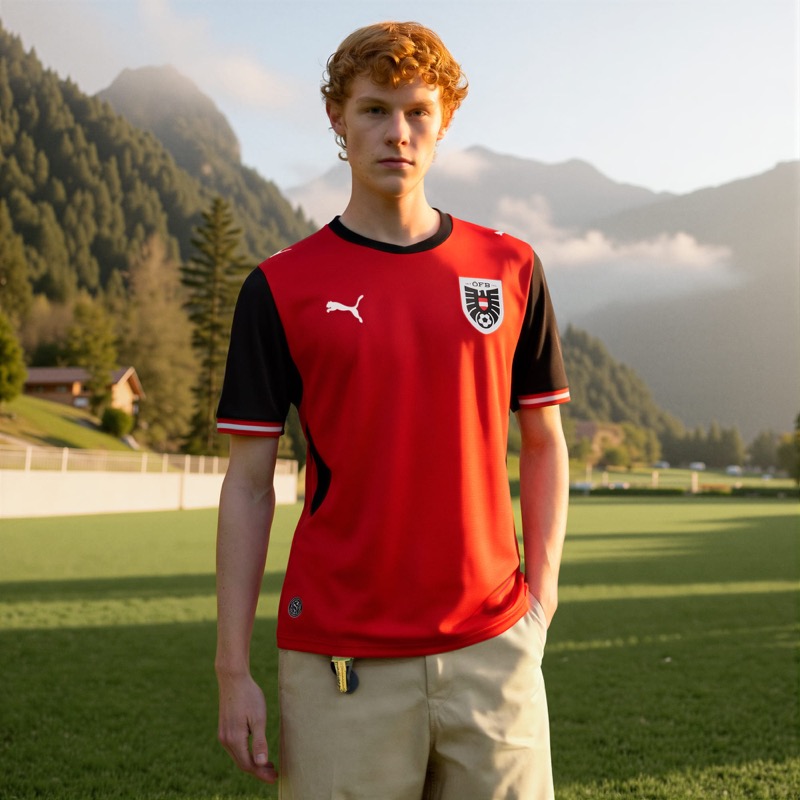 Image courtesy of Puma
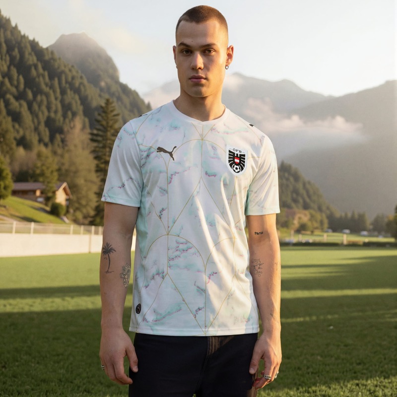 Image courtesy of Puma
Austria's home is straightforward: red body, black sleeves and shoulders. It's clean but doesn't take any risks. The away is more interesting with a marble pattern inspired by Vienna's cafe culture. The soft blue and white tones look sharp, and the geometric gold lines add a nice detail. The away saves this set from being forgettable.
5. Senegal: B+
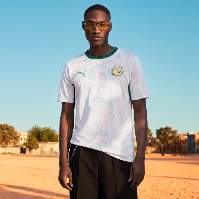 Image courtesy of Puma
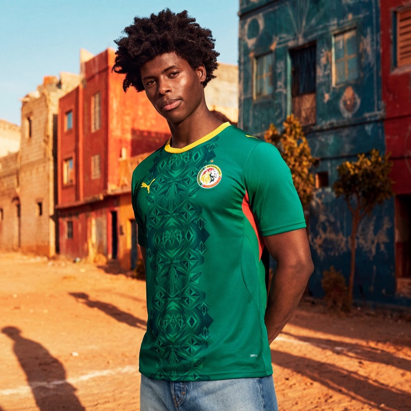 Image courtesy of Puma
Senegal's home kit is one of the more unique designs in the entire Puma collection. It's white with soft pastel patterns inspired by the Car Rapide, the hand-painted minibuses that are everywhere in Dakar. The design is subtle but the cultural connection is strong. The away is a deep green with a diamond pattern down the center. We like it, but it doesn't hit as hard as the home. The home jersey carries this set for us.
4. Morocco: B+
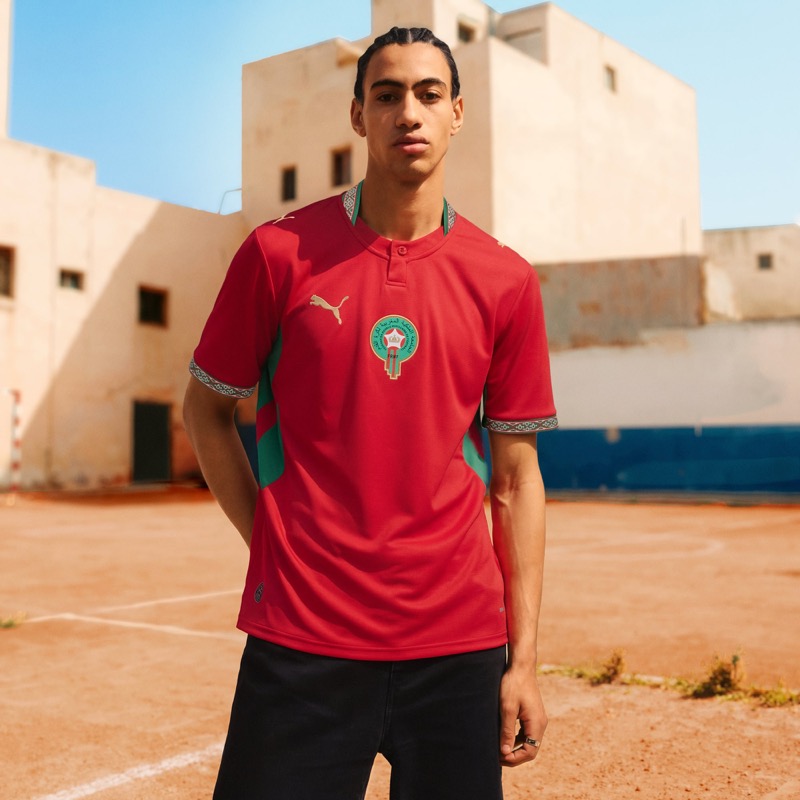 Image courtesy of Puma
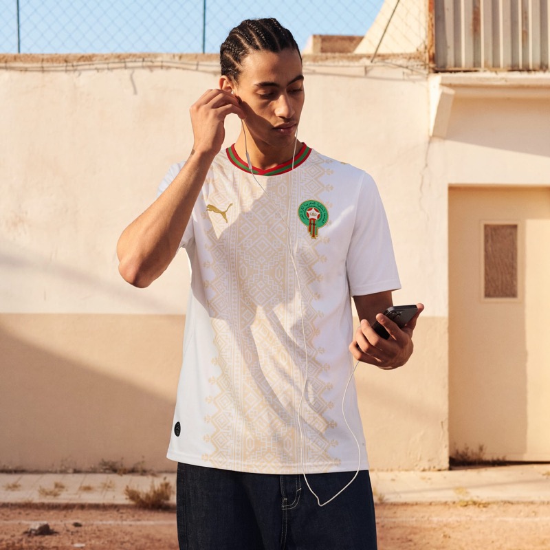 Image courtesy of Puma
Morocco's set is solid across the board. The home is red with green accents and a geometric pattern on the collar and sleeves inspired by traditional Moroccan tilework. The collar itself isn't our favorite, but the details are nice. The away is white with gold geometric patterns that feel almost hand-drawn. We like the color and the pattern on that one. Both kits are good, and the combination of red, green, white, and gold just works for Morocco's identity.
3. Ghana: A-
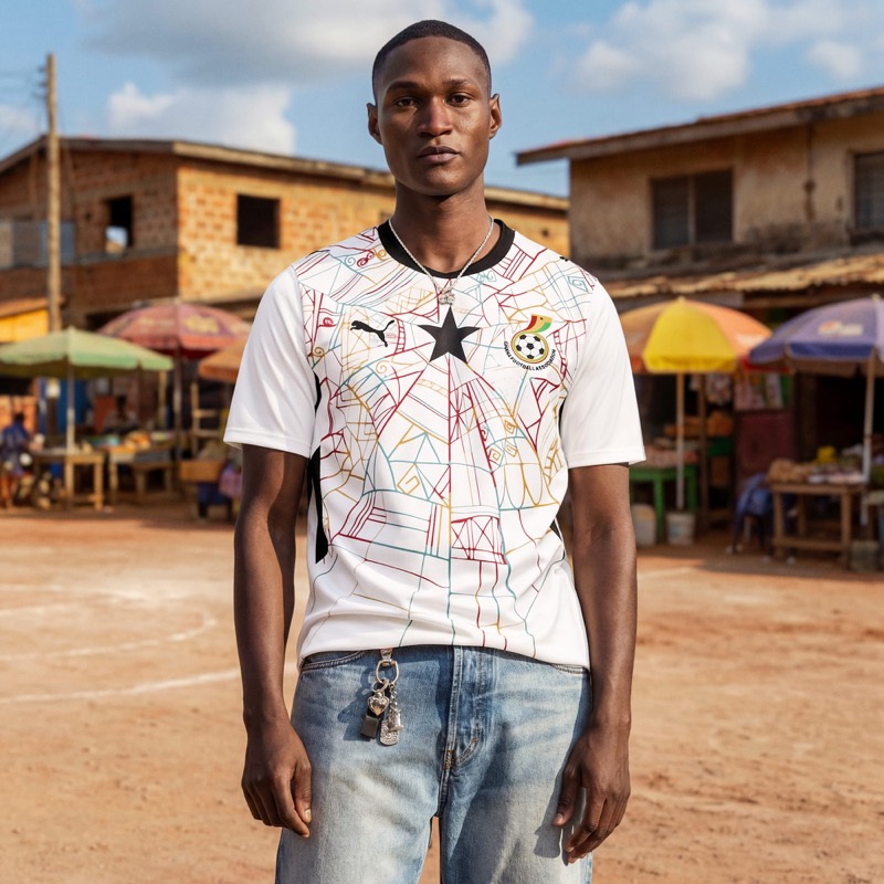 Image courtesy of Puma
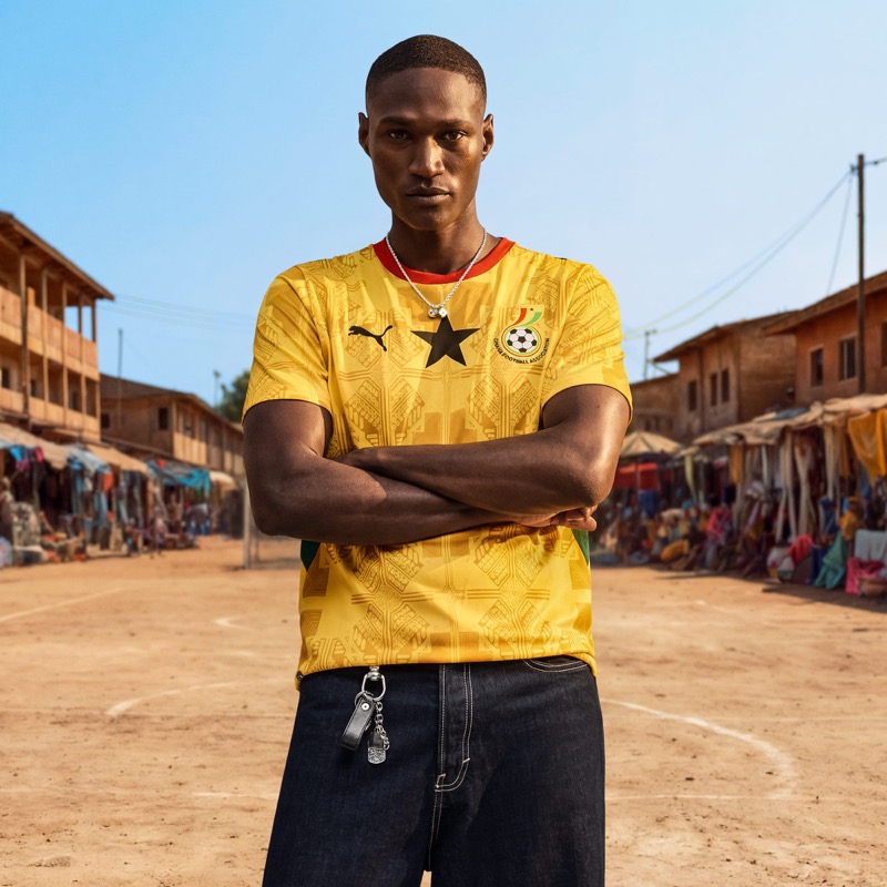 Image courtesy of Puma
Ghana brought it. The home kit is white with a colorful abstract line drawing that covers the entire front of the jersey. Red, yellow, green, and teal lines weave around the iconic black star. It looks like street art, and it's one of the most creative kits in this whole collection. The away goes golden yellow with a kente-inspired pattern. Both jerseys feel authentically Ghanaian. This is how you do cultural design on a soccer kit.
2. Portugal: A-
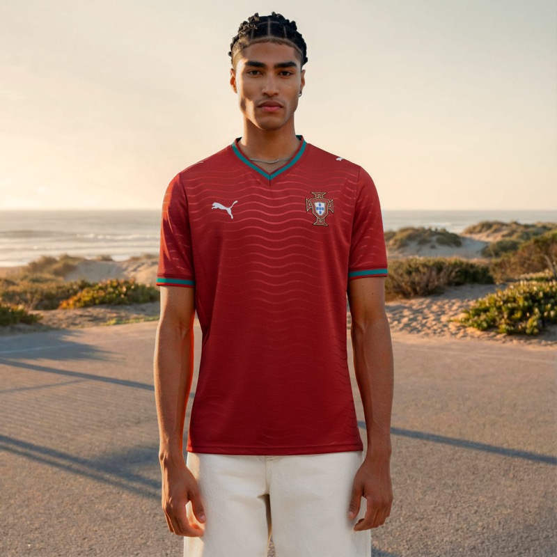 Image courtesy of Puma
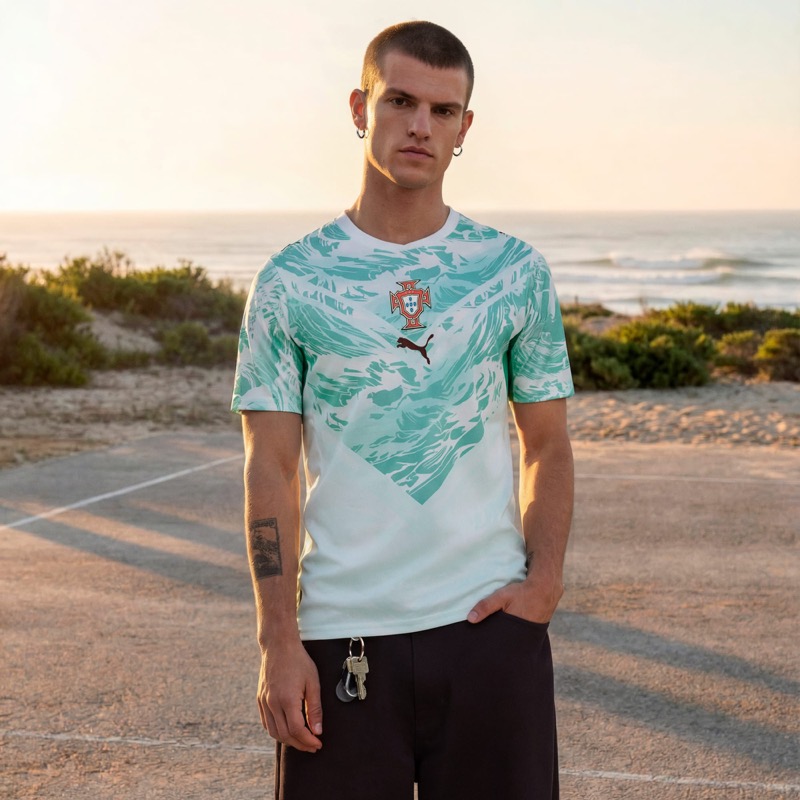 Image courtesy of Puma
This is Puma's first World Cup with Portugal, and they delivered. The home is a deep red with a wave pattern and teal accents on the collar and cuffs. Simple, but the color pops and it looks great. The away is even better. The teal and white ocean wave pattern with the chevron shape is one of the best away kits we've seen from any brand this cycle. It's bold, it's different, and it still feels distinctly Portuguese. The away kit alone almost carried this to the top spot.
Shop the Portugal Away Jersey on Amazon
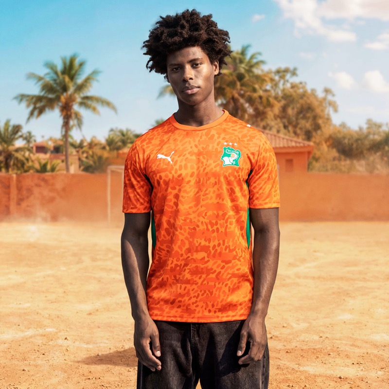
1. Ivory Coast: A
Image courtesy of Puma
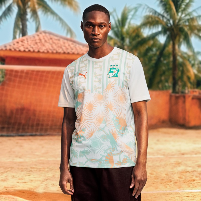 Image courtesy of Puma
Our favorite set in the entire Puma collection, and it's not particularly close. The home kit takes the iconic Elephants orange and layers it with a leopard-print texture that gives it real energy. The green accents on the sides are the perfect complement. Then the away kit goes in a completely different direction with a tropical floral pattern in white, orange, and mint green. Puma described it as celebrating Ivory Coast's streetwear influence, and we see it. Both kits are strong on their own. Together, they're the best package Puma put out for 2026. The defending African champions deserve this.
Shop all Puma 2026 World Cup kits: Amazon | Puma.com
We may earn a small commission from links on this page. It doesn't cost you anything extra.