The UFL season kicks off tonight, and all eight teams have new uniforms from New Era. We ranked every set from best to worst.
1. D.C. Defenders
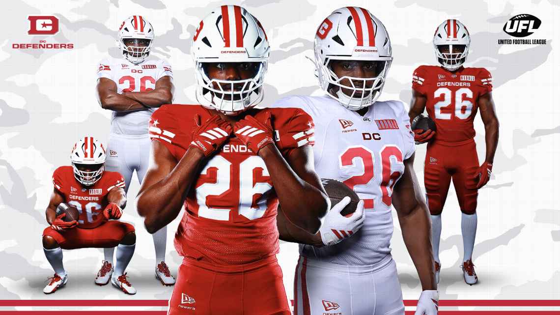
Image via UFL
The cleanest set in the league. The red home jersey is sharp, the white away is just as good, and the DC logo on the helmet ties the whole thing together. The striping pulls from the D.C. flag, which is a smart detail that doesn't feel forced. Everything about this uniform says professional football team, and that's what you want out of a spring league kit.
Grade: A-
2. Dallas Renegades
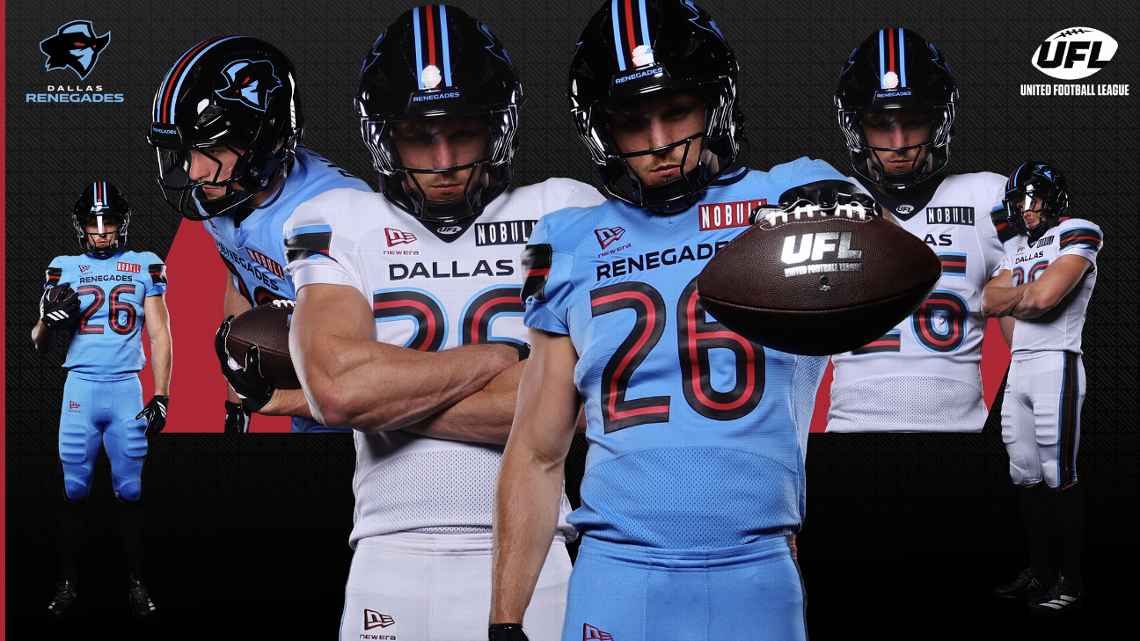
Image via UFL
We're suckers for powder blue, and the Renegades have one of the better color schemes in the UFL. The light blue home jersey with black and red accents looks good, and the white road set is clean. They switched to a black helmet this year, which works. This is a team that looks like it belongs on TV.
Grade: B+
3. St. Louis Battlehawks
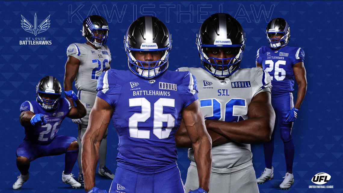
Image via UFL
The Battlehawks' blue really pops. The home jersey is bold without being obnoxious, and the silver away set with "STL" across the chest is a nice touch. The helmet has a darker finish this year, which we're not totally sold on, but everything else works. The Gateway Arch details on the uniform are a cool nod to the city.
Grade: B+
4. Columbus Aviators
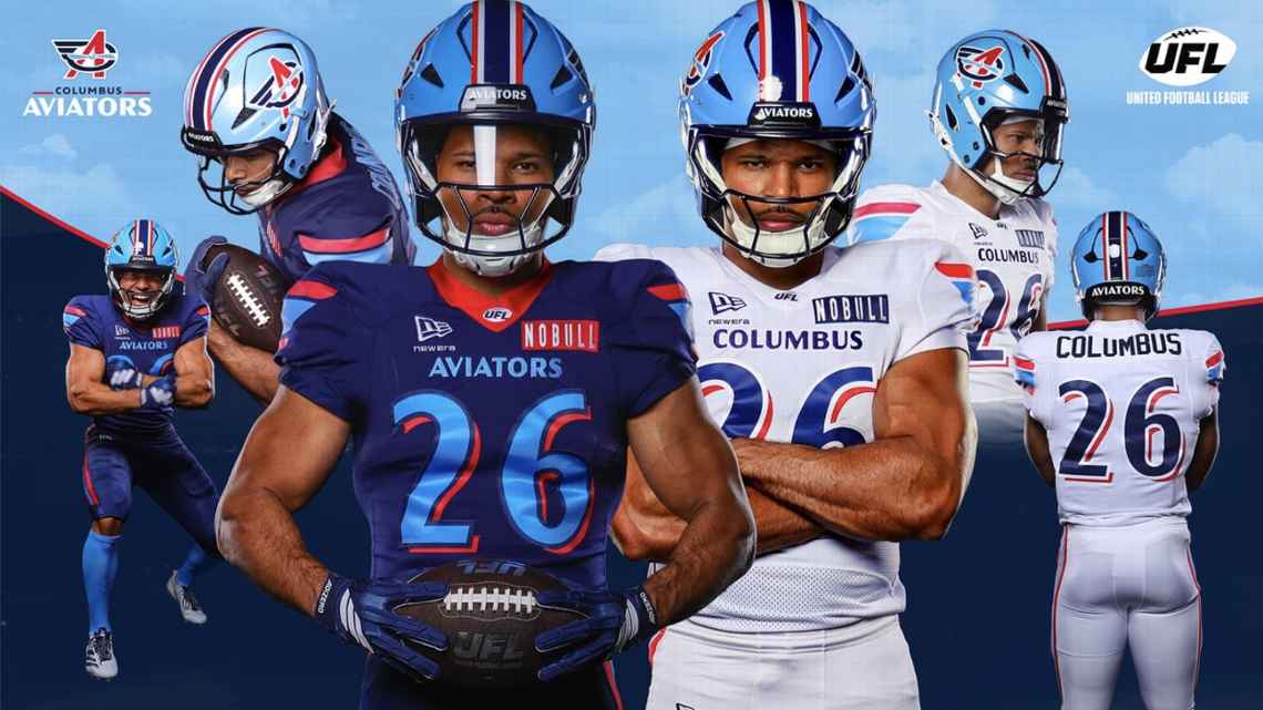
Image via UFL
Good-looking set. The navy base with white accents and the light blue helmet give it a distinct identity. The problem is it's a little too similar to what the Renegades are doing with their color palette, and the Renegades do it better. Still a solid uniform for a brand-new franchise. The aviation theme comes through without being over the top.
Grade: B
5. Orlando Storm
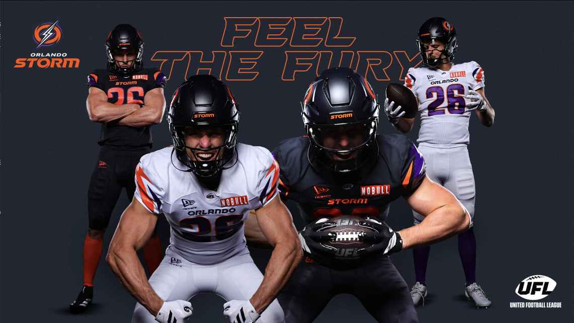
Image via UFL
The orange on these jerseys is really nice. It has an Oklahoma State vibe, and the purple accents mixed in give it something extra. The lightning-inspired striping is a solid detail. The black home jersey with orange hits and the white road set both work well. This is a team that's going to look good on the field.
Grade: B
6. Houston Gamblers
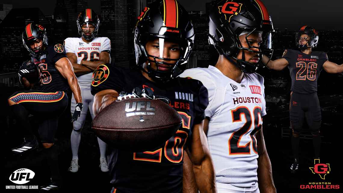
Image via UFL
We're not big on black jerseys in general, but the Gamblers make it work well enough. The white road set is actually the highlight here. The black and red color scheme with the spade details on the pants is a nice touch for the rebrand from the Roughnecks. Nothing special, but nothing bad either.
Grade: B-
7. Birmingham Stallions
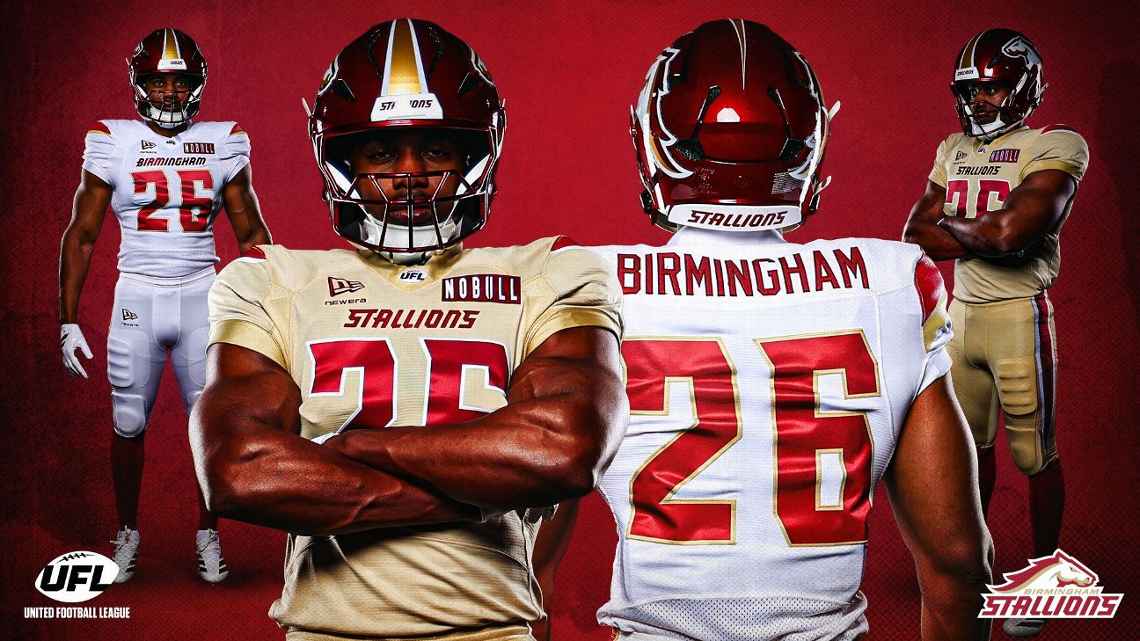
Image via UFL
Three-time champs, but the uniforms aren't winning anything. The white away jersey with "Birmingham" across the chest is fine, but that gold home jersey just doesn't work for us. It's not a color that translates well to a football uniform. The cardinal red helmet with the gold stripe is decent, but the overall look feels like it belongs in a different sport.
Grade: D+
8. Louisville Kings
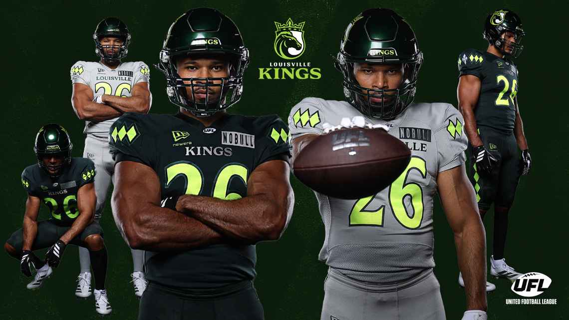
Image via UFL
These are our least favorite uniforms in the league. The neon green accents on dark green just look cheap. It doesn't feel like a professional football team. The silver road set is slightly better, but those lime green details drag the whole thing down. When you go neon, you're gambling, and the Kings lost this one. The fleur-de-lis shoulder detail is nice, but it can't save the color scheme.
Grade: D