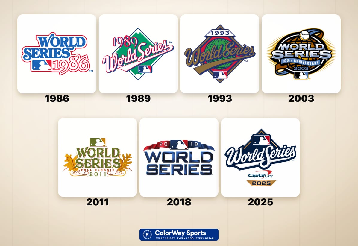
The World Series logo is the rarest piece of design in American sports. It gets used for about two weeks a year, it gets stitched onto a jersey sleeve that only two teams ever wear, and then it is almost always retired and replaced by a brand new one. Forty of them have come and gone since 1986, and they tell you exactly what Major League Baseball thought it was selling in any given October.
Here is where we part ways with the internet. The consensus says the nineties were the golden age of World Series design, that the globe and bat marks were untouchable, and that everything since has been decline. We went back through all forty and we do not buy it. The best era of World Series logos is the modern navy run from 2015 to 2021, and the beloved globe and bat era is a B minus. The nostalgia is doing a lot of heavy lifting on those nineties marks. What follows is all eight eras, graded, with the reasoning.
Interactive Tool Think we are wrong? Grade all 40 yourself → Tap any of the 40 logos, hand it an A through F, and write your own note. We only show you our grade after you have made your call. Your list saves on your device and you can share it.Every World Series Logo, 1986 to 2025
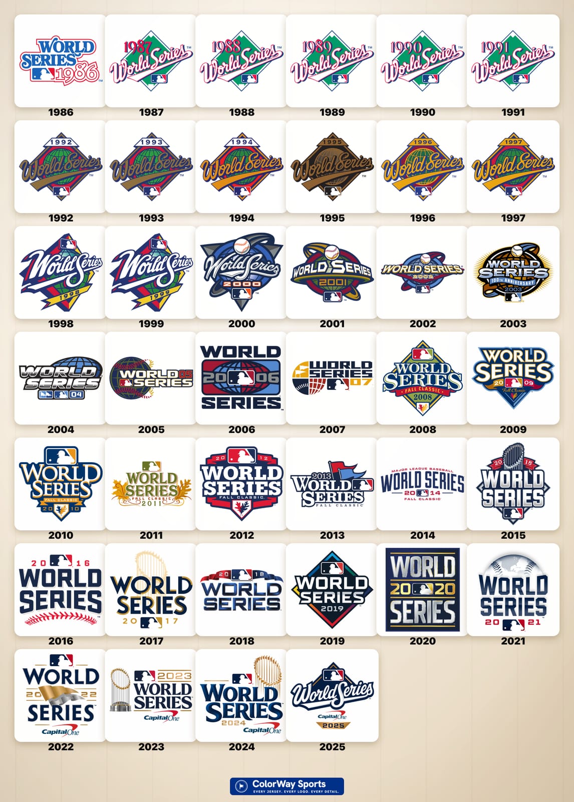
MLB posted its own version of this lineup, the last 30 World Series logos in a row, during the 2025 Fall Classic:
All eight eras below in order, with the best and the worst called out at the bottom. For the other October mark, the one every playoff team wears on its cap, see our ranking of every MLB postseason logo from 2011 to 2026.
Era 1 · 1986 · The Standalone Wordmark
ColorWay Sports Grade
C
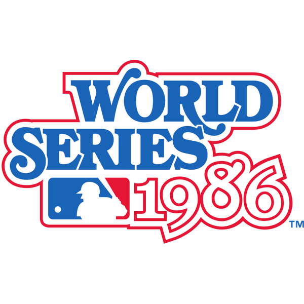
1986
The 1986 mark is the odd one out, and that is the whole point of starting here. There is no diamond, no globe, no template, and nothing tying it to the year before or the year after. It is a stacked red and blue block wordmark with the MLB silhouette wedged in the middle and a big outlined 1986 doing most of the work. As a piece of standalone design it is honest and it reads cleanly from across a room, which is genuinely more than some of what is coming can claim. What holds it to a C is that there is no idea in it. It is the words World Series and a year, set in a typeface, with the league logo dropped in to fill a gap. It also happens to be attached to the most replayed October in baseball history, Mets over Red Sox, Buckner and all, which makes the plainness of the mark a real missed opportunity.
Era 2 · 1987 to 1991 · The Green Diamond Script Era
ColorWay Sports Grade
B-
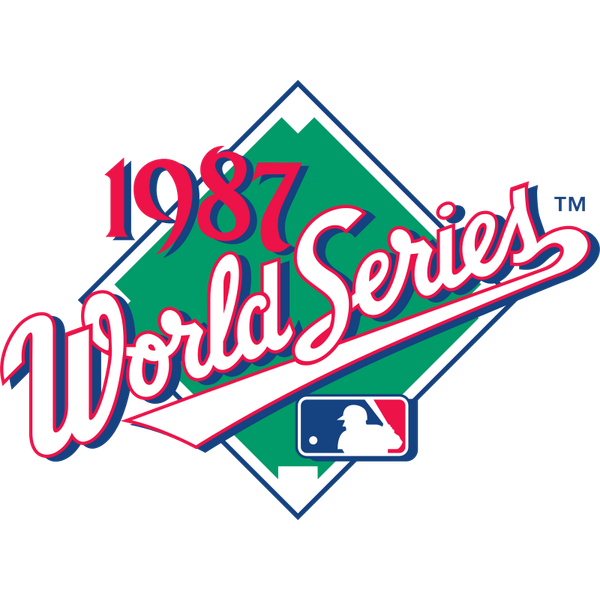
1987
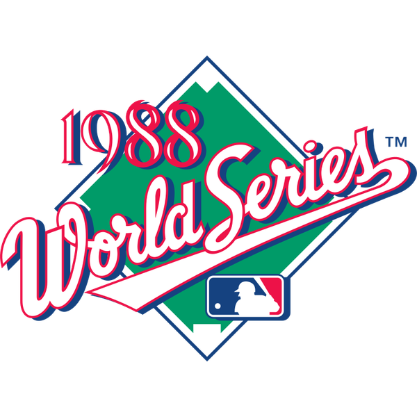
1988
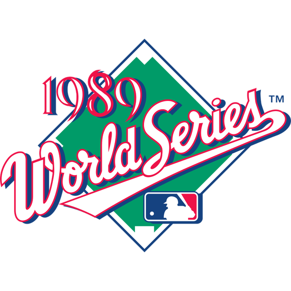
1989
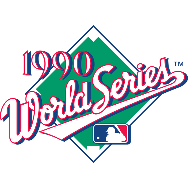
1990
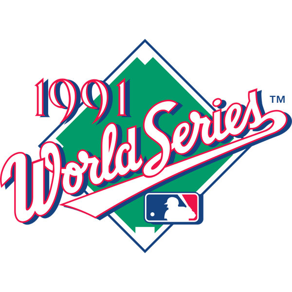
1991
This is the one people get misty about, and it is good without being great. Five straight years of the same locked template: a green infield diamond turned on its point, a white cursive World Series script running across it on a slant, the year set above in an outlined red script, and the MLB mark anchored at the bottom. The green is the best thing here. No other era commits to the actual color of a baseball field, and against a white home jersey sleeve that green pops in a way navy never does. So why only a B minus? Because it is fussy. The outlined year script mushes together the moment you shrink it to sleeve size, the cursive and the block type are fighting for the same space, and five years of near-identical marks is not the same thing as five years of good ideas. It is a charming era. It is not a great one, and the affection people have for the Twins in the Metrodome and the Bash Brothers is doing some of the grading for them.
Era 3 · 1992 to 1997 · The Globe and Bat Era
ColorWay Sports Grade
B-
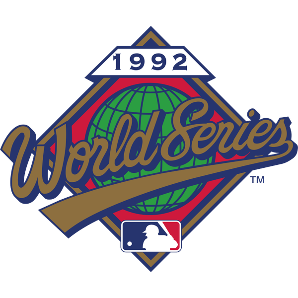
1992
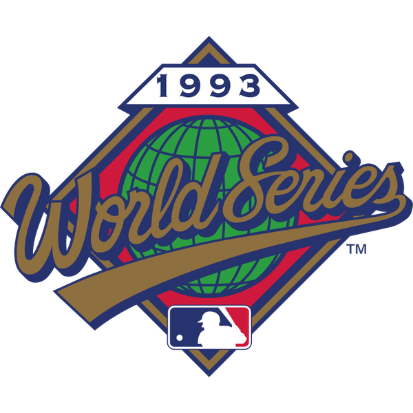
1993
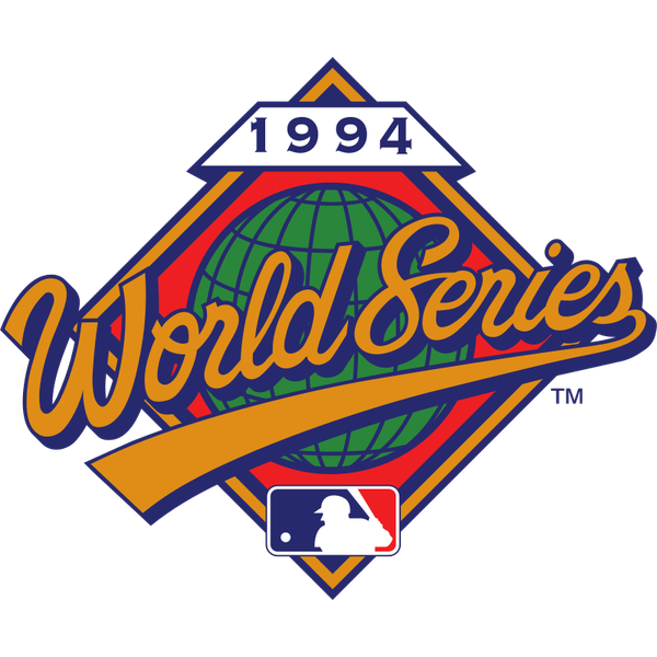
1994
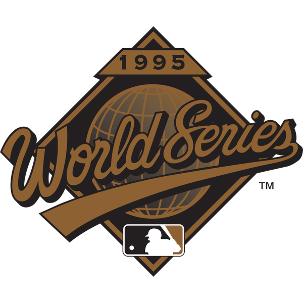
1995
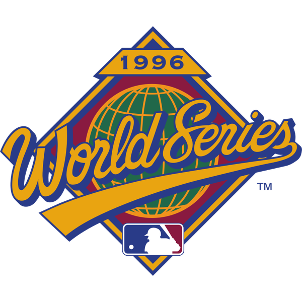
1996
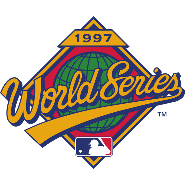
1997
Here is the take that will get us yelled at. This is the internet's favorite era of World Series design and we have it tied for fifth. The template swaps the flat green diamond for a full globe with a wooden bat slashing across it, keeps the cursive, and moves the year up into a banner at the top. What everyone loves is the material feel, and it is real: the bat has woodgrain, the globe has depth, and the metallic treatment on the 1995 sepia version and the gold 1996 and 1997 versions gives the whole thing the weight of a trophy. The problem is that it is doing too much. Globe plus bat plus banner plus diamond plus cursive script plus the MLB mark is six ideas competing inside one small patch, and at the size this thing actually lives at, a sleeve, it collapses into a brown and gold smudge. Squint at 1995 and tell us what you are looking at. The nineties nostalgia is real and we understand it. B minus.
This era does contain the strangest logo in the entire set. The 1994 mark is a World Series logo for a World Series that never happened. The players strike wiped out the postseason that September, the Fall Classic was cancelled for the first time since 1904, and the logo had already been designed and produced. It sits in the chronology as a small permanent monument to the ugliest labor fight in the sport's history.
Era 4 · 1998 to 2002 · The Y2K Swoosh Era
ColorWay Sports Grade
A-
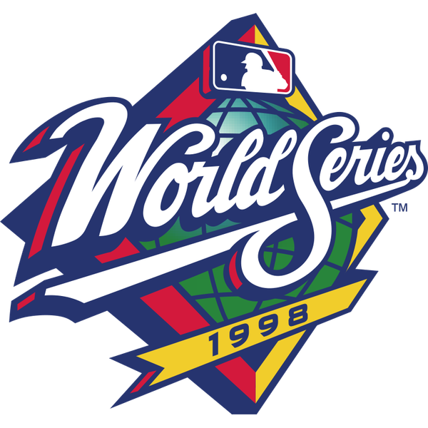
1998
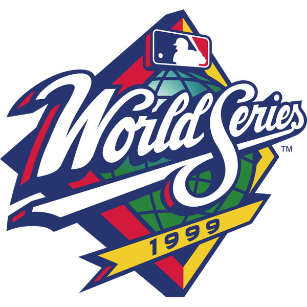
1999
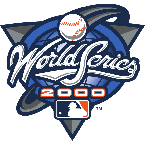
2000
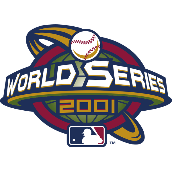
2001
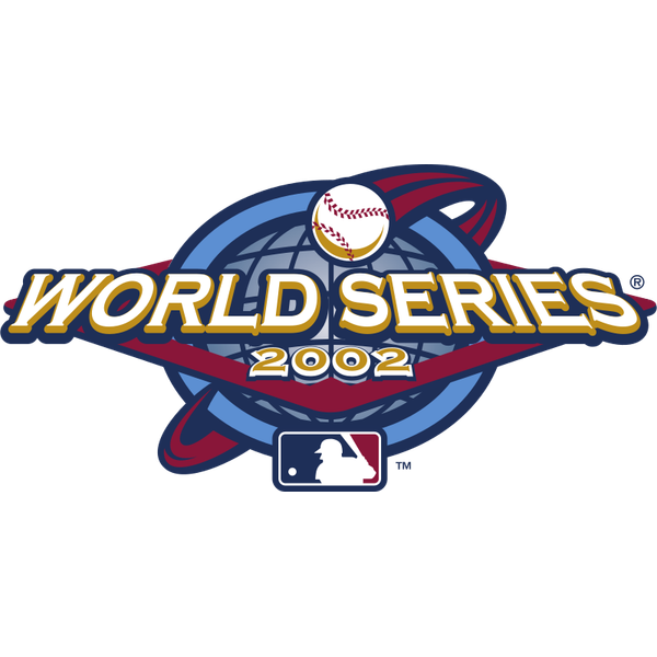
2002
Everybody hates this era and everybody is wrong. Yes, it is the most 1999 thing ever committed to a jersey. The 1998 and 1999 marks keep the globe but go to a hard white block script with a year ribbon, and they are the same design, the one time in this whole run before 2025 that MLB used a World Series logo two years in a row. Then 2000 arrives and baseball discovers the swoosh, and the 2000, 2001, and 2002 marks are all oval-and-orbit constructions with a baseball rocketing around a ring. Here is why it lands an A minus: it commits. There is an actual idea in these, motion and orbit and momentum, and the era chases it for five straight years without blinking. The 2000 Subway Series mark has more energy in it than the entire back half of the Fall Classic era. Design that is confidently of its moment ages into character. Design that is trying to be timeless ages into nothing. We would take a swaggering, slightly ridiculous 2001 mark over a safe one every October.
Era 5 · 2003 to 2007 · The Chrome Era
ColorWay Sports Grade
A-
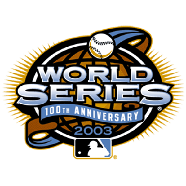
2003
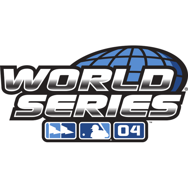
2004
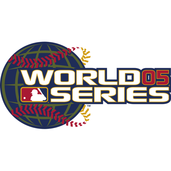
2005
2006
2007
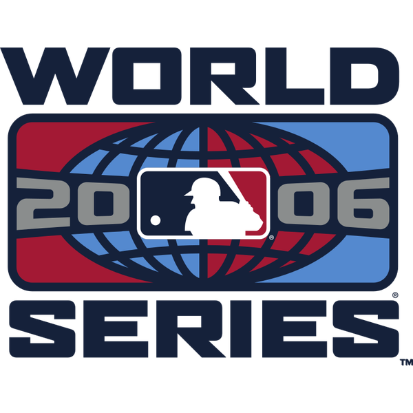
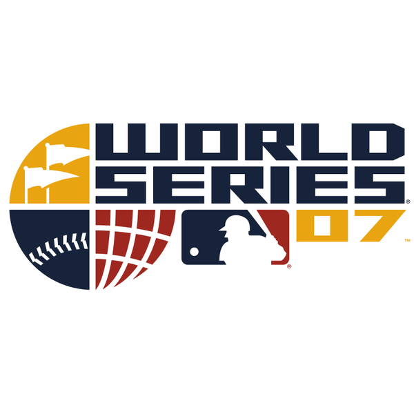
The other one we are going to get yelled at for. Chrome, bevel, and gradient, and we like it. The 2004 and 2005 marks are metallic block letters over a wireframe globe, the 2006 mark is a red and blue globe shield, and the 2007 split-baseball mark is the most inventive construction in twenty years of these. And then there is 2003, the 100th anniversary roundel, which is the single best one-off in the entire set: gold, circular, an actual occasion to celebrate, and the only mark on this board anyone would want on a hat with no other context. This era is dimensional in a way nothing before or since has tried to be. It reads as an object under stadium lights. It is loud, it is unsubtle, and it is a lot more fun than the polite navy wordmarks people claim to prefer. A minus.
Era 6 · 2008 to 2014 · The Fall Classic Era
ColorWay Sports Grade
B+
2008
2009
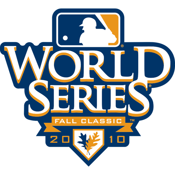
2010
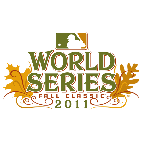
2011
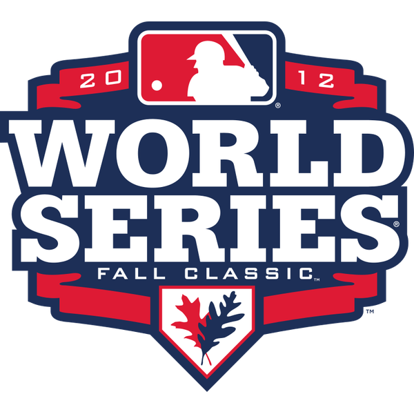
2012
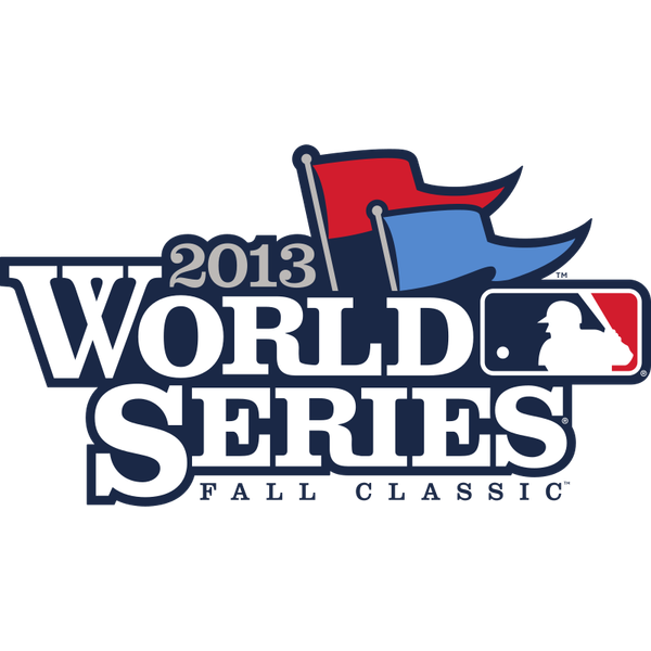
2013
2014
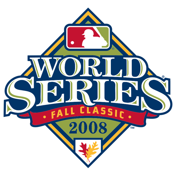
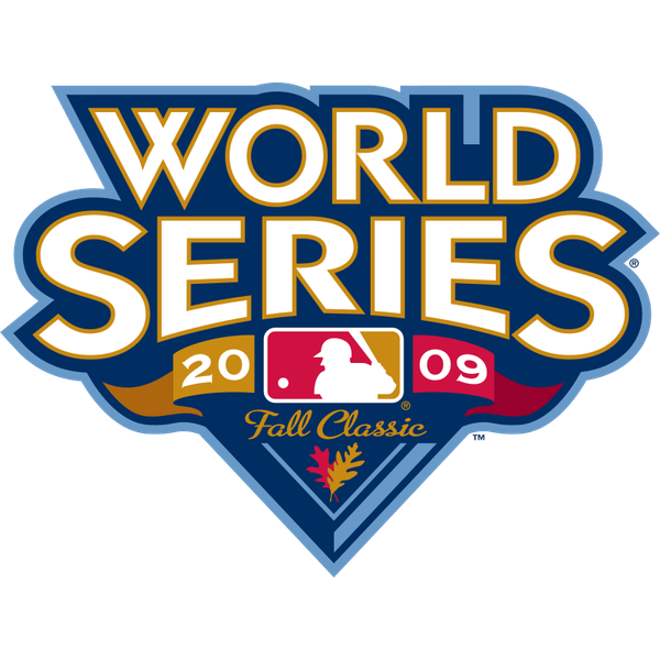
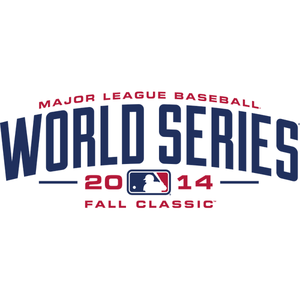
The most conceptually interesting era, and the one that runs out of gas. For seven straight years MLB put the words Fall Classic on the World Series logo and actually designed around what that means. The 2008 diamond has a falling leaf in it. The 2011 mark, easily the best of the run, wraps the wordmark in autumn oak and maple leaves in burnt orange and gold. The 2009 and 2010 marks use navy and gold with the leaf motif tucked into the year. This is the only era that ever tried to give the World Series a seasonal identity rather than a year stamp, and when it works it is lovely. B plus instead of A because the back half sags badly. The 2013 pennant flag and the 2014 arched wordmark are both fine and forgettable, and by 2014 the leaf idea had been quietly abandoned. Great concept, seven years, about four years of follow-through.
Era 7 · 2015 to 2021 · The Modern Navy Era
ColorWay Sports Grade
A
2015
2016
2017
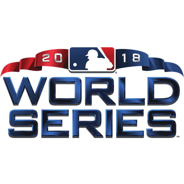
2018
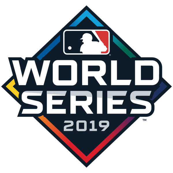
2019
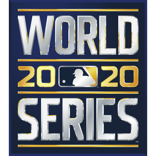
2020
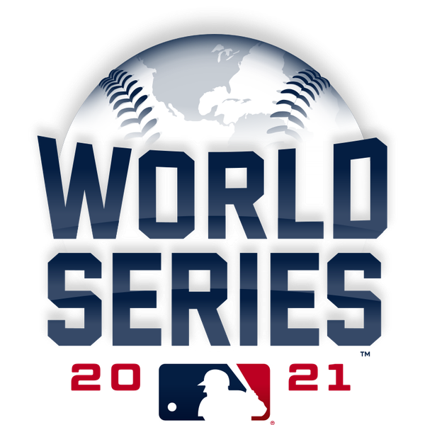
2021
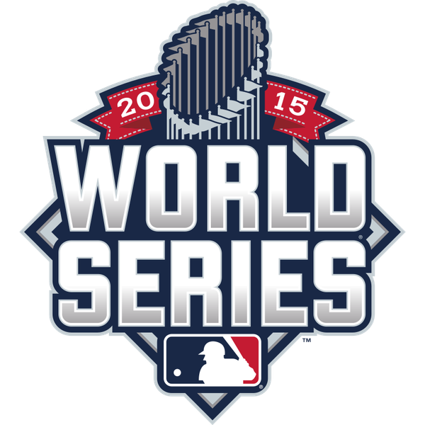
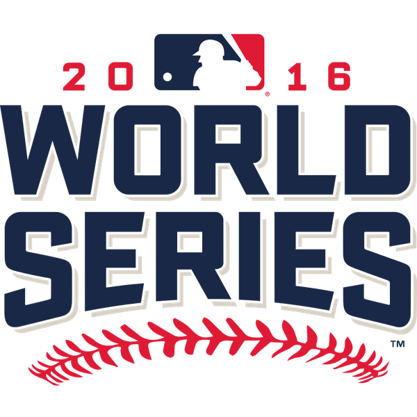
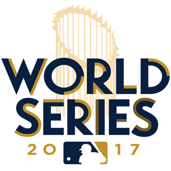
The best era of World Series logos, and it is not particularly close. Seven years of navy and silver marks that finally understand what this thing is actually for. Every one of them reads instantly at sleeve size, on a cap, on a broadcast bug, and blown up on an outfield wall, which is the only test that matters for a mark that lives on a uniform. And the variety inside the system is what pushes it to an A. The 2016 mark rides on red baseball seams. The 2017 mark puts the Commissioner's Trophy behind the wordmark as a gold outline and it is the warmest thing on this board. The 2019 mark blocks the diamond into color panels. The 2021 mark wraps the type over a globe dome. The 2020 mark, a silver wordmark trapped in a dark box, is accidentally the most honest logo MLB has ever made, a neutral-site World Series played in an empty ballpark rendered as a wordmark in a void. Same navy spine, seven genuinely different executions. That is what a design system is supposed to do.
Era 8 · 2022 to 2025 · The Capital One Era
ColorWay Sports Grade
C-
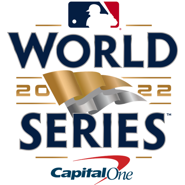
2022
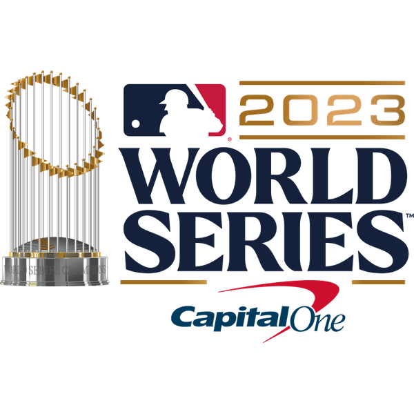
2023
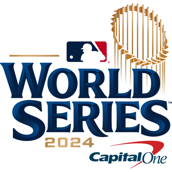
2024
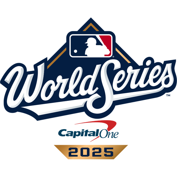
2025
The era did not stop trying, but it did let a bank in. We originally called these four the same logo with the year swapped, and MLB's own 30-logo lineup shows that was wrong. They are four different marks. 2022 is a navy wordmark with a waving gold and silver pennant, the prize the teams are chasing, and it is the best idea of the era. 2023 sets the wordmark beside a full Commissioner's Trophy, with Capital One under it. 2024 moves the trophy behind the wordmark, again with Capital One. And 2025 brings back the cursive World Series script, the lineage that ran from 1987 to 2000, drawn by designer Kelly Hume through Fanbrandz (per the Seattle Times), with Capital One and a gold 2025 banner.
So why only a C minus? The sponsor. Capital One sits inside the championship mark of the sport's championship series, on the patch and in every broadcast use, and once you see it you cannot unsee it. We graded the NBA's YouTube TV era an F for that same sin. And 2023 and 2024 are close cousins, a navy wordmark and a trophy rearranged, which is the least interesting stretch since the Fall Classic era ran out of leaves. What keeps it off the bottom tier is 2022's pennant and 2025's script, which is the best pure piece of World Series lettering in two decades. Strip the bank out of 2025 and we would be talking about an A minus.
2026: The Script Returns Again
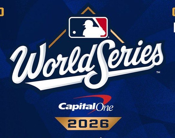
via MLB
The 2026 World Series logo showed up in MLB's 2026 postseason schedule graphic, and it is a near copy of 2025: the same cursive script, the MLB logo atop a gold diamond, Capital One, and a gold 2026 banner. It is the first back-to-back World Series repeat since 1998 and 1999. We love the script and we understand wanting to keep it, but a new year deserves a new mark. It is part of a bigger pattern, too. MLB is using the same postseason logo for the third straight year, which we get into in our MLB postseason logo ranking.
The Best Era
2015 to 2021, the Modern Navy Era, grade A. Seven years of marks that work at every size they actually have to work at, built on one navy spine with seven genuinely different ideas hung off it: the 2016 seams, the 2017 gold trophy, the 2019 color-blocked diamond, the 2021 globe dome. It is not the era that photographs best in a nostalgia thread. It is the era that does the job. A World Series logo lives on a sleeve and a cap, not on a poster, and this is the only run that consistently remembered that.
The Worst Era
2022 to 2025, the Capital One Era, grade C minus. Not because it is ugly, and not because it is lazy. These are four different logos, and the 2022 pennant and 2025 script are both good. It is the worst era because a bank moved into the championship mark, because 2023 and 2024 barely move the needle from each other, and because the one great idea, the 2025 script, is now being repeated in 2026 instead of built on.
Frequently Asked Questions About World Series Logo History
What is the best World Series logo era of all time?
The best World Series logo era is the 2015 to 2021 modern navy run, which we graded an A. It is built on a single navy spine with seven different ideas hung off it, from the 2016 baseball seams to the 2017 gold Commissioner's Trophy outline to the 2019 color-blocked diamond. Every mark in the era reads instantly at sleeve size and on a cap, which is the only test that matters for a logo that lives on a uniform. This runs against the common view that the nineties were the peak, and we explain why in the era breakdown.
What is the worst World Series logo era?
The worst World Series logo era is the 2022 to 2025 Capital One era, graded C minus. The four marks are different from each other: 2022 has a gold and silver pennant, 2023 sets the wordmark beside the Commissioner's Trophy, 2024 puts the trophy behind the wordmark, and 2025 brings back the cursive script. What drags the era down is the Capital One logo built into the championship mark and how similar 2023 and 2024 are.
Are the nineties World Series logos overrated?
In our ranking, yes. The 1992 to 1997 globe and bat era grades a B minus, tied with the green diamond era. The material feel is real, with woodgrain on the bat and depth in the globe, but the marks stack six competing ideas into one small patch and collapse into a brown and gold smudge at the size they actually live at, which is a jersey sleeve. Nostalgia does a lot of the grading for that era.
Why is there a 1994 World Series logo if the World Series was cancelled?
The 1994 World Series logo was designed and produced before the players strike wiped out the postseason that September. The Fall Classic was cancelled for the first time since 1904, but the mark already existed, so it survives in the chronology as a logo for a World Series that was never played. It uses the same globe and bat diamond template as 1992, 1993, and 1995.
Why is Capital One on the World Series logo?
Capital One holds the presenting sponsorship of the World Series, so since 2022 its logo has been built into the official mark itself rather than kept to separate signage. That puts the sponsor on the patch and in every broadcast use of the logo. We graded the era a C minus, mostly for that.
Does the World Series logo change every year?
Almost every year. Most World Series since 1986 have had their own logo with the year built in, and the mark is retired once the series ends. There are two exceptions: 1998 and 1999 used the same design, and the 2026 World Series logo is a near copy of 2025, with the same cursive script, gold diamond and Capital One. Most eras also share a template for several years and change the year, colors and small details, which is why the marks group into eight design families.
What does the 2026 World Series logo look like?
The 2026 World Series logo keeps the cursive World Series script that returned in 2025, with the MLB logo atop a gold diamond, Capital One under the script and a gold 2026 banner. It appears in MLB's 2026 postseason schedule graphic and is the first back-to-back World Series logo repeat since 1998 and 1999.
Who designed the 2025 World Series logo?
The cursive 2025 World Series script was drawn by designer Kelly Hume through the agency Fanbrandz, according to the Seattle Times. It revived the script lineage MLB used on World Series logos from 1987 to 2000.
Which World Series logo had the Fall Classic wordmark?
The Fall Classic wordmark appeared on the World Series logo from 2008 through 2014. The best of those is 2011, which wraps the mark in burnt orange and gold autumn leaves. It is the only era that gave the World Series a seasonal identity instead of stamping the year on it, and we graded the run a B plus.
Where can I buy old World Series gear and caps?
Fanatics and New Era carry championship caps, jerseys, patches, and Fall Classic collectibles going back across many of the years on this board, including New Era World Series cap releases with the year's logo on the side.
The Bottom Line on World Series Logo History
Forty years of World Series logos break into an arc that runs the opposite direction from the one everybody assumes. The nineties marks people canonize are busy and fussy at the size they actually live at. The Y2K and chrome eras that get laughed at had real conviction and aged into character. The Fall Classic era had the best single idea and ran out of patience with it. And the modern navy run that nobody gets sentimental about is the one that quietly did the job better than any of them. Then 2022 arrived and a bank moved into the mark. The designs kept changing, from the 2022 pennant to the 2025 cursive, and that script is the best lettering the Fall Classic has had in decades. Now 2026 is repeating it. We would rather see MLB take the script somewhere new than stamp a new year on it.