Screenshot via YouTube
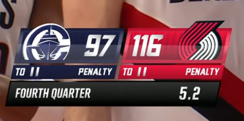
The Portland Trail Blazers local broadcast scorebug for the 2026 NBA season has the look and feel of a stock Fox Sports template with Portland's red, black, and white colors dropped in. It might actually be exactly that. It gets the job done from a functional standpoint, but it does the bare minimum when it comes to giving the Blazers any kind of unique broadcast identity.
The layout is clean enough. Team logos are visible, scores are easy to read, and the game clock and quarter information are where you expect them to be. The red and black color scheme comes through, but it does not do anything interesting with it. There are no design elements that connect the scorebug to Portland or to the Trail Blazers brand specifically. You could swap in any other red-and-black team's logos and it would look exactly the same.
This is the problem with regional networks leaning on templated scorebug designs. When every broadcast on the same network uses the same framework, individual teams lose any sense of visual identity on screen. The Blazers have a classic pinwheel logo and a strong brand history, but none of that shows up in their broadcast graphics. It is just a generic sports bar, accent color, and logo placement.
The readability is fine. The proportions are acceptable. The overall size does not take up too much of the screen. But those are baseline requirements, not things worth praising.
Grade: B-
It looks like a generic Fox scorebug, and it might actually be one. Works from a readability standpoint but barely qualifies as a design with any personality. Portland deserves better.