Image via Milwaukee Brewers
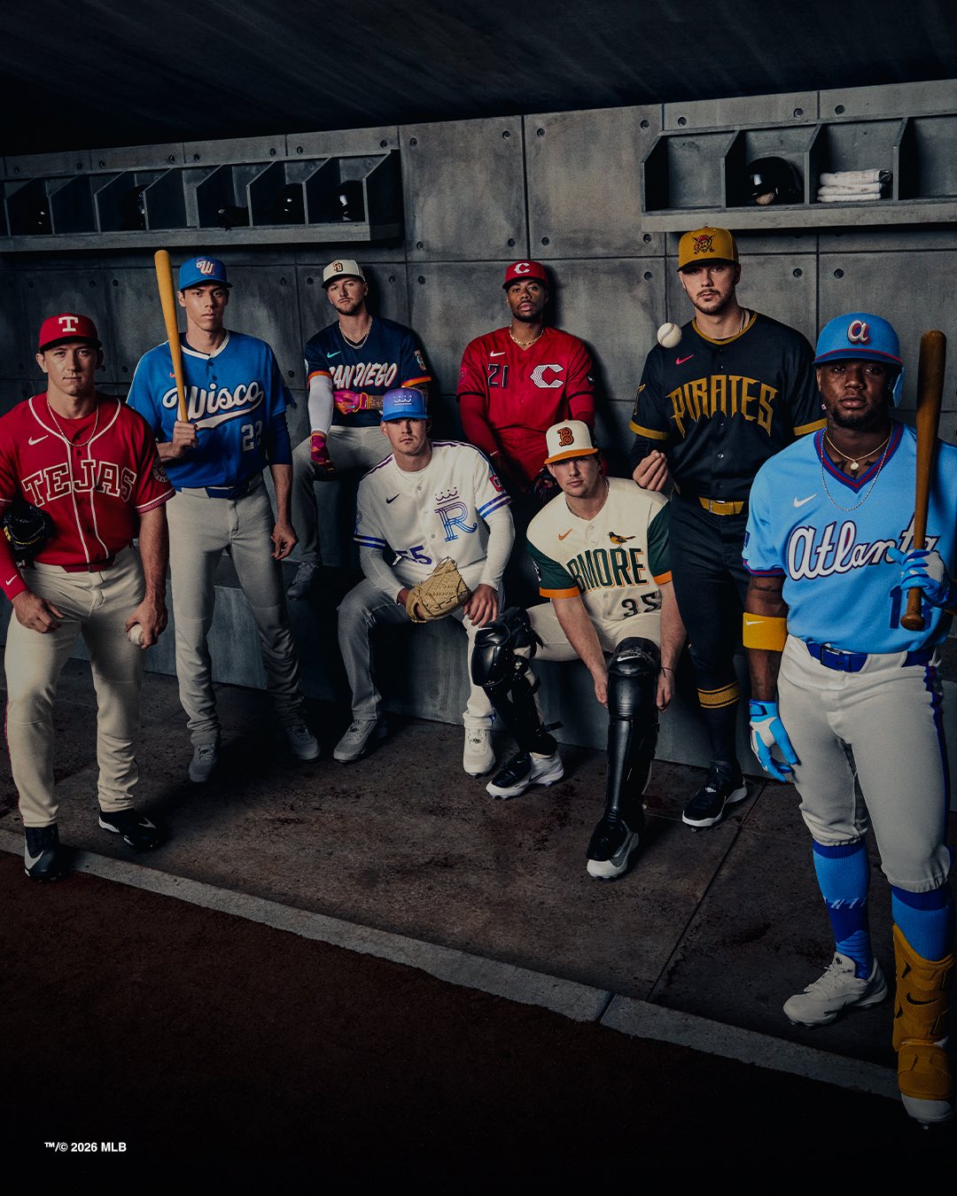
The Milwaukee Brewers officially dropped their 2026 City Connect jersey today, and this one is all about the state. The "Wisco" script across the chest leans fully into Wisconsin pride, and the blue base with rainbow accent details throughout the uniform makes for one of the more distinctive City Connect designs we have seen this cycle.
ColorWay Sports may earn a commission on purchases, at no extra cost to you.
The Design
The jersey features a rich blue base color that pulls from the Wisconsin state flag rather than the Brewers' traditional navy and gold. "Wisco" is spelled out across the chest in a custom script that feels casual and regional in the best way. It is the kind of nickname that only people from Wisconsin actually use, and putting it on a jersey gives the whole thing an authentic local feel.
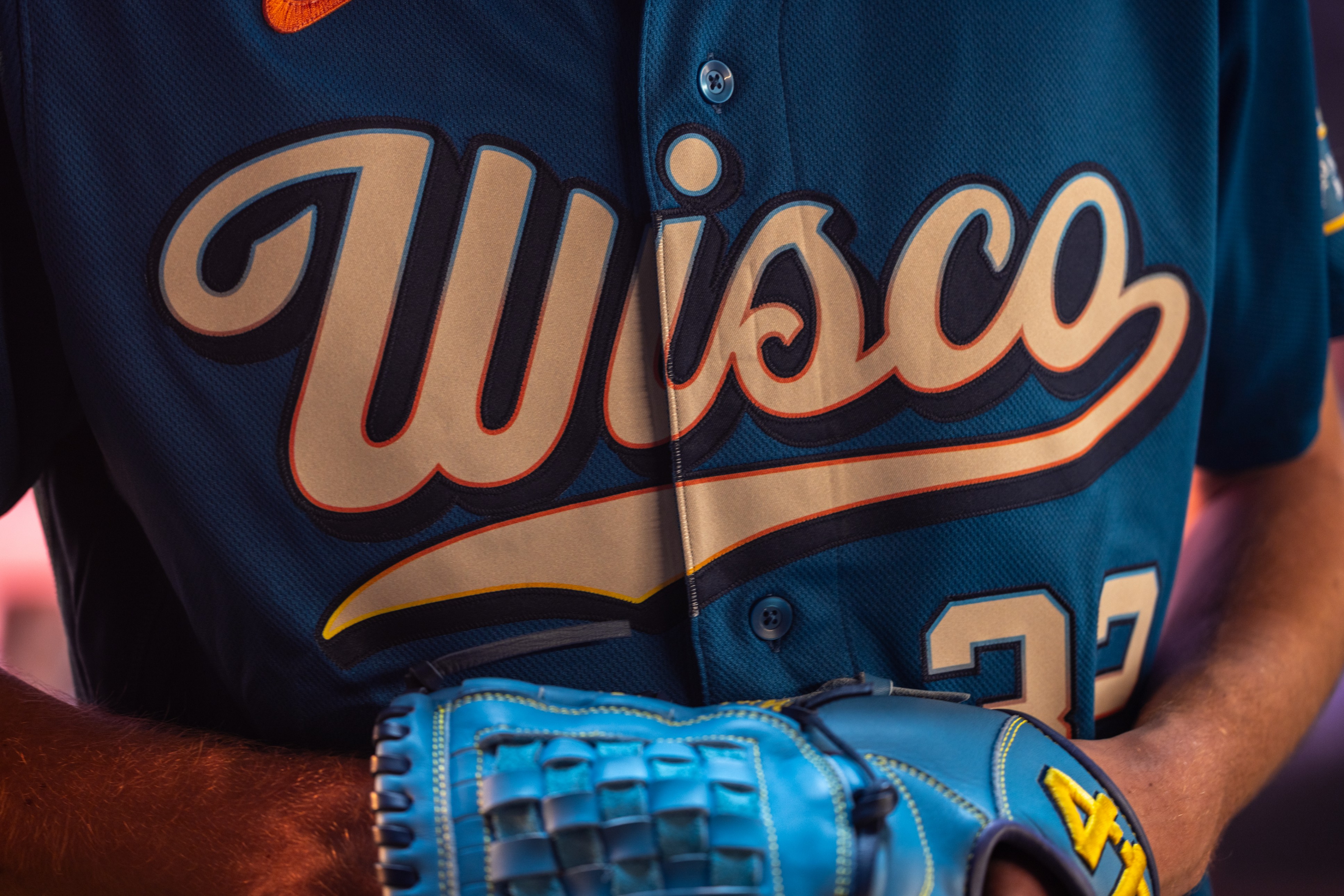
Image via Milwaukee Brewers
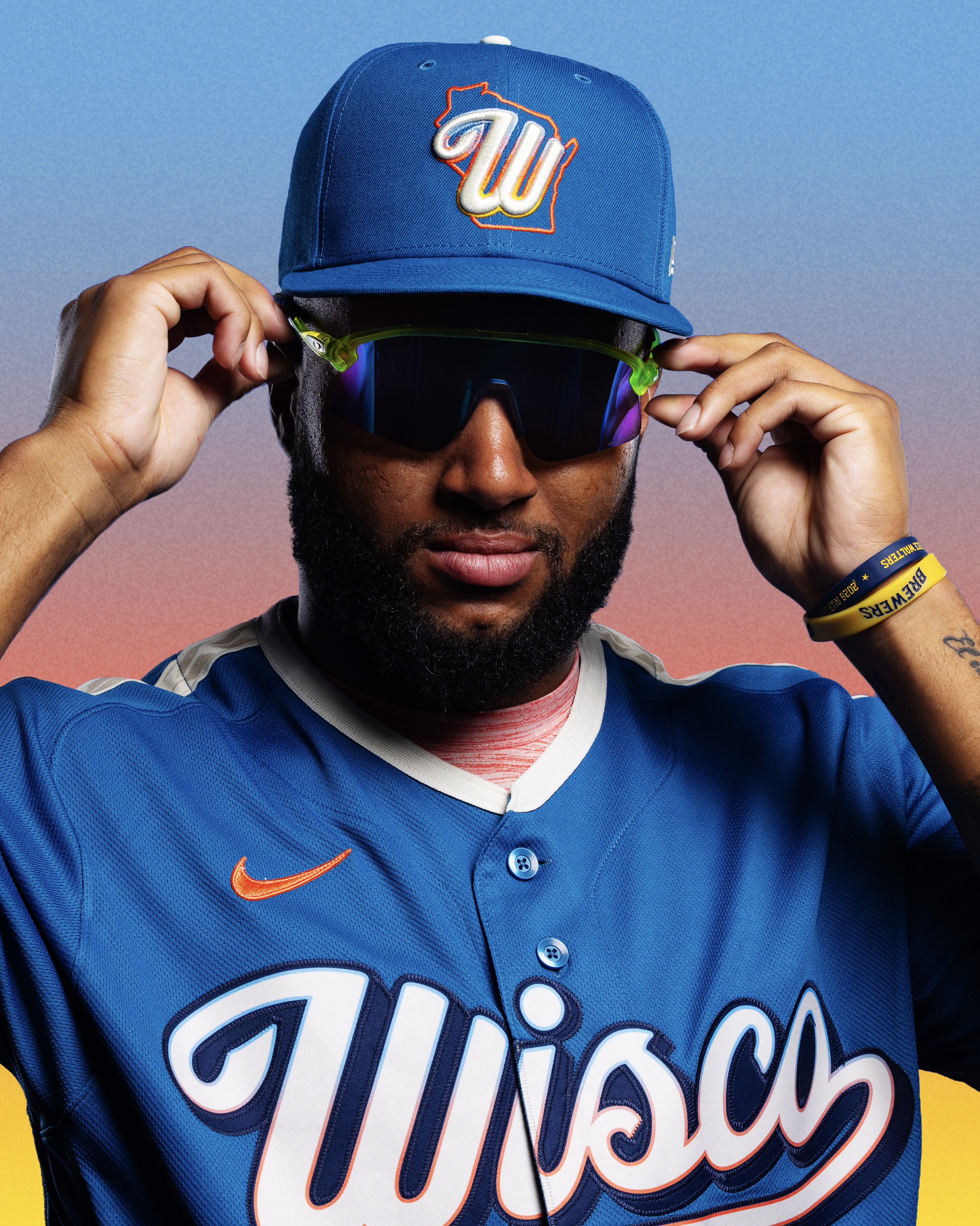
The rainbow color hints are woven throughout the jersey in subtle ways. You will notice them in the piping, the sleeve trim, and the accents around the lettering. It is not an overwhelming rainbow effect. It is more like small pops of color that represent the diversity of the state and keep the uniform from feeling one-dimensional.
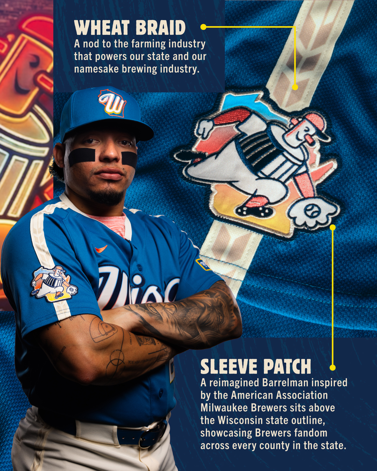
Image via Milwaukee Brewers
The details are strong. There is a wheat braid pattern that nods to Wisconsin's agricultural identity, and the Barrelman logo shows up as a sleeve patch. The hat might be the best part of the whole package. It matches the blue base and carries the same rainbow accents, and it is the kind of cap that works just as well off the field as it does on it.
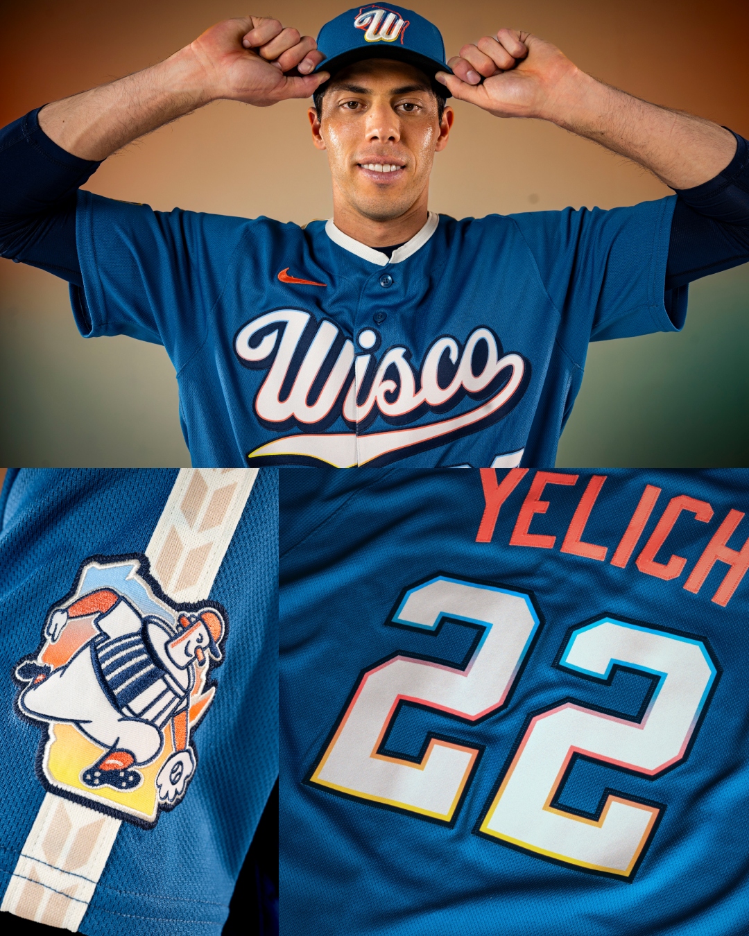
Image via Milwaukee Brewers
What We Think
We really like this one. Normally, when a City Connect jersey moves away from the team's actual color scheme, we are skeptical. The whole point of a team's identity is the colors, and when you swap those out for something completely different, it can feel disconnected. But the Brewers made it work here because the concept is clear. This is not a Brewers jersey. This is a Wisconsin jersey. And once you accept that framing, the state-inspired blue and rainbow accents make total sense.
The color itself is great. It is a shade of blue that stands out from the rest of the league and gives the Brewers something totally unique in their rotation. The hat is excellent. The rainbow touches are tasteful and well-placed. If we are being honest, we would have loved to see this same concept executed in Brewers navy and gold, because we think the Wisconsin pride story could still work with the team's own palette. But the state colors give it its own lane, and we respect the commitment to the concept.
This is one of the stronger City Connect designs in the 2026 class. We are giving it an A-.
For the full breakdown of every City Connect jersey this year, check out our 2026 MLB City Connect Official Rankings.