Image via MLB
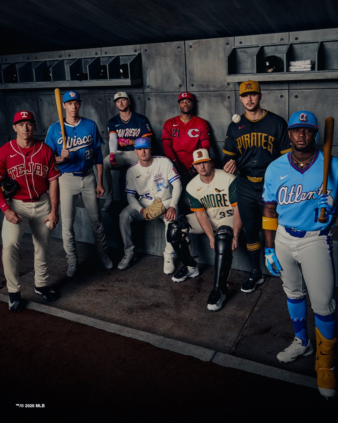
Nike and MLB officially dropped eight new City Connect jerseys today. We had seen leaks of most of these over the past few weeks, but now the full official photos, details, and wear schedules are out. Some of these look even better than the leaks suggested. Others look worse.
We ranked and graded all eight from worst to first.
ColorWay Sports may earn a commission on purchases, at no extra cost to you.
8. Kansas City Royals City Connect: C-
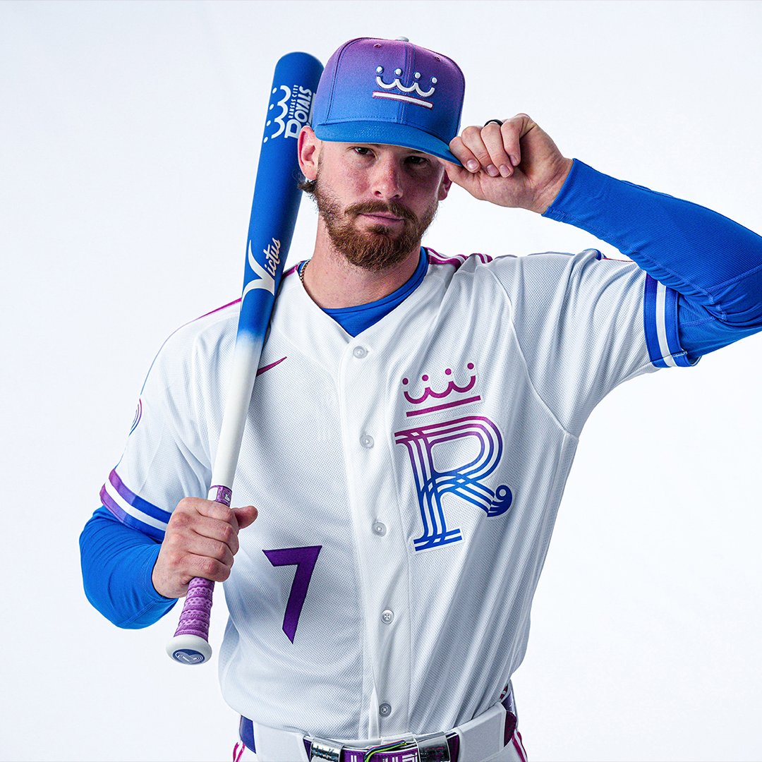
Image via Kansas City Royals
The official Royals City Connect actually looks a little better than the leak did. The gradient hat is a rare choice and the different crown logo has some personality to it. The white base is clean. But when we ask the real question that matters for any uniform, "would you be excited to see this on TV or at a game," the answer is no. The purple-to-blue gradient on the "R" logo just does not feel like Kansas City. It feels like it belongs to a different sport entirely.
7. Baltimore Orioles City Connect: C
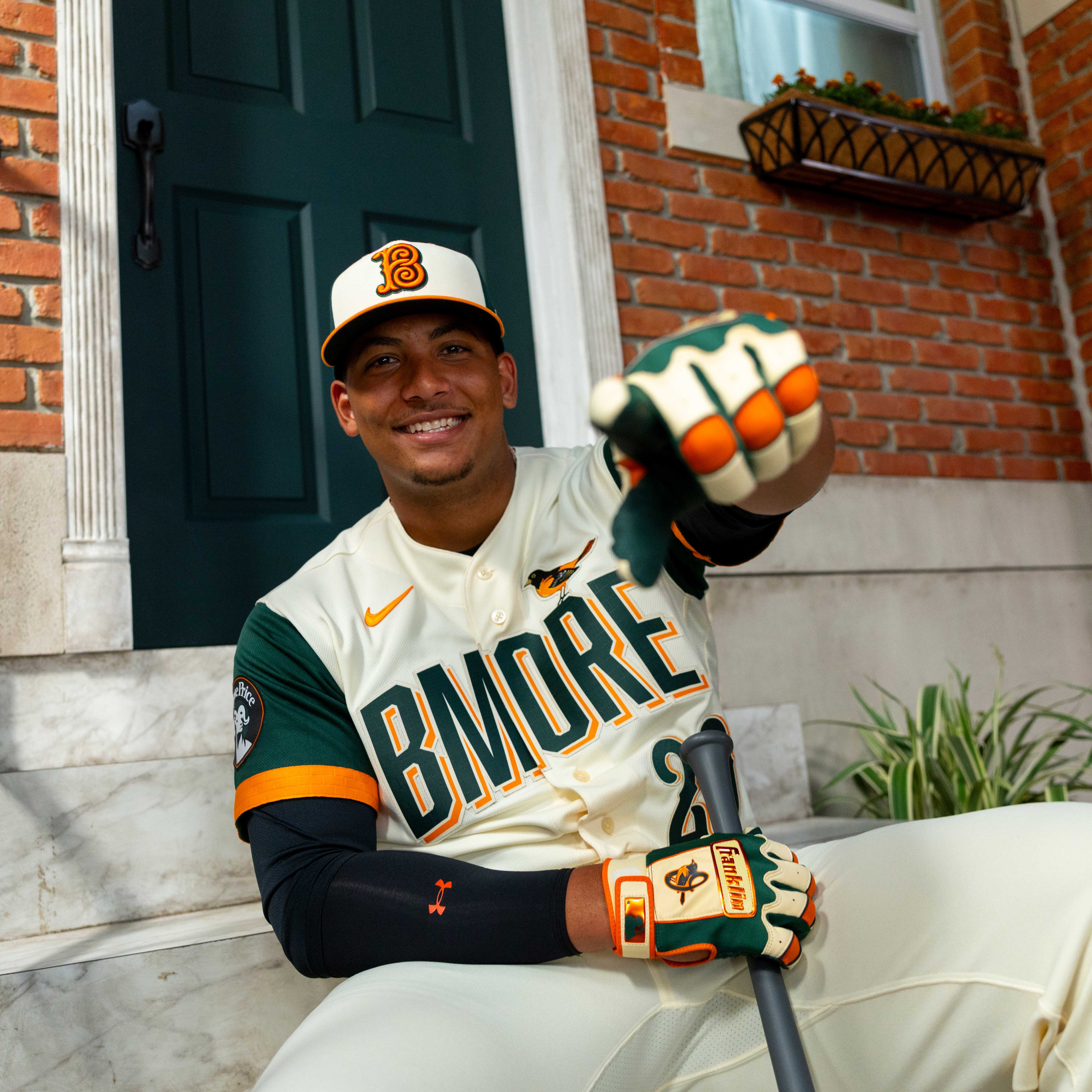
Image via Baltimore Orioles
The Orioles went with cream and green, and the more we see it, the less we love it. The Oriole bird sitting on top of the "BMORE" wordmark is a nice touch, and we do like that the monochrome cream base makes it feel like a legitimate uniform. The brickyard pattern hidden inside the collar is a cool detail. But here is the problem: you cannot see those details on TV. From a broadcast perspective, this just does not pop. It does not give us any real feeling, and for a city with as much sports energy as Baltimore, that is a miss.
6. Texas Rangers City Connect: B-
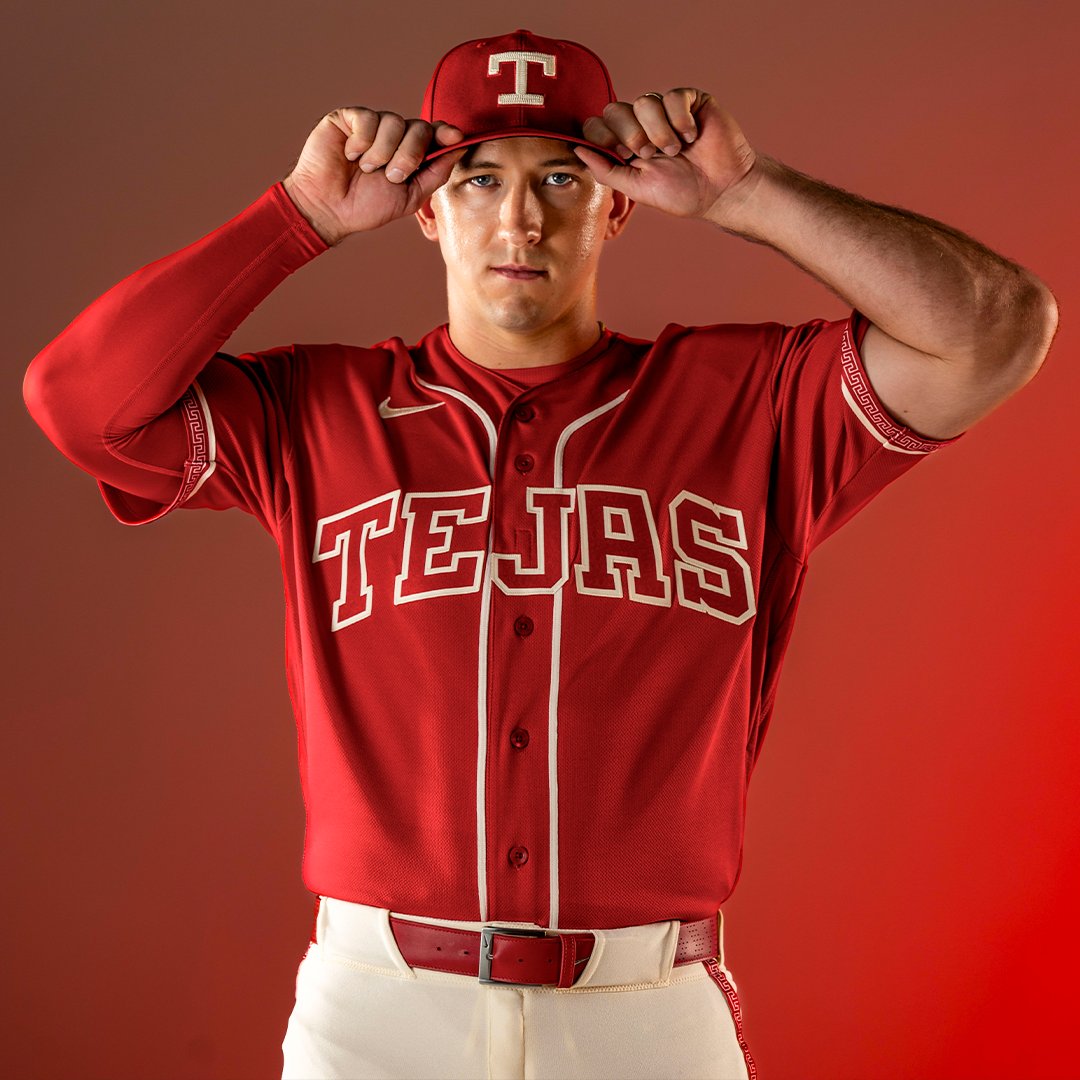
Image via Texas Rangers
The Rangers Tejas jerseys are not bad, but they are kind of boring. The all-red look reminds us a lot of the NBA Christmas jerseys from 2012-13. The hat with the stitching detail has a nice feel to it, and the white pants at least break up the red. But we would have liked to see some hints of blue mixed in if you are going to commit to that much red. We also generally prefer when teams stick to their actual name on the front. Using "Tejas" is obviously meant to sell jerseys, and we get why teams do it, but we would rather see "Texas" or "Rangers" on the chest.
5. Cincinnati Reds City Connect: B
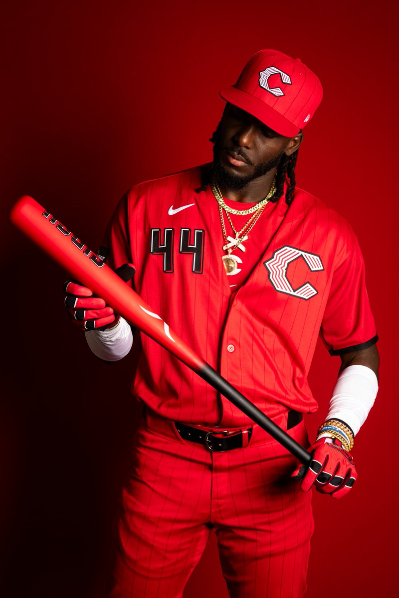
Image via Cincinnati Reds
We are conflicted on the Reds City Connect. The all-red look is bold and the color itself is really good. But we have never been fans of putting the number and logo at the top of the jersey like this, and it does not win us over here either. The hat features a different version of the C logo that does not quite have an identity yet. It feels like the Reds are still figuring out what their City Connect brand actually is. The red pops hard in the official photos, and it will probably look solid on the field. But we are not in love with it.
4. Pittsburgh Pirates City Connect: A-
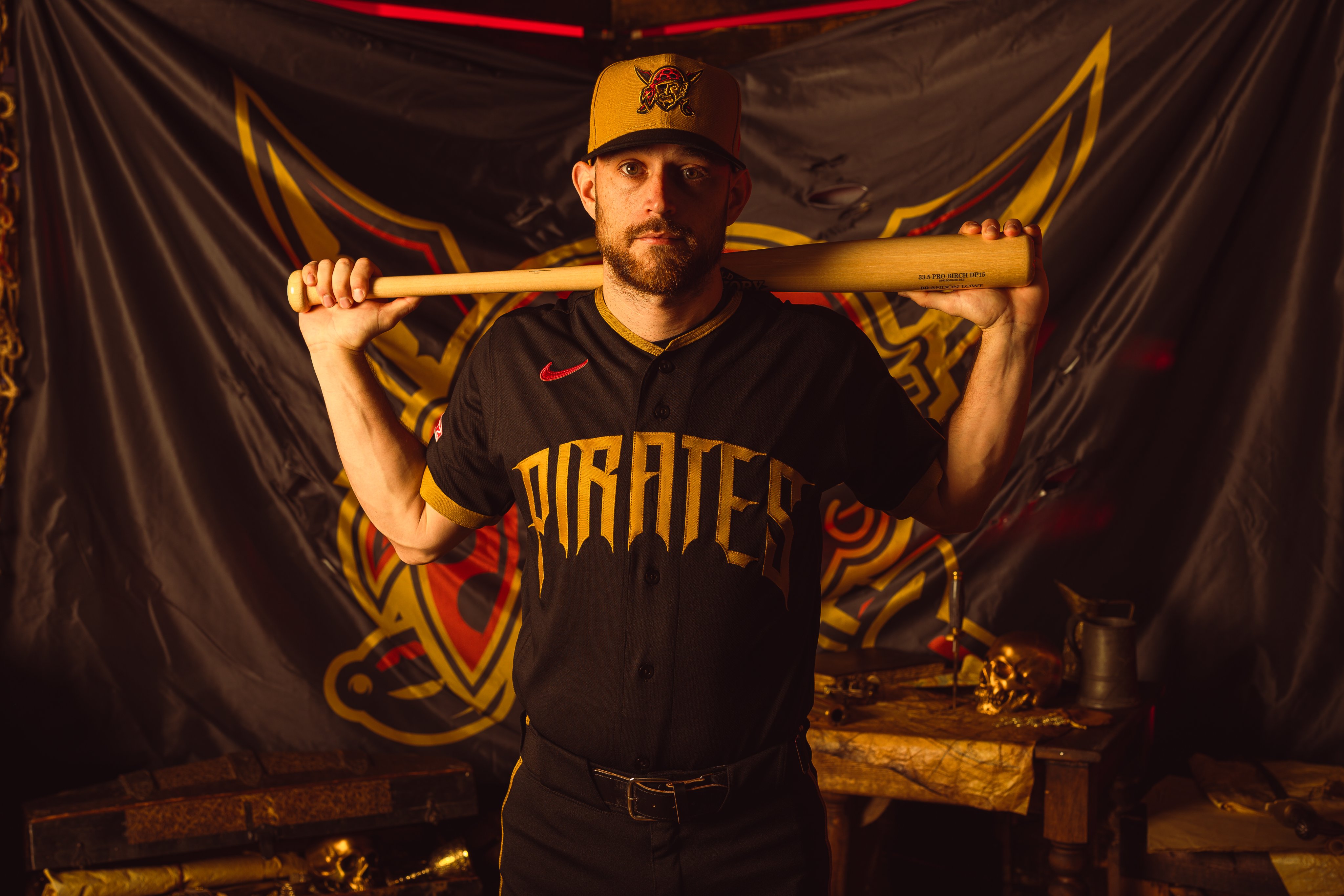
Image via Pittsburgh Pirates
The yellow hat is doing wonders for this jersey. The Jolly Roger logo on the cap is one of the best pieces in this entire City Connect cycle, and the black and gold color scheme stays completely true to the Pirates brand. Paul Skenes has been rocking black jerseys all year, usually the one that says "Pittsburgh," and this City Connect version that says "Pirates" in that gothic lettering is a fantastic companion piece. The all-black monochrome look is the one thing holding it back slightly. It makes it feel more like a fashion piece than a legitimate game uniform. But it is a really good jersey regardless.
3. Milwaukee Brewers City Connect: A-
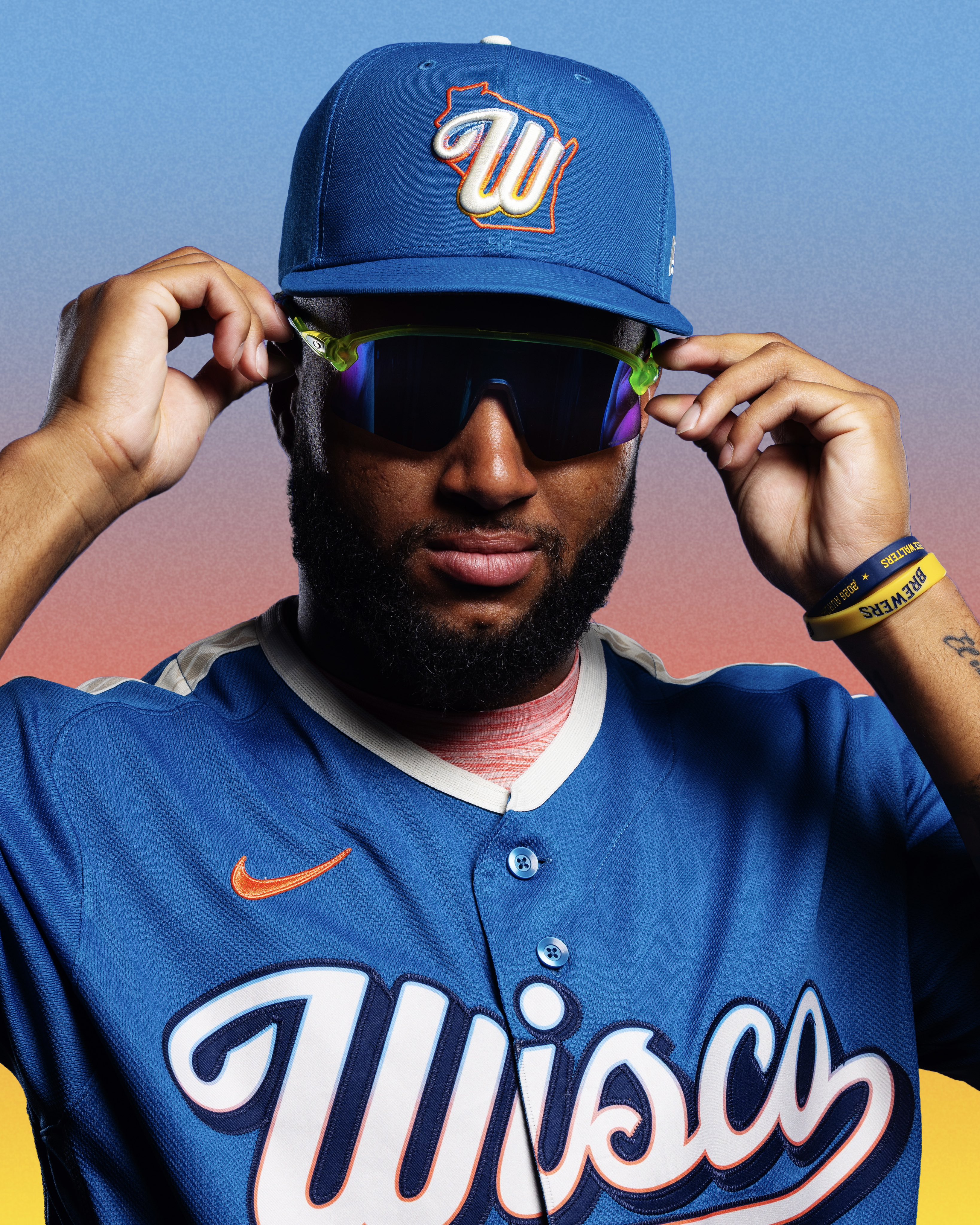
Image via Milwaukee Brewers
We love this Wisco jersey. The blue base is great, the hat is great, and the rainbow color hints throughout the uniform give it a personality that most City Connects just do not have. Normally this would be the type of jersey we would not like because the colors do not really match the Brewers' usual palette. But the fact that it represents the whole state of Wisconsin instead of just the team makes it work. It is their identity for this jersey, and they leaned all the way into it. The one thing we wish they did differently is use the actual Brewers colors, but they went with the colors of the state instead. It still works. This is a jersey that looks like a real uniform and not a gimmick, which is what separates the good City Connects from the bad ones.
2. San Diego Padres City Connect: A
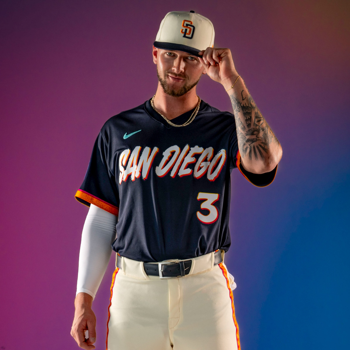
Image via San Diego Padres
The hat looks incredible. The jersey looks great. We honestly do not know what we would change about this one. The Dia de los Muertos theme is done tastefully, the dark navy with the orange and cream accents gives it a premium feel, and the pants being a different color than the jersey is a big plus. We always prefer when teams avoid going full monochrome because it makes the uniform look more legitimate. Same thought as the Brewers at number 3. This looks like a real jersey, not a costume. And we say this as Dodger fans who hate the Padres: this is a great City Connect.
1. Atlanta Braves City Connect: A+
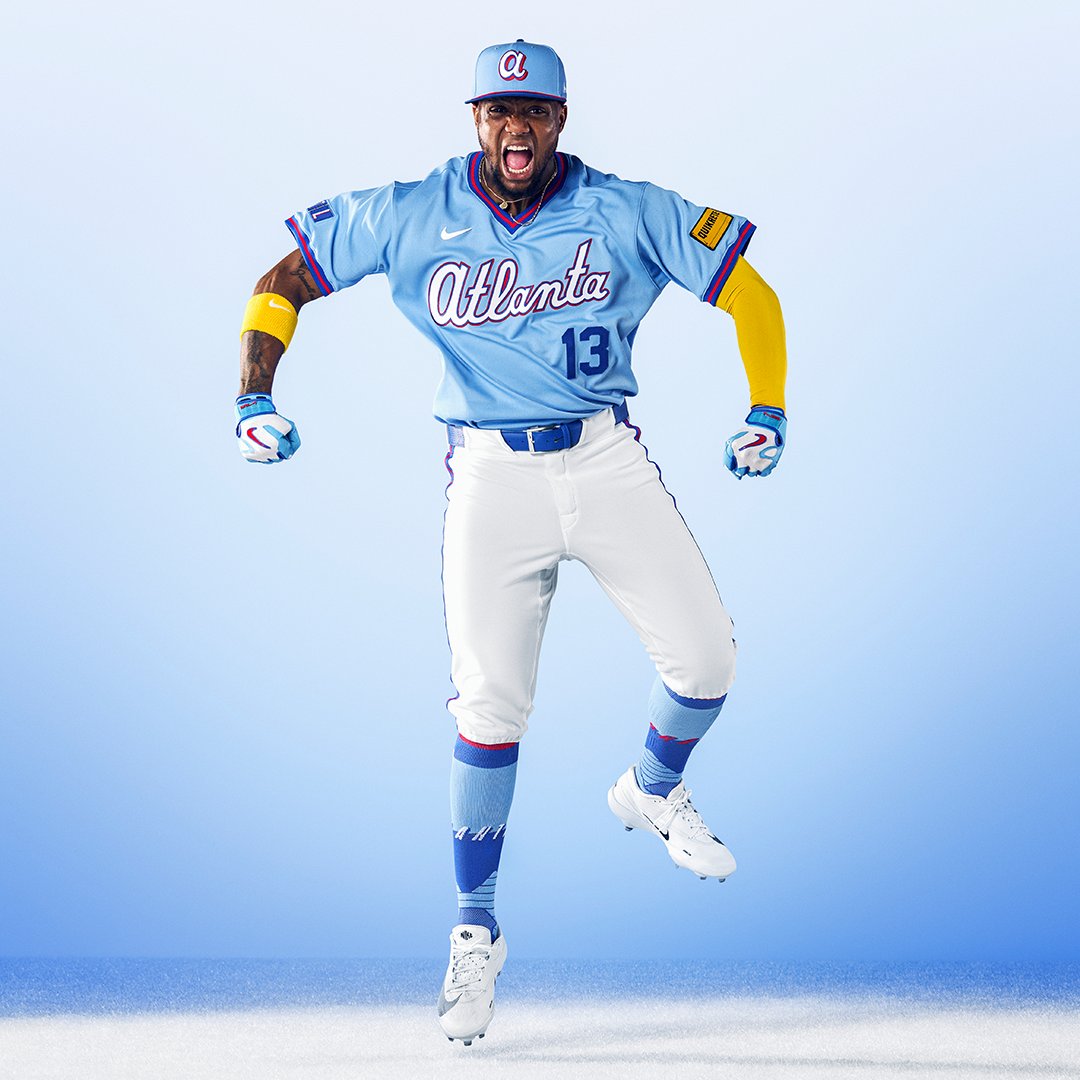
Image via Atlanta Braves
The Atlanta City Connect looks even better as the official release than it did as a leak. The powder blue is incredible. This might be our favorite City Connect jersey ever made, across any team, any year. The 1980s SuperStation-era throwback is exactly the kind of thing City Connects should be doing: connecting a franchise to its history and its city. The blue is perfect, the "Atlanta" script is perfect, the TBS-inspired ATL sleeve patch is perfect. Everything about this uniform works. It is not trying to be edgy or trendy. It just looks like a beautiful baseball uniform with real meaning behind it. Clear A+ and the best of this entire batch by a wide margin.
Individual Breakdowns
- Atlanta Braves City Connect Review
- San Diego Padres City Connect Review
- Milwaukee Brewers "Wisco" City Connect Review
- Pittsburgh Pirates City Connect Review
- Cincinnati Reds City Connect Review
- Texas Rangers "Tejas" City Connect Review
- Baltimore Orioles "BMORE" City Connect Review
- Kansas City Royals City Connect Review
All images via official team social media accounts and MLB.