Image via Pittsburgh Pirates
The Pittsburgh Pirates officially dropped their 2026 City Connect jersey today, and this one is a winner. The combination of black and gold with gothic lettering across the chest gives Pittsburgh exactly what its fanbase has been asking for. We have the full breakdown and our grade below.
ColorWay Sports may earn a commission on purchases, at no extra cost to you.
The Jersey
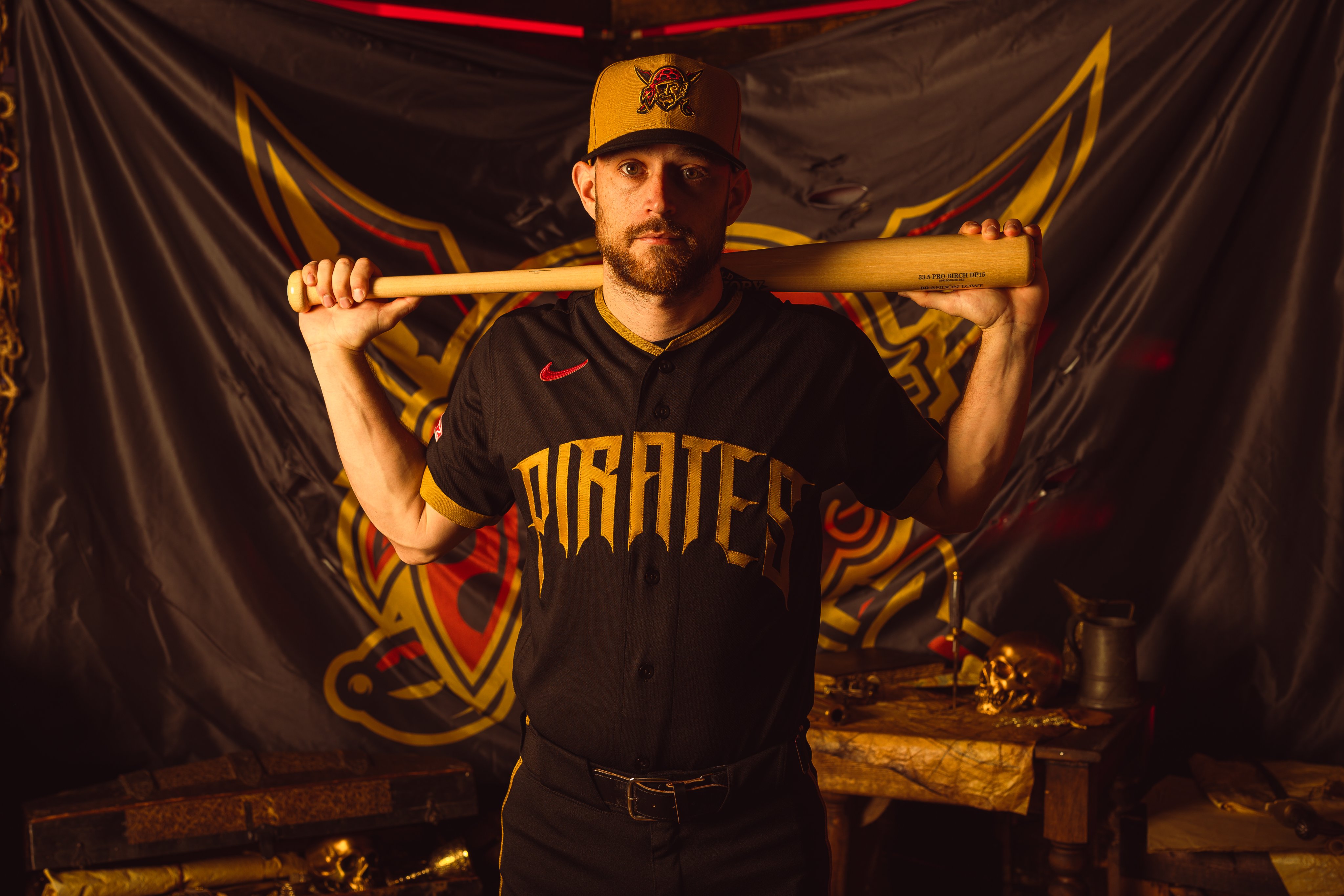
The centerpiece of this uniform is the word "Pirates" written in gothic lettering across the front of the jersey. The typeface is bold, detailed, and pulls directly from the kind of lettering you see all over Pittsburgh's history and architecture. The gold-on-black colorway makes it pop without feeling overdone, and the gothic style gives the whole design a level of edge that most City Connects do not have.
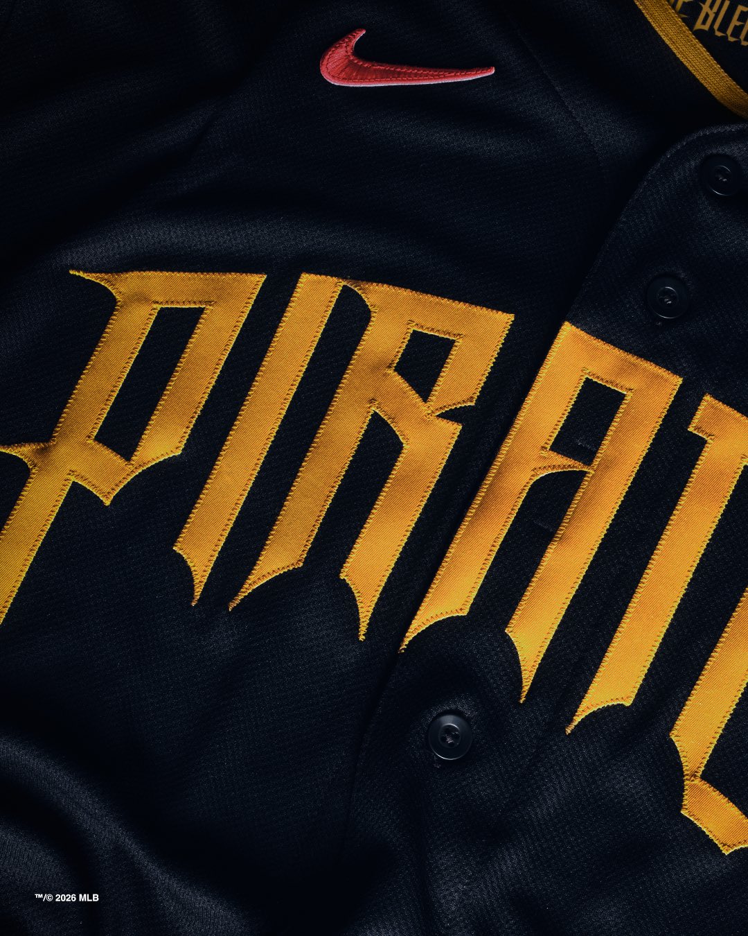
Image via Pittsburgh Pirates
Paul Skenes is the face of this release, and that is the right call. Skenes already loves wearing the black Pirates jerseys, particularly the alternate that says "Pittsburgh" across the chest. Putting him front and center in this City Connect just feels natural. He looks like a guy who was born to wear black and gold on a mound.
The Hat
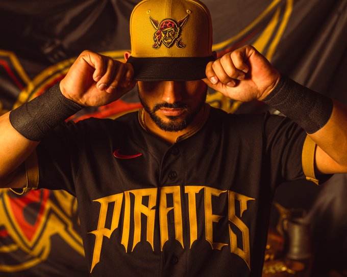
Image via Pittsburgh Pirates
We need to talk about the hat because it might be the best part. The yellow cap is doing serious work here. Most City Connect hats blend into the background or just match the jersey without adding much, but the Pirates went with a full gold crown that immediately grabs your attention. The Jolly Roger logo on the front in black ties the whole thing together. It is clean, it is bold, and it gives the uniform a totally different energy than the jersey alone would.
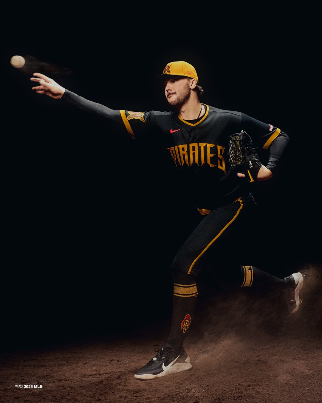
Image via Pittsburgh Pirates
What We Think
This is one of the stronger City Connect jerseys we have seen this cycle. The gothic lettering is the kind of creative choice that actually connects to the city instead of feeling like a generic Nike template. Pittsburgh has deep roots in that style of typography, and using it here makes the design feel earned.
The black base works because the Pirates already own that color. Unlike some teams that force black into their alternates for no reason, Pittsburgh has always been a black-and-gold franchise. This feels like an extension of their identity rather than a departure from it.
The yellow hat elevates the whole uniform. Without it, this would be a strong but straightforward black jersey. With it, the uniform has contrast, personality, and shelf appeal. We expect that hat to sell extremely well on its own.
If we are being picky, the only thing holding this back from a perfect score is that black jerseys in general can feel safe. We would love to see a team like the Pirates go fully gold for an alternate someday. But within the context of what Nike is doing with the City Connect program, this is a top-tier entry.
We are giving the Pittsburgh Pirates 2026 City Connect an A-.
For a look at how the Pirates stack up against every other team this year, check out our Full 2026 City Connect Rankings.