Image via Atlanta Braves
Update: All eight City Connect jerseys have been officially released by Nike and MLB. Check out our Official 2026 City Connect Rankings With Updated Grades and Photos.
The 2026 MLB City Connect jersey cycle has been one of the more active ones yet. Between official reveals, team store leaks, and social media scoops, we now have a look at nine different City Connect uniforms across the league. The Braves, Brewers, Pirates, Padres, Giants, Rangers, Orioles, Reds, and Royals have all had their 2026 City Connect designs leaked or revealed. We graded all of them from worst to first.
ColorWay Sports may earn a commission on purchases, at no extra cost to you.
9. Royals City Connect: C+
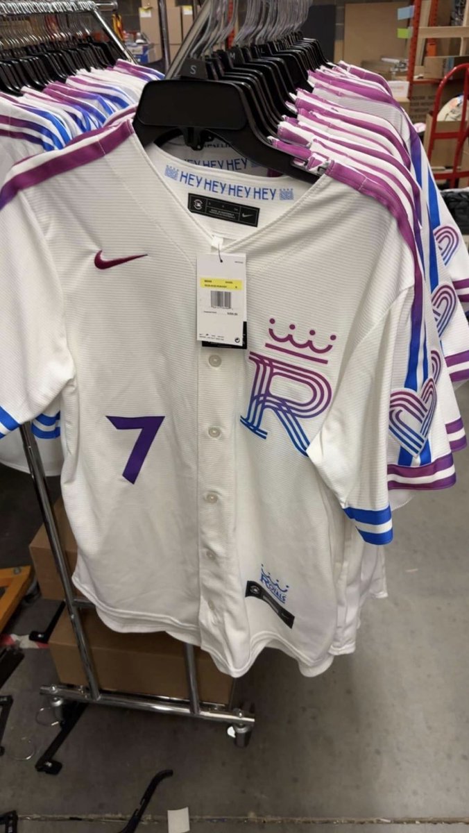
Leaked image via @Tha_Chadwick on Reddit
Kansas City energy just got a new look. Catch the all-new 2026 Kansas City Royals City Connect Jersey and wear the pride of the "City of Fountains" on game day. pic.twitter.com/vALc9ZRNS3
— Grishko Fashion (@GrishkoFashion) March 26, 2026
The cream base is nice, and the piping along the sides and sleeves adds some structure. But the logo is where this one loses us. The stylized "R" with the crown on top and the purple-blue-pink color scheme feels disconnected from the Royals brand. The "HEY HEY HEY HEY" text inside the collar is a fun detail, but the overall color palette just does not feel like Kansas City. The purple and blue stripes on the shoulders are bold, but they feel like they belong to a different team entirely.
8. Reds City Connect: C+
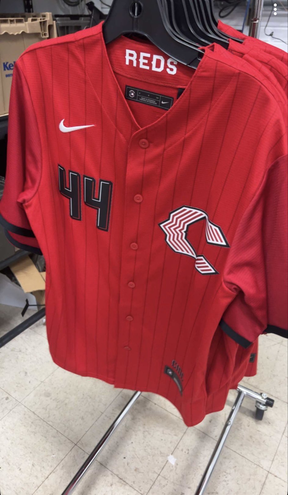
via @drewsturgell19 / @TalkinBaseball_ on X
The Reds City Connect that leaked earlier this season is fine. It does not do anything wrong, but it does not do anything that makes you want to buy it either. The color scheme stays in the red family, which is a plus, but the overall design feels safe. For a franchise with as much history as the Reds, we expected something with more personality. We covered the full breakdown in our Reds City Connect leak post.
7. Orioles City Connect: B-
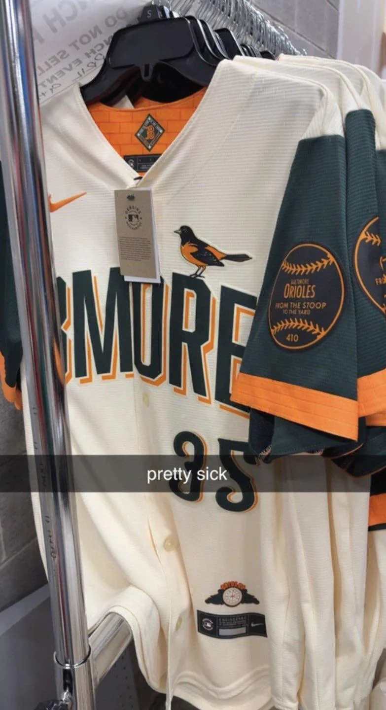
Leaked image via @Tha_Chadwick on Reddit
There is a lot to like here. The cream base is clean, the dark green sleeves are a bold departure, and the Oriole bird sitting on top of the logo is a great touch. The "From the Stoop to the Yard" sleeve patch with the 410 area code is the kind of local detail that City Connects should have. But "BMORE" as the chest wordmark is holding this one back. It feels like a nickname that works on a hoodie but not on a game jersey. The colors are nice and the overall package is solid, but the name choice keeps it from reaching the next level.
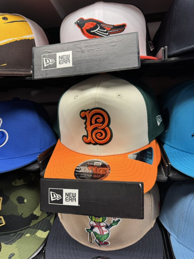
The Orioles City Connect hat with cream and green colorway. Leaked image via @nuthistory
The hat is solid too. Cream front panel with a green brim and a stylized "B" in orange. It matches the jersey well and would sell on its own.
6. Rangers City Connect: B-
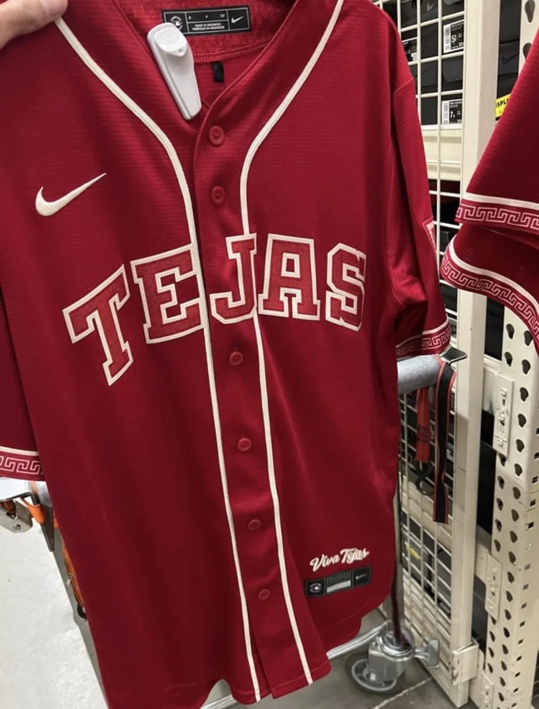
via u/Tha_Chadwick on Reddit
The Rangers went with a red base and "TEJAS" across the chest in a retro-style font. The color is a good direction, and the throwback lettering is a nice nod to the team's Texas roots. The sleeve details are cool. But at the end of the day, it is a red jersey with a different name on it, and it does not push the envelope far enough to stand out in a crowded City Connect field. We broke this one down fully in our Rangers Tejas post.
5. Giants City Connect: B
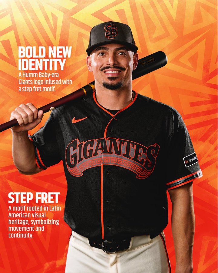
Image via @SFGiants
The Giants committed to their "Gigantes" theme and it shows. The black base with orange detailing stays in the team's color family, the shield patch on the sleeve is well done, and the cultural details throughout are thoughtful. The hat is the standout piece of the set. If you are going to swap out the team name for something different on the front, this is how you do it. Full breakdown in our Giants Gigantes post.
4. Padres City Connect: B
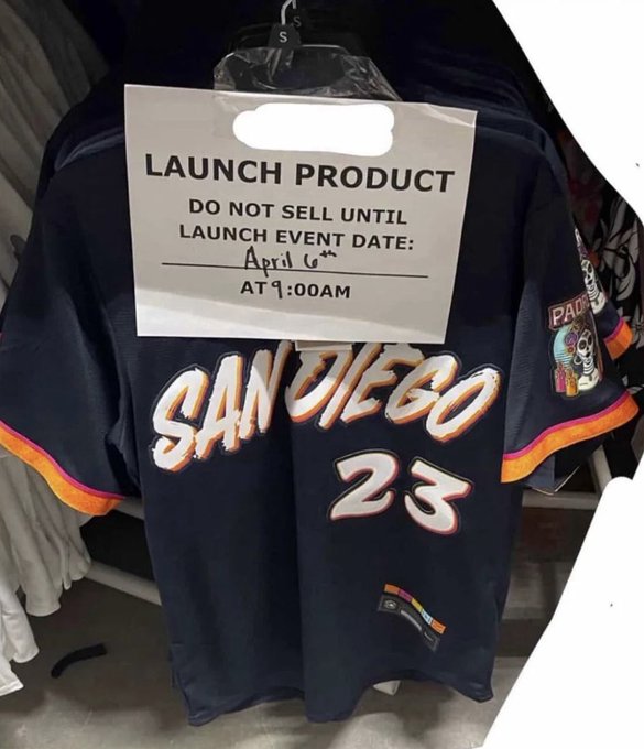
Leaked image via Reddit
The Padres finally moved away from the brown and gold for their City Connect, going with a navy base and orange accents inspired by Dia de los Muertos. The brush-style "San Diego" wordmark is bold, and the skull patch on the sleeve is a strong cultural detail. The navy and orange color combo just looks better on the Padres than brown ever did. The hat is clean and wearable too. It is trendy and might not age perfectly, but right now this is one of the more unique City Connects in the league. Full breakdown in our Padres City Connect post.
3. Pirates City Connect: B+
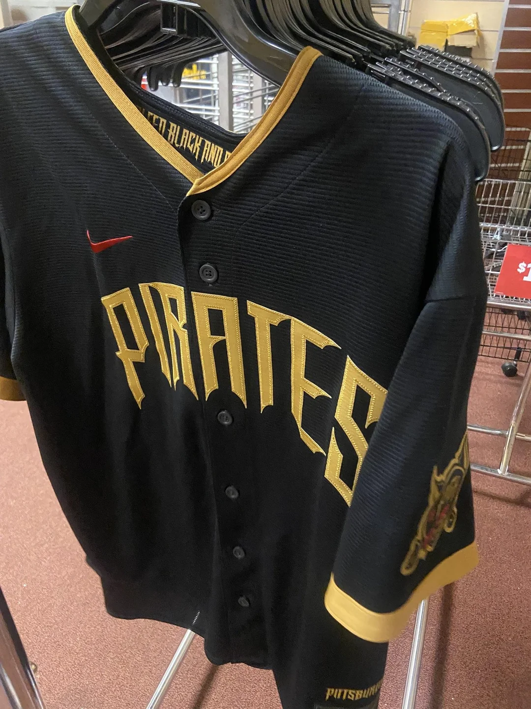
Leaked image via Reddit
The Pirates kept it simple and it works. Black jersey with gold "PIRATES" lettering on the front. The color scheme stays true to the franchise, and the overall look is clean without trying too hard. What bumps this one up is the hat that leaked alongside it.
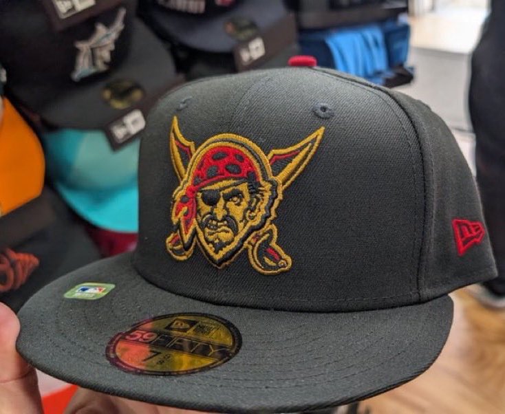
The Pirates City Connect hat with the classic Jolly Roger. Leaked image via @nuthistory
That Jolly Roger pirate logo on the hat is one of the best cap designs in this entire City Connect cycle. The black crown with the gold and red pirate face is clean and aggressive in the best way. This hat alone could carry the entire set. Full jersey breakdown in our Pirates City Connect post.
2. Brewers City Connect: B+
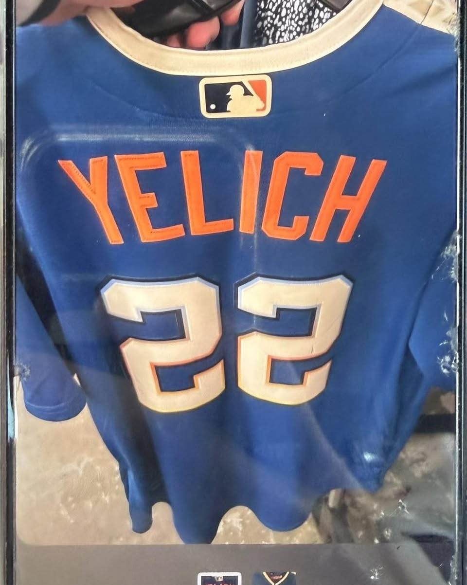
Leaked image via Christina Lorey on Facebook
The Brewers went all in on Wisconsin with "Wisco" across the chest in a cream script font, and we are here for it. The blue base is a departure from the Brewers' usual navy and gold, and the orange accents on the Nike swoosh, numbers, and lettering give it a retro feel that stands out. The "FORWARD" text inside the collar is a nice nod to Wisconsin's state motto.
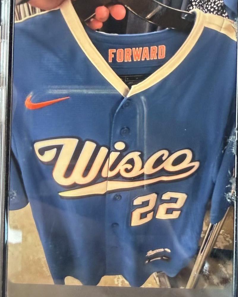
The back of the Brewers City Connect with Yelich #22. Leaked image via Christina Lorey on Facebook
The back is where this jersey really shines. The orange name lettering pops against the blue, and the number treatment with the cream fill and blue outline is clean. The colors are not the traditional Brewers palette, which might bother some fans, but this is a City Connect that represents the whole state, not just the team. Pat Murphy said this is not just Milwaukee's team, it is Wisconsin's team, and the jersey reflects that.
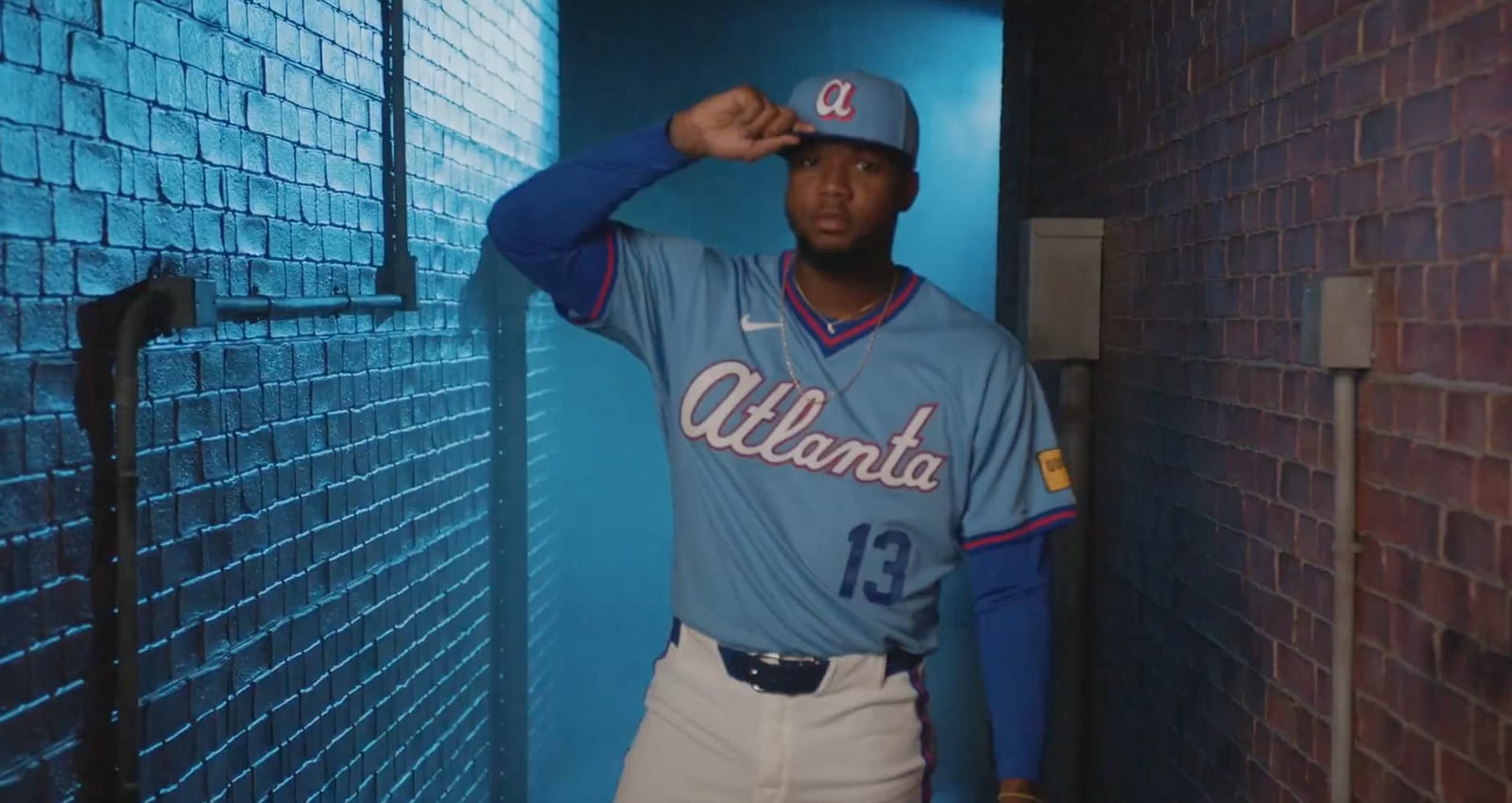
1. Braves City Connect: A+
Image via Atlanta Braves
The Braves took the top spot and it was not close. The powder blue throwback inspired by the 1970s and 80s uniforms is exactly what a City Connect should be. It connects the franchise to its history while still feeling modern. The TBS-inspired "ATL" sleeve logo is a brilliant detail that ties the team to the city's broadcasting roots. The cream piping, the red and blue color balance, and the overall presentation are all top tier.
This is the only City Connect this cycle that we would actually want to wear. It looks like a real baseball uniform, not a fashion experiment. Full breakdown in our Braves City Connect post.
This post will be updated as more City Connect jerseys are revealed throughout the 2026 season.
Leaked images credited to @Tha_Chadwick on Reddit (Orioles jersey), @nuthistory (Orioles hat, Pirates hat), and Christina Lorey on Facebook (Brewers). All other images via official team accounts or previous leaks.