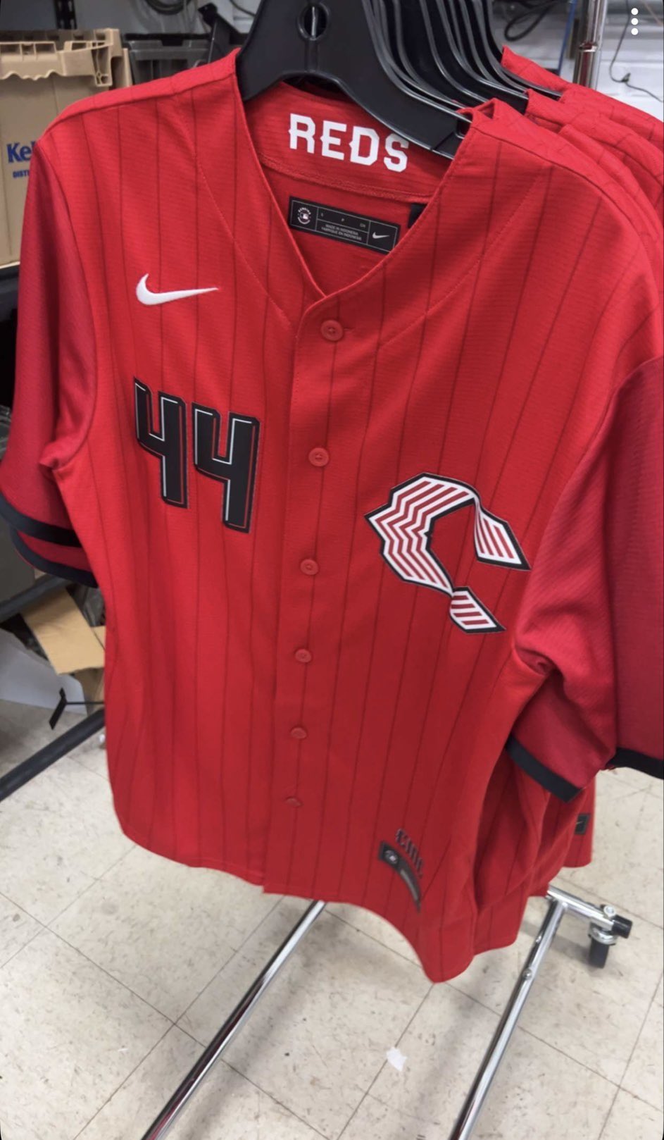
via @drewsturgell19 / @TalkinBaseball_ on X
Update: The Reds City Connect has been officially released by Nike and MLB. See our Official Reds City Connect Review With New Photos.
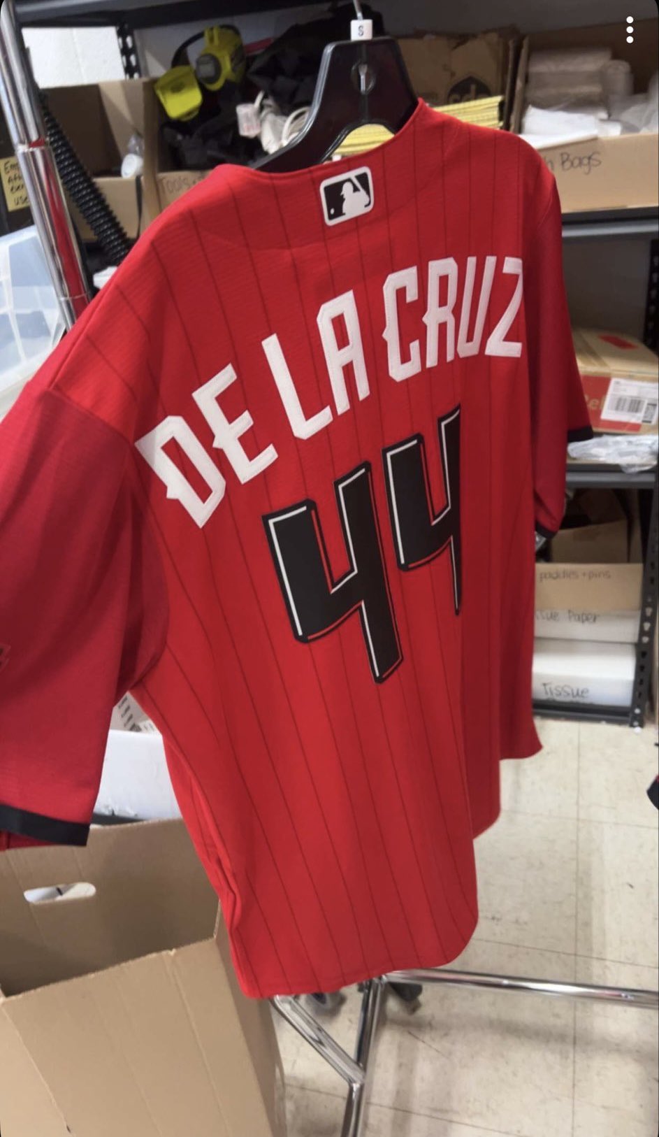
The Reds' 2026 City Connect jersey just leaked and we have some mixed feelings on this one. The photos surfaced on X from @drewsturgell19 and were shared by @TalkinBaseball_, showing what appears to be the De La Cruz #44 version hanging on a rack in what looks like a warehouse or stockroom.
ColorWay Sports may earn a commission on purchases, at no extra cost to you.
The Jersey
The base is all red with tonal red pinstripes running through the entire jersey. That part we actually like. Red on red pinstripes is a bold move and it gives the jersey some texture without adding a second color to the body. The black accents on the sleeve cuffs and the dark charcoal numbers add some edge to it.
The "REDS" text on the inside of the collar is a nice touch. It keeps the branding present without putting it across the chest, which is instead reserved for that new logo.
The Logo
This is where we have a problem. The C logo on the chest is a completely redesigned version with horizontal stripes running through it and a stylized shape that feels more like a streetwear brand than a baseball team. We get what they were going for. It's supposed to be modern and different. But the Reds already have one of the most recognizable logos in baseball with that wishbone C. When you mess with something that iconic, you better make sure the replacement is better. This one feels gimmicky.
We like when teams keep their core logo and build the City Connect around it with different colors, textures, or materials. The Braves just did this perfectly with their City Connect. The Reds went the other direction and tried to reinvent the wheel, and it doesn't quite land.
The Back
via @drewsturgell19 / @TalkinBaseball_ on X
The back shows "DE LA CRUZ" in white lettering with the number 44 in that same dark charcoal with a white and red outline. The font is angular and has some character to it. The numbers are probably the best design element on the whole jersey. The dark tone-on-tone with the red base actually works well from the back.
What We'd Change
Honestly, just the logo. Keep the red pinstripes, keep the black accents, keep the dark numbers. But put the classic wishbone C on the chest instead of this new one. That alone would bump this jersey up significantly. The bones of this design are solid. The execution on the logo just misses.
Our Grade: C+
The color palette works. The pinstripes work. The black accents work. But the logo brings the whole thing down. It's not terrible, but for a franchise with the visual history that Cincinnati has, we expected more. We're interested to see what the hat looks like, because that could either save or sink the full set.