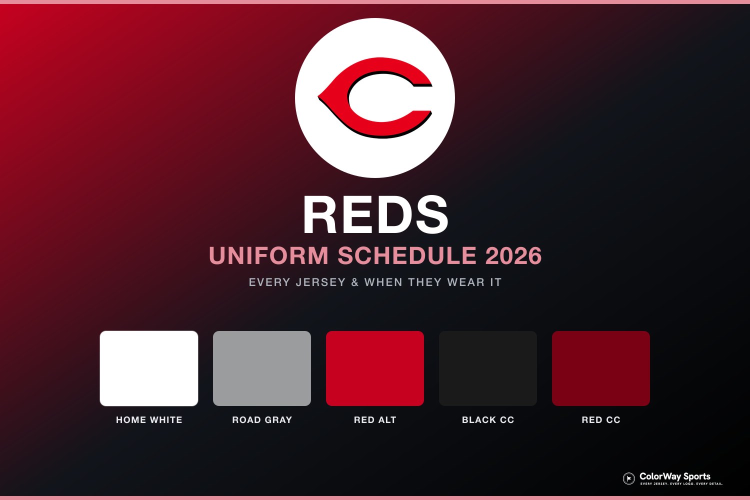
Image via Cincinnati Reds
The Cincinnati Reds officially released their 2026 City Connect jersey today, and the full uniform is now out in the open. After weeks of leaks and speculation, we finally have the official photos and promo shots from Nike and the team. The design goes all-in on red, and it is a bold look that will stand out on the field this season.
ColorWay Sports may earn a commission on purchases, at no extra cost to you.
The Design
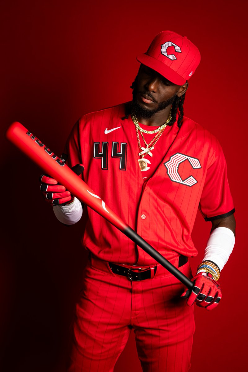
The jersey features an all-red colorway from top to bottom. The base is a deep red, and the team went with a modified "C" logo and player number placed at the top of the chest rather than the traditional center placement. The pants, belt, socks, and cleats all stay in the red family, giving it a monochromatic look that hits hard from a distance.
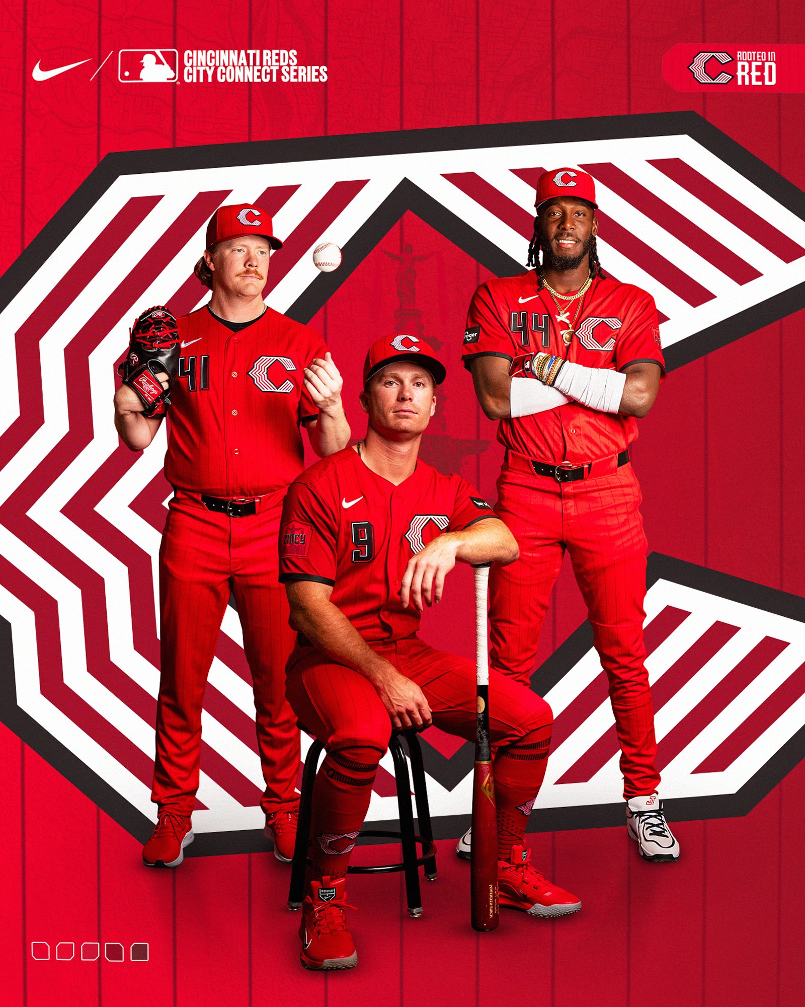
Image via Cincinnati Reds
The cap features a different logo from what is on the jersey, which gives the hat its own identity separate from the rest of the uniform. The overall silhouette is clean and the red pops in a way that most City Connects do not achieve.
What We Think
We are conflicted on this one. The red itself is a really good color. The all-red commitment is something we respect because it takes confidence to go that bold, and when you see the full uniform together in the promo shots, it genuinely looks sharp. The color pops and the monochromatic approach gives it a presence that a lot of City Connect jerseys lack.
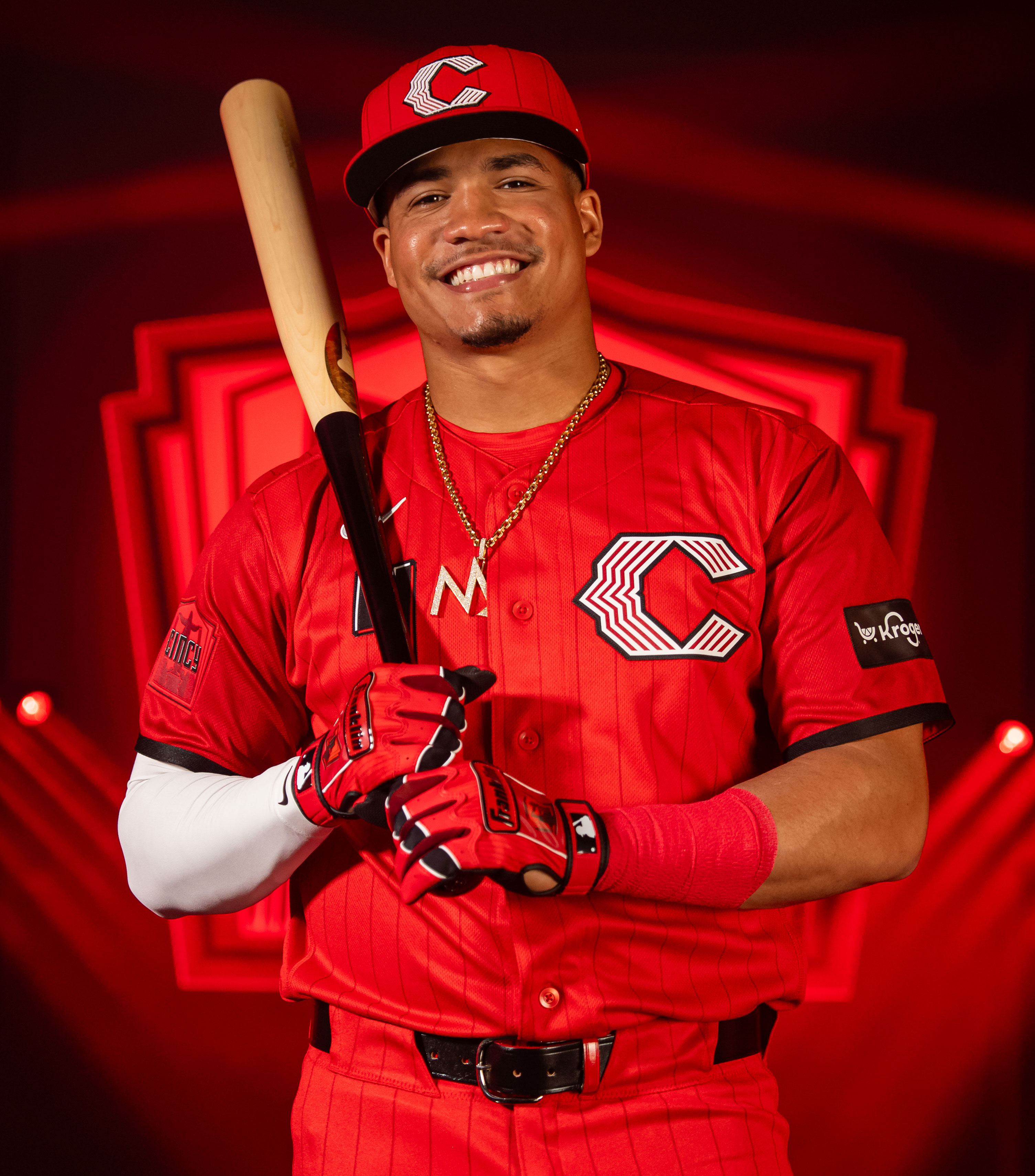
Image via Cincinnati Reds
Where it loses us is the placement of the number and logo at the top of the jersey. We have never been fans of that layout on any team. It throws off the balance of the design and makes the chest area feel top-heavy. When you have a jersey this clean, the placement matters, and pushing everything up to the collar just does not work for us.
The hat is another mixed bag. The alternate logo on the cap does not seem to carry a strong identity on its own. It feels disconnected from the rest of the uniform rather than complementing it. A City Connect hat should feel like it belongs with the jersey, and this one feels like it is doing its own thing.
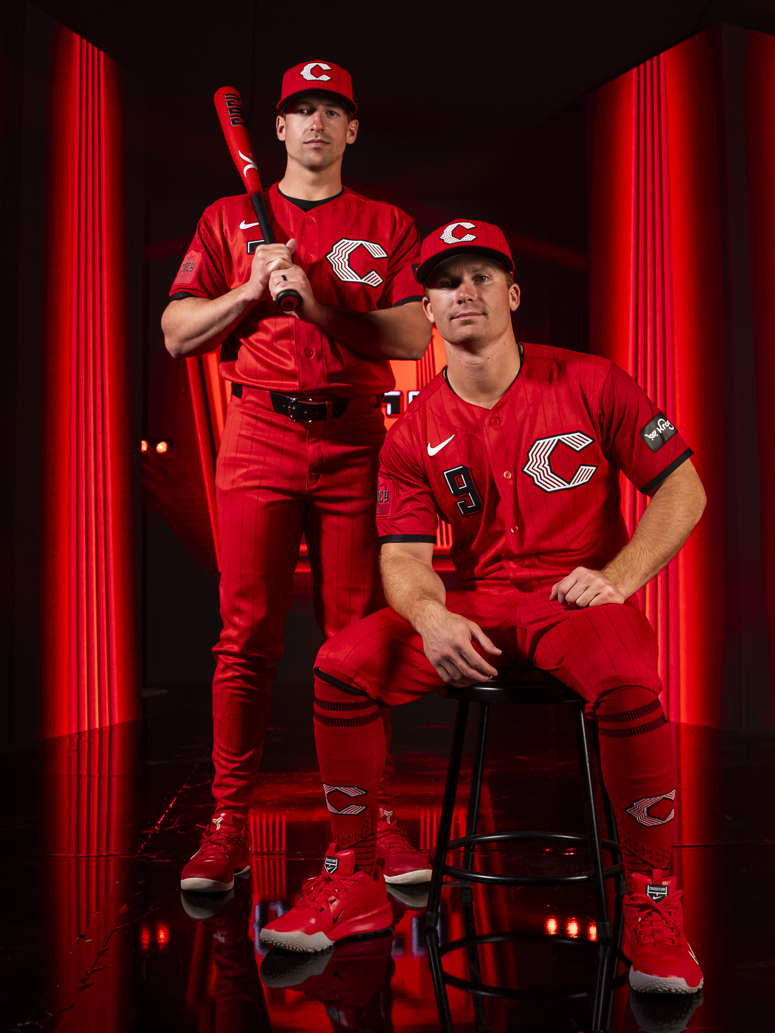
Image via Cincinnati Reds
We like the red pop but we are not in love with it. The color is there, the boldness is there, but some of the design choices hold it back from being a top-tier City Connect. We are giving it a B.
For the full breakdown of every 2026 City Connect jersey and where the Reds land, check out our 2026 MLB City Connect Rankings.