via the official Braves X post
Update: The Braves City Connect has been officially released by Nike and MLB. See our Official Braves City Connect Review With New Photos.
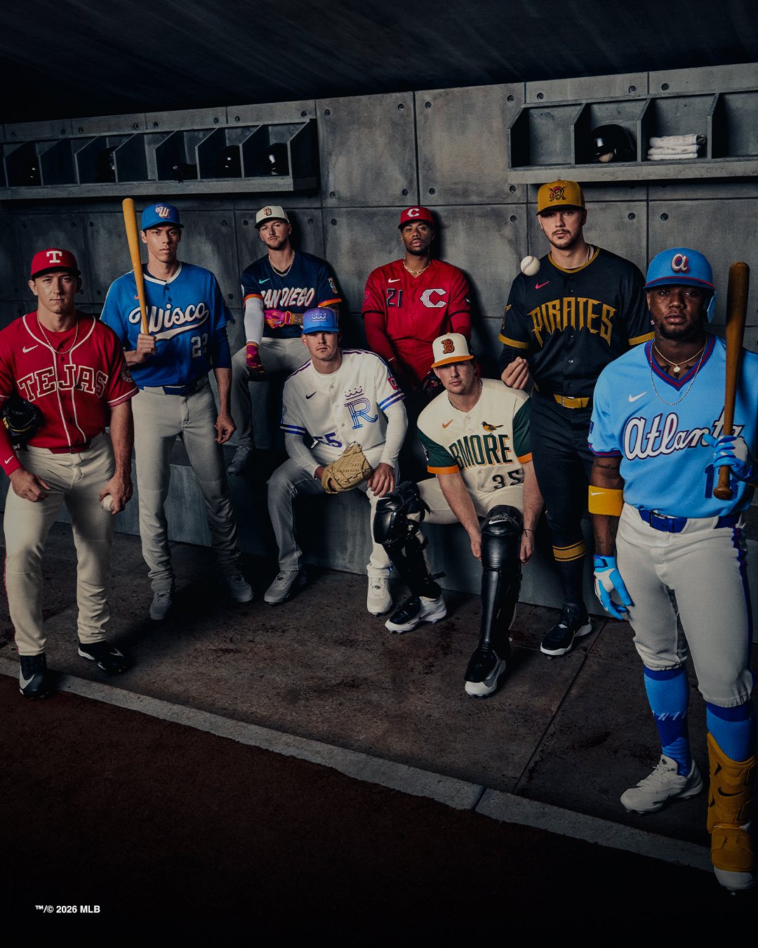
The Braves just released their 2026 City Connect jerseys and we have a lot to say about these. This is how you do a City Connect uniform. Instead of going with random colors and some abstract design that has nothing to do with the team, Atlanta went back to their roots and made something that actually means something.
ColorWay Sports may earn a commission on purchases, at no extra cost to you.
The Jersey

via the official Braves X post
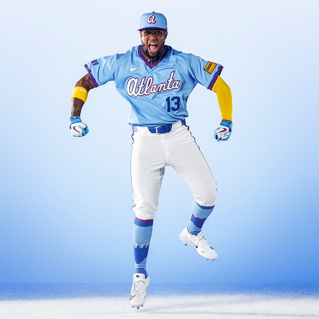
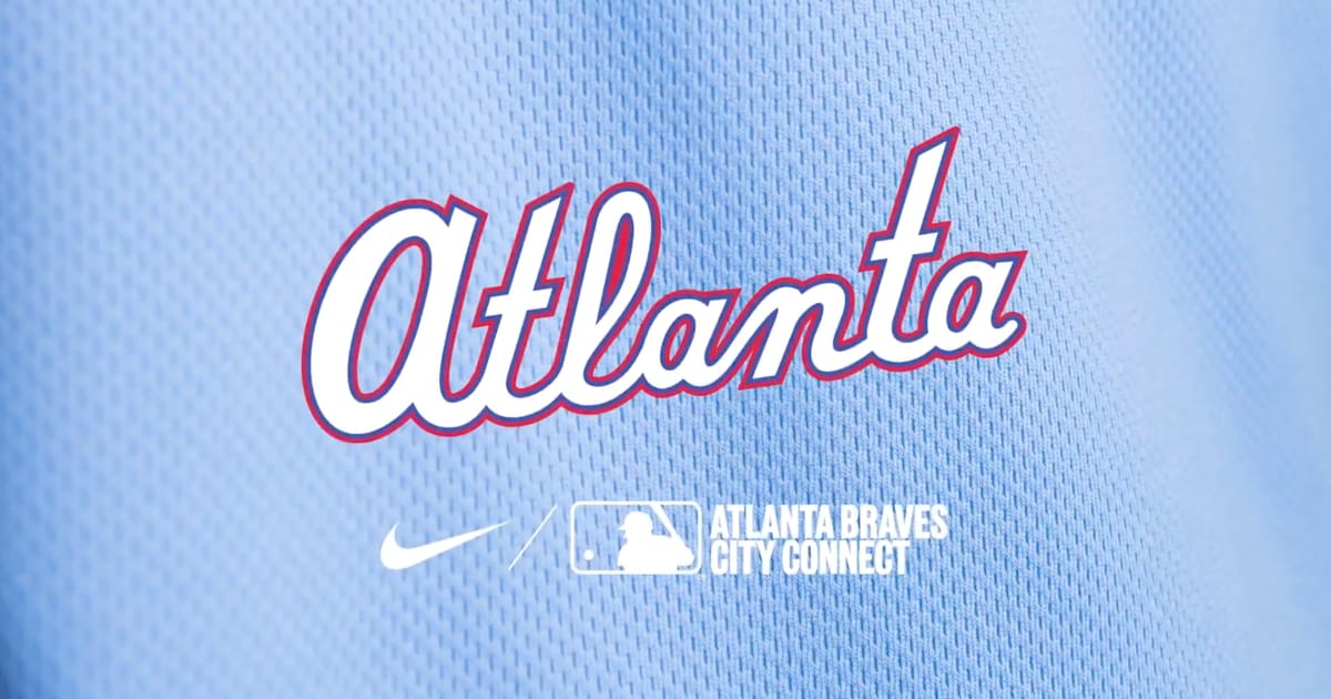
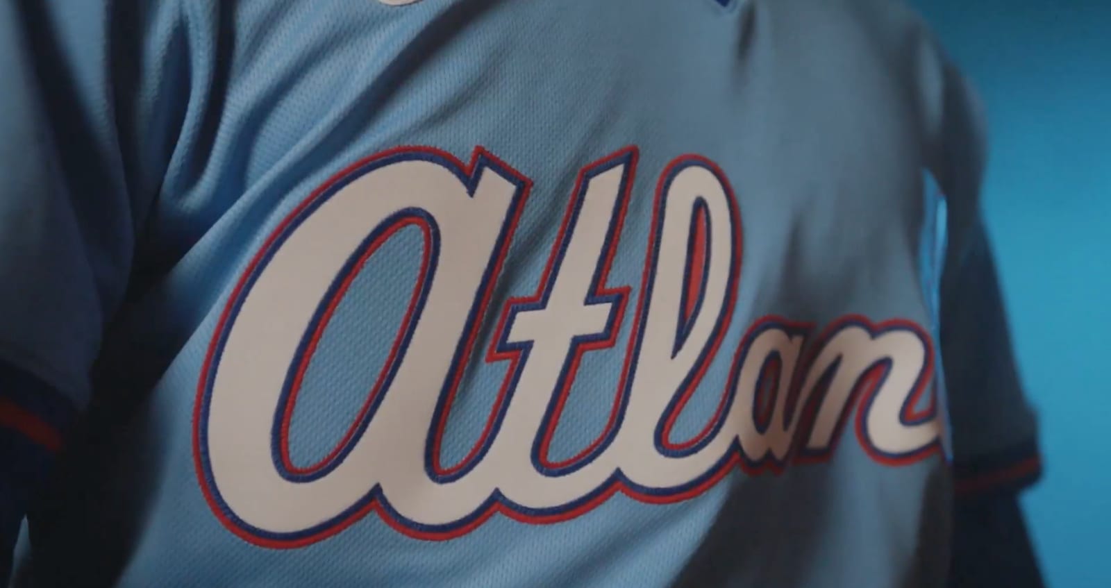
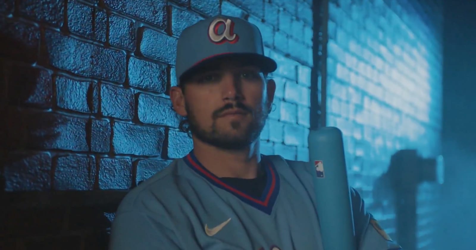
The light blue is the star of the show. It's clean, it's different from their standard navy and red, and it immediately takes you back to the powder blue era of baseball. The "Atlanta" script across the chest is done in white with a red and blue outline that pops without being too loud. The blue sleeves and collar give the jersey some contrast and keep it from being all one color.
via the official Braves X post
We love light blue jerseys in baseball. There's something about that color on a diamond that just works. And the Braves didn't overthink it. The colors blend well together. The light blue, the navy accents, the red trim. It all feels natural and connected to who this franchise is.
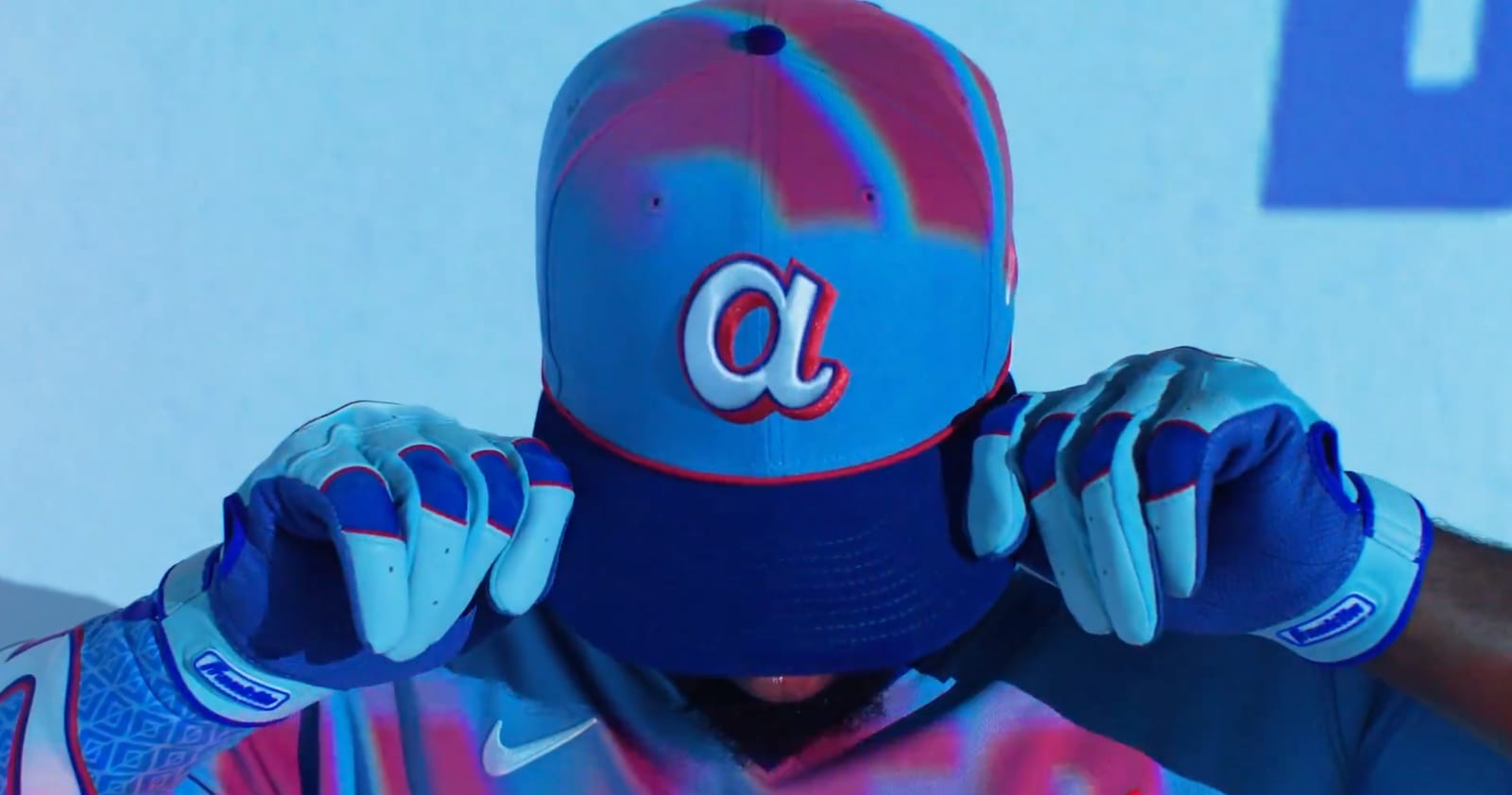
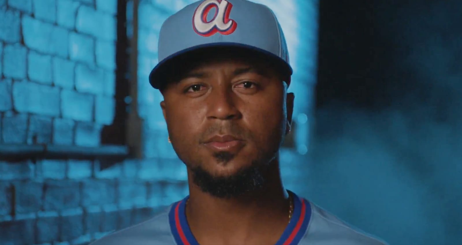
The Hat
via the official Braves X post
The lowercase "a" on the hat is a great touch. It ties directly into the throwback era and gives the whole set a retro feel without being a full-on replica. The light blue crown with the navy brim is a classic combination.
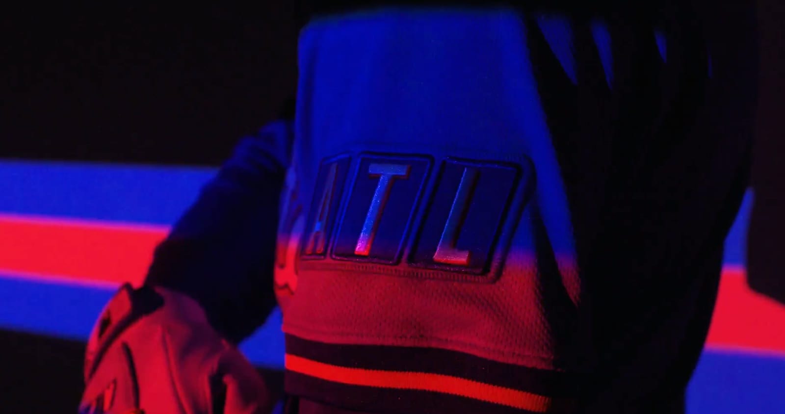
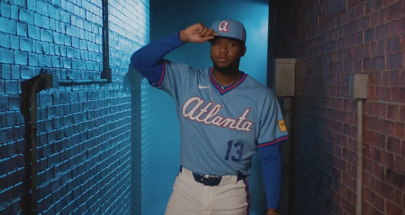
The TBS Connection
ATL sleeve patch via the official Braves X post
This is where it gets really cool. The sleeve has an "ATL" patch, but look at the lettering style. It's designed in the same blocky format as the classic TBS logo. If you grew up watching Braves baseball, you watched it on TBS. That network and the Braves were synonymous for decades. This is a subtle nod that most people might miss, but if you know, you know. It's a very nice touch and it lets you feel what Atlanta is.
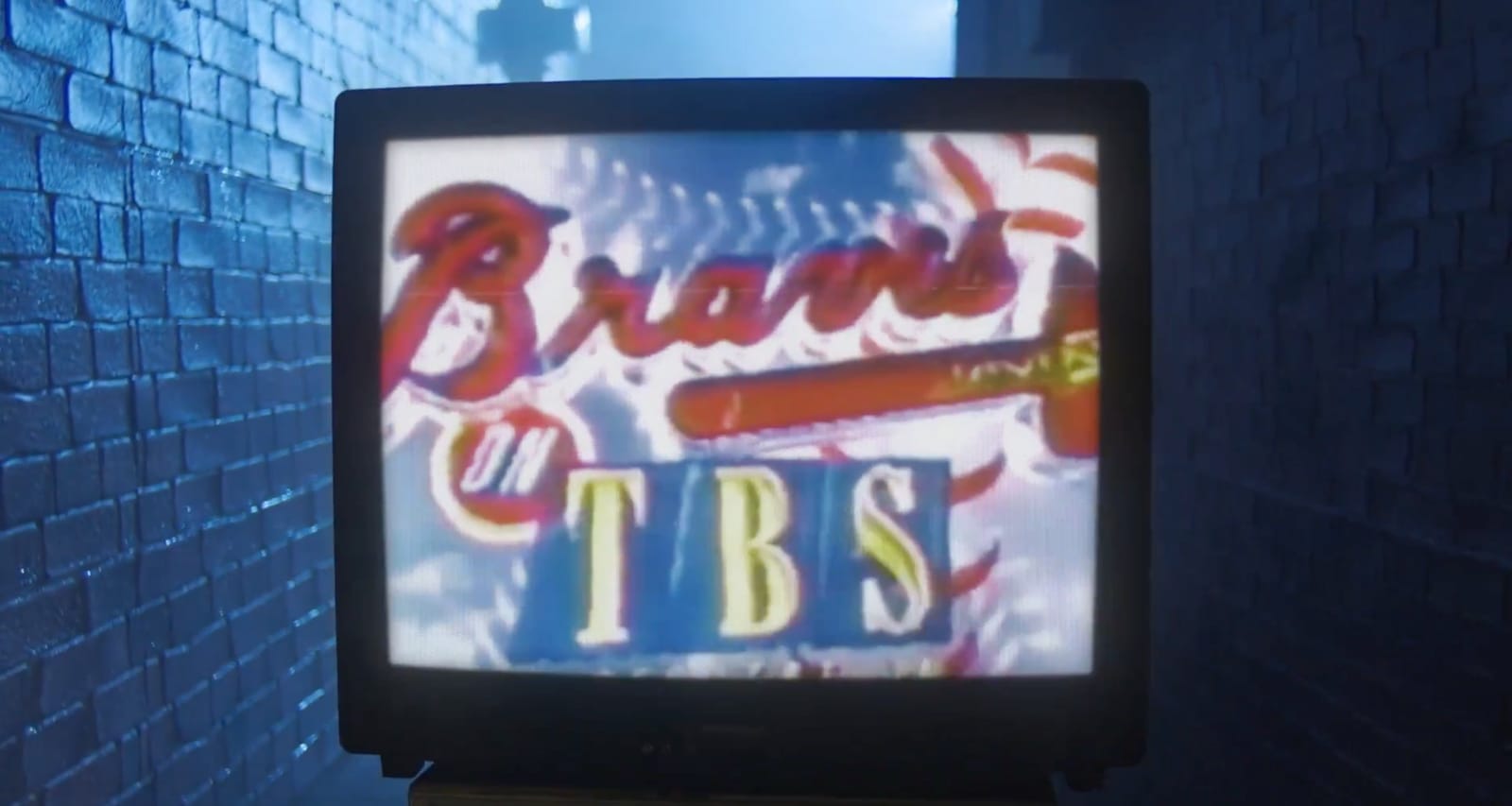
Braves on TBS broadcast graphic via TBS / Warner Bros. Discovery
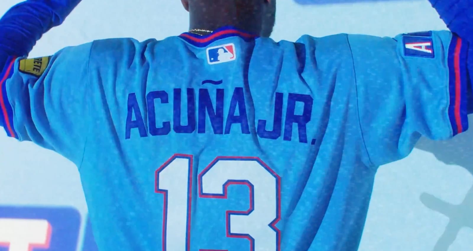
The Details
via the official Braves X post
The back of the jersey keeps it clean. White numbers and lettering with the same red and blue outline treatment. Acuna Jr. in the 13 looks great in this colorway.
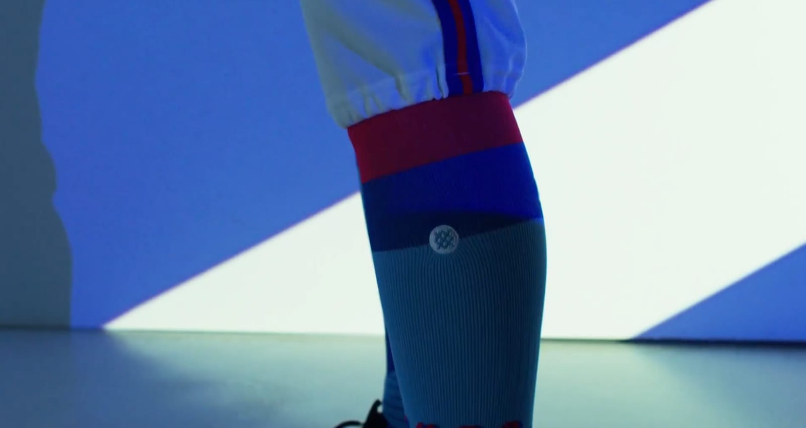
via the official Braves X post
The socks pull everything together with the red and blue striping on a navy base. Small detail, but it completes the look.
via the official Braves X post
via the official Braves X post
Our Grade: A+
This is one of the best City Connect jerseys we've seen across all of MLB. The Braves did what so many teams fail to do with these alternate uniforms. They made something that feels like it actually belongs to the franchise. It's an ode to their past. The light blue, the lowercase "a", the TBS-inspired sleeve patch. It all connects. It's more of a throwback than just some random City Connect with random colors, and that's exactly what makes it work.