Image via Atlanta Braves
The Atlanta Braves officially released their 2026 City Connect jersey today, and we finally have the full high-resolution photos and on-body shots. We covered the initial reveal back when the first images leaked, but seeing the official release in full detail just confirms what we already thought. This is an A+ uniform and it might be the best City Connect jersey Nike has ever produced.
ColorWay Sports may earn a commission on purchases, at no extra cost to you.
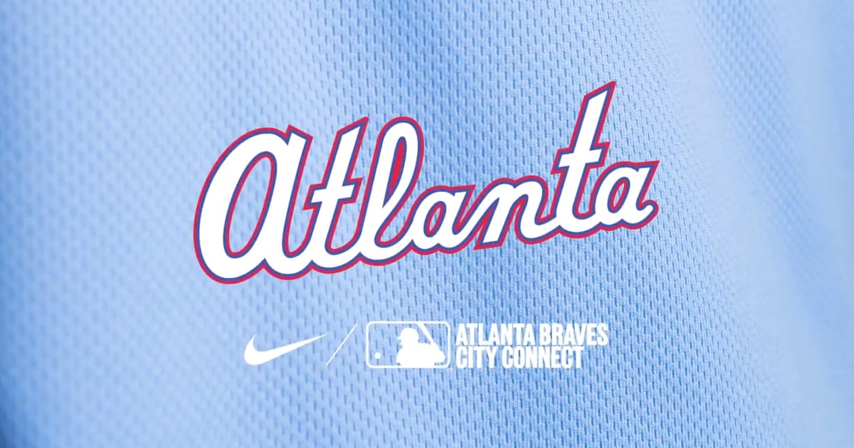
The Powder Blue
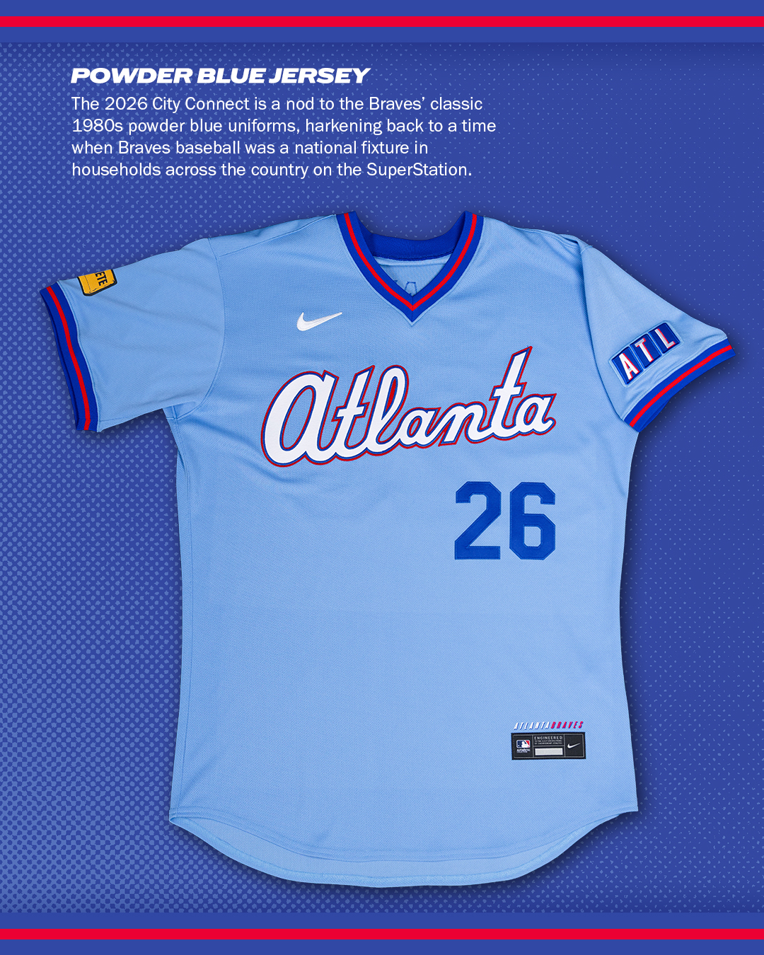
Image via Atlanta Braves
The powder blue looks even better in the official release photos than it did in the leaks. That shade of blue is the whole identity of this uniform. It pulls directly from the 1980s SuperStation era when the Braves were on TBS every single night and the whole country watched Atlanta baseball. That is exactly what City Connect jerseys should be doing. They should connect the team to a real piece of the city's history, not just slap a random color scheme on a jersey and call it culture.
The "Atlanta" script across the chest is clean and readable. The white lettering with red and blue outlines gives it contrast without making it feel busy. On a broadcast, this jersey is going to pop against the green grass at Truist Park. Powder blue has always been one of the best colors in baseball and the Braves absolutely nailed this shade.
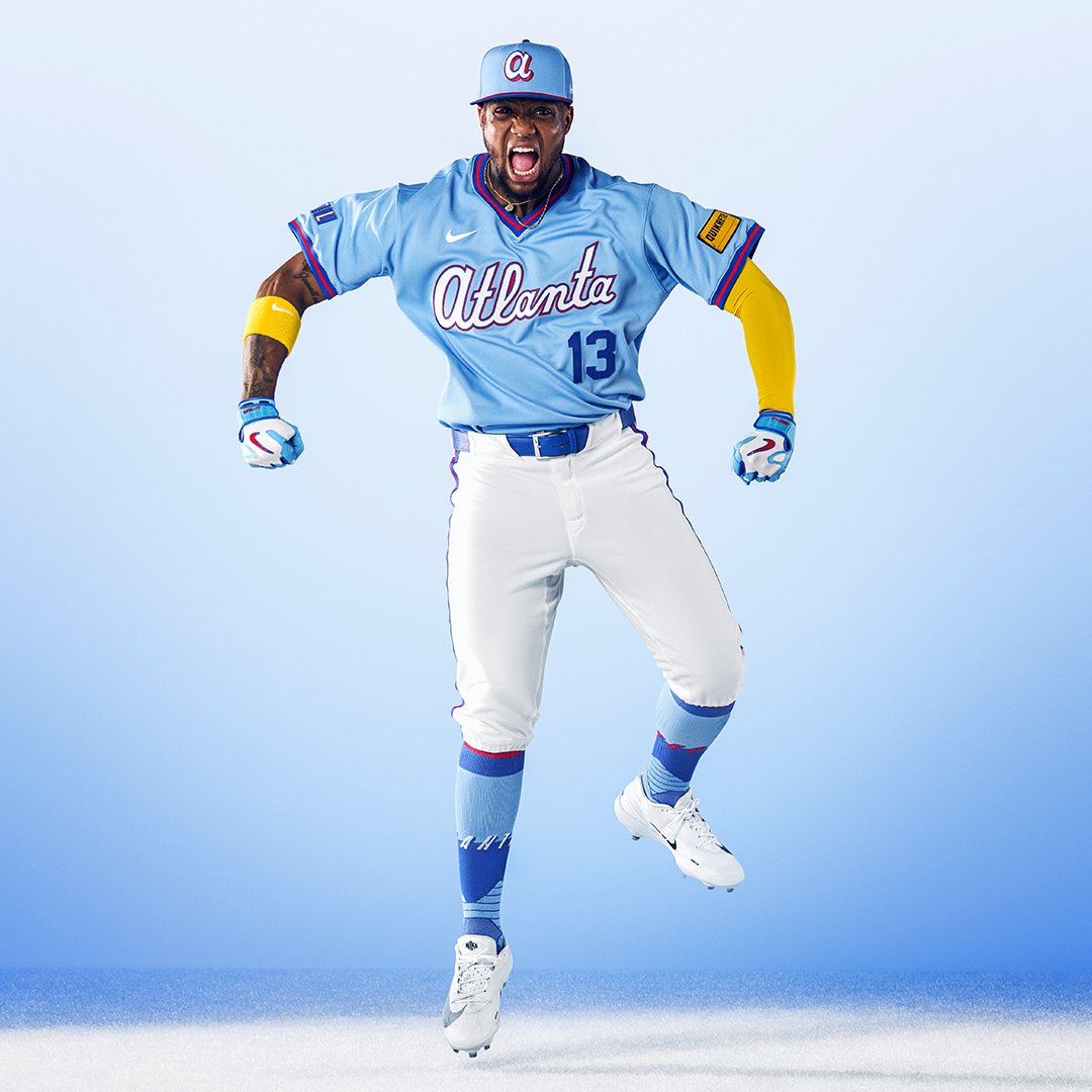
The Hat
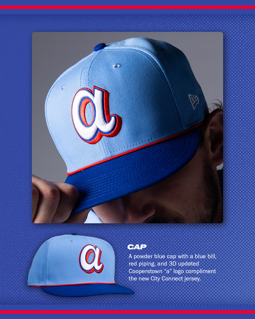
Image via Atlanta Braves
The hat ties the whole set together. The powder blue crown with the Cooperstown-style lowercase "a" is a perfect pairing. It feels retro without being a costume. The brim color and the overall shape keep it modern enough that fans will want to wear this hat outside the ballpark. We think this cap alone is going to be one of the top sellers in MLB this season.
The ATL Sleeve Patch
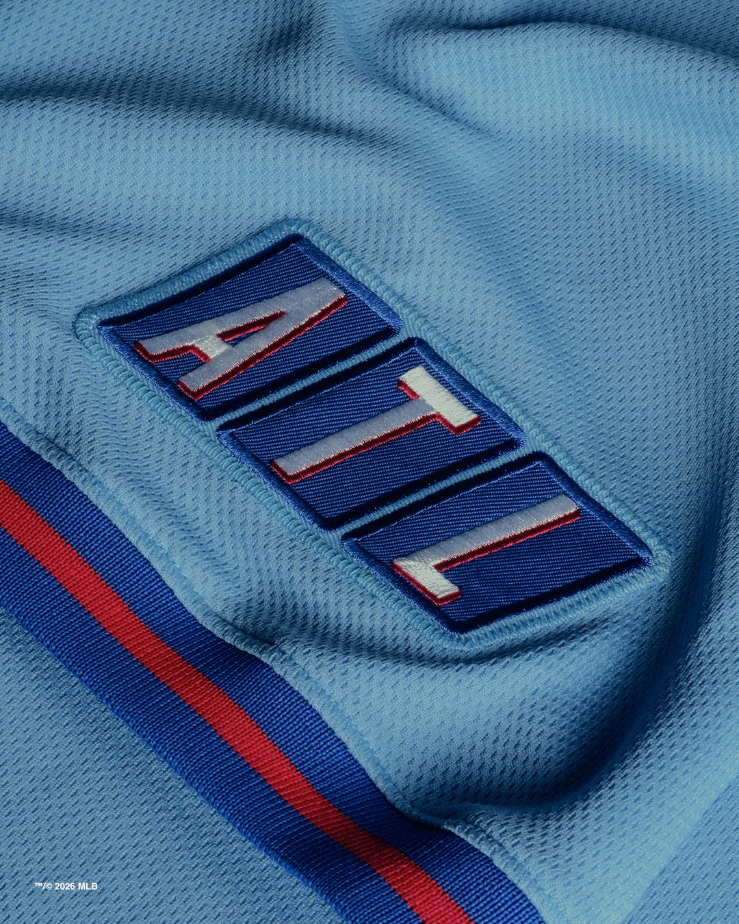
Image via Atlanta Braves
The ATL sleeve patch is probably our favorite detail on the whole uniform. The blocky lettering style is a direct nod to the old TBS logo, and that connection matters. If you grew up watching the Braves on SuperStation TBS, this hits different. It is the kind of subtle, meaningful detail that separates a great City Connect from a forgettable one. Most fans might not catch the reference right away, but the ones who do will appreciate it.
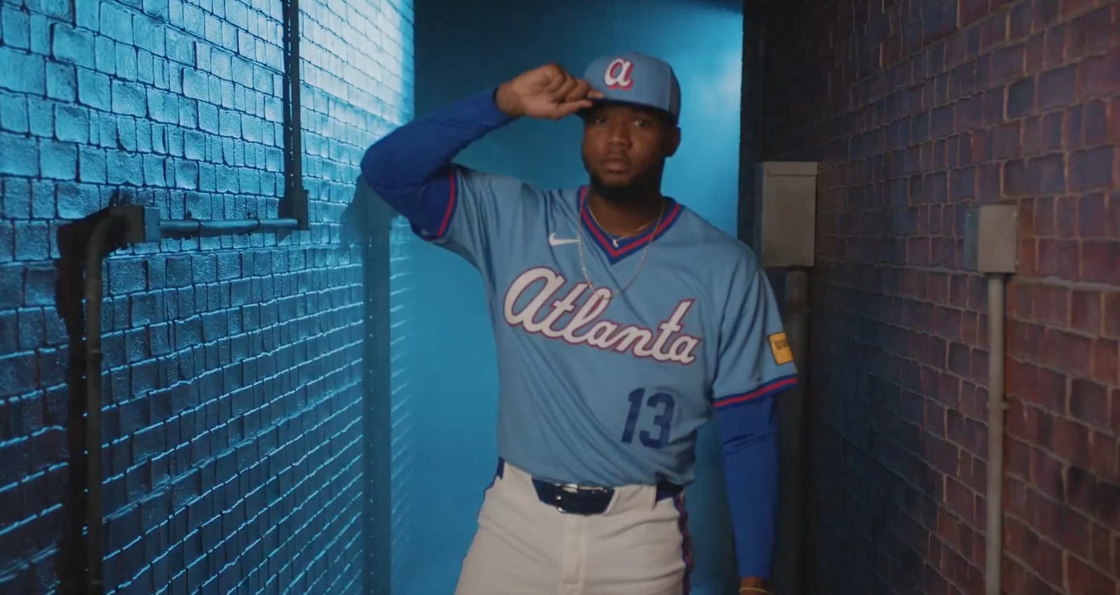
On the Field
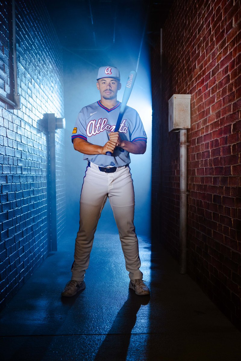
Image via Atlanta Braves
The tunnel shots give a good sense of how this jersey looks in real lighting and not just a studio setup. The colors hold up. The fit is clean. The whole package from hat to socks works together in a way that a lot of City Connects have struggled with. Some teams get the jersey right but miss on the pants or the hat. Atlanta got every single piece right here.
Final Verdict
This is a City Connect that actually connects. The powder blue throwback to the SuperStation era is meaningful, the colors are gorgeous, and the details like the ATL patch show that the Braves put real thought into this design. We have this ranked at the very top of our Full 2026 City Connect Rankings and the official photos only reinforce that. If every team put this much care into their City Connect, the whole program would be in a different place.