Image via Kansas City Royals
The Kansas City Royals officially released their 2026 City Connect jersey today, and we have some thoughts. After tracking the leaks over the past few weeks, we were not expecting much from this one. The official version does look a bit better than what we saw in the early images, but that is not saying a whole lot. We are giving it a C-.
ColorWay Sports may earn a commission on purchases, at no extra cost to you.
The Design
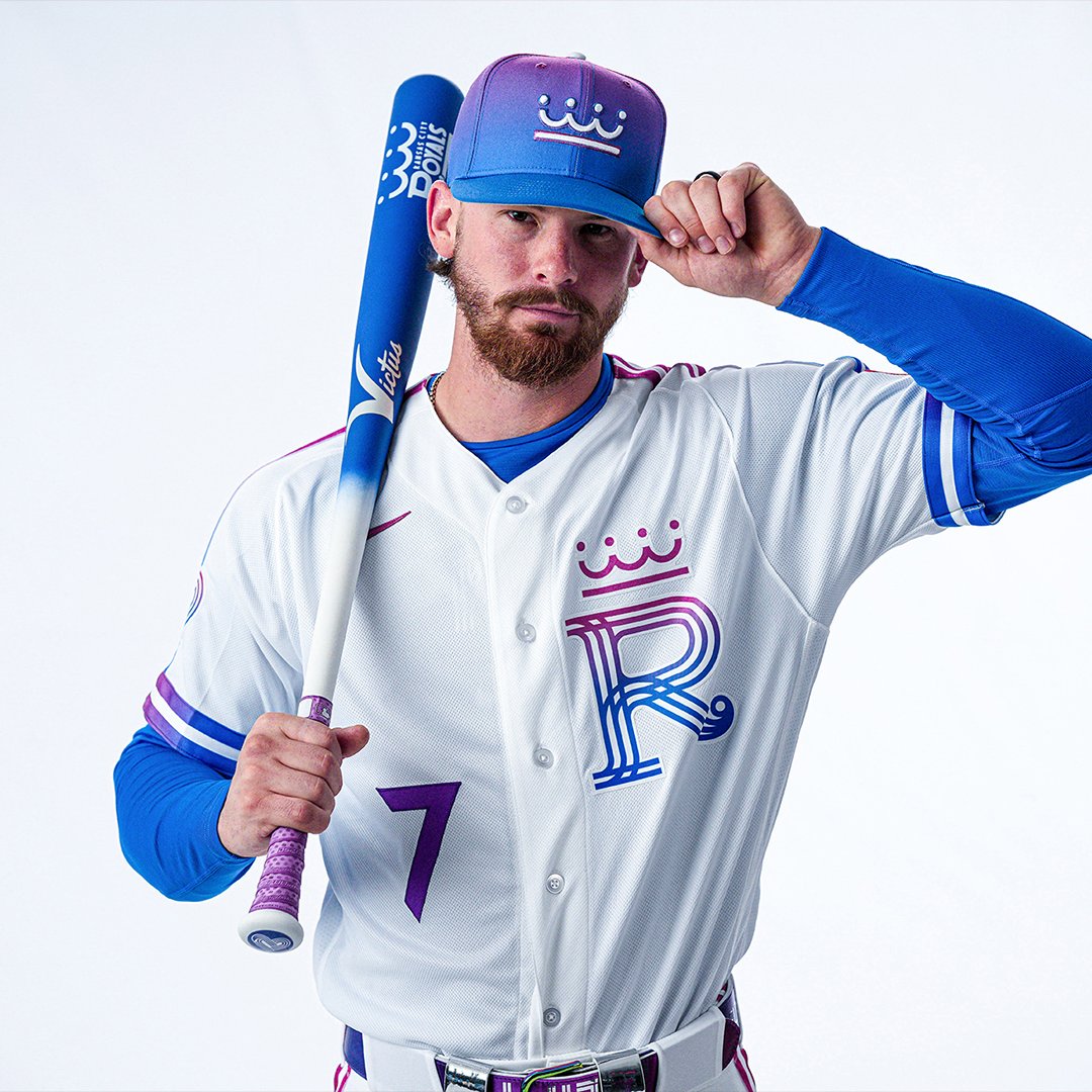
The jersey features a white base with a large gradient "R" logo on the chest that fades from Royals purple down into blue. The "R" is topped with a crown element that carries the same gradient treatment. It is a clean enough concept on paper, but in execution it feels like it is trying to be modern without fully committing to anything bold.
Image via Kansas City Royals
The hat is actually the highlight of this release. The gradient treatment on the cap is rare for baseball, and they went with a different crown as the hat logo done in all one color, which looks nice. Most teams play it safe with their City Connect caps, so we will give the Royals credit there. The gradient on a fitted hat is something you do not see often, and it gives the cap some standalone appeal even if the rest of the uniform does not match that energy.
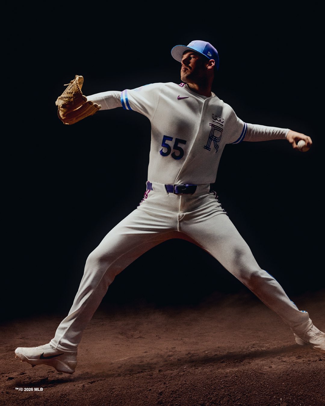
Image via Kansas City Royals
What We Think
Here is the real test for any City Connect jersey. If you are at the game or watching on TV, are you happy the team is wearing these? For the Royals, the answer is no. The white base makes the whole thing feel washed out, and the gradient logo, while interesting up close, does not pop from a distance the way a City Connect should. These uniforms are supposed to be the fun ones, the ones that make you stop scrolling or look up from your nachos. This one just does not do that.
The purple-to-blue color scheme is fine in theory. Kansas City has used purple in its history, and blending it with the traditional royal blue is not a bad idea. But the execution here lands somewhere between forgettable and just okay. It does not feel like a jersey that represents Kansas City in a way that makes you think about the city itself.
We will say this: the official photos improved our opinion slightly compared to the leaks. The hat genuinely looks better than expected, and the single-color crown logo on the cap is a nice touch. But a decent hat cannot carry an entire uniform.
For a look at how the Royals stack up against every other team this year, check out our Full 2026 City Connect Rankings.