via the Washington Commanders
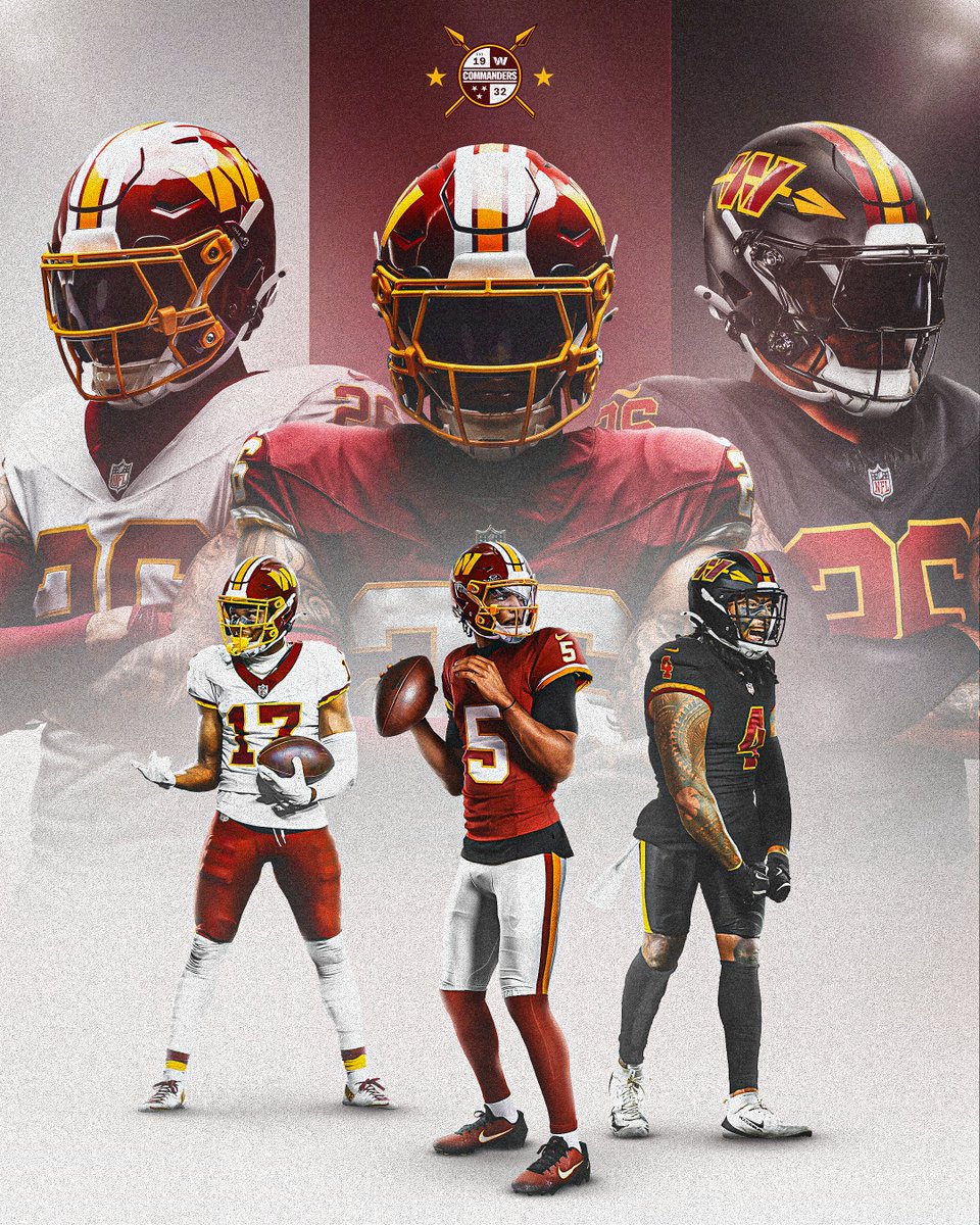
The Washington Commanders just dropped their 2026 uniforms, and this is the best uniform reveal we've seen from any NFL team going through a redesign. Washington went back to the Super Bowl era. They kept the burgundy and gold foundation that made this franchise iconic for decades, swapped the old logo for the Commanders crest, and gave fans exactly what they've been asking for since the rebrand. Three jerseys. All of them good. Let's break it down.
via the Washington Commanders
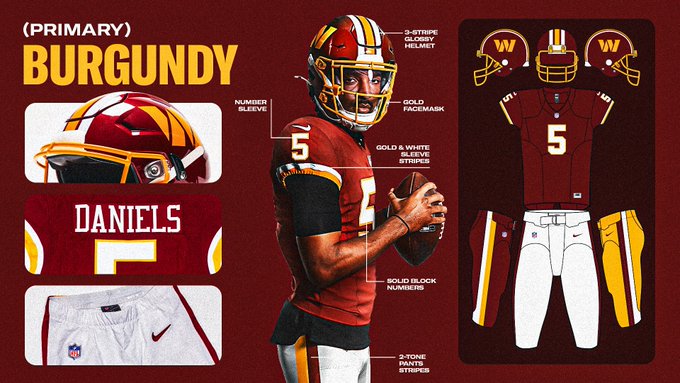
Burgundy Home Jersey with Gold Pants
via the Washington Commanders
The home set is a burgundy jersey paired with gold pants, and it looks like it was pulled straight out of the Joe Gibbs era. The solid block numbering is clean and classic. The three-stripe glossy helmet with the gold facemask ties the whole thing together. The gold and white sleeve stripes match the two-tone pants striping, and the number placement on the sleeves keeps everything balanced.
This is what the Commanders should have looked like from day one of the rebrand. The original Commanders set tried too hard to create a new identity and ended up looking disconnected from the franchise's history. This set leans all the way into what worked. The burgundy and gold balance is perfect. The stripe work is consistent from helmet to pants. There's nothing here that's trying to be modern or experimental. It's just a great football uniform that belongs in the NFC East.
Burgundy Home Grade: A
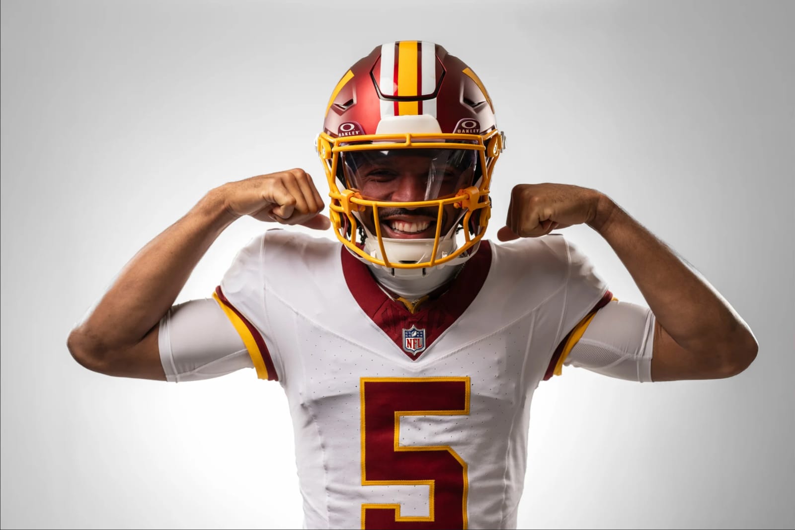
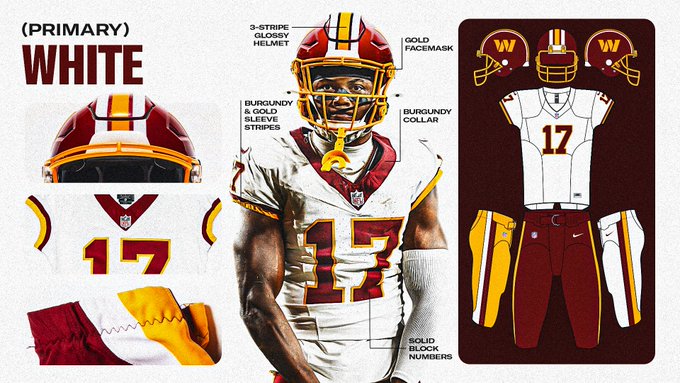
White Primary Jersey with Gold Pants
via the Washington Commanders
The white primary jersey follows the same design language. White jersey with burgundy and gold sleeve stripes, the same solid block numbers, and the same three-stripe glossy helmet. The burgundy collar is a nice touch. Gold pants carry over from the home set, giving Washington a consistent look whether they're at home or on the road.
We like the consistency across both primary sets. Some teams try to differentiate too much between their home and road uniforms, and it ends up feeling disconnected. Washington kept everything locked in. The white version is sharp, clean, and professional. It fits perfectly alongside the Cowboys, Eagles, and Giants in the NFC East, which is exactly where it should be.
White Primary Grade: A
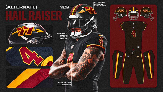
The "Hail Raiser" Black Alternate Jersey
via the Washington Commanders
This is where things get really interesting. The Hail Raiser is an all-black uniform with black pants, burgundy and gold stripe detailing, and a completely different helmet. The alternate spear W logo decal on the side of the helmet is one of the best alternate helmet designs in the NFL right now. The double spearhead creates an intimidating look straight on, and it pulls from the franchise's 1960s uniform history.
We usually don't love black alternates. Most of the time they feel like a cash grab that doesn't connect to the team's actual identity. This one is different. The spear through the helmet ties into the Commanders warrior theme in a way that actually makes sense. The numbers on the shoulder pads pop against the black. The gold and burgundy accents keep it connected to the primary set without feeling forced. Washington can only wear this four times during the regular season, and every single one of those games is going to feel like an event.
Hail Raiser Grade: A
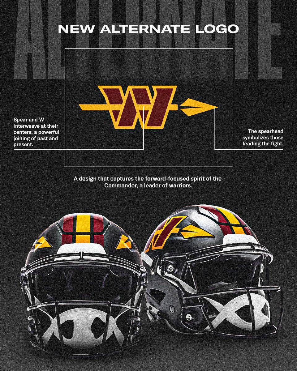
The New Alternate Spear W Logo
via the Washington Commanders
The spear W is the standout piece of this entire rebrand. The W and the spear interweave at their centers, creating a forward-facing design that captures the commander and warrior identity the franchise is going for. From the front, the spearheads on both sides of the helmet create a straight-on look that's genuinely intimidating. It's the best thing to come out of the Commanders era so far, and it gives the franchise a secondary mark that actually carries weight.
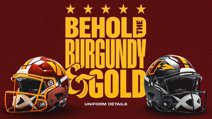
Washington Commanders 2026 Helmets: Glossy Burgundy and the Black Spear
Emily Morgan/Washington Commanders
The return to a glossy helmet finish is the right call. The matte burgundy helmet that Washington has been wearing since the rebrand was fine, but the glossy version is what fans remember. It's what looked best under the lights during the Gibbs years. The gold facemask against the glossy burgundy is one of the cleanest helmet combinations in professional football.
The black alternate helmet with the spear W adds real depth to the uniform closet. The three-stripe pattern carries across both helmets, keeping them visually connected even though the colorways are completely different. The spear design references the 1960s era uniforms and Washington's 70th anniversary celebration. It's a smart way to honor the franchise history without repeating it exactly.
The Full Commanders Brand Arsenal for 2026
via the Washington Commanders
Washington now has one of the deepest brand arsenals in the NFL. Two helmets, two logos, the "Raise Hail" alternate wordmark, and the shield crest. Every piece connects back to the burgundy and gold color foundation. The primary W logo stays on the main helmets, the spear W lives on the alternate, and the shield ties everything together as the overarching brand mark. This is how you build a visual identity that gives you options without losing consistency.
Overall Take on the Washington Commanders 2026 Uniforms
This is the best any team has done with a full uniform redesign. Washington didn't try to reinvent anything. They looked at what made this franchise visually iconic for 50 years and brought it back. The burgundy and gold. The block numbers. The glossy helmet. The stripe work. It's all here.
The Hail Raiser alternate is the cherry on top. It gives Washington a modern option that still feels connected to the franchise's roots. The spear helmet alone is going to sell a ton of merchandise, and rightfully so.
The only reason this isn't a perfect score is honestly something that has nothing to do with the design itself. We wish they never had to change the name or the logo. That's just the reality. But given the situation, this is probably the best outcome anyone could have asked for. It's an ode to the past without actually being the past. The Commanders took a franchise that was visually lost for the last few years and gave it an identity that fans can be proud of again.
This is the highest grade we've given any NFL uniform redesign.
Overall Grade
A
How Do the 2026 Commanders Uniforms Compare to Other NFL Redesigns?
We gave the Falcons a B for their 2026 redesign. Atlanta fixed the mess from 2020, but they didn't wow anyone. Washington did what Atlanta couldn't. They created a uniform set that immediately feels right and connects to 50 years of franchise history. If the Ravens nail their April 16 reveal, the NFC East and AFC North could have the two best redesigns of the year. But right now, Washington is in a league of its own.
If you want to see what we were expecting before the reveal, check out our preview here. We called for the Super Bowl era look, the glossy helmet, and the spear alternate. Washington delivered on all three.
Frequently Asked Questions About the Commanders 2026 Uniforms
What do the new Washington Commanders uniforms look like?
The 2026 Commanders uniforms feature three sets: a burgundy home jersey with gold pants, a white primary jersey with gold pants, and the all-black "Hail Raiser" alternate. All three feature solid block numbering, consistent sleeve striping, and a glossy burgundy helmet with a gold facemask for the primary sets. The Hail Raiser uses a separate black helmet with the new spear W logo.
Did the Commanders go back to their old uniforms?
Yes. The 2026 uniforms are built around the Super Bowl era look from the Joe Gibbs years. Washington essentially brought back the retro design that fans loved and replaced the old logo with the Commanders W crest. The result is a modern uniform that looks and feels like the classic burgundy and gold sets from the 1980s and 1990s.
What is the Commanders Hail Raiser jersey?
The Hail Raiser is Washington's all-black alternate uniform for the 2026 season. It features a black jersey and black pants with burgundy and gold stripe accents, plus a completely different black helmet with the new spear W alternate logo. The name "Hail Raiser" plays on the franchise's "Hail to the Redskins" fight song heritage. Teams can only wear alternate uniforms four times per regular season.
What is the spear W logo on the Commanders helmet?
The spear W is a new alternate logo designed for the Hail Raiser helmet. The W and spear interweave at their centers, and the double spearhead design creates an intimidating straight-on look. The design pulls from the franchise's 1960s uniform history and was also referenced during the team's 70th anniversary celebration in the early 2000s.
How many uniforms do the Commanders have in 2026?
Washington has three uniform combinations for the 2026 season: the burgundy home jersey with gold pants, the white primary jersey with gold pants, and the all-black Hail Raiser alternate. They also have two helmets (glossy burgundy primary and black alternate) and a full brand arsenal that includes two logos, the "Raise Hail" wordmark, and the shield crest.
When did the Commanders reveal their new uniforms?
The Washington Commanders officially revealed their 2026 uniforms on April 15, 2026, just days before the NFL Draft. The reveal confirmed months of speculation that the team would return to a Super Bowl era inspired look with a glossy burgundy helmet and classic block numbering.
What grade did the Commanders new uniforms get?
We gave the 2026 Commanders uniforms an overall grade of A, which is the highest grade we've given any NFL team going through a full uniform redesign. Every jersey in the set received an A individually. The burgundy home, white primary, and Hail Raiser alternate all delivered.