ESPN updated the mobile app and the NBA scores page is the cleanest piece of the redesign. The score module reads faster than it used to, the type is sharper, the matchup layout is tightened, and the spacing finally lets the basketball numbers breathe. We like it.
What ESPN Changed on the NBA Scores Page
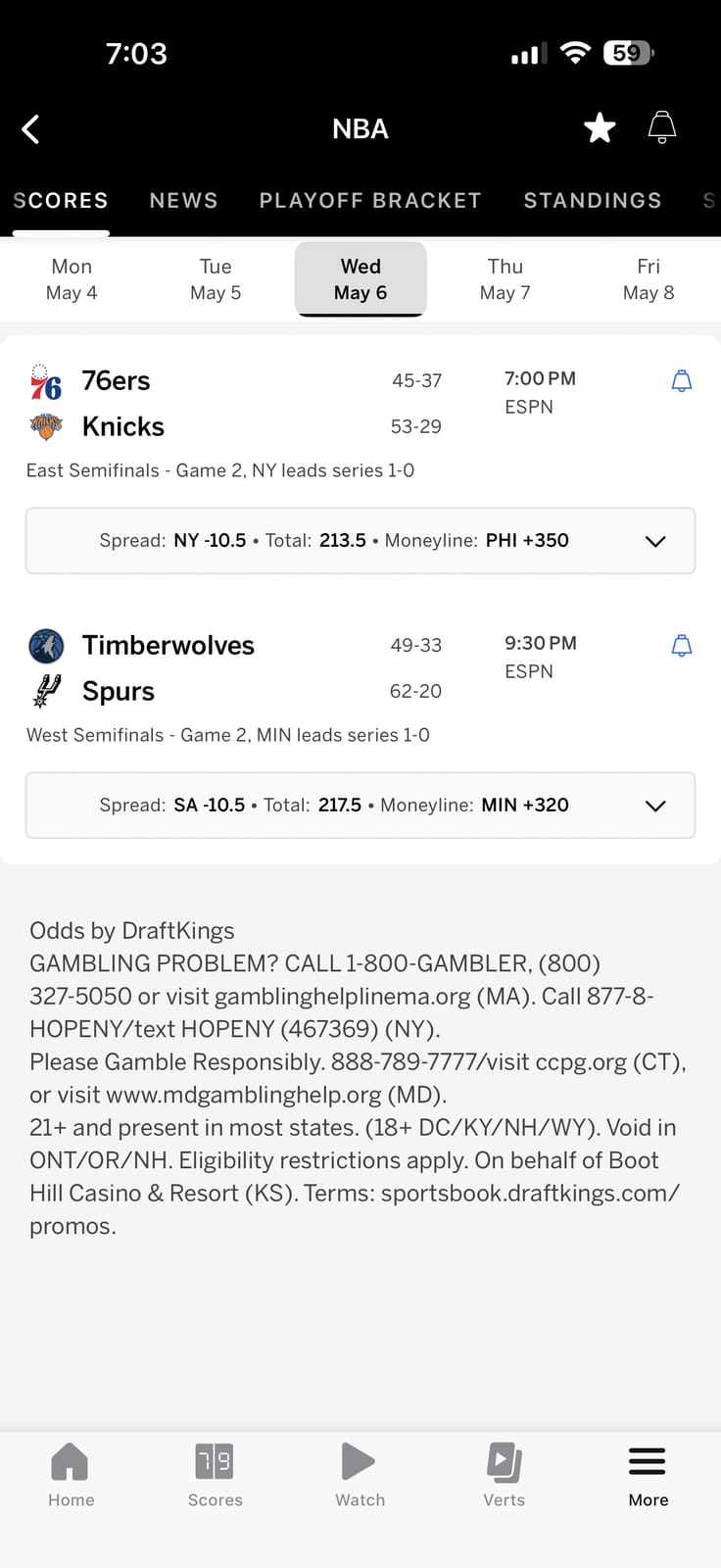
ESPN's updated NBA scores page on the mobile app. Screenshot used for editorial commentary.
The score module is the headline change. Each game card runs a clean two-team stack with the team marks, the records, the scores, and the time or status all sitting on a tighter grid than the previous version. The team type is heavier and the scores are sized up so the read at a glance lands on the actual basketball numbers first instead of the surrounding chrome.
The card backgrounds are doing more work too. The neutral white-on-white treatment from the previous version pushed every game card into the same visual weight regardless of whether the game was live, final, or upcoming. The updated layout gives live games a clearer accent treatment so the cards you actually want to tap stand out faster on the scroll.
The team logos render bigger and cleaner. The colors pop a little harder. The whole thing feels less like a database printout and more like a designed product.
What Works
Three pieces are doing the most work in the new look.
The matchup read. Two teams, two scores, the time or quarter, the records. Everything you need to know about a game in one quick scan. The previous version had the right information but the spacing made you hunt for it.
The type system. The team names and the scores are sized for thumb-distance reading on a phone. The supporting metadata sits a clear tier below the headline numbers in both size and weight.
The card density. ESPN got more games visible on a single screen without making any single card feel cramped. That is the hard part of mobile sports product design and the redesign nailed the balance.
Grade
ESPN Mobile App NBA Scores Redesign
A-
A real upgrade on a piece of the app that millions of NBA fans pull up multiple times a day. The score module is the most-used surface in any sports app and ESPN tightened the one that mattered most.
Frequently Asked Questions
Did ESPN update its mobile app in 2026?
Yes. ESPN rolled out an updated mobile app design that tightens the score module across the league pages, with the NBA scores page reading as the cleanest piece of the redesign. The team marks render bigger, the score type is sharper, and the matchup card density improved without making any single game feel cramped.
What changed on the ESPN app NBA scores page?
The NBA scores card layout was rebuilt with a tighter grid, heavier team type, larger score numbers, clearer live-game accent treatment, and bigger team logos. The previous version put every game card in the same visual weight whether live, final, or upcoming. The updated layout differentiates by game state so the cards you actually want to tap stand out on the scroll.
Is the ESPN app NBA scores redesign a real improvement?
Yes. The score module is the most-used surface in any sports app and the updated ESPN version reads faster, looks sharper, and packs more games per screen without crowding. We grade the redesign at A- because the core matchup read, the type system, and the card density all improved in the same pass.
What about the ESPN app NBA scorebug for live games?
The in-game NBA scorebug treatment on ESPN's broadcast (separate from the app) is a different story and we have already graded it at the lower end of the 2026 national broadcast cycle in our ESPN NBA scorebug review. The mobile app score module redesign covered here is the standalone scores page in the ESPN iOS and Android apps.
The Bottom Line on the ESPN App NBA Scores Update
ESPN's updated mobile app NBA scores page is a real upgrade. The score module is cleaner, the type is sharper, the matchup card density got tighter without crowding, and the live-game treatment finally separates from finals and upcoming. Grade A-. The most-used surface in the app got the redesign it needed.