Screenshot via YouTube
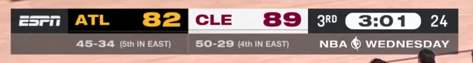
ESPN made a change to their NBA scorebug a few years ago and absolutely nailed it. The current version for the 2026 season is simple, compact, and feels like it belongs on a big national broadcast. It does not try to do too much. It just gives you the information you need and stays out of the way, which is exactly what a scorebug should do.
The best detail about this scorebug is how the colors match the actual uniforms on the court. The base color of each team's section in the scorebug matches the uniform that team is wearing, and the lettering matches the jersey lettering. That might sound like a small thing, but it is a level of attention to detail that separates ESPN from every other national broadcast in basketball right now. When you are watching a game and glance at the scorebug, the color coordination with the jerseys makes it feel like the entire broadcast was designed as one cohesive package.
The layout is clean and minimal. You get the team names, the score, the quarter, and the game clock. There is no unnecessary branding crammed into the scorebug itself, no sponsorship logos competing for attention with the score. It sits in the corner and lets the game be the focus.
If we had one critique, it would be that adding team logos could make it even better. Logos are an instant visual identifier, and some other networks have used them effectively. But honestly, the color-matching system ESPN uses works so well that the logos are not really missed. You know exactly who is playing the moment you look at the screen.
We will review the ESPN playoff and NBA Finals scorebug versions separately since those get their own unique treatment each year. For the regular season, this is the best scorebug on national television and it is not particularly close. We ranked all the national NBA broadcast scorebugs in our full national NBA scorebug rankings.