New F1 regulations always bring new liveries, and 2026 is no exception. Every team has a fresh look on a completely new car. Some teams nailed it. Some played it too safe. Here's where they all land.
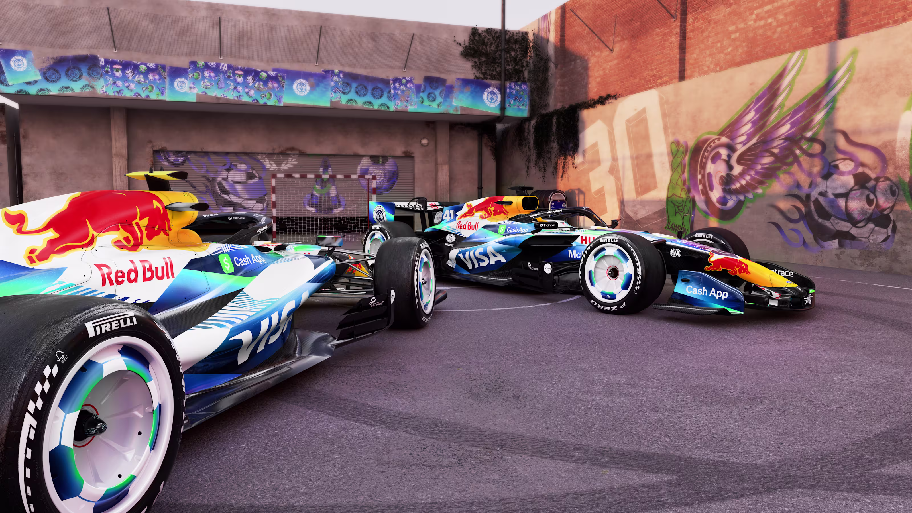
1. Red Bull
 Image via Red Bull Racing
That new blue is something else. Red Bull went bold and it paid off. The color is rich, the livery is aggressive, and with Verstappen's number 3 on the car, the whole thing just comes together. This is the best-looking car on the grid. No debate.
2. Mercedes
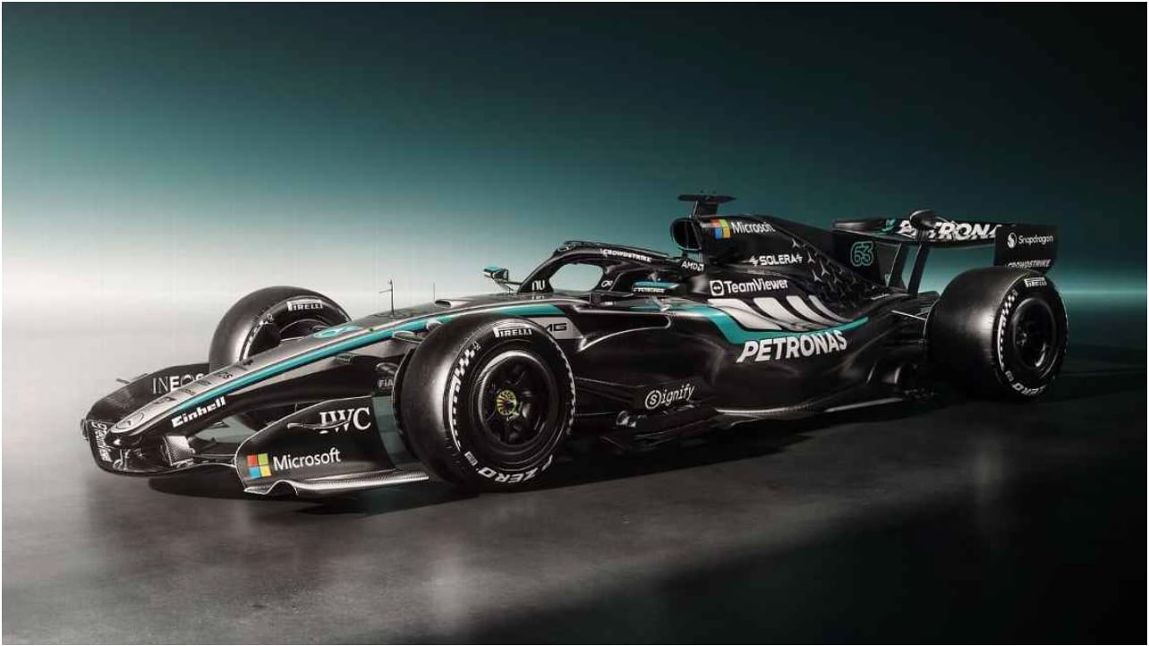 Image via Mercedes-AMG Petronas
Mercedes always does a good job with their coloring. The hints of turquoise against the silver is a combination that just works every single time. There's a reason this team always looks like a premium brand on wheels. They know what they're doing.
3. Williams
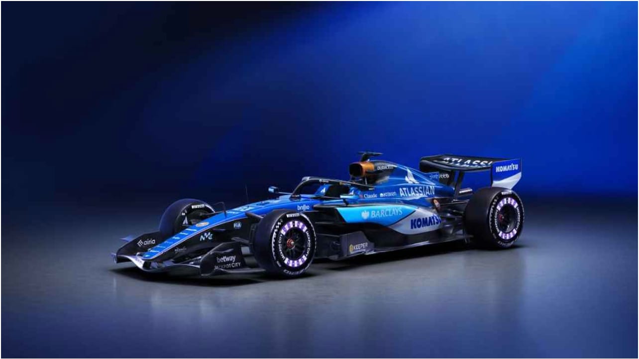 Image via Williams Racing
The blue is beautiful, and the Duracell battery on top of the car is one of those sponsor placements that actually looks cool. Williams has been putting out great liveries quietly for years and this one keeps the streak going.
4. Aston Martin
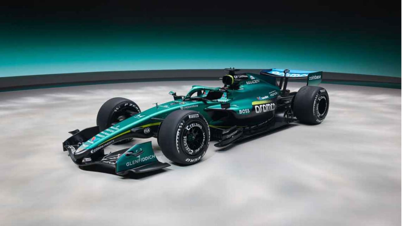 Image via Aston Martin Aramco
The green is just gorgeous. There's really not much to critique here. Aston Martin's colors are elite and the livery does them justice. The only reason they're not higher is that the car itself isn't iconic enough yet to push it into the top tier. Give it time.
5. Alpine
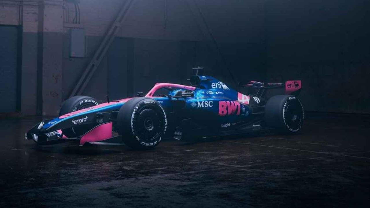 Image via BWT Alpine
The blue and pink is a little gimmicky, sure. But we love the colors. It stands out on a grid full of dark liveries, and sometimes that's all it takes. Alpine isn't trying to be something they're not, and the result is a car that catches your eye every time it goes by.
6. Audi
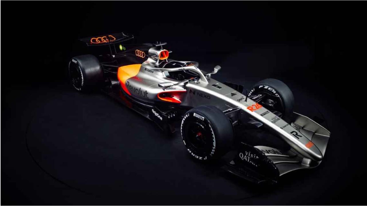 Image via Audi F1
The silver look is cool and we like the direction. But for a brand like Audi entering F1 for the first time, we expected a little more color. It's clean, it's professional, but it's playing it safe. We want to see them take a bigger swing.
7. Ferrari
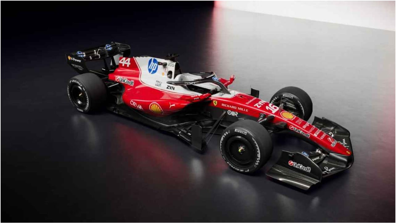 Image via Scuderia Ferrari
This is going to be controversial, but the white is a problem. Ferrari red is one of the most iconic colors in all of motorsport. When you dilute it with that much white, it hurts the brand. We love Ferrari. We love the red. We just want to see more of it on the car.
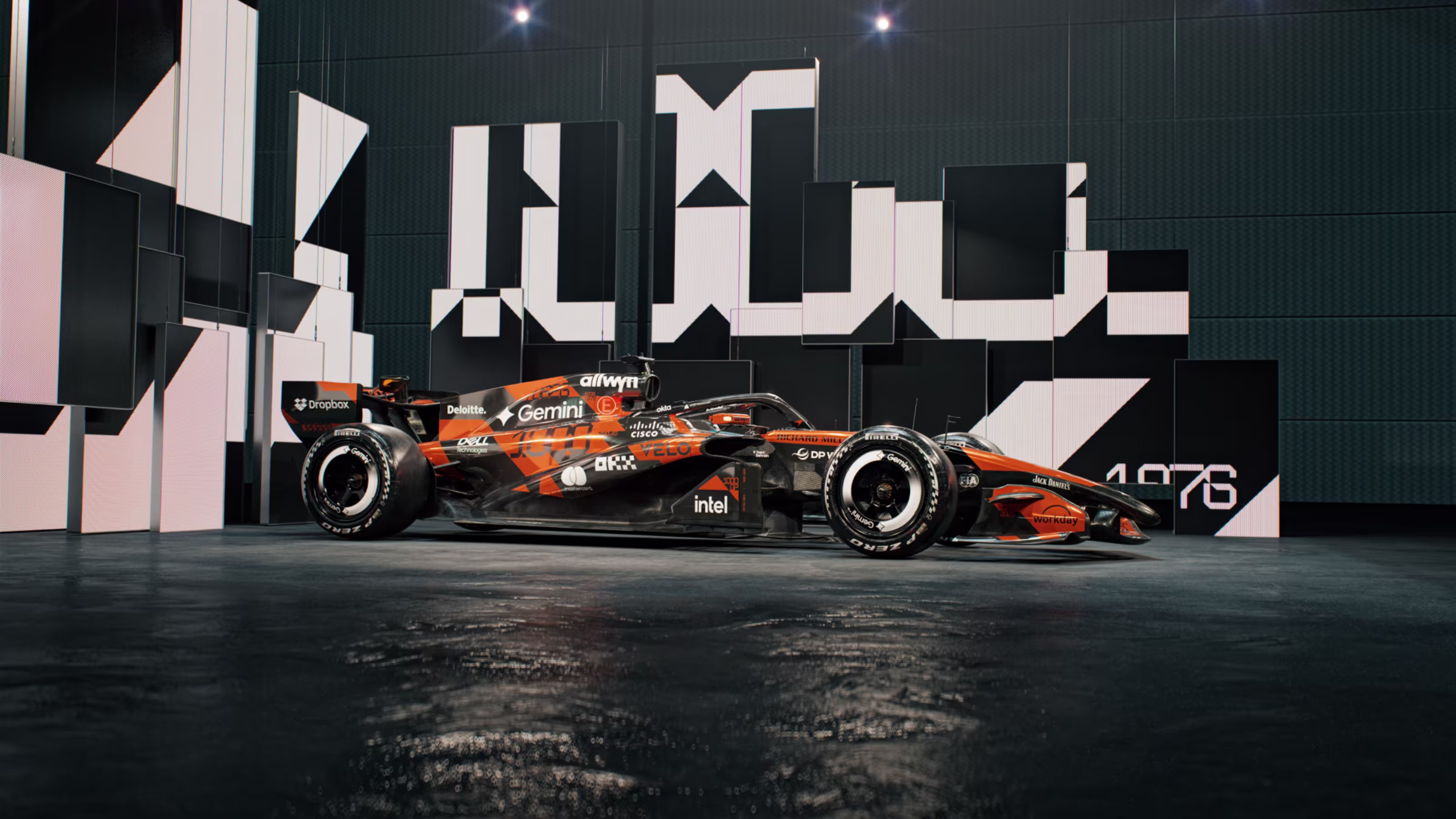
8. McLaren
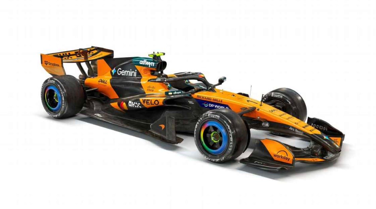 Image via McLaren Racing
It's nice. The papaya orange is always going to pop. But we wish there was a little more flair beyond just the orange and black. McLaren has had some incredible liveries in recent years and this one feels like it's coasting. Give us something unexpected.
9. Cadillac
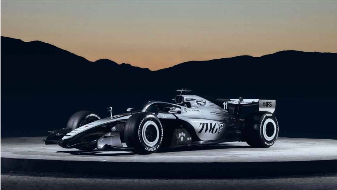 Image via Cadillac F1
The new American team on the grid. The black and white is solid, and we don't mind that the two sides of the car are different shades. That's actually kind of interesting. But we wish they did more to differentiate themselves. When you're the new kid, you need to make a statement. This doesn't quite get there.
10. V-Carb Racing Bulls
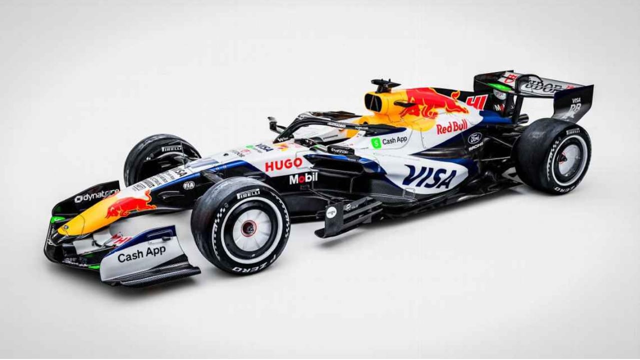 Image via Racing Bulls
It's fine. The problem is that everyone knows this is Red Bull's second team, and the car feels like it. It doesn't have its own identity. It's never going to stand out when the car it's based on is sitting right there at the top of this list.
11. Haas
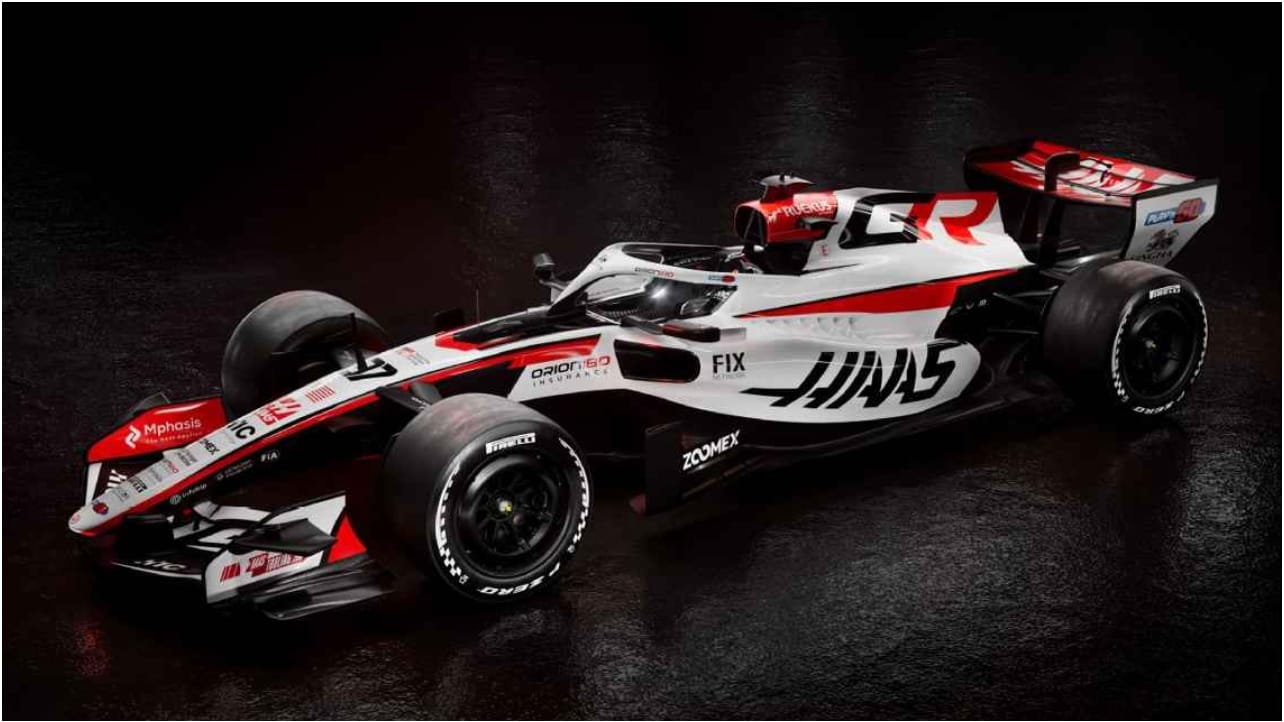 Image via MoneyGram Haas
The black, white, and red color scheme just doesn't do it for us. It's been some version of this for a while now and it's never clicked. Haas needs a full visual reset. Start fresh, find a real identity, because this isn't it.