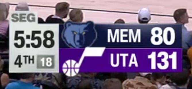
Screenshot via YouTube
The Utah Jazz local broadcast scorebug for the 2026 NBA season is the definition of average. It checks every box you need a scorebug to check without doing a single thing that makes you look twice. For a team that has gone through multiple visual identity shifts over the past few years, the broadcast graphics feel like they got left behind somewhere in the process.
The layout works. Team logos are visible, scores are readable, and the game information is organized in a way that makes sense. The Jazz's navy and green color palette shows up in the design, and the contrast between the two is decent enough to keep things legible. The overall size and positioning of the scorebug is appropriate, sitting where it should without blocking too much of the game action.
But that is really all there is to say about it. There is nothing about this design that reflects the Jazz brand, the state of Utah, or any kind of creative direction. The note logo, the mountain motifs, the gradient color schemes that the Jazz have used across their uniforms and court designs over the past few seasons, none of it makes an appearance in the broadcast graphics. It is a scorebug that exists purely to display information, and while that is technically the job, the best scorebugs in the league manage to do that while also contributing to the overall viewing experience.
The typography is standard. The spacing is adequate. There are no distracting elements, but there are no interesting ones either.
Grade: B-
Average across the board. It checks the boxes without doing anything memorable. The Jazz have a visual identity worth showing off, and this scorebug does not bother trying.