The new 2026 NESN scorebug during a Red Sox vs Brewers broadcast. Screenshot via NESN.
NESN rolled out a completely new scorebug for the 2026 Red Sox season, replacing the design they had been using for years. The old one was a fan favorite. Clean, simple, and distinctly Boston. The new one brings team colors and logos into the mix, which sounds like an upgrade on paper, but the execution tells a different story.
The Old NESN Scorebug
The old NESN scorebug that was used for multiple seasons. Screenshot via NESN.
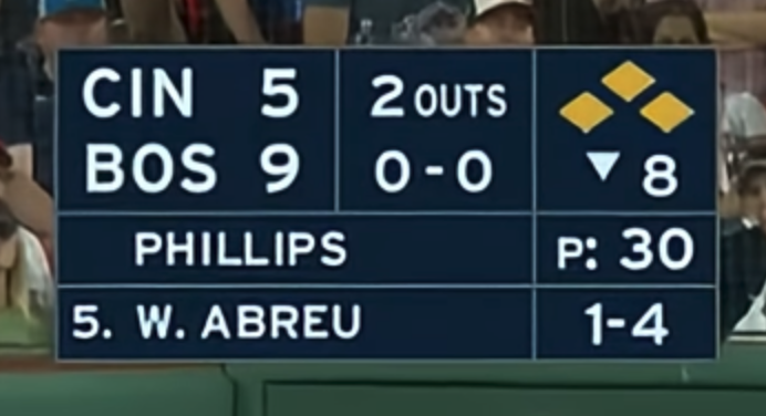
The previous NESN scorebug was one of the better local broadcast designs in baseball. It had a dark blue base with a clean grid layout showing the score, outs, count, inning, and base runners all in a compact package. The batter info and pitcher info sat neatly below in separate rows.
What made it work was the simplicity. No team logos, no team colors bleeding into the background, just a clean blue-and-white color scheme that felt like it belonged to NESN and the Red Sox. It had its own identity. You could glance at any screenshot from a Red Sox game and immediately know it was a NESN broadcast just from the scorebug alone.
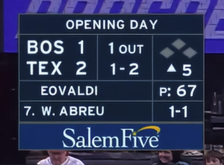
The old NESN scorebug on Opening Day with the SalemFive ad bar below. Screenshot via NESN.
Even on special occasions like Opening Day, the scorebug kept its composure. An "Opening Day" banner would sit above the main bug, and a sponsor bar would appear underneath, but the core design stayed the same. Clean and consistent.
The New 2026 NESN Scorebug
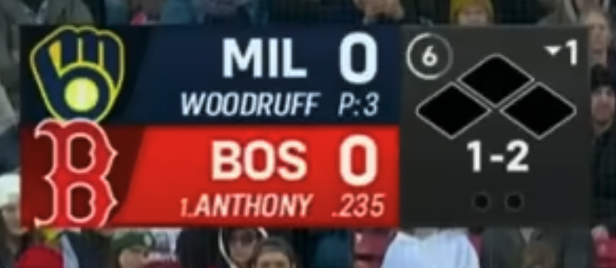
The new 2026 NESN scorebug during a Red Sox vs Brewers broadcast. Screenshot via NESN.
The 2026 version is a full overhaul. NESN added team logos to the left side of each team's row and introduced team-colored backgrounds. The Red Sox row gets a red background, and the opposing team gets their own color treatment. The base runner diamond, count, and inning information moved to the right side in a darker panel.
On its own, the new design is fine. It is a perfectly functional scorebug that shows you everything you need to know. The team logos and colors add visual identity for each matchup, which is something a lot of modern broadcast designs are moving toward.
But here is the problem. It looks like every other scorebug now.
The team-color-on-each-row layout is the same approach that Fox, ESPN, and half the local broadcasts around the league already use. The old NESN bug stood out because it did not do that. It had its own thing going. That dark blue grid with the clean white text was distinctive. Now it blends in with everyone else.
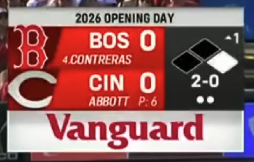
The new NESN scorebug on 2026 Opening Day with the Vanguard ad bar below. Screenshot via NESN.
On Opening Day, the new bug added a "2026 Opening Day" banner on top and a Vanguard sponsor bar on the bottom, similar to how the old design handled it. But with the colored rows, logos, and extra elements already in play, the additional layers make the whole package feel heavier than it needs to be.
The Ad Bar
One more thing worth noting. The Vanguard ad bar that sits below the scorebug on certain broadcasts is not great. It makes the overall package feel heavier and more cluttered. The old design had sponsor bars too (SalemFive on Opening Day, for example), but the simpler base design handled the extra weight better. The new one with the colored rows plus the ad bar plus the logos starts to feel like a lot of information competing for attention.
The Grades
The old NESN scorebug gets an A- from us. It was clean, distinctive, and felt like it belonged to the Red Sox broadcast. Very few local scorebugs had that kind of identity.
The new 2026 NESN scorebug gets a B. It is not bad by any means, and the team colors and logos are a nice touch in theory. But the overall layout lost what made the old one special. It went from having its own personality to looking like a template that any team could use. We might warm up to it as the season goes on, but right now it feels like a step back.
Screenshots via NESN