Screenshot via YouTube
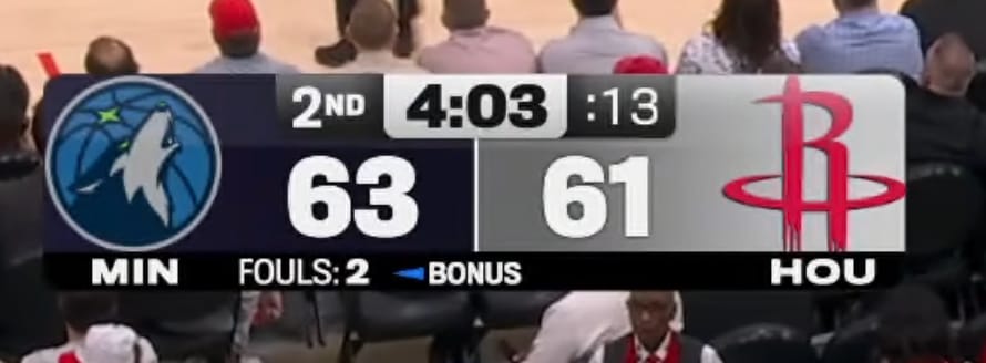
Amazon Prime Video's NBA scorebug for the 2026 season has grown on us throughout the year. When you first tune into a Prime broadcast, you immediately know what network you are watching. The design is clean, simple, and carries the same visual DNA as their NFL scorebug, which is a good thing because that one works well too.
One of the smartest choices Prime made is using team graphics and logos instead of abbreviations. When you have full-color logos sitting right in the scorebug, you do not need three-letter abbreviations next to them. The logos already tell you who is playing, and they look better than text. It keeps the whole thing visually clean and lets the team branding do the work.
The coolest detail on this scorebug is the shot clock. When the shot clock hits 10 seconds and under, it turns blue instead of the red that every other network uses. It is a small thing, but it is a completely on-brand move for Amazon. Prime's entire visual identity is built around that blue, and working it into a functional element of the scorebug is the kind of design thinking we like to see. It is subtle enough that most viewers probably do not even notice it, but once you see it, you appreciate the attention to detail.
The overall layout is compact and stays out of the way. It does not stretch across the screen or take up too much real estate. You get the team logos, the score, the quarter, and the game clock in a tight package that lets you focus on the actual basketball. For a streaming platform that is still relatively new to live sports broadcasting, Prime has put together a scorebug that feels polished and professional.
We ranked all the national NBA broadcast scorebugs in our full national NBA scorebug rankings.