 Image via Nike
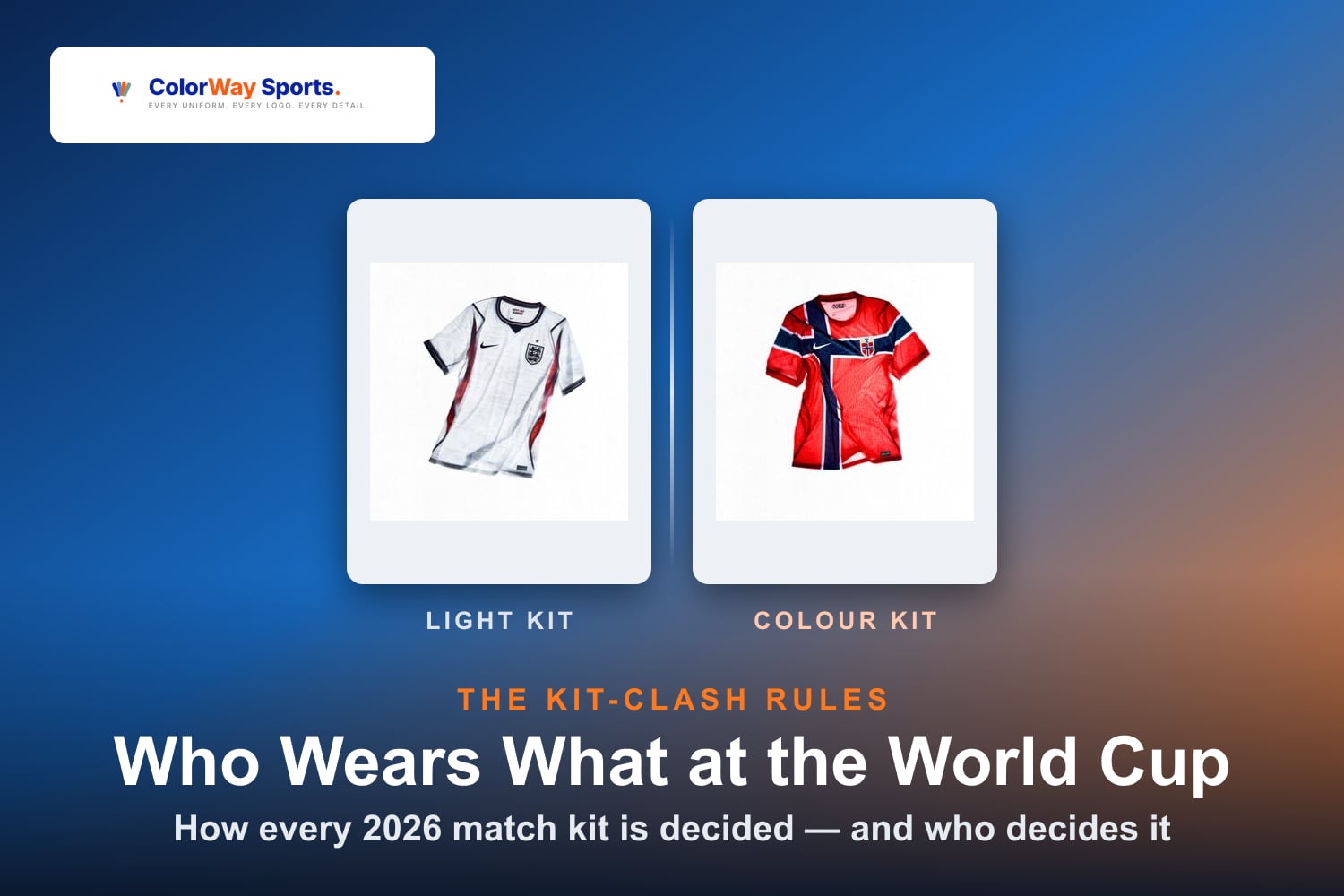
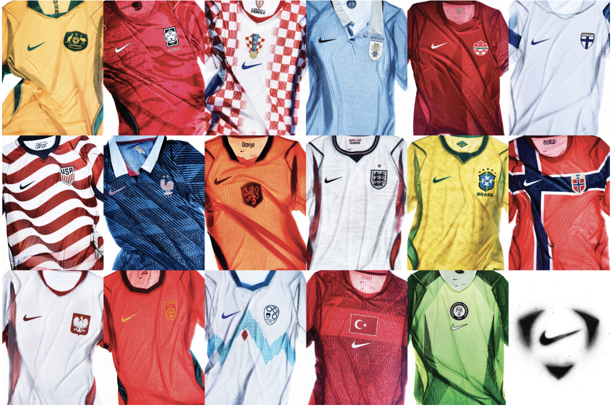
Nike just released kits for 16 national teams ahead of the 2026 World Cup. New regulations, new templates, and some genuinely bold design choices. Here's where every kit lands.
1. France
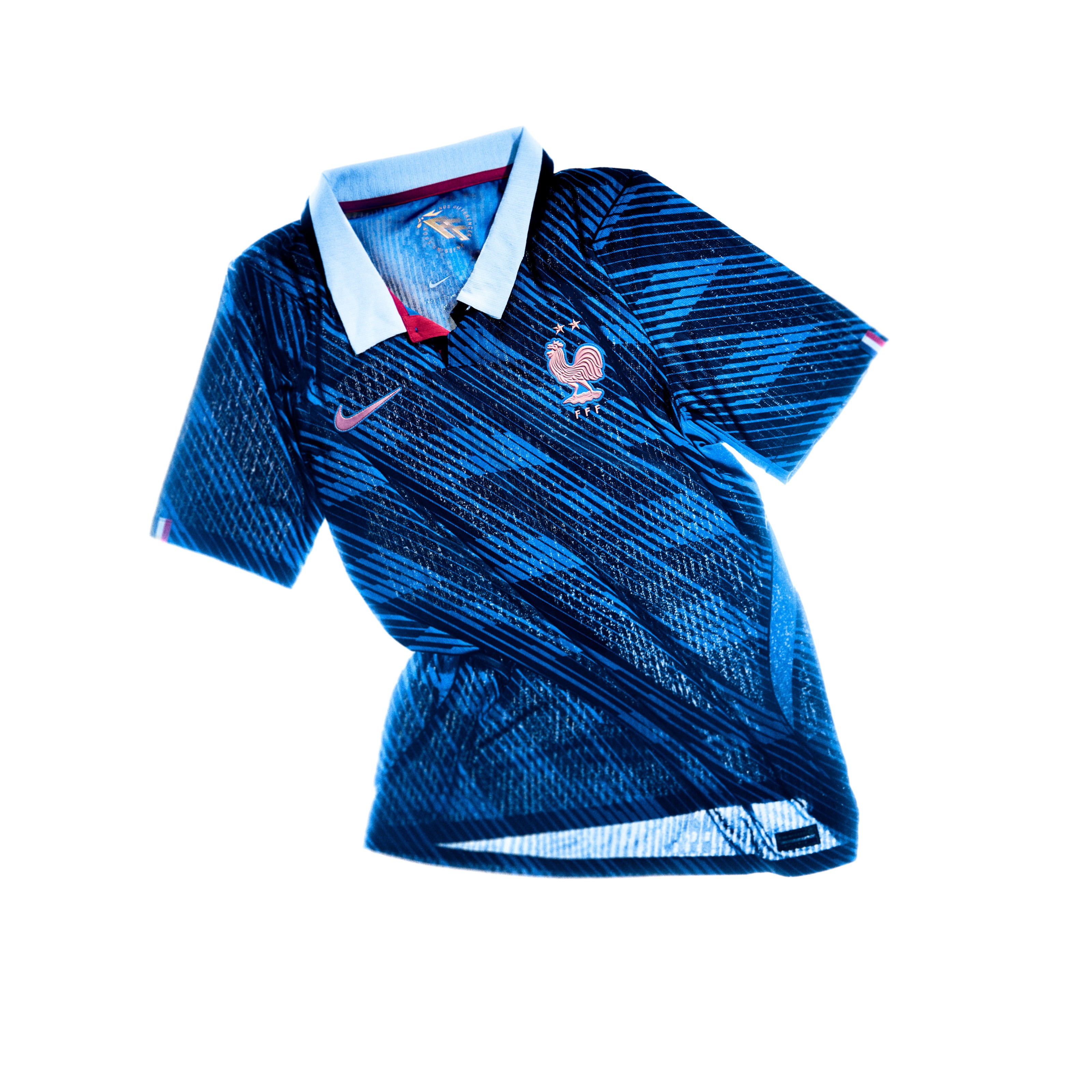 Image via Nike
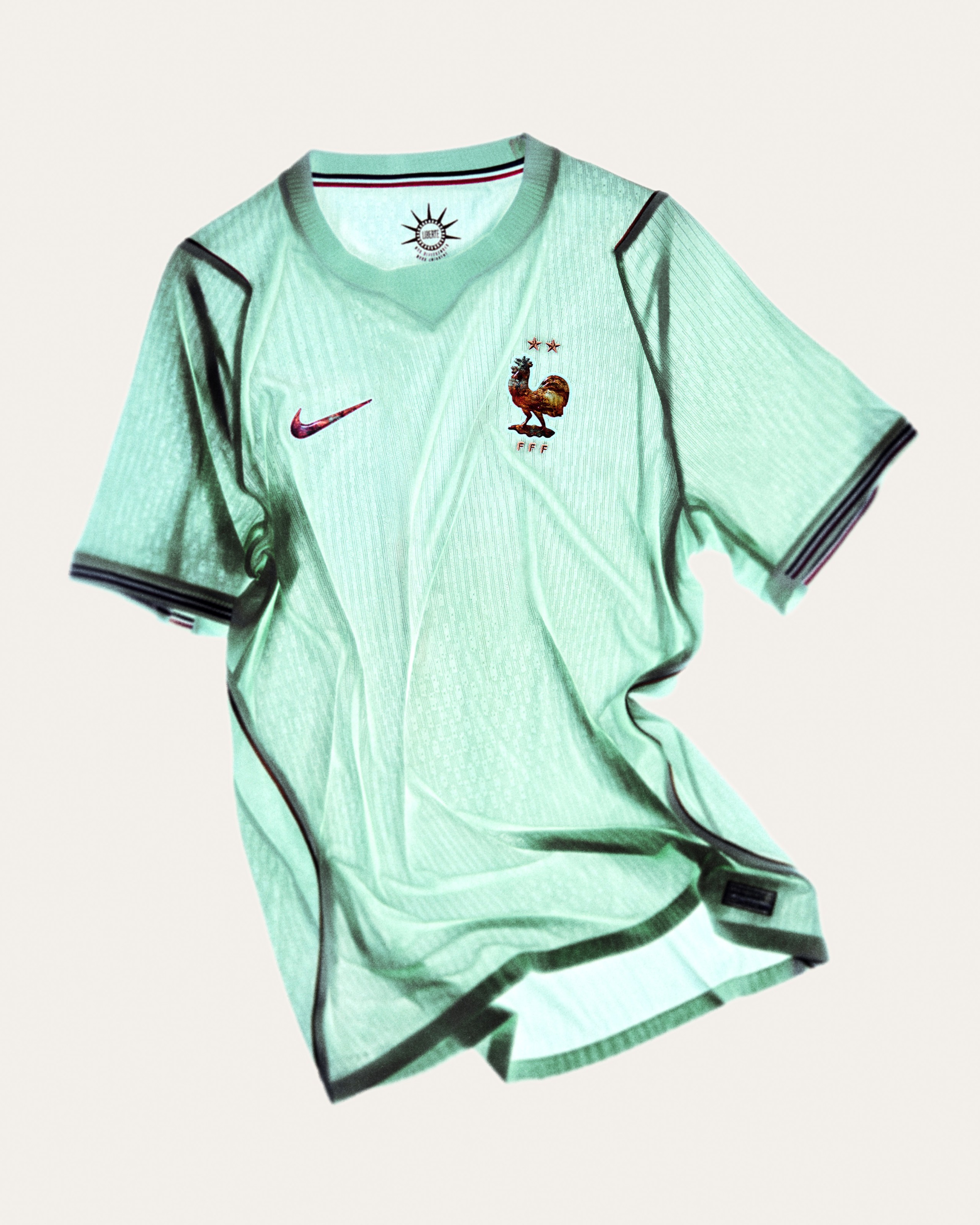 Image via Nike
The away kit is the star here. That green jersey inspired by the Statue of Liberty is one of the most creative things Nike has done in years. The patina color is unique, it tells a story, and it's going to look incredible on the pitch. The home kit is clean too, with that metallic copper crest on white. France wins this one going away.
2. Brazil
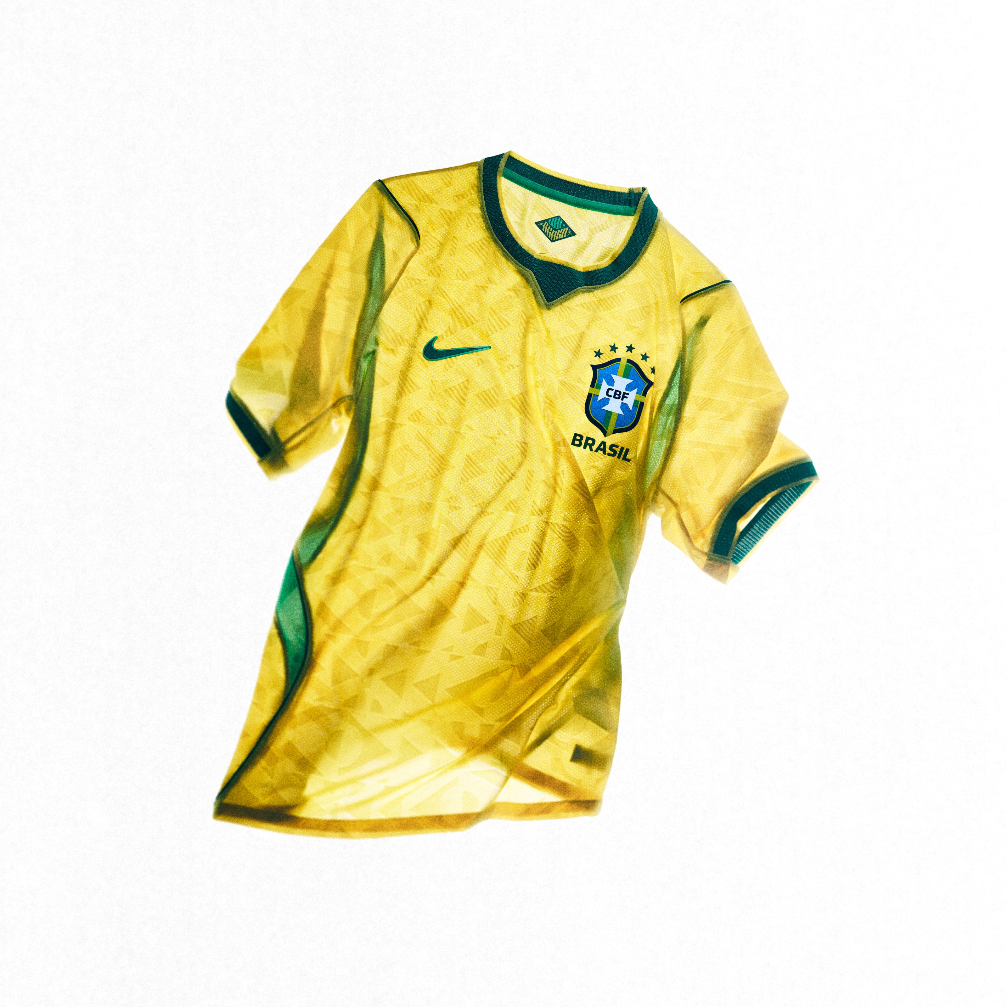 Image via Nike
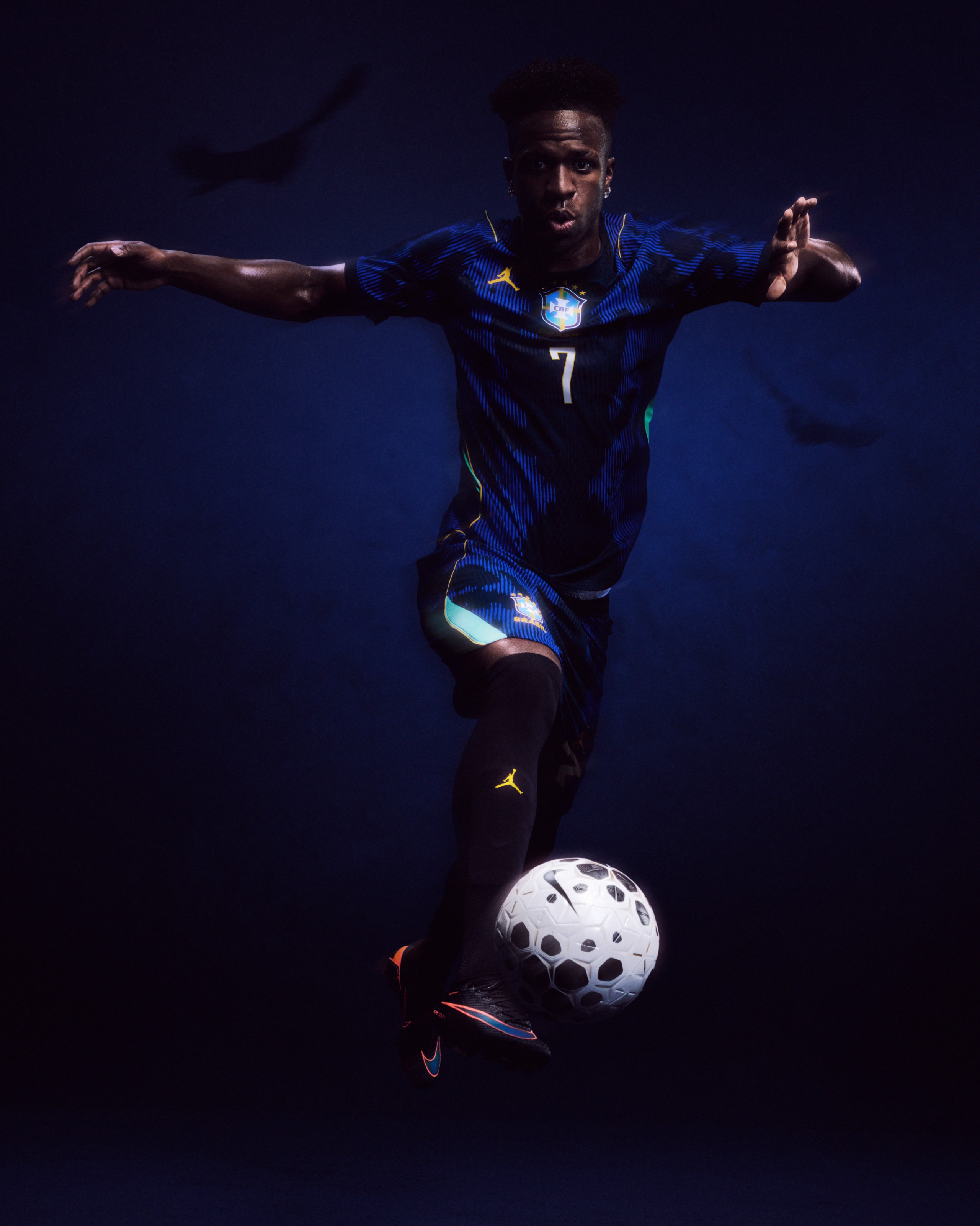 Image via Nike
It's Brazil. The yellow, green, and blue is one of the most iconic color combinations in sports, and Nike didn't mess it up. The home kit looks great. The away kit with the darker palette through the Jordan Brand collab is interesting. Our only gripe is the blue could be a bit lighter, more like the classic Brazil blue. But that's a minor complaint on a kit that's always going to look good.
3. Norway
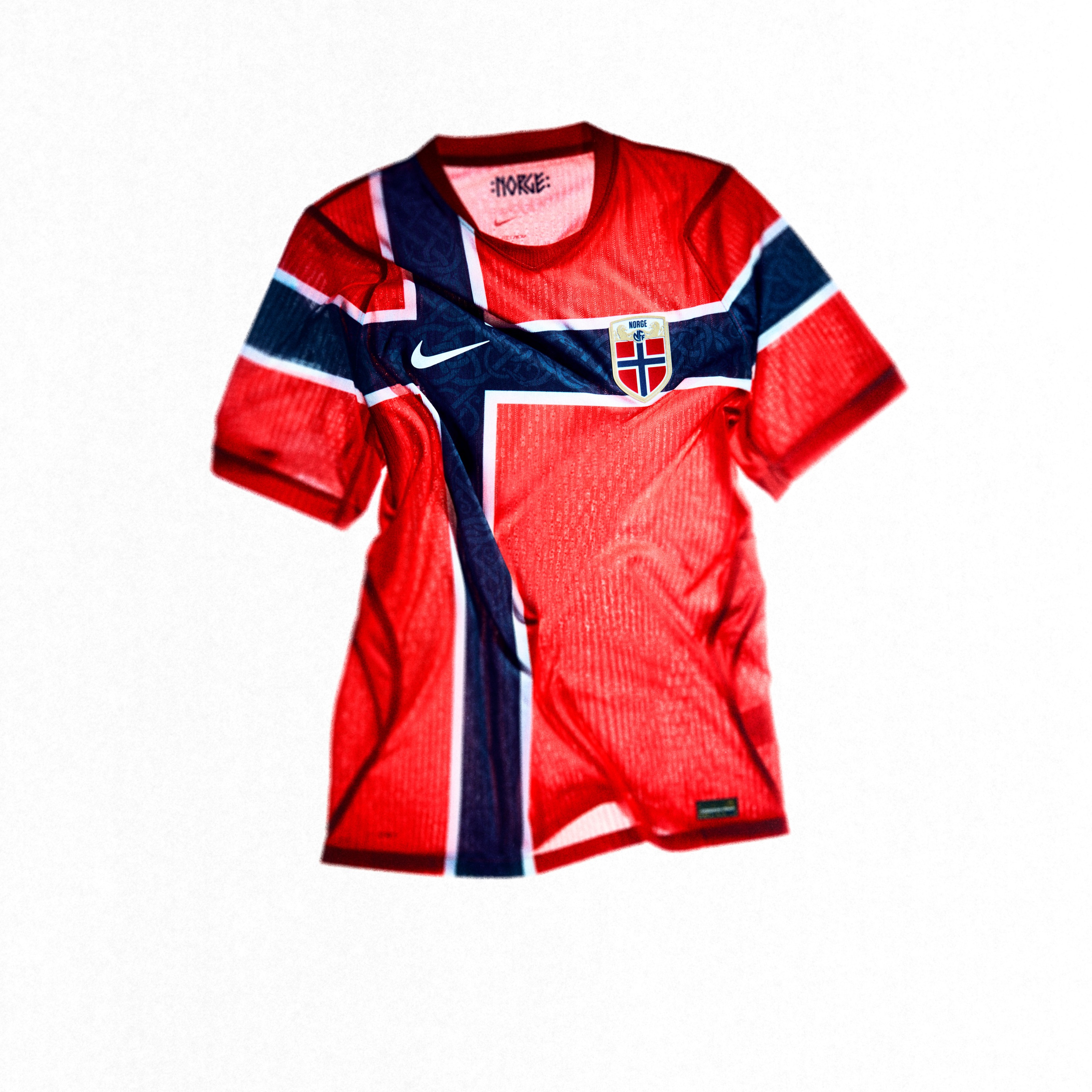 Image via Nike
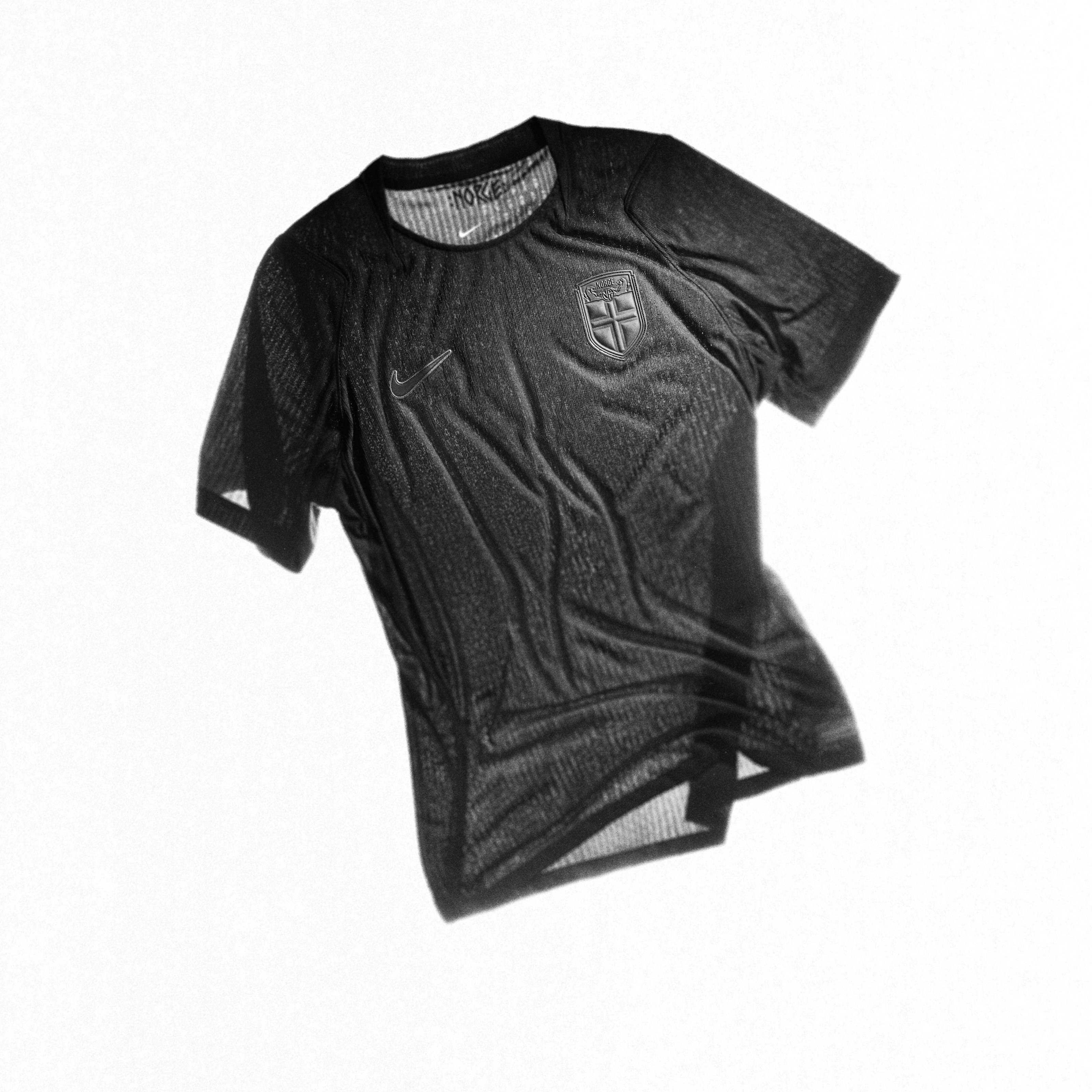 Image via Nike
That home red jersey with the tonal Viking cross is absolutely incredible. It's one of those kits where you have to look closely to see the detail, and when you do, it hits different. The all-black away kit inspired by Viking warriors is aggressive and clean. Norway doesn't get enough credit for consistently putting out great kits.
4. Netherlands
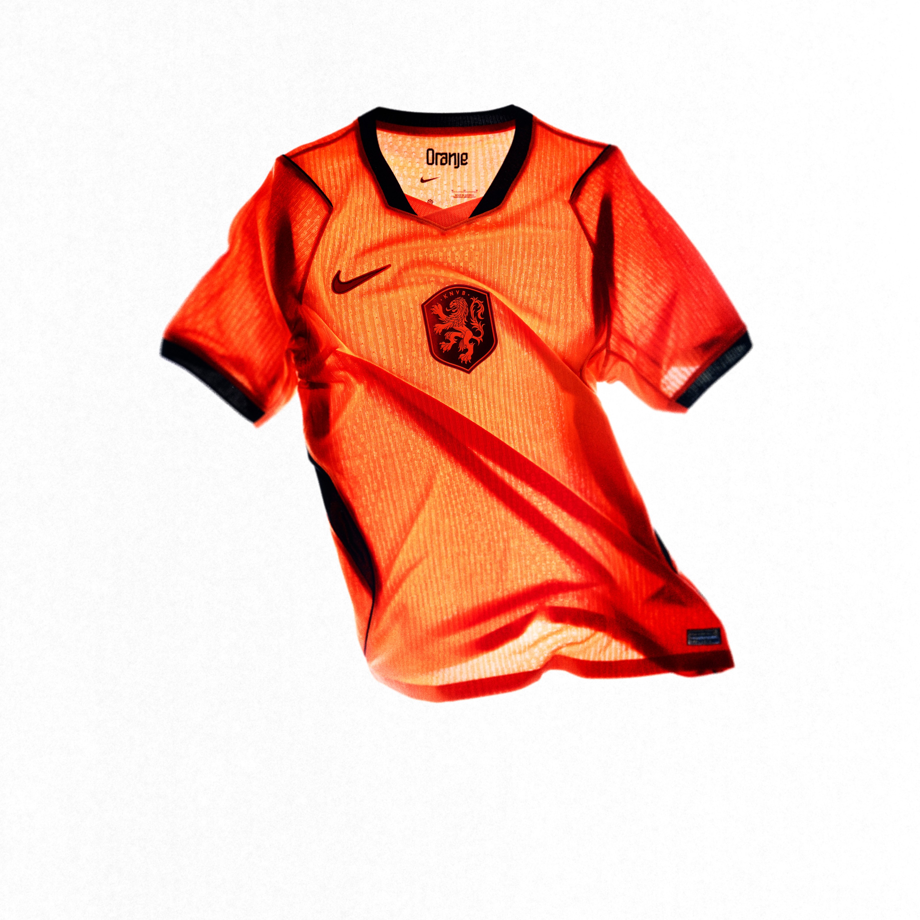 Image via Nike
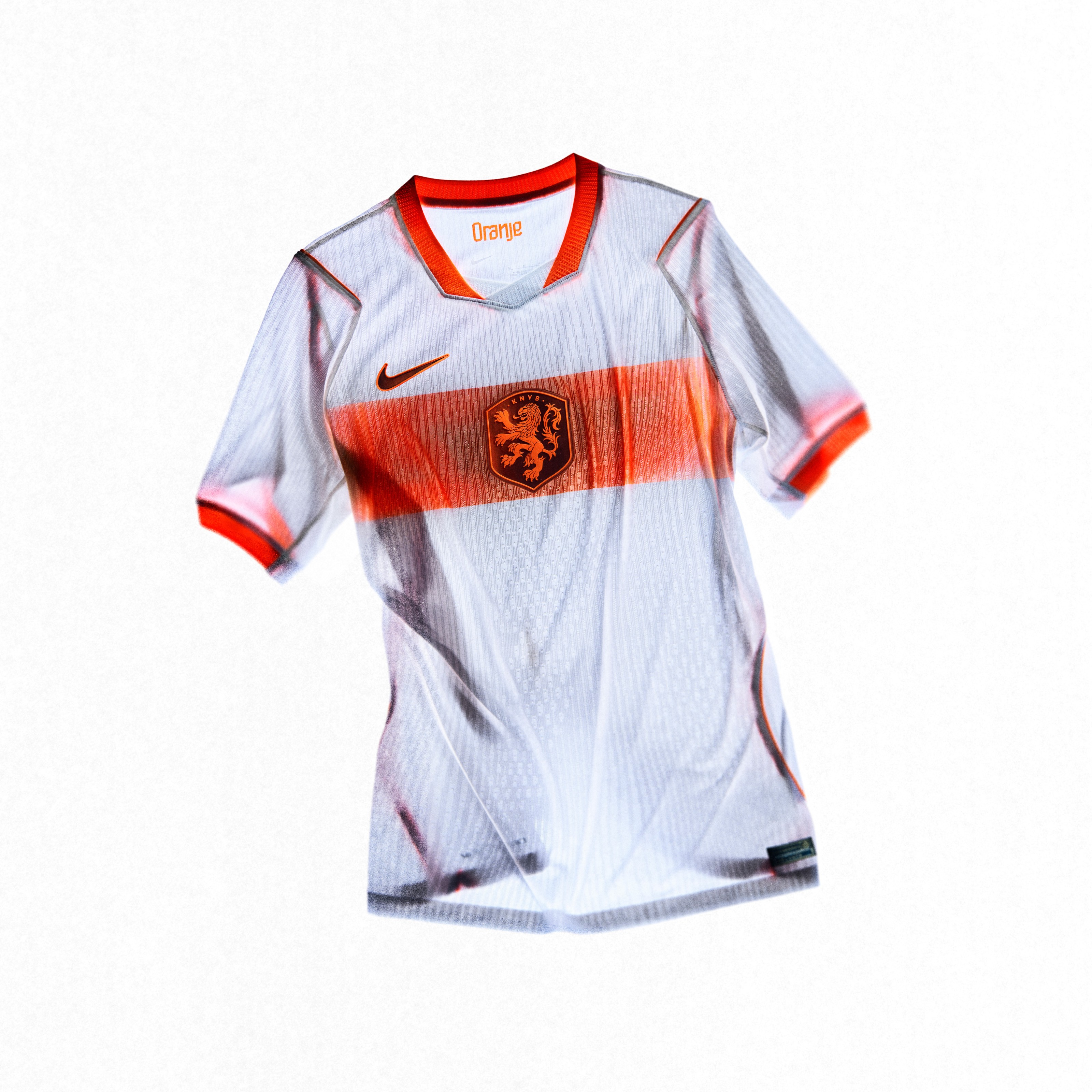 Image via Nike
You can't go wrong with Dutch orange. It's one of the most recognizable colors in international soccer, and this home kit does it justice. The away kit is sharp too, all-white with that orange fade. The Netherlands always looks good, and this year is no exception.
5. USA
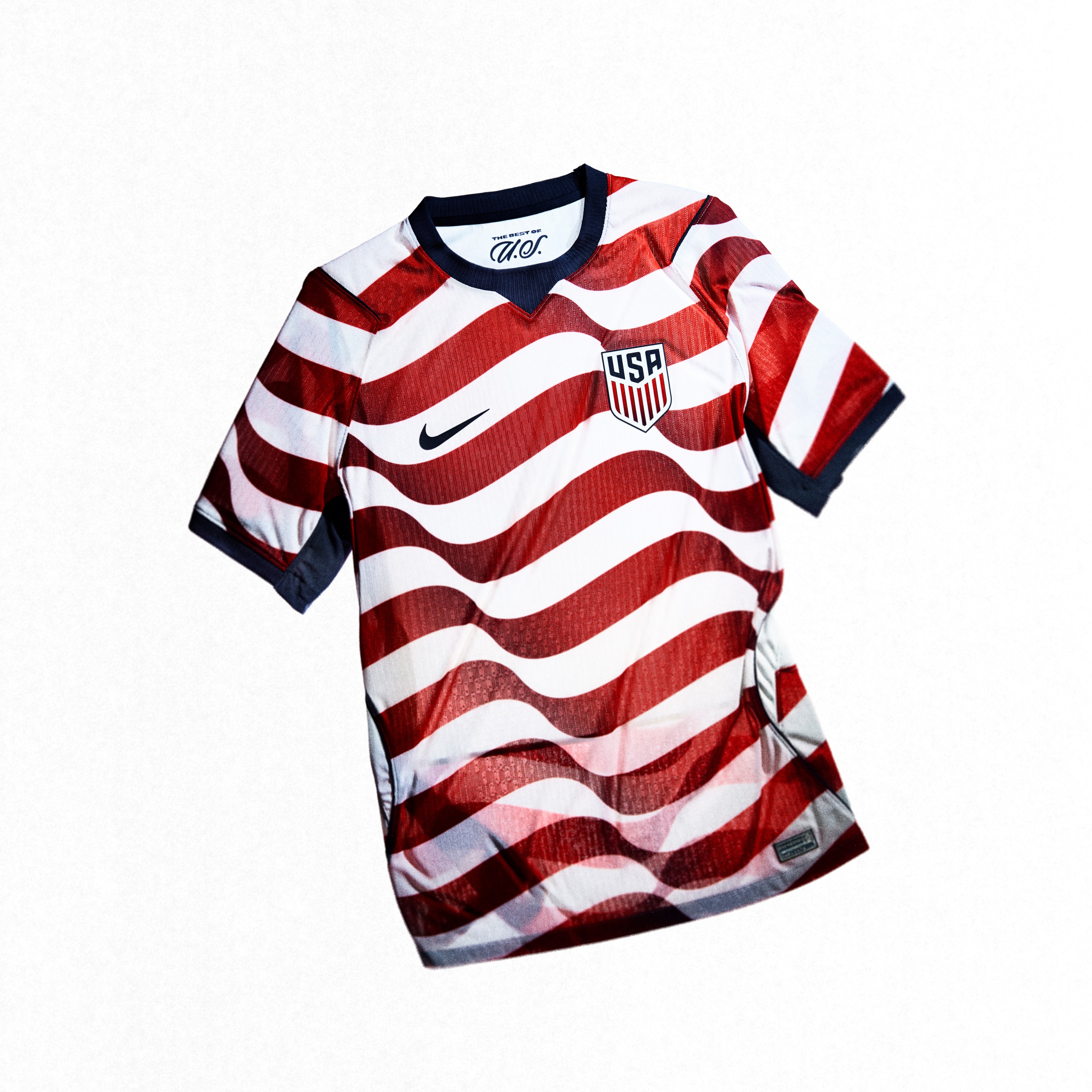 Image via Nike
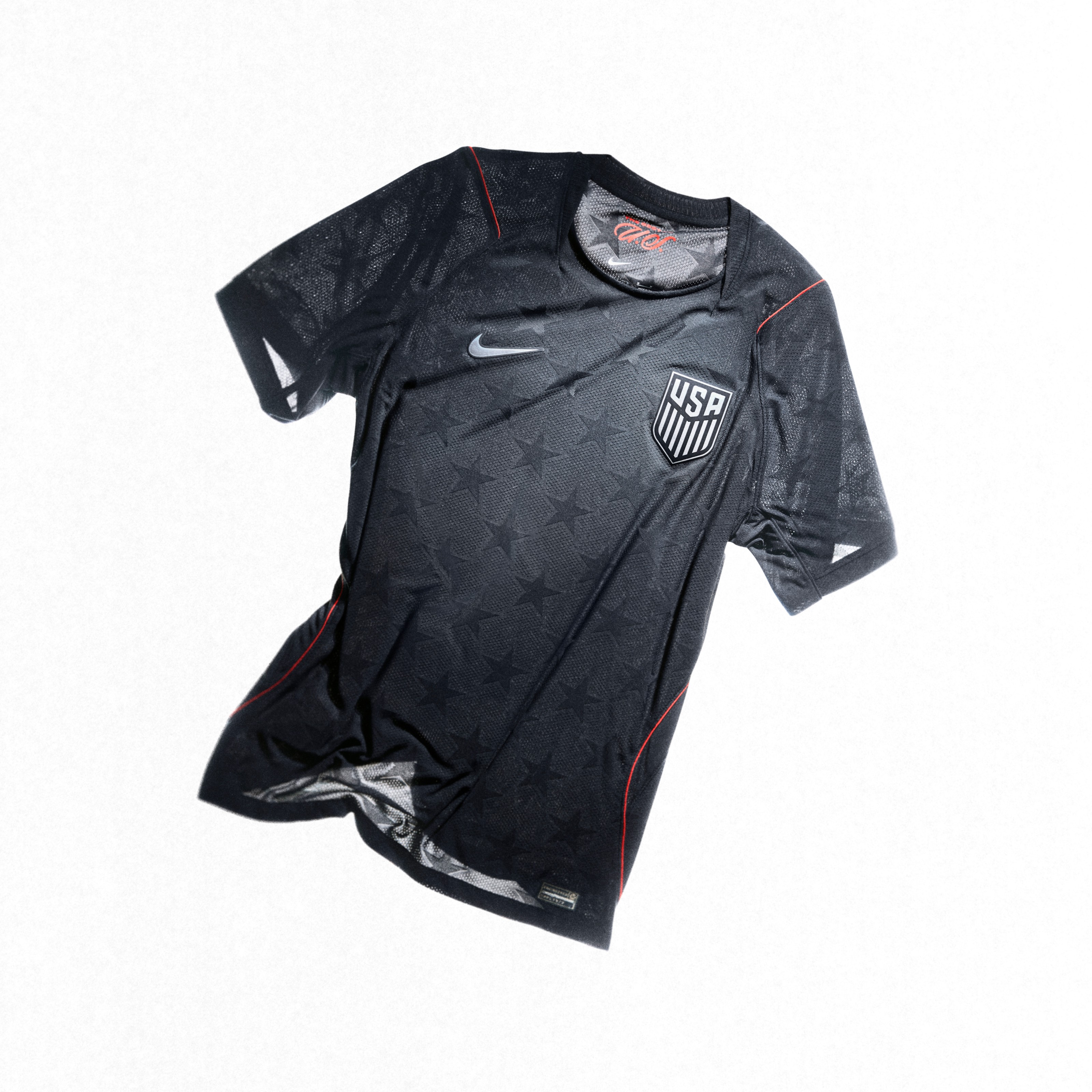 Image via Nike
The home kit is a winner. Nike got it right with the stars and stripes feel without making it look like a costume. It's patriotic and clean at the same time. The away kit is a bit bland for our taste. For a World Cup on home soil, we expected something with a little more punch on the second kit. But the home more than makes up for it.
6. England
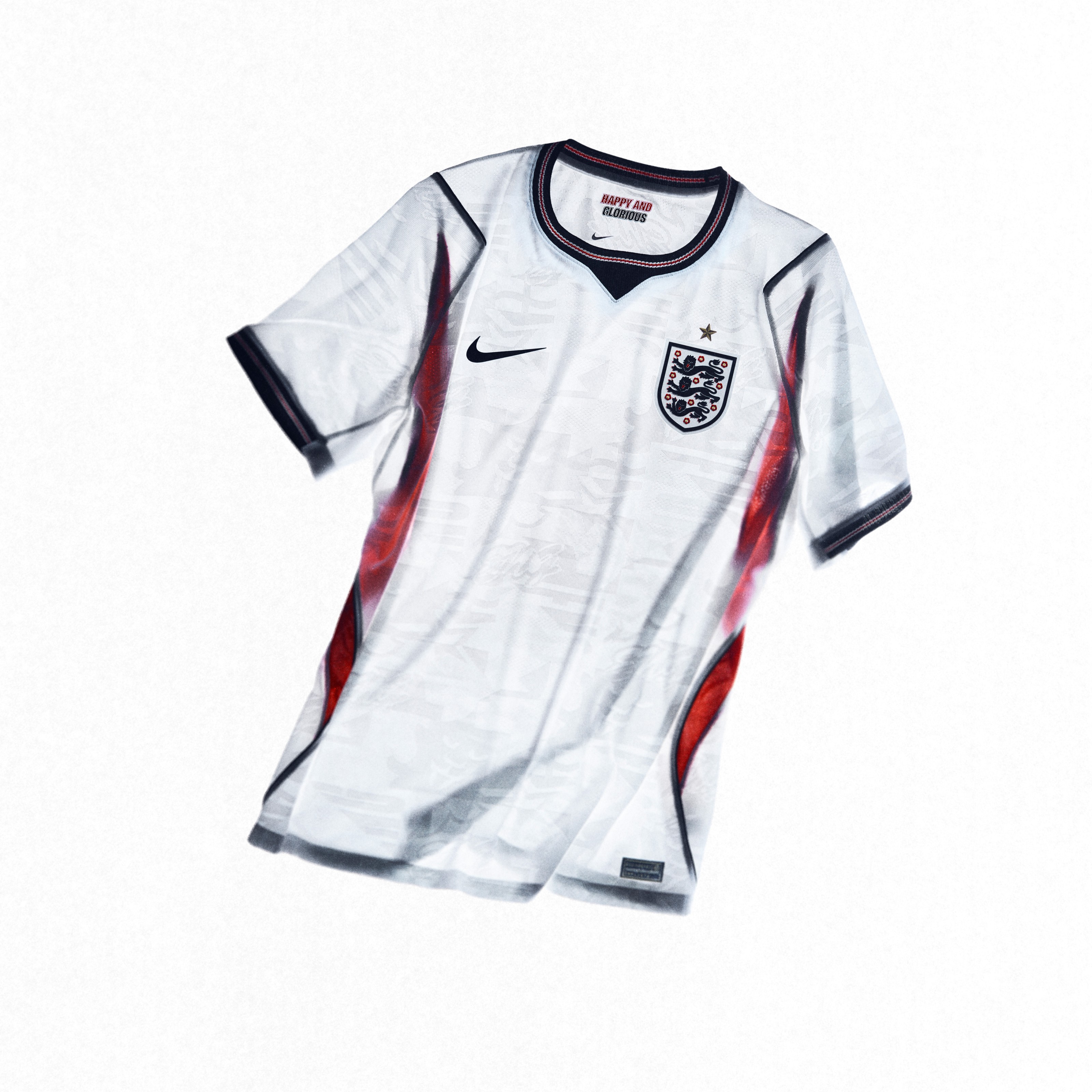 Image via Nike
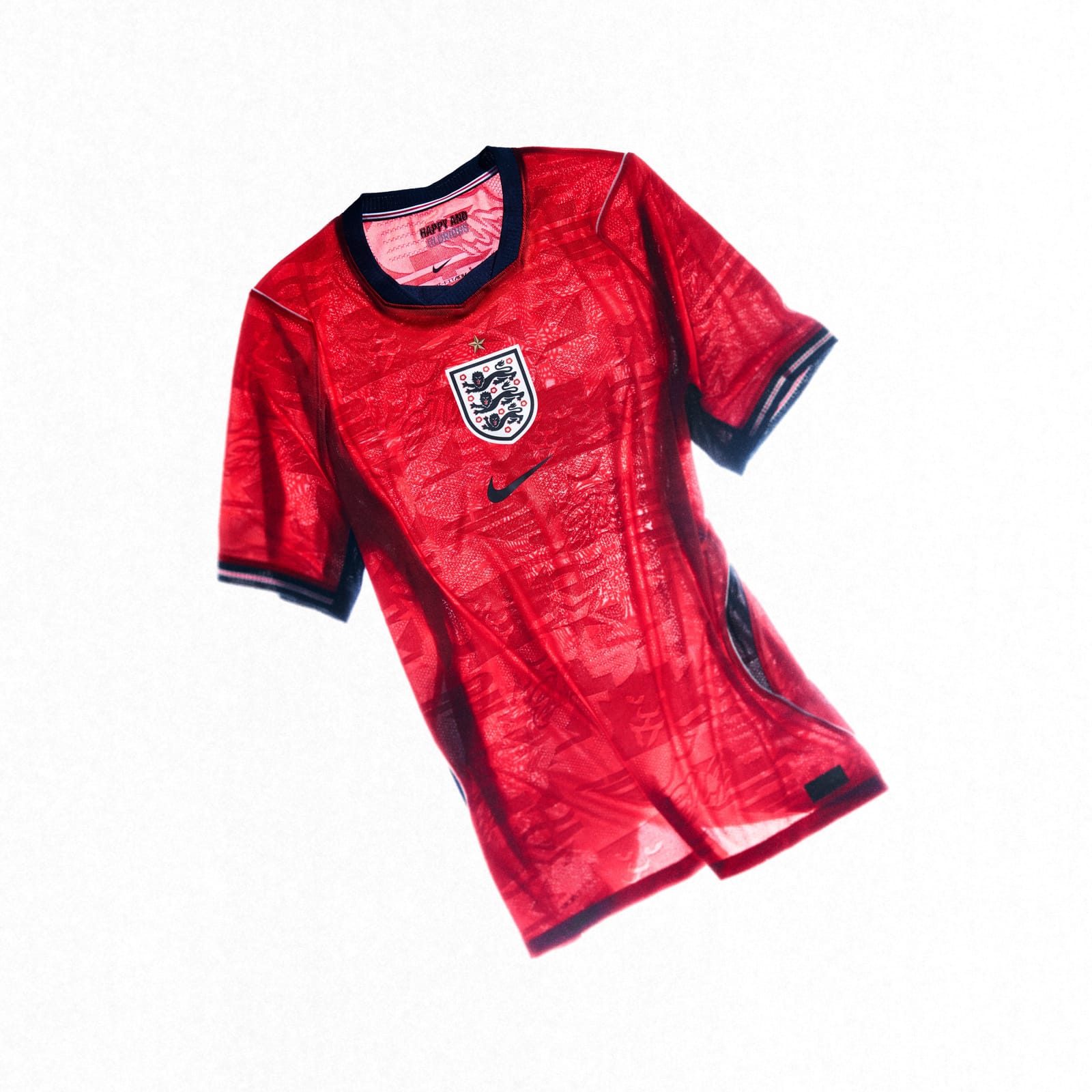 Image via Nike
The away kit edges out the home for us, but both are solid. England has a way of keeping things classic without being boring, and this set continues that. There's a reason the Three Lions kits always sell well. They just look right.
7. Croatia
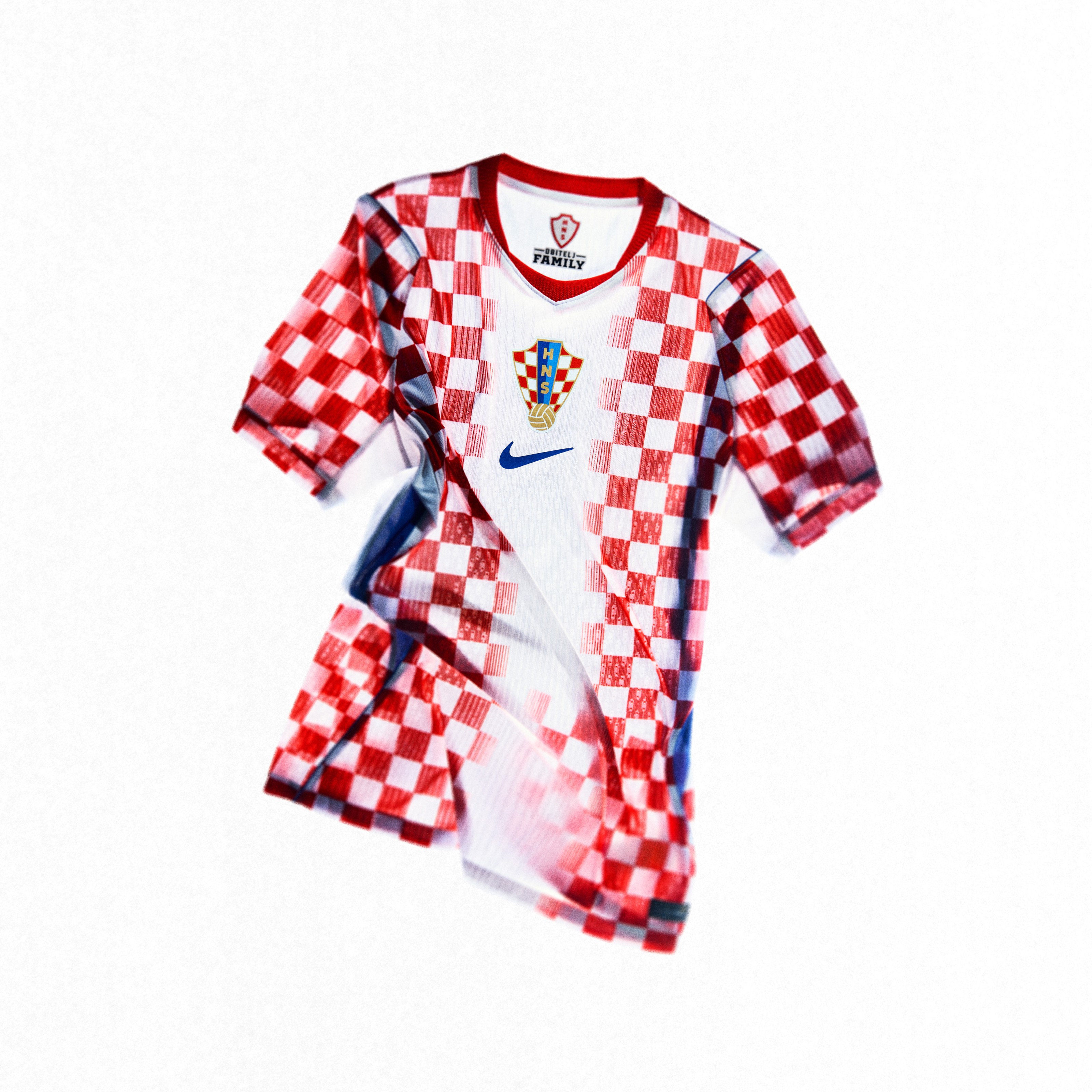 Image via Nike
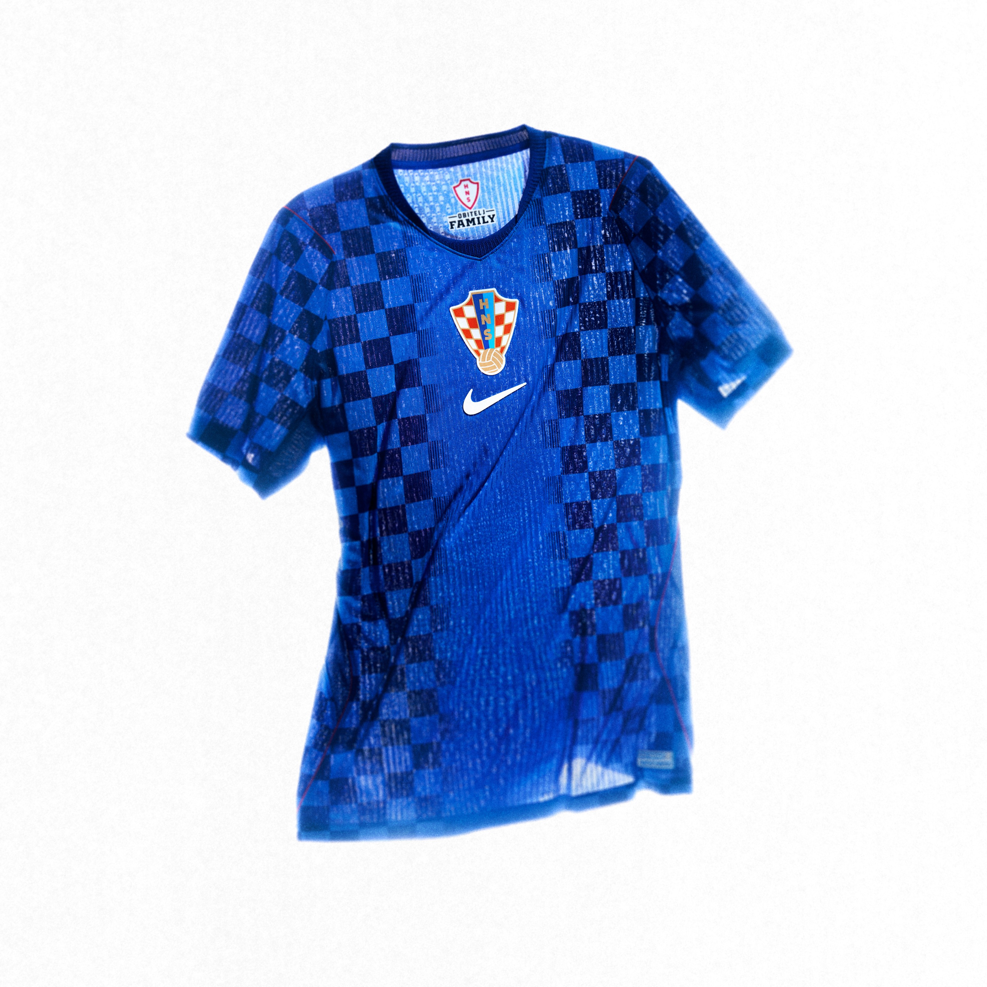 Image via Nike
The checkered pattern is Croatia's identity, and this version is refined without losing what makes it special. The home kit scales down the checkers from the 1990 original, which gives it a more modern feel. The away is the better of the two. That darker blue checkered look is clean and understated.
8. Uruguay
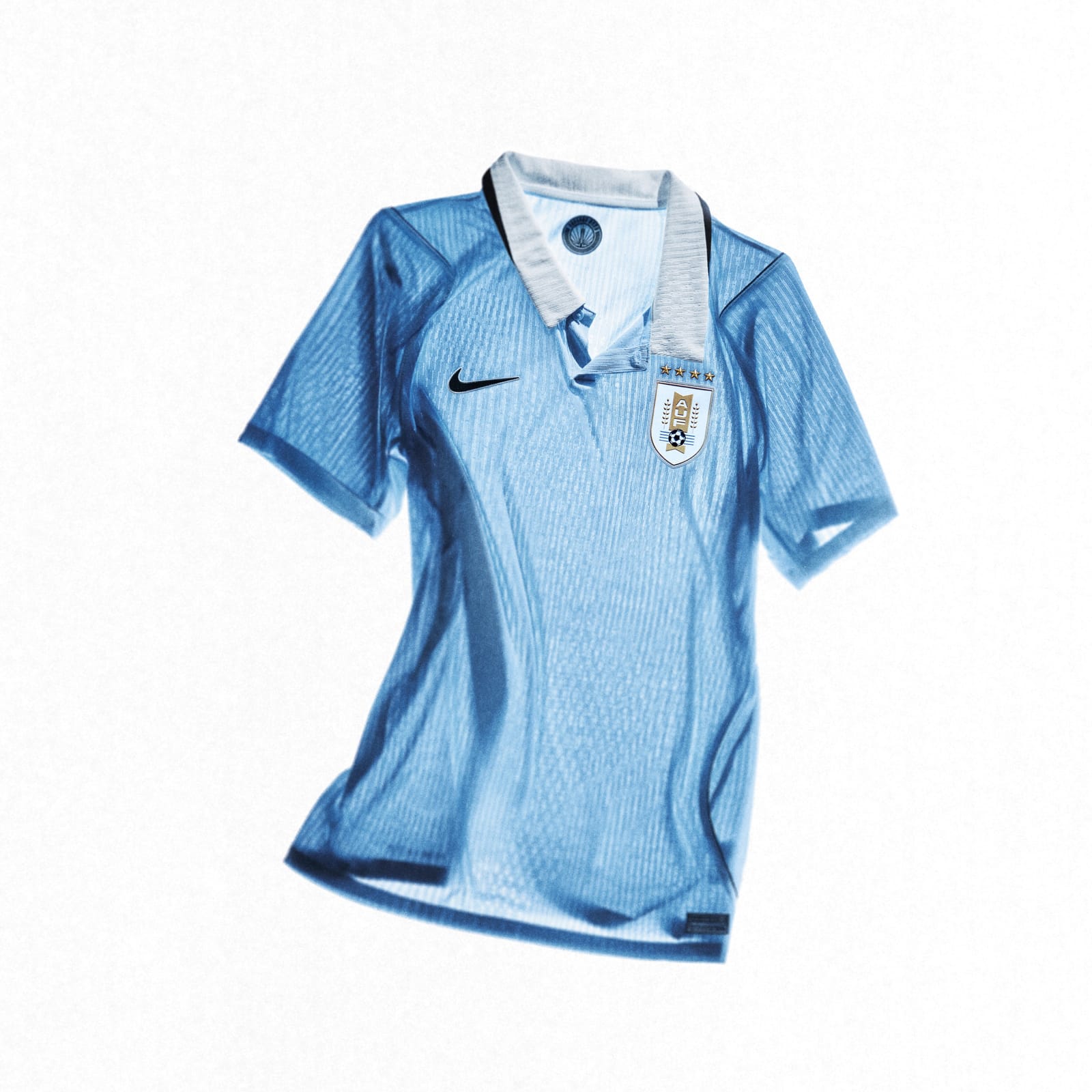 Image via Nike
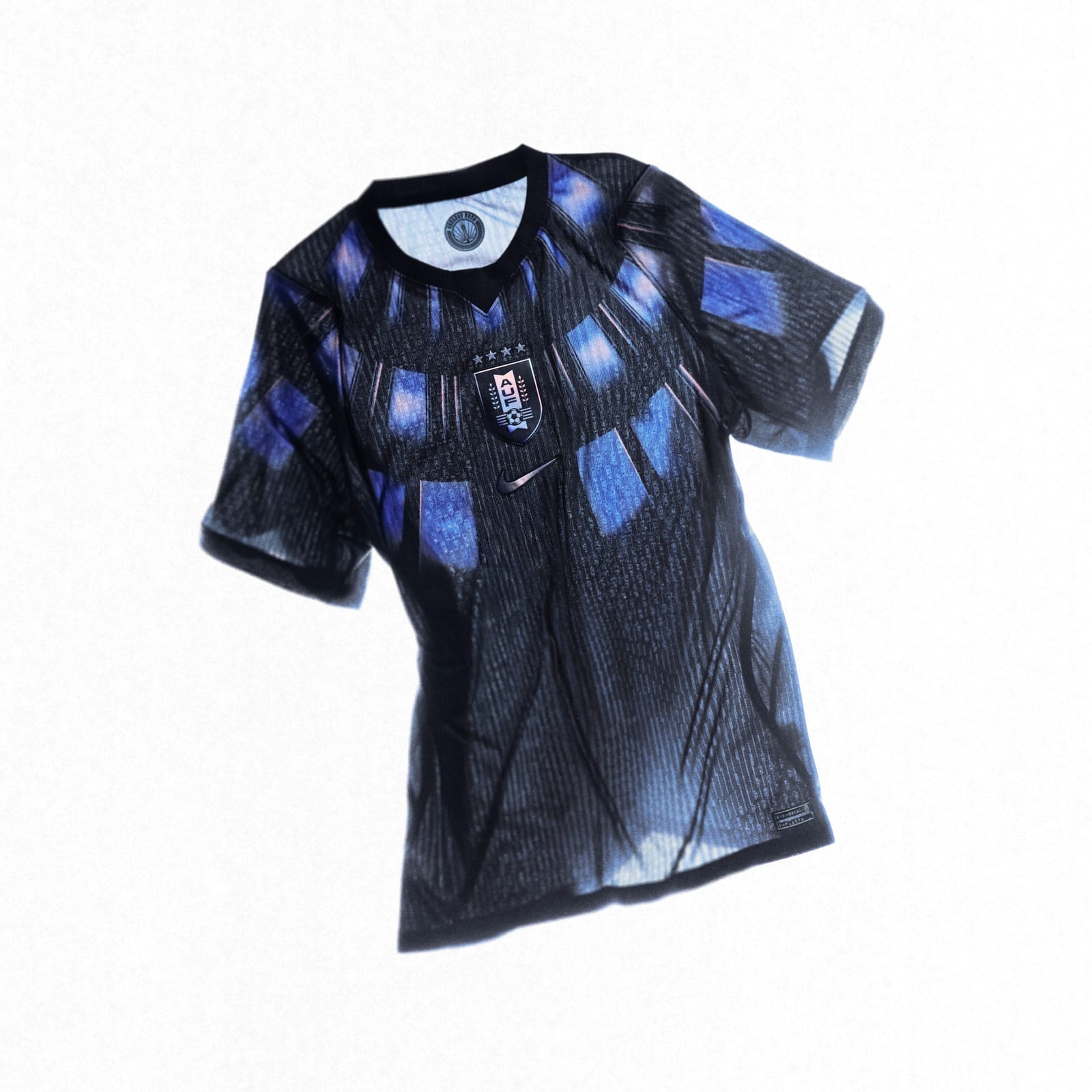 Image via Nike
The powder blue home jersey is beautiful. Uruguay's color is one of those shades that just feels right on a soccer kit. The navy accents keep it clean. The away with the wings pattern is fine but the home is the one you want to wear.
9. Nigeria
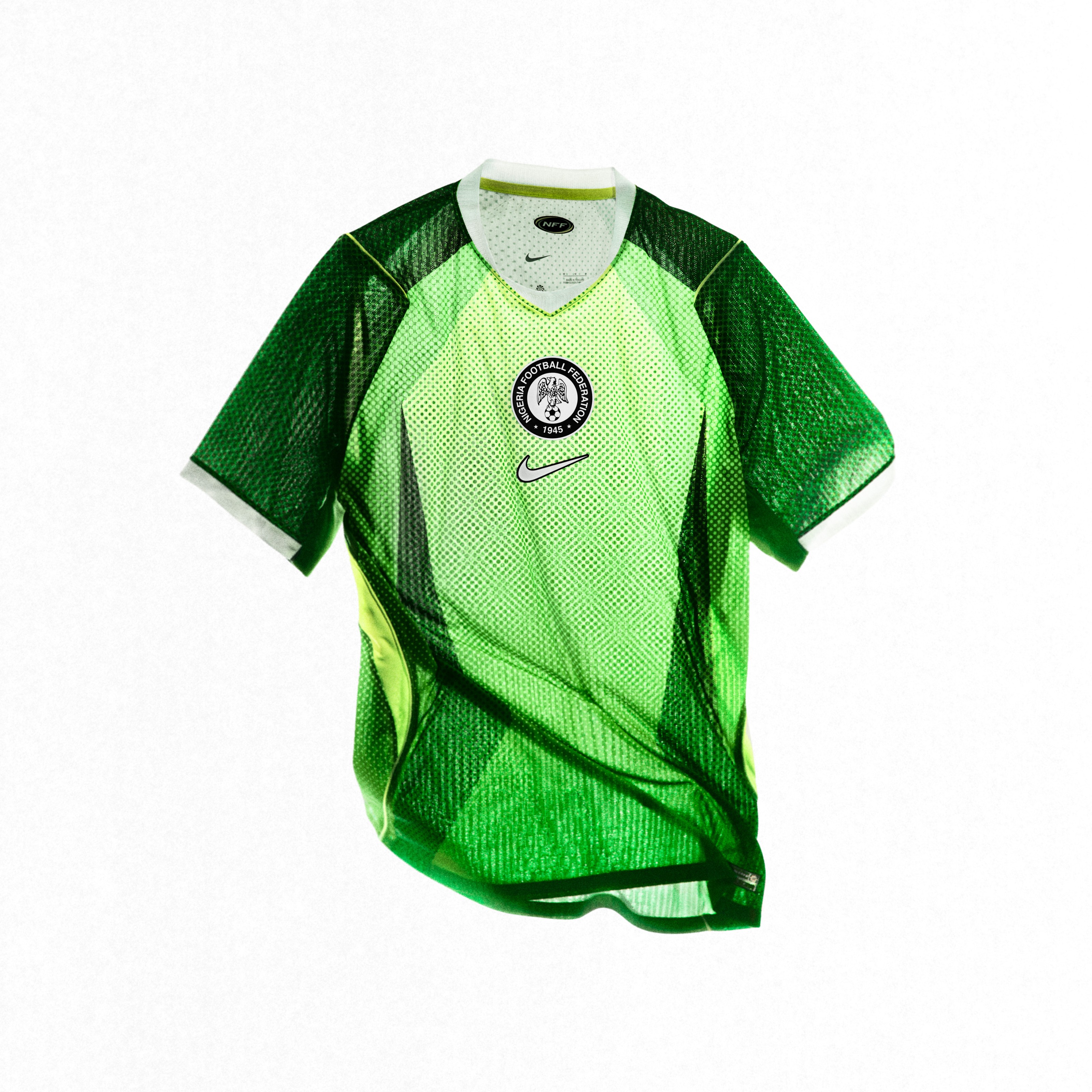 Image via Nike
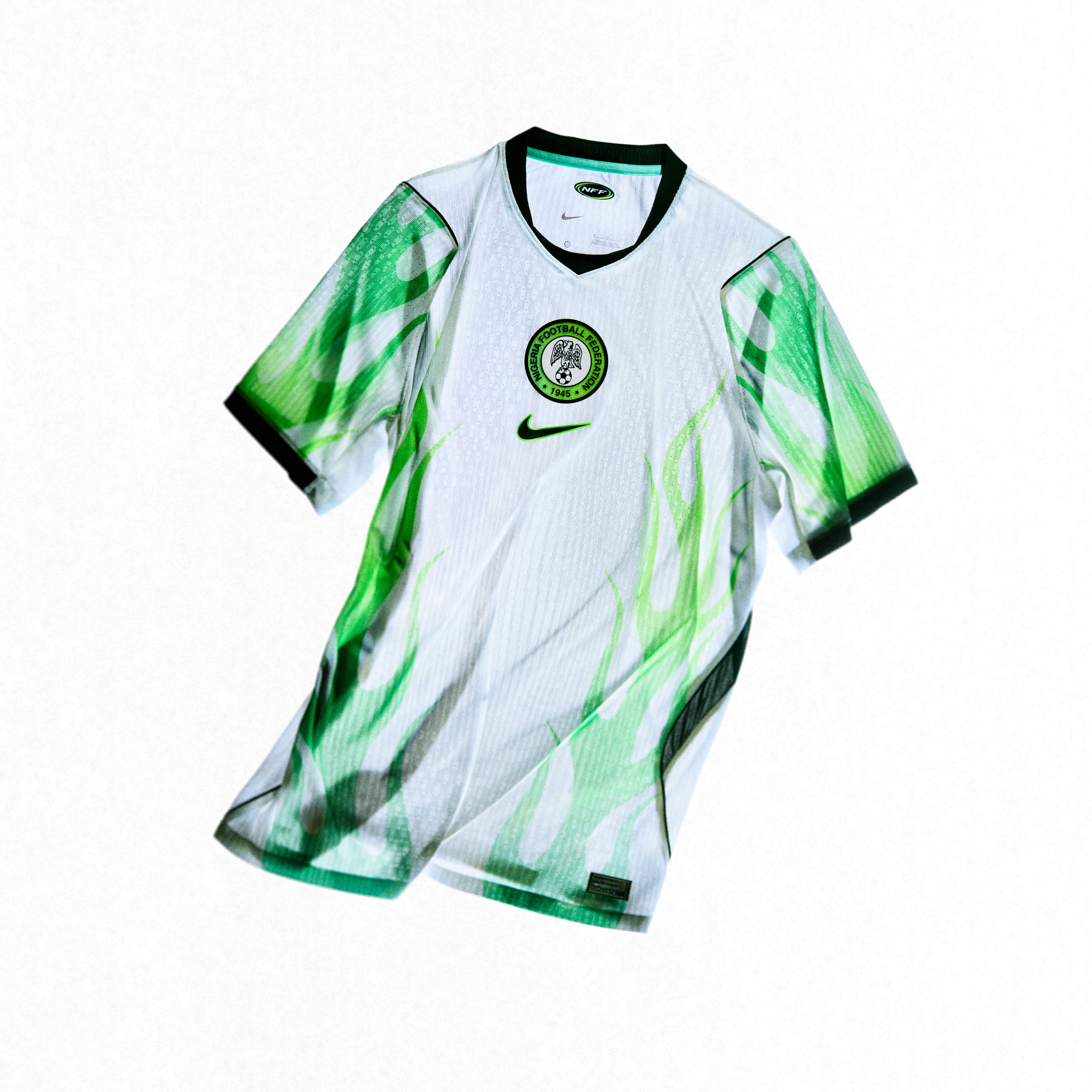 Image via Nike
Nigeria always brings great colors to the table, and that's what saves them here. The green is vibrant, and the away kit with that green-to-volt flame pattern is bold. The design itself is a bit busy, but when the colors are this good, you can get away with it. Best of the bottom half.
10. Slovenia
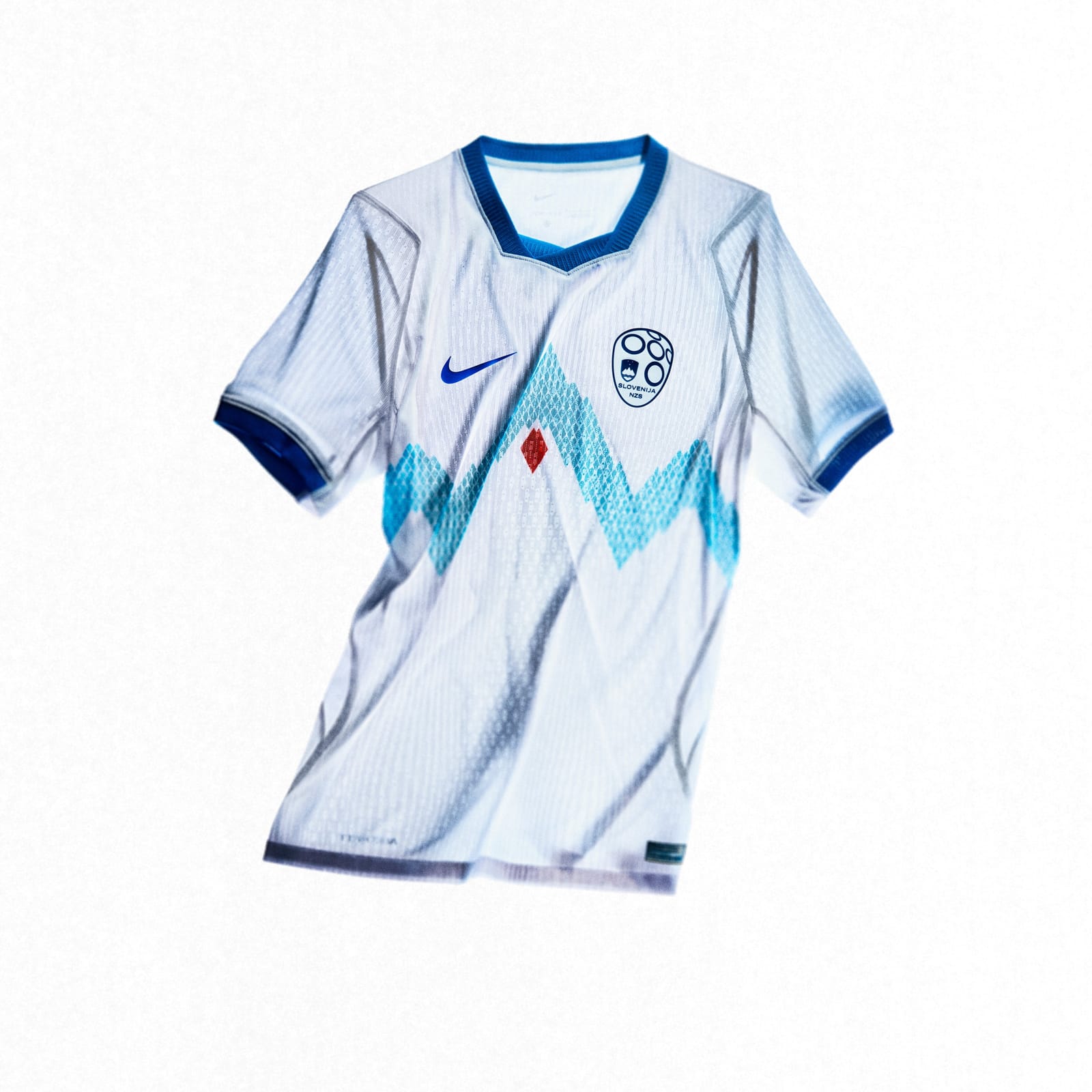 Image via Nike
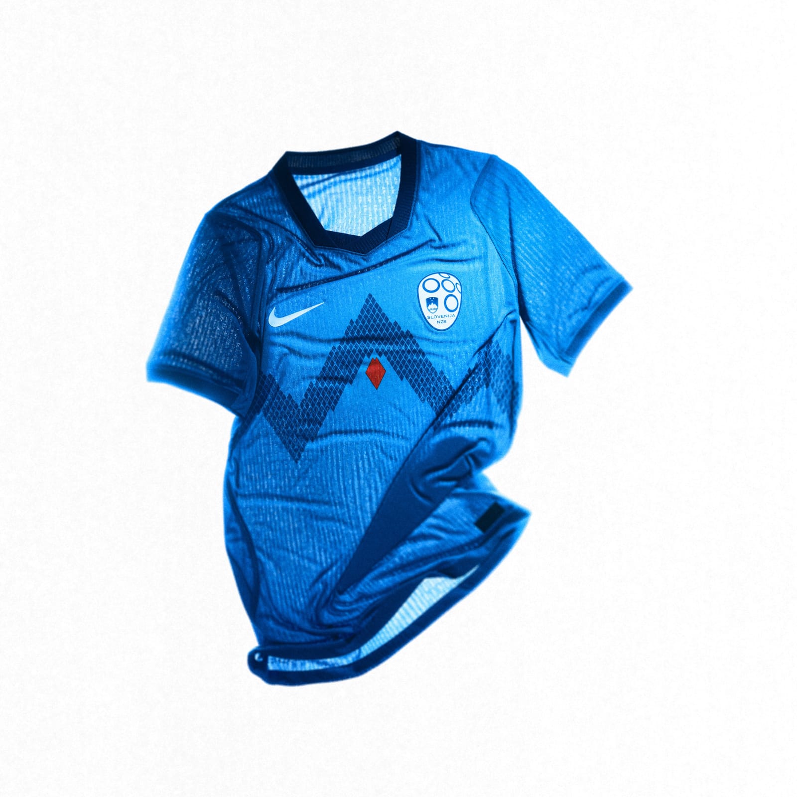 Image via Nike
Not bad at all. The mountain silhouettes in the grid pattern are a nice touch, and it has more personality than most of the kits below it. Slovenia clearly put thought into this one. It's just not flashy enough to crack the top half.
11. Australia
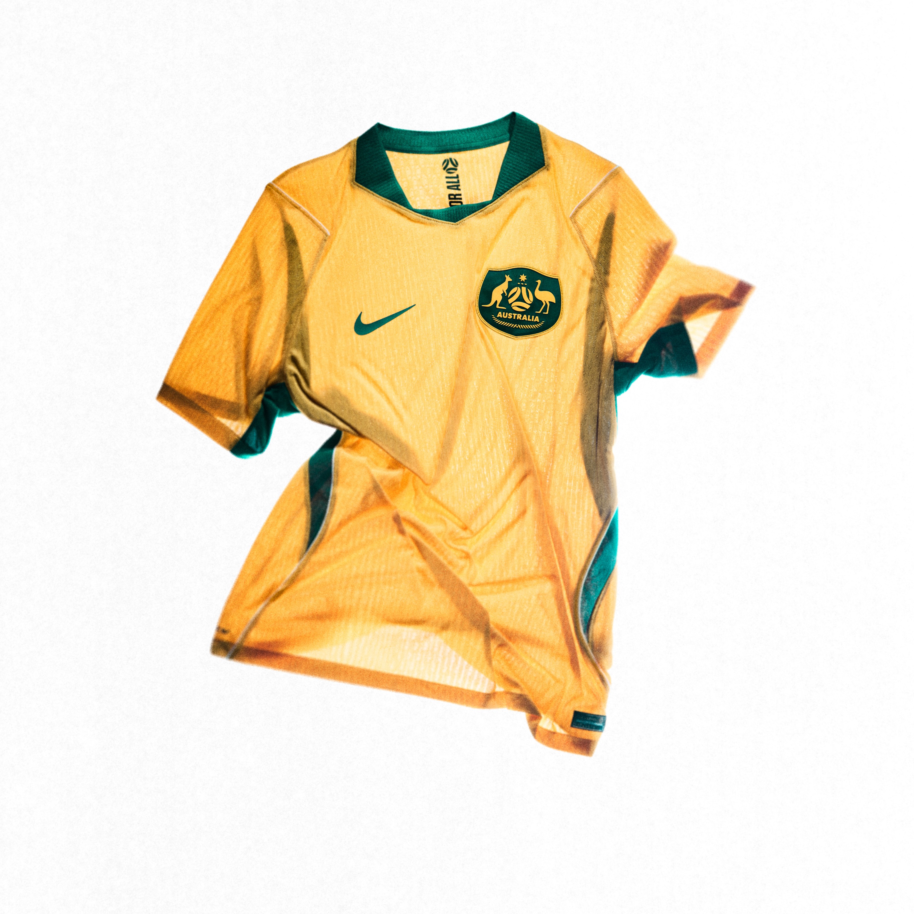 Image via Nike
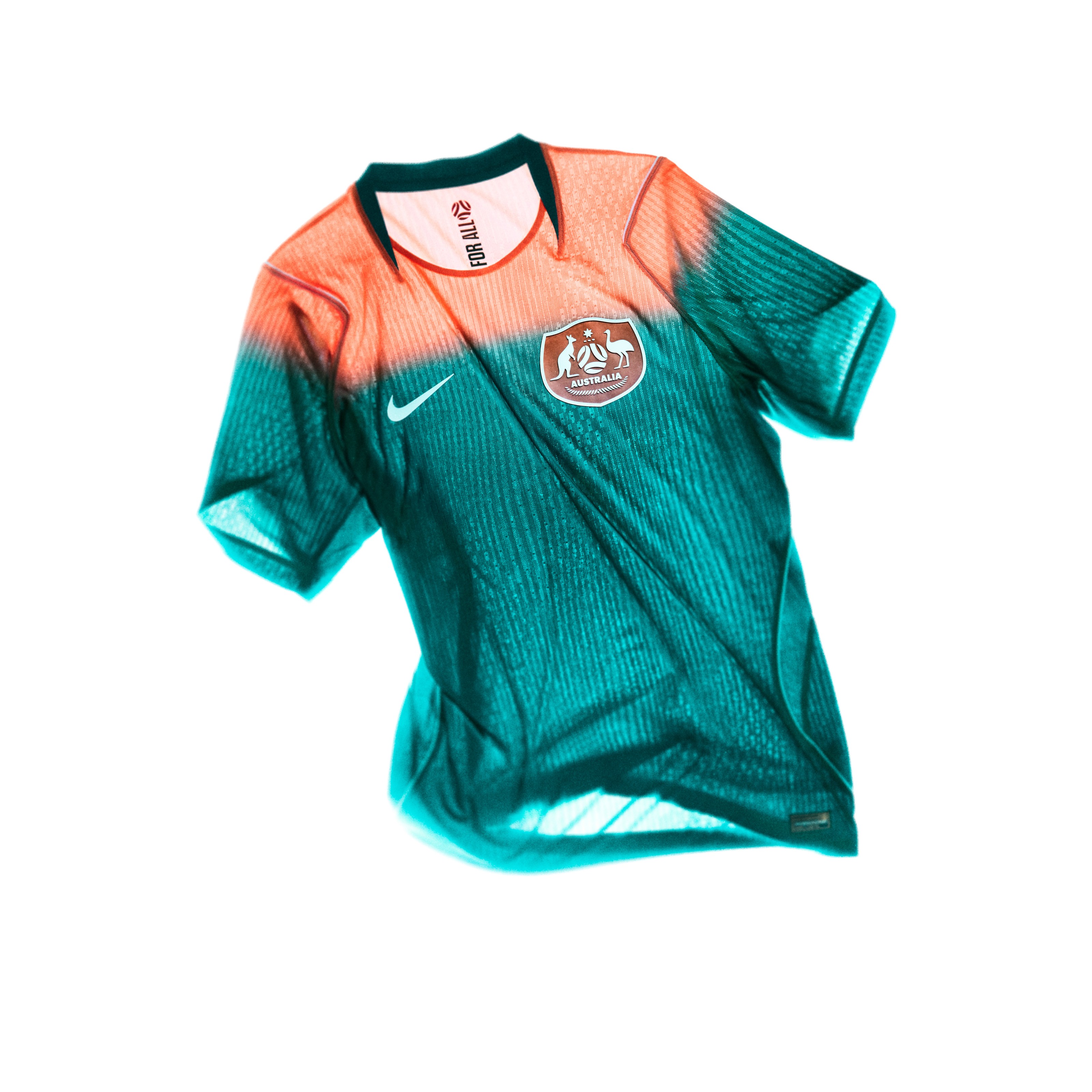 Image via Nike
Both kits are solid. The home yellow-green is a callback to their 2006 kit, which is a nice touch. The away kit with the coral-to-dark-green gradient is the standout. It's different, it's bold, and it works. The Socceroos don't always get attention for their kits, but this set is decent.
12. Canada
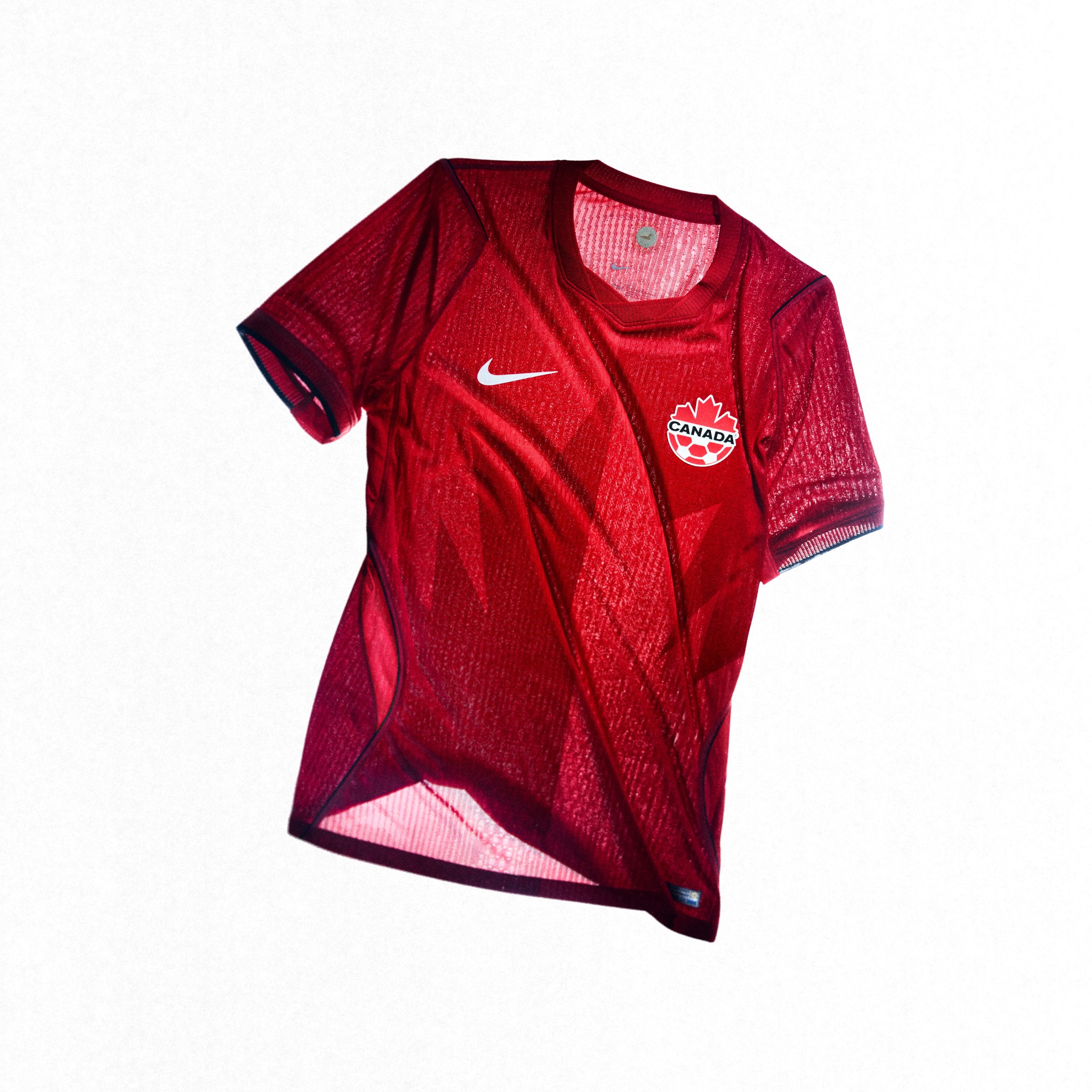 Image via Nike
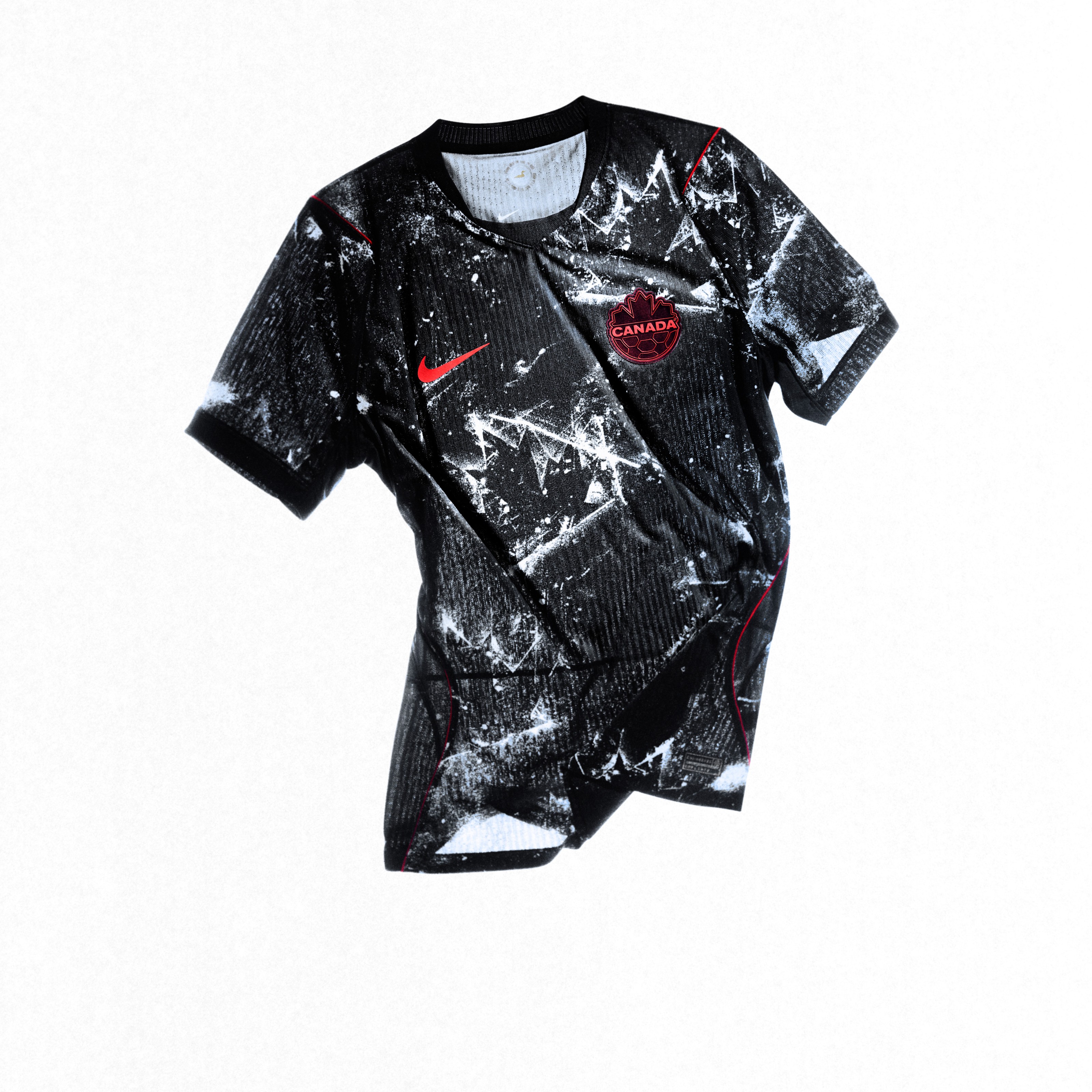 Image via Nike
The home kit in red is fine. It does what it needs to do. The away kit is where it falls apart for us. It just doesn't bring enough to the table. For a country hosting the World Cup alongside the US and Mexico, we expected Canada to come out with something more memorable. These kits won't be the ones people remember.
13. South Korea
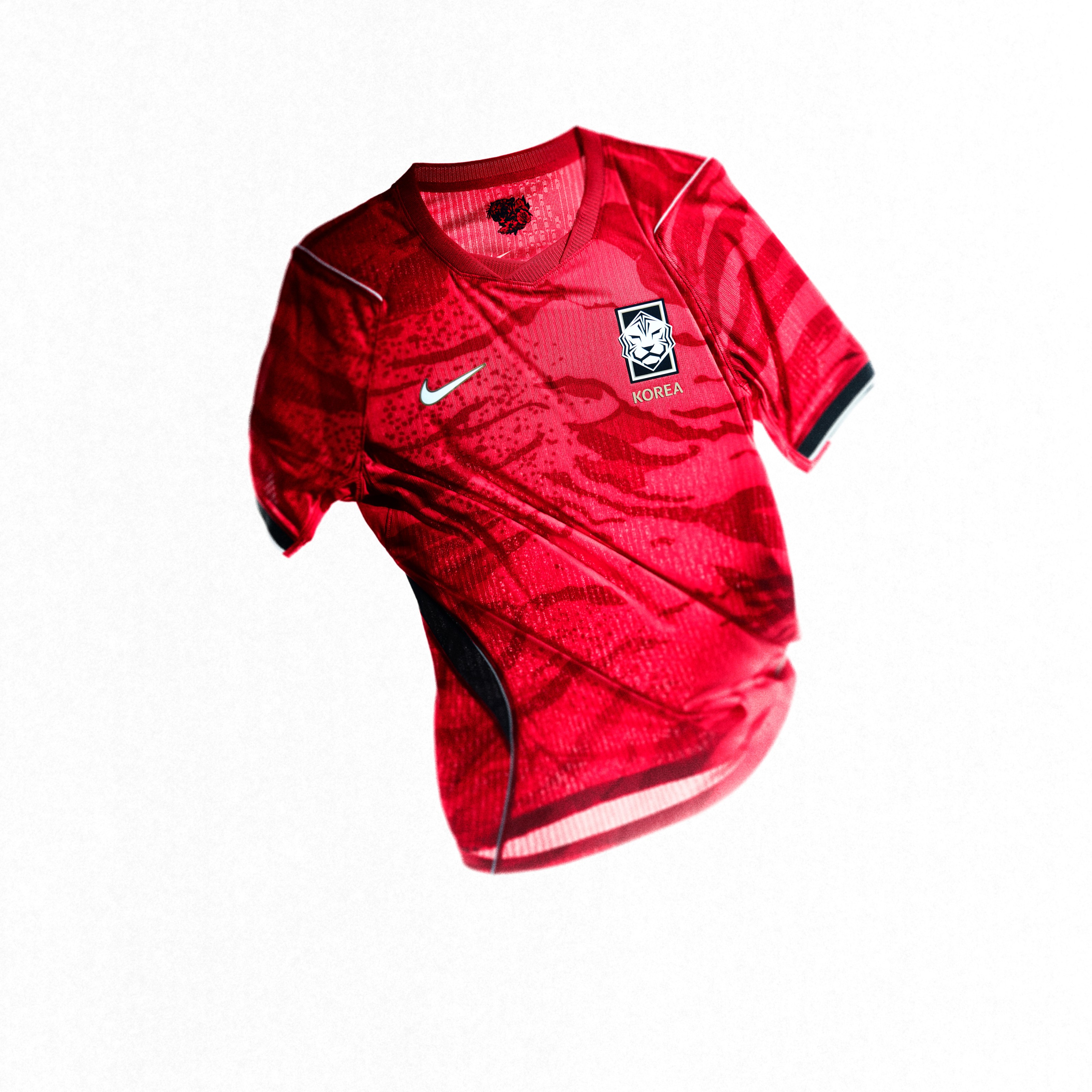 Image via Nike
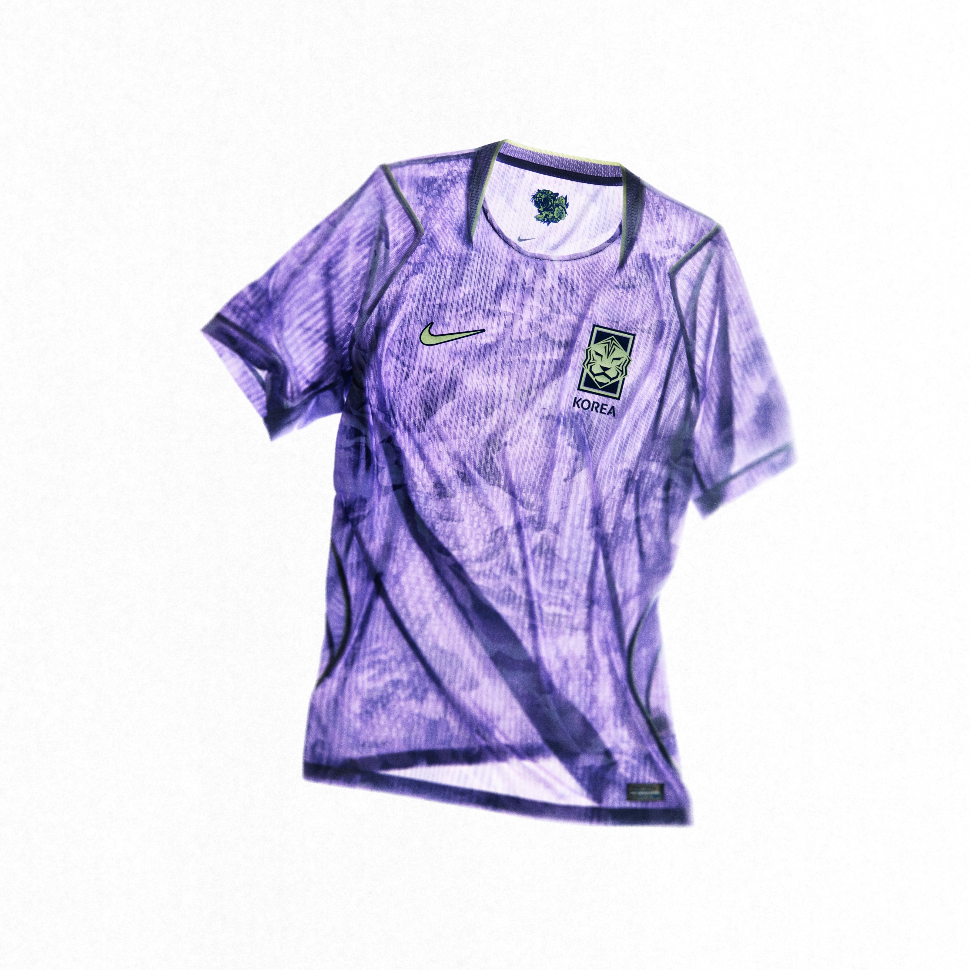 Image via Nike
The white tiger print on the home kit is fine. The violet away is fine. Everything about this set is just fine. Nothing wrong with it, nothing exciting about it either. South Korea has had better kits in the past, and this one just doesn't stand out.
14. Turkey
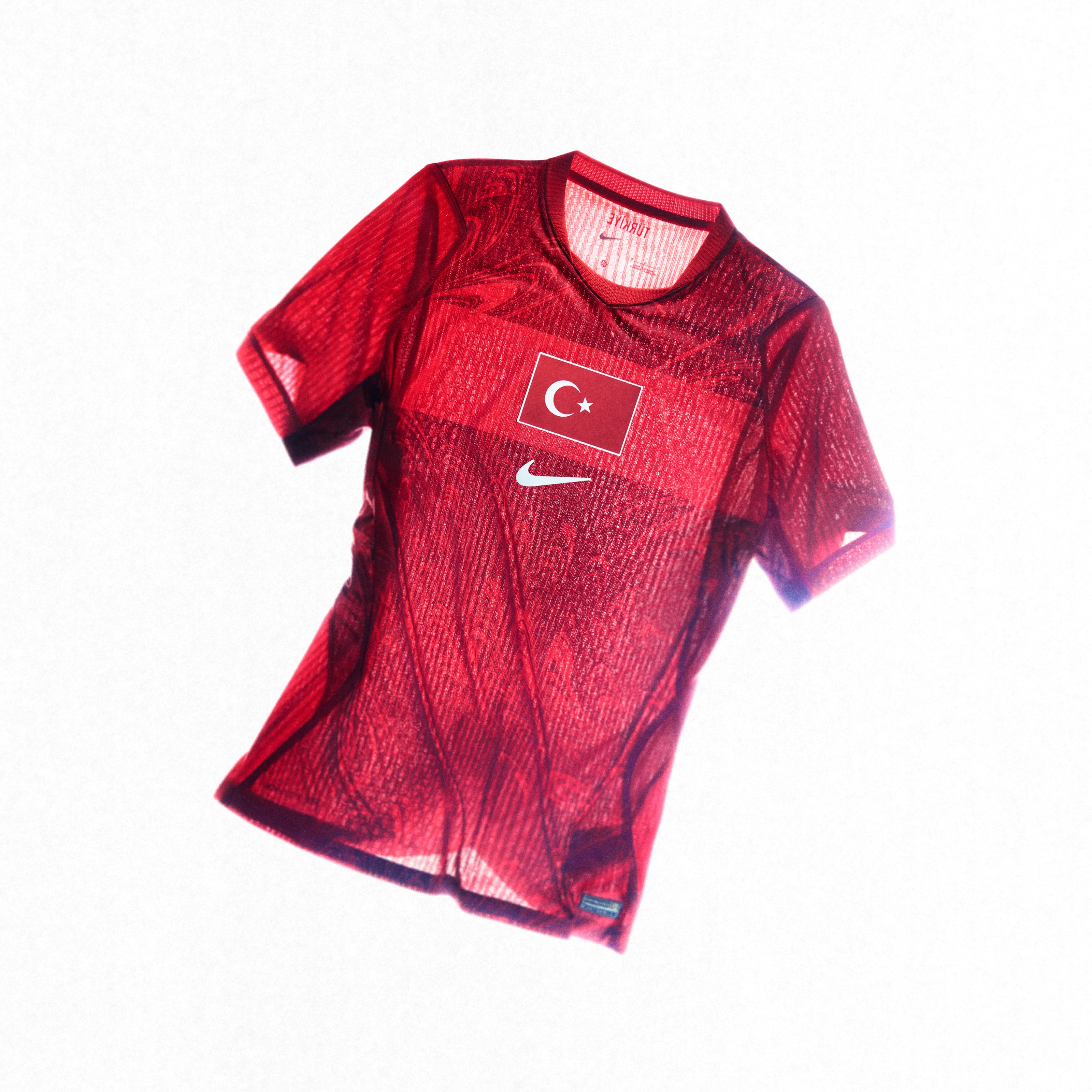 Image via Nike
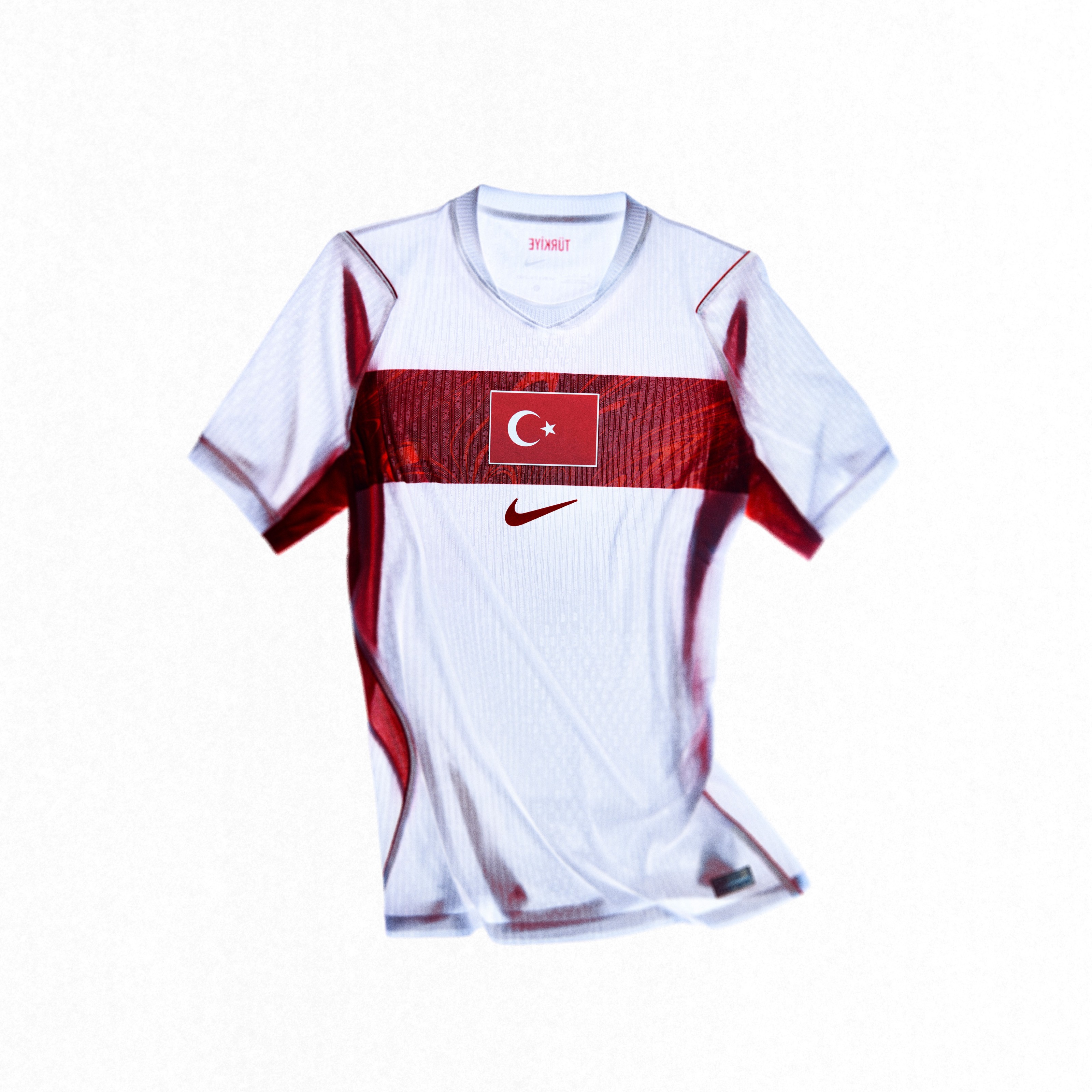 Image via Nike
The red home with the chest band is a standard Nike template that doesn't do much to stand out. The white away is clean but forgettable. Turkey's colors should pop more than this.
15. Poland
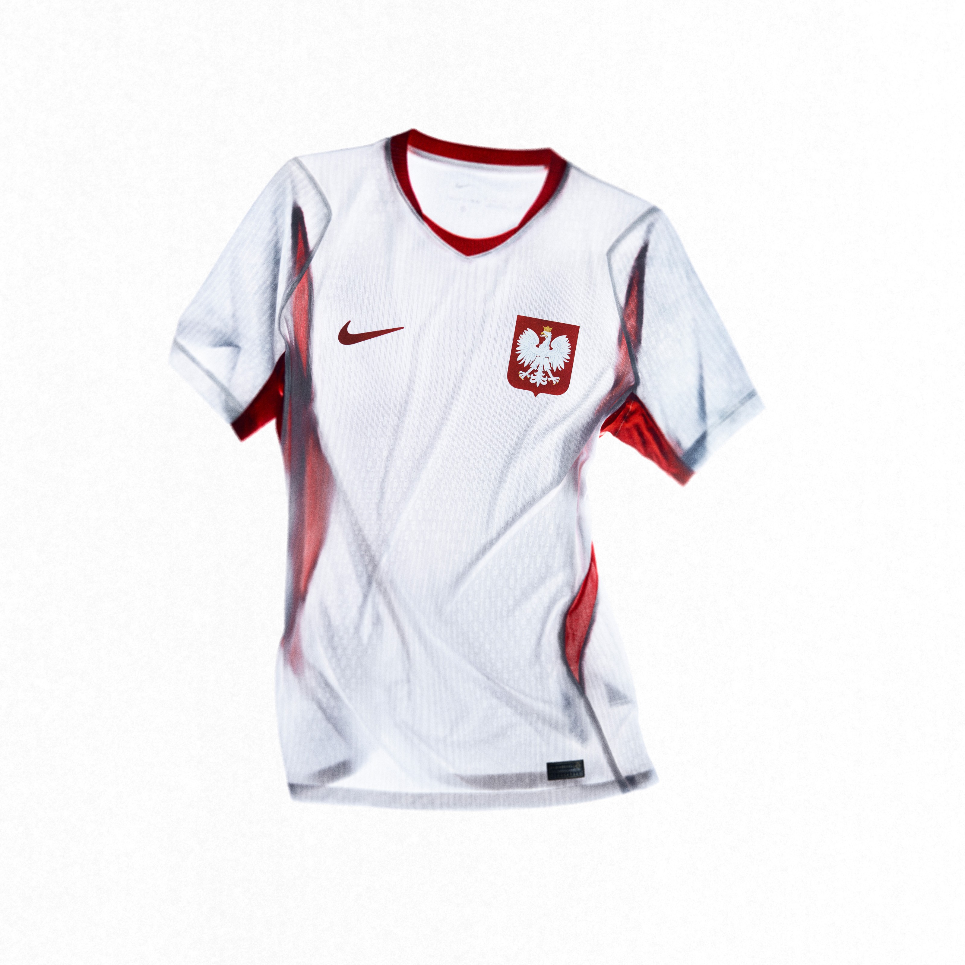 Image via Nike
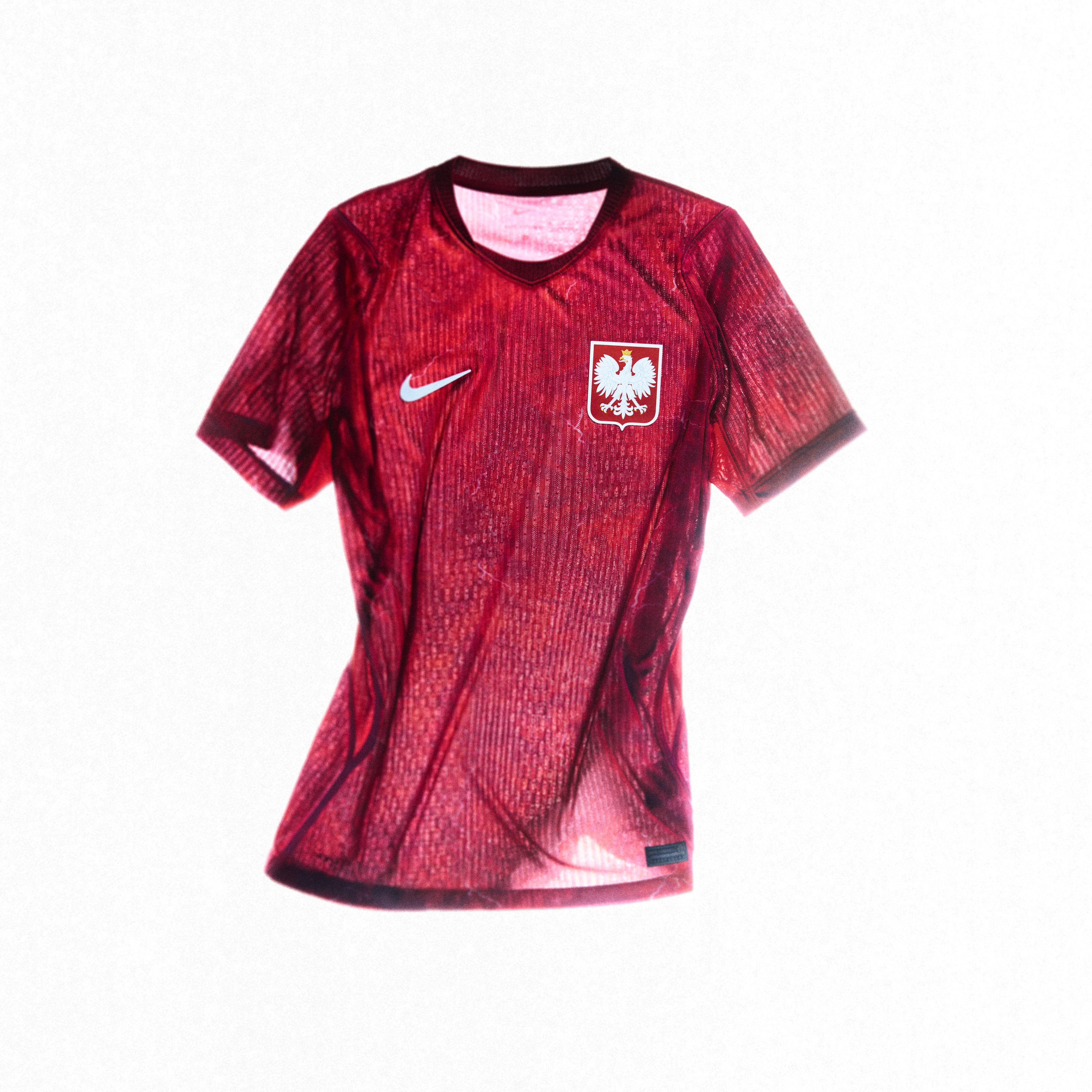 Image via Nike
The white home with the eagle feather graphic is subtle to the point of being invisible. The red away is being marketed as a "future classic," but right now it's just plain. Poland needs more personality in their kits.
16. China
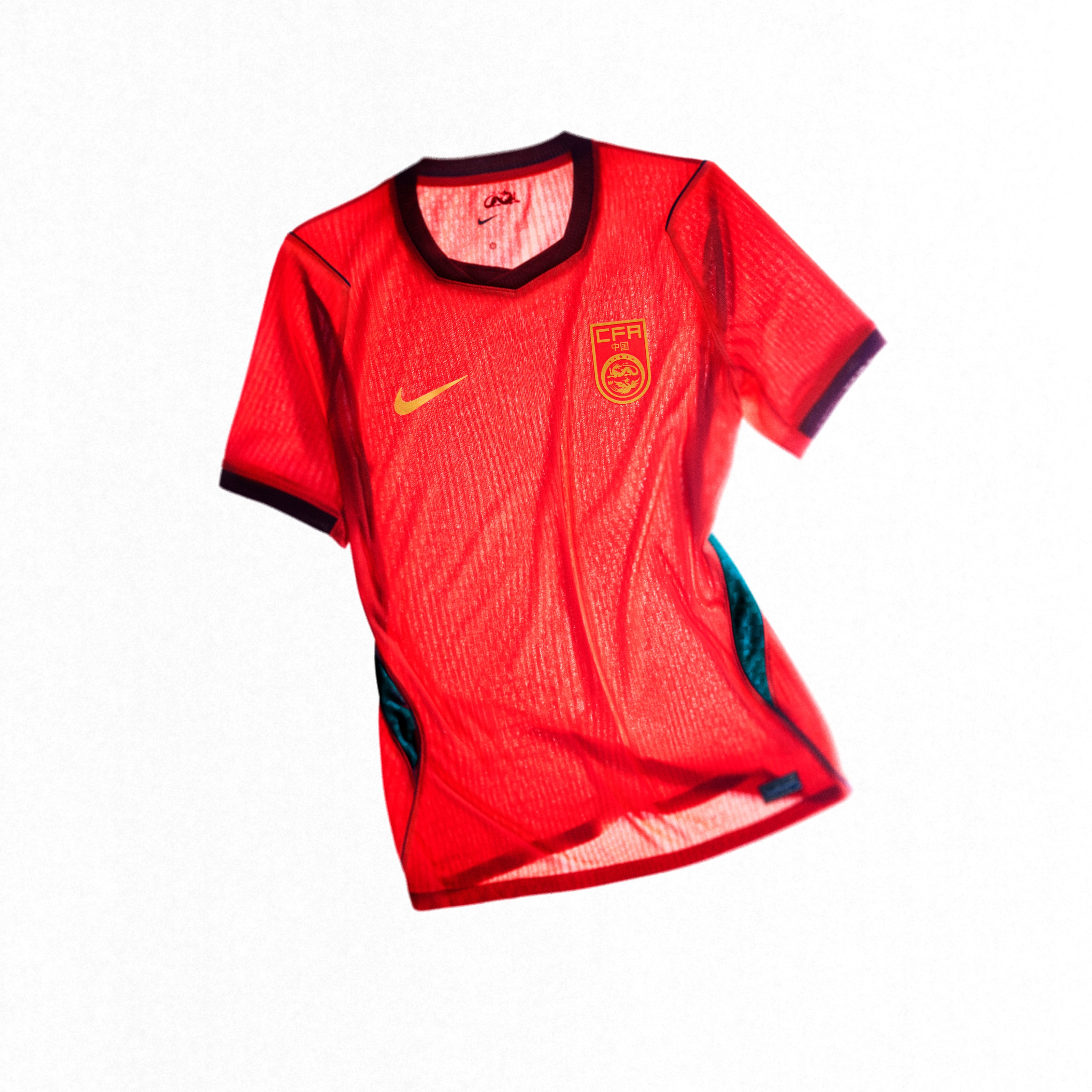 Image via Nike
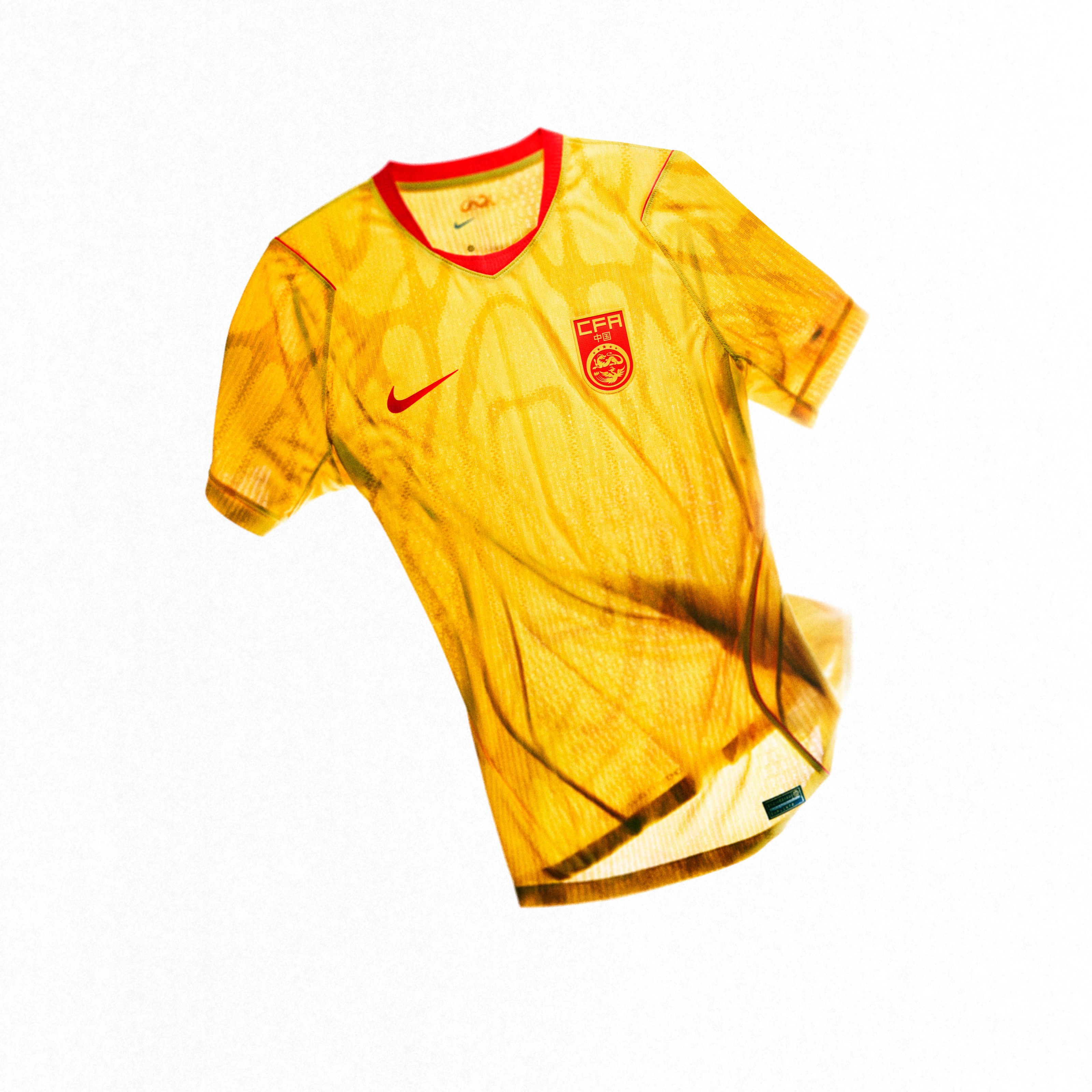 Image via Nike
Red and gold should be an easy win. Somehow this kit makes it boring. There's nothing here that grabs your attention, and for a country with that much visual culture to pull from, this feels like a missed opportunity.