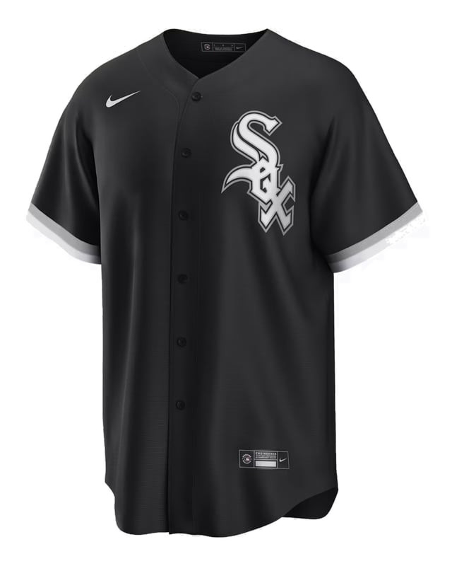
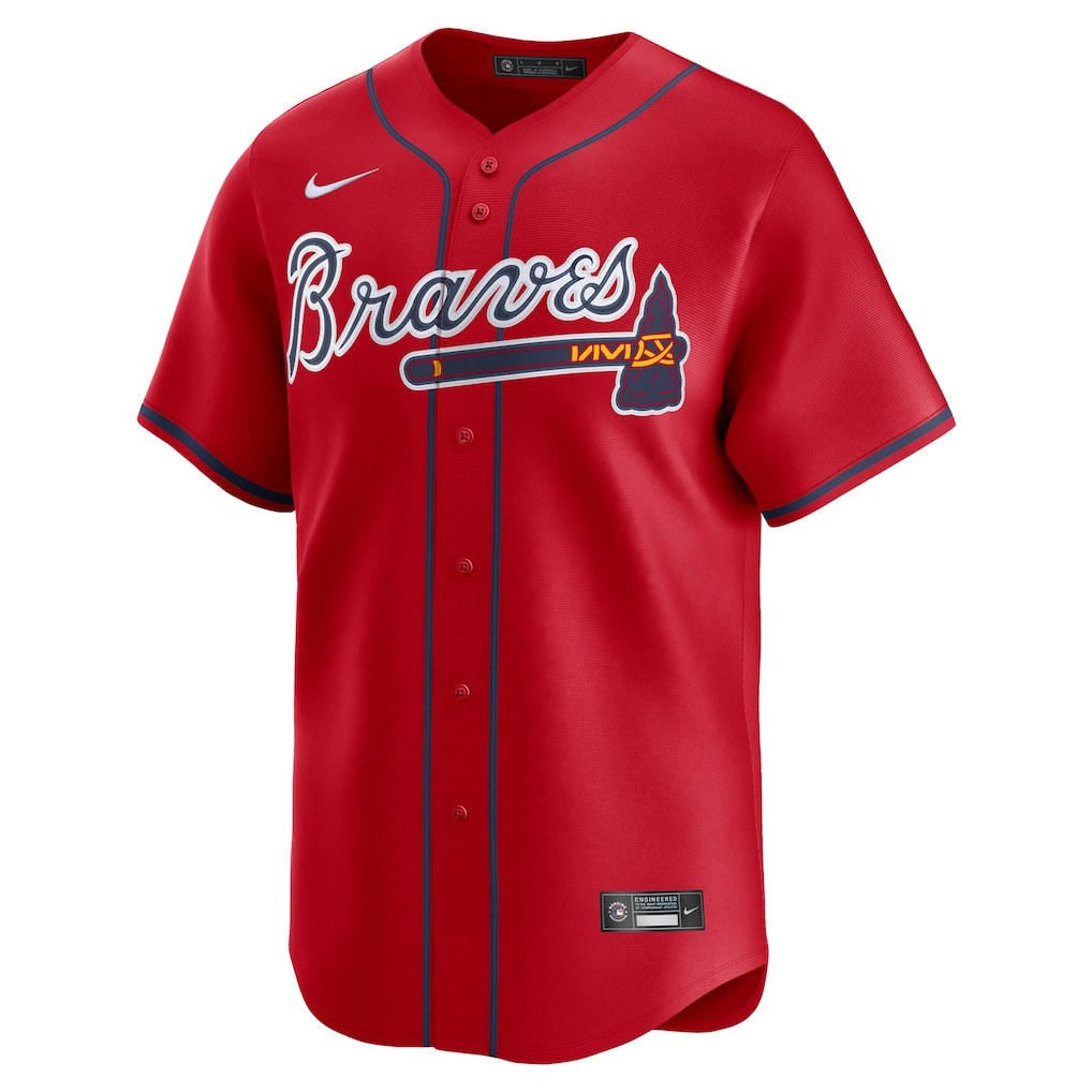
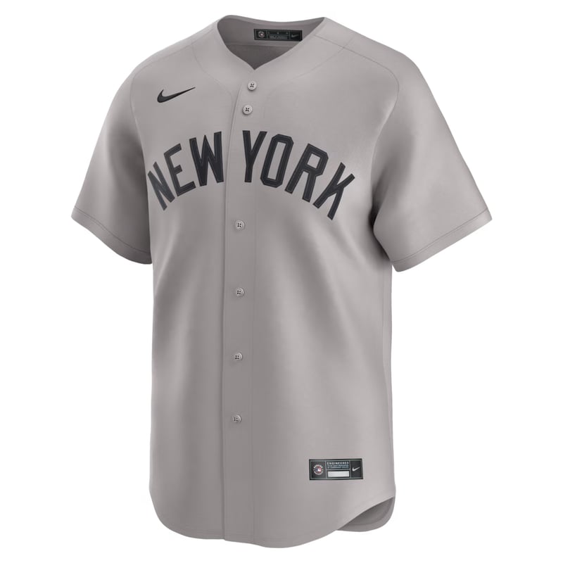
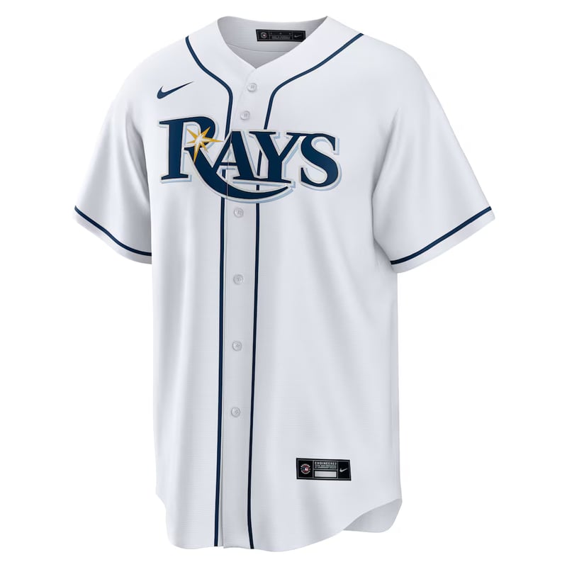
This is the ColorWay Sports MLB daily uniform tracker: what every team actually wore, every game, every day, logged the morning after. Not just the City Connects and throwbacks, the whole wardrobe, home whites and road grays included, because you can't spot the patterns without the full record. Every matchup also gets a ColorWay grade for how the two uniforms looked sharing a field.
Wondering what jersey your team is wearing tonight? Our MLB uniform schedule guide and the per-team schedule pages linked at the bottom of this tracker map what all 30 teams plan to wear and when, so you can call tonight's uniform before first pitch. This page is the receipts: what they actually put on.
ColorWay Sports may earn a commission on new Fubo subscriptions, at no extra cost to you.
Sunday, August 23
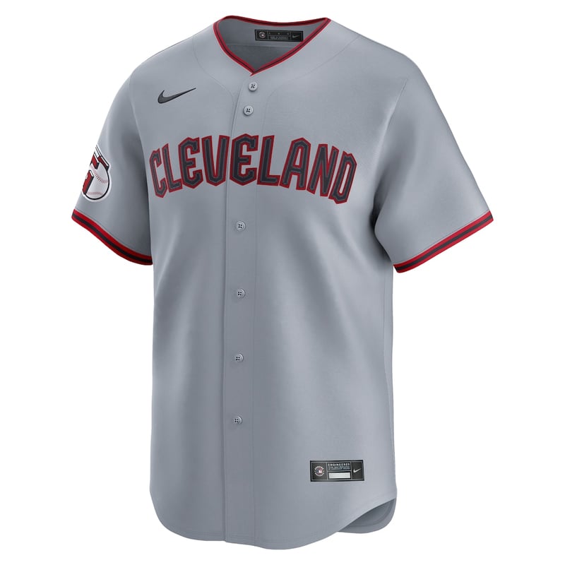
Fifteen games, and the Sunday rules all fired at once. Two clubs hosted in powder blue on the same afternoon, San Diego went to camouflage, Seattle brought out the cream Steelheads, and the day ends at a minor league park in Williamsport, where the Braves and Brewers play the Little League Classic at Journey Bank Ballpark tonight. All fifteen games and all thirty uniforms are verified below.
Powder blue takes this for the second day running, and this one is the stronger version of the argument. Texas run the light blue with the full red, white and blue treatment: the looping Rangers script in white with a red outline, tri-color trim at the sleeve, and the red brim up top to tie it off. Where some clubs treat powder blue as a pastel novelty, Texas wear it like a primary color with a complete identity built around it.
It also had the best possible foil on the field. Anaheim came in wearing the red alternate, and red against powder blue is the kind of contrast that makes both shirts look sharper than they do alone. A Sunday home tradition, worn on a Sunday, at home, against the one visitor that flatters it most.
A second straight day in the barrel for the Serpientes set, and wearing it on back-to-back nights only sharpened the case against it. The honest description is that it does not read as a game jersey at all. It reads like a batting practice or spring training top: the all-over tonal pattern, the pale thin script floating on it, and the three competing shades of purple give it the disposable, merchandise-first feel of a shirt that was never meant for a September box score.
Busy is the word. Every element is fighting every other element, so from the center field camera nothing wins and the whole thing smears into a purple blur. Arizona's purple history deserves a reclamation project. It deserves a cleaner one than this.
The first dual Clash in the history of this tracker, because for the first time the slate produced the same great matchup twice at once. Two clubs hosted in powder blue on the same Sunday afternoon, and each drew a visitor in exactly the dark, saturated road look that powder blue needs: Detroit's navy script alternate in Kansas City, Anaheim's all-red in Arlington.
Splitting them would have been dishonest, because the two frames are mirror images of the same idea. Powder blue was born as a road color built to read against gray, and both of these clubs now wear it at home against visitors who bring real color instead. When it happens twice in one afternoon, the award adapts.
Tampa Bay Rays at Baltimore Orioles
St. Louis Cardinals at Philadelphia Phillies
Toronto Blue Jays at New York Yankees
Washington Nationals at Miami Marlins
Athletics at Houston Astros
New York Mets at Chicago White Sox
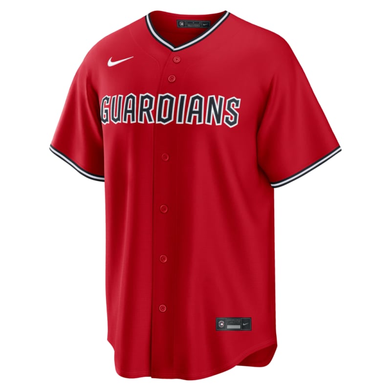
Cleveland Guardians at Colorado Rockies
San Francisco Giants at Boston Red Sox
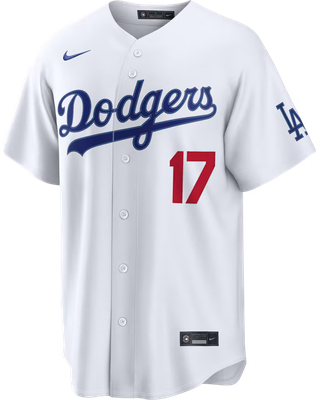
Pittsburgh Pirates at Los Angeles Dodgers
Chicago Cubs at Seattle Mariners
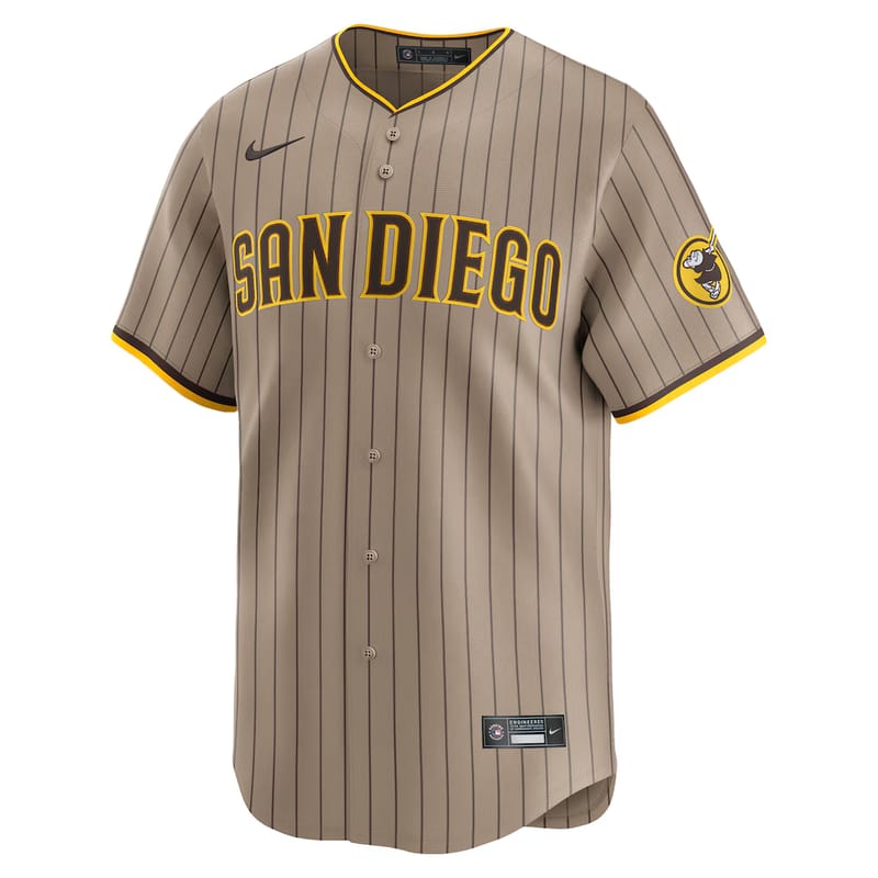
Minnesota Twins at San Diego Padres
Cincinnati Reds at Arizona Diamondbacks
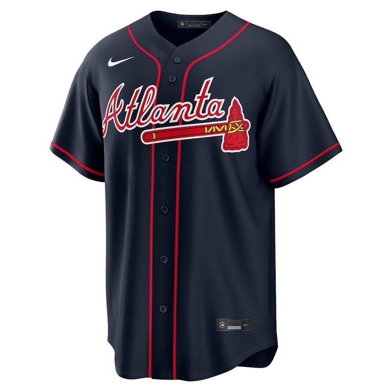
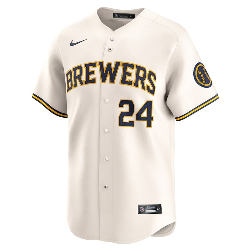
Atlanta Braves at Milwaukee Brewers
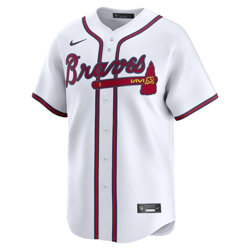
The one game on the calendar that was built for a costume came and went without one. Atlanta wore the road grays, Milwaukee the home creams, and the special touches stayed off the shirts: the event patch, some personality in the catcher's gear, and a pregame tribute from both clubs to Hank Aaron, who is the bridge between these two cities. A Milwaukee Brave who became an Atlanta legend and finished his career back in Milwaukee. On a night with younger eyes on the game than usual, both clubs dressed like themselves, and we count that as a point in favor.
Saturday, August 22
Fifteen games and all thirty uniforms verified, and after a white-and-gray start the night turned colorful: Pittsburgh's black, Los Angeles's cream City Connect, Boston's yellow, Arizona's purple Serpientes, Kansas City's powder blue, St. Louis's powder blue, Cincinnati's red script, Chicago's royal blue, plus navy alternates for the Rays, Guardians, Twins and Braves. It is also the middle day of Players' Weekend, so every cap on the field carries the patch on its side panel. Two of tonight's looks are debuts in this tracker: the Cubs' royal blue alternate and Boston's yellow City Connect.
Two clubs wore powder blue tonight and the Cardinals wore it better, which is not the result you would expect against Kansas City. The difference is the red. St. Louis run the powder blue with the birds-on-the-bat in red across the chest and red piping down the sleeve, so the shirt has a warm accent doing the work instead of leaning on the pastel alone. Powder blue is a soft color and it needs something with heat next to it or it drifts.
The other half of it is that this is a road uniform being worn like one. Grey pants would have killed it; the matching powder blue trousers make it a complete look rather than a jersey borrowed for the night. Quinn Mathews pitching in it, red cap, red-brimmed everything, on the same weekend every cap in the league carries the Players' Weekend patch, is about as good as a throwback palette gets in 2026. Philadelphia won 12-3. The uniform was the best thing St. Louis had all night.
The Serpientes set has a real idea in it and the execution keeps getting in the way. Purple is Arizona's own history and reclaiming it is the right instinct, but this is three shades of it at once: a deep purple body, a lighter turquoise-leaning script, and pale blue trim that belongs to a different uniform. Nothing anchors. The eye never finds a primary color because there is not one.
The script is the bigger problem. "Serpientes" is set in a thin, wide, pale letterform that has no weight at chest height, so from the outfield camera it reads as a smudge rather than a wordmark. Compare it to the Cardinals' powder blue in the same night's slate: one accent color, high contrast, legible from anywhere in the park. Arizona's is louder and says less. Cincinnati beat them and the broadcast still could not make the shirt look good.
Kansas City in powder blue against Detroit in the road greys is the cleanest-looking matchup on a fifteen-game card, and it works because neither club is trying. The Royals' powder blue is the softest color on the field tonight and the Tigers' grey is the plainest, which should be a recipe for a washed-out television picture. It is the opposite. The navy Detroit script and the navy-and-white Royals lettering give both shirts a hard edge, so the two pale bodies separate cleanly and the wordmarks carry the contrast.
It is also the matchup that best explains why powder blue survived. It is a road color by origin, built to sit against grey without either side disappearing, and Kansas City wearing it at home flips that logic and still works. Add the Players' Weekend patch on both caps and this is a very 2026 frame of a very 1980 idea.
Toronto Blue Jays at New York Yankees
Atlanta Braves at Milwaukee Brewers
Washington Nationals at Miami Marlins
St. Louis Cardinals at Philadelphia Phillies
Tampa Bay Rays at Baltimore Orioles
Los Angeles Angels at Texas Rangers
Athletics at Houston Astros
New York Mets at Chicago White Sox
Detroit Tigers at Kansas City Royals
Pittsburgh Pirates at Los Angeles Dodgers
Chicago Cubs at Seattle Mariners
San Francisco Giants at Boston Red Sox
Cincinnati Reds at Arizona Diamondbacks
Cleveland Guardians at Colorado Rockies
Minnesota Twins at San Diego Padres
Friday, August 21
Fifteen games, all thirty uniforms verified, and the busiest color night of the season so far: eleven of the thirty jerseys were something other than white or gray, with TEN City Connects on one slate. Philadelphia's black, Boston's Green Monster green, Miami's Retro Wave, Baltimore's cream BMORE, Milwaukee's Wisco powder, Chicago's red Bulls pinstripes, Kansas City's white-and-purple, Texas's deep red Tejas, Arizona's purple, San Diego's navy, and Seattle's royal-and-gold all showed up on the same Friday. It is also Players' Weekend, so every cap in the league carried the weekend patch on its side panel. If you are wondering what that patch on MLB hats is this weekend, we explained it here, along with why the nickname jerseys are not coming back.
On a night with ten City Connects on the board, Seattle's is the one that still looks like nobody else's. Royal blue with the lowercase gold "seattle" script is a color pairing no other team in the league touches, and running it over black pants with the gold-and-blue piping down the leg gives it structure most City Connects never find. The trident on the helmet does the identifying without a wordmark.
What earns it the night over the powders and purples is that it works as a baseball uniform rather than a merch drop. Real script, real piping, a palette pulled from the franchise's own history, and on Players' Weekend it wore the patch like it belonged there.
Miami walked the Nationals off in it, and the uniform still cannot be saved by the moment. The Retro Wave's problem is that it is four ideas wearing one shirt: a black base, neon pink numbers, teal piping, and a horizontal static pattern that reads as interference lines from the stands. The white pants with a single pink-and-teal stripe belong to a different, better uniform.
Vice worked because it committed to color. This set keeps the Vice palette but buries it on black, which is the one background that makes neon pink and teal look dim. A walk-off celebration is the best possible photo op a jersey can get, and even in that frame the eye goes to the helmet flames and the sneakers, not the shirt.
Scarlet against grape is the kind of two-color collision the award exists for. Cincinnati's wishbone-C script red is one of the oldest color statements in the sport, Arizona's purple is one of the newest, and neither one blinked: no white jersey anywhere on the field, both caps in team color, and the contrast held from every camera. This is what the sport looks like when both teams dress like themselves.
Atlanta Braves at Milwaukee Brewers
St. Louis Cardinals at Philadelphia Phillies
Toronto Blue Jays at New York Yankees
San Francisco Giants at Boston Red Sox
Washington Nationals at Miami Marlins
Tampa Bay Rays at Baltimore Orioles
New York Mets at Chicago White Sox
Detroit Tigers at Kansas City Royals
Athletics at Houston Astros
Los Angeles Angels at Texas Rangers
Cleveland Guardians at Colorado Rockies
Cincinnati Reds at Arizona Diamondbacks
Minnesota Twins at San Diego Padres
Pittsburgh Pirates at Los Angeles Dodgers
Chicago Cubs at Seattle Mariners
Thursday, August 20
A lighter Thursday card, nine games instead of the usual fifteen, and the color still showed up. Eight of the eighteen jerseys on the slate were something other than white or gray: Kansas City's powder blue at home, Toronto's royal in St. Petersburg, Seattle's Northwest Green in Milwaukee for a second straight night, Cincinnati's red script, the Angels' red in Houston, Washington's navy in Texas, Baltimore's black under the lights, and Milwaukee's cream underneath it all. The five road grays did the quiet work, including Atlanta's road set on the South Side and the Yankees' gray at Camden Yards, and the whole AL West trio of home teams stayed in white.
Kansas City is the franchise that made powder blue a baseball color in the first place, and this is the rare case where the modern version improves on the memory. The 1970s powders were road uniforms because the rules of the era said they had to be. Wearing it at Kauffman in the sunshine, over white pants with the royal blue script and cap holding the dark end of the palette, is the configuration those teams never got to try.
It also did what an alternate is supposed to do to a slate. On a card carrying four other colored jerseys, the powder was the one that read from every camera angle: light enough to separate from the A's gray, saturated enough to never look washed out, and completely unmistakable as Kansas City. Bobby Witt Jr. homering in it did not hurt.
The detail that earns the pick is restraint. No gradient, no side panel, no chrome. One color doing all the work, which is exactly how the original powders operated fifty years ago.
Nothing is wrong with the script. The problem is that the script is the entire uniform. Below the red Guardians wordmark there is no piping, no sleeve trim, no secondary red anywhere on the body, and the result is a home white that reads as an unfinished template from more than about thirty feet away. Most classic whites earn the plainness with some structural detail, pinstripes, a chest number, a collar line. Cleveland's has none of it.
The comparison that stings is the one the schedule set up. Cleveland wore its red alternate in this same building on Wednesday, and the red set solves every one of these problems, so the wardrobe clearly can. Gavin Williams striking out eleven deserved a sharper frame than the emptiest home white in the league.
This is also a fixable stinker. A single line of red piping on the placket would move this uniform out of this category permanently.
St. Louis Cardinals at Cincinnati Reds
San Francisco Giants at Cleveland Guardians
Toronto Blue Jays at Tampa Bay Rays
Athletics at Kansas City Royals
Atlanta Braves at Chicago White Sox
Seattle Mariners at Milwaukee Brewers
New York Yankees at Baltimore Orioles
Los Angeles Angels at Houston Astros
Wednesday, August 19
A full fifteen-game Wednesday, and the story is black. Four different clubs reached for a black alternate on the same night — Pittsburgh, the White Sox, Arizona and Miami — which is as many blacks as the league has produced on any slate we have logged. Underneath that the card was conservative: ten home whites and seven standard road grays account for more than half of it. The rest of the colour came from three reds (Cleveland, Cincinnati's script rather than the City Connect, and the Angels in Houston), Colorado's purple at Coors, Milwaukee's cream, Washington's navy in Texas, Seattle's Northwest Green, and San Diego's brown at Citi Field for a second straight night. The Dodgers again passed on their usual gray for the Los Angeles alternate, a third night running.
Northwest Green is the best color any team added in the last decade and Seattle still treats it like a guest. It came out at American Family Field on a night when four clubs went black, and it was the only jersey on the slate doing something no other franchise could do.
The green works because it is not a hockey green or a forest green borrowed from somewhere else. It is a specific, slightly muted evergreen pulled off the Pacific Northwest, and it sits between the navy and the silver in the Mariners' palette without fighting either. Put it on the road over gray and the whole uniform gets quieter and better at once, which is the opposite of what most alternates do.
The knock is how rarely it appears. A color this distinctive should be a primary, not an occasional. On a night of black alternates and plain whites it was the one jersey on a field anywhere that told you where the team was from.
Same jersey, same ballpark, second night in a row, and that is exactly why it lands here again.
We said yesterday that brown needs a partner color and a plain white gives it none. Tonight San Diego proved the point by doing it twice. Wearing the brown once into a white-and-royal home set is a choice. Wearing it into the same set on consecutive nights, in the same series, at the same park, under the same lights, is a rotation problem rather than a design problem.
The Padres own the best road option in the sport for a matchup like this. The khaki set they wore in the opener on Monday is warmer, it separates from a white jersey instead of collapsing into a silhouette, and it is the one uniform in baseball that no other team can approximate. They had it in the bag and left it there for two straight games.
None of this is an argument against the brown. It is an argument for wearing it where it can be seen.
Detroit Tigers at Pittsburgh Pirates
San Diego Padres at New York Mets
Atlanta Braves at Minnesota Twins
Chicago White Sox at Chicago Cubs
Black against white pinstripes, on the South Side, in the only series in baseball where both teams are named after the same city. The Crosstown matchup does the thing a rivalry uniform pairing should do without anybody designing a thing for it.
What makes it work is that the two clubs are opposites by nature rather than by coordination. Chicago's black alternate is the most severe uniform in the American League, all charcoal and silver with nothing warm in it. The Cubs' home white is the friendliest look in the National League, pinstripes and a royal roundel that has barely changed in seventy years. Put them on the same field and the contrast is total: dark against light, industrial against nostalgic, no shared color anywhere.
The best clashes are usually two saturated colors shouting at each other. This one is the other kind, where the whole frame is built on value rather than hue, and it holds up just as well.
Arizona Diamondbacks at Boston Red Sox
Miami Marlins at Philadelphia Phillies
New York Yankees at Baltimore Orioles
San Francisco Giants at Cleveland Guardians
St. Louis Cardinals at Cincinnati Reds
Toronto Blue Jays at Tampa Bay Rays
Athletics at Kansas City Royals
Seattle Mariners at Milwaukee Brewers
Washington Nationals at Texas Rangers
Los Angeles Angels at Houston Astros
Los Angeles Dodgers at Colorado Rockies
Tuesday, August 18
A full fifteen-game slate, and for the second night running not one City Connect came out of a closet. The home clubs stayed conservative: eight of the fifteen hosts wore a plain white, with Philadelphia and Chicago's pinstripes and Milwaukee's cream the only variations on that theme. Four home alternates broke it up, and Colorado's purple was the loudest of them. The road brought the color. Nine visitors wore a standard gray, but Arizona's black, the navies out of Seattle and Washington, San Diego's brown and the Angels' red kept the away dugouts from running together. The Dodgers again passed on their usual gray for the Los Angeles alternate they hardly ever wear.
On a night when eight home clubs wore a plain white, the Mets made the case that plain white is a design problem most of the league quietly loses. The blue script with the orange outline does something almost no other home wordmark manages, which is carry two colors at once without either one demoting itself to trim. Orange is genuinely hard to place on white because it goes pale under stadium light, and New York solves it by never letting the orange stand on its own. It exists only as an edge against blue.
The cap finishes it. Royal with the orange interlocking NY is one of the few in the sport that reads as clearly from the upper deck as it does in a dugout shot, and against white it gives the uniform a fixed point to hang from. Nothing here is new and nothing is trying to be. It is a very well balanced white uniform on a night that asked for one.
We have been on record all season that the brown is one of the better ideas in the sport, and the best-dressed game we have logged is this same brown against Arizona's Sedona red. That is exactly the problem tonight. Brown needs a partner color to play against, and at Citi Field it did not have one.
Set against a white jersey and a royal cap, San Diego's brown stops reading as brown and starts reading as an absence. It is the darkest thing on the field with nothing near its own value to push against, so the broadcast camera renders it as a silhouette rather than a color. The gold lettering that carries this uniform in daylight goes muddy under lights, and from the center field angle the wordmark is close to unreadable.
None of that is an argument against the brown. It is an argument against wearing it into a plain white.
New York Yankees at Baltimore Orioles
Detroit Tigers at Pittsburgh Pirates
San Francisco Giants at Cleveland Guardians
St. Louis Cardinals at Cincinnati Reds
Toronto Blue Jays at Tampa Bay Rays
Miami Marlins at Philadelphia Phillies
Arizona Diamondbacks at Boston Red Sox
San Diego Padres at New York Mets
Athletics at Kansas City Royals
Atlanta Braves at Minnesota Twins
Seattle Mariners at Milwaukee Brewers
Washington Nationals at Texas Rangers
Chicago White Sox at Chicago Cubs
Los Angeles Angels at Houston Astros
Los Angeles Dodgers at Colorado Rockies
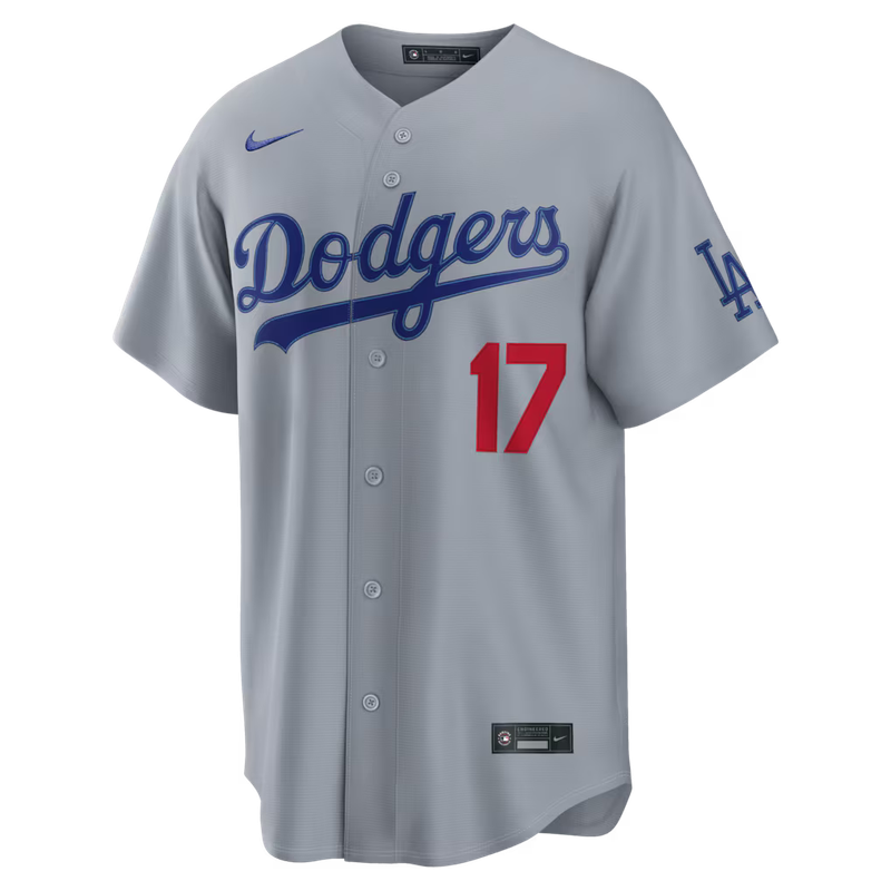
Gray against purple has no business working as well as this did. The Dodgers' alternate is the quieter of their two grays, the Los Angeles script in royal rather than the heavier Dodgers wordmark, and quiet is exactly what this pairing needed. Colorado's purple is a saturated violet that takes over whatever frame it enters, and put against a busy road uniform it turns the whole picture into noise.
What makes it land is that both clubs are working in the same family. Dodger royal and Rockies purple sit close enough on the wheel to look deliberate and far enough apart that nobody confuses the two, and the gray gives the purple somewhere to breathe. Coors at night does the rest. Purple reads as its actual color under those lights in a way it never quite does in daylight.
Monday, August 17
Eleven games, a doubleheader in Cincinnati, and zero City Connects across the entire slate. Nine of the eleven home clubs wore white, with only Cincinnati's red script in the nightcap and Colorado's purple breaking it. The colour came from the road instead: seven visiting or home clubs reached for an alternate, led by two blacks, Atlanta's navy, Arizona's Sedona red and the Los Angeles alternate grey the Dodgers almost never wear.
On a day with almost nothing to choose from, the best-looking thing on a field was a road gray, which tells you how good this particular road gray is. The navy cap and helmet are the reason. St. Louis made navy the primary road lid this season and it changes the whole balance of the uniform: the birds-on-the-bat is a red-and-yellow mark sitting on a cool grey field, and a red cap on top of that made the top half of the player fight itself. Navy gives the red somewhere to land.
It also fixes the oldest problem with grey. Road uniforms flatten under stadium light because everything in them is the same value, and a dark cap restores the contrast at the one point a broadcast camera actually frames, which is a player's head and shoulders.
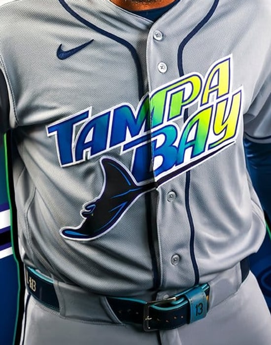
This is a hard one to award on a night when nobody wore anything, and that is exactly why Tampa Bay gets it. When every club is in its plainest set, the ranking becomes a straight question of whose plainest set is worst, and the Rays lose that. The light blue and the yellow sunburst are a genuinely distinctive palette and almost none of it appears on the home white. What is left is a white jersey with a navy wordmark that could belong to a dozen franchises.
The Rays own one of the more interesting colour stories in the sport. The home uniform is where they use the least of it.
St. Louis Cardinals at Cincinnati Reds, Game 1
St. Louis Cardinals at Cincinnati Reds, Game 2
Arizona Diamondbacks at Boston Red Sox
Athletics at Kansas City Royals
Chicago White Sox at Chicago Cubs
Los Angeles Dodgers at Colorado Rockies
Miami Marlins at Philadelphia Phillies
Detroit Tigers at Pittsburgh Pirates
San Diego Padres at New York Mets
Atlanta Braves at Minnesota Twins
Baltimore Orioles at Tampa Bay Rays
Sunday, August 16
Fifteen games, and after a Saturday that carried six City Connects this was the hard swing back the other way: zero City Connects, zero throwbacks, and only two home clubs in anything but white. Sunday is the plainest day on the baseball calendar and this one made the case better than most.
Thirteen of the fifteen home teams wore white or cream. Toronto went back to the powder blue against the Yankees for a second straight day, and Houston opened the night game in the orange alternate. Those were the only two home clubs that reached for colour at all.
The road teams did the work instead. Eight visiting clubs pulled on the standard gray, and six reached for something: Washington, Milwaukee and Seattle in navy, the White Sox in black, and Texas and Kansas City both in royal blue in games that started seven minutes apart in California. San Diego made fifteen with the khaki road set, which is not an alternate at all but is still the only jersey in the sport built on a sand base.
Strip it down and the whole slate runs on grays, whites, three navies and two royals, with one orange jersey in Houston to break it. That sounds dull and mostly is, but it is also the truest picture of what a baseball Sunday looks like when nobody has a promotion to run.
Toronto wore this for a second straight day and it was the only home jersey in the league on Sunday that had any colour in it at all, which is a small indictment of everyone else and a large compliment to the Blue Jays.
Powder blue is a hard colour to own. Most of the teams that carry one treat it as a novelty, a once-a-month Sunday softener, and it shows: the sets look thin, the caps do not match, and the whole thing reads as a costume. Toronto treats it as a real uniform. The maple leaf in the roundel holds up at that value because it is a heavy, solid mark with enough internal contrast to survive a light background, and the royal blue trim gives the powder something to push against instead of letting it float.
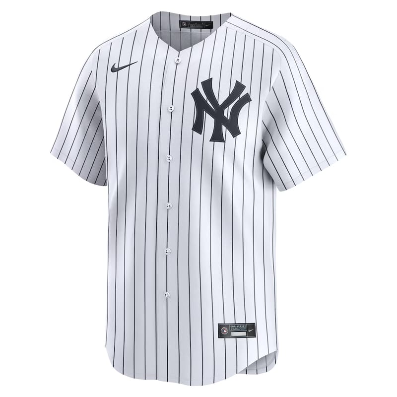
The Yankees are also the ideal opponent for it. New York's road gray is the most conservative uniform in the sport and it functions here as a neutral wall, so the powder reads brighter than it would against a white or a colour. Two clubs with genuinely opposite instincts, and the one taking the risk won the frame.
There is a version of this argument that says powder blue belongs on the road, and we have made it on this page before. Toronto is the counter-example. When the jersey is built properly and the mark is strong enough, it works at home too.
Milwaukee owns one of the two or three best marks in baseball and this is the jersey that hides it.
The ball-in-glove is a genuinely great piece of design, an m and a b built into a fielder's mitt, and it does its work through outline and negative space rather than colour. That means it needs a light field. On the cream and on the powder blue it reads instantly, the glove shape resolves at distance, and the joke lands for anyone seeing it for the first time. On navy it goes flat. The yellow holds, the outline does not, and from the middle deck it collapses into a shape rather than a logo.
The deeper problem is that navy is not really a Brewers colour. It arrived as a road-alternate convenience and it competes with the identity the club actually spent the last few years rebuilding around, which is the retro yellow-and-blue palette from the Bambi's Bombers era. Milwaukee has a cream, a powder blue and a proper home white. All three are better than this, and all three do more work for the mark.
Wearing it in Los Angeles against a home white made it worse. Dodger Stadium in August is the best light in the sport, and the Brewers spent it in the one jersey they own that looks the same in every light there is.
Baltimore Orioles at Tampa Bay Rays
Boston Red Sox at Pittsburgh Pirates
Arizona Diamondbacks at Atlanta Braves
New York Yankees at Toronto Blue Jays
Washington Nationals at New York Mets
San Diego Padres at Cleveland Guardians
Chicago White Sox at Detroit Tigers
Miami Marlins at Cincinnati Reds
Philadelphia Phillies at Minnesota Twins
St. Louis Cardinals at Chicago Cubs
Colorado Rockies at San Francisco Giants
Texas Rangers at Athletics
Kansas City Royals at Los Angeles Angels
Milwaukee Brewers at Los Angeles Dodgers
Seattle Mariners at Houston Astros
Saturday, August 15
Fifteen games, and six City Connects on one slate. San Francisco in the Gigantes black, the Mets in the concrete gray NYC set, Tampa Bay, Cincinnati in the red, Atlanta in the light blue, and the Dodgers in the cream. That is the most this log has carried in a single day, and it is not a coincidence. Saturday is the City Connect slot for several clubs by standing rule, the Mets and Dodgers among them, so the alternates cluster the way they do on Friday nights.
Only five of the fifteen home teams wore white, the Tigers, Cubs, Guardians, Astros and Angels. Everyone else reached for something, and the road teams stayed conventional to balance it: seven road grays against eight visiting alternates.
Powder blue had its best day of the season with three separate entries. St. Louis wore it in Chicago, Kansas City wore it in Anaheim, and Toronto wore its own at home against the Yankees. Two of those were on the road, which is where the colour belongs and where almost nobody uses it any more.
Sacramento's gold was the other standout, worn against a Texas road gray. It is the loudest home jersey in the league right now and the only one built around a city the team is only passing through, which makes it the strangest good-looking uniform in baseball.
Powder blue is a road colour, and almost nobody treats it like one any more. Most of the teams that own a light blue alternate save it for a Sunday at home, where it competes with a white uniform it was never designed to sit next to. St. Louis wore this one at Wrigley Field, against Chicago in home whites, which is exactly the frame it was built for.
The birds on the bat are the reason it works. That mark is busy by any modern standard, two cardinals, a yellow bat, a lot of small shapes, and on a white or gray jersey it can turn muddy at distance. Powder blue is light enough to keep the contrast and saturated enough that the red pops off it rather than sinking in. The chest is the whole uniform here and the background finally lets it breathe.
It also solves a problem the Cardinals have all season, which is that their two primary looks are nearly interchangeable on television. Home white and road gray with the same chest mark and the same red cap is a wardrobe with one idea in it. The powder blue is the only jersey St. Louis owns that changes the picture, and they should be reaching for it far more than they do.
This is the most thought-through City Connect in the league on paper and one of the least effective on a field, and both of those things are true at once.
The research is genuinely good. The base is concrete gray for the city, the pinstripes are built from the circles and diamonds of the MTA's local and express symbols, the purple runs through the details for the 7 line that carries people to Citi Field, and there is a subway token on the sleeve. Read the design brief and it is hard to argue with any single decision.
Then you watch a game in it. Concrete gray reads as dirty white on broadcast, the purple is a thin accent that disappears past about ten rows, and the subway pinstripes resolve into ordinary pinstripes at any real distance. What is left is a gray jersey with black letters on it, worn by a team whose actual identity is one of the loudest orange-and-blue combinations in sport. Almost nothing that makes this concept interesting survives the trip to a television screen.
The lettering is the other problem, and it is a choice rather than an execution issue. NYC claims the entire city on a uniform worn by the Queens team, in a market where the other club already owns the New York shorthand. The Mets have a borough, a colour scheme and a script nobody else can use. Dressing them in municipal gray trades all of that for a concept you have to be told about.
Chicago White Sox at Detroit Tigers
St. Louis Cardinals at Chicago Cubs
New York Yankees at Toronto Blue Jays
Colorado Rockies at San Francisco Giants
Washington Nationals at New York Mets
Baltimore Orioles at Tampa Bay Rays
Miami Marlins at Cincinnati Reds
San Diego Padres at Cleveland Guardians
Seattle Mariners at Houston Astros
Philadelphia Phillies at Minnesota Twins
Boston Red Sox at Pittsburgh Pirates
Arizona Diamondbacks at Atlanta Braves
Milwaukee Brewers at Los Angeles Dodgers
Kansas City Royals at Los Angeles Angels
Texas Rangers at Athletics
Friday, August 14
Fourteen games on the board, all fourteen logged, and it was the loudest colour night of the month. Nine of the ten home teams skipped white. Cincinnati in the black City Connect, Pittsburgh in theirs, Detroit in orange, the Mets in black, Cleveland in the navy City Connect, Tampa Bay in the Devil Rays throwback, Atlanta in red, Toronto in the navy City Connect, and Houston in orange. Only the Cubs broke the pattern, and they broke it upward, going to the light blue rather than the home whites.
That is a full inversion of Wednesday, when all fifteen home clubs wore white and every alternate in baseball belonged to a visitor. Tonight the visitors did the opposite: six of the ten came in gray, and only Boston in red, San Diego in the sand pinstripes, Chicago in black, and Seattle in navy brought anything else.
The Friday effect is doing most of this work. The Mets wear black at home every Friday, City Connects cluster on Friday nights across the league, and the result is a slate where the colour is concentrated rather than scattered. Kansas City opened the west coast window in the road gray against an Angels home white — the first time the plain Angels home white has appeared in this log, as against the 1980s throwback they usually reach for. The west coast then delivered the two best-looking games of the night: the Athletics in kelly green against a Rangers road gray, and Colorado's purple against San Francisco's orange, which is the rarest colour-on-colour pairing the schedule can produce.
Kelly green and gold is the most underused colour pair in American sport, and this is the only team that owns it. Nobody else in baseball is within reach of this green. It is not forest, it is not hunter, it is not the safe dark green a brand consultant reaches for when they want green without commitment. It is loud, and it has been loud since the early seventies.
The jersey earns the day because it does almost nothing beyond letting the colour work. Gold script, gold piping down the placket, white pants underneath so the green reads at full strength instead of getting muddied by a matching bottom. There is no gradient, no secondary logo crowding the chest, no attempt to modernise a look that was already right.
It is also worth saying plainly, given where this franchise is: a team in a temporary ballpark with an unresolved future still puts the best colour combination in the league on the field most nights. The uniform is the most stable thing about the Athletics right now.
Toronto is one of the easiest cities in baseball to dress. The club owns a royal blue nobody confuses for anyone else, a maple leaf with more instant recognition than most franchise marks, and a colour scheme already tied to a national identity. The City Connect throws all of it away and comes back with navy.
Navy is what a team picks when it cannot decide. It is the safest colour in sport, it is already worn by a third of the league, and on this jersey it actively fights the one element that should carry the design. The red accents want a bright field to sit against, the way red sits on white on the Canadian flag. Against navy they go dull, and the whole thing reads closer to a generic road alternate than a tribute to a specific place.
The frustrating part is that the concept had somewhere obvious to go. Red and white is right there, unclaimed, nationally understood, and used by nobody else in the league. Toronto had the clearest brief of any City Connect and answered it with the colour that says the least.
St. Louis Cardinals at Chicago Cubs
Miami Marlins at Cincinnati Reds
Boston Red Sox at Pittsburgh Pirates
Chicago White Sox at Detroit Tigers
Washington Nationals at New York Mets
San Diego Padres at Cleveland Guardians
Baltimore Orioles at Tampa Bay Rays
Arizona Diamondbacks at Atlanta Braves
New York Yankees at Toronto Blue Jays
Seattle Mariners at Houston Astros
Kansas City Royals at Los Angeles Angels
Texas Rangers at Athletics
Milwaukee Brewers at Los Angeles Dodgers
Colorado Rockies at San Francisco Giants
Matchup Grade: 8.5 / 10
Purple against orange is the loudest frame the schedule can produce, and it almost never happens, because both of these are alternates that have to be chosen on the same night by two clubs with no reason to coordinate. Colorado's purple is a true violet rather than a navy pretending, and San Francisco's orange is the actual orange from the cap, not a muted jersey version of it.
What makes it work rather than clash is the value match. Both tops sit at nearly the same darkness, so neither one flattens the other on camera, and both teams paired them with gray or white below rather than doubling down. The result is two saturated blocks of colour at the same weight, which reads as a deliberate pairing even though nobody planned it.
The one thing keeping it off a 9 is the caps. Colorado's black crown drains a little energy out of the purple, and a purple cap on purple would have pushed this into the best-looking game of the month.
Thursday, August 13
Nine games on the board and the road teams brought the colour again. All nine are final, and five of the first six visitors skipped the gray or wore it as the whole look: Cleveland in navy at Detroit, Cincinnati in the red script at Rate Field, Pittsburgh in the black alternate rather than the City Connect for the second straight night, Seattle in navy at Yankee Stadium after leading with the Northwest Green there on Wednesday, and Boston and Chicago in road grays at Toronto and Washington.
The split that stands out is at home. Five of the six home clubs wore white, and Washington was the only one to answer with colour, pulling the navy alternate against the Cubs' gray. That is the inverse of Wednesday, when all fifteen home teams wore white and every alternate belonged to a road team.
The two late games are Milwaukee at the Dodgers, where the Brewers went to the powder blue against a Dodgers home white, and Texas at the Angels in a road gray against Anaheim's home white. Both finished late, Milwaukee taking a one-run game and the Angels shutting out Texas. The game that mattered most tonight: Philadelphia at Minnesota at the Field of Dreams site in Dyersville, Iowa. Both clubs have released special uniforms for it, and it takes both of our daily honours below.
Philadelphia went with gray rather than cream, and that is the call that makes this set. Everybody expects a Field of Dreams uniform to be cream, because cream is the shorthand for old, and the Twins went there. The Phillies went the other way and it reads more like a jersey that actually existed than a costume of one.
The script is the reason. Red "Phillies" with a black outline and that long tail sweeping under the word is the best wordmark the franchise owns, and on a plain gray field with red and black piping running the placket, there is nothing competing with it. No nameplate clutter, no gradient, no drop shadow. The whole jersey is one shape.
The detail to look for on the broadcast is the 1839 Baseball Centennial patch on the right sleeve, which both clubs are wearing tonight. It is the small piece that ties the game to the reason it exists, and it is doing more work than any amount of manufactured vintage would.
Shop the Phillies Field of Dreams jersey on Fanatics →
Philadelphia Phillies at Minnesota Twins
Matchup Grade: 8.5 / 10
Two takes on the same brief, and they split cleanly. Minnesota did the expected thing beautifully: cream with navy pinstripes, the red "Twins" script outlined in navy with a tail running under it, the most literal reading of 1930s baseball you can build. Philadelphia refused the cream entirely and put its best script on plain gray.
Side by side, the gray is what keeps this from being two cream jerseys blurring into the corn. Cream against gray gives you an actual value difference on camera, which matters at a ballpark with no stands behind the outfield and nothing but green and sky in the background. Both sleeves carry the 1839 Baseball Centennial patch.
Cleveland Guardians at Detroit Tigers
Cincinnati Reds at Chicago White Sox
Pittsburgh Pirates at Miami Marlins
Seattle Mariners at New York Yankees
Boston Red Sox at Toronto Blue Jays
Chicago Cubs at Washington Nationals
Milwaukee Brewers at Los Angeles Dodgers
Texas Rangers at Los Angeles Angels
Wednesday, August 12
Fifteen games again, the same fifteen pairings as Tuesday, and the wardrobe went the other way. Nine alternates on Tuesday became ten on Wednesday, and for the second straight night not a single City Connect came out of a closet. What changed is where the colour sat: every one of the ten alternates belonged to the road team. Ten visiting clubs skipped the gray, and all fifteen home teams wore white or cream.
That is a genuinely unusual split. The road gray is the most-worn uniform in baseball and it appeared only five times all night, on the Cubs, Red Sox, Mets, Reds and Phillies. Everybody else who travelled brought colour: Cleveland and Minnesota and Tampa Bay and Milwaukee in navy, Pittsburgh in the black alternate rather than the City Connect, Colorado in purple, Houston in orange, Kansas City in powder blue, Texas in the royal, and Seattle in the Northwest Green at Yankee Stadium. San Francisco supplied the only cream. Our Matchup of the Day is in Toronto, where two of the most classic looks in the sport met with no colour at all.
The Northwest Green is the best colour any team currently runs and it does not get out often, so a road wearing at Yankee Stadium is a gift. Against the pinstripes it looked even better than it does at home, because the Yankee white is the most neutral backdrop in the sport and it let the teal carry the entire frame. The 50th-season patch on the sleeve is the detail worth noticing this year, a small anniversary mark that sits on the shoulder without fighting the arched MARINERS script. Seattle has three good looks and this is the one to lead with.
Cleveland Guardians at Detroit Tigers
Pittsburgh Pirates at Miami Marlins
Chicago Cubs at Washington Nationals
Seattle Mariners at New York Yankees
Boston Red Sox at Toronto Blue Jays
New York Mets at Atlanta Braves
Baltimore Orioles at Minnesota Twins
Cincinnati Reds at Chicago White Sox
Philadelphia Phillies at St. Louis Cardinals
Texas Rangers at Los Angeles Angels
Colorado Rockies at Arizona Diamondbacks
Tampa Bay Rays at Athletics
Milwaukee Brewers at San Diego Padres
Houston Astros at San Francisco Giants
Kansas City Royals at Los Angeles Dodgers
Tuesday, August 11
Fifteen games, thirty uniforms, and a slate that split almost exactly down the middle between the plain and the interesting. Twenty of the thirty were classics, ten road grays against ten home whites, which is the baseline the schedule keeps returning to. What lifted the night was where the colour landed: nine alternates and the first City Connect the league has worn since the weekend.
The alternates clustered in the West and the AL. Seattle brought the navy into Yankee Stadium, Minnesota answered Baltimore's gray with its own navy, Colorado went purple in Arizona against the Sedona red, and Tampa Bay's navy ran into the Athletics in the light green. Milwaukee and Kansas City both travelled in powder blue on the same night, which is the best accident on the board, and Miami pulled out the black alternate rather than the City Connect. San Francisco supplied the only City Connect of the evening, the black set, against a Houston road gray. Our Matchup of the Day is in Sacramento, where the Rays' navy met the Athletics' green.
There is no trick to it, which is exactly why it wins. The Dodger home white is the least complicated great uniform in baseball: script across the chest, red number under it, blue cap, and nothing else asking for attention. On a night when nine clubs reached for an alternate to make an ordinary Tuesday feel like an event, Los Angeles put on the same thing it has worn for seventy years and still had the best-looking frame on the board. Kansas City's powder blue across from it did not hurt either, one soft colour against a clean white being about as easy on the eye as the sport gets.
Cleveland Guardians at Detroit Tigers
Pittsburgh Pirates at Miami Marlins
Chicago Cubs at Washington Nationals
Seattle Mariners at New York Yankees
Boston Red Sox at Toronto Blue Jays
New York Mets at Atlanta Braves
Baltimore Orioles at Minnesota Twins
Cincinnati Reds at Chicago White Sox
Philadelphia Phillies at St. Louis Cardinals
Texas Rangers at Los Angeles Angels
Colorado Rockies at Arizona Diamondbacks
Tampa Bay Rays at Athletics
Milwaukee Brewers at San Diego Padres
Houston Astros at San Francisco Giants
Kansas City Royals at Los Angeles Dodgers
Monday, August 10
Ten games on a Monday, and the wardrobe stayed quiet the way Mondays usually do. Sixteen of the twenty uniforms were classics, plain home whites and road grays, and there was not a single City Connect anywhere in the league, which is exactly what the calendar predicts now that those have settled into Friday and Saturday slots. Every road team except one wore the gray.
The colour that did show up came in four places. Baltimore brought the orange alternate to Minneapolis, Arizona went to the black alternate at home against Colorado, Tampa Bay wore the navy in Oakland, and Milwaukee kept rolling in the powder blue, which is their road set rather than an alternate and still the best-looking travel uniform in baseball. Our Matchup of the Day is in St. Louis, where Philadelphia's road gray met the Cardinals' home white. No colour at all, just two of the most storied classic uniforms in the National League sharing a field, and sometimes that is the whole point.
The powder blue is technically Milwaukee's road uniform, not an alternate, and that is the whole reason it wins tonight. Most clubs treat the gray as a tax they pay for leaving home. The Brewers decided their travel look should be the prettiest thing they own, and the result is a jersey that makes every road broadcast better than it needed to be. Against San Diego's home white at Petco it read like a throwback to a decade when teams were not afraid of a soft colour.
Boston Red Sox at Toronto Blue Jays
New York Mets at Atlanta Braves
Baltimore Orioles at Minnesota Twins
Philadelphia Phillies at St. Louis Cardinals
Texas Rangers at Los Angeles Angels
Colorado Rockies at Arizona Diamondbacks
Tampa Bay Rays at Athletics
Milwaukee Brewers at San Diego Padres
Houston Astros at San Francisco Giants
Kansas City Royals at Los Angeles Dodgers
Sunday, August 9
All fifteen of Sunday's games are logged below, and Sunday is the day the calendar jerseys come out. Both of the league's standing Sunday traditions turned up: the Mariners in the cream Steelheads throwback at T-Mobile and the Padres in the camouflage at Petco, two clubs that have quietly built a weekly ritual most of the sport has not bothered to copy. Add the Giants in the cream at Oracle and the Phillies in the cream at Citizens Bank and that is four uniforms on the board that only exist because of what day it is. Not one City Connect appeared anywhere in the league, two days after eleven of them turned up on a single Friday night.
The colour moved to the road. Seven visiting clubs skipped the gray: the Angels in red for a fourth straight game in Miami, the Orioles in orange at Texas, the Astros in orange at San Diego, the Dodgers in the blue in Phoenix, and three separate navies from the Guardians, Tigers and Rays. The other eight road teams all wore the gray.
At home the count ran seven classics against eight alternates. The Marlins broke out the teal throwback, the Royals and Rangers both went powder blue on the same afternoon, Washington wore the red, and Pittsburgh went back to the black alternate a day after it was our Jersey of the Day. The best pairing of the afternoon was in Arlington, where Baltimore's orange ran into Texas in the powder blue. It was the only game on the board with no white and no gray anywhere in the frame, one warm colour against one cool one, and it is our Matchup of the Day.
This is our No. 1 Marlins jersey and the only A in their closet, and Sunday is the only day you can see it. Miami hands the 1993 teal a standing Sunday home slot, which means the best thing the franchise owns is also the hardest to catch. The formula is simple enough that it is strange nobody copies it: one loud colour that belongs to exactly one team, a block wordmark with the swoosh underline, a legacy patch on the sleeve, and white pants so nothing competes with the teal. The Retro Wave spends an entire concept trying to say that Miami is bright and a little bit 1990s. The teal just is.
Cincinnati Reds at Washington Nationals
Athletics at Boston Red Sox
New York Mets at Pittsburgh Pirates
Toronto Blue Jays at Philadelphia Phillies
Atlanta Braves at New York Yankees
Los Angeles Angels at Miami Marlins
Chicago Cubs at Kansas City Royals
Cleveland Guardians at Chicago White Sox
Minnesota Twins at Milwaukee Brewers
Colorado Rockies at St. Louis Cardinals
Baltimore Orioles at Texas Rangers
Detroit Tigers at San Francisco Giants
Los Angeles Dodgers at Arizona Diamondbacks
Tampa Bay Rays at Seattle Mariners
Houston Astros at San Diego Padres
Saturday, August 8
All fifteen games are in, and Saturday was the mirror image of Friday. A night after eleven clubs wore a City Connect, exactly one did: the Nationals in the District Blueprint. Nine home teams went to the plain white or the pinstripes. The six that reached for something else all had a reason: the Cardinals in the cream, which carries the "St. Louis" script and is reserved for Saturday home games at Busch, the Royals in the powder blue, the Giants in the Gigantes, the Pirates in the black alternate, the Diamondbacks in the black, and Washington in the City Connect. The road is where the rest of the colour went: the Braves and Twins in navy, the Rays in navy, the Orioles in black, the Rockies in purple, the Angels in red for a third straight night at Miami, and the Dodgers in the blue alternate in Phoenix. Nine of the fifteen visitors still wore the gray.
The Pirates own the best black jersey in baseball and it is not particularly close. The reason is the gold. Most teams that go black treat it as a blank canvas and then trim it in something safe, which is how you end up with a jersey that reads as a placeholder. Pittsburgh runs the black against a real, saturated yellow-gold, and that single colour does all the work: the script pops, the piping reads from the upper deck, and the cap matches instead of approximating. It also helps that this is a genuine alternate rather than a novelty, so it looks like a uniform the team owns rather than a costume it borrowed for a night.
New York Mets at Pittsburgh Pirates
Toronto Blue Jays at Philadelphia Phillies
Cincinnati Reds at Washington Nationals
Atlanta Braves at New York Yankees
Athletics at Boston Red Sox
Los Angeles Angels at Miami Marlins
Cleveland Guardians at Chicago White Sox
Minnesota Twins at Milwaukee Brewers
Chicago Cubs at Kansas City Royals
Colorado Rockies at St. Louis Cardinals
Baltimore Orioles at Texas Rangers
Los Angeles Dodgers at Arizona Diamondbacks
Houston Astros at San Diego Padres
Tampa Bay Rays at Seattle Mariners
Detroit Tigers at San Francisco Giants
Friday, August 7
All fifteen games are in, and Friday belonged to the City Connects. Seven clubs wore one at home: the Pirates in the black, the Red Sox in the Fenway green, the Marlins in the Retro Wave, the White Sox in the red, the Brewers in the Wisco, the Royals in the white, the Cardinals in The Lou, the Rangers in the Tejas, the Diamondbacks in the purple, the Padres in the navy, and the Mariners in the Rush-Blue. That is the heaviest City Connect night of the season so far, which is what Friday is built for. The visitors barely varied: thirteen of the fifteen road clubs wore the gray, with only the Angels in red at Miami and the Rays in navy at Seattle breaking it. At home the plain white showed up in just three parks, the Yankees and Phillies in the pinstripes and the Giants in the orange Friday alternate.
The Rush-Blue is the rare City Connect that reads as a real uniform rather than a costume, and it is the best-looking thing anyone put on Friday. The blue is genuinely its own colour, not a borrowed royal, and pairing it with the black pants gives the whole silhouette a weight that most City Connects never find because they stop at the shirt. Seattle also resisted the two traps that sink this category: there is no novelty wordmark shouting a nickname, and there is no gradient. It is a strong colour, clean lettering, and a matching cap, which is all a good uniform has ever needed.
New York Mets at Pittsburgh Pirates
Toronto Blue Jays at Philadelphia Phillies
Cincinnati Reds at Washington Nationals
Atlanta Braves at New York Yankees
Athletics at Boston Red Sox
Los Angeles Angels at Miami Marlins
Cleveland Guardians at Chicago White Sox
Minnesota Twins at Milwaukee Brewers
Chicago Cubs at Kansas City Royals
Colorado Rockies at St. Louis Cardinals
Baltimore Orioles at Texas Rangers
Los Angeles Dodgers at Arizona Diamondbacks
Houston Astros at San Diego Padres
Tampa Bay Rays at Seattle Mariners
Detroit Tigers at San Francisco Giants
Thursday, August 6
All eleven games are in, and the road teams ran the day completely. Eight of the eleven visitors turned up in colour: red for the Angels in Baltimore, blue for the Mets in Cleveland, black for the Pirates in Milwaukee, black for the Marlins in Atlanta, black for the White Sox in Boston, royal for the Blue Jays at Wrigley, navy for the Tigers in Seattle, navy for the Twins in Kansas City, and brown for the Padres in Phoenix. Only the Athletics and the Nationals wore the gray. At home it was white in nine parks, with Milwaukee in the cream and Philadelphia in the powder blue.
Thursday at Citizens Bank Park means powder blue, and it is the most reliable standing uniform slot in baseball. Nothing else in the league is this locked to a day of the week, which is why "what do the Phillies wear on Thursday" is a question people actually type. The uniform earns the attention: a soft, almost pastel blue with the maroon-and-white script across the chest, the powder blue cap, and a silhouette lifted straight out of the late 1970s. Most throwback-adjacent looks feel like a costume for one night. This one has been worn often enough to just be part of who the Phillies are.
Athletics at Cincinnati Reds
Los Angeles Angels at Baltimore Orioles
New York Mets at Cleveland Guardians
Pittsburgh Pirates at Milwaukee Brewers
Toronto Blue Jays at Chicago Cubs
Detroit Tigers at Seattle Mariners
Detroit's navy against Seattle's home white was the cleanest separation on the slate. The Tigers' navy is a genuinely dark navy rather than a washed-out one, so it reads as a solid block against the Mariners' whites instead of turning muddy under the lights, and the orange "Detroit" script is the only warm colour on the field. Simple, high-contrast, and it did not need a City Connect to be the best-looking game of the night.
Washington Nationals at Philadelphia Phillies
Chicago White Sox at Boston Red Sox
Miami Marlins at Atlanta Braves
Minnesota Twins at Kansas City Royals
San Diego Padres at Arizona Diamondbacks
Wednesday, August 5
All fifteen games are in, and the road teams ran the day. Seven of the fifteen visitors turned up in colour: royal for the Blue Jays in Houston, navy for the Rays in Denver and the Twins in Kansas City, red for the Angels in Baltimore, black for both the Marlins in Atlanta and the Pirates in Milwaukee, and brown for the Padres in Phoenix. The other eight wore gray. At home it was the usual near-sweep of white, twelve of fifteen, broken by Cleveland in the red alternate, Milwaukee in the cream, and Arizona closing the night in Sedona red.
Seven road teams wore colour on Wednesday and Boston still took the day in the plainest thing on the schedule. The Fenway home white is a hundred years of restraint in one shirt: the hanging-sox wordmark in red, the thin red soutache tracing the placket and the sleeves, navy cap, and nothing else asking for attention. It is the uniform every "classic" argument eventually points at, and the reason is that there is nothing in it to date. Strip the modern fabric and this reads the same in 1935 as it does tonight. On a slate with brown, cream and two different reds competing for the eye, the whites were the best-looking thing on television.
Toronto Blue Jays at Houston Astros
Los Angeles Dodgers at Chicago Cubs
San Francisco Giants at Texas Rangers
Tampa Bay Rays at Colorado Rockies
Los Angeles Angels at Baltimore Orioles
New York Mets at Cleveland Guardians
Athletics at Cincinnati Reds
Washington Nationals at Philadelphia Phillies
Chicago White Sox at Boston Red Sox
Miami Marlins at Atlanta Braves
Pittsburgh Pirates at Milwaukee Brewers
Minnesota Twins at Kansas City Royals
St. Louis Cardinals at New York Yankees
Detroit Tigers at Seattle Mariners
San Diego Padres at Arizona Diamondbacks
Matchup Grade: 8.5 / 10
Fifteen games, and this is the only one where neither team wore white. San Diego brought the brown with the gold script, Arizona answered in Sedona red, and the result is the rarest thing on a baseball schedule: a broadcast with no neutral half. Brown and red should not work together, two warm colours close enough on the wheel to muddy each other, and the reason it does is the gold. It sits on the Padres' chest and sleeves and gives the eye somewhere cool to land between the two heavy tones. Put this on any night of the season and it stands out. On a Wednesday where eight visitors wore gray, it is not close.
Tuesday, August 4
A full fifteen-game slate, and for once the road teams refused to blend in. Nine visitors went with gray, but the other six brought colour: the Angels in red, the White Sox and Pirates both in black, the Rays in navy, the Padres in brown, and the Dodgers in royal blue. Every single home team wore white or cream, which is the cleanest split we have logged all season.
The royal blue alternate is the one Dodgers look that does not rely on the script doing all the work. On the whites and the grays that arced "Dodgers" is the entire uniform; on the blue it has to share the frame with the colour, and it holds up. The red number keeps its warmth against the darker base, and the whole thing reads cleanly under lights in a way most coloured alternates do not. Fifteen games on the schedule and this was the one worth stopping on.
Dodgers at Cubs
Nationals at Phillies
Angels at Orioles
Mets at Guardians
Marlins at Braves
Athletics at Reds
Pirates at Brewers
Twins at Royals
Blue Jays at Astros
Giants at Rangers
Tigers at Mariners
Rays at Rockies
Padres at Diamondbacks
Cardinals at Yankees
White Sox at Red Sox
The only game all year where both teams are called the Sox, and they could not have looked more opposite. Chicago in the black alternate with the silver diagonal script, Boston in the home whites with the red script and the navy outline. Black against white, silver against red, the plainest possible palette on both sides and not a single wasted mark between them. Two clubs that figured out their look decades ago and have spent every year since refusing to touch it.
Monday, August 3
A quiet eight-game Monday to open the week, and the road teams may as well have carpooled: seven of the eight visitors wore gray, with only Tampa Bay breaking rank in the light blue. The colour came almost entirely from the home dugouts. Houston pulled out the white "Stros" City Connect it saves for Monday home games, Colorado wore the purple, Milwaukee went cream, and San Diego travelled in the sand pinstripes. The Dodgers' road grays take Jersey of the Day, Cardinals at Yankees is our Matchup of the Day, and the slate grades out to about 6.8.
The cursive "Dodgers" script in blue on gray with the red number underneath is one of the least complicated uniforms in baseball and one of the hardest to improve on. There is no wordmark trick, no gradient, no concept to explain, just a script the club has barely touched in decades sitting on a plain gray base. At Wrigley, against a Cubs side in its own white pinstripes, it made for the most classically dressed frame of a quiet Monday. Jersey of the Day.
Dodgers at Cubs
Blue Jays at Astros
Rays at Rockies
Padres at Diamondbacks
Pirates at Brewers
Nationals at Phillies
Giants at Rangers
Cardinals at Yankees
Matchup Grade: 8 / 10
Two of the most decorated franchises in the sport sharing a field, and neither reached for anything: St. Louis in the road grays with the birds-on-bat, New York in the home pinstripes. No alternates, no City Connects, nothing invented this decade. On a night when seven of eight road teams wore gray, this is the pairing where that plainness reads as pedigree rather than absence, and it takes Matchup of the Day on the strength of the two uniforms alone.
Sunday, August 2
A full 15-game Sunday, and Sunday is the one day of the week with standing uniform traditions built into it. San Diego pulled out the camouflage military jersey it wears every Sunday home game, Seattle wore the black-and-cream Steelheads throwback that now owns Steelheads Sundays at T-Mobile Park, and the Mets went back to the Cooperstown pinstripes for a second straight day. Add Baltimore's orange, Houston's navy, the Royals in royal blue against Colorado's purple, and the Angels in the Surf City cream, and there was plenty of colour underneath a board that leaned heavily on grays. The Mets throwback repeats as Jersey of the Day, Red Sox at Dodgers takes Matchup of the Day, and the slate grades out to about 7.2.
Back-to-back for the Cooperstown pinstripes, and we are not going to pretend otherwise: this is still the best jersey anyone put on this weekend. The racing-stripe piping over both shoulders and down the V-neck is the detail that carries it, a 1980s cue almost nobody in baseball wears anymore, and the blue script with the orange outline sits perfectly on the pinstriped white. Forty years on from the 1986 title, the uniform holds up better than most of what the league is putting out new. Jersey of the Day again.
Marlins at Mets
Rangers at Astros
Phillies at Orioles
Royals at Rockies
Twins at Mariners
Brewers at Angels
Giants at Padres
Cardinals at Blue Jays
White Sox at Rays
Diamondbacks at Guardians
Nationals at Braves
Pirates at Reds
Yankees at Cubs
Tigers at Athletics
Red Sox at Dodgers
Matchup Grade: 8 / 10
Boston's road grays against the Dodgers' home whites is the classic version of this sport, and the second straight night these two shared a field in Chavez Ravine. No alternates, no throwbacks, no City Connects, just the red script on gray against the cursive Dodgers script on white, two of the most recognisable uniforms in baseball with nothing dressed up. It does not have the colour of a Tigers-Athletics frame, but on pedigree and cleanliness it is the best-looking broadcast of the day. Matchup of the Day.
Saturday, August 1
A full 15-game Saturday, and the two best looks on the board were both history lessons. The Mets broke out the Cooperstown pinstripes with the shoulder piping to mark 40 years since their last World Series, and it is the sharpest thing anyone wore all night. Cincinnati debuted the new red City Connect, Tampa Bay went charcoal in theirs, and Detroit's navy script against the A's Sacramento gold gave us the loudest colour clash of the day. Jersey of the Day goes to the Mets throwback, the Tigers and Athletics take Matchup of the Day, and the slate grades out to about 7.5.
The Mets pulled out the Cooperstown Collection pinstripes to mark 40 years since the 1986 title, and it is a beauty: white pinstripes, the racing-stripe piping running over both shoulders and down the V-neck, and the blue script with the orange outline. That shoulder piping is the detail that makes it, a genuinely 1980s design cue almost nobody wears anymore. Easy Jersey of the Day.
Cardinals at Blue Jays
White Sox at Rays
Marlins at Mets
Twins at Mariners
Yankees at Cubs
Phillies at Orioles
Rangers at Astros
Nationals at Braves
Diamondbacks at Guardians
Pirates at Reds
Giants at Padres
Brewers at Angels
Tigers at Athletics
Matchup Grade: 8.5 / 10
Detroit's navy script alternate against the Athletics' Sacramento gold is the boldest frame of the night. Deep navy on one side, full saturated yellow on the other, no white or gray anywhere in the picture. The A's gold is a divisive jersey but it is undeniably vivid, and putting it opposite Detroit's cleanest dark look gives you a broadcast that pops from the first pitch. Matchup of the Day.
Red Sox at Dodgers
Royals at Rockies
Friday, July 31
A full 15-game Friday, and the City Connects came out in force: the Reds and Orioles in black, the Blue Jays and Padres in navy, the Rockies in purple, the Angels in the Surf City cream, and the Mariners in blue. Add the Rays' white Devil Rays throwback, Arizona's Sedona red, and Houston's orange, and this was one of the most colourful slates of the season. The Mets' black alternate takes Jersey of the Day, Rangers royal blue at Astros orange is our Matchup of the Day, and the slate grades out to about 7.5.
New York's black alternate is the rare black jersey that earns it: the orange-and-blue script pops off the dark base instead of getting swallowed by it, and the whole thing reads sharp rather than moody. On a night stacked with City Connects trying hard to be different, the Mets won by wearing the best-balanced jersey on the board. Jersey of the Day.
Yankees at Cubs
Pirates at Reds
Diamondbacks at Guardians
White Sox at Rays
Phillies at Orioles
Marlins at Mets
Cardinals at Blue Jays
Nationals at Braves
Rangers at Astros
Matchup Grade: 8.5 / 10
Texas in the royal blue against Houston's orange, the boldest colour-on-colour frame of the night and an easy Matchup of the Day. Two saturated, unmistakably different palettes with no white or gray anywhere in the picture, which is exactly what we want out of a summer Friday.
Royals at Rockies
Brewers at Angels
Giants at Padres
Twins at Mariners
Red Sox at Dodgers
Tigers at Athletics
Thursday, July 30
A 10-game Thursday heavy on the home whites, with the color coming from the alternates: the Rangers and Royals in royal blue, the Cubs in blue, the Pirates and Marlins in black, the Nationals and Mariners in navy, and the Mets in the blue alternate for the sharpest frame of the night against Miami's black. The Dodgers' home whites take Jersey of the Day, the Marlins-Mets black-on-blue is our Matchup of the Day, and the slate grades out to about 7.0.
The Dodgers' home whites are about as clean as it gets in baseball: the cursive Dodgers script and the red number on a crisp white base, no clutter, no gimmicks. On a Thursday full of home whites, the Dodgers wore the classic best, and it takes our Jersey of the Day.
Marlins at Mets
Matchup Grade: 8.5 / 10
The sharpest frame on the board: Miami's plain black alternate against the Mets' royal-blue alternate, two teams that both skipped the whites and let the color do the talking. Black on blue with the orange-and-teal trim popping on both sides, and it is an easy Matchup of the Day.
Rangers at Rays
Matchup Grade: 7 / 10
Texas broke out the royal-blue alternate on the road against the Rays' clean home whites, a nice pop of color on the visiting side of an otherwise traditional frame.
Royals at Twins
Matchup Grade: 7 / 10
The Royals went to the royal-blue alternate in Minnesota, the blue looking crisp against the Twins' home whites and their navy-and-red trim.
Yankees at White Sox
Matchup Grade: 6.5 / 10
A classic understated pairing: the Yankees' road grays with the pinstripe-free NEW YORK script against the White Sox' clean home whites. No frills, just two traditional looks.
Cubs at Cardinals
Matchup Grade: 7 / 10
The Cubs pulled on the blue alternate for the rivalry trip to St. Louis, the Cubbie blue against the Cardinals' home whites with the birds-on-the-bat, one of the game's great uniform rivalries.
Pirates at Reds
Matchup Grade: 7 / 10
Pittsburgh wore the black alternate with the gold Pittsburgh script (not the City Connect) at Cincinnati, the black-and-gold reading sharp against the Reds' home whites.
Nationals at Braves
Matchup Grade: 7 / 10
Washington went with the navy alternate in Atlanta, the curly W in red on the navy base against the Braves' home whites, a solid color-versus-classic frame in the NL East.
Red Sox at Athletics
Matchup Grade: 6.5 / 10
Boston's road grays with the red script against the Athletics' clean home whites and green-and-gold trim, the same timeless AL pairing that took our Matchup of the Day the night before.
Giants at Padres
Matchup Grade: 6.5 / 10
San Francisco's road grays against the Padres' home white pinstripes, a quiet NL West frame with the brown-and-gold trim doing the heavy lifting on the home side.
Mariners at Dodgers
Matchup Grade: 7.5 / 10
Seattle's navy alternate against the Dodgers' home whites in Chavez Ravine, the deep navy playing well off the crispest home white in the National League, our Jersey of the Day.
Wednesday, July 29
A full 16-game Wednesday, headlined by a Braves-Mets split doubleheader at Citi Field, the makeup of Tuesday's rainout. The color stayed steady across the slate: the Reds broke out the red, the Diamondbacks the Sedona red, the Royals went powder blue, the Mariners their navy, the Angels the cream Surf City City Connect, and the Mets closed the nightcap in the black alternate. The Mets take Jersey of the Day, the Red Sox-Athletics classic gray-on-white crossover is our Matchup of the Day, and the slate grades out to about 6.9 out of 10.
The Mets' black alternate is one of the most beloved looks in the National League, the blue-and-orange script popping off the black base, and they broke it out for the nightcap of the doubleheader. On a board full of grays and whites, the black was the sharpest thing on the field, and it is an easy Jersey of the Day.
Red Sox at Athletics
Matchup Grade: 8 / 10
Two classic looks sharing a field: Boston's road grays with the red script against the Athletics' clean home whites with the green-and-gold trim. No alternates, no gimmicks, just two of the most traditional uniforms in the American League, and that timeless pairing takes our Matchup of the Day.
Braves at Mets (Game 1)
Matchup Grade: 6.5 / 10
Game one of the Citi Field doubleheader kept it classic in the day game, Atlanta's road grays against the Mets' home white pinstripes, a clean, traditional NL East frame before the color came out at night.
Braves at Mets (Game 2)
Matchup Grade: 7.5 / 10
The nightcap brought the wardrobe out. Atlanta's road grays against the Mets' black alternate, the blue-and-orange script glowing off the black, made for the best-dressed frame of the split and our Jersey of the Day.
Mariners at Dodgers
Matchup Grade: 7.5 / 10
Seattle's deep Northwest navy against the Dodgers' crisp home whites is navy-on-white at its cleanest, a sharp marquee look under the lights at Chavez Ravine.
Diamondbacks at Pirates
Matchup Grade: 7.5 / 10
Arizona's Sedona red against Pittsburgh's black-and-gold alternate is a bold, high-contrast pairing, two dark, saturated looks that let the red and the gold do the talking.
Royals at Twins
Matchup Grade: 7.5 / 10
Kansas City's powder blue is one of the softest, most likable looks in baseball, and against Minnesota's home whites it made for an easy, breezy summer frame at Target Field.
Brewers at Giants
Matchup Grade: 7.5 / 10
Milwaukee's powder blue against San Francisco's home cream is a warm, throwback-leaning pairing, two soft tones that play beautifully together in the Bay light.
Astros at Angels
Matchup Grade: 7 / 10
Houston kept it simple in the road grays while the Angels countered with the cream Surf City City Connect, the red script and halo detailing giving the frame a warm, vintage-leaning glow.
Guardians at Reds
Matchup Grade: 7 / 10
Cleveland's road grays against Cincinnati's red script alternate, the red bringing a welcome jolt of color to an otherwise neutral frame at Great American Ball Park.
Blue Jays at Nationals
Matchup Grade: 6.5 / 10
Toronto's road grays against Washington's home whites, a clean, understated matchup that lets the curly W and the classic lines carry the look.
Orioles at Tigers
Matchup Grade: 6.5 / 10
Baltimore's road grays against Detroit's clean home whites, a straightforward AL matchup that lets the Old English D carry the frame.
Yankees at White Sox
Matchup Grade: 6.5 / 10
The Yankees' “NEW YORK” road grays against the White Sox' black-and-white pinstriped home set, two storied looks with no gimmicks. It always plays.
Cubs at Cardinals
Matchup Grade: 6.5 / 10
A classic NL Central look, Chicago's road grays against St. Louis' home whites and the birds on the bat. Simple and timeless.
Phillies at Marlins
Matchup Grade: 6 / 10
Philadelphia's road grays against Miami's home whites, a plain but clean frame down in south Florida.
Rockies at Padres
Matchup Grade: 6.5 / 10
Colorado's road grays against San Diego's brown-and-gold pinstriped home whites, the Padres' warm color scheme giving the neutral matchup a little extra character.
Rangers at Rays
Matchup Grade: 6.5 / 10
Texas' road grays against Tampa Bay's home whites, a tidy, low-key frame to round out the Wednesday board.
Tuesday, July 28
Fifteen games on the board Tuesday, headlined by a Guardians-Reds split doubleheader in Cincinnati, and the color skewed toward the alternates once the sun went down. Cleveland went road gray in the day game and broke out the navy Diamond C at night, Arizona brought the Sedona red, Toronto and Milwaukee both reached for powder blue, and the Athletics ran their kelly green out on a Tuesday. San Francisco wore the black SF Fog City Connect and the Angels countered Houston with the cream Surf City City Connect. The A's green takes Jersey of the Day, the Mariners-Dodgers navy-on-white marquee is our Matchup of the Day, and the slate grades out to about 7 out of 10. Atlanta's game at the Mets was postponed.
The A's don't usually pull the kelly green on a Tuesday, it's their Green Friday staple, but they broke it out early this week and it's still the brightest thing in the closet. Gold “Athletics” script glowing on that bright kelly base, straight from the Charlie Finley heyday, and it's an easy Jersey of the Day.
Guardians at Reds (Game 1)
Matchup Grade: 6.5 / 10
Game one of the Cincinnati doubleheader kept it plain in the afternoon sun, Cleveland's road grays against the Reds' home whites, a clean, classic frame with the color saved for the nightcap.
Guardians at Reds (Game 2)
Matchup Grade: 7.5 / 10
The nightcap brought the wardrobe out. Cleveland's navy alternate with the big red Diamond C on the chest against Cincinnati's red script alternate made for a rich, saturated frame, the best-dressed look of the split.
Mariners at Dodgers
Matchup Grade: 8 / 10
Seattle's deep Northwest navy against the Dodgers' crisp white home set is navy-on-white at its cleanest, and with two of the game's marquee clubs sharing the field at Chavez Ravine it takes our Matchup of the Day on look and pedigree alike.
Diamondbacks at Pirates
Matchup Grade: 7.5 / 10
Arizona's Sedona red against Pittsburgh's black-and-gold alternate is a bold, high-contrast pairing, two dark, saturated looks that let the red and the gold do the talking.
Rangers at Rays
Matchup Grade: 7.5 / 10
Texas broke out the royal blue alternate, and that bright blue popping off Tampa Bay's home whites gave the board a clean, punchy contrast.
Blue Jays at Nationals
Matchup Grade: 7.5 / 10
Toronto's powder blue is one of the softest, most likable looks in the league, and against Washington's home whites it made for an easy, breezy summer frame.
Brewers at Giants
Matchup Grade: 7.5 / 10
Milwaukee's powder blue against San Francisco's black SF Fog City Connect is a study in opposites, the lightest jersey on the night set against the darkest, and the contrast works.
Red Sox at Athletics
Matchup Grade: 7.5 / 10
The Athletics' kelly green is the loudest thing on the board and our Jersey of the Day, gold “Athletics” script glowing on that bright green base. Boston's road gray is the perfect neutral backdrop to let it shine.
Astros at Angels
Matchup Grade: 7 / 10
Houston kept it simple in the road grays while the Angels countered with the cream Surf City City Connect, the red script and halo detailing giving the frame a warm, vintage-leaning glow.
Orioles at Tigers
Matchup Grade: 6.5 / 10
Baltimore's road grays against Detroit's clean home whites, a straightforward AL matchup that lets the Old English D carry the look.
Royals at Twins
Matchup Grade: 6.5 / 10
Kansas City's road grays against Minnesota's home whites, a tidy, understated Central frame with the color left in the closet.
Yankees at White Sox
Matchup Grade: 6.5 / 10
Two storied uniforms with no gimmicks, the Yankees' “NEW YORK” road grays against the White Sox' black-and-white pinstriped home set. It always plays, even on a quiet Tuesday.
Cubs at Cardinals
Matchup Grade: 6.5 / 10
A classic NL Central look, Chicago's road grays against St. Louis' home whites and the birds on the bat. Simple and timeless.
Rockies at Padres
Matchup Grade: 6.5 / 10
Colorado's road grays against San Diego's brown-and-gold pinstriped home whites, the Padres' warm color scheme giving the neutral matchup a little extra character.
Phillies at Marlins
Matchup Grade: 6 / 10
Philadelphia's road grays against Miami's home whites, a plain but clean frame down in south Florida.
Monday, July 27
A full 11-game Monday to open the week, and the color came out early. The Braves and Mariners both reached for navy, the Blue Jays and Brewers went powder blue, the Diamondbacks wore black, and Detroit debuted the Motor City City Connect in front of the home crowd. The Mets' classic home whites take Jersey of the Day, the storied Yankees-White Sox crossover is our Matchup of the Day, and the slate grades out to about 6.9 out of 10.
On a Monday full of road grays and alternates, the Mets kept it classic at home: the white pinstripes with the blue “Mets” script and orange trim, one of the most recognizable home looks in the National League. Sometimes the best jersey on the board is simply the timeless one.
Mariners at Rangers
Matchup Grade: 7.5 / 10
Navy on white is one of baseball's cleanest looks, and the Mariners' deep Northwest navy gave the Rangers' crisp home whites a sharp, classic contrast to open the Monday board.
Braves at Mets
Matchup Grade: 7.5 / 10
Atlanta's navy alternate, red “Atlanta” script and tomahawk included, played sharp against the Mets' home pinstripes at Citi Field.
Blue Jays at Nationals
Matchup Grade: 7 / 10
Toronto's powder blue is a summer staple, soft and clean against Washington's home whites.
Orioles at Tigers
Matchup Grade: 7 / 10
Detroit broke out the Motor City City Connect, the halftone-dot navy set with the bold “MOTOR CITY” wordmark, and it easily carried the frame past Baltimore's road gray.
Diamondbacks at Pirates
Matchup Grade: 7 / 10
Arizona's teal-trimmed black against Pittsburgh's home whites, a tidy dark-on-light contrast.
Phillies at Marlins
Matchup Grade: 6 / 10
Gray at Miami's home whites, a quiet, businesslike pairing to open the week in South Florida.
Yankees at White Sox
Matchup Grade: 8 / 10
Two of the American League's most storied uniforms side by side: the Yankees' “NEW YORK” road grays against the White Sox' black-and-white home whites. No color, no gimmicks, just a timeless look that always plays. It takes the Matchup of the Day on pedigree alone.
Cubs at Cardinals
Matchup Grade: 6.5 / 10
The oldest rivalry in the National League in its plainest dress, Chicago's road gray at St. Louis' home whites. Classic, if quiet.
Brewers at Giants
Matchup Grade: 7 / 10
Milwaukee's powder blue against San Francisco's home cream, two soft throwback-leaning tones that pair better than they have any right to.
Red Sox at Athletics
Matchup Grade: 6 / 10
Boston's “BOSTON” road gray at the Athletics' home whites, a clean but low-wattage look on the coast.
Astros at Angels
Matchup Grade: 6.5 / 10
Houston's road gray against the Angels' bright white alternate, a crisp, sun-washed Southern California pairing.
Sunday, July 26
Fifteen getaway-day games, and Sunday dialed the color back a notch from Saturday, a lot of home whites and road grays, but a few clubs kept the party going. The Orioles broke out the orange, the Marlins wore their throwback teal against San Diego's brown, and the Rays ran the Devil Rays look back. The Orioles' orange alternate is our Jersey of the Day, the Angels-Giants classic-on-classic frame is our Matchup of the Day, and the slate grades out to about 7 out of 10.
Baltimore's orange alternate is a jolt of pure color, the black “Orioles” script and Maryland-flag sleeve patch popping off that bright orange base. On a Sunday full of home whites and road grays, the O's brought the most saturated look on the board, an easy Jersey of the Day.
Angels at Giants
Matchup Grade: 7.5 / 10
A quieter Sunday headliner, but a clean one. The Angels' road gray against the Giants' home cream is old-school baseball with no gimmicks, and San Francisco's cream is one of the most underrated home looks in the league, warmer and richer than a plain white. Two classic identities closing out the weekend.
Braves at Orioles
Matchup Grade: 8.0 / 10
Baltimore's orange alternate is the loudest, best-dressed look of the day and our Jersey of the Day, the black “Orioles” script and Maryland-flag sleeve patch popping off the bright orange. Atlanta's road gray is the perfect neutral backdrop to let it shine.
Padres at Marlins
Matchup Grade: 8.5 / 10
The best pure color matchup of the day: San Diego's brown against Miami's throwback teal. Two of the most distinctive base colors in the sport, and they look fantastic sharing a field.
Guardians at Rays
Matchup Grade: 8.0 / 10
Tampa Bay ran the Devil Rays throwback back for a second straight day, still the most fun jersey in the building, against Cleveland's clean navy alternate with the solo block C.
Dodgers at Mets
Matchup Grade: 8.0 / 10
The Dodgers' royal-blue road alternate against the Mets' fan-favorite black, a bold, saturated pairing to close out the series.
Mariners at Rangers
Matchup Grade: 7.5 / 10
Seattle's navy alternate against Texas' powder blue is a soft, pretty contrast, deep navy set against sky blue.
Diamondbacks at Nationals
Matchup Grade: 7.5 / 10
Arizona's sleek black against Washington's red is a strong, high-contrast frame, two saturated solids with no gray in between.
Royals at Tigers
Matchup Grade: 7.0 / 10
Kansas City's royal-blue alternate brings the color on the road against Detroit's crisp home white and Old English D.
Yankees at Phillies
Matchup Grade: 6.5 / 10
New York's road gray and Philadelphia's home white close the weekend with classic, buttoned-up looks and nothing extra.
Rockies at Brewers
Matchup Grade: 6.5 / 10
Colorado's road gray against Milwaukee's white home pinstripes, a clean, classic getaway-day look on the crisp white base.
Blue Jays at Red Sox
Matchup Grade: 6.5 / 10
Toronto's road gray with the “Toronto” wordmark at Boston's home white, two traditional AL East looks keeping it simple.
Cubs at Pirates
Matchup Grade: 6.0 / 10
Chicago's road gray with the “Chicago” script against Pittsburgh's home white, a straightforward Sunday matchup after Saturday's blacks.
Athletics at Twins
Matchup Grade: 6.0 / 10
The A's road gray against Minnesota's home white, a quiet close to the series.
Reds at Cardinals
Matchup Grade: 6.0 / 10
Cincinnati's road gray against St. Louis' home white, two primaries and no frills.
Astros at White Sox
Matchup Grade: 6.0 / 10
Houston's road gray against Chicago's home white, the most low-key frame of the day.
Saturday, July 25
Fifteen more games the day after Hall of Fame Weekend, and the alternates and City Connects kept right on coming. The Rays broke out the beloved Devil Rays throwback, the Reds and Cardinals turned in a red-vs-powder-blue color clash, San Diego brought the brown, and the Dodgers and Mets — stuck in plain primaries Friday for a movie shoot at Citi Field — finally cut loose in their blue and black alternates. The Rays' Devil Rays set takes Jersey of the Day, that Dodgers-Mets alternate clash is our Matchup of the Day, and the slate grades out to about 7 out of 10.
Nobody had more fun on Saturday than Tampa Bay. The Devil Rays throwback — a white jersey with the rainbow-gradient “Devil Rays” wordmark arched across the chest — is a full trip back to the franchise's late-'90s origins, and it was easily the best-dressed look of the night. The Rays even won in it, and “Saturday Night Fever” fit the vibe perfectly.
Dodgers at Mets
Matchup Grade: 8.5 / 10
A night-and-day answer to Friday. With the movie cameras gone, both clubs finally broke out the good stuff: the Dodgers in their royal-blue road alternate, the Mets in the fan-favorite black. Two bold, saturated looks that could not be further from the plain primaries they were stuck in 24 hours earlier, and the field was all the better for it.
Guardians at Rays
Matchup Grade: 8.5 / 10
The Rays' Devil Rays throwback is the best thing they own, a white top with the rainbow-gradient “Devil Rays” wordmark arched across the chest that beams you straight back to the late '90s. Cleveland's clean navy alternate, just the solo block C on the chest, plays the perfect straight man to it. Our Jersey of the Day, and the Rays won in it too.
Reds at Cardinals
Matchup Grade: 8.0 / 10
A candy-store matchup. Cincinnati's all-red alternate against St. Louis' powder blue is one of the brighter color clashes of the weekend, red and sky-blue popping off each other with nothing muddy in between.
Padres at Marlins
Matchup Grade: 7.5 / 10
San Diego's brown is the most distinctive base color in the sport, and it does its usual work against Miami's clean home white. Brown-on-white is a quietly great combination the Padres have all to themselves.
Braves at Orioles
Matchup Grade: 7.5 / 10
Baltimore's black alternate has real weight to it, the orange trim glowing against Atlanta's road gray. The kind of dark-vs-neutral frame that always reads well under the lights.
Diamondbacks at Nationals
Matchup Grade: 7.0 / 10
Arizona's sleek black alternate against Washington's City Connect is a tidy dark-vs-bright pairing, the Nationals bringing the color to balance the D-backs' modern black.
Cubs at Pirates
Matchup Grade: 7.0 / 10
Pittsburgh's black alternate is their sharpest jersey, and with Paul Skenes on the mound it is basically a given — the Pirates go black every time he starts. Chicago's road gray keeps it classic on the other side.
Angels at Giants
Matchup Grade: 7.0 / 10
San Francisco's orange “Gigantes” City Connect is loud in the best way, and it lifts an otherwise quiet frame with the Angels' road gray.
Athletics at Twins
Matchup Grade: 7.0 / 10
Minnesota's cream “Twin Cities” City Connect is one of the warmer looks in the league, and it carries the frame against the A's plain road gray.
Mariners at Rangers
Matchup Grade: 7.0 / 10
Seattle's navy alternate travels well, deep and clean against Texas' home white. An uncomplicated, sharp look.
Royals at Tigers
Matchup Grade: 7.0 / 10
Kansas City's royal-blue alternate is a nice pop of color on the road, set against Detroit's crisp home white and Old English D.
Rockies at Brewers
Matchup Grade: 6.5 / 10
Colorado's road gray against Milwaukee's white home pinstripes is a clean, classic frame, navy pinstripes on a crisp white base and one of the tidier home looks in the National League.
Blue Jays at Red Sox
Matchup Grade: 6.5 / 10
Toronto's road gray at Boston's home white is a clean, traditional pairing, if a quiet one — two of the AL East's most classic identities keeping it simple.
Yankees at Phillies
Matchup Grade: 6.5 / 10
New York's road gray and Philadelphia's home white is about as buttoned-up as a matchup gets, two heritage looks with nothing extra — and nothing wrong with that.
Astros at White Sox
Matchup Grade: 6.0 / 10
Houston's road gray against Chicago's home white is the most low-key frame of the day, a pair of primaries doing their jobs without asking for attention.
Friday, July 24
Fifteen games and one of the most fun uniform nights of the season, because this was Hall of Fame Weekend. All 30 clubs wore throwback caps to mark the induction ceremony, and the jerseys followed suit with a City Connect and alternate blowout: the Rays' Devil Rays fauxback, Boston's green CC, the Rangers' red Tejas set, Baltimore's cream-and-green BMORE, Philadelphia's blue Philly, and plenty more. Only one game on the entire slate had both teams in their standard uniforms, and there is a reason for that, which we get into below. The Angels' throwback “Los Angeles” caps take Jersey of the Day, the clean Dodgers-Mets primary matchup is our Matchup of the Day, and the slate grades out to 8 out of 10.
On a night when all 30 teams wore throwback caps for Hall of Fame Weekend, the Angels' was our favorite. Los Angeles paired the road gray with a vintage “Los Angeles” cap, a clean nod to the franchise's California Angels era, and it was the sharpest of the throwback lids across the league. It is a simple change, just a cap, but it turned a plain road-gray look into the best-dressed detail of the day.
Dodgers at Mets
Matchup Grade: 8 / 10
The one game on the board where both teams wore their standard uniforms, and it is a beauty for it. Los Angeles in the classic road gray with the script Dodgers, New York in the clean home white with the blue and orange: no City Connect, no alternate, just two of the sport's most timeless looks sharing a field. There is a fun reason it was the only primary-on-primary matchup of the night, too, with a Hollywood movie shooting scenes at Citi Field this week, and sometimes the simplest frame is the best one.
Rockies at Brewers
Matchup Grade: 6.5 / 10
The plainest frame on a loud night. Colorado's road gray with the purple Colorado script meets Milwaukee's home cream and the navy ball-in-glove, a warm, classic National League look that keeps its head down while the rest of the league goes technicolor.
Royals at Tigers
Matchup Grade: 7.5 / 10
Detroit broke out the orange alternate with the white Tigers script, one of the boldest tops in the American League, and it pops against Kansas City's road gray and powder-free blue. A little orange goes a long way, and it gave the whole matchup some heat.
Cubs at Pirates
Matchup Grade: 7.0 / 10
Pittsburgh went to the black City Connect with the gold accents and the city skyline details, and against Chicago's clean road gray it is a sharp, high-contrast city look. The gold on black is the Pirates' best modern swing.
Diamondbacks at Nationals
Matchup Grade: 7.0 / 10
Washington reached for the navy alternate with the red National script across the chest, a deeper, warmer look than their crisp home whites. Arizona's road gray keeps it quiet on the other side, letting the Nats' navy carry the color.
Yankees at Phillies
Matchup Grade: 8.0 / 10
Philadelphia's blue City Connect, the Liberty-blue fade with the bold PHILLY wordmark, is one of the better CC sets in the league, and it looks even sharper next to the Yankees' timeless road gray and interlocking NY. Modern versus classic, and both win.
Braves at Orioles
Matchup Grade: 8.0 / 10
Baltimore's cream-and-green BMORE City Connect is a genuinely distinctive set, the green sleeves and orange trim giving it a look nobody else owns. Against Atlanta's road gray it reads warm and instantly recognizable under the lights.
Guardians at Rays
Matchup Grade: 8.5 / 10
The star of the night. Tampa Bay brought back the Devil Rays fauxback, the white jersey with the rainbow-gradient Devil Rays script and the sting-ray logo, and it is pure late-90s nostalgia. It is the most fun jersey on the whole slate and steals the show against Cleveland's plain road gray.
Padres at Marlins
Matchup Grade: 7.5 / 10
Two of the more distinctive palettes in the sport share a field. San Diego's sand-and-chocolate brown runs against Miami's black City Connect with the vice-inspired teal and pink Miami script, and the brown-versus-black pairing is darker and richer than anything else on the board.
Blue Jays at Red Sox
Matchup Grade: 8.0 / 10
Boston's green City Connect, the Fenway-inspired teal-green with the yellow accents, is one of the most divisive-but-fun looks in the league, and it is a total change of pace from the road grays around it. Toronto's clean gray lets the green do all the talking.
Astros at White Sox
Matchup Grade: 7.5 / 10
Chicago's red City Connect trades the usual black-and-white for a bold Southside red, and it is a jolt of color against Houston's road gray with the navy and orange. Not the White Sox's most-worn look, which is exactly why it stands out.
Mariners at Rangers
Matchup Grade: 8.0 / 10
Texas broke out the red Tejas City Connect with the papel-picado detailing, a warm, celebratory set that is one of the sharpest CCs in the game. Seattle answered in the deep navy alternate, and navy-against-red is a clean, high-contrast frame.
Athletics at Twins
Matchup Grade: 7.5 / 10
Minnesota's Ripple Effect City Connect leans into the Land of 10,000 Lakes with its watery blue tones, a soft, distinctive look against the Athletics' plain road gray. One of the quieter City Connects, but it still adds color to a gray road set.
Reds at Cardinals
Matchup Grade: 7.5 / 10
St. Louis wore The Lou, the red City Connect with the light-blue accents nodding to the city flag, and it is a warmer, more modern take on Cardinal red. Cincinnati's road gray keeps it simple across the field.
Angels at Giants
Matchup Grade: 7.5 / 10
San Francisco's orange alternate with the black Giants script is one of the boldest solid-color tops in the National League, and it glows against the Angels' road gray. Orange-on-gray is a bright, unmistakable San Francisco look, but the Halos take the night's spotlight with their throwback caps.
Thursday, July 23
A five-game Thursday getaway slate, and it played about as quiet as that number suggests. Four of the five home teams reached for a white or a classic, the road clubs did most of the talking in their alternates, and nothing on the board came close to the color a full Friday delivers. Atlanta's home white was the sharpest thing in a dull room and takes Jersey of the Day, the Rays and Blue Jays get Matchup of the Day almost by default, and San Diego's brown ran for a seventh straight game. The slate grades out to 6.5 out of 10.
On a night this short on color, the cleanest classic wins by default, and Atlanta's home white is a very good classic. The lowercase Braves script across the chest, the tomahawk underline, and the navy-and-red trim on a crisp white is one of the more timeless looks in the National League, and it does not need a gimmick to carry a broadcast. It is not the flashiest jersey on any given night, but on a quiet Thursday it was the sharpest thing on the field.
Rays at Blue Jays
Matchup Grade: 7.5 / 10
The fourth meeting in five days, and the two clubs finally broke the blue-on-blue streak. Tampa Bay stayed in the deep navy with the sunburst RAYS wordmark, and instead of answering in another blue, Toronto went to the home whites with the split BLUE JAYS script and the maple-leaf bird on the chest. Navy against clean white and blue is a more traditional frame than the all-blue nights, and after three of those in a week it was the change of pace the series needed.
Padres at Braves
Matchup Grade: 7.5 / 10
San Diego's brown is the gift that keeps giving, and it ran for a seventh straight game here, the sand-and-chocolate look nobody else in the league owns. Atlanta met it in the home whites with the classic Braves script across the chest, and brown against a clean white with navy and red trim is a genuinely warm National League frame. On a quiet night this pushed the Rays and Blue Jays for the sharpest pairing on the board.
Twins at Guardians
Matchup Grade: 7 / 10
A tidy color-on-color in Cleveland. Minnesota's navy alternate with the gold TC keeps the Twins' best non-white look on the road, and the Guardians answered in the red alternate with the block CLEVELAND across the chest. Navy against red is a clean, high-contrast pairing that gave an otherwise plain matchup some real color.
Diamondbacks at Cardinals
Matchup Grade: 6.5 / 10
Arizona brought the black alternate to Busch, the darkest jersey in the Sedona-red closet, and hung a ten-spot on the board in it. St. Louis stayed classic in the home whites with the birds-on-the-bat, and black against white with Cardinal red is a sharp enough contrast even if the black itself leans a little generic. The scoreboard did more talking than the wardrobe here.
Royals at Tigers
Matchup Grade: 5.5 / 10
The quiet end of a quiet night. Kansas City went with the road gray and the basics, no powder blue in sight, and Detroit stayed in the home whites with the Old English D. Gray against white is the plainest frame the sport offers and there was nothing here to change that, but the Tigers' clean home look kept it from bottoming out.
Wednesday, July 22
Seventeen games, the biggest slate this tracker has logged in a single day, and we have Tuesday's rain to thank for it. Both games washed out at Yankee Stadium and Fenway came back as doubleheaders, and both twin bills ran the identical wardrobe script: road gray in the afternoon, black alternate under the lights. Twelve alternates hit the field in all and not one City Connect, which is exactly what a Wednesday is supposed to look like. The color that did show up was worth the wait, with the Rays and Blue Jays running their third blue-on-blue in four days for our Matchup of the Day, Kansas City finally reaching for the powder blue, Detroit's navy earning Jersey of the Day, and San Diego's brown hitting a sixth straight game. The slate grades out to 7.3 out of 10.
Detroit's navy alternate is the quiet success story of the 2026 uniform year. The orange Detroit script sitting on navy gives the Tigers something their gray road set never has, which is warmth, and it manages to look brand new while borrowing nothing but the team's own colors. It travels well too. Against Wrigley Field's pinstripes it read cleanly all afternoon, and Hao-Yu Lee's three-run homer in it was the highlight of Detroit's day. This is how you add an alternate without wandering away from who you are.
Rays at Blue Jays
Matchup Grade: 8.5 / 10
Three blue-on-blue games in four days between these two, and this is the best-looking one yet because they finally swapped ends of the spectrum. Tuesday it was Tampa Bay in the light blue against Toronto in the royal. Wednesday the Rays went to the deep navy with the sunburst RAYS wordmark and the Blue Jays answered in the powder blue, so instead of two mid-tone blues competing for the same space you get the darkest jersey either club owns against the lightest. That is how you do a single-color matchup: pick opposite ends and let the contrast carry it. No white and no gray anywhere in the frame for the second straight meeting, and the Rogers Centre roof kept the light even enough that both blues read true on camera.
Tigers at Cubs
Matchup Grade: 7.5 / 10
Detroit's navy alternate is the best thing to happen to that uniform set in years, and it keeps proving it on the road. The orange Detroit script on navy is warmer and more legible than anything the block-D grays give you, and against Wrigley's white pinstripes with the red C it makes a proper old-school National League frame out of an interleague game. Two clubs with genuinely classic identities, neither one hiding behind a gimmick.
Pirates at Yankees (Game 1)
Matchup Grade: 7 / 10
Tuesday's rainout turned into a Wednesday twin bill, and the opener went traditional. Pittsburgh's road gray carries more than most: the gold Pittsburgh script with the black outline is one of the few gray chests in the sport with real color on it, and the black-and-gold cap does the rest. Against the Yankee pinstripes and the interlocking NY it is about as close to a 1970s postcard as the modern schedule allows.
Pirates at Yankees (Game 2)
Matchup Grade: 8 / 10
The nightcap got the black, and the black is the move. Gold on black under the Bronx lights against white pinstripes is a genuinely strong frame, high contrast without either club leaving its own palette. Worth flagging for the pattern watchers: we have been tracking a theory that Pittsburgh saves the black alternate for Paul Skenes starts, and this one puts a dent in it. Skenes did not pitch either end of the doubleheader, Bubba Chandler started the nightcap, and the black came out anyway. The jersey looks like a night-game call more than a pitcher call.
Orioles at Red Sox (Game 1)
Matchup Grade: 6.5 / 10
The other Tuesday rainout also became a doubleheader, and the other doubleheader opened exactly the same way. Baltimore's gray keeps the orange Baltimore script and the cartoon bird on the cap, which is the detail that saves it, and Fenway in the afternoon sun is a flattering room for Boston's home whites and the red hanging-socks logo. Clean, warm, and completely uninterested in doing anything new.
Orioles at Red Sox (Game 2)
Matchup Grade: 7.5 / 10
Both doubleheaders ran the identical script: road gray in the day game, black alternate under the lights. Baltimore's black with the orange Orioles script is the sharper of the two black tops that showed up on Wednesday, mostly because orange on black is a warmer contrast than gold on black, and the orange-brimmed black cap ties it together properly. Against Boston's home whites it gives Fenway a night look with some actual weight to it.
Dodgers at Phillies
Matchup Grade: 8 / 10
Two nights running in the royal blue, and Los Angeles has clearly decided this is the road look. The white Los Angeles script on blue photographs better than either gray in the closet, and Citizens Bank Park keeps giving it the right backdrop: red pinstripes, red cap, red everything. Bright blue against white-and-red is a real color story, and it is the reason this matchup keeps grading near the top of the board.
Mets at Brewers
Matchup Grade: 8 / 10
Repeat of Monday's pairing and it grades the same, because it is one of the better quiet matchups in the league. New York's blue alternate with the orange trim is the most underrated jersey in their rotation, and Milwaukee's cream with the navy and gold ball-in-glove is warmer than a plain white would be under the American Family Field roof. Blue and orange against cream and gold is a color pairing nobody else is running.
Giants at Royals
Matchup Grade: 7.5 / 10
Kansas City finally broke out the powder blue for this series after two nights of home whites, and it changes the whole frame. The powder blue with the navy Royals script is the best uniform the franchise owns and one of the five best in baseball, full stop, and it turns a routine midweek game into something worth looking at. San Francisco's gray with the black-outlined orange SAN FRANCISCO holds up its end as a backdrop.
Twins at Guardians
Matchup Grade: 7 / 10
Minnesota went back to the navy with the Twins script for a second straight night, but Cleveland came back down to the home whites after Tuesday's red, and the game gives up a little because of it. Navy against white is a clean, correct frame with the Guardians' navy-and-red trim doing the accent work. It just is not the same game as navy against that big red top was twenty-four hours earlier.
Padres at Braves
Matchup Grade: 7.5 / 10
Six straight days in the brown for San Diego, which is now less a streak than a policy. The brown and gold remains the one palette nobody else in the sport can touch, and it keeps paying off against Atlanta's home whites, where the navy Braves script and the red trim give the frame its only cool tones. A sixth day in and we still have not gotten tired of looking at it.
Nationals at Rockies
Matchup Grade: 7 / 10
Washington stayed in the navy alternate with the red-outlined Nationals script, which is the right call at Coors Field, where the thin light tends to wash out anything pale. Colorado's home whites with the purple pinstripes and the black-and-purple trim are subtler than people give them credit for, and the navy gives them something solid to sit against.
Cardinals at Angels
Matchup Grade: 7.5 / 10
A fourth straight day in the white alternate throwback for the Angels, and at this point the regular home set may as well be in storage. The red Angels script with the underline is cleaner than anything else they own, and it is the correct jersey to keep running. St. Louis brings the birds-on-the-bat to gray, which is one of the two or three road chests in baseball that people actually recognize from distance, plus the navy helmet that we have already gone on record liking.
Athletics at Diamondbacks
Matchup Grade: 6.5 / 10
Arizona came out of the black alternate they wore Tuesday and back into the home whites, which takes the edge off. The Sedona red and teal trim on the white is a good modern set and the red helmet gives it some punch, and the Athletics' gray with the green-and-gold Athletics script is a better road top than the franchise's current situation deserves. It just is not a night either club reached for anything.
Reds at Mariners
Matchup Grade: 6.5 / 10
Third straight day of this exact pairing in Seattle, and it grades where it has graded all series. Cincinnati's gray carries the red CINCINNATI across the chest with the wishbone C on the cap, and Seattle's home whites lean on the navy and northwest green with the compass logo. Two well-built classic sets under a bright afternoon at T-Mobile Park, no surprises in either direction.
White Sox at Rangers
Matchup Grade: 6.5 / 10
Chicago put the black alternate away after two nights of it, and the series loses its best frame in the process. The gray with the black CHICAGO wordmark is a sharp, severe road look on its own terms, and Texas answers with home whites, the blue Rangers script and the red-white-and-blue trim. Correct and unobjectionable, just several notches down from what these two were wearing on Monday and Tuesday.
Marlins at Astros
Matchup Grade: 6.5 / 10
Miami's road gray is the most improved gray in baseball since the rebrand, with the black-outlined Miami script and the blue and red trim giving it more life than most, and Houston's home whites with the navy ASTROS wordmark and the orange piping are as clean as that franchise has looked in a decade. Two good uniforms, zero risk taken, and the sixth 6.5 on a slate that ran long on whites and grays.
Tuesday, July 21
Rain took two games off the board, with the Pirates at Yankees and the Orioles at Red Sox both postponed, and the 13 that survived split hard between the clubs that dressed up and the clubs that clocked in. Eight teams went out in plain road gray and eight in home whites, but the color that did show up was excellent: the Rays and Blue Jays ran blue on blue for our Matchup of the Day, the Twins and Guardians both reached for alternates, San Diego's brown hit a fifth straight day, and the Dodgers went back to the royal blue. The slate grades out to 7.4 out of 10.
The Dodgers have been leaning on the royal blue alternate more and more, and it is the correct instinct. The blue with the white Los Angeles script across the chest is a better jersey than either gray they own, it photographs cleanly under the lights, and it gives a team that spends most of its road schedule in muted gray an actual identity on the field. Max Muncy put a two-run homer into the night in it at Citizens Bank Park. More of this, please.
Rays at Blue Jays
Matchup Grade: 8.5 / 10
The ColorWay Clash of the Day, and it is the second blue-on-blue meeting between these two in three days. Tampa Bay's columbia blue with the sunburst is the best jersey the Rays own, and Toronto answered again with the royal blue alternate, the arched BLUE JAYS wordmark over the bird crest. Two blues this far apart in value should not work together, and they do, because pale sky against deep royal reads as contrast rather than clash. Nothing else on this board put two colors on the field with no white and no gray anywhere in the frame.
Twins at Guardians
Matchup Grade: 8 / 10
Navy against red, and both clubs skipped the plain stuff. Minnesota went to the navy alternate with the Twins script, Cleveland to the big red top with the block GUARDIANS wordmark, and the result is the sharpest color pairing the AL Central has produced in weeks. Red and navy is the oldest contrast in baseball for a reason, and when both teams reach for their alternates on the same night the broadcast gets better for free.
Padres at Braves
Matchup Grade: 7.5 / 10
A fifth straight day in the brown for San Diego, and it still has not gotten old. The brown and gold is the one color story nobody else in the sport can run, and against Atlanta's clean home whites with the navy-and-red script it gives the frame all of its warmth. Manny Machado and Fernando Tatis Jr. both went deep in it, which is the version of this uniform everyone remembers.
Dodgers at Phillies
Matchup Grade: 8 / 10
The Dodgers keep going back to the blue, and it keeps being the right call. The royal alternate with the white Los Angeles script is a better-looking jersey than either of their grays, and against Philadelphia's red pinstripes it makes one of the best-dressed matchups the National League can produce. Bright blue against white-and-red pinstripes is a real color story rather than two teams in laundry.
White Sox at Rangers
Matchup Grade: 8 / 10
The same pairing that won Matchup of the Day on Monday, back for a second night and just as sharp. Chicago's black alternate with the silver diagonal SOX against the cleanest home whites in the league is a tuxedo of a baseball game. We graded it 8.5 as the featured matchup yesterday; on a night when a blue-on-blue took the crown it settles in at 8, which is still better than almost everything else here.
Athletics at Diamondbacks
Matchup Grade: 7.5 / 10
Arizona went to the black alternate with the teal trim and the snake head on the sleeve, which is the darkest thing in their closet and a sharper look than the Sedona red they wore the night before. The Athletics' road gray with the green Athletics script and gold accents is a genuinely underrated road set, and green-and-gold against black-and-teal is a color pairing nobody else in baseball can put on a field. A walk-off single ended it.
Mets at Brewers
Matchup Grade: 7 / 10
Milwaukee's home cream is the warmest base in the National League, that ball-in-glove logo sitting on off-white with navy and gold, and it does most of the work in this frame. New York's road gray with the blue NEW YORK script is a clean, unfussy road set. Cream against gray is quieter than it sounds on paper, but the Brewers' cream lifts any pairing it lands in.
Cardinals at Angels
Matchup Grade: 7.5 / 10
A third straight day in the white throwback alternate for the Angels, and we are not going to complain about it. The arched red Angels script, the halo over the A, and the California sleeve patch make it the best thing in their closet by a distance. St. Louis brought the road gray with the birds on the bat and that dark navy helmet, and retro white against classic gray is a warm, old-fashioned frame.
Nationals at Rockies
Matchup Grade: 6.5 / 10
Colorado stayed in the home whites with the purple-and-black trim rather than reaching for the purple alternate, which is the less interesting of their two options. Washington's gray with the arched WASHINGTON in navy and red is a well-built road uniform. Plenty of offense, but the clothes never rose above functional.
Tigers at Cubs
Matchup Grade: 6.5 / 10
The same two traditional sets these clubs wore on Monday, and a six-run first inning that made the uniforms beside the point. Detroit's road gray with the orange-trimmed Detroit script against Chicago's home pinstripes and the wishbone C is handsome and completely expected. Wrigley makes anything look better and it does not have to work hard here.
Giants at Royals
Matchup Grade: 6.5 / 10
Kansas City in the home whites with the royal script and gold accents, San Francisco in the road gray with the orange SF trim. The Royals' home white is quietly one of the better ones in the league, and the orange on the Giants' gray keeps it from disappearing. Gray at white is the sport's default setting and this is a clean version of it.
Marlins at Astros
Matchup Grade: 6.5 / 10
Miami's road gray with the Miami script against Houston's home whites and the navy-and-orange star. Both clean, neither ambitious, and the Marlins turned an around-the-horn triple play in it, which is the rarest thing that happened on this entire slate. The uniforms were the least interesting part of a genuinely wild game.
Reds at Mariners
Matchup Grade: 6.5 / 10
Five home runs between them and both teams in their plainest clothes. Seattle wore the home whites with the navy MARINERS script and the teal underline, Cincinnati the road gray with the red CINCINNATI wordmark. These are two well-drawn, well-behaved uniforms that were never going to make anybody look twice.
Monday, July 20
Monday nights are usually when the wardrobe goes quiet, and this 15-game slate mostly proved it: nine teams in plain road gray, eight in home whites or pinstripes, and exactly one City Connect on the entire board. The clubs that did put color on the field carried the night. The White Sox and Rangers gave us black against the cleanest whites in baseball for our Matchup of the Day, the Rays and Blue Jays went blue on blue, the Mets' royal alternate met Milwaukee's home cream, Houston broke out the white "Stros" City Connect, and the Angels wore the white throwback alternate for a second straight day. The slate grades out to 7.3 out of 10.
Back-to-back Jersey of the Day honors for the same uniform, and it earned them again. The Angels' white throwback alternate, arched red "Angels" script, halo floating over the A, California patch on the sleeve, walked off the Cardinals on a hit by pitch and looked better doing it than anything else on the Monday board. This is the jersey the Angels should be wearing every home game.
White Sox at Rangers
Matchup Grade: 8.5 / 10
The ColorWay Clash of the Day, and it is a study in how far clean beats busy. Chicago's black alternate with the gothic SOX wordmark is the sharpest thing in a wardrobe that has not had much to celebrate, and Texas answered with the whitest whites in the league, that unbroken cream-free home set with the royal and red piping running down the placket. Black against pure white is the oldest contrast in the book, and under the Globe Life roof it reads like a tuxedo. No City Connect, no throwback, no gimmick, just two teams wearing their best plain clothes.
Twins at Guardians
Matchup Grade: 7 / 10
Cleveland went to the red alternate and then hit seven home runs in it, which is the kind of night that gets a jersey promoted in the rotation. The big red top with the block GUARDIANS wordmark is the loudest thing in the AL Central closet, and Minnesota's road gray with the navy MINNESOTA script is the quietest, so the frame ends up all Cleveland. Fine, not thrilling, but red against gray always beats gray against white.
Padres at Braves
Matchup Grade: 7.5 / 10
San Diego's brown alternate is on a heater, a fourth straight day in the uniform that nobody else in baseball can wear, and Atlanta met it in the home whites with the navy-and-red script. Brown and gold against clean white with red trim is a warmer color story than it has any right to be. The Padres brown is the single best color in the sport right now and it lifts every game it shows up in.
Orioles at Red Sox
Matchup Grade: 6.5 / 10
Boston's 14th straight win came in the standard home whites, the red script and the navy cap, while Baltimore stayed in the road gray with the orange-outlined BALTIMORE across the chest. Gray at white is the default setting of the sport, but the Orioles' orange trim keeps this one from going flat, and Fenway makes any uniform look better than it is.
Giants at Royals
Matchup Grade: 6.5 / 10
A walk-off bunt deserved better clothes. San Francisco brought the road gray with the orange SF-orange trim and Kansas City wore the home whites with the powder-blue-adjacent royal script, saving the actual powder blues for another day. The Royals' home white is a genuinely underrated jersey, that curly script in royal with gold accents, but pair anything with plain gray and the whole frame settles down.
Pirates at Yankees
Matchup Grade: 8 / 10
Pittsburgh's plain black alternate with the gold script is the jersey they trust, and putting it against the Yankee Stadium pinstripes is one of the better looks the schedule can produce. Black and gold against navy-on-white pinstripes is high contrast without being loud, two of the most conservative wardrobes in baseball both dressed up. The Pirates keep quietly wearing one of the sport's best black jerseys and nobody talks about it.
Rays at Blue Jays
Matchup Grade: 8 / 10
Blue on blue, and it worked. Tampa Bay's columbia blue alternate with the sunburst is the best jersey the Rays own, and Toronto answered with the royal blue alternate, the arched BLUE JAYS wordmark and the bird crest. Two different blues in one frame is a risk and this one lands because the values are so far apart, pale sky against deep royal. Color-on-color games are still the easiest way to make a Monday look like an event.
Mets at Brewers
Matchup Grade: 8 / 10
New York's royal blue alternate with the orange-trimmed METS script is the loudest thing in the NL East closet, and Milwaukee's home cream with the navy-and-gold ball-in-glove is the warmest. Bright blue against cream is a great pairing that almost nobody gets to run, because so few teams still wear a true cream at home. This is the Brewers' best uniform and one of the Mets' best, in the same frame.
Dodgers at Phillies
Matchup Grade: 7 / 10
Milestone night at Citizens Bank Park, and both teams dressed for it in their standards. Los Angeles wore the regular road gray with the royal Dodgers script and the red number, not the alternate gray, and Philadelphia went with the home pinstripes and the red Phillies script. Gray at pinstripes is not a showstopper, but these are two of the five best scripts in baseball facing each other, and the Phillies' red-on-white-with-red-pinstripes is a genuinely beautiful uniform.
Marlins at Astros
Matchup Grade: 7.5 / 10
The only City Connect on the entire Monday board, and it is one of the good ones. Houston wore the white Space City jersey, the navy ASTROS wordmark cut through by the big orange-to-yellow gradient star, the nebula-print sleeve trim, and the "we choose to go to the moon" line stitched down by the hem. Miami answered with the plain black alternate, script Marlins in teal and red, not the Retro Wave City Connect. Black against a white City Connect gives the Astros' star and sleeve gradients all the room they need, and it is the rare Monday game where somebody actually dressed up.
Nationals at Rockies
Matchup Grade: 7.5 / 10
Colorado's purple alternate is the only true purple jersey in the league, and it does a lot of work against a plain road gray. Washington's gray with the arched WASHINGTON in navy and red is a well-built road set, and purple against gray at altitude is a better-looking frame than the standings suggest. Nobody else can wear this color, which is exactly why the Rockies should wear it more.
Reds at Mariners
Matchup Grade: 6.5 / 10
Cal Raleigh's grand slam came in the Mariners' home whites, the navy MARINERS script with the teal underline, against Cincinnati's road gray and the red CINCINNATI wordmark. Both of these are solid, well-drawn uniforms, and neither is trying to do anything. Gray at white with red and navy accents is the baseline of the sport, and there is nothing wrong with the baseline.
Cardinals at Angels
Matchup Grade: 7.5 / 10
A walk-off hit by pitch, in the best-looking home jersey the Angels own. The white throwback alternate with the arched red Angels script, the halo over the A, and the California sleeve patch is a second straight day of work for a uniform that deserves it, and St. Louis brought the road gray with the birds on the bat and that dark navy helmet. Retro white against classic gray is a warm, old-fashioned frame.
Tigers at Cubs
Matchup Grade: 6.5 / 10
Ten innings at Wrigley in the two most traditional uniforms either team owns. Detroit wore the road gray with the orange-trimmed Detroit script, Chicago the home pinstripes with the blue-and-red wishbone C. No alternates, no throwbacks, just navy and gray against blue and white pinstripes. It is handsome and it is completely expected, which is what a Monday afternoon at Wrigley is supposed to be.
Athletics at Diamondbacks
Matchup Grade: 7.5 / 10
Arizona went to the Sedona red alternate, the deep brick-red top with the teal accents and the snake head on the sleeve, and it is the best thing in the D-backs' rotation that is not the purple City Connect. The Athletics' road gray with the green ATHLETICS script and the gold trim is a nice foil, green and gold against red and teal. Two teams with genuinely unusual color palettes, both leaning into them.
Sunday, July 19
Sunday in baseball means throwback and alternate jerseys, and this 16-game slate delivered the goods: the Mariners debuted the black-and-cream Steelheads throwback in a walk-off win, the Tigers' brand-new navy alternate met the Angels' white throwback alternate in our Matchup of the Day, Paul Skenes pitched in the Pirates' black alternate right on schedule, and the White Sox and Blue Jays went full color-on-color. The Sunday slate grades out to 7.3 out of 10.
Our pick from the Sunday slate: the Angels in the white throwback alternate, the retro jersey with the arched red "Angels" script, the halo floating over the A, and the California state patch on the sleeve. It is the best uniform in the Angels' closet and the one that most deserves regular work, and against Detroit's new navy alternate it anchored the best-dressed game of the day, straight from the Angels' own feed.
Tigers at Angels
Matchup Grade: 8.5 / 10
The ColorWay Clash of the Day, and it is not close: Detroit's brand-new navy alternate, the dark blue jersey with the orange "Detroit" script across the chest, against the Angels' white throwback alternate with the arched red "Angels" script, the halo over the A, and the California sleeve patch. Deep navy against crisp retro white is a gorgeous uniform frame, two of the best-looking alternates in the American League sharing one field, and the kind of matchup that makes a Sunday getaway game appointment viewing for jersey fans.
White Sox at Blue Jays
Matchup Grade: 8 / 10
The best color-on-color uniform pairing of the day: Chicago's black alternate jersey with the gothic SOX wordmark against Toronto's royal blue alternate for a second straight day. Black against bright royal is a broadcast-friendly clash with zero white in the frame, and it turned a last-place series finale into the sharpest-dressed game on the Sunday slate.
Rays at Red Sox
Matchup Grade: 7 / 10
After Saturday's yellow marathon party, Boston went back to the classic home whites with the red lettering, and Tampa Bay stayed in the navy alternate jersey. Navy on white at Fenway is baseball comfort food, a clean traditional uniform pairing that never embarrasses anybody and never steals a headline either.
Pirates at Guardians
Matchup Grade: 7 / 10
Paul Skenes took the mound, and right on cue, the Pirates wore the black alternate jersey, not the City Connect, the standard black alternate. That is now a pattern this tracker has receipts for: when Skenes pitches, Pittsburgh dresses him in black. Against Cleveland's home whites the all-black road look reads sharp and a little menacing, which is exactly the vibe when the best pitcher in baseball is dealing.
Dodgers at Yankees
Matchup Grade: 7 / 10
The Dodgers closed the Bronx series in the standard road gray, the one with "Dodgers" in script across the chest rather than the city name. It is the workhorse of their road set and the more traditional of the two grays, and after Saturday's blue it gave the weekend two genuinely different looks in the same ballpark.
Mets at Phillies
Matchup Grade: 8 / 10
A day after taking Matchup of the Day honors in gray and cream, this rivalry re-dressed and nearly won it again: New York in the royal blue alternate jersey, Philadelphia back in the cream alternate. The Mets' blue is their best non-pinstripe look, and blue-on-cream carries almost as much warmth as Saturday's pairing with more color in the frame.
Marlins at Brewers
Matchup Grade: 6.5 / 10
Miami closed the Milwaukee series in standard road gray against the Brewers' cream home uniform with the ball-in-glove crest. After two nights of black jerseys from the Marlins, the gray is a letdown, and gray-on-cream is about as quiet as a big-league uniform matchup gets.
Twins at Cubs
Matchup Grade: 7 / 10
Minnesota upgraded from Saturday's road gray to the navy alternate jersey with the red-trimmed Twins script, and the Cubs stayed in the Wrigley pinstripes. A navy jersey against white pinstripes on a Sunday afternoon is a properly traditional uniform frame, a half-point better than the gray version of the same series.
Rangers at Braves
Matchup Grade: 7 / 10
Texas brought out the royal blue alternate jersey with TEXAS across the chest, and Atlanta answered in the classic home whites after Saturday's powder blue City Connect. The Rangers' royal is a strong road look and it reads cleanly against the Braves' red-scripted white uniform, a solid Sunday pairing without Saturday's fireworks.
Padres at Royals
Matchup Grade: 8.5 / 10
Same uniforms, same verdict: San Diego's brown-and-sand road look against Kansas City's powder blues, the identical pairing that won best-dressed honors on Saturday, so it keeps the identical 8.5. Brown against powder blue remains the best color conversation in baseball right now, and we are happy this series gave it two straight days.
Orioles at Astros
Matchup Grade: 7 / 10
Houston closed the homestand in the navy alternate jersey with the orange star bridging the wordmark, a full upgrade on Saturday's home whites, while Baltimore repeated in road gray. The navy gives this uniform matchup actual contrast, and the cartoon bird on the Orioles' cap plays nicely off the Astros' orange trim.
Giants at Mariners
Matchup Grade: 7.5 / 10
Seattle's Sunday special made its first appearance in this tracker: the black-and-cream Steelheads throwback with SEATTLE arched across the chest, the new uniform honoring the city's 1946 Negro League club. It is one of the classiest throwback jerseys in baseball, and even against a plain Giants road gray it lifts the whole frame, right down to the walk-off celebration.
Nationals at Athletics
Matchup Grade: 6 / 10
The same gray-on-white pairing this series opened with on Friday, and it keeps the same 6. After Saturday's gold Sacramento script, the Athletics' plain home whites feel like the morning after the party, and Washington's road gray does nothing to raise the temperature.
Reds at Rockies
Matchup Grade: 7.5 / 10
Cincinnati broke out the red alternate jersey with the white script for getaway day, and Colorado wore the home whites with the purple trim. A true red jersey on a white home uniform is one of the simplest good looks in the sport, and after two days of gray from the Reds it is a welcome dose of color at altitude.
Cardinals at Diamondbacks
Matchup Grade: 7 / 10
St. Louis followed up the Victory Blue show with the road grays, but here is the detail that saves it: the dark navy batting helmet over the gray jersey, one of the best helmet-and-uniform combinations in baseball. The birds-on-the-bat over gray with that deep helmet shell is quietly elite, and it nudges an otherwise plain gray-on-white pairing up a half point.
Saturday, July 18
Saturday flipped the wardrobe from Friday's City Connect night to a loaded alternate jersey showcase: 15 games, a Cleveland doubleheader, and some of the best uniform pairings of the week. The Cardinals' Victory Blue jersey steals Jersey of the Day, the Braves' light blue City Connect and the Red Sox's yellow Boston marathon jersey kept the color coming, the Athletics broke out the gold "Sacramento" script, and a Mets-Phillies rivalry classic in road gray and cream takes the Matchup of the Day crown. The Saturday slate grades out to 7.2 out of 10.
Our pick from the Saturday slate: St. Louis in the Victory Blue alternate out in the desert against the Diamondbacks. The powder-toned jersey with the birds-on-the-bat chest is a top-five alternate uniform in baseball for us, a look that manages to feel both vintage and fresh, and it wears even better under the lights. Straight from the Cardinals' own feed, on the field and not on the rack.
Dodgers at Yankees
Matchup Grade: 7.5 / 10
The marquee series in the Bronx got its best look on Saturday, with Los Angeles in the blue road jersey against the Yankee pinstripes. Dodger blue on white is one of the great color pairings in American sports, and the blue road is a rarer sight than the grays, so drawing it in the middle game of a Dodgers-Yankees weekend is the best-case outcome for anyone watching this rivalry for the uniforms.
Mets at Phillies
Matchup Grade: 8 / 10
The ColorWay Clash of the Day comes from the NL East: New York's road gray with the blue-and-orange script into Philadelphia's cream alternate with the maroon-tinged pinstripes. This is one of baseball's oldest uniform rivalries, and the pairing of a classic gray jersey against a warm cream home look is exactly the kind of throwback frame that needs no City Connect help. Two storied looks, one storied rivalry, and an easy call for the day's crown.
Cardinals at Diamondbacks
Matchup Grade: 8 / 10
Our Jersey of the Day makes its appearance: St. Louis in the Victory Blue alternate, the powder-toned uniform that turns the birds-on-the-bat into a desert stunner against Arizona's home whites. A light blue jersey with that much history reads beautifully on a white backdrop, and it single-handedly lifts this matchup near the top of the Saturday board.
Pirates at Guardians (Game 1)
Matchup Grade: 7.5 / 10
The doubleheader opener in Cleveland went full color-on-color: Pittsburgh's black alternate jersey against the Guardians' red alternate. Black and red is one of the strongest two-tone frames a uniform matchup can throw, and with the gold Pirates trim flickering against all that Cleveland red, the opener out-dressed most of the slate.
Pirates at Guardians (Game 2)
Matchup Grade: 6.5 / 10
The nightcap dressed all the way back down: Pirates road gray, Guardians home white. After a black-versus-red opener, the traditional gray-on-white uniform pairing felt like the palate cleanser, serviceable and clean but never memorable.
Twins at Cubs
Matchup Grade: 6.5 / 10
A day after showing off the light blue alternate, the Cubs went back to the home white pinstripes at Wrigley, and Minnesota answered in road gray. The Cubs' pinstriped uniform always carries the frame, but gray-on-white is the most common pairing in baseball for a reason, and the grade sits where it always does.
Reds at Rockies
Matchup Grade: 7 / 10
Colorado swapped Friday's gradient City Connect for the straight purple alternate jersey, and Cincinnati stayed in road gray. Purple remains the rarest primary color in baseball, so any night the Rockies break it out, the uniform matchup gets an automatic lift over a standard gray-versus-white affair.
White Sox at Blue Jays
Matchup Grade: 7.5 / 10
Toronto swapped Friday's navy City Connect for the royal blue alternate, the brighter jersey with the arched "BLUE JAYS" wordmark and the classic bird crest, while Chicago stayed in road gray. Royal blue reads far livelier on the broadcast than the near-black navy did, and against a plain gray uniform it does all the visual work, a half-point bump on the same building's Friday-night pairing.
Padres at Royals
Matchup Grade: 8.5 / 10
The best-dressed game of the Saturday slate: San Diego's brown-and-sand road uniform against Kansas City's powder blues. Brown and powder blue sit about as far apart on the color wheel as two baseball jerseys get, and the result is a warm-against-cool pairing that looked custom-built for a summer Saturday at Kauffman.
Marlins at Brewers
Matchup Grade: 7 / 10
Miami stayed in black for a second straight night in Milwaukee, but note the distinction: this was the standard black alternate jersey, not the retro-wave City Connect from Friday. Against the Brewers' cream home uniform with the ball-in-glove crest, the plain black look is sharp if a little quiet, a solid frame without Friday's fireworks.
Rangers at Braves
Matchup Grade: 7.5 / 10
Atlanta broke out the light blue City Connect, the powder-toned jersey with the vintage "Atlanta" script that nods to the Hank Aaron era, while Texas kept it plain in road gray. The powder blue carries this uniform matchup by itself; it is one of the best-looking alternates in the National League and it turns a routine gray night into a good one.
Rays at Red Sox
Matchup Grade: 8 / 10
Boston reached for the marathon-inspired yellow City Connect, the loudest jersey in the franchise wardrobe, and Tampa Bay countered in the navy alternate. Navy against bright yellow is a genuinely striking uniform pairing, the kind of high-contrast frame that makes a July Saturday at Fenway feel like an event.
Orioles at Astros
Matchup Grade: 6.5 / 10
A night after black-versus-orange lit up Houston, both teams reset to the basics: Baltimore in road gray, the Astros in home white. The cartoon bird cap keeps the Orioles' road uniform from fading entirely, but this is a standard-issue pairing on a slate with much flashier jersey choices.
Giants at Mariners
Matchup Grade: 6.5 / 10
Seattle put Friday's Jersey of the Day navy back in the closet and wore the home white, while San Francisco repeated in road gray. The teal-trimmed Mariners home uniform is quietly one of the cleaner whites in the American League, but next to Friday night's look this pairing plays it safe.
Tigers at Angels
Matchup Grade: 6.5 / 10
Same city, same jerseys, same grade: Detroit's road gray against the Angels' white "Angels" script alternate, an identical uniform pairing to Friday night. The script alternate is a nice change-up from the standard home white, but gray-on-white physics still apply.
Nationals at Athletics
Matchup Grade: 7 / 10
The Athletics broke out the gold "Sacramento" alternate jersey, easily the boldest thing in their current uniform set, against Washington's road gray. The gold pops hard on the broadcast and rescues what was Friday's lowest-graded matchup, a full point better with one wardrobe change.
Friday, July 17
Friday means City Connect night across baseball, and a full 14-game slate delivered. We logged everything from the marquee Dodgers-Yankees classics crossover to a Fenway doubleheader and a parade of City Connect jerseys: the Marlins' black "MIAMI" night look, Milwaukee's "Wisco," the Rockies' blue-and-purple gradient, and the Royals' white crown. It is a jersey-and-uniform lover's Friday, and the slate grades out to a solid 7.5 out of 10.
Our pick from a loaded Friday: Seattle's navy-and-teal alternate, worn at home against the Giants. It is a clean, moody Pacific Northwest look that stands out on a night full of louder City Connects, proof that a great alternate does not need neon to win the day. Each day we spotlight one team's look straight from their own feed, so you see the jersey and uniform on the field and not just on the rack.
Dodgers at Yankees
Matchup Grade: 8.5 / 10
The marquee crossover of the night, and the reason it takes Matchup of the Day: Los Angeles in the classic road grays with the blue "Dodgers" script against the Yankees home pinstripes. No City Connect gimmicks, just two of the most iconic uniforms in the sport sharing a field, and that timeless gray-on-pinstripe contrast still looks as good as ever.
Giants at Mariners
Matchup Grade: 8 / 10
San Francisco brought the road grays into Seattle, and the Mariners answered with the navy-and-teal alternate that earns our Jersey of the Day. That teal-trimmed navy is one of the most underrated alternate jerseys in the American League, and it easily out-dressed the Giants gray across the diamond.
Marlins at Brewers
Matchup Grade: 8.5 / 10
A City Connect duel and, alongside Dodgers-Yankees, the best-dressed pairing on the board. Miami's black "MIAMI" night jersey with the teal and hot-pink piping against Milwaukee's cream-and-blue "Wisco" script. Two bold, modern uniforms that both commit hard to their color stories.
Orioles at Astros
Matchup Grade: 8 / 10
Baltimore went to the black alternate, Houston countered in the orange. It reads a little like Halloween, but the black-on-orange contrast is loud in the best way and both teams look sharp.
Rays at Red Sox (Game 1)
Matchup Grade: 7 / 10
Game one of the Fenway doubleheader. Tampa Bay in the columbia-blue alternate, Boston in the home whites. A soft, summery pairing that stays clean if a touch low on contrast.
Rays at Red Sox (Game 2)
Matchup Grade: 8 / 10
Game two, and Boston switched it up in the kelly-green City Connect with the gold numbers. Against Tampa Bay's light blue, this one pops far more than the opener, and that green is one of the more distinctive City Connect jerseys going.
Cardinals at Diamondbacks
Matchup Grade: 7.5 / 10
St. Louis in the road grays, Arizona breaking out the purple City Connect. The throwback purple is a fun jolt of color and does most of the lifting here against the Cardinals gray.
Reds at Rockies
Matchup Grade: 7.5 / 10
Cincinnati brought the grays to Coors, where Colorado wore the blue-and-purple gradient City Connect. It is one of the loudest jerseys in the league, and love it or not, it makes the matchup.
Padres at Royals
Matchup Grade: 7.5 / 10
San Diego's sand-and-brown road pinstripes are one of the most distinctive travel uniforms in baseball, and Kansas City met them in the white City Connect with the gradient crown. Two unusual palettes that play off each other nicely.
White Sox at Blue Jays
Matchup Grade: 7 / 10
Chicago in the road grays, Toronto in the navy City Connect. The Jays' CC brings enough color to carry a fairly quiet pairing.
Rangers at Braves
Matchup Grade: 7.5 / 10
Texas in the grays against Atlanta's red alternate. The red does the work here, giving the matchup a clean pop against the road gray.
Twins at Cubs
Matchup Grade: 7.5 / 10
Minnesota in the road grays, Chicago in the light-blue alternate. Wrigley's baby blue is always an easy watch and lifts this one above the average.
Tigers at Angels
Matchup Grade: 6.5 / 10
Detroit's road gray against the Angels white alternate. Clean and classic, but with white-on-gray there is not much color on the field, so it stays low-key.
Nationals at Athletics
Matchup Grade: 6 / 10
Washington in the grays, the A's in the home whites. About as understated as a matchup gets, gray against white with no alternates in sight.
Thursday, July 16
Baseball is back. The All-Star break wrapped and the second half opened with a single marquee game, the Mets at the Phillies in Philadelphia. New York went with the road grays and Philadelphia broke out the powder blue, and one game was all we needed to settle the style matchup. On a one-game night, the slate average is easy: 8.5 out of 10.
On a one-game night the pick makes itself: Philadelphia's powder blue. It is one of the best throwback looks in the National League, a soft sky-blue that reads beautifully under the lights at Citizens Bank Park, and it comfortably out-dressed the Mets' road grays across the diamond. Each day we spotlight one team's look straight from their own feed, so you see the jersey and uniform on the field and not just on the rack.
Mets at Phillies
Matchup Grade: 8.5 / 10
The only game on the board, and a sharp one. The Mets opened the second half in their classic road grays with the blue-and-orange "New York" script, while the Phillies countered with the powder blue. Gray against powder blue is a clean, summery pairing, and Philadelphia's baby blue is the whole reason this one grades so high. The Phillies get the better uniform of the night, and it is not particularly close.
Sunday, July 12
A 15-game getaway-day slate to close the weekend, and it played out the way Sundays usually do: powder blues and creams instead of Friday's City Connect parade. The Brewers and Blue Jays brought powder blue, the Rangers went powder too, the Astros wore orange, the Rockies purple, the Angels red, the Giants their signature cream, and the Padres broke out the camouflage. Slate average: 6.9 out of 10.
Our pick from Sunday's slate: San Diego's camouflage jersey, the Padres' signature military tribute and one of the most recognizable alternate uniforms in baseball, worn at home against Toronto. Each day we spotlight one team's look straight from their own feed, so you see the uniform on the field and not just on the rack.
Brewers at Pirates
Matchup Grade: 7.5 / 10
Milwaukee closed the series in the powder blue road alternate, Pittsburgh back in its black jersey. Powder blue against black stays one of the sharpest travel uniform pairings in the game.
Athletics at White Sox
Matchup Grade: 6 / 10
A quiet getaway-day uniform pairing, the Athletics in road gray against the White Sox home whites. Clean and classic, but with no color on the field it stays a low-key look.
Yankees at Nationals
Matchup Grade: 7 / 10
New York's road grays against Washington's red alternate jersey, the Curly W in scarlet bringing the only real color to the matchup. The red lifts an otherwise standard Sunday uniform pairing.
Guardians at Marlins
Matchup Grade: 7 / 10
Cleveland in road gray, Miami in its blue alternate jersey. The Marlins' Caribbean blue is the pop here, turning a plain road-gray matchup into something with real color.
Red Sox at Mets
Matchup Grade: 8 / 10
Boston's road grays against New York's pinstriped home whites, two of the sport's most storied uniforms sharing a field. We are rating it high purely because it is the classic matchup between two classic jerseys, which is exactly why we made it today's jersey matchup of the day.
Mariners at Rays
Matchup Grade: 7 / 10
Seattle's navy alternate against Tampa Bay's home whites, a clean nautical light-and-dark uniform pairing.
Rockies at Giants
Matchup Grade: 7.5 / 10
Colorado broke out the purple alternate against San Francisco's cream home uniform. Purple on cream is a genuinely distinctive pairing you only get in this ballpark.
Royals at Orioles
Matchup Grade: 7 / 10
Kansas City in the royal blue alternate jersey, Baltimore in home whites. The royal blue reads bright and clean against the Orioles' whites.
Braves at Cardinals
Matchup Grade: 6.5 / 10
Atlanta's road grays against St. Louis' home whites, a tidy old-school NL uniform pairing with the Cardinals' red birds doing the color work.
Phillies at Tigers
Matchup Grade: 6 / 10
Philadelphia in road gray, Detroit in home whites, a plain but sharp getaway-day uniform matchup.
Astros at Rangers
Matchup Grade: 7.5 / 10
Houston's orange alternate against Texas' powder blue, two colored jerseys sharing a field for a genuinely vivid Sunday uniform pairing.
Cubs at Reds
Matchup Grade: 6 / 10
Chicago's road grays against Cincinnati's home whites, a straightforward NL Central uniform matchup.
Diamondbacks at Dodgers
Matchup Grade: 6 / 10
Arizona in road gray, Los Angeles in home whites, a clean but quiet Sunday uniform pairing.
Blue Jays at Padres
Matchup Grade: 7.5 / 10
Toronto's powder blue against San Diego's camouflage alternate, our jersey of the day. The camo is polarizing but unmistakable, and the powder blue makes it a genuinely eye-catching uniform matchup.
Angels at Twins
Matchup Grade: 7 / 10
Los Angeles broke out the red alternate against Minnesota's home whites, the halo red bringing the color to close the slate. A bright, clean jersey pairing to end the day.
Saturday, July 11
A big 16-game Saturday, headlined by the Brewers and Pirates finally playing Friday's rained-out game as part of a doubleheader in Pittsburgh. Saturday brought the color the midweek slates lacked: City Connects for the Giants and Blue Jays, powder blue for the Brewers and Royals, the Cardinals' cream, the Astros' orange, and a stack of alternates. Slate average: 7.0 out of 10.
Our pick from Saturday's slate: Kansas City's powder blue, one of the cleanest looks in the game, worn in Baltimore. Each day we spotlight one team's look straight from their own feed, so you see the uniform on the field and not just on the rack.
Brewers at Pirates (Doubleheader Game 1)
Matchup Grade: 7.5 / 10
The Friday washout became a Saturday twin bill, and the Pirates dressed Game 1 as a home date, breaking out the black 'Pirates' City Connect against Milwaukee's powder blue road alternate. Powder blue against black is a genuinely sharp travel pairing, and Pittsburgh took it 7-6.
Brewers at Pirates (Doubleheader Game 2)
Matchup Grade: 7 / 10
The nightcap ran back the same powder-blue-versus-black color story, Milwaukee in the travel powders and Pittsburgh back in black, and the Pirates completed the sweep with another one-run win, 3-2.
Athletics at White Sox
Matchup Grade: 6.5 / 10
A tidy, low-scoring 1-0 game in a tidy, low-key pairing: the Athletics' road grays against Chicago's home white pinstripes. Classic and clean, but with no color on the field it stays in the quiet tier.
Yankees at Nationals
Matchup Grade: 7 / 10
Same pairing as Friday, same look: New York's pinstripe road grays against Washington's navy script alternate. The navy carries more weight than a home white would, and the Yankees took it 4-2.
Guardians at Marlins
Matchup Grade: 6.5 / 10
Cleveland's road grays against Miami's home whites, a plain light-on-light matchup that leaned entirely on two base looks. The Guardians handled it 4-1.
Red Sox at Mets
Matchup Grade: 6.5 / 10
Two classic names played straight: Boston's road grays against New York's home whites in a 4-0 Red Sox shutout. Dependable and broadcast-friendly, but no color means it stays quiet.
Mariners at Rays
Matchup Grade: 7 / 10
Seattle's navy alternate against Tampa Bay's home whites, a clean nautical light-and-dark pairing. The Rays ran away with it 6-1.
Rockies at Giants
Matchup Grade: 7 / 10
San Francisco broke out the black SF Fog City Connect, the orange-and-purple graffiti wordmark glowing against Colorado's road grays. The black adds real pop the base grays can't, and the Giants won 4-2.
Royals at Orioles
Matchup Grade: 7.5 / 10
Our Jersey of the Day in the flesh: Kansas City's powder blue against Baltimore's home whites. Powder-on-white is one of the softest, cleanest pairings in the sport, and even in a 6-1 Orioles win the Royals were the best-dressed team on the field.
Braves at Cardinals
Matchup Grade: 7 / 10
St. Louis wore the cream 'St. Louis' alternate with the birds on the bat, a warm vintage look against Atlanta's road grays. Cream reads softer than white and gives the frame a throwback glow; the Cardinals won 4-1.
Phillies at Tigers
Matchup Grade: 6.5 / 10
After Friday's orange, Detroit went back to the home whites against Philadelphia's road grays, a plain light-on-light pairing. The Phillies edged it 4-2.
Astros at Rangers
Matchup Grade: 7.5 / 10
Houston brought the orange alternate to the Lone Star Series, and it popped against Texas' home whites. Orange on white is a clean, punchy contrast, and the Astros backed it up 9-3.
Cubs at Reds
Matchup Grade: 7 / 10
Cincinnati's red alternate against Chicago's road grays, a dependable pop of color from the home side. The Cubs took it 5-3.
Diamondbacks at Dodgers
Matchup Grade: 7 / 10
Arizona's black alternate traveled to Los Angeles and put up nine runs on the Dodgers' classic home whites. Black against white and Dodger blue is a crisp television look, even on a rough night for the home nine.
Blue Jays at Padres
Matchup Grade: 7 / 10
Toronto's powder blue road alternate against San Diego's home whites, a clean, soft travel look with the Jays' light blue carrying the frame. The Padres won a wild one 8-7.
Angels at Twins
Matchup Grade: 7.5 / 10
Color on color in Minneapolis: the Angels' red alternate against the Twins' cream 'Twin Cities' alternate. Red on cream is a warm, retro-leaning pairing that reads softer and richer than red on white, and the Twins took it 5-3.
Friday, July 10
Fourteen games, with Brewers at Pirates rained out and rescheduled as a Saturday doubleheader, a washout that also claimed the Pirates' Friday-home black City Connect. The rest of the league more than covered for it: eight City Connects hit the field in one night after two straight nights of zero, exactly the weekend pattern this tracker was built to prove. Only two home teams stayed in white, seven road teams stayed in gray, and 19 of the 28 uniforms on the field were alternates or City Connects. Slate average: 7.5 out of 10, the best-dressed night of the log so far.
Our pick from Friday's slate: Detroit's orange home alternate jersey, the navy Old English D floating on all that orange while the Tigers hung ten runs on the Phillies. Each day we spotlight one team's look straight from their own feed, so you see the uniform on the field and not just on the rack.
Yankees at Nationals
Matchup Grade: 7 / 10
Washington reached for the navy script alternate jersey instead of its usual Friday District Blueprint City Connect, the only club to skip its weekend slot by choice last night. The Yankees' road gray uniforms kept things classic on the other side, and New York edged the finale 5-3.
Red Sox at Mets
Matchup Grade: 8.5 / 10
Full color on color at Citi Field: Boston's red alternate jersey against New York's black alternate uniform. It ties the best-looking game we have logged all season, and the Mets' black has now been on the field for both of them.
Royals at Orioles
Matchup Grade: 8 / 10
The first City Connect ever logged in this tracker, and it is a great one: Baltimore's cream BMORE uniform with the green cap and gold trim, right on its Friday home slot. Kansas City's road grays gave it a quiet backdrop, and the O's made the colors count in a 5-3 win.
Mariners at Rays
Matchup Grade: 7 / 10
Seattle's navy alternate jersey made its third straight appearance in this log, this time against Tampa Bay's home whites. A clean nautical pairing, and the Rays ran away with it 7-2.
Guardians at Marlins
Matchup Grade: 7.5 / 10
Miami's black Retro Wave City Connect uniform hit its Friday home slot, the neon pink and teal glowing against Cleveland's standard road grays. The Guardians spoiled the vibe with a 3-2 win.
Phillies at Tigers
Matchup Grade: 7.5 / 10
Detroit's orange Friday home alternate jersey makes its tracker debut, and the Tigers hung ten runs in it. Philadelphia's road gray uniform never stood a chance, visually or on the scoreboard.
Cubs at Reds
Matchup Grade: 7 / 10
Cincinnati broke out the original black City Connect with the candy-stripe C, right in its Friday home window, while the Cubs countered in their royal blue alternate jerseys. Hunter Greene made the black look mean in a 4-0 shutout.
Athletics at White Sox
Matchup Grade: 7.5 / 10
Chicago's red Bulls-collaboration City Connect pinstripes got their first tracker appearance and a 14-1 laugher to go with them. The Athletics' road gray uniforms were bystanders in every sense.
Angels at Twins
Matchup Grade: 8 / 10
Color on color in Minneapolis: the Angels' red alternate jersey against the Twins' lake-blue Ripple Effect City Connect uniform. One of the best-looking fields of the night, decided by a single run.
Braves at Cardinals
Matchup Grade: 7.5 / 10
St. Louis gave The Lou, its all-red City Connect uniform with the birds still on the bat, its first tracker run in a tight 2-1 win. Atlanta's road grays played the straight man.
Astros at Rangers
Matchup Grade: 7.5 / 10
Texas rolled out the deep-red Tejas City Connect jersey in its standing Friday-night slot and pulled away 7-3. Houston stayed in its standard road gray uniform for the Lone Star matchup, and the papel picado sleeve detail won the style points.
Diamondbacks at Dodgers
Matchup Grade: 7.5 / 10
Arizona's Sedona red alternate jersey traveled well, putting nine runs on the Dodgers' classic home whites. Red against Dodger blue and white is always a sharp television look, even on a rough night for the home team.
Blue Jays at Padres
Matchup Grade: 7 / 10
A two-blue night in San Diego: Toronto's powder blue alternate jersey against the Padres' moody Obsidian City Connect uniform. The powder carried the contrast and the Jays carried the game 5-3.
Rockies at Giants
Matchup Grade: 8 / 10
The loudest pairing of the night: Colorado's purple alternate jersey against San Francisco's orange Friday alternate. Purple against orange should not work this well, and the Rockies stole the game 4-3.
Thursday, July 9
The full 13-game slate is in the books. A mostly classic Thursday: a dozen home teams in white or cream, six road teams in the standard grays, and eight clubs reaching for an alternate. Almost all the color came from the road, where seven visiting teams broke out an alternate, from the Brewers' powder blue and Mariners' navy to the Diamondbacks' black and the Cubs' and Royals' royal blues, while Cincinnati supplied the night's only home alternate in its red. No City Connects. Slate average: 6.9 out of 10.
Our pick from Thursday's slate: Milwaukee's powder blue road alternate, one of the best travel looks in the game, worn in an 8-4 win in St. Louis. Each day we spotlight one team's look straight from their own feed, so you see the uniform on the field and not just on the rack.
Yankees at Rays
Matchup Grade: 6.5 / 10
Standard gray-on-white at the Trop, and the Yankees hung a 12-spot in it. The pinstripe road grays are as classic as the sport gets, but a plain gray-versus-white pairing is the definition of a quiet uniform night.
Guardians at Twins
Matchup Grade: 7 / 10
Cleveland's navy alternate with the big red Diamond C traveled to Minnesota and got the sweep-avoiding win. The Diamond C reads clean against the Twins' home whites, and the navy carries more visual weight than a standard road gray would.
Braves at Pirates
Matchup Grade: 6.5 / 10
The Braves flipped last night's script, romping 10-5 a day after dropping the opener, both clubs in their base looks: Atlanta's road grays against Pittsburgh's home white pinstripes. A tidy, traditional pairing that leans entirely on two classic identities.
Royals at Mets
Matchup Grade: 7 / 10
Kansas City reached for the royal blue alternate in Queens, a deeper, more saturated blue than their signature powder, and the Mets took the series finale. Royal-on-white is a clean, punchy pairing, the bold blue carrying well against New York's home whites.
Red Sox at White Sox
Matchup Grade: 6.5 / 10
Two of the oldest names in the sport, played straight: Boston's road grays against Chicago's home white pinstripes in a tight 2-1 finish. Clean and classic, but with no color on the field it stays in the quiet tier.
Cubs at Orioles
Matchup Grade: 7.5 / 10
The night's best-dressed game. Chicago's royal blue alternate is a deep, saturated blue that separates cleanly from Baltimore's home whites with the orange trim doing the accent work, and the Orioles edged it 3-2 at Camden Yards. Blue-on-white is simple, but a rich royal like this one always lifts the pairing.
Athletics at Tigers
Matchup Grade: 6 / 10
Detroit stayed in the classic home whites and the Athletics brought the standard road grays, the green and gold caps doing the only real color work in a 4-1 Tigers win. It is about as old-school as a uniform night gets, which keeps it in the quiet tier.
Mariners at Marlins
Matchup Grade: 7 / 10
Seattle's navy alternate traveled to Miami and read clean against the Marlins' home whites, the teal and silver trim giving it a quiet lift. Miami took it 8-4 in one of the sharper navy-on-white looks of the night.
Phillies at Reds
Matchup Grade: 7 / 10
Cincinnati broke out the red home alternate and Philadelphia countered with the road grays, red carrying most of the color in a 1-0 pitcher's duel. The Reds' red against gray is a punchy, high-contrast pairing even with the bats quiet.
Brewers at Cardinals
Matchup Grade: 8 / 10
Milwaukee's powder blue is one of the best road alternates in the game, and it popped against St. Louis' home whites in an 8-4 Brewers win. Soft blue over clean white is a low-key great combination, and it was the best-dressed game of Thursday's new batch.
Angels at Rangers
Matchup Grade: 7.5 / 10
The Angels' red alternate against Texas' home whites is a bright, clean AL West look, and the Rangers walked it off 7-6. Red-on-white always reads well, and the Halos' cardinal red is one of the more saturated in the league.
Diamondbacks at Padres
Matchup Grade: 7.5 / 10
Arizona's black alternate with the teal piping against San Diego's brown-and-gold home whites is one of the more distinctive color stories in the majors. The D-backs took it 3-1, and the black-on-white contrast held up cleanly at Petco.
Rockies at Giants
Matchup Grade: 6 / 10
Colorado kept it simple in the road grays against San Francisco's cream home uniform, a soft, classic pairing with the orange trim doing the accent work. The Giants rolled 8-2 in a quiet, traditional look.
Wednesday, July 8
A full 15-game slate. Ten home teams stayed in white or cream, eight road teams wore the standard grays, and 12 clubs broke out an alternate. No City Connects last night: the new-for-2026 designs mostly live on Fridays and Saturdays, so the board stayed classic. Slate average: 7.3 out of 10.
Our pick from Wednesday's slate: Toronto's powder blue road alternate, worn in a 10-0 statement win in San Francisco. Each day we spotlight one team's look straight from their own feed, so you see the uniform on the field and not just on the rack.
Rockies at Dodgers
Matchup Grade: 7 / 10
The most traditional look of the night: the Dodgers in the iconic home white uniform, the Rockies in their standard road grays. Dodger Stadium does a lot of the visual work here, and the classic script always reads clean on camera.
Blue Jays at Giants
Matchup Grade: 8 / 10
Toronto's powder blue alternate jersey against San Francisco's cream home uniform is a soft, vintage palette you rarely get in the same frame. The powder blue has quietly become one of the best road looks in baseball, and it earned a 10-0 shutout on the scoreboard too.
Cubs at Orioles
Matchup Grade: 8 / 10
A real color-on-color night at Camden Yards: Chicago's royal blue alternate against Baltimore's black alternate with the orange trim doing the separating. Two alternates in one game is exactly the kind of matchup this tracker exists to log.
Athletics at Tigers
Matchup Grade: 6.5 / 10
Standard gray-on-white in Detroit. The Old English D keeps any Tigers home game from being boring, but this was the quietest uniform pairing of the night.
Braves at Pirates
Matchup Grade: 7.5 / 10
The Pirates went full black-and-gold with the black alternate, the one with the retro gold "Pittsburgh" script that Paul Skenes loves, against Atlanta's road grays. Worth noting for pattern hunters: the new all-black City Connect stays in the closet until Friday home games.
Yankees at Rays
Matchup Grade: 7.5 / 10
Tampa Bay broke out the Columbia blue alternate at home and shut out the Yankees in their road grays. The light blue is the best thing in the Rays closet and it lifts an otherwise standard pairing.
Mariners at Marlins
Matchup Grade: 7 / 10
Seattle wore the navy alternate on the road, a clean dark-on-white read against Miami's home whites with the blue Marlins accents keeping it from going flat.
Astros at Nationals
Matchup Grade: 6.5 / 10
Both clubs stayed standard in Washington. No Cherry Blossom City Connect on a Wednesday; the Nats save that one for weekend rotations.
Phillies at Reds
Matchup Grade: 7.5 / 10
Cincinnati wore the solid red alternate with the white script and put an 11-spot on Philadelphia's road grays. Note for the pattern file: the new red-pinstriped City Connect 2.0 is a Saturday uniform, so this was the classic red.
Royals at Mets
Matchup Grade: 8.5 / 10
The best-dressed game of the night. Kansas City's powder blue alternate against the Mets' black alternate is a genuine color-on-color pairing, the soft blue popping off the black with the orange and royal accents doing the fine detail. Two alternates, maximum contrast, easy call.
Red Sox at White Sox
Matchup Grade: 6.5 / 10
Gray on pinstripes on the South Side. Two of the oldest uniform identities in the sport, played completely straight.
Guardians at Twins
Matchup Grade: 7 / 10
Cleveland's navy alternate with the big red Diamond C traveled to Minnesota and lost a one-run game to the Twins' home whites. The Diamond C is one of the better chest marks introduced in the last few seasons.
Brewers at Cardinals
Matchup Grade: 7.5 / 10
Milwaukee's navy alternate with the ball-in-glove against the birds on the bat in St. Louis. Two of the best logos in baseball on one field lifts a standard dark-on-white pairing.
Angels at Rangers
Matchup Grade: 7.5 / 10
The Angels wore the red alternate on the road and hung 13 runs on it. Red on white is a classic, and no City Connect night for Texas: the new Tejas set waits for its scheduled slots.
Diamondbacks at Padres
Matchup Grade: 7 / 10
San Diego's home white with the brown and gold trim is one of the more distinctive base uniforms in the league, and it carried a standard matchup against Arizona's road grays.
The Pattern Engine: Running Uniform Counts
This is where the tracker earns its keep over time. Every look gets counted, and as the days stack up this section becomes the evidence file behind every "what jersey are they wearing today" question: how often each team wears each uniform, and which days of the week each alternate actually shows up. Twenty-four days in, we have logged 319 games and 638 individual uniforms. 55 different alternates and throwbacks account for 229 of them. Here is the alternate board.
Seattle's navy is the most-worn alternate in baseball right now at 13, just ahead of the Pirates' black at 12 and the Padres' brown at 10, and all three are really road uniforms in everything but name. That is the quiet story of the alternate board: the jerseys at the top are not special-occasion pieces, they are teams that have effectively replaced a gray with something with colour in it.
Here is the City Connect board:
The day-of-week rhythm is still the clearest pattern in the data, and it has held up as the sample has grown. 27 different City Connects have been worn 48 times, and 32 of those 48 came on a Friday. Add the 9 Saturdays and Friday plus Saturday accounts for 85 percent of every City Connect we have logged. The seven that fall outside are three Mondays, two Tuesdays, one Wednesday and one Sunday, and midweek slates keep confirming the shape: plenty of alternates, almost no City Connects. Houston is the reason Monday keeps creeping up, because the white "Stros" kit is tied to Monday home games.
The one club that ignores the calendar entirely is the Angels. Their cream Surf City City Connect is the most-worn City Connect on the board at 5, and it has come out on a Tuesday, a Wednesday, a Friday, a Saturday and a Sunday. Nobody else has worn one on more than two different days of the week. If you are trying to predict an Angels home game, the City Connect is genuinely live any night, which is not true of the other 29 teams.
The other reliable rhythm is the Sunday matinee, where the powder blues, creams and throwbacks come out. Two of them are now formal standing traditions rather than tendencies: San Diego wears the camouflage jersey for every Sunday home game, and Seattle's new black-and-cream Steelheads throwback owns every Sunday home game at T-Mobile Park. Around them, the Blue Jays and Rangers powder blues, the Giants and Brewers creams, and the Marlins, Rays and Mets throwbacks have all used the Sunday slot.
Two exceptions still prove the Friday rule. The Pirates' Friday-home black City Connect missed one week only because the game itself was rained out, and the Nationals were the lone club to skip their slot by choice, wearing the navy alternate instead of the District Blueprint. Friday is officially City Connect night in 2026, and the log now has three weeks of receipts.
Every Team's Uniform Schedule
The tracker logs what happened; these pages predict what's next. Every team's full uniform rotation, day by day:
Frequently Asked Questions
What is the MLB daily uniform tracker?
It is a running log of what every MLB team actually wore in every game, updated each morning after the previous night's slate. Every jersey and uniform gets recorded, from home whites and road grays to alternates, City Connects, and throwbacks, and every matchup gets a ColorWay grade for how the two looks paired on the field.
What jersey is my team wearing tonight?
Open your team's page from the uniform schedule grid above. It maps every fixed jersey day the club runs, like Friday City Connects, Sunday creams, or powder blue day games, so you can call tonight's look before first pitch. Then check back here tomorrow morning, because this tracker logs the uniform every MLB team actually wore, every single day.
How do I find out what jersey the Dodgers or Yankees are wearing tonight?
The Dodgers uniform schedule and Yankees uniform schedule pages predict tonight's jersey from each team's day-of-week rotation, and the daily log on this page records what they actually wore last night, from home whites to City Connects. The same goes for all 30 clubs through the team pages above, so the question has an answer both before and after every game.
How do you know what uniform each team wore?
We check every game the morning after using game photos and broadcast footage from the night before, then log both teams' uniforms. When something is ambiguous, like a City Connect versus a similar regular alternate, we verify against multiple dated game photos before recording it.
How often do MLB teams wear their City Connect uniforms?
Most City Connect uniforms follow a fixed weekly slot. The Pirates wear their all-black 2026 City Connect for Friday home games, the Reds wear their pinstriped City Connect 2.0 on Saturdays, and most other clubs use similar weekend anchors. The running counts on this page will show the real frequency as the season plays out.
Do MLB teams always wear white at home and gray on the road?
No, and that is exactly why this tracker exists. White at home and gray on the road is the default, but on the Friday, July 10 slate alone, 19 of the 28 uniforms on the field were alternates or City Connects. Some clubs, like the Phillies, follow a strict published rotation, while others swap in alternates whenever the mood or the starting pitcher calls for it.
When do MLB teams wear their alternate jerseys?
It varies by team. Some alternates have fixed days, like Friday reds or Sunday creams, while others are manager's choice or a starting pitcher's preference. That day-of-week data is exactly what this tracker is built to surface, and the pattern section above fills in with evidence as the days accumulate.
The Bottom Line on the MLB Daily Uniform Tracker
Baseball puts on more uniforms than any other sport, and nobody logs what actually hits the field each night. That is the gap this page fills: every team, every game, every day, graded and counted, with the day-of-week patterns emerging as the record grows. Bookmark it, check it with your morning coffee, and when you want to know what your team wears next, the full uniform schedule guide has the forward-looking answer.
Jersey photography courtesy of Nike and Fanatics. ColorWay Sports is an independent design site and is not affiliated with, endorsed by, or sponsored by Major League Baseball or any of its clubs.
More from around the ballparks
Which Roofs Were Open on July 4thevery retractable roof, loggedThe Minor League Promo MLB Should CopyLouisville's Nothing NightUniqlo Field at Dodger Stadiumthe naming-rights change, explainedCamden Yards' New ScoreboardBaltimore's video board upgradeOracle Park's LED UpgradeSan Francisco's new lightingThe Dodgers' SportsNet LA Scorebugreviewed and gradedNESN's Red Sox Scorebugreviewed and graded
NFL Stories
Arizona Cardinals
Atlanta Falcons
Baltimore Ravens
Buffalo Bills
Carolina Panthers
Chicago Bears
Cincinnati Bengals
Cleveland Browns
Dallas Cowboys
Denver Broncos
Detroit Lions
Green Bay Packers
Houston Texans
Indianapolis Colts
Jacksonville Jaguars
Kansas City Chiefs
Las Vegas Raiders
Los Angeles Chargers
Los Angeles Rams
Miami Dolphins
Minnesota Vikings
New England Patriots
New Orleans Saints
New York Giants
New York Jets
Philadelphia Eagles
Pittsburgh Steelers
San Francisco 49ers
Seattle Seahawks
Tampa Bay Buccaneers
Tennessee Titans
Washington Commanders
NBA Stories
Atlanta Hawks
Boston Celtics
Brooklyn Nets
Charlotte Hornets
Chicago Bulls
Cleveland Cavaliers
Dallas Mavericks
Denver Nuggets
Detroit Pistons
Golden State Warriors
Houston Rockets
Indiana Pacers
LA Clippers
Los Angeles Lakers
Memphis Grizzlies
Miami Heat
Milwaukee Bucks
Minnesota Timberwolves
New Orleans Pelicans
New York Knicks
Oklahoma City Thunder
Orlando Magic
Philadelphia 76ers
Phoenix Suns
Portland Trail Blazers
Sacramento Kings
San Antonio Spurs
Toronto Raptors
Utah Jazz
Washington Wizards
MLB Stories
Arizona Diamondbacks
Atlanta Braves
Baltimore Orioles
Boston Red Sox
Chicago Cubs
Chicago White Sox
Cincinnati Reds
Cleveland Guardians
Colorado Rockies
Detroit Tigers
Houston Astros
Kansas City Royals
Los Angeles Angels
Los Angeles Dodgers
Miami Marlins
Milwaukee Brewers
Minnesota Twins
New York Mets
New York Yankees
Oakland Athletics
Philadelphia Phillies
Pittsburgh Pirates
San Diego Padres
San Francisco Giants
Seattle Mariners
St. Louis Cardinals
Tampa Bay Rays
Texas Rangers
Toronto Blue Jays
Washington Nationals
NHL Stories
Anaheim Ducks
Boston Bruins
Buffalo Sabres
Calgary Flames
Carolina Hurricanes
Chicago Blackhawks
Colorado Avalanche
Columbus Blue Jackets
Dallas Stars
Detroit Red Wings
Edmonton Oilers
Florida Panthers
Los Angeles Kings
Minnesota Wild
Montreal Canadiens
Nashville Predators
New Jersey Devils
New York Islanders
New York Rangers
Ottawa Senators
Philadelphia Flyers
Pittsburgh Penguins
San Jose Sharks
Seattle Kraken
St. Louis Blues
Tampa Bay Lightning
Toronto Maple Leafs
Utah Hockey Club
Vancouver Canucks
Vegas Golden Knights
Washington Capitals
Winnipeg Jets
UEFA Champions League
Premier League
La Liga
Serie A
Bundesliga
Ligue 1
MLS
All F1 Stories
Alpine
Aston Martin
Audi
Cadillac
Ferrari
Haas
McLaren
Mercedes
Racing Bulls
Red Bull Racing
Williams
NASCAR