The 2026 Final Four is heading to San Antonio's Alamodome, and the NCAA just unveiled the court design. We've been looking forward to this one all year. And honestly? We're underwhelmed.
 Images via NCAA
Let's get into it.
First Impressions: A Sea of Navy
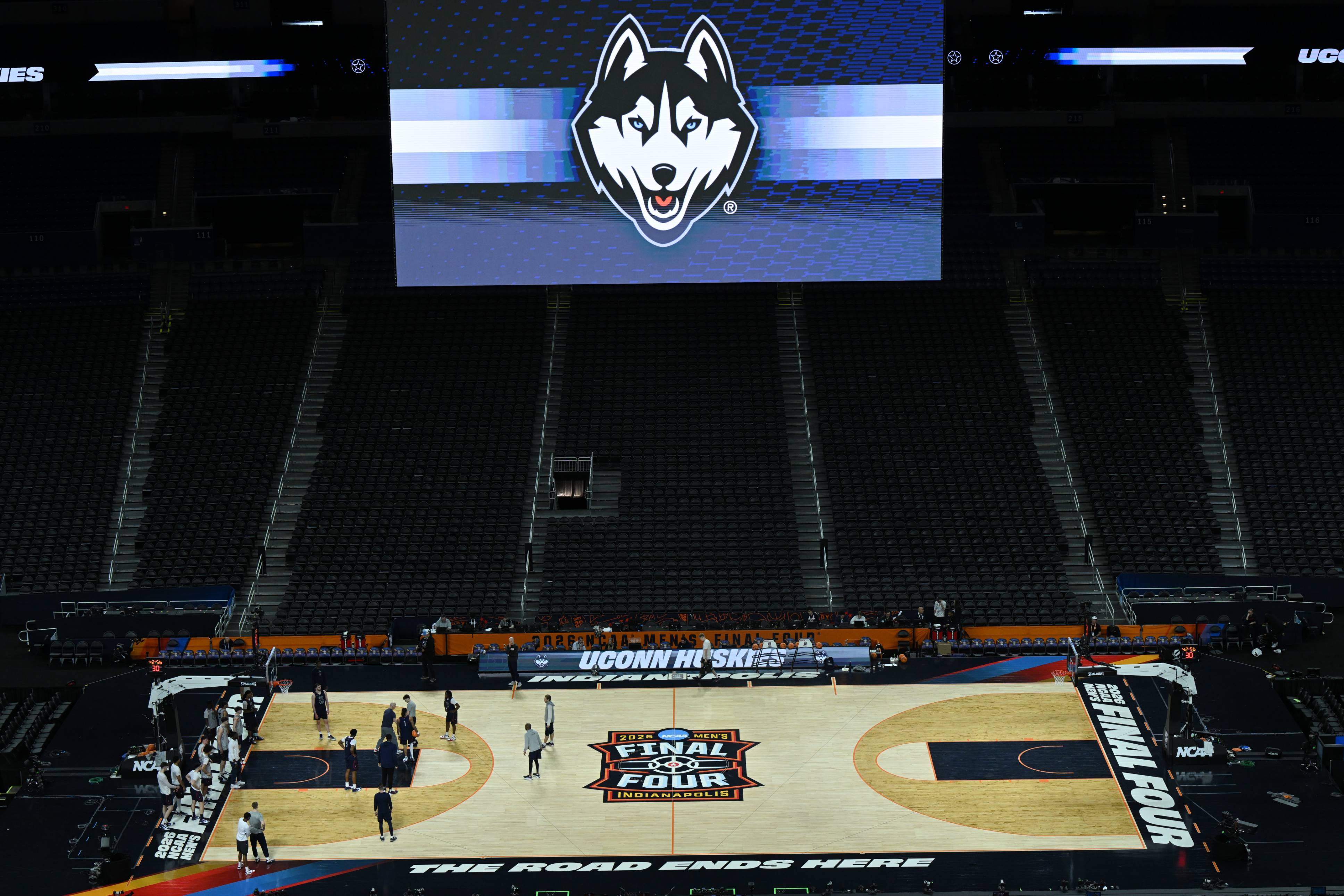
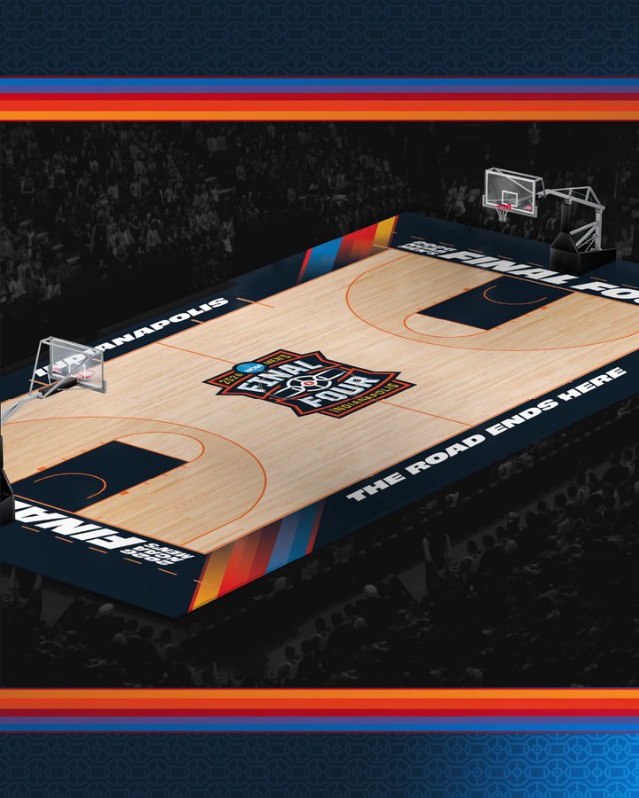
The court is dominated by navy blue. The lane, the key, the center circle, the baseline text. It's navy on navy with a side of navy. There's nothing inherently wrong with the color, but when everything blends together like this, nothing stands out. The eye has nowhere to go.
 Images via NCAA
We get that the NCAA has a brand to maintain. But the Final Four is supposed to be the biggest stage in college basketball. This court should feel like an event. Instead it feels like a regional semifinal that got a fresh coat of paint.
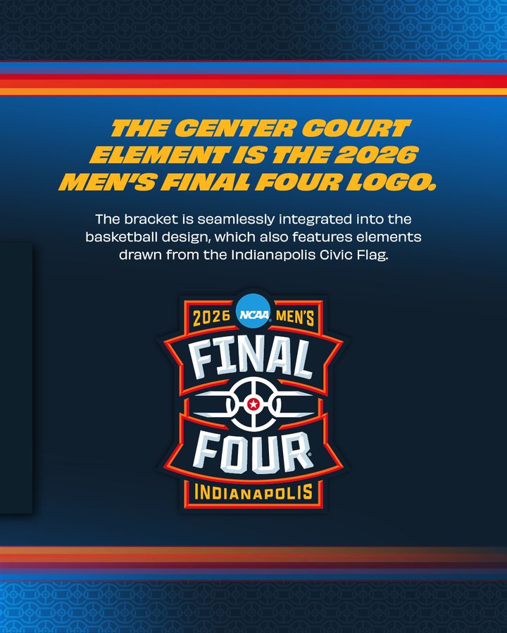
The Logo Problem
Here's where it really falls apart for us. The center court logo looks the same as it does every single year. It's a small, contained circle that barely fills the jump ball area. Compare that to the old Final Four courts where the logo stretched wide across the paint, covered the lane, and made you feel like you were watching something special.
And we have another issue. The Final Four logo and the First Four logo are almost indistinguishable. If you're branding the biggest event in college basketball, it should not look like the play-in round. There needs to be a clear visual separation between the two. Right now, a casual fan couldn't tell them apart.
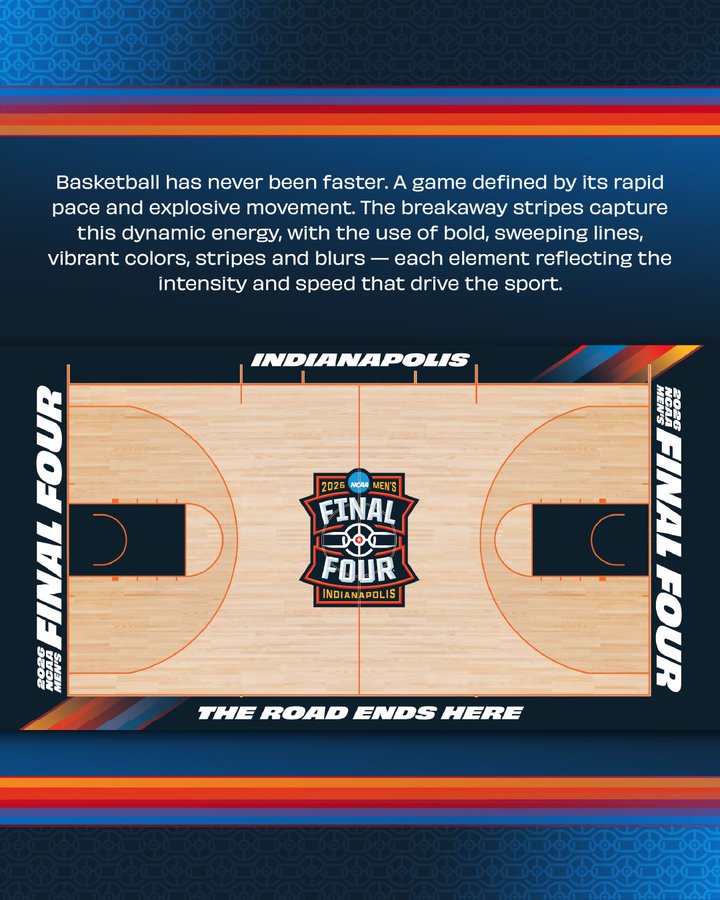
"The Road Ends Here" - We Know
The baseline reads "THE ROAD ENDS HERE" again. We've seen this phrase on Final Four courts for years now. It was cool the first time. Maybe even the second time. But at some point the NCAA needs to rotate it out or come up with something fresh. It's become background noise.
We do like the "FINAL FOUR" text on the opposite baseline. That's clean and reads well on camera. But one good baseline doesn't save the whole floor.
 Images via NCAA
Where Are the Colors?
This is the biggest miss. The corners have minimal design. The overall palette is flat. There's no pop. No energy. San Antonio is one of the most vibrant cities in America and this court does nothing to reflect that. Give us some color in the corners. Give us accents that make this feel like it's in Texas. Give us something beyond corporate navy.
The best Final Four courts in history used color as a weapon. They made the floor part of the show. This one just exists.
What We Miss: The Golden Era of Final Four Courts
This is where we get a little nostalgic. Look at the Final Four logos and courts from the early 2000s through about 2015. They were unique. They were bold. They had personality. Each year felt completely different from the last.
2002 - Atlanta
![]()
The 2002 logo had a basketball net draping through the design with a distinct Atlanta skyline feel. It was colorful, creative, and you knew exactly what year and city you were looking at. Every Final Four logo told a story back then.
2008 - San Antonio
![]()
The last time the Final Four was in San Antonio, the logo featured warm southwestern tones and design elements that actually represented the host city. It had character. You could feel the location just by looking at the branding. That's what good design does.
2011 - Houston
![]()
The 2011 logo is one of our favorites. Bright colors, a star motif for Texas, and a design that was unmistakably its own. You could hang this on a wall. You could put it on a t-shirt and people would buy it. Try doing that with the current generic circle logo.
These old logos had one thing in common: they were designed to be remembered. The current Final Four branding is designed to be inoffensive, and that's the problem.
Our Grade: C
We're giving the 2026 Final Four court a C. It's not broken. It's functional. The wood looks fine, the lines are clean, and it'll look decent enough on TV. But "decent enough" shouldn't be the standard for the biggest weekend in college basketball.
The NCAA used to swing for the fences with these courts. Big, wide, bright logos in the center. Colors that made the floor feel alive. Designs that were tied to the host city. Now we get the same template with a different year stamped on it.
San Antonio deserved better. The Final Four deserved better. And honestly, the fans who pay hundreds of dollars to be in that building deserve a court that feels like the event it's supposed to be.
The Bottom Line
The 2026 Final Four court is safe, corporate, and forgettable. We want the NCAA to take risks again. Give us color. Give us a logo that fills the floor. Give us a reason to remember what this court looked like five years from now. Right now, we can't even tell it apart from last year's.
![]() The NCAA's design inspiration board for the 2026 Final Four. The colors and energy here are exactly what we wish made it onto the actual court. Images via NCAA
The NCAA's design inspiration board for the 2026 Final Four. The colors and energy here are exactly what we wish made it onto the actual court. Images via NCAA