We were skeptical of the 2026 Final Four court when the design first dropped. We wrote about it at the time and gave it a C. But now that we have actually seen it on TV with teams playing on it, we have to admit something. This court is growing on us.
The first semifinal between Illinois and UConn gave us a great look at everything from the court design to the uniforms to the broadcast presentation. Some of it is really good. Some of it is not.
The Court
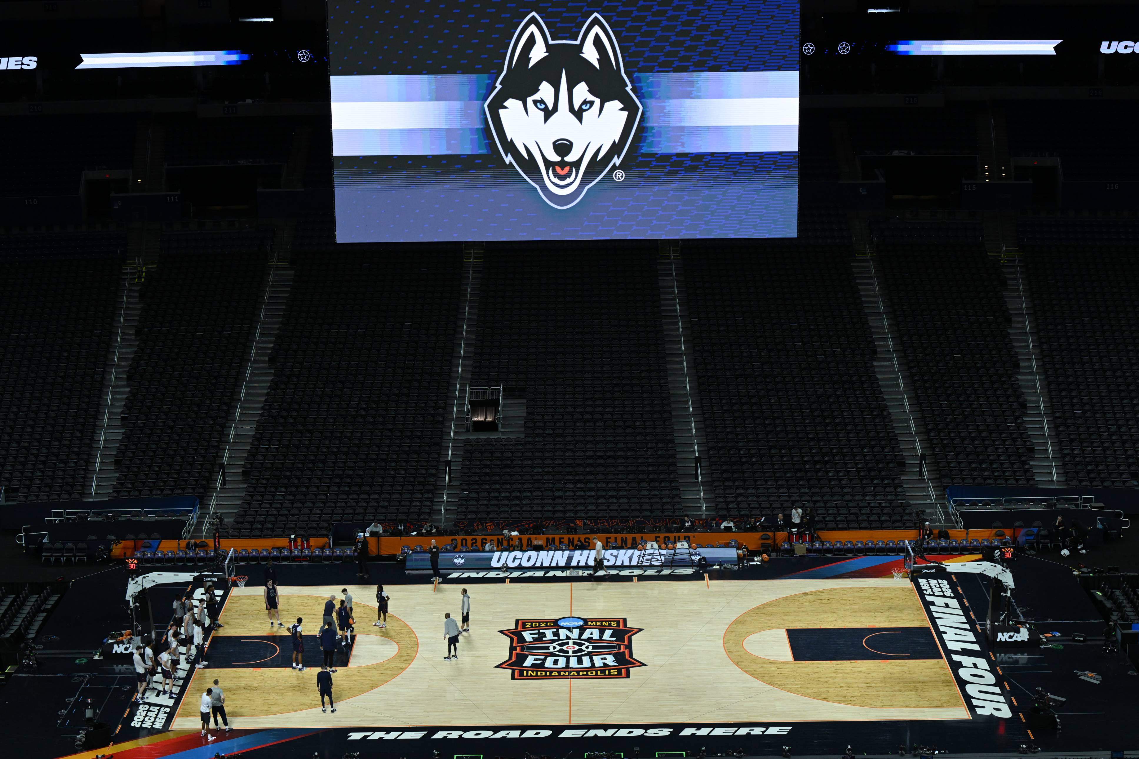 Image via @UConnMBB on X
The thing that stands out the most on TV is the "Final Four" script across the baseline. We are so used to watching NBA games where the baselines are covered in ads for insurance companies and crypto exchanges. Seeing a clean script that just says "Final Four" stretching across the entire baseline is refreshing. It looks great on camera and it actually makes the court feel like an event.
The center court logo looks better in action than it did in the preview renders. The colors in the corners add just enough without being distracting. The overall look on a broadcast is clean and the floor reads well from every camera angle.
We were wrong about this court. It works.
The Uniforms
The first uniform matchup of the tournament is Illinois in orange against UConn in white. This is a great looking game.
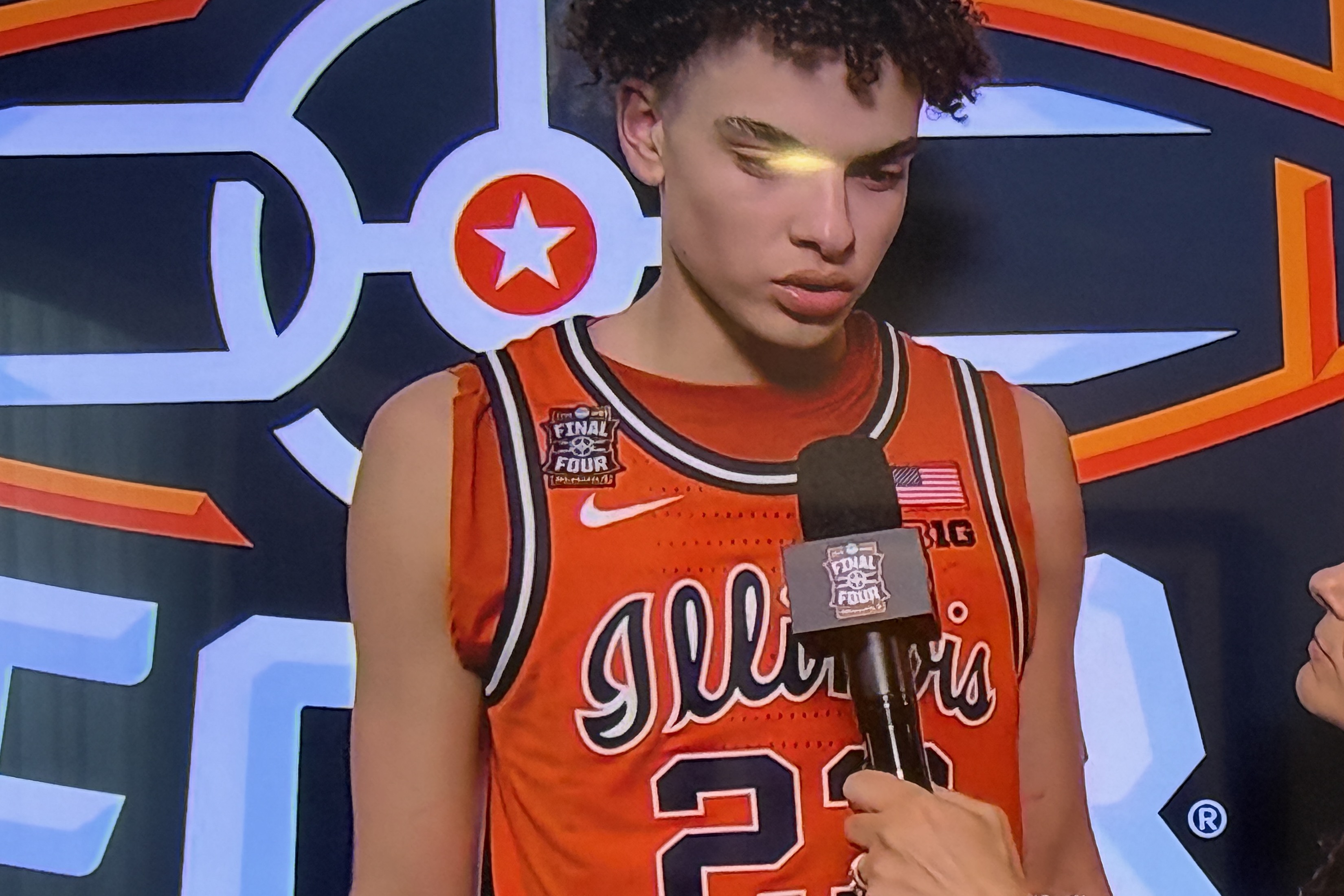
The Illinois orange jerseys pop on the court. They are vibrant without being overwhelming and the contrast against the hardwood is perfect. The Final Four patch on the chest looks great on the orange jersey.
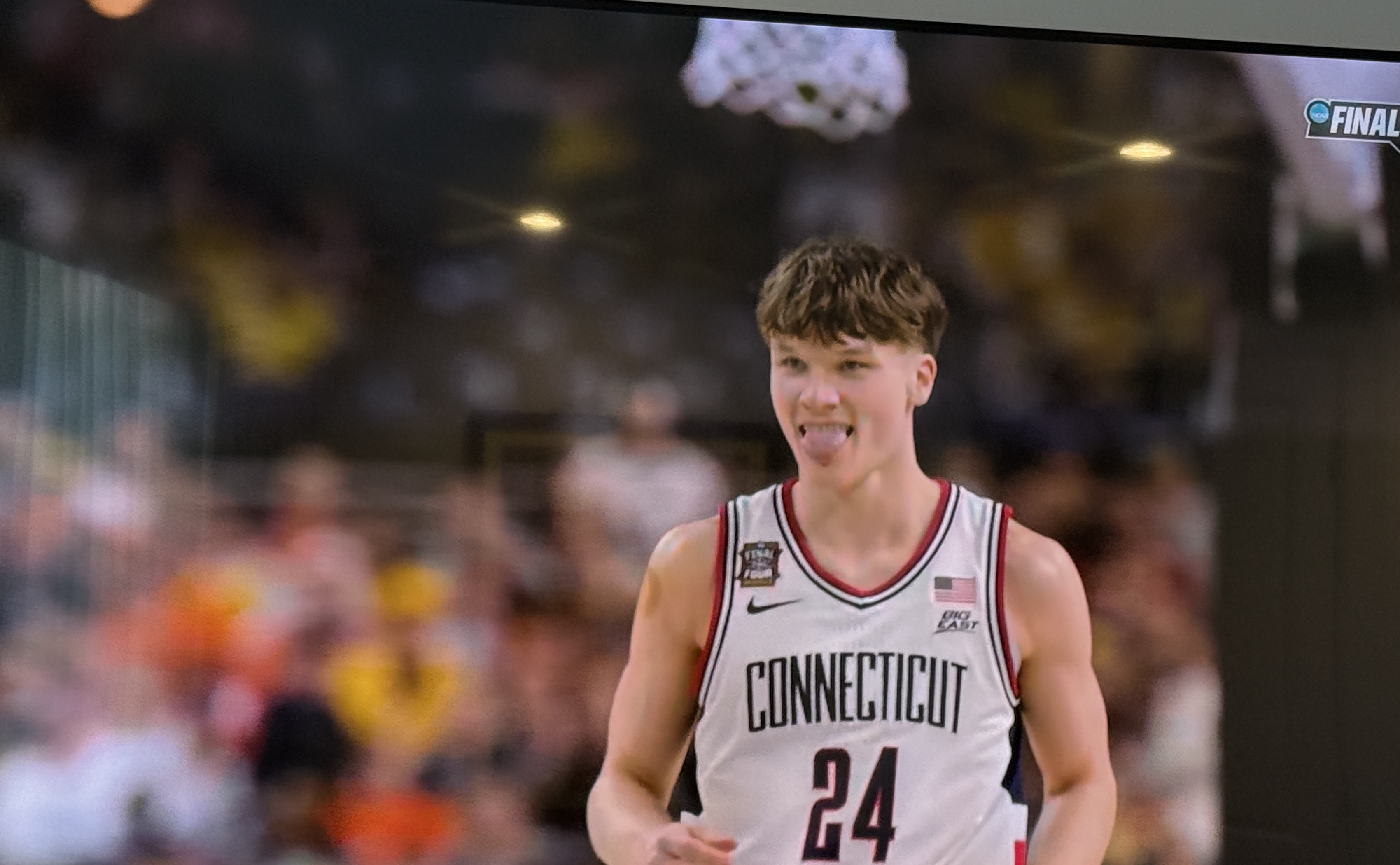
The UConn white jerseys are clean. "Connecticut" across the chest with navy and red trim is a classic look. The Final Four patch works just as well on the white jersey as it does on the Illinois orange. Both teams look like they belong on this stage.
The Broadcast
This is where things get mixed for us.
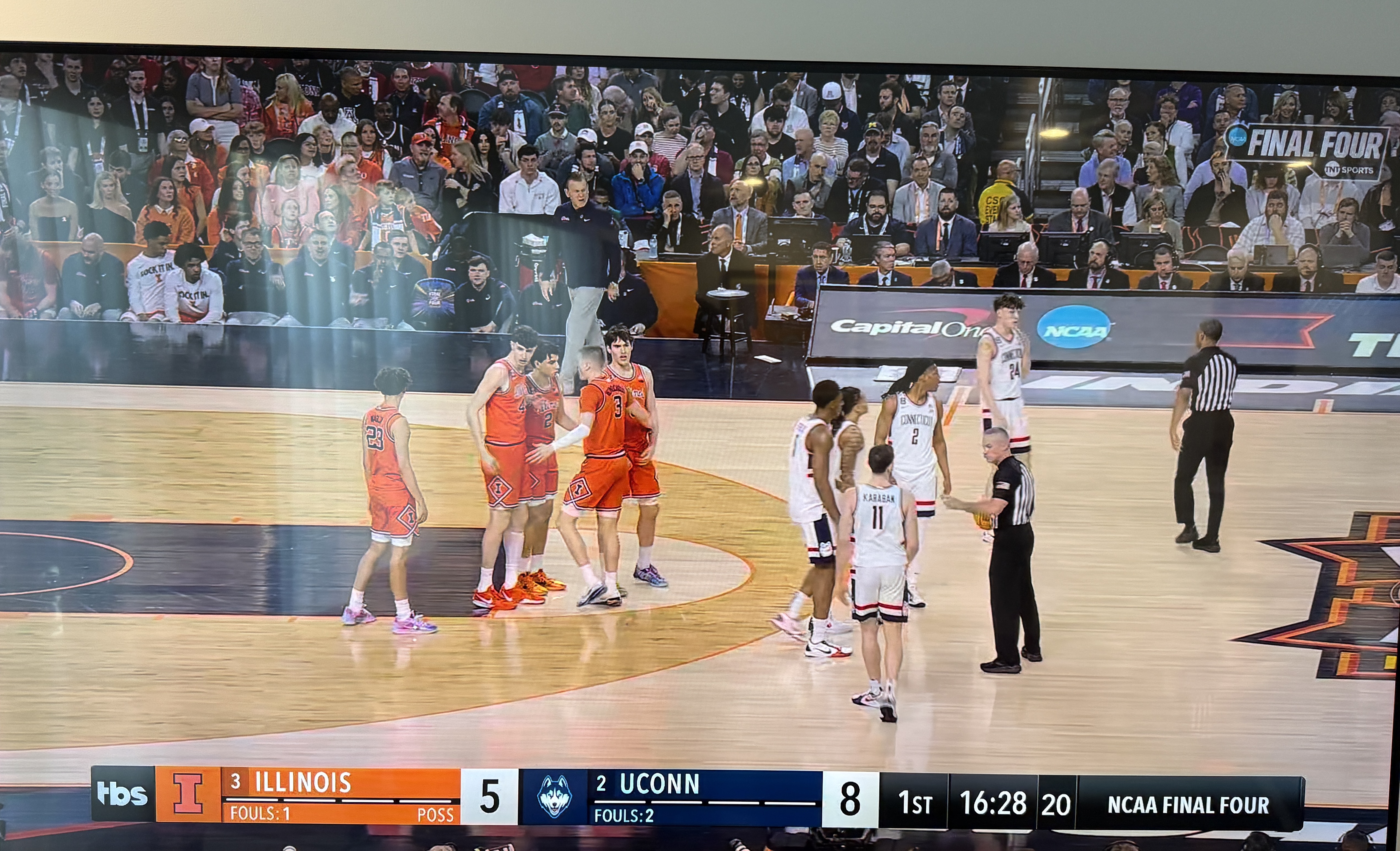
The scorebug on TBS is functional but way too basic for the Final Four. It barely acknowledges what we are watching. There is a small "NCAA Final Four" label tucked into the bottom right corner of the scorebug and that is about it. This is the biggest weekend in college basketball. The scorebug should feel like it.
Then there is the Final Four logo in the top right corner of the broadcast. This is our biggest problem with the entire presentation. The logo in the corner looks almost identical to the "First Four" script they used at the very start of the tournament for the play-in games. The Final Four should have its own distinct branding that matches the specific logo for that year. Instead it looks like they just reused the same generic template from the opening round. The biggest weekend of the tournament should not share its on-screen identity with the smallest.
Our Take
The court is better than we expected. The baselines are the highlight. The uniforms are a perfect matchup. But the broadcast side needs work. When we are watching the Final Four, everything on screen should scream that this is the biggest event in college basketball. The court does its job. The broadcast graphics do not.