via Nebraska Athletics / adidas
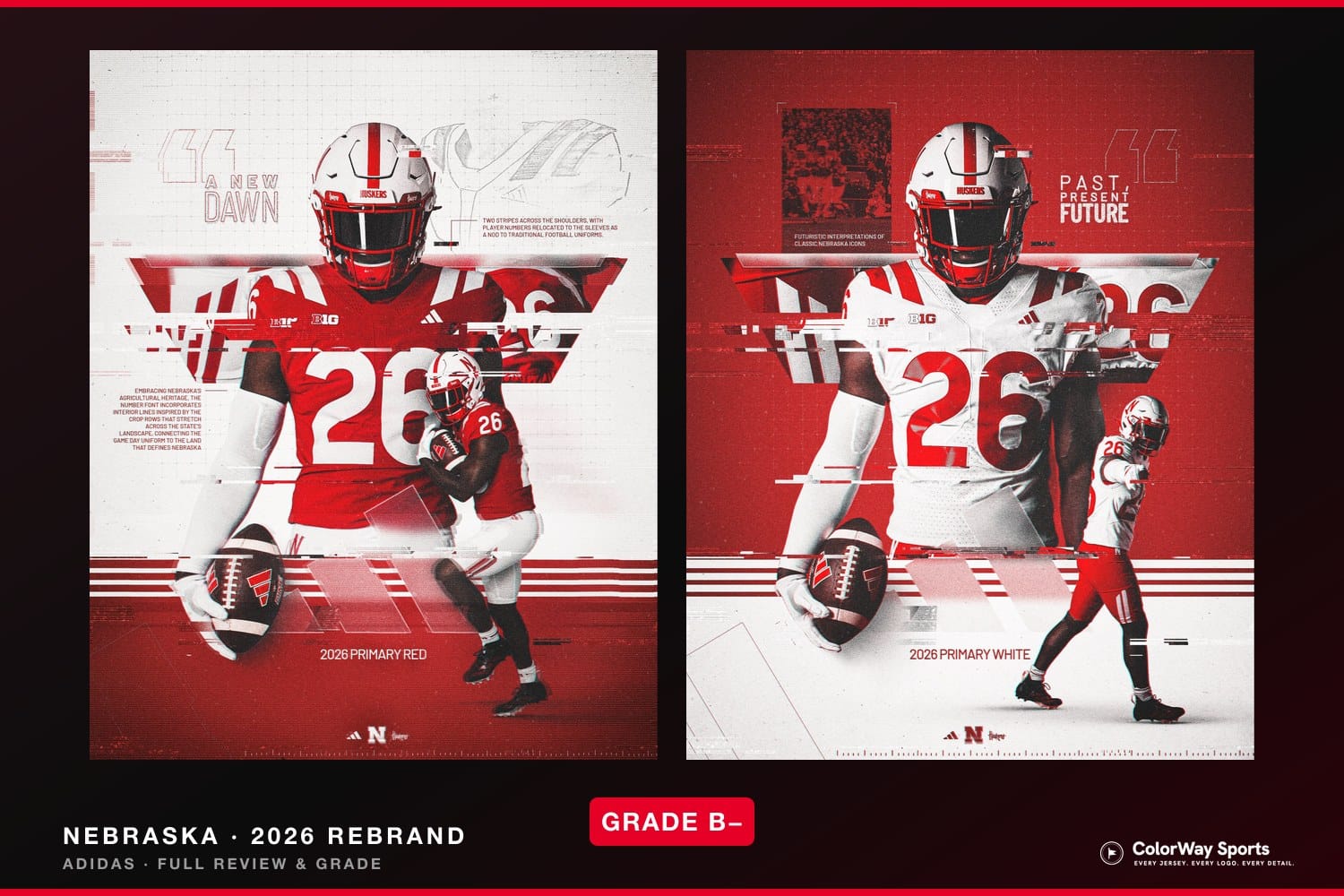
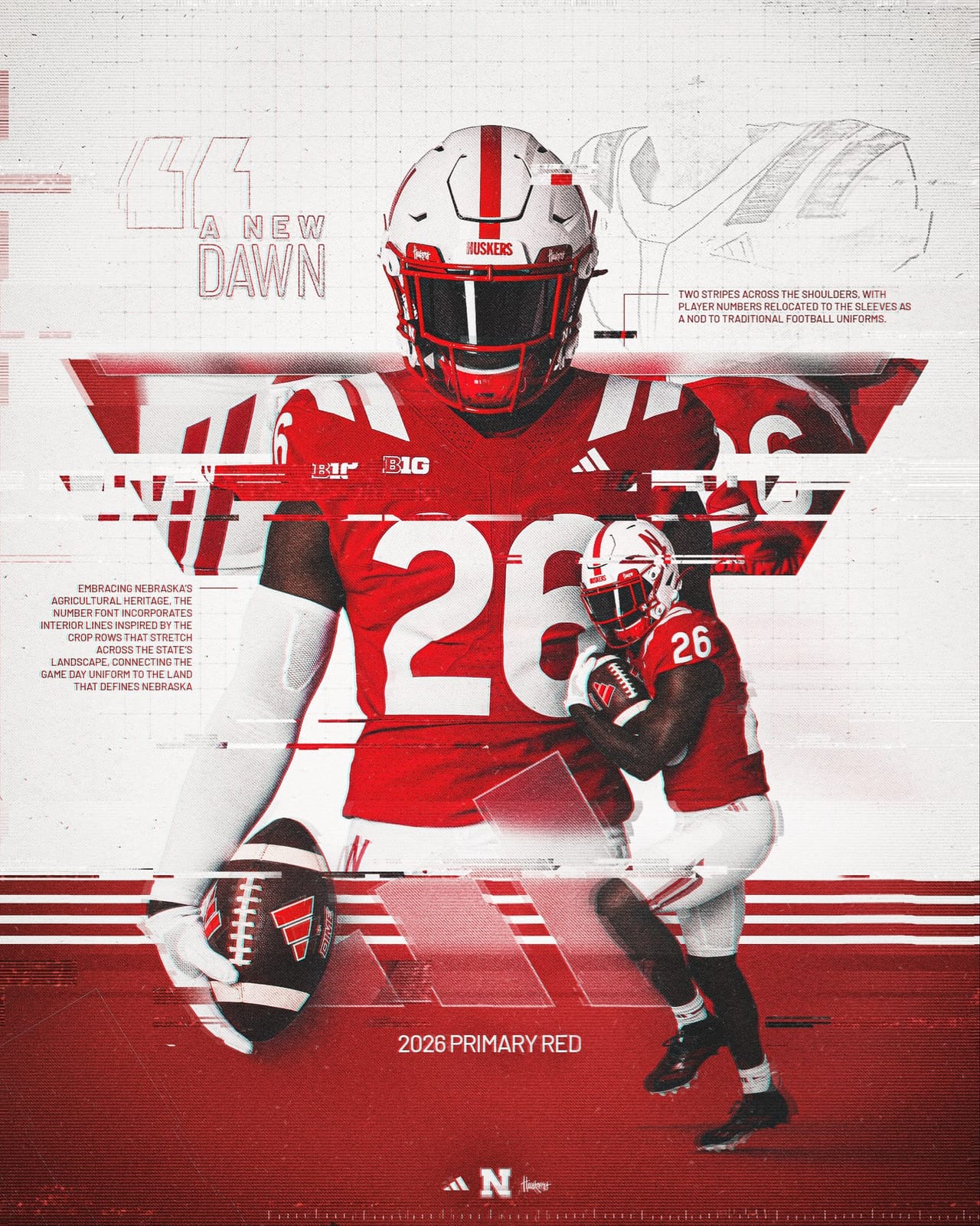
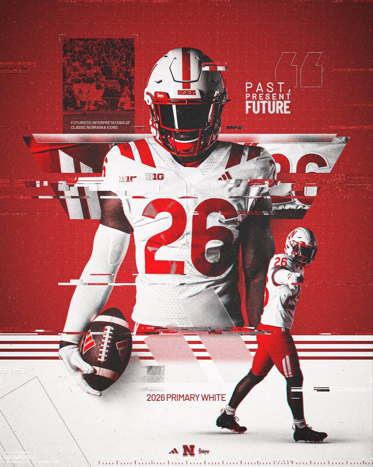
Nebraska football has a new look. The Cornhuskers and adidas unveiled redesigned 2026 uniforms on Saturday night inside the Hawks Championship Center, following the Battle at the Boneyard seven-on-seven event, and they will hit the field this fall. adidas reportedly approached Nebraska about two years ago with a modernized concept, and the pitch leaned all the way into the one thing that truly defines the state: agriculture. The result is a "Past, Present, Future" rebrand the program is calling "A New Dawn." Here is our full breakdown and grade.
Every uniform photo and graphic in this post — including the cover image — comes from Nebraska Athletics and adidas. These are the school's official reveal images, not ColorWay Sports originals.
What Nebraska Actually Changed
via Nebraska Athletics / adidas
This is a refresh, not a teardown. The bones of the Nebraska look — scarlet and cream, the block feel, the iconic helmet — all survive. What changed are the details:
- A brand-new number font. This is the headline. The numerals borrow from the digits engraved on a steel anvil, with interior lines that mimic the rows of crops stretching across the heartland. It is the most distinctive number set Nebraska has worn in decades.
- The stripes moved up. The two contrasting stripes that used to live on the sleeves have been relocated to the shoulders, and there are now two truncated stripes running along the sides of the jersey and pants.
- TV numbers on the sleeves. With the shoulders given over to the stripes, the secondary numbers slid down onto the sleeves — a nod to traditional football uniforms.
- A "Stick N" on the right hip, sitting opposite the adidas mark.
- The "Winning Tradition" patch is gone, replaced by an embroidered phrase stitched inside the back collar.
via Nebraska Athletics / adidas
The Numbers Are the Best Part
Let us start with what works, because it works really well. The new number font is excellent. It is distinct, creative, and genuinely different from anything else in college football — and the agricultural story behind it (the anvil digits, the crop-row interior lines) gives it a reason to exist beyond "let's make it look futuristic." On a sport where most number fonts are interchangeable block or rounded sets, Nebraska now has a numeral that you could identify from the end zone with the logos covered up. That is the whole point of a uniform identity, and this is the element that earns the rebrand its grade.
But the Old Stripes Were Better
Here is where it loses us. The previous Nebraska uniform paired horizontal stripes on the shoulders with vertical stripes down the pants, and that combination was clean, classic, and unmistakably Husker. The redesign trades that for two stripes across the shoulders and the truncated side stripes, and the new arrangement just does not land the same way. We understand the instinct to modernize, but the old striping was one of the more timeless things Nebraska had going. This is a case where "different" is not automatically "better."
The Helmet Stayed the Same, and That Is the Right Call
Credit where it is due: adidas and Nebraska left the helmet alone. The white shell, the red center stripe, and the Stick "N" are untouched, and that was exactly the correct decision. The Nebraska helmet is one of the cleanest, most recognizable lids in the sport — there was nothing to fix, and the restraint to not touch it keeps the whole identity grounded even as everything around it changed.
The Pants Are Fine
The pants are... all right. The relocated striping carries down onto them, and they read a little busier than the old set, but nothing here is offensive. This is the kind of change that looks slightly odd in the reveal graphics and then becomes completely normal once you have watched three quarters of football in it. We will get used to them.
The Reaction Has Been Mixed
It is worth noting that the rollout drew a divided response. A chunk of the fan base pushed back hard on the new number font, and the quiet removal of the visible "Winning Tradition" patch — relocated to an embroidered phrase inside the collar — did not go unnoticed. That is the risk of leaning into a bold, story-driven redesign: the people most attached to the old look are exactly the ones who notice when a piece of it goes away. We happen to love the numbers, but we get why a traditionalist would bristle.
The Overall Grade: B-
This is a refresh that gets its biggest swing — the number font — completely right, and gives back some of that goodwill on the striping. The jerseys are not really our cup of tea, and we would have kept the old stripe layout, but a program is allowed to modernize, and there is nothing embarrassing here. Keeping the helmet untouched was smart, the numbers are a legitimate upgrade, and the agricultural concept is one of the more thoughtful design stories of the offseason. It just is not the home run the number font, on its own, could have been.
Nebraska 2026 Rebrand · Overall Grade
B-
Numbers: A- · Stripes: C+ · Helmet: Unchanged (good) · Pants: B-
How It Stacks Up Against the Other 2026 Redesigns
Nebraska joins a busy redesign season. For more uniform and brand breakdowns, see our reviews of the Los Angeles Rams 2026 rebrand, the new College Football Playoff logo, and the 2026 Pac-12 conference logo.
Frequently Asked Questions About Nebraska's 2026 Uniforms
When did Nebraska reveal its new 2026 uniforms?
Nebraska and adidas unveiled the new uniforms on Saturday, June 20, 2026, inside the Hawks Championship Center, following the program's Battle at the Boneyard seven-on-seven event. The uniforms debut in the 2026 season.
What changed in the new Nebraska uniforms?
The biggest change is a new number font inspired by anvil-engraved digits and crop rows. The two sleeve stripes moved up to the shoulders, the TV numbers moved down to the sleeves, two truncated stripes were added along the sides, a "Stick N" was placed on the right hip, and the visible "Winning Tradition" patch was replaced by an embroidered phrase inside the back collar.
Did Nebraska change its helmet?
No. The Nebraska helmet is unchanged — a white shell with a red center stripe and the red Stick "N" remain exactly as they were. Leaving the helmet alone was one of the best decisions of the rebrand.
Who makes Nebraska's uniforms?
adidas. The company has outfitted Nebraska for years and reportedly approached the program about two years ago with the modernized concept that became this 2026 redesign.
What is the design inspiration behind the new uniforms?
Nebraska's agricultural heritage. The number font borrows from the digits stamped on a steel anvil and the interior lines mimic rows of crops across the state, connecting the game-day uniform to the land that defines Nebraska.
What grade do the new Nebraska uniforms get?
Our overall grade is a B-. The new number font is the standout (A- on its own), the helmet staying the same was the right call, but the new shoulder-and-side striping is a step down from the classic layout, which drags the grade into the B-minus range.