The Minnesota Twins carry five uniforms in 2026, and unlike a rigidly scheduled team such as the Phillies, their closet runs on feel more than a published timetable. The only soft anchor is the blue "Ripple Effect" City Connect, which tends to own Friday nights at Target Field — everything else is manager's choice, with the home whites and the pinstripe grays handling the day-to-day work. Here's the full Twins wardrobe for 2026 and when each jersey actually comes out.
Sample Home-and-Road Week at a Glance
One honest caveat the grid can't show: outside the City Connect's Friday-home habit, the Twins don't run a fixed day-of-week system. The navy "Twins" alternate and the cream "Twin Cities" alternate can surface on any given day — the navy mostly on the road, the cream mostly at home — so treat the week above as a representative homestand, not a guarantee.
The Twins carry five uniforms in 2026, and the set is the same one they built out of the 2023 brand overhaul — the franchise's first full redesign since 1987, anchored by Twins Navy, scarlet red, and "Kasota gold," a warm tan named for the limestone quarried in southern Minnesota. What's new for 2026 lives in the details: the navy alternate was redrawn to read "Twins" across the chest instead of "Minnesota," and the road grays picked up a fresh "MIN" sleeve patch. None of it changes how the closet rotates; it just sharpens a set that already knew what it was.
Home Whites (Most Home Games)
The home white is Minnesota's signature look: a clean white jersey with the "Twins" script across the chest — the standalone "T" leading into a connected cursive "wins" with the underline tail, a design lineage that traces straight back to the 1987 World Series club. It's worn with the navy "TC" cap, the interlocking Twin Cities mark that has ridden along since the team came to Minnesota. This is the default for the bulk of every homestand, essentially any home game not handed to one of the alternates, and it is one of the cleanest, most timeless home looks in the American League. The Twins are smart to leave it almost entirely alone.
Road Pinstripe Grays (Most Away Games)
On the road, the Twins wear a gray set laced with navy pinstripes and "Minnesota" arched across the chest in navy, paired with the white "M" cap that carries the red North Star above the letter. For 2026 the team freshened the sleeve patch, swapping in a new mark built around the club's "MIN" abbreviation set in gray inside a navy baseball with silver stitching. It's the workmanlike default for most away games — more functional than iconic — but the pinstripes give it a quiet heritage nod, since plenty of Twins Hall of Famers wore them across their Minnesota careers.
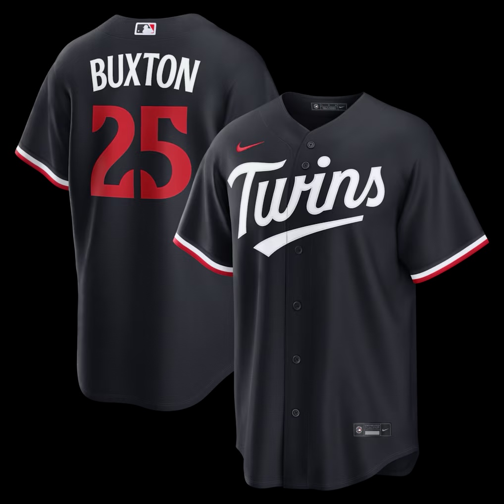
Navy Alternate (Manager's Choice, Mostly Road)
The navy alternate is the headline change for 2026. The base navy stayed, but the arched "Minnesota" wordmark was replaced by a white "Twins" script across the chest — the first time in roughly four decades that the club has carried a road-friendly option reading "Twins" rather than the state name, a callback to the powder-blue road era of the mid-1980s. The shoulder swaps the usual interlocking lettering for a patch shaped like the state of Minnesota, with a star in the lower-right corner marking where Target Field sits. There's no fixed day attached to it — it's the jersey the staff reaches for when they want a jolt of color, most often on the road. The redesign is modern and a little pasted-together, but seeing "Twins" on the front away from home is a genuine novelty.
Cream "Twin Cities" Alternate (Manager's Choice, Mostly Home)
The cream alternate is the most civic-minded jersey in the closet. It revives a legacy cream base and stretches "Twin Cities" across the chest, with a crisscrossed flag-style mark pairing an "M" for Minneapolis and "StP" for St. Paul — a deliberate move to honor both halves of the metro rather than lean on one. It's worn with a navy "TC" cap rendered in cream lettering to match. Like the navy, it has no standing day on the calendar; it's a manager's-choice look that mostly shows up at home. It is arguably the best thing the 2023 rebrand produced, blending history, civic pride, and clean modern type into one cohesive package.
City Connect — The "Ripple Effect" Kit (Friday Home Games)
The City Connect, introduced in June 2024, is the most conceptually loaded jersey the Twins own. The base is a wash of blues run through with darker striations, a sublimated pattern meant to read as ripples spreading across the surface of a lake — the "Ripple Effect," leaning all the way into the Land of 10,000 Lakes identity. Instead of a chest wordmark it carries a white "MN" patch built around the North Star motif, claiming the whole state rather than just the Twin Cities. The cap is the showpiece: a yellow state silhouette framing glowing northern lights, with "10,000 Lakes" on one side and, under the brim, a purple-outlined topographic map of Lake Minnetonka as a nod to Prince. After debuting with blue pants, the team switched to white pants in 2025 to balance the design. It's the closest thing Minnesota has to a scheduled look — worn mostly on Friday home games — and it's a vivid, unmistakably local entry in the City Connect program.
How the Twins Rotation Actually Works
Let's be straight about it: the Twins are not a scheduled-rotation team the way the Phillies are. That club treats its closet like a published timetable; Minnesota really only has one soft anchor — the "Ripple Effect" City Connect on Friday home games. Everything else is feel and matchup: home whites for the rest of the homestand, pinstripe grays for most of the trip, and the two alternates dropped in whenever the staff wants something different — the navy mostly on the road, the cream mostly at home, neither pinned to a day of the week.
It still works, because the City Connect is the jersey fans actually plan around, and handing it a standing Friday slot builds anticipation even without a rigid system. The whites and grays are perfectly content to handle the quiet weekday work, while the navy and cream alternates stay special precisely because you never quite know when they'll appear.
One more note on the set as a whole: the 2026 closet is the most cohesive the Twins have fielded in years. Kasota gold threads through the trim and accents on every piece, tying the navy, the scarlet, the cream, and the lake-blue City Connect back to a single design language — the real payoff of the 2023 overhaul.
Frequently Asked Questions
How many uniforms do the Twins have in 2026? Five: the home white, the road pinstripe gray, the navy alternate, the cream "Twin Cities" alternate, and the blue "Ripple Effect" City Connect. The set carried over from 2025, with the navy alternate redesigned to read "Twins" and a new "MIN" sleeve patch added to the road grays for 2026.
When do the Twins wear the City Connect uniform? The blue "Ripple Effect" City Connect, introduced in June 2024, is the team's most-scheduled look — worn mostly on Friday home games at Target Field. It features a lake-ripple sublimation pattern, a white "MN" chest patch, and a cap with a yellow state silhouette and northern lights.
What is the new navy Twins jersey for 2026? It's the redesigned navy alternate. The chest wordmark switched from "Minnesota" to a white "Twins" script — the first road-friendly "Twins" front in about 40 years — and the shoulder now carries a Minnesota-state-shaped patch with a star marking Target Field. It's mostly a road look with no fixed day.
What is the cream Twins uniform? That's the cream "Twin Cities" alternate, which revives a legacy cream base and spells "Twin Cities" across the chest with a crisscrossed "M" and "StP" flag mark honoring both Minneapolis and St. Paul. It's worn with a navy "TC" cap in cream lettering, mostly at home.
Do the Twins have a strict uniform rotation like the Phillies? No. Outside of the City Connect's Friday-home habit, the Twins pick their jerseys by feel rather than a published schedule, so the home whites, pinstripe grays, navy alternate, and cream alternate all stay flexible across the week.
What are the Minnesota Twins' team colors? Twins Navy, scarlet red, and "Kasota gold" — a warm tan named for the Kasota limestone quarried in southern Minnesota — locked in by the 2023 rebrand. Kasota gold runs through the trim and accents on every uniform as the connective thread across the set.
More MLB Coverage
- Kansas City Royals 2026 Uniform Schedule — the AL Central rival's closet, broken down
- Detroit Tigers 2026 Uniform Schedule — the other AL Central set and when each jersey comes out
- Boston Red Sox 2026 Uniform Schedule — five uniforms anchored by two City Connects
- Philadelphia Phillies 2026 Uniform Schedule — the gold standard of a true scheduled rotation
Uniform details compiled from team and league sources. ColorWay Sports is an independent design site and is not affiliated with, endorsed by, or sponsored by the Minnesota Twins or Major League Baseball.