NFL Stories
 Arizona Cardinals
 Atlanta Falcons
 Baltimore Ravens
 Buffalo Bills
 Carolina Panthers
 Chicago Bears
 Cincinnati Bengals
 Cleveland Browns
 Dallas Cowboys
 Denver Broncos
 Detroit Lions
 Green Bay Packers
 Houston Texans
 Indianapolis Colts
 Jacksonville Jaguars
 Kansas City Chiefs
 Las Vegas Raiders
 Los Angeles Chargers
 Los Angeles Rams
 Miami Dolphins
 Minnesota Vikings
 New England Patriots
 New Orleans Saints
 New York Giants
 New York Jets
 Philadelphia Eagles
 Pittsburgh Steelers
 San Francisco 49ers
 Seattle Seahawks
 Tampa Bay Buccaneers
 Tennessee Titans
 Washington Commanders
 NBA Stories
 Atlanta Hawks
 Boston Celtics
 Brooklyn Nets
 Charlotte Hornets
 Chicago Bulls
 Cleveland Cavaliers
 Dallas Mavericks
 Denver Nuggets
 Detroit Pistons
 Golden State Warriors
 Houston Rockets
 Indiana Pacers
 LA Clippers
 Los Angeles Lakers
 Memphis Grizzlies
 Miami Heat
 Milwaukee Bucks
 Minnesota Timberwolves
 New Orleans Pelicans
 New York Knicks
 Oklahoma City Thunder
 Orlando Magic
 Philadelphia 76ers
 Phoenix Suns
 Portland Trail Blazers
 Sacramento Kings
 San Antonio Spurs
 Toronto Raptors
 Utah Jazz
 Washington Wizards
 MLB Stories
 Arizona Diamondbacks
 Atlanta Braves
 Baltimore Orioles
 Boston Red Sox
 Chicago Cubs
 Chicago White Sox
 Cincinnati Reds
 Cleveland Guardians
 Colorado Rockies
 Detroit Tigers
 Houston Astros
 Kansas City Royals
 Los Angeles Angels
 Los Angeles Dodgers
 Miami Marlins
 Milwaukee Brewers
 Minnesota Twins
 New York Mets
 New York Yankees
 Philadelphia Phillies
 Pittsburgh Pirates
 San Diego Padres
 San Francisco Giants
 Seattle Mariners
 St. Louis Cardinals
 Tampa Bay Rays
 Texas Rangers
 Toronto Blue Jays
 Washington Nationals
 NHL Stories
 Anaheim Ducks
 Boston Bruins
 Buffalo Sabres
 Calgary Flames
 Carolina Hurricanes
 Chicago Blackhawks
 Colorado Avalanche
 Columbus Blue Jackets
 Dallas Stars
 Detroit Red Wings
 Edmonton Oilers
 Florida Panthers
 Los Angeles Kings
 Minnesota Wild
 Montreal Canadiens
 Nashville Predators
 New Jersey Devils
 New York Islanders
 New York Rangers
 Ottawa Senators
 Philadelphia Flyers
 Pittsburgh Penguins
 San Jose Sharks
 Seattle Kraken
 St. Louis Blues
 Tampa Bay Lightning
 Toronto Maple Leafs
 Vancouver Canucks
 Vegas Golden Knights
 Washington Capitals
 Winnipeg Jets
 All Soccer Stories
 International Competitions
 UEFA Champions League
 Premier League
 Arsenal
 Aston Villa
 Bournemouth
 Brentford
 Brighton
 Chelsea
 Coventry City
 Crystal Palace
 Everton
 Fulham
 Hull City
 Ipswich Town
 Leeds United
 Liverpool
 Manchester City
 Manchester United
 Newcastle
 Nottingham Forest
 Sunderland
 Tottenham
 La Liga
 Serie A
 Bundesliga
 Ligue 1
 MLS
MLS All F1 Stories
 Alpine
 Aston Martin
 Audi
Audi Cadillac
 Ferrari
 Haas
Haas McLaren
 Mercedes
 Racing Bulls
 Red Bull Racing
 Williams
 NASCAR
The Twins own one of the best chest marks in the American League and one of the worst City Connects, and the gap between them is enormous. That "Twins" script is a genuinely beautiful piece of lettering, and every jersey that carries it lands somewhere between fine and excellent. The one that does not carry it is the one that falls off a cliff. Here is every Minnesota Twins jersey and uniform for 2026, ranked worst to first and graded.
5. Ripple Effect City Connect
Introduced in June 2024, the "Ripple Effect" is the most conceptually loaded jersey the Twins own. The base is a wash of blues run through with darker striations, a sublimated pattern meant to read as ripples spreading across a lake, leaning all the way into the Land of 10,000 Lakes identity. There is no chest wordmark at all, just a white "MN" patch built around the North Star. The cap is the genuinely clever part: a yellow state silhouette framing the northern lights, "10,000 Lakes" on the side, and a topographic map of Lake Minnetonka under the brim as a nod to Prince. It gets most Friday home games.
It grades a D, and it is the worst thing in the closet by a distance. The problem is not the concept, it is that the execution reads as corny rather than cool, and the all-over blue wash makes the thing look like pajamas instead of a baseball uniform. Dropping the chest wordmark entirely is what kills it, because the "Twins" script is the single best asset this franchise has and this jersey is the only one that refuses to use it. The cap has genuinely great ideas on it. The jersey it is attached to does not.
4. Twin Cities Cream Alternate
The cream alternate is the most civic-minded jersey Minnesota owns. It revives a legacy cream base and stretches "Twin Cities" across the chest, with a crisscrossed flag-style mark pairing an "M" for Minneapolis and "StP" for St. Paul, a deliberate choice to honor both halves of the metro instead of picking one. It is worn with a navy "TC" cap rendered in cream lettering to match, and it has no standing day on the calendar, turning up mostly at home when the staff calls for it.
It grades a B-. We like it, and the idea behind it is genuinely thoughtful, but the execution is bland. Cream on cream with a cream-lettered cap gives you a uniform with almost no color anywhere on it, and the result is quieter than a jersey built on this much civic meaning deserves to be. It is a good concept rendered at low volume. A little contrast, even just leaning harder into the navy or red the Twins already own, would move this up several spots.
3. Road Pinstripe Grays
On the road, Minnesota wears a gray set laced with navy pinstripes and "Minnesota" arched across the chest in navy, paired with the white "M" cap carrying the red North Star above the letter. For 2026 the club freshened the sleeve patch, swapping in a new mark built around the "MIN" abbreviation set in gray inside a navy baseball with silver stitching.
It grades a B. We do not mind it at all, but it is not great either, and that is about the whole story. The pinstripes are the best thing on it, a quiet heritage nod to the sets plenty of Twins Hall of Famers wore, and the arched state name is perfectly competent. It is just more functional than memorable, and it is carrying the arched "Minnesota" rather than the script that makes the rest of this closet sing. A solid road uniform that does its job and asks for nothing.
2. Navy Alternate
The navy alternate is the headline change for 2026. The navy base stayed, but the arched "Minnesota" was replaced by a white "Twins" script across the chest, the first time in roughly four decades the club has carried a road-friendly option reading "Twins" rather than the state name, a callback to the powder-blue road era of the mid-1980s. The shoulder swaps the usual interlocking lettering for a patch shaped like the state of Minnesota, with a star marking where Target Field sits. There is no fixed day for it; it is the jolt of color the staff reaches for, most often on the road.
It grades a B, and we genuinely like it. Getting the "Twins" script onto a road-friendly jersey is the right instinct, because that lettering is the best thing this franchise owns and it had been stuck at home for decades. Navy is a strong base for it, and the white script pops cleanly. The state-shaped shoulder patch is the piece that keeps it from going higher, feeling a little pasted-on next to type this good. It edges the road gray because it puts the better wordmark on the field.
1. Home White
The home white is Minnesota's signature look and the best jersey they own. A clean white base with the "Twins" script across the chest, the standalone "T" leading into a connected cursive "wins" with the underline tail, a design lineage running straight back to the 1987 World Series club. It is worn with the navy "TC" cap, the interlocking Twin Cities mark that has ridden along since the team arrived in Minnesota, and it takes the bulk of every homestand.
It grades an A-, and the script is the entire reason. That wordmark is a genuinely lovely piece of lettering, the kind of mark most franchises would kill for, and the Twins have been smart enough to leave it almost completely alone for decades. On a clean white base with the navy and red trim doing just enough, it is one of the most timeless home looks in the American League. Everything good in this closet traces back to that script, and this is the jersey that shows it off best.
What About the Field of Dreams Uniform?
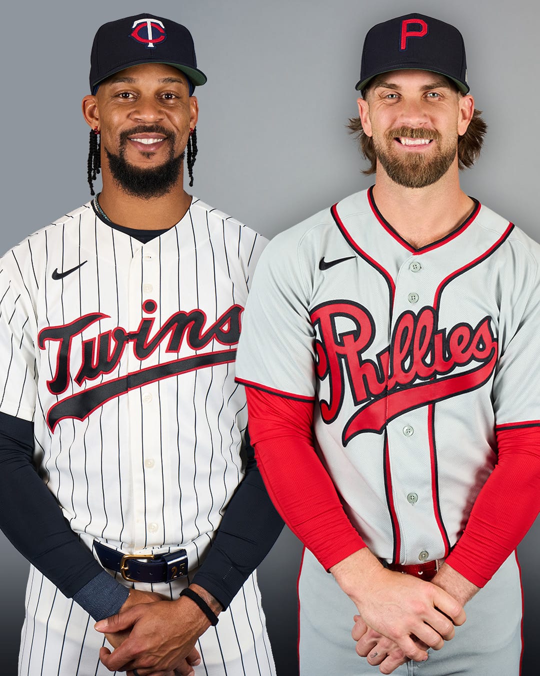
Not ranked here, and deliberately so. The Twins face the Phillies in the 2026 Field of Dreams Game in Iowa, and both clubs wear special throwbacks built for that single night. It is a one-off event uniform rather than part of the rotation, so it sits outside these rankings. We covered the 2026 Field of Dreams uniforms separately.
Every Twins Jersey in 2026, at a Glance
1. Home White — A- · most home games
2. Navy Alternate — B · manager's choice, mostly road
3. Road Pinstripe Grays — B · most away games
4. Twin Cities Cream Alternate — B- · manager's choice, mostly home
5. Ripple Effect City Connect — D · Friday home games
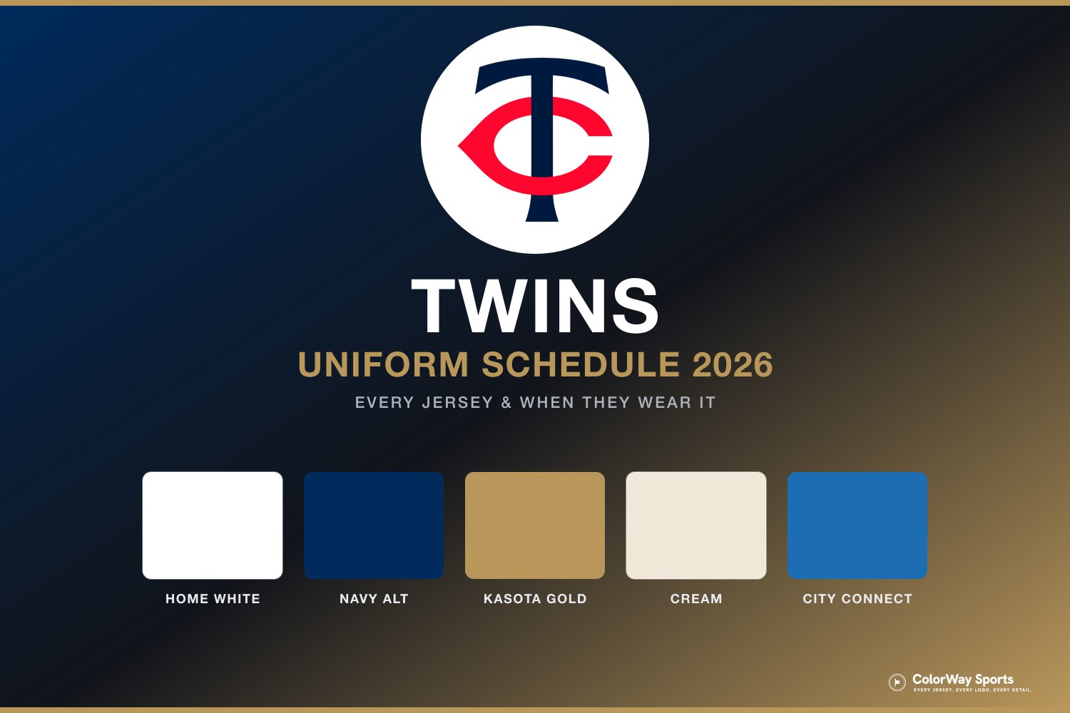
For which look comes out on which day, the Twins uniform schedule maps the full 2026 rotation, and the Twins uniform calendar shows every jersey they have actually worn this season, game by game. If you want the same treatment for the rest of the league, we have ranked every Brewers jersey, every Tigers jersey, and every Rangers jersey, and the full 2026 City Connect ranking puts the Ripple Effect against all 29 other clubs.
The Bottom Line on the Twins Jersey Rankings
This is a closet with one great idea in it, and the ranking is basically a measure of how close each jersey stands to that idea. The "Twins" script is a beautiful mark, and the two jerseys that carry it, the home white and the new navy alternate, are the two best things Minnesota owns.
The road gray is fine and the cream is thoughtful but underpowered, both landing in the comfortable middle. Neither is a problem, and neither is a jersey anyone is going to remember.
Then there is the Ripple Effect, which drops the script entirely in favor of an all-over blue wash and lands somewhere between corny and sleepwear. The cap is full of genuinely good ideas. The jersey underneath it threw away the best asset the franchise has.
Frequently Asked Questions
What is the best Twins jersey for 2026?
We rank the home white No. 1 with an A-. It carries the "Twins" script that traces back to the 1987 World Series club, paired with the navy "TC" cap, and it is one of the most timeless home uniforms in the American League. The new navy alternate is second at a B.
How many uniforms do the Twins have in 2026?
Five in the regular rotation: the home whites, the road pinstripe grays, the navy alternate, the cream "Twin Cities" alternate, and the Ripple Effect City Connect. The Field of Dreams throwback is a one-off event uniform and is not part of the rotation.
What is the Twins City Connect called?
The "Ripple Effect." It debuted in June 2024, uses a blue lake-ripple pattern instead of a chest wordmark, and carries an "MN" North Star patch. The cap features a yellow state silhouette with the northern lights and a Lake Minnetonka topographic map under the brim as a nod to Prince.
When do the Twins wear the cream Twin Cities jersey?
There is no fixed day. It is a manager's-choice alternate that shows up mostly at home, unlike the City Connect, which is anchored to Friday home games.
Why does the Twins navy alternate say "Twins" instead of "Minnesota"?
That was the headline change of the 2026 redesign. Swapping the arched "Minnesota" for the white "Twins" script gave the club its first road-friendly jersey reading "Twins" in roughly four decades, a callback to the powder-blue road sets of the mid-1980s.