NFL Stories
 Arizona Cardinals
 Atlanta Falcons
 Baltimore Ravens
 Buffalo Bills
 Carolina Panthers
 Chicago Bears
 Cincinnati Bengals
 Cleveland Browns
 Dallas Cowboys
 Denver Broncos
 Detroit Lions
 Green Bay Packers
 Houston Texans
 Indianapolis Colts
 Jacksonville Jaguars
 Kansas City Chiefs
 Las Vegas Raiders
 Los Angeles Chargers
 Los Angeles Rams
 Miami Dolphins
 Minnesota Vikings
 New England Patriots
 New Orleans Saints
 New York Giants
 New York Jets
 Philadelphia Eagles
 Pittsburgh Steelers
 San Francisco 49ers
 Seattle Seahawks
 Tampa Bay Buccaneers
 Tennessee Titans
 Washington Commanders
 NBA Stories
 Atlanta Hawks
 Boston Celtics
 Brooklyn Nets
 Charlotte Hornets
 Chicago Bulls
 Cleveland Cavaliers
 Dallas Mavericks
 Denver Nuggets
 Detroit Pistons
 Golden State Warriors
 Houston Rockets
 Indiana Pacers
 LA Clippers
 Los Angeles Lakers
 Memphis Grizzlies
 Miami Heat
 Milwaukee Bucks
 Minnesota Timberwolves
 New Orleans Pelicans
 New York Knicks
 Oklahoma City Thunder
 Orlando Magic
 Philadelphia 76ers
 Phoenix Suns
 Portland Trail Blazers
 Sacramento Kings
 San Antonio Spurs
 Toronto Raptors
 Utah Jazz
 Washington Wizards
 MLB Stories
 Arizona Diamondbacks
 Atlanta Braves
 Baltimore Orioles
 Boston Red Sox
 Chicago Cubs
 Chicago White Sox
 Cincinnati Reds
 Cleveland Guardians
 Colorado Rockies
 Detroit Tigers
 Houston Astros
 Kansas City Royals
 Los Angeles Angels
 Los Angeles Dodgers
 Miami Marlins
 Milwaukee Brewers
 Minnesota Twins
 New York Mets
 New York Yankees
 Philadelphia Phillies
 Pittsburgh Pirates
 San Diego Padres
 San Francisco Giants
 Seattle Mariners
 St. Louis Cardinals
 Tampa Bay Rays
 Texas Rangers
 Toronto Blue Jays
 Washington Nationals
 NHL Stories
 Anaheim Ducks
 Boston Bruins
 Buffalo Sabres
 Calgary Flames
 Carolina Hurricanes
 Chicago Blackhawks
 Colorado Avalanche
 Columbus Blue Jackets
 Dallas Stars
 Detroit Red Wings
 Edmonton Oilers
 Florida Panthers
 Los Angeles Kings
 Minnesota Wild
 Montreal Canadiens
 Nashville Predators
 New Jersey Devils
 New York Islanders
 New York Rangers
 Ottawa Senators
 Philadelphia Flyers
 Pittsburgh Penguins
 San Jose Sharks
 Seattle Kraken
 St. Louis Blues
 Tampa Bay Lightning
 Toronto Maple Leafs
 Vancouver Canucks
 Vegas Golden Knights
 Washington Capitals
 Winnipeg Jets
 All Soccer Stories
 International Competitions
 UEFA Champions League
 Premier League
 Arsenal
 Aston Villa
 Bournemouth
 Brentford
 Brighton
 Chelsea
 Coventry City
 Crystal Palace
 Everton
 Fulham
 Hull City
 Ipswich Town
 Leeds United
 Liverpool
 Manchester City
 Manchester United
 Newcastle
 Nottingham Forest
 Sunderland
 Tottenham
 La Liga
 Serie A
 Bundesliga
 Ligue 1
 MLS
MLS All F1 Stories
 Alpine
 Aston Martin
 Audi
Audi Cadillac
 Ferrari
 Haas
Haas McLaren
 Mercedes
 Racing Bulls
 Red Bull Racing
 Williams
 NASCAR
Milwaukee made one genuinely great decision for 2026, bringing powder blue back as the everyday road uniform, and it is comfortably the best thing they own. The rest of the closet is harder to love. The home set splits between cream and white pinstripes with no real logic, the navy alternate leans on the best logo in baseball and still comes out flat, and the new City Connect barely reads as a baseball jersey at all. Here is every Milwaukee Brewers jersey and uniform for 2026, ranked worst to first and graded.
5. Wisco City Connect
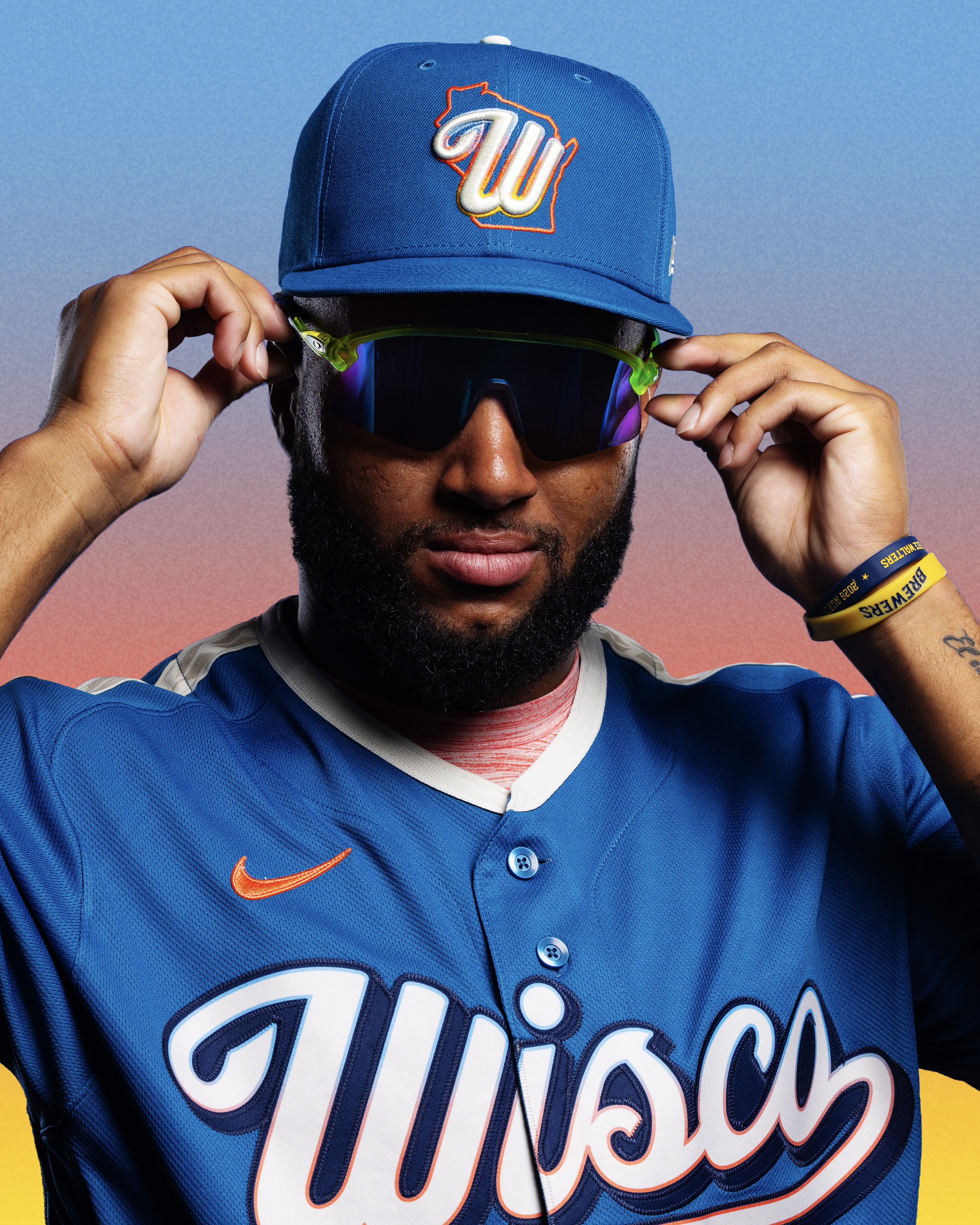
The "Wisco Way" City Connect was unveiled in April 2026 as Milwaukee's second entry in the program, and it is the most conceptually loaded jersey they own. It abandons navy and gold entirely for a blue base inspired by Wisconsin's lakes and rivers, with cream accents for the sandy shorelines and a sunset gradient of orange, yellow, and blue running through the wordmark, number trims, and sleeve patches. "Wisco" is splashed across the chest in a custom script nodding to old American Association lettering, supper-club signage, and vintage brewery labels, with "Forward" sewn into the collar. There is a wheat-braid accent for the state's farms, a Barrelman sleeve patch, and a jock tag reimagining the first City Connect's grill as a fishing bobber. It gets roughly 15 Friday home games.
It grades a D-, and the problem is right there in that description. There is something cool buried in here, and individually a lot of these ideas are charming, but there is so much going on that the thing stops reading as a baseball jersey. A sunset gradient, a custom script, a wheat braid, a Barrelman patch, and a bobber jock tag are five different stories competing on one uniform, and abandoning navy and gold means none of it even reads as Milwaukee from the stands. This is a design that would work beautifully as a poster. On the field it is a mess.
4. Navy Alternate
The navy alternate is the closest thing the Brewers have to a hard rule. It is a navy jersey built around the franchise's heritage ball-in-glove logo, the famous "m" and "b" hidden inside a fielder's mitt, with gold accents and the matching navy ball-in-glove cap. It is the standing Sunday uniform, worn both at home and on the road.
It grades a C-. The jersey is fine, and it is hard to be too hard on anything carrying that logo, which remains one of the great pieces of design in American sports. But the execution looks cheap to us. Navy with gold accents is about as safe as an alternate gets, the whole thing feels thin next to the cream and powder blue sets, and it leans entirely on the crest to do the work rather than being a well-built uniform in its own right. Giving the ball-in-glove a standing weekly slot is smart. It deserves a better jersey around it.
3. White Pinstripe Home Alternate
The white pinstripe is the cream home's running mate at American Family Field. It shares the same styling, "Brewers" across the chest in navy block lettering trimmed in gold and the ball-in-glove crest, but on a crisp white base laced with navy pinstripes. There is no fixed rule splitting it from the cream; the two rotate through a homestand by feel.
It grades a C+. It is fine, and that is about the strongest thing we can say. The pinstripes give it a slightly sharper edge than a plain white would have, but next to the cream it just looks like the less interesting version of the same idea, and it is frankly a bit boring. The warmth of the cream is what makes the ball-in-glove and the gold trim sing, and swapping to a bright white drains some of that out. A perfectly acceptable home uniform that never gave us a reason to look twice.
2. Cream Home
The cream home is the Brewers' signature look and the one most fans picture: a warm off-white base with "Brewers" arched across the chest in navy block lettering trimmed in gold, navy and gold piping, and the navy cap carrying the modernized ball-in-glove. Choosing cream over a bright white gives it a throwback warmth that pairs naturally with the retro crest. It takes the bulk of every homestand.
It grades a B, and it is the best of the home looks by a clear margin. The cream base is doing real work here, giving the navy and gold something warmer to sit against and making the ball-in-glove feel like the heritage mark it is rather than a logo bolted onto a modern uniform. It is clean, classic, and unmistakably Milwaukee, which is more than the City Connect can claim. It falls short of the powder blue only because it is the safe version of a good idea rather than a genuinely exciting one.
1. Powder Blue Road
This is the big one for 2026. Milwaukee retired the traditional road grays outright and brought powder blue back as the primary road uniform, a direct revival of what the franchise wore from 1970 into the mid-1980s. The new version runs "Milwaukee" arched across a powder blue base in navy block lettering outlined in gold, with the numbers mirroring that navy-and-gold treatment, paired with the navy cap carrying a yellow front panel and the ball-in-glove crest.
It grades an A, and it is the only genuinely great uniform the Brewers own. The jersey is excellent and the helmet is the piece that seals it, the yellow front panel giving the whole look a jolt most road sets never get near. Powder blue is a nostalgia play that a lot of clubs run as a once-a-week novelty, and Milwaukee had the nerve to make it the everyday road uniform instead. That is the right call. It is instantly one of the most distinctive road looks in the National League, and it is the only jersey here that made us want to see more of it.
Why Do the Brewers Sometimes Wear Pinstripes and Sometimes Not?
Because there is no rule. The cream home and the white pinstripe home alternate simply rotate through a homestand by feel, with no fixed day separating them, which is genuinely odd for a club that otherwise runs a tidy schedule. The navy alternate owns Sundays and the Wisco City Connect owns Friday home games, but the cream and the pinstripes just trade off. If you are trying to predict which one shows up on a given afternoon, the Brewers uniform calendar is the honest answer.
Every Brewers Jersey in 2026, at a Glance
1. Powder Blue Road — A · most away games
2. Cream Home — B · most home games
3. White Pinstripe Home Alternate — C+ · home games, no fixed day
4. Navy Alternate — C- · Sundays, home and road
5. Wisco City Connect — D- · Friday home games
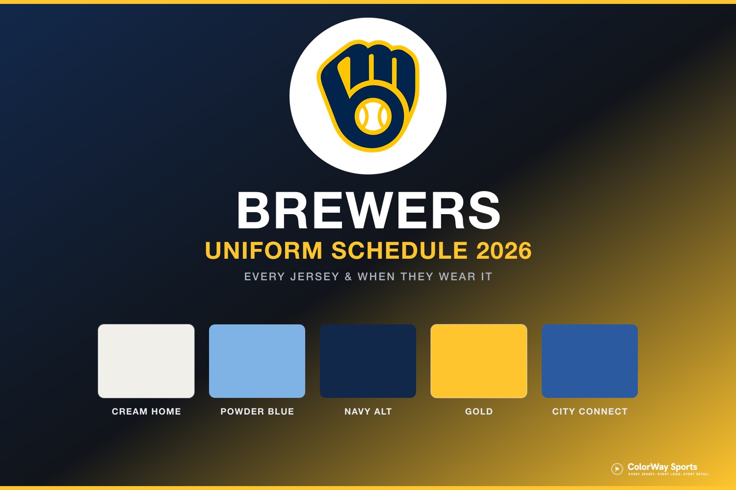
For which look comes out on which day, the Brewers uniform schedule maps the full 2026 rotation, and the Brewers uniform calendar shows every jersey they have actually worn this season, game by game. If you want the same treatment for the rest of the league, we have ranked every Twins jersey, every Cubs jersey, and every Cardinals jersey, and the full 2026 City Connect ranking puts the Wisco kit against all 29 other clubs.
The Bottom Line on the Brewers Jersey Rankings
We will be honest: we do not love the Brewers' jerseys. This is a closet with one standout and a lot of filler, and the standout only exists because the club made a bold call and killed its road grays.
The powder blue is genuinely excellent, helmet included, and it is the sort of swing more teams should take. The cream home is a good, safe uniform that the warm base elevates. After that it thins out fast: the white pinstripe is the duller twin of the cream, and the navy alternate leans on the ball-in-glove, one of the best logos in sports, without building a jersey worthy of it.
And the Wisco City Connect is the clearest example of a design with too many ideas. Individually a lot of them are charming. Stacked onto one jersey, with navy and gold thrown out entirely, they add up to something that barely looks like a baseball uniform, let alone a Milwaukee one.
Frequently Asked Questions
What is the best Brewers jersey for 2026?
We rank the powder blue road uniform No. 1 with an A. It revives the look the franchise wore from 1970 into the mid-1980s, carries "Milwaukee" in navy and gold, and pairs with a navy cap with a yellow front panel. It replaced the road grays outright for 2026.
How many uniforms do the Brewers have in 2026?
Five: the cream home, the white pinstripe home alternate, the powder blue road, the navy ball-in-glove alternate, and the Wisco City Connect.
Did the Brewers get rid of their road grays?
Yes. Milwaukee retired the traditional gray road uniform ahead of 2026 and replaced it with the powder blue set as the primary road look. The gray "Milwaukee" road jersey is no longer worn.
What is the Brewers City Connect called?
The "Wisco Way" kit, with "Wisco" across the chest. Unveiled in April 2026, it drops navy and gold for a blue base with a sunset gradient, and is worn for roughly 15 Friday home games.
When do the Brewers wear the ball-in-glove navy jersey?
Sundays, both at home and on the road. It is the closest thing the Brewers have to a fixed weekly uniform slot.