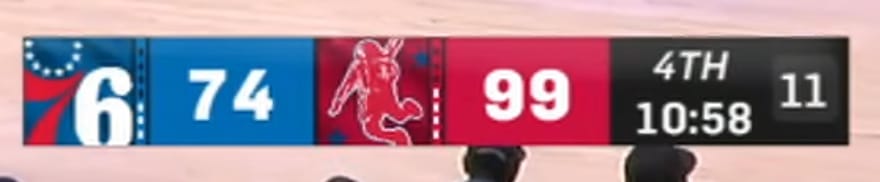
Screenshot via YouTube
The Houston Rockets local broadcast scorebug for the 2026 NBA season goes for a modern, stripped-down look that fits the direction the franchise has been heading with their overall rebrand. It is clean and readable, which honestly puts it ahead of a lot of other local scorebugs around the league. But clean does not always mean interesting, and this one sits right on the line between polished and forgettable.
The layout is straightforward. Team logos, abbreviations, and scores are all easy to read at a glance. The color blocking uses the Rockets' red and black palette without overdoing it, which keeps the bug from feeling too heavy on screen. The quarter indicator and game clock are positioned well enough that you never have to hunt for them. From a pure information design standpoint, it does everything it needs to do.
Where the Rockets scorebug falls short is in personality. There is nothing about this design that screams Houston basketball. It could be any team's scorebug with a different color swap, and you would not think twice. The Rockets have leaned into a more minimalist brand identity over the past few years, and the broadcast graphics reflect that. The problem is that minimalism works best when there is at least one distinctive element anchoring the design, and this one does not have that.
The typography is fine without being memorable. The spacing is solid without being creative. It checks every box on the functional side and none on the style side.
Grade: B
Modern and functional, but kind of boring. It fits the Rockets rebrand direction and does the job without leaving any impression. A little more personality would push this into the upper tier.