Screenshot via YouTube
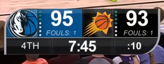
The Phoenix Suns local broadcast scorebug for the 2026 NBA season feels like it belongs to a different era of the franchise. The Suns have invested heavily in rebranding over the past few years with updated logos, new court designs, and a sharper overall visual identity. But the scorebug has not kept pace with any of that. It looks outdated compared to what the team is doing everywhere else.
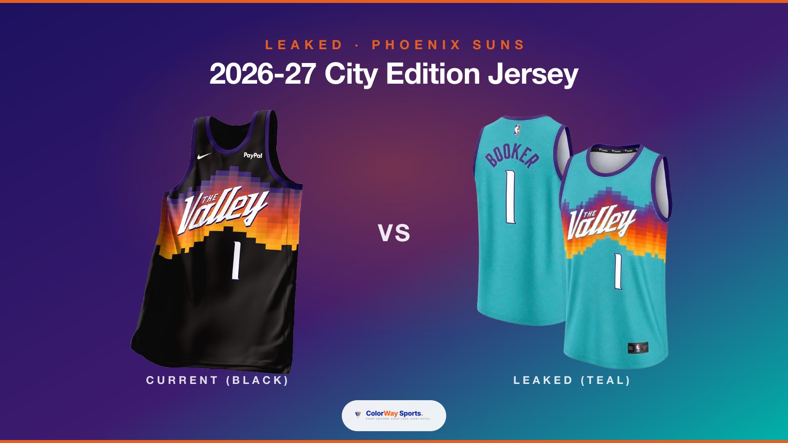
The layout itself is serviceable. Scores are easy to read, team logos are clear, and the game clock and period information are positioned in logical spots. The Suns' purple and orange color scheme is present, but it is used in a flat, unimaginative way that does not capture the energy those colors can bring. When you see how the Suns use their sunburst motifs and gradient treatments on their uniforms and arena branding, and then you look at this scorebug, the disconnect is obvious.
The design feels like it was built a few years ago and never updated. There is a stiffness to the typography and the overall structure that does not match the modern, dynamic direction the Suns brand has been moving. Other teams around the league have refreshed their broadcast graphics to match their rebrands, and Phoenix has not done that yet. It makes the local broadcast feel a step behind the national broadcasts and the in-arena experience.
Readability is not an issue. The proportions are fine. It does the basic job without failing at anything. But for a franchise that has put this much effort into their visual identity refresh, the scorebug sticking with an older design language is a noticeable gap.
Grade: B-
Feels outdated. Phoenix has rebranded across the board but the broadcast graphics have not kept up. The Suns deserve a scorebug that matches the energy of their current visual identity.