Two new Timberwolves logos have leaked, and if they're real, Minnesota is heading in the right direction.
Leaked wolf logo via u/Impossible_Low_2539 on r/timberwolves
Leaked MINN alternate logo via u/Impossible_Low_2539 on r/timberwolves
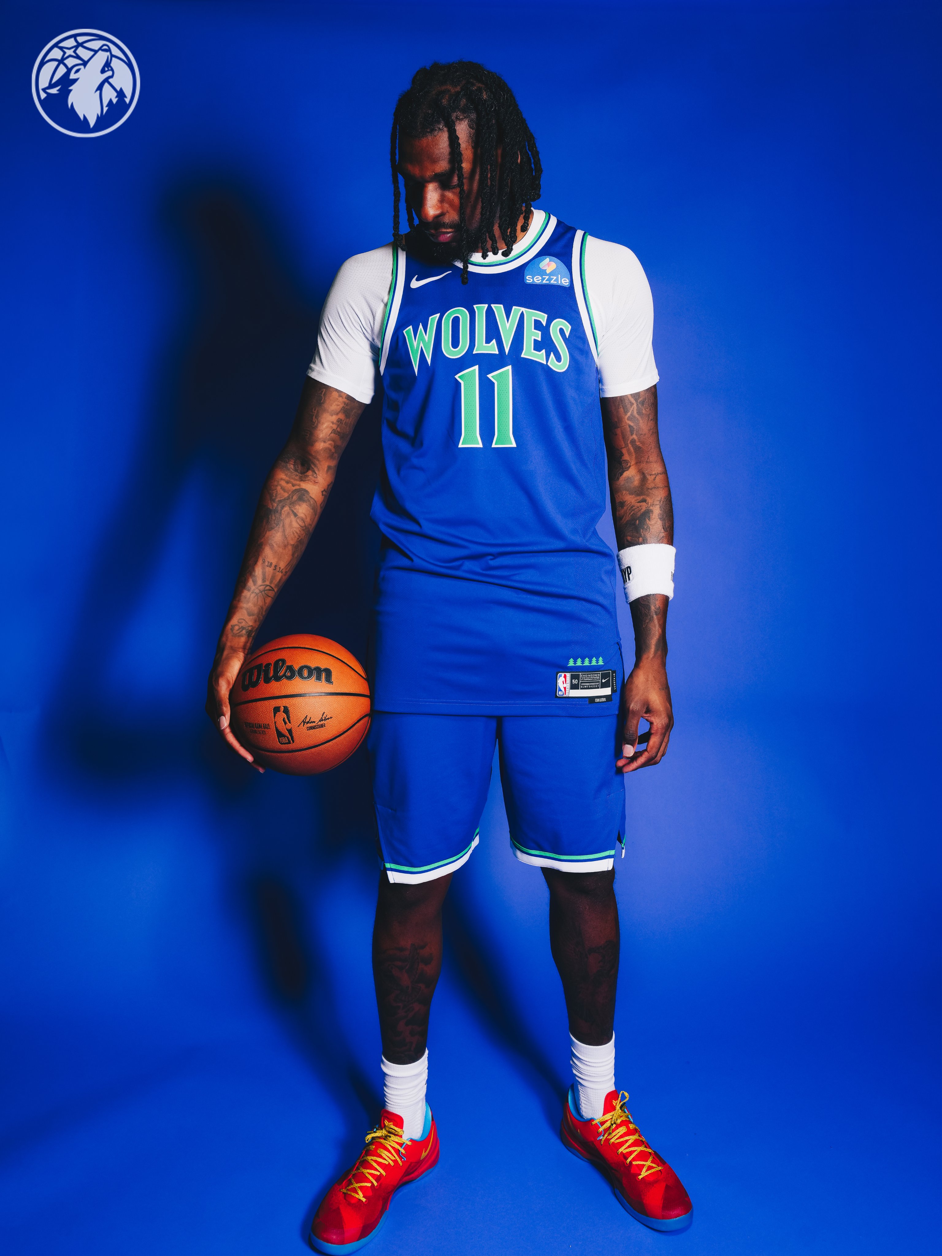
The photos surfaced on the Timberwolves subreddit and show two new marks: a modernized wolf head inside a basketball circle, and a "MINN" alternate logo with the same design language. Both feature the classic blue and green color scheme that defined the franchise during the Kevin Garnett era.
The Colors Are the Story
The current Timberwolves branding has felt sterile for a while. The navy and muted green never had the same energy as the originals. These leaked logos bring back the brighter, more vibrant blue and green that made the T-Wolves identity stand out in the first place.
If the logos are real, new jerseys are almost certainly coming with them. And if they take any cues from the hardwood classic jerseys the team has already worn, they're going to be solid.
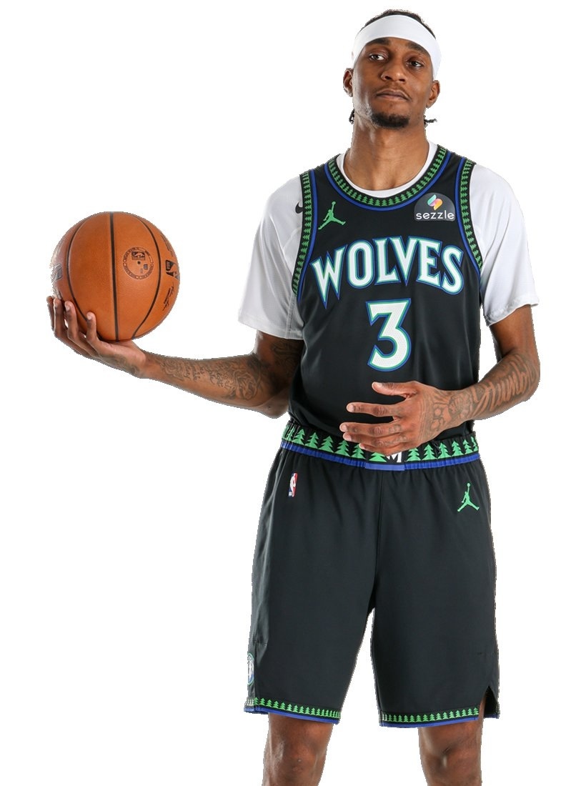
Timberwolves Hardwood Classic Edition jersey via NBA Store
That hardwood classic look has the right idea. The bright green and blue together, the clean layout, the throwback font. If the full rebrand carries that same energy with updated versions of the classic KG-era colors, this could be one of the better uniform overhauls in the league.
The Verdict
Nothing official yet, and these could always turn out to be mock-ups. But if they're legit, the Timberwolves are making the right call. Go back to what worked. The classic blue and green is the identity of this franchise, and it's been missed.
This feels like a step in the right direction.