A World Cup emblem is the first thing the tournament says about itself — the mark that ends up on the ball, the badge, the broadcast, and a billion screens before a single match is played. For the first four decades, host nations just made posters. FIFA did not standardize a single official logo until Mexico 1970, and from 2026 onward it is locking the whole thing into a fixed template. That makes right now — the end of the bespoke era — the perfect moment to rank all 23 of them.
Below is every official World Cup emblem from 1930 to 2026 — first walked through era by era, then laid out in full chronological order, then ranked best to worst. We judge them purely as design: how iconic, how clean, how well each captures its host, and how it reads decades later.
The six eras of World Cup design
The poster era (1930–1950). The first tournaments had no logo at all, just commissioned artwork. Uruguay 1930 set an impossibly high bar with Guillermo Laborde's art-deco goalkeeper flinging himself at a save — a genuine piece of period art. The 1934, 1938, and 1950 editions followed the same poster tradition, with Brazil 1950 usually counted as the first "official" emblem even though it still behaves like a billboard.
The national-identity era (1954–1966). Hosts kept full creative control, and the results swung wildly. Switzerland 1954 produced the first design that truly works as a logo — a red ball with the white Swiss cross, ringed by the tournament name in three languages. England 1966 became the first to put the trophy inside the mark, wrapped in the Union Jack and three lions.
The unified modern logo (1970–1990). Mexico 1970 is the turning point: FIFA's first standardized official logo, and still one of the cleanest ever drawn. The graphic confidence ran through Argentina 1978's sweeping sky-blue arcs and Italy 1990's geometric football.
The globe-and-ball era (1994–2006). The formula became the ball plus the flag plus the globe. USA 1994 fused the ball with the Stars and Stripes; France 1998 floated it over the horizon; Korea/Japan 2002 bent the zeros into an infinity symbol for the first two-host tournament; Germany 2006 went with laughing faces.
The vibrant era (2010–2022). The high point. South Africa 2010, Brazil 2014, Russia 2018, and Qatar 2022 each ditched clean geometry for expressive, culturally rooted, motion-ready marks pulled from flags, folk art, and local craft. Four of the best emblems in the tournament's history landed back to back.
The template era (2026– ). For 2026, the actual trophy appears inside the intertwined "2" and "6" of the year — and FIFA has declared this the structure for every World Cup from here on, with only the date and some city-specific color changing. Consistency in, bespoke identity out.
Every World Cup Logo, In Order (1930–2026)
Every official emblem in chronological order, from the poster era through the 2026 template — the full visual sweep of the tournament's identity.
1930 · Uruguay
1934 · Italy
1938 · France
1950 · Brazil
1954 · Switzerland
1958 · Sweden
1962 · Chile
1966 · England
1970 · Mexico
1974 · West Germany
1978 · Argentina
1982 · Spain
1986 · Mexico
1990 · Italy
1994 · USA
1998 · France
2002 · Korea/Japan
2006 · Germany
2010 · South Africa
2014 · Brazil
2018 · Russia
2022 · Qatar
2026 · USA · Canada · Mexico
Our Ranking, Best to Worst
Design is subjective, so treat this as the opening argument rather than the last word. Brazil's 2014 hands and South Africa's 2010 figure lead for us, with England 1966 and the bold modern marks just behind — and the early poster-era entries bringing up the rear.
2014 · Brazil
Three interlocking hands cupping the trophy in Brazilian green and gold — the first World Cup emblem designed for motion.
2010 · South Africa
A figure stretching for the ball in fluid ribbon strokes, the ball sitting in the negative space, in the vivid colors of the flag and African textile art.
1966 · England
The first logo to feature the trophy, set on the Union Jack with the three lions — unmistakably British.
2018 · Russia
The trophy silhouette filled with red, blue, and gold drawn from Russian folk art and the country's space history.
2022 · Qatar
An unbroken loop reading as both an 8 and an infinity symbol, shaped like a Gulf woollen shawl, in deep maroon.
1970 · Mexico
FIFA's first unified official logo — simple, graphic, and the first to feature the Adidas Telstar ball.
1978 · Argentina
Two sweeping arcs of sky blue and white around a ball, reading at once as cupped hands, raised arms, and a stadium bowl.
1954 · Switzerland
The first design that truly works as a logo: a red ball with the white Swiss cross, ringed by the tournament name in three languages.
1930 · Uruguay
Guillermo Laborde's art-deco goalkeeper mid-save — a genuine piece of period artwork that opened the whole tradition.
1990 · Italy
An abstract football built from green, red, and black geometric panels with sharp angular 'Italia 90' type.
1998 · France
The ball rising like a sun over the globe's horizon, in the French tricolor.
2006 · Germany
'Celebrating Faces of Football' — three laughing faces, two forming the 0 and 6 of the year, in the German flag's colors.
2002 · Korea/Japan
A fluid trophy with the zeros of 2002 bent into an infinity symbol for the first two-host tournament.
1986 · Mexico
A red-and-white ball between two halves of the globe under the line 'the world united by the ball.'
2026 · USA · Canada · Mexico
The trophy inside the intertwined '2' and '6' — the first time the actual trophy appears, and the template for every future tournament.
1974 · West Germany
Bold type, the German flag's stripes, and a framed sphere, marking the debut of the new trophy that year.
1962 · Chile
A double-read of a stadium seen from above and a globe, with the Chilean flag planted in the middle.
1994 · USA
The ball fused with the American flag, stars across the top and red-and-white stripes waving underneath.
1950 · Brazil
Often credited as the first official emblem, though it still behaves like a promotional poster.
1982 · Spain
A football trailing a streak of red and yellow — clean but plain; Joan Miró's official poster did the memorable design work that year.
1934 · Italy
A host-designed promotional poster from the pre-logo era, very much of its 1930s moment.
1938 · France
Another poster-era entry — period artwork for the last World Cup before the war.
1958 · Sweden
The 'VM' lettering with a player and ball, reading more like an event flyer than a fixed identity.
The bottom line
The arc is unmistakable: World Cup design went from commissioned posters, to host-by-host experiments, to one clean global mark in 1970, to a vibrant, culturally specific golden age across 2010–2022 — and now, with 2026, into a locked template that will repeat for decades. The emblems that age best are the ones unmistakably about their host rather than a formula: Brazil's interlocking hands, South Africa's leaping figure, the bold marks of Russia and Qatar, and the timeless simplicity of Mexico 1970. The 2026 mark is clean and handsome, but it is also the last bespoke-feeling cover before the template takes over — which may make this the final ranking like it we ever get to write.
Frequently Asked Questions
What was the first official World Cup logo?
Mexico 1970 was the first unified official FIFA World Cup logo. Before that, host nations produced promotional posters rather than reusable marks — Uruguay 1930's art-deco goalkeeper is the most famous. Switzerland 1954 is usually credited as the first design that truly functions as a logo, but it was not yet a FIFA-standardized identity.
What is the best World Cup logo of all time?
It is subjective, but our ranking puts Brazil 2014 first — three interlocking hands cupping the trophy in green and gold — followed by South Africa 2010 and England 1966. The bold, culturally specific modern marks (Russia 2018, Qatar 2022) and the timeless Mexico 1970 round out the top tier, while the early poster-era designs sit at the bottom.
What does the 2026 World Cup logo look like?
The 2026 emblem shows the World Cup trophy inside the intertwined numerals "2" and "6," the first time the actual trophy image has appeared in the official mark. FIFA has announced this as a permanent template for future tournaments, with only the year and city-specific color variations changing going forward.
Why do World Cup logos look so different from each tournament to the next?
Until 2026, every World Cup emblem was designed bespoke for its host nation, so each one reflected local color, culture, and design trends of its era. That is why the 1970, 1990, and 2010 marks look nothing alike. From 2026 onward, FIFA is standardizing a single template, so future emblems will look far more consistent.
Which World Cup had the most colorful logo?
South Africa 2010 is the most vibrant, built from the bright blue, green, red, orange, and gold of the South African flag and African textile art. The 2002, 2006, and 2026 marks are also notably colorful, but 2010 set the standard for the expressive modern era.
What is the worst World Cup logo?
It is subjective, but the early poster-era artwork and the busiest mid-century efforts tend to land at the bottom of most rankings, ours included — Sweden 1958's event-flyer layout is a frequent pick for the weakest of all. They were never designed to work as reusable logos the way the modern emblems are.
More 2026 World Cup design coverage
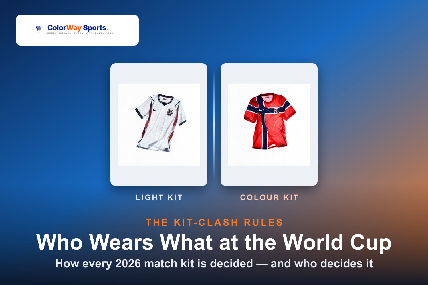
See our live match-by-match jersey tracker grading every kit pairing of the tournament, our breakdown of how each team's match kit is actually chosen, and our review of the 2026 World Cup broadcast scorebug.
Emblem design details compiled from public design retrospectives and tournament archives. Grades and rankings are ColorWay Sports editorial opinion.