Every MLB team has its own local broadcast, and every local broadcast has its own scorebug. Or at least that is how it should work. The reality in 2026 is that a huge chunk of the league shares the exact same scorebug template because they are on the same regional network. The teams that invest in their own broadcast look and feel stand out immediately. The rest blend together.
We grabbed every local scorebug in baseball and organized them into three groups: teams with their own unique designs, teams sharing the NBC Sports template, and teams on the FanDuel Sports Network template.
This is local broadcasts only. We will cover the national scorebugs (ESPN, Fox, NBC, Netflix, Apple TV+) in a separate post.
Update · April 2026
The White Sox went off-script and ran a custom Kids Day scorebug at Rate Field this April. We graded the alternate package separately since this post tracks regular-season looks only.
Teams With Their Own Scorebug
These are the teams that either have their own broadcast network or have a scorebug that actually feels like it belongs to their team. Ranked from our favorite to least favorite.
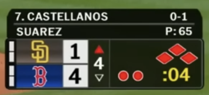
1. Chicago White Sox (NBC Sports Chicago)
The White Sox scorebug is the most unique one in baseball right now. NBC Sports Chicago did their own thing here instead of using the standard NBC Sports template that the Giants, A's, and Phillies share. The layout and feel are completely different from anything else in the league. This is what it looks like when a team's broadcast actually tries to stand out.
2. New York Yankees (YES Network)
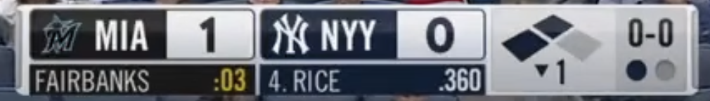
The YES Network scorebug is timeless. It does not try to be flashy. It does not try to reinvent anything. It gives you the score, the count, the pitcher, the batter, and gets out of the way. The navy and white color scheme matches the Yankees brand perfectly. This scorebug could run for another 20 years and still look right.
3. New York Mets (SNY)
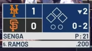
SNY has a distinctive scorebug that stacks the teams vertically with the diamond indicator and pitcher/batter info below. The orange and blue Mets colors come through strong. It is one of the more unique layouts in baseball and it feels like a Mets broadcast the second you see it.
4. Chicago Cubs (Marquee Sports Network)
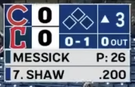
The Marquee scorebug stacks the teams vertically with the pitcher, batter average, count, and outs. It is a clean layout and the fact that the Cubs built their own network means they have full control over the design. We like the structure of this one.
5. Atlanta Braves (FanDuel Sports Network South)
The Braves technically air on FanDuel Sports Network but their scorebug feels more custom than most teams on that network. The navy background with the team logo, batter info with the batting average, and pitch count give it a more complete feel. It has personality that the other FanDuel teams do not have.
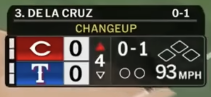
6. Texas Rangers (Bally Sports Southwest)
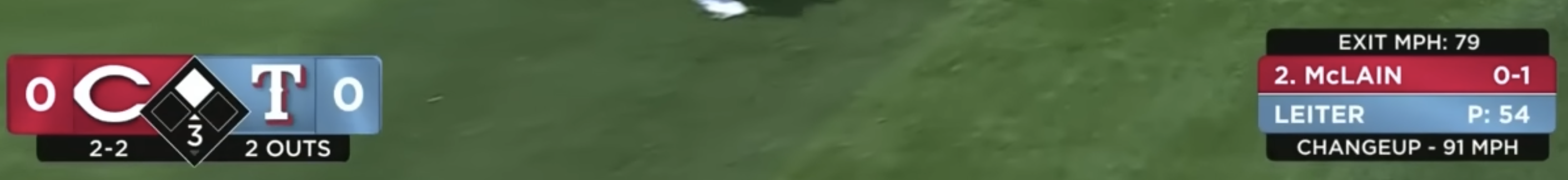
The Rangers scorebug stretches across the entire bottom of the screen with the score on the left and the pitch info on the right. The diamond-shaped base indicator sits in the center. It uses the full width of the broadcast without feeling cluttered. Nobody else in baseball uses this much screen real estate for their scorebug and it works.
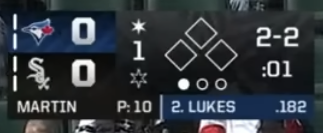
7. Toronto Blue Jays (Sportsnet)
The Blue Jays broadcast on Sportsnet has one of the cleanest scorebugs in baseball. The layout is simple, the information is easy to read, and the Sportsnet logo sits nicely in the corner without taking over. Everything you need is right there and nothing you do not.
8. Houston Astros (Space City Home Network)
The Astros have their own network and their own scorebug to go with it. Space City Home Network keeps it compact and horizontal with everything you need in a tight layout. The fact that it is their own design and not a shared template already puts it ahead of most teams.
9. Boston Red Sox (NESN)
The NESN scorebug has been solid for years. The dark background with the team logos stacked vertically and the batter info is clean and functional. NESN knows what they are doing and they do not mess with it.
10. Pittsburgh Pirates (SportsNet Pittsburgh)
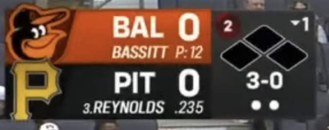
The Pirates scorebug has a dark background with the team logos, the diamond indicator, and the batter info at the bottom. It comes together nicely. Pittsburgh does not get enough credit for having one of the better local broadcasts in baseball.
11. Baltimore Orioles (MASN)
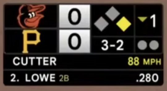
The MASN scorebug is taller and more vertical than most, but it works. The team logos at the top with the score beneath, then pitch info and batter stats below. It packs a lot of data into the space.
12. Los Angeles Dodgers (Spectrum SportsNet)
This one is personal for us because we are Dodger fans. We already did a full breakdown of the Spectrum SportsNet scorebug earlier this season and it is fine, but that is the problem. It is just fine. The Dodgers are one of the biggest brands in sports and their scorebug looks like it could belong to any team. It reminds us of the Spectrum SportsNet Lakers scorebug. Same network, same generic feel. We wish Spectrum would lean into the Dodgers brand more. Give us more blue, more personality, something that makes you feel like you are watching the Dodgers and not just another LA sports broadcast.
The NBC Sports Template
These teams all air on NBC Sports regional networks and share a similar scorebug layout. The designs have slight variations in color but the template is the same.
Same template, different team colors.
San Francisco Giants (NBC Sports Bay Area)
Oakland Athletics (NBC Sports California)
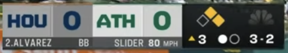
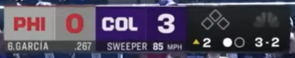
Philadelphia Phillies (NBC Sports Philadelphia)
The FanDuel Sports Network Template
This is the biggest issue with local scorebugs in 2026. FanDuel Sports Network (formerly Bally Sports) and other shared regional networks broadcast for a huge chunk of the league and most of them use the same basic scorebug layout with minor color swaps. If you can swap the logos and colors and the scorebug looks identical, that is a design failure.
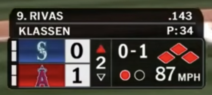
Los Angeles Angels (FanDuel Sports Network West)

The Angels version is the one exception on this network. It stretches across the bottom with the batter name and pitch info on top. The layout is different enough from the standard FanDuel template that it deserves a callout.
The rest of these are all the same scorebug with different team colors. Same template. Same layout. Different logo.
Tampa Bay Rays (FanDuel Sports Network Sun)
Milwaukee Brewers (FanDuel Sports Network Wisconsin)
Cincinnati Reds (FanDuel Sports Network Ohio)
Miami Marlins (FanDuel Sports Network Florida)
Cleveland Guardians (FanDuel Sports Network Great Lakes)
Minnesota Twins (FanDuel Sports Network North)

St. Louis Cardinals (FanDuel Sports Network Midwest)
Detroit Tigers (FanDuel Sports Network Detroit)

Kansas City Royals (FanDuel Sports Network Kansas City)

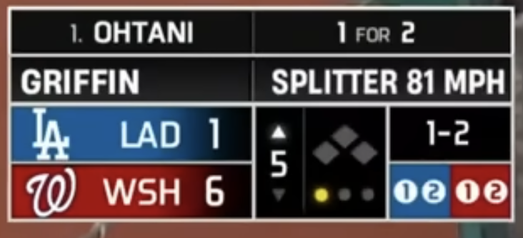
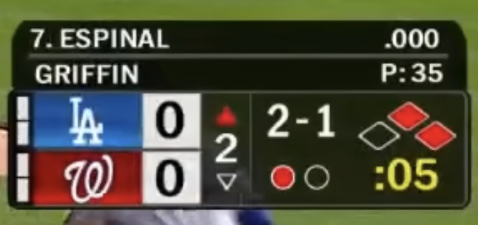
Washington Nationals (MASN)
Seattle Mariners (Root Sports)
Arizona Diamondbacks (DBACKS.TV)
Colorado Rockies (DNVR/MLB Local)
San Diego Padres (SDPN/MLB Local)
The Breakdown
Half the league does not have its own scorebug. That is the state of baseball broadcasting in 2026.
Our Take
The best local scorebugs in baseball are the ones that feel like they belong to the team. When you turn on a White Sox broadcast, it looks different from everything else. When you turn on YES, you know it is the Yankees. That is what a scorebug should do. It should be part of the team's identity, not a generic template with a logo swap.
The FanDuel Sports Network situation is the worst thing happening in baseball broadcasting right now. Almost a third of the league shares the same scorebug. That means a Guardians fan, a Marlins fan, a Cardinals fan, and a Tigers fan are all watching the same broadcast graphics every night. These teams have completely different identities, completely different color schemes, and completely different histories. Their scorebugs should reflect that.
We get that regional sports networks are a business and standardizing saves money. But baseball is a visual sport. The broadcast is how most fans experience the game. If you are going to put your team on TV 162 times a year, the least you can do is make the scorebug feel like it belongs to your city.