 Screenshot via YouTube
We went through every NBA local broadcast and grabbed screenshots of all 30 scorebugs for the 2026 season. The results tell you a lot about the state of regional sports networks right now. Almost half the league (13 teams) shares the exact same FanDuel Sports Network scorebug template with different team colors swapped in. Another 4 teams share the NBC Sports template. That leaves only 13 teams in the entire NBA with a truly unique local broadcast scorebug.
We ranked every unique scorebug from best to worst, then broke down the two big network groups separately.
Unique Scorebugs Ranked
1. New York Knicks (MSG) - A-
Screenshot via YouTube
MSG continues to be one of the best regional sports networks in the country when it comes to broadcast design. The Knicks scorebug is clean, easy to read, and feels like it belongs on a premium broadcast. The layout gives you everything you need without cluttering up the screen.
2. Brooklyn Nets (YES Network) - A-
 Screenshot via YouTube
YES Network has always put out strong broadcast graphics, and the Nets scorebug keeps that standard going. The design is sharp and modern with good use of contrast. It sits nicely in the corner and never gets in the way of the action.
3. Dallas Mavericks (Own Broadcast) - A-
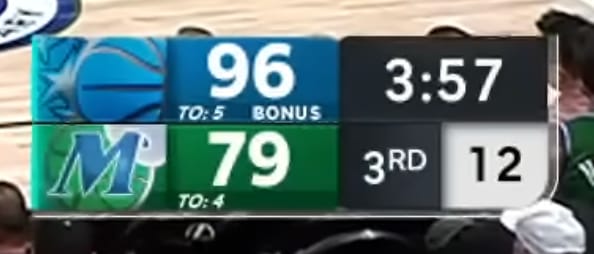 Screenshot via YouTube
The Mavericks have one of the best-looking scorebugs in the league this season. The incorporation of the team logo into the graphics package gives it a polished, branded feel that most teams do not pull off this well. Dallas clearly put some thought into how this looks on screen.
4. Chicago Bulls (NBC Sports Chicago) - B+
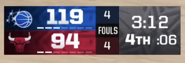 Screenshot via YouTube
NBC Sports Chicago runs a clean scorebug that does exactly what it needs to do. The design is simple and readable, and the Bulls branding comes through without being overdone. It is a step above the standard NBC Sports template used by other markets.
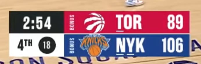
5. Toronto Raptors (Sportsnet) - B+
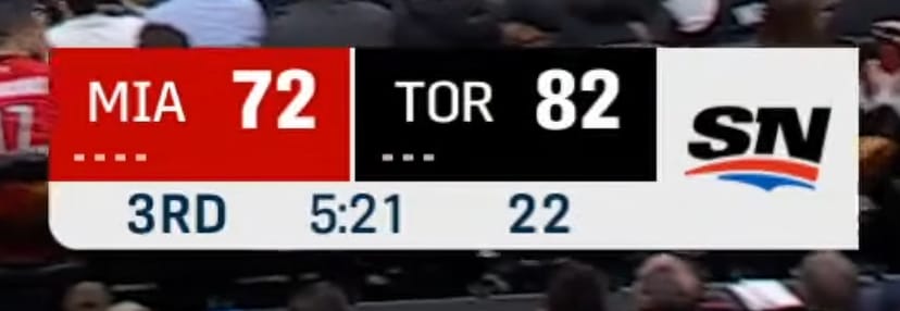 Screenshot via YouTube
Sportsnet Canada consistently puts out quality broadcast graphics across all their sports coverage, and the Raptors scorebug is no exception. The design feels modern and professional, and the Canadian networks in general tend to do a better job with on-screen graphics than most American regional sports networks.
6. Washington Wizards (Monumental Sports Network) - B+
 Screenshot via YouTube
The Wizards scorebug is one of the more underrated designs in the league this season. The modern shape, clean layout, and team colors all work well together. Washington went through a full rebrand recently, and the local broadcast graphics actually kept up. The result is a scorebug that looks current and feels intentional.
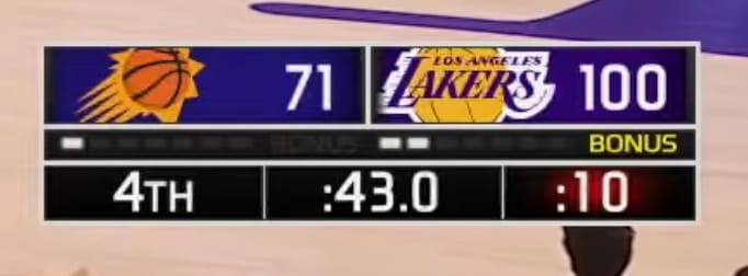
7. Los Angeles Lakers (Spectrum SportsNet) - B
 Screenshot via YouTube
The Lakers scorebug on Spectrum SportsNet is fine. It is functional, clean, and does the job. There is nothing particularly exciting about it, but there is also nothing wrong with it. For a franchise this big, you might expect something with a little more personality.
8. Houston Rockets (Own Broadcast) - B
 Screenshot via YouTube
Houston's scorebug has a modern feel to it, which fits the Rockets' recent rebrand and overall direction. The design is competent but does not do much to stand out from the crowd. It gets the job done without leaving much of an impression.
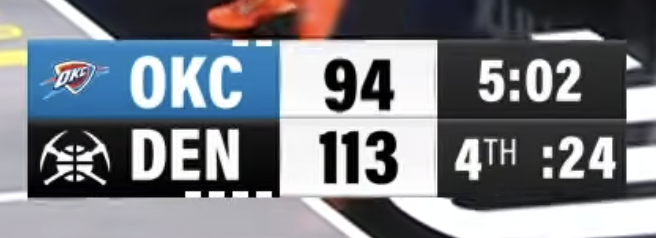
9. Denver Nuggets (Altitude) - B-
 Screenshot via YouTube
The Nuggets scorebug on Altitude is not bad, but it is not particularly interesting either. The design is straightforward and functional without any real flair. It just kind of sits there.
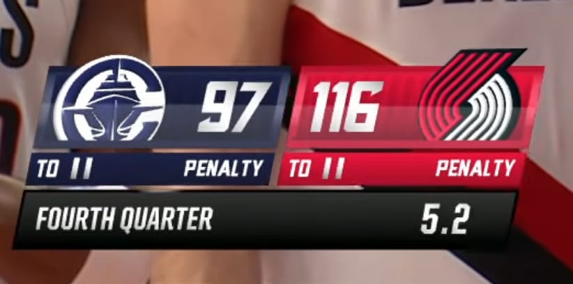
10. Portland Trail Blazers (Own Broadcast) - B-
 Screenshot via YouTube
Portland's scorebug has a look that feels like it could be a generic Fox Sports template, and it might actually be one. It is clean enough but does not feel like something that was designed specifically for the Trail Blazers brand. It works, but just barely.
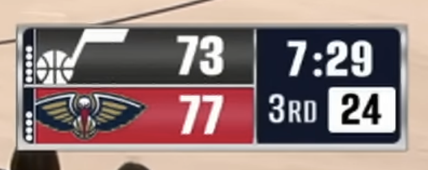
11. Utah Jazz (Own Broadcast) - B-
 Screenshot via YouTube
The Jazz scorebug is another case of a design that checks the boxes without doing anything memorable. The team colors come through fine, but the overall layout does not bring much energy to the broadcast. It is average across the board.
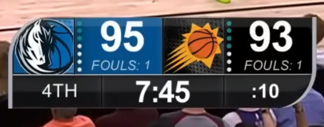
12. Phoenix Suns (Own Broadcast) - B-
 Screenshot via YouTube
The Suns scorebug feels a little outdated compared to what other teams are doing this season. Phoenix has gone through a big rebrand in recent years, but the local broadcast graphics have not quite kept up. This one could use a refresh.
13. New Orleans Pelicans (Own Broadcast) - C+
 Screenshot via YouTube
The Pelicans have one of the weaker unique scorebugs in the league. The design looks dated and does not feel like it belongs in 2026. New Orleans has such a fun brand and color scheme to work with, so it is a shame the local broadcast graphics are this plain.
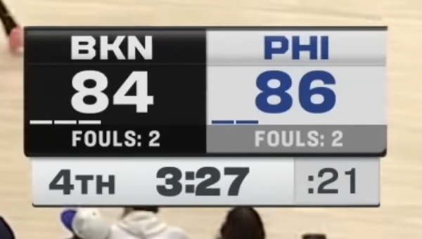
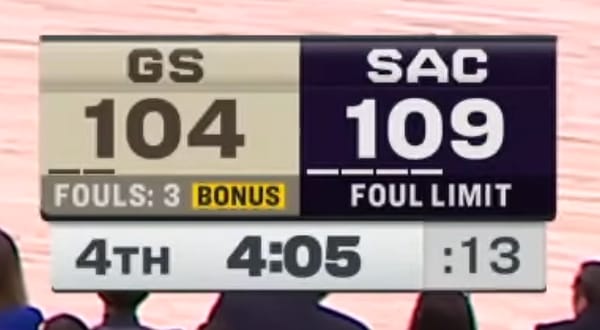
NBC Sports Group - B+
 Screenshot via YouTube
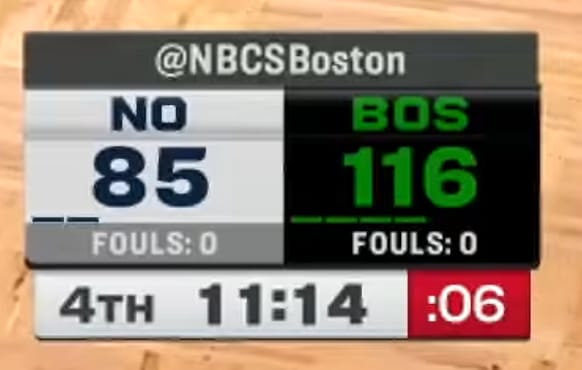
Four NBA teams currently air their local broadcasts on NBC Sports regional networks: the Boston Celtics (NBC Sports Boston), Golden State Warriors (NBC Sports Bay Area), Philadelphia 76ers (NBC Sports Philadelphia), and Sacramento Kings (NBC Sports California). All four share the same scorebug template with team-specific colors and logos swapped in.
We actually kind of like the NBC Sports scorebug. It is clean, consistent across markets, and does not take up too much screen real estate. The design is professional and easy to read, which is about all you can ask for from a shared template. Having a unified look across the NBC Sports family gives it a more polished feel than what you get on the FanDuel side of things.
 Screenshot via YouTube
 Screenshot via YouTube
 Screenshot via YouTube
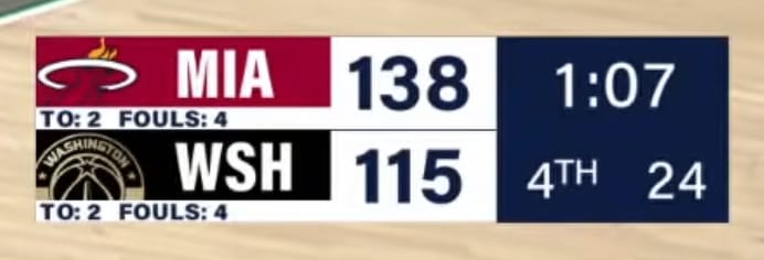
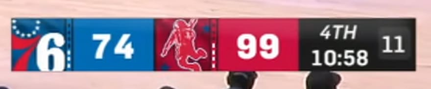
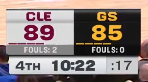
FanDuel Sports Network Group - C+
 Screenshot via YouTube
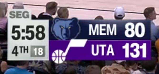
This is where things get repetitive. A whopping 13 NBA teams now share the FanDuel Sports Network scorebug template: the Atlanta Hawks, Charlotte Hornets, Cleveland Cavaliers, Detroit Pistons, Indiana Pacers, LA Clippers, Memphis Grizzlies, Miami Heat, Milwaukee Bucks, Minnesota Timberwolves, Oklahoma City Thunder, Orlando Magic, and San Antonio Spurs.
The FanDuel Sports Network scorebug stretches too far across the bottom of the screen and takes up more real estate than it should. The design is generic, boring, and gives almost no individual identity to any of the 13 teams using it. You get different team colors and logos, but the template itself is the same every time. For a league with as much visual personality as the NBA, having nearly half the teams share one uninspired scorebug template is disappointing.
 Screenshot via YouTube
 Screenshot via YouTube
 Screenshot via YouTube
 Screenshot via YouTube
 Screenshot via YouTube
 Screenshot via YouTube
 Screenshot via YouTube
 Screenshot via YouTube
 Screenshot via YouTube
 Screenshot via YouTube
 Screenshot via YouTube
 Screenshot via YouTube
What About National Broadcasts?
This post only covers local broadcast scorebugs. The national broadcast scorebugs from ESPN, NBC Peacock, and Amazon Prime Video are ranked in a separate post. Those networks have their own distinct designs that deserve their own breakdown.
Read it here: Every NBA National Broadcast Score Bug for 2026 Ranked