via the NHL
The Stanley Cup Playoffs ice logo is one of the great visual signatures the NHL has given up. For years it was painted right below each blue line on every rink, every playoff series. After the 2020 postseason the league pulled it off the ice and handed the space over to rotating digital ads. Six playoffs later the logo still has not come back, and we still think it should.
The short version of why it disappeared: digital ad inventory. The NHL replaced the physical Stanley Cup Playoffs logo with virtual sponsor placements that change shot to shot, generate more revenue per game, and make every playoff broadcast look exactly like a regular-season broadcast. That trade is what this post is about.
What the Stanley Cup Playoffs Ice Logo Used to Look Like
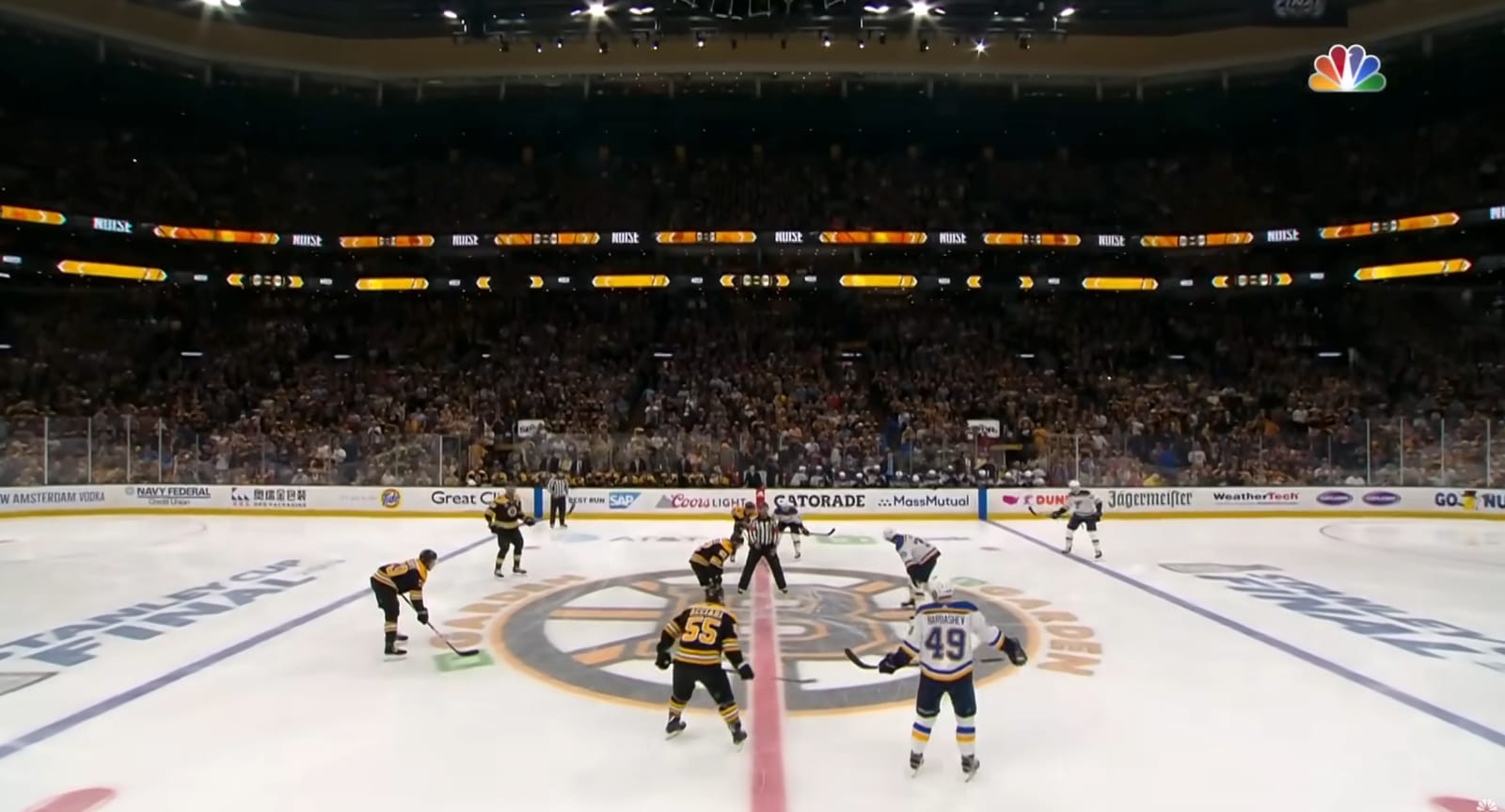
For more than a decade the Stanley Cup Playoffs ice logo was painted directly on the ice surface below each blue line at every NHL postseason rink. It was one of the first things you noticed when a playoff game started. You turned on the TV and immediately knew this was not a regular-season game. The logo on the ice changed the entire feel of the broadcast. It made the playoffs feel like an event. We covered the full era-by-era ranking of the championship branding in our Stanley Cup Final logo history 1989-2026 breakdown.
via NBC Sports
Look at that. The Stanley Cup Final logo right there on center ice at TD Garden during the 2019 Blues-Bruins series. It's massive, it's visible on every faceoff, and it tells you exactly what you're watching. You didn't need to check the scorebug to know this was the Stanley Cup Final. The ice told you. That kind of branding turns a hockey game into an event.
What the Ice Looks Like Now
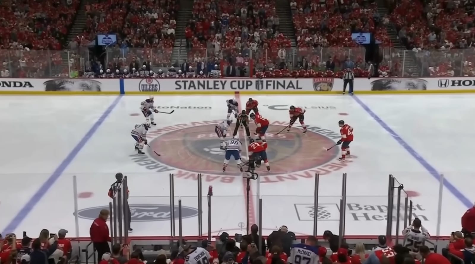
After 2020, the NHL pulled the Stanley Cup Playoffs logo off the ice and replaced the space with digital advertising. The same spots below each blue line that used to read "Stanley Cup Playoffs" now rotate through sponsor ads that change mid-play. The result is a playoff game that looks exactly like a regular-season game. Nothing on the ice surface tells you this is the postseason.
via NHL broadcast
Compare that to a recent Stanley Cup Final broadcast. The "Stanley Cup Final" text is on the boards above the ice, but the ice surface itself is cluttered with sponsor logos and digital ads. The physical playoff branding below the blue lines is gone. It doesn't hit the same way. The NHL is the only major professional sports league in North America that doesn't display a postseason logo on its playing surface during the playoffs. The NBA puts the Playoffs logo on the court. MLB puts the World Series logo behind home plate. The NFL puts the conference and Super Bowl logos on the field. The NHL has nothing. That's a branding failure.
The Old Presentation Was Better
via NBC Sports
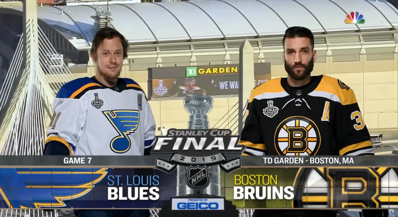
Look at that 2019 Stanley Cup Final Game 7 broadcast graphic from NBC. Blues vs. Bruins at TD Garden. The Stanley Cup Final logo front and center. The jersey patches clearly visible on both players. The broadcast graphics wrapping around the playoff branding. Everything felt connected and polished. It looked like the biggest event in hockey because the entire visual package told you it was.
Now compare that to a 2026 playoff broadcast. The jersey patches are smaller. The digital board ads glitch and clip through the players. The ice is covered in rotating sponsor logos instead of playoff branding. It's a downgrade in every way.
The Stanley Cup Final Logo Evolution
The playoff logo isn't the only thing that's changed. The Stanley Cup Final logo itself has gone through several iterations over the years, and while the current version looks fine on its own, the way it's used in the broadcast has gotten worse.
We miss the old Stanley Cup Final logo. The previous version had more weight to it. It felt like a championship event logo. The current one is cleaner and more modern, but it lost some of that gravitas in the redesign. The logo itself isn't the problem though. The problem is that you barely see it during the broadcast anymore because it's not on the ice where it belongs.
The Digital Ad Problem
This goes beyond just the playoff logo. The NHL introduced digitally enhanced dasherboards in 2022, which overlay virtual ads on top of the physical boards during broadcasts. The technology has been widely criticized by fans for being glitchy, distracting, and making it harder to follow the puck. Players sometimes clip through the ads on screen, and the constant rotation of sponsor logos during play creates visual noise that doesn't exist in any other sport at this level.
The NHL saw a 21% increase in sponsorship revenue after introducing digital board ads. So from a business perspective, it works. But from a fan experience perspective, the product on screen has gotten noticeably worse. And removing the playoff logo from the ice was the first step down that path.
What Other Leagues Do
Every other major league in North America understands that the postseason needs to look different from the regular season.
The NBA puts the Playoffs logo on the court during the postseason. They even build entirely new courts for the NBA Cup. The NFL paints the conference championship and Super Bowl logos on the field. MLB puts the World Series and postseason logos behind home plate and on the mound. Every single one of these leagues uses their playing surface to make the postseason feel special.
The NHL used to do this too. And then they stopped because they wanted more ad revenue. The NBA has the In-Season Tournament with branded courts and logos on center court. If the NBA can redesign entire courts for a mid-season tournament, the NHL can put a logo on the ice for the Stanley Cup Playoffs.
The Bottom Line
The Stanley Cup Playoffs are the best postseason in professional sports. The intensity, the physicality, the overtime drama. Nothing else comes close. But the way the NHL presents it on screen has gone backwards. The Stanley Cup Playoffs ice logo belongs below the blue line where it sat for years. Fans have been asking for it back, there is literally a petition for it, and the NHL has not said a word.
Sixteen teams are competing for the greatest trophy in sports right now and you still will not see a single playoff logo painted on the ice surface. That is a missed opportunity, and the NHL should fix it.
Frequently Asked Questions About the Stanley Cup Playoffs Ice Logo
Why did the NHL remove the Stanley Cup Playoffs ice logo?
The NHL removed the Stanley Cup Playoffs ice logo from below the blue lines after the 2020 postseason to free the surface for digital advertising. The space that previously held the painted playoff logo now rotates through sponsor ads during the broadcast, which generates more revenue per game than a single static logo could.
When did the Stanley Cup Playoffs ice logo disappear?
The Stanley Cup Playoffs ice logo last appeared on NHL ice during the 2020 postseason. The 2026 playoffs are the sixth consecutive year without the painted logo on the rink surface.
What years did the Stanley Cup Playoffs ice logo appear on the ice?
The standardized Stanley Cup Playoffs ice logo ran from 2009 through 2020 across every NHL postseason rink. Earlier playoff eras featured custom Stanley Cup Final ice graphics painted at center ice for individual championship series, but 2009 to 2020 was the era of one consistent league-wide playoff logo painted below each blue line.
Does any other sport not put a playoff logo on its playing surface?
No. The NHL is the only major professional sports league in North America that does not display a postseason logo on its playing surface. The NBA, NFL, and MLB all put playoff, championship, or postseason logos on their courts, fields, and diamonds during the postseason.
When do the 2026 Stanley Cup Playoffs start?
The 2026 Stanley Cup Playoffs begin on April 18, 2026. The Conference Semifinals start May 6, Conference Finals start May 22, and the Stanley Cup Finals begin June 4.
What does the 2026 Stanley Cup Playoffs logo look like?
The 2026 Stanley Cup Playoffs logo features a photorealistic depiction of the Stanley Cup on a black and silver shield. The typography uses "Victoria SC Serif" inspired by the 1925 Stanley Cup-winning Victoria Cougars' trophy etching and "Windsor Sans" inspired by Montreal's Windsor Hotel where the NHL was founded in 1917.
More NHL Playoffs Coverage
- 2026 NHL Stanley Cup Playoffs Round 2 Jersey Tracker — every Round 2 sweater matchup graded
- 2026 NHL Eastern Conference Final Preview: Hurricanes vs Canadiens — Conference Final sweaters and schedule
- Stanley Cup Final Logo History: 1989-2026 — every Stanley Cup Final logo ranked