 NFL Stories
 Arizona Cardinals
 Atlanta Falcons
 Baltimore Ravens
 Buffalo Bills
 Carolina Panthers
 Chicago Bears
 Cincinnati Bengals
 Cleveland Browns
 Dallas Cowboys
 Denver Broncos
 Detroit Lions
 Green Bay Packers
 Houston Texans
 Indianapolis Colts
 Jacksonville Jaguars
 Kansas City Chiefs
 Las Vegas Raiders
 Los Angeles Chargers
 Los Angeles Rams
 Miami Dolphins
 Minnesota Vikings
 New England Patriots
 New Orleans Saints
 New York Giants
 New York Jets
 Philadelphia Eagles
 Pittsburgh Steelers
 San Francisco 49ers
 Seattle Seahawks
 Tampa Bay Buccaneers
 Tennessee Titans
 Washington Commanders
 NBA Stories
 Atlanta Hawks
 Boston Celtics
 Brooklyn Nets
 Charlotte Hornets
 Chicago Bulls
 Cleveland Cavaliers
 Dallas Mavericks
 Denver Nuggets
 Detroit Pistons
 Golden State Warriors
 Houston Rockets
 Indiana Pacers
 LA Clippers
 Los Angeles Lakers
 Memphis Grizzlies
 Miami Heat
 Milwaukee Bucks
 Minnesota Timberwolves
 New Orleans Pelicans
 New York Knicks
 Oklahoma City Thunder
 Orlando Magic
 Philadelphia 76ers
 Phoenix Suns
 Portland Trail Blazers
 Sacramento Kings
 San Antonio Spurs
 Toronto Raptors
 Utah Jazz
 Washington Wizards
 MLB Stories
 Arizona Diamondbacks
 Atlanta Braves
 Baltimore Orioles
 Boston Red Sox
 Chicago Cubs
 Chicago White Sox
 Cincinnati Reds
 Cleveland Guardians
 Colorado Rockies
 Detroit Tigers
 Houston Astros
 Kansas City Royals
 Los Angeles Angels
 Los Angeles Dodgers
 Miami Marlins
 Milwaukee Brewers
 Minnesota Twins
 New York Mets
 New York Yankees
 Oakland Athletics
 Philadelphia Phillies
 Pittsburgh Pirates
 San Diego Padres
 San Francisco Giants
 Seattle Mariners
 St. Louis Cardinals
 Tampa Bay Rays
 Texas Rangers
 Toronto Blue Jays
 Washington Nationals
 NHL Stories
 Anaheim Ducks
 Boston Bruins
 Buffalo Sabres
 Calgary Flames
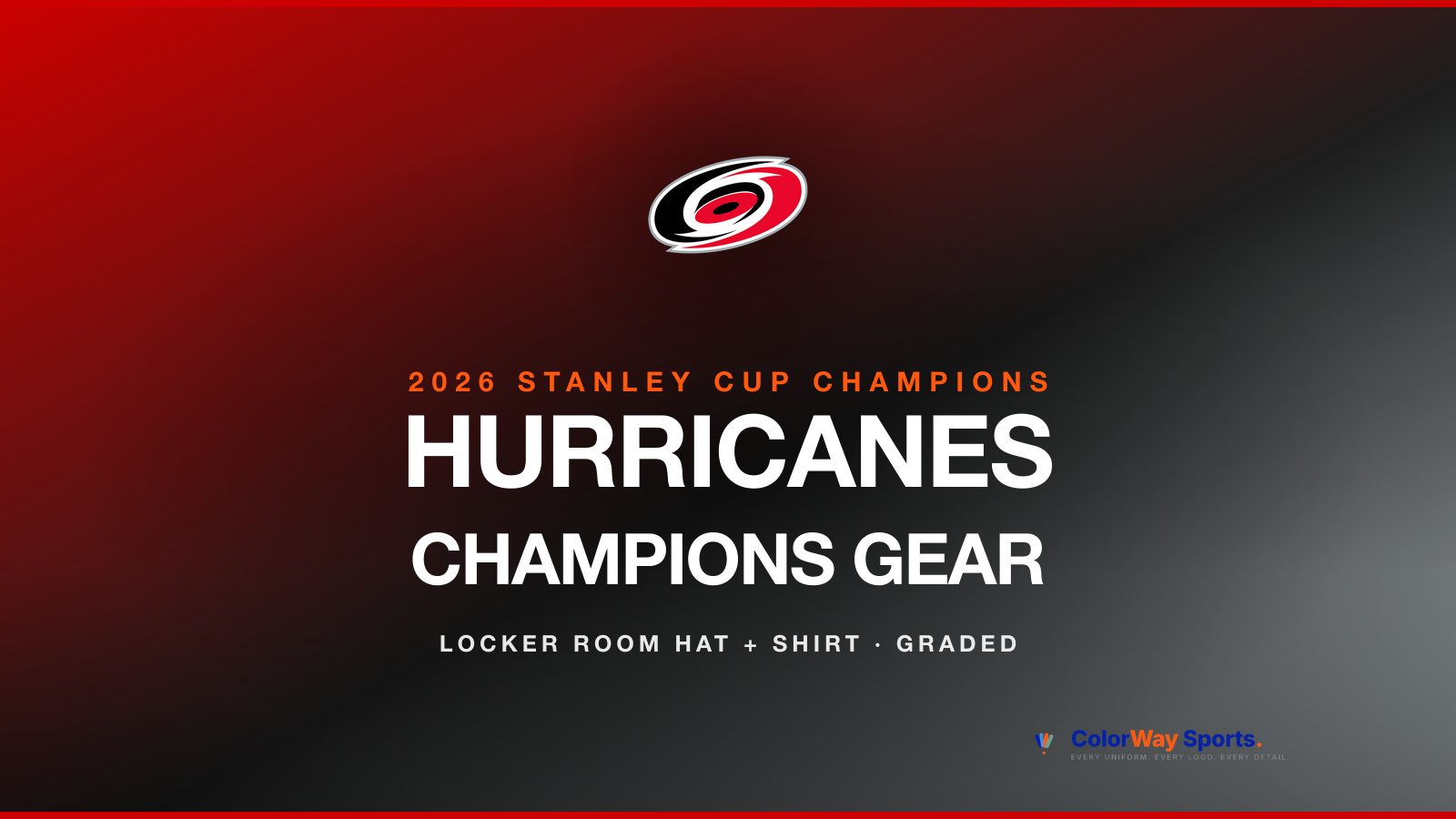
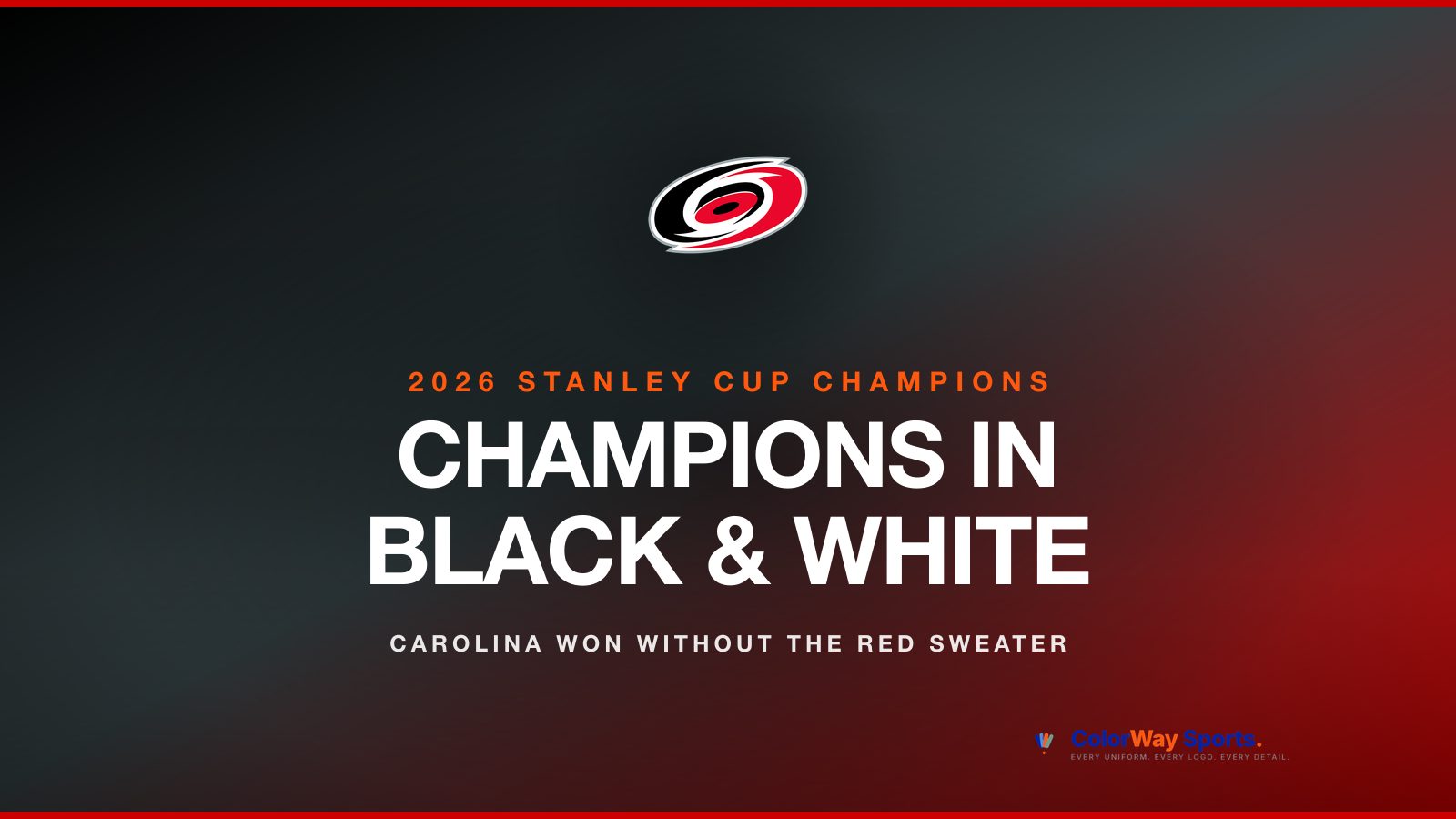
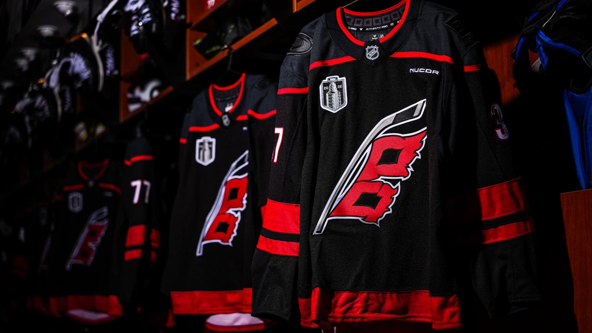
 Carolina Hurricanes
 Chicago Blackhawks
 Colorado Avalanche
 Columbus Blue Jackets
 Dallas Stars
 Detroit Red Wings
 Edmonton Oilers
 Florida Panthers
 Los Angeles Kings
 Minnesota Wild
 Montreal Canadiens
 Nashville Predators
 New Jersey Devils
 New York Islanders
 New York Rangers
 Ottawa Senators
 Philadelphia Flyers
 Pittsburgh Penguins
 San Jose Sharks
 Seattle Kraken
 St. Louis Blues
 Tampa Bay Lightning
 Toronto Maple Leafs
 Utah Hockey Club
 Vancouver Canucks
 Vegas Golden Knights
 Washington Capitals
 Winnipeg Jets
 All Soccer Stories
 International Competitions
 UEFA Champions League
 Premier League
 La Liga
 Serie A
 Bundesliga
 Ligue 1
 MLS
MLS All F1 Stories
 Alpine
 Aston Martin
 Audi
Audi Cadillac
 Ferrari
 Haas
Haas McLaren
 Mercedes
 Racing Bulls
 Red Bull Racing
 Williams
 NASCAR
The Stanley Cup Final logo has gone through seven distinct visual eras since 1989. The ribbon-and-cup patches that sat on the chest of every player in the early 90s. The conference-vs-conference oval crests of the late 90s. The sunburst Stanley Cup wordmarks that defined the Jaromir Jagr and Patrick Roy eras. The shield-and-banner moment in the mid 2000s. The forgettable 2008 transitional one-off. The iconic silver shield that ran for thirteen years and became the visual shorthand for playoff hockey. And the new Stanley Cup Final wordmark the league rolled out in 2022 that we are still living with today.
We tracked every single one of them, year by year, from 1989 to 2026. Below is the complete history, the era-by-era ranking, and the case for which era of the Stanley Cup Final logo is the best of all time. For the related case on the playoff logo that used to live on the rink itself, see our Stanley Cup Playoffs ice logo breakdown.
Every Stanley Cup Final Logo, 1989 to 2026
Thirty-six Final logos plus the 2026 Stanley Cup Playoffs identity. The 2005 lockout year is the only break in the run.
Era 1 · 1989 to 1994 · The Ribbon-and-Cup Patches
Grade: B
1989
1990
1991
1992
1993
1994
The opening era of the modern Stanley Cup Final logo was an embroidered patch built around the silhouette of the Cup itself. Wales Conference and Campbell Conference text wrapped the top, the Stanley Cup Championship wordmark sat across a red ribbon at the bottom, and the year was stitched into the banner. Each year carried a slightly different tweak: the 1993 logo added Centennial Championship text to mark the trophy's hundredth year, and the 1994 logo cleaned up the typography. We like the ribbon, the colors, and the heritage feel, but there is a lot going on in the composition and it would not work in a modern broadcast environment.
Era 2 · 1995 to 1999 · The Oval Crest Era
Grade: B+
1995
1996
1997
1998
1999
The conference names changed from Wales and Campbell to Eastern and Western in 1993, and by 1995 the logo had caught up with the realignment. The new oval crest dropped the ribbon and stitched the conference names into a circular wrap around the Stanley Cup itself, with the year displayed across the top of the trophy. The orange-and-blue color treatment that defined this era is one of the most underrated palettes in NHL history. The 90s sports design language was at its peak across every league at the same time, and the Cup logo lived in the middle of it. Clean, just colorful enough, and the kind of crest that holds up.
Era 3 · 2000 to 2004 · The Sunburst Stanley Cup Era
Grade: A-
2000
2001
2002
2003
2004
The turn of the millennium got a new look. The Stanley Cup itself moved center stage with a giant sunburst ray treatment behind it, the year displayed in oversized digits across the top of the trophy, and the Stanley Cup wordmark anchored on a banner below. Western Conference vs Eastern Conference text wrapped around the top. This is the era we associate with the Devils dynasty, the Avalanche second Cup, the Red Wings winning in 2002, and the Lightning's first championship in 2004. We like these more than the 90s oval crest. Very clean, the right amount of room, and the orange the NHL has always loved is leaning into the Cup itself.
Era 4 · 2006 to 2007 · The Modern Shield Era
Grade: B
2006
2007
The 2005 lockout cancelled the season and skipped a year, and when the Cup Finals returned in 2006 the logo had been completely redesigned. The new shield format put Stanley Cup in giant red letters across a banner at the top, the NHL shield in the center, and the year stamped across the bottom. The conference names appeared in vertical text along each side. It is a clean post-lockout modernization with the two-color Eastern and Western treatment, but it does not feel particularly royal for a Stanley Cup Final mark and the Cup itself disappears from the composition.
Era 5 · 2008 · The One-Year Wordmark Shield
Grade: A-
2008
The 2008 logo broke from everything around it. The NHL stripped the shield down to its essentials, stacked the Stanley Cup wordmark above a clean NHL shield with the 2008 year tag, and ran it as a one-off. The result is sharp, official, and feels like a real championship mark instead of a corporate template. We did not expect to like this one and we do.
Era 6 · 2009 to 2021 · The Iconic Silver Shield Era
Grade: A
2009
2010
2011
2012
2013
2014
2015
2016
2017
2018
2019
2020
2021
The longest-running Stanley Cup Final logo of the modern era, and the one most fans picture in their head when they think Cup logo. The silver shield with the Stanley Cup illustration centered, Stanley Cup Playoffs (and later Final) wordmark across the bottom, and the year tucked into the top right of the shield. Thirteen straight years of the same template, with year-to-year tweaks. The Penguins three-peat era, the Blackhawks dynasty, the Capitals finally winning, the Lightning back-to-back, the Bubble Cup in 2020, the Avalanche championship of 2021. Every single one of those moments lived under this logo. Simple, official, and the Cup is front and center where it belongs. The only nitpick is we wish there was a little gold or color hint to mark the Final specifically, but the silver-on-silver minimalism is the whole point.
Era 7 · 2022 to 2025 · The New Stanley Cup Final Wordmark
Grade: D
2022
2023
2024
2025
The NHL retired the silver shield template in 2022 and shifted to a stacked wordmark format. Stanley Cup in smaller letters above the much larger FINAL wordmark, with a small Cup-and-shield mark above. The new mark feels closer to broadcast title-card design than to a competition crest. It is built to live in motion graphics, on streaming title cards, on broadcast bumpers, and we get the strategy. We just do not like it. It feels stiff, the color is gone, and there is none of the royal Stanley Cup Final energy that defined every other era we have ranked. The lowest mark we will give in this entire history.
2026 · The Stanley Cup Playoffs Logo
2026 (Playoffs Logo)
A note on 2026: the NHL has only released the Stanley Cup Playoffs logo so far, not the Stanley Cup Final logo. The Playoffs mark above is what fans are seeing through Round 1 in April 2026. The dedicated Stanley Cup Final logo for 2026 has not dropped yet and will be released closer to the start of the Final in early June, once the matchup is set. We will update this post as soon as the Final logo is unveiled.
The Best Stanley Cup Final Logo Era of All Time
Our pick is the 2009-2021 silver shield era. Thirteen straight years of the same iconic template scored every defining moment of modern hockey. The Penguins three-peat era, the Blackhawks dynasty, the Capitals finally winning, the Lightning back-to-back, the Bubble Cup in 2020, the Avalanche championship of 2021. Simple, official, the Cup front and center. The longevity is not an accident. The design works.
Two A- eras tie for second place. The 2008 one-year wordmark shield, which we did not expect to like and absolutely do, lands in the upper tier on minimalism and royalty alone. The 2000-2004 sunburst era ties it on the strength of the Cup-as-hero composition and the orange-on-blue palette that defined the Devils, Avalanche, Red Wings, and Lightning championship runs.
The 2022 to present new Stanley Cup Final wordmark is the worst era in this entire run. A D from us. Stiff, colorless, and stripped of the royal Final energy every other era earned. We will keep saying it across every league: the corporate-clean direction modern sports branding has gone has cost real visual personality, and the Cup logo is one of the saddest examples of that trend.
Frequently Asked Questions About Stanley Cup Final Logos
When did the NHL change the Stanley Cup Final logo?
The NHL has changed the Stanley Cup Final logo seven times since 1989. The major eras are 1989-1994 (ribbon-and-cup patches), 1995-1999 (oval crest), 2000-2004 (sunburst Stanley Cup), 2006-2007 (modern shield), 2008 (one-year wordmark shield), 2009-2021 (silver shield era), and 2022 to present (new Stanley Cup Final wordmark).
Was there a 2005 Stanley Cup Final logo?
No. The 2004-05 NHL season was cancelled because of the lockout, so no Stanley Cup Final was played and no Stanley Cup Final logo was created for 2005. The 2005 gap is the only break in the run between 1989 and 2026.
What is the 2026 Stanley Cup Final logo?
The 2026 Stanley Cup Final logo has not been released as of late April 2026. The NHL typically unveils the Final logo closer to the start of the Stanley Cup Final in early June, once the matchup is set. The Stanley Cup Playoffs logo for 2026 has been in use since Round 1 tipped off in April.
What is the difference between the Stanley Cup Playoffs logo and the Stanley Cup Final logo?
The Stanley Cup Playoffs logo is used across all four rounds of the playoffs, including the Stanley Cup Final. The Stanley Cup Final logo is a separate dedicated mark used only during the Final round between the Eastern Conference and Western Conference champions. Both logos exist in parallel during a typical postseason.
What was the most iconic Stanley Cup Final logo?
The 2009 to 2021 silver shield Stanley Cup Final logo ran for thirteen consecutive years and is the version most modern hockey fans associate with the Stanley Cup Playoffs. The longevity, the consistency, and the run of championship moments it scored across that period make it the most culturally embedded Stanley Cup Final logo of the modern era.
When did the Stanley Cup Final logo change to the new wordmark style?
The NHL retired the silver shield template after the 2021 Stanley Cup Final and introduced the new stacked wordmark style for the 2022 Stanley Cup Final between the Colorado Avalanche and the Tampa Bay Lightning. That format has been in use through the 2025 Final and is expected to be the basis for the 2026 Stanley Cup Final logo when it drops.
Who designs the Stanley Cup Final logo?
The NHL's in-house creative team and contracted design partners produce the Stanley Cup Final logo each year. Year-to-year tweaks within an era (like updating the year stamp on the silver shield era) are typically internal updates, while major template changes (1995, 2000, 2006, 2008, 2009, 2022) involve external creative direction or full rebrands.