via NBC Sports
The Stanley Cup Playoffs ice logo has been one of the defining visual signatures of NHL postseason hockey for decades. It is also one of the most overlooked. Unlike the rest of the league's branding, the ice logo has never been team-specific. The same logo went down on every NHL surface during the playoffs, and every era of the postseason has its own version. From the year-specific painted Cup Finals of the 1990s to the iconic 13-year standardized logo that ran from 2009 to 2021 to the digital replacement that took over in 2020, the Stanley Cup Playoffs ice logo evolved from a hand-painted tradition into a corporate ad break. We covered why the league pulling it off the ice still bothers us in our NHL playoffs ice logo post. Here is the full era-by-era history of how the painted ice logo got from its 1990s origins to where it is now.
1980s and 1990s: Year-Specific Painted Cup Finals
The earliest era of Stanley Cup Final ice logos was custom every year. Each Final got its own hand-painted center-ice logo, often tied to the host city, the year, or the matchup. There was no league-wide standard. The Edmonton Oilers dynasty Finals, the 1989 Calgary win, the 1993 Canadiens Cup, the 1994 Rangers Cup at Madison Square Garden, the 1996 Avalanche-Panthers series, and the 1997 Red Wings sweep over the Flyers all featured their own bespoke ice graphics. Hockey Night in Canada and ESPN broadcasts from this era show wildly different center-ice treatments from one Final to the next. The lack of standardization is what makes this era visually rich. Each Final felt like its own design moment painted directly into the surface of the ice.
2000s: The Last Custom Cup Final Era
The 2000s carried the per-Final custom approach forward but the league started moving toward more recognizable visual continuity. The 2001 Avalanche win, the 2002 Red Wings Cup over Carolina, the 2004 Lightning championship over Calgary, the 2008 Penguins-Red Wings classic all had their own painted center ice. The Cup Final logos in this era were closer to corporate identity than the 90s freelance feel. By the late 2000s the league was about to standardize the entire postseason brand under a single recurring logo, and this decade was the last time every Final got a unique paint job at center ice.
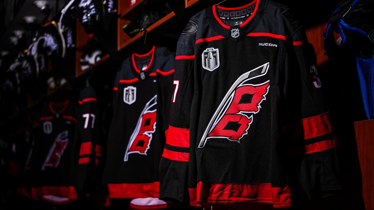
2009 to 2021: The Iconic Standardized Painted Era
via NBC Sports
This is the era hockey fans actually remember. In 2009 the NHL standardized its postseason branding for the first time, painting the same Stanley Cup Playoffs logo below each blue line at every venue throughout the playoffs, with the Stanley Cup Final logo taking over center ice for the championship round. The same look ran for 13 straight seasons from 2009 through 2021, anchoring postseason broadcasts from the Penguins-Red Wings 2009 Final, through the Hawks-Bruins 2013 series, the Kings-Rangers 2014 sweep, the Penguins-Predators 2017 Final, the Capitals 2018 Cup, the Blues-Bruins 2019 Final, and the Lightning's 2020 bubble title. This logo on the ice was the visual marker of NHL playoff hockey for an entire generation of fans. The petition to bring it back has thousands of signatures, and the painted era is the reason.
2022: The Redesign That Never Hit the Ice
In March 2022 the NHL unveiled a new Stanley Cup Playoffs and Stanley Cup Final logo, the first redesign of the postseason brand in 13 seasons. The new design dropped the line-art typography of the previous logo and replaced it with a more elegant rendering of the actual Stanley Cup trophy inside a shield-like emblem, with the etchings on the trophy highlighted for the first time. The redesign also introduced two custom typefaces, Windsor Sans (a nod to the Windsor Hotel in Montreal where the NHL was founded in 1917) and Victoria SC Serif (a tribute to the 1925 Cup-winning Victoria Cougars). Every detail of the new logo paid tribute to the league's roots. There was just one problem. The painted ice tradition had already ended two seasons earlier. The new logo lives only in broadcast graphics, social media branding, and digital overlays. It has never appeared painted on an NHL ice surface.
2020 to Today: The Digital Replacement
After the 2020 bubble playoffs in Edmonton and Toronto, the NHL pulled the painted Stanley Cup Playoffs logo off the ice for good. The same space below the blue lines now rotates through digital advertising that changes mid-play. Sponsor logos cycle in and out where the Stanley Cup Playoffs logo used to live, and the only postseason branding that touches the playing surface is the league shield at center ice on top of the host team's primary logo. The 2026 playoffs are the sixth consecutive year without a painted playoff logo on the ice, and we covered why that still bothers us in our Stanley Cup Playoffs logo on ice post. The era we are in now is not the painted era at all. It is the digital ad era, and the Stanley Cup Playoffs logo is no longer part of the actual ice.
What We Lost in the Switch
The painted ice logo did something digital ads cannot. It made every playoff game feel like an event from the moment the broadcast cut to the rink. Fans turning on TV in the middle of a period knew immediately what they were watching. The postseason looked different from the regular season. Every Final felt like a championship from the opening faceoff. Digital ads do not replace that. They add visual noise to the ice surface, they distract from gameplay, and they reduce the playoff broadcast to the same look as a midweek November game with a different commercial in the corner.
The NHL is the only major North American sports league that does not put a postseason logo on its playing surface. The NBA paints the Playoffs logo on the court. MLB paints the World Series logo behind home plate. The NFL paints the conference and Super Bowl logos on the field. The NHL paints sponsor ads. We are not the only ones who think this should change. The painted era earned 13 seasons because it worked. The digital era is six years in and counting.
Frequently Asked Questions
When did the NHL stop painting the Stanley Cup Playoffs logo on the ice?
The NHL removed the painted Stanley Cup Playoffs logo from below the blue lines after the 2020 postseason. The 2026 playoffs are the sixth consecutive year without a playoff logo on the ice surface. The space is now used for rotating digital ads.
How many Stanley Cup Playoffs ice logos have there been?
The Stanley Cup Playoffs ice logo has gone through four major eras. Year-specific painted Cup Final logos throughout the 1980s and 1990s, the 2000s custom-per-Final era, the 2009 to 2021 standardized painted logo that ran for 13 seasons, and the 2022 redesigned shield logo that lives only in digital broadcast graphics.
What was the iconic Stanley Cup Playoffs logo painted on the ice?
The most recognizable Stanley Cup Playoffs ice logo ran from 2009 through 2021. It was painted below each blue line at every NHL playoff venue and stayed in place for 13 straight postseasons, including the 2010 Hawks Cup, the 2013 Hawks-Bruins Final, the 2017 Penguins back-to-back, the 2018 Capitals championship, the 2019 Blues Cup, and the Lightning's 2020 bubble title.
When did the NHL update the Stanley Cup Playoffs logo?
The NHL unveiled a redesigned Stanley Cup Playoffs and Stanley Cup Final logo in March 2022, the first postseason brand update in 13 seasons. The new logo features a shield emblem around a more detailed rendering of the Cup, with custom typography in Windsor Sans and Victoria SC Serif.
Why did the NHL replace the painted ice logo with digital ads?
The NHL pulled the painted Stanley Cup Playoffs logo from the ice after 2020 to make room for additional digital advertising. The same space below each blue line now rotates through sponsor ads that change mid-play. The decision was financial and the result has been widely criticized by fans, including an active petition to bring the painted logo back.
Did every Stanley Cup Final have a different painted logo?
Yes, through the 1980s, 1990s, and 2000s, every Stanley Cup Final had its own custom painted center ice logo tied to the year and host city. The league standardized the painted ice logo across all playoff venues starting in 2009, ending the per-Final custom tradition.
What does the Stanley Cup Playoffs ice look like in 2026?
The 2026 Stanley Cup Playoffs ice has no painted playoff logo. The space below the blue lines that used to feature the Stanley Cup Playoffs logo now rotates through digital sponsor ads. Center ice features the host team's primary logo and the NHL shield, with no postseason branding on the playing surface.
Cover and broadcast images via NBC Sports.