The Tennessee Titans have officially unveiled their new look, and it's a full rebrand: new uniforms, new logo, new identity. It comes at the perfect time. New stadium on the way, Cam Ward under center, and a franchise ready to turn the page. This is his era's jersey, and there's something nice about that. A new chapter deserves a new look.
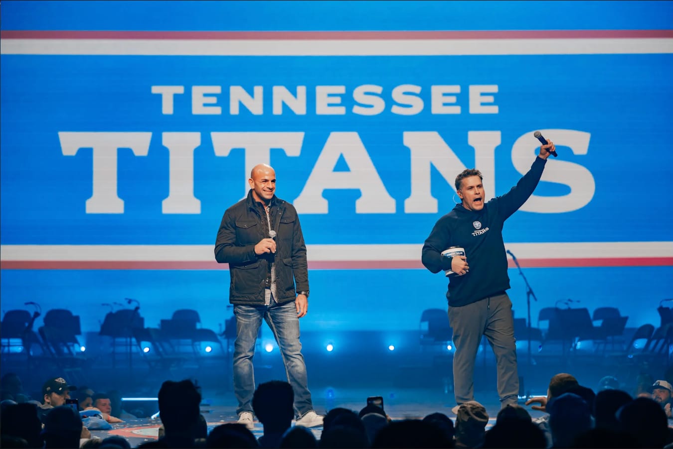 Image via Titans.com
The Jerseys: A-
We like these. The Titans went back to the lighter blue, and it was the right call. It's cleaner, it's sharper, and it connects back to the Oilers history in a way that feels intentional without being a costume.
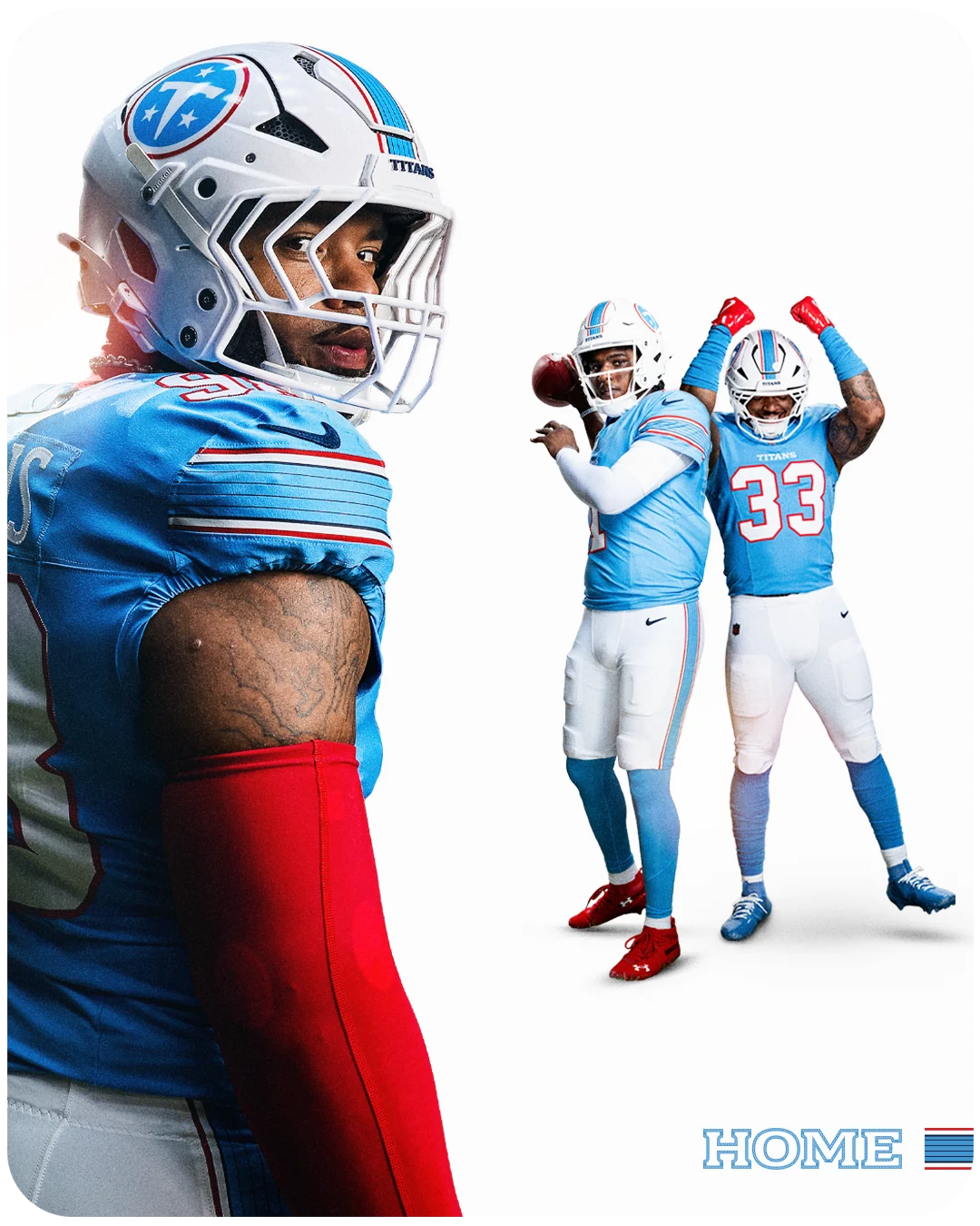 Image via Titans.com
The home jersey is the standout. The color pops, the sleeves are clean, and the overall design doesn't try to do too much. The helmet looks good too, though we think they could have pushed it a little further. The old flames behind the logo had personality. Losing that element isn't a dealbreaker, but it would have been nice to see them find a way to keep some of that energy, even if the direction is more classic.
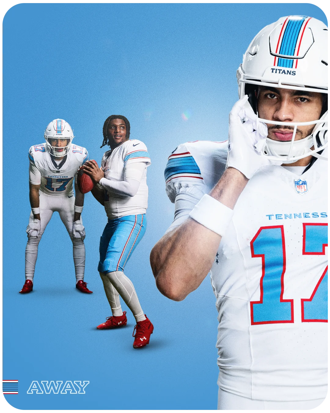 Image via Titans.com
Our favorite combination is the white away jersey with the blue pants. That's the look. Blue jersey with white pants is strong too, because we're not fans of monochrome. When you've got a color this good, break it up. Let the contrast do the work.
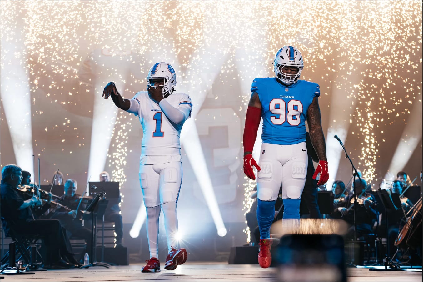 Image via Titans.com
This is part of a bigger trend across the league. Teams are going simpler. Stripping things back, cleaning things up, letting the colors speak for themselves. We like that direction. Not every uniform needs to scream at you.
The Logo: B-
This is where the rebrand falls short.
![]() Image via Titans.com
Image via Titans.com
The new logo is too bland. When you're overhauling the entire brand, the logo is your chance to make a statement. The jerseys can be simple. The logo should have some flair.
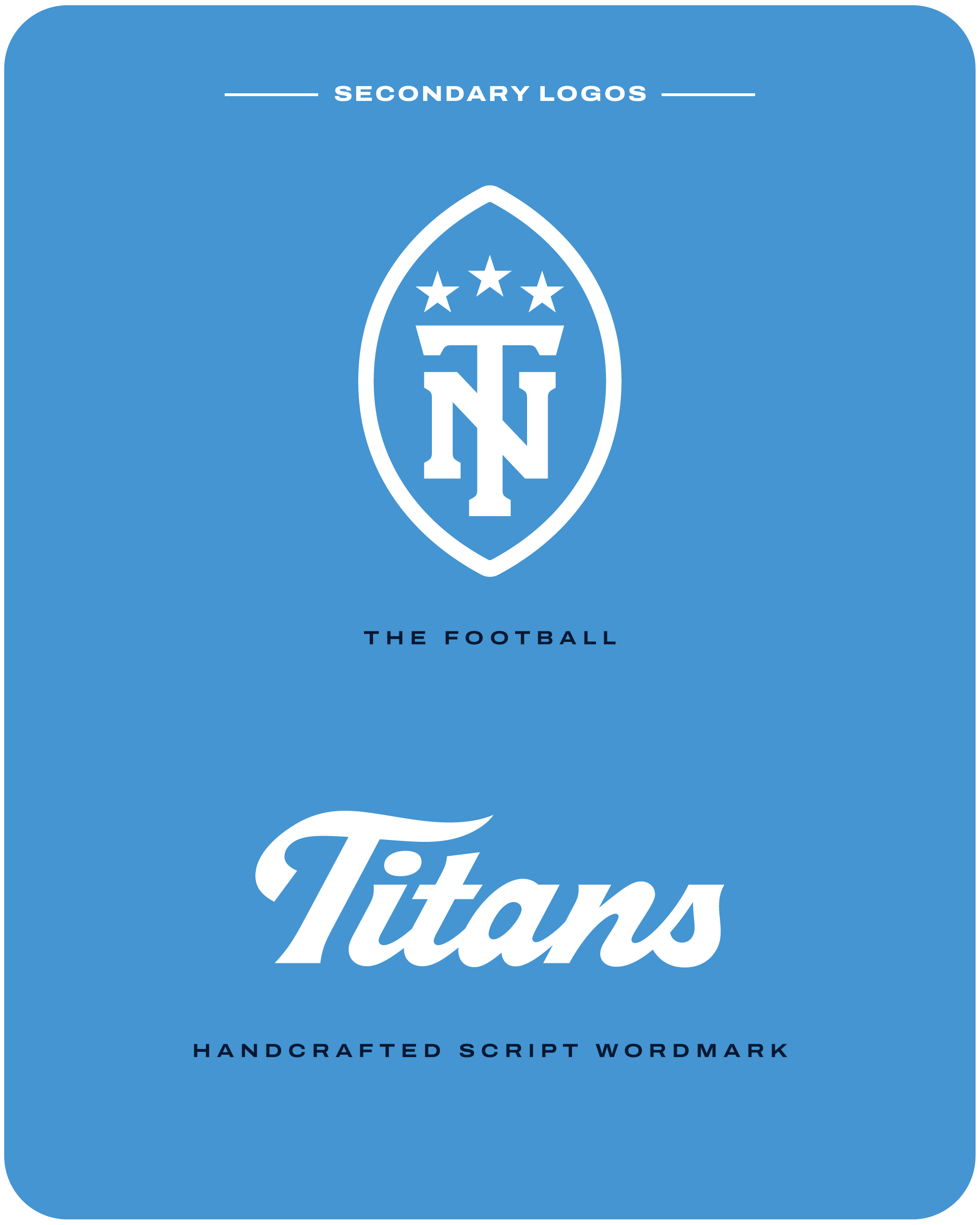 Image via Titans.com
There's room to have fun with it, to give it some edge, some personality that makes people stop and look. The secondary logos and script wordmark have more character than the primary mark. Instead, the main logo plays it safe. It's fine. But "fine" isn't what you want out of a full rebrand.
The Bottom Line: B+
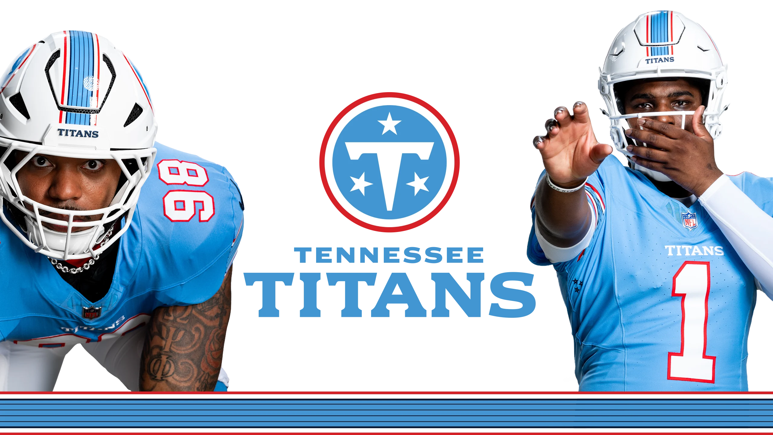 Image via Titans.com
The jerseys are carrying this rebrand. They're clean, they're modern, and they're going to look good on the field once the games start. The lighter blue was the right move. The Cam Ward era has a look that fits.
But the logo holds it back from being a home run. An A- on the uniforms and a B- on the logo averages out to a solid B+ overall. Not blown away, but not disappointed either. We'll see how it all comes together under the stadium lights.